Table of Contents
- What High-Performing Adventure Pages Do Differently
- The 10-Block Blueprint for Fast, High-Quality Adventure Pages
- Copy Frameworks That Raise Booking Confidence
- 30-Day Build Plan for Adventure Campaigns
- Common Failure Modes and Fixes
- FAQ
Adventure brands operate in a high-emotion category, but conversion still depends on clarity. People may click because the visuals look exciting, yet they only register or book when the page answers practical decision questions quickly and credibly. If those answers are delayed or vague, interest fades before action.
That is why speed alone is not enough. Launching a page quickly helps only when the page has clear message hierarchy, confidence-building proof, and a low-friction next step. Teams that pair fast build cycles with strong conversion structure usually outperform teams that spend weeks polishing design details without decision logic.
This guide gives you a complete build-and-optimize system for adventure landing pages in Unicorn Platform. It is designed for startups, small teams, and growing brands that need to ship quickly while maintaining professional quality and measurable performance.
sbb-itb-bf47c9b
Key Takeaways Before You Build
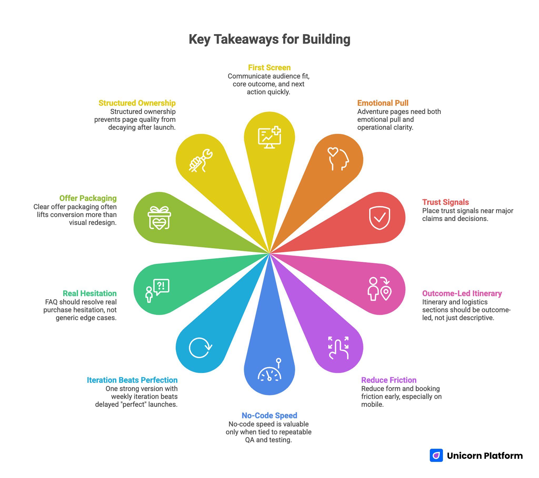
Essential Points for Creating a High-Converting Adventure Landing Page
- The first screen should communicate audience fit, core outcome, and next action in seconds.
- Adventure pages need emotional pull and operational clarity at the same time.
- Trust signals work best when distributed near major claims and decisions.
- Itinerary and logistics sections should be outcome-led, not just descriptive.
- Form and booking friction should be reduced early, especially on mobile.
- No-code speed is valuable only when tied to repeatable QA and testing.
- One strong version with weekly iteration beats delayed "perfect" launches.
- FAQ should resolve real purchase hesitation, not generic edge cases.
- Clear offer packaging often lifts conversion more than visual redesign.
- Structured ownership prevents page quality from decaying after launch.
Why Adventure Landing Pages Fail Even When They Look Good
Many adventure pages are designed as mood boards instead of decision tools. They contain strong imagery, branded language, and broad promises, but they do not help users evaluate fit, safety, value, and logistics with confidence. When decision effort is high, conversion drops even if traffic quality is strong.
Another common problem is proof timing. Teams often place testimonials, safety cues, and experience evidence too far down the page. Users who need confidence early never reach those sections, so the page loses qualified intent that was already expensive to acquire.
A third issue is action friction. Unclear booking options, overloaded forms, and weak CTA context create hesitation at the moment users are ready to commit. In practice, this creates a performance ceiling that cannot be fixed by adding more paid traffic.
What High-Performing Adventure Pages Do Differently
1. They confirm relevance immediately
Strong pages identify who the experience is for and what outcome attendees can expect. This reduces cognitive load and helps visitors self-qualify quickly. Relevance clarity is often the fastest path to conversion quality improvement.
2. They pair aspiration with specificity
High-performing pages still use emotion, but they anchor it in concrete details. They show what the day looks like, what support exists, and what results or experiences are realistic. This blend builds excitement without creating uncertainty.
3. They make trust visible early
Trust is not a bottom-section feature. Pages that convert well place credibility cues near top claims, then reinforce them again near itinerary and offer decisions. The repeated placement helps users maintain confidence across the full reading journey.
4. They use predictable section jobs
Long pages stay usable when each section has one clear purpose. Visitors can scan quickly, dive deeper where needed, and find answers without searching across unrelated blocks.
5. They optimize for change
Adventure campaigns evolve frequently because of seasonality, route updates, guide scheduling, and partnership shifts. Strong pages are built so teams can update key sections quickly without breaking structure or brand consistency.
The 10-Block Blueprint for Fast, High-Quality Adventure Pages
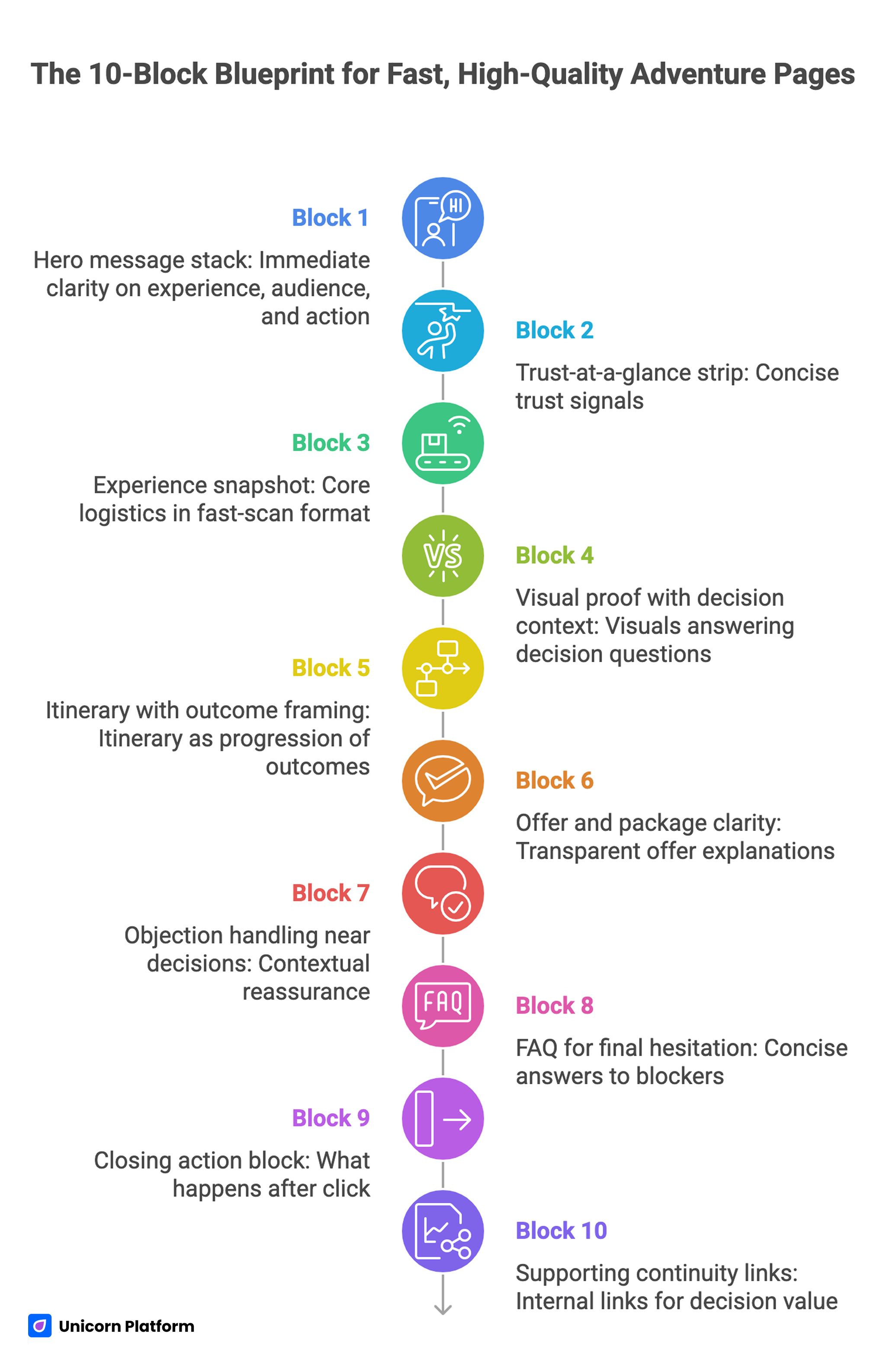
Structured 10-Block Design for Adventure Landing Page Success
If you need a reusable baseline, start with a structured framework like a high-converting landing page structure and adapt each block to your specific offer and booking model. This approach keeps fast production aligned with conversion logic.
Block 1: Hero message stack
Your hero should answer three things immediately: what experience this is, who it is for, and what users should do next. Keep headline language concrete and outcome-led, then use a subheadline to clarify format and support level.
A practical setup includes one primary CTA and one optional lower-friction action. This lets cautious users explore while keeping a clear path for ready-to-book visitors.
Block 2: Trust-at-a-glance strip
Add one compact trust layer directly below the hero. Include concise signals such as guide credentials, participant count, safety positioning, or review strength.
The goal is not to prove everything at once. The goal is to reduce initial uncertainty before users evaluate itinerary and pricing.
Block 3: Experience snapshot
Provide core logistics in a fast-scan format: duration, difficulty, group size, location context, season window, and inclusions. This block helps users determine fit quickly and reduces low-quality inquiries.
Keep language plain and specific. Avoid internal jargon or category shorthand that first-time visitors may not understand.
Block 4: Visual proof with decision context
Use visuals to answer decision questions, not only to create atmosphere. Show terrain reality, group dynamics, guide support, and conditions users should expect.
Organized visual storytelling is usually more persuasive than broad image galleries with no explanatory context. It also helps your team defend design choices with conversion logic instead of personal taste.
Block 5: Itinerary with outcome framing
Present itinerary as a progression of outcomes, not only a timeline of activities. Users should understand what each stage gives them in practical terms, including difficulty progression and support touchpoints.
When itinerary framing is clear, booking confidence improves because uncertainty about effort and value decreases. This section is often the difference between passive interest and active booking intent.
Block 6: Offer and package clarity
If you have multiple options, explain differences by use-case fit. Avoid naming conventions that sound polished but fail to communicate practical distinctions.
Transparent inclusion and payment terms usually improve both conversion and post-booking satisfaction. Clear terms reduce refund friction and improve lead quality for operations teams.
Block 7: Objection handling near decisions
Address predictable concerns where they appear naturally in the flow. For example, answer safety and physical readiness near itinerary sections, and answer cancellation or refund terms near offer decisions.
Contextual reassurance works better than generic reassurance blocks detached from decision moments. Users trust answers more when they appear exactly where concern is likely to surface.
Block 8: FAQ for final hesitation
A strong FAQ targets real blockers such as weather policy, experience level fit, gear requirements, group composition, and schedule flexibility. Keep answers concise first, then add detail where helpful.
Place FAQ near lower intent zones where users usually pause before committing. This placement gives hesitant users one more confidence checkpoint before they drop off.
Block 9: Closing action block
The final action block should describe what happens after click: confirmation timing, next-step communication, and preparation expectations. This reduces perceived risk and improves form completion quality.
Clear next-step transparency is more effective than pressure-heavy urgency language for most adventure audiences. It keeps the final conversion step calm, credible, and easy to understand.
Block 10: Supporting continuity links
Use internal links only when they add decision value in context. For example, when discussing visual direction and destination presentation, a related resource like travel site design ideas can help readers apply more specific layout choices.
Keep links distributed naturally and never cluster multiple internal links in one paragraph. Readers should encounter deeper resources at the exact moment those resources become useful.
Copy Frameworks That Raise Booking Confidence
Framework 1: Headline by audience readiness
For beginner-focused offers, prioritize guidance clarity and confidence language. Users in this segment need reassurance about support, difficulty fit, and first-step simplicity.
For experienced audiences, prioritize challenge specificity and experience differentiation. These users care more about route quality, uniqueness, and execution quality.
Framework 2: Subheadline clarity test
Before publishing, validate subheadline quality with four checks. This takes minutes but prevents weak launch copy that requires expensive traffic to diagnose later:
- Is the audience explicit?
- Is the outcome explicit?
- Is the support mechanism clear?
- Is the expected effort realistic?
Running this test prevents vague messaging that looks good visually but underperforms in conversion. It also creates cleaner alignment between creative, media, and product teams.
Framework 3: CTA progression by confidence stage
Early CTA language should support exploration. Mid-page CTA language should reinforce fit confirmation. Late CTA language should support direct commitment with clear expectations.
This progression aligns with real user behavior and reduces drop-off from premature hard asks. As confidence grows, your CTA language can become more direct without feeling pushy.
Framework 4: Decision-grade specificity
Replace broad adjectives with observable details. For instance, instead of saying "expert-guided," explain guide ratio, session structure, or preparation workflow.
Specific language shortens the trust-building path and improves booking quality. It also reduces mismatch between user expectations and the delivered experience.
Framework 5: Risk-reduction microcopy
Place concise reassurance near forms and package decisions. Clarify cancellation windows, rescheduling terms, and communication timelines in practical language.
Small microcopy additions often remove hidden hesitation without increasing page complexity. These details are especially useful for mobile users making quick decisions.
Design Rules for Adventure Pages That Convert
Creative direction should serve understanding. Distinctive visuals can improve brand memory, but conversion suffers if structure and hierarchy are unclear.
Prioritize readable typography, consistent section rhythm, and strong contrast around action points. Users should never search for what to do next.
Keep one dominant objective per screen. When every section asks for equal attention, users lose decision momentum and interaction quality declines.
If you use animation or parallax effects, apply a strict usefulness rule. Effects that do not improve comprehension should be reduced or removed.
What Startup Teams Can Borrow From Other High-Intent Page Types
Lesson from startup-focused pages
Startup landing pages often succeed because they are concise and operationally clear. Adventure teams can use the same principle by simplifying top-stack language and making section jobs explicit.
This does not reduce brand personality. It increases decision speed while preserving storytelling where it matters most.
Lesson from hospitality-style pages
Hospitality pages are strong at packaging environment and logistics in one flow. Adventure pages can apply this by combining aspiration visuals with clear inclusion details and schedule clarity.
When lodging or comfort is part of the experience, a resource like hotel landing page structure guidance can help present accommodation details without crowding core booking logic. This helps keep conversion flow clean while still answering practical comfort questions.
Lesson from educational offer pages
Educational pages typically explain progression clearly. Adventure teams can adapt this by presenting pre-trip preparation, on-trip support, and post-trip outcomes as a clear path.
Progression clarity reduces uncertainty and helps first-time participants commit faster. It also makes support conversations easier because expectations are set before booking.
Mobile Experience: Where Adventure Conversions Often Break
A large share of discovery and booking intent starts on mobile through social feeds, chat referrals, and creator content. If your page is hard to parse on phone screens, paid and organic traffic quality is wasted.
Mobile experience is not just a usability detail — it directly affects discoverability, engagement, and performance outcomes. Google’s Core Web Vitals framework explains how loading speed, visual stability, and interaction responsiveness influence both user satisfaction and visibility in modern search results.
Ensure top messaging remains readable without zooming. Keep primary CTA visible early and avoid giant media blocks that push essential details too far down.
Simplify forms for mobile completion and reduce unnecessary fields. Mobile friction can quietly limit conversion rates even when message quality is strong.
Integrate mobile QA in each release cycle instead of treating it as final-stage cleanup. Early fixes protect campaign efficiency and prevent avoidable drop-off from paid traffic.
Measurement and Optimization Workflow
Fast publication should be paired with structured measurement. At minimum, track section engagement, CTA interaction, form completion behavior, and booking quality by source.
Use this data to prioritize one high-impact change per cycle. Avoid running multiple unrelated changes at once because attribution becomes unclear.
If your team needs deeper optimization context across page architecture and user behavior, a focused reference like landing page optimization patterns can help diagnose friction points faster. Use that resource to prioritize fixes by impact rather than by subjective preference.
Document each change with expected behavioral impact. Over time, this builds a reusable decision library that speeds future campaign launches.
30-Day Build Plan for Adventure Campaigns
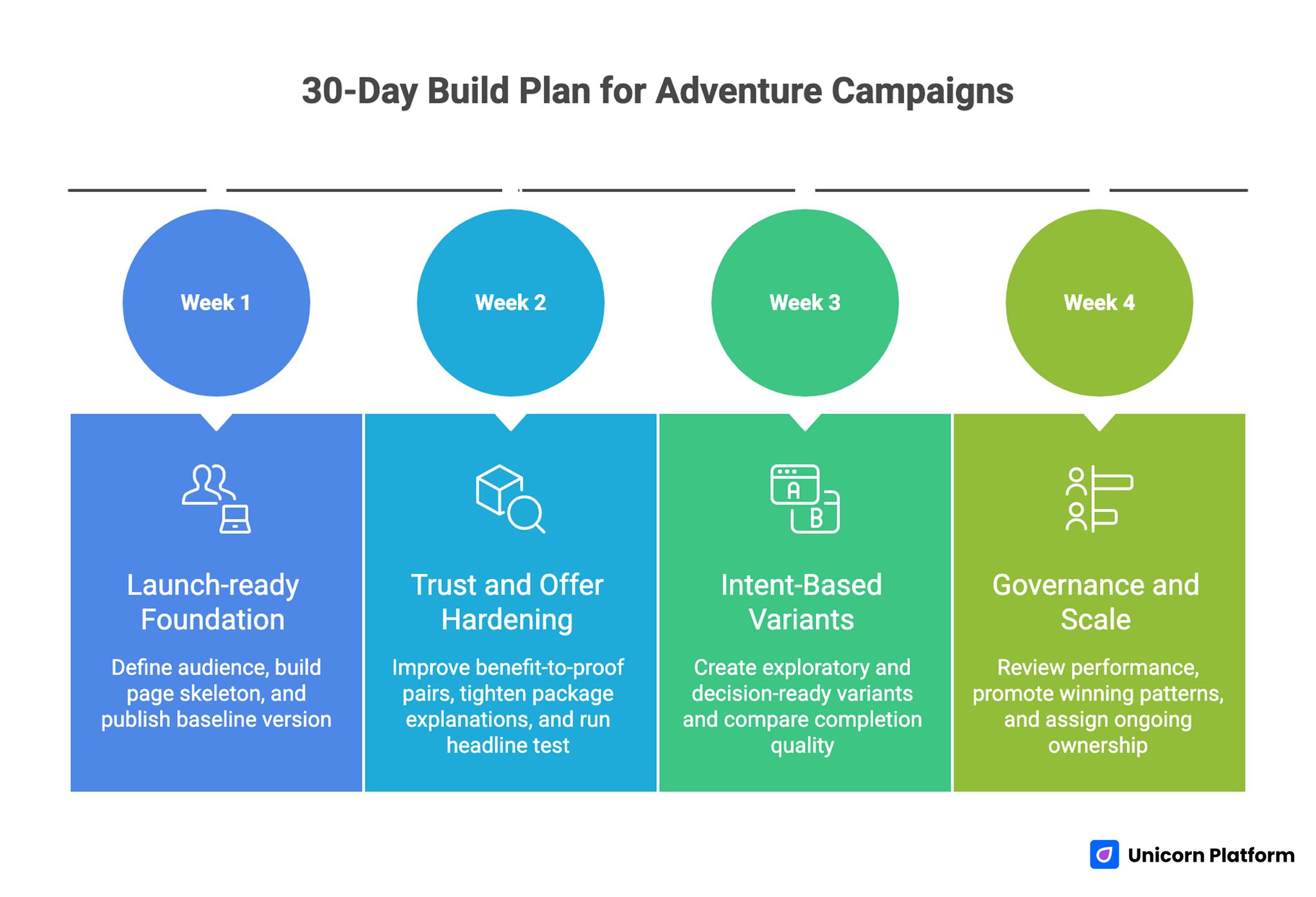
30-Day Build and Optimization Plan for High-Converting Adventure Landing Pages
Week 1: Launch-ready foundation
Define one primary audience segment and one core booking objective. Build the 10-block page skeleton in Unicorn Platform and complete a baseline mobile check before launch.
By the end of week one, publish a coherent version with clear hero messaging, trust strip, itinerary clarity, and a clean primary CTA path. Shipping this baseline quickly gives you real data to improve instead of assumptions to debate.
Week 2: Trust and offer hardening
Improve benefit-to-proof pairs, tighten package explanations, and place risk-reduction microcopy near action points. Remove low-value sections that add length without decision value.
Run one controlled test on headline or subheadline while keeping structure stable. Single-variable testing makes outcome interpretation much more reliable.
Week 3: Intent-based variants
Create two variants based on visitor readiness: exploratory and decision-ready. Adjust CTA intensity, proof depth, and objection emphasis according to source behavior.
Compare completion quality along with conversion volume to avoid low-fit growth. Higher-quality bookings usually outperform larger but low-intent volume over time.
Week 4: Governance and scale
Review section-level performance, mobile drop-off zones, and support ticket themes. Promote winning patterns into your base template and archive clear style and QA rules.
Assign ongoing ownership for copy freshness, proof updates, and release QA to prevent performance drift.
10 Applied Scenarios for Real Adventure Teams
1. Beginner-friendly weekend retreat
Lead with safety and support clarity before challenge messaging. Beginners convert faster when confidence cues appear early and explicitly.
2. Advanced route program
Emphasize route differentiation and execution standards, then support with specific guide credibility. Advanced users evaluate quality depth, not generic excitement language.
3. Family-oriented adventure package
Highlight inclusions, pace, and age-fit details near top sections. Family buyers need practical planning confidence before emotional storytelling.
4. Premium small-group expedition
Use outcome framing around exclusivity, guide access, and support quality. Premium users want certainty around experience design, not only destination imagery.
5. Seasonal limited-window offer
Use transparent timing and clear participation conditions. Honest urgency helps action without damaging trust.
6. Partner-driven campaign traffic
Align landing message with partner narrative for continuity. Message mismatch between referral source and landing page is a common conversion leak.
7. International audience mix
Make timezone, language support, and logistics policies visible early. International uncertainty can suppress high-intent bookings if key details are hidden.
8. High-consideration multi-day program
Add deeper itinerary outcome context and preparation guidance. Longer commitment offers require stronger decision support and clearer expectations.
9. Last-minute fill campaign
Ship a minimum strong version quickly and prioritize speed-to-feedback. Controlled daily adjustments can outperform delayed full redesign.
10. Repeat-attendee campaign
Shorten foundational explanation and emphasize what is new this cycle. Returning audiences need relevance updates and action clarity more than broad orientation.
Common Failure Modes and Fixes
Failure mode 1: Strong visuals, weak decision logic
If users enjoy the page but do not convert, tighten top-stack message clarity and improve offer transparency. Decision logic usually drives bigger gains than extra design polish.
Failure mode 2: Trust appears too late
Move key credibility cues closer to claims and early decision points. Early trust placement often reduces bounce and improves booking quality.
Failure mode 3: Itinerary is descriptive but not persuasive
Rewrite itinerary blocks around expected outcomes and support context. Users need to understand what each stage changes for them.
Failure mode 4: Offer structure is hard to compare
Simplify package differences and label options by use-case fit. Interpretation cost is one of the most common hidden conversion barriers.
Failure mode 5: Form friction blocks intent
Reduce fields and clarify next steps. Progressive qualification often preserves conversion while improving downstream data quality.
Independent ecommerce UX research from the Baymard Institute consistently shows that unnecessary complexity in checkout flows and pricing presentation increases abandonment rates. Clear structure and transparency in forms and offers reduce cognitive load and improve completion behavior.
Failure mode 6: No structured iteration cadence
Adopt weekly testing with one major variable per cycle. Performance compounds when optimization is disciplined and observable.
Failure mode 7: No quality ownership after launch
Assign clear owners for message quality, proof freshness, and release QA. Ownership clarity is critical for sustained conversion performance.
FAQ: Adventure Landing Pages in 2026
What should be above the fold on an adventure landing page?
Place audience fit, core outcome, trust-at-a-glance, and one clear primary action. Users should understand relevance and next step without heavy scrolling.
How long should an adventure landing page be?
Length should match decision complexity. Short pages can work for simple offers, while multi-day or high-consideration offers usually need deeper itinerary and trust detail.
Should we use one page for all traffic sources?
A shared base structure works well, but source-specific variants usually perform better when intent differs meaningfully. Keep architecture stable and customize message emphasis.
How many CTA buttons are ideal?
Use one primary action and one optional secondary action in early sections. Add stronger commitment prompts later as confidence increases.
Where should testimonials appear?
Place testimonials near claims and near booking decisions instead of grouping everything in one isolated section. Contextual placement is usually more persuasive.
How do we handle safety concerns without making the page feel heavy?
Use concise, specific reassurance tied to support and preparation steps. Clear safety context builds confidence without derailing page momentum.
What is the fastest improvement if conversion is low?
Improve first-screen clarity, move trust cues upward, and simplify package explanation. These changes often create the fastest measurable lift.
How often should we refresh content during active campaigns?
Run weekly review cycles for copy relevance, proof freshness, and mobile behavior. Frequent small updates generally outperform occasional large redesigns.
Can no-code workflows support serious optimization?
Yes, when teams combine no-code speed with strict QA and controlled experiments. The tool enables speed, but process rigor drives results.
What is the biggest mistake teams make with adventure pages?
Treating them as visual storytelling pages only. The best pages combine story with practical decision architecture that reduces risk and clarifies value.
Final Takeaway
A high-performing adventure landing page is built for fast confidence, not only fast publishing. Emotional narrative helps attract attention, but conversion happens when structure, proof, and action clarity work together across the full page.
With Unicorn Platform, teams can ship quickly and iterate often. The competitive advantage comes from applying that speed through a disciplined framework: clear section jobs, contextual trust placement, low-friction actions, and repeatable QA.
Start with one strong version, test with real behavior data, and improve in focused cycles. That is how adventure pages become dependable booking systems instead of one-time campaign pages.