Table of Contents
- Why Template-Based App Pages Underperform
- Template Archetypes That Work for App Growth Teams
- 30-Day Plan for Template-Led App Growth
- Common Mistakes and Fast Fixes
- FAQ
Most teams do not fail because they cannot find a good template. They fail because they launch fast without defining how the template should support real conversion behavior. The page looks polished, but user intent, trust flow, and action clarity are misaligned.
This happens often in app growth teams with tight release cycles. A template is chosen, copy is edited quickly, and campaigns are launched before section jobs are clear. Results look unstable across channels, and teams respond with random edits that create more drift.
A template should be treated as a conversion framework, not as a visual shortcut. When structure, messaging, and technical quality are aligned, templates can accelerate launch speed without reducing performance quality.
This guide gives a practical way to work with templates for mobile apps in Unicorn Platform. The objective is simple: preserve production speed while improving activation quality, conversion consistency, and post-click user confidence.
sbb-itb-bf47c9b
Key Takeaways
Mobile App Template Strategy
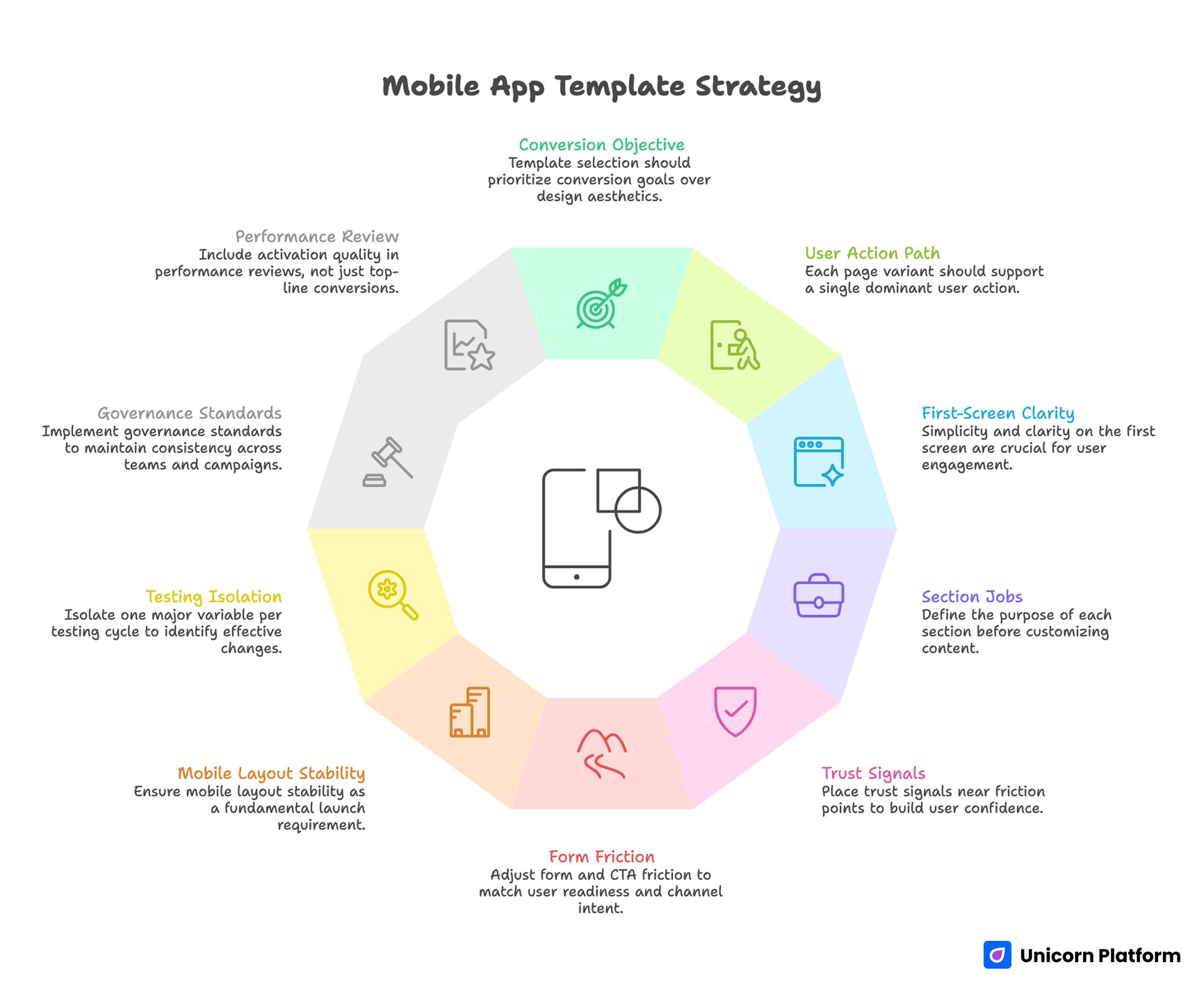
- Template selection should start with conversion objective, not only design style.
- One page variant should support one dominant user action path.
- First-screen clarity has greater impact than decorative complexity.
- Section jobs should be defined before copy customization begins.
- Trust signals should appear near friction points, not in one isolated block.
- Form and CTA friction should match readiness stage and channel intent.
- Mobile layout stability should be treated as a launch requirement.
- Testing should isolate one major variable per iteration cycle.
- Governance standards reduce drift across teams and campaigns.
- Performance review should include activation quality, not just top-line conversion.
Why Template-Based App Pages Underperform
Template-led projects usually underperform for structural reasons. Teams often select a theme because it looks modern, then ship without deciding what user behavior should improve. Without that decision, every later edit is reactive.
The next issue is mixed section purpose. Hero blocks try to explain product category, pricing, features, and social proof all at once. Users scan quickly, fail to identify what matters most, and delay action.
Another issue is weak trust timing. App pages frequently place confidence signals far below the initial CTA, asking users to commit before risk concerns are addressed.
There is also operational mismatch. Paid traffic may promise one use case while template copy reflects a broader brand narrative. When click intent and page narrative diverge, conversion quality falls.
Finally, teams often optimize for submission volume or click-through only. Without activation and retention signals, template edits can appear successful while product-qualified outcomes decline.
What Strong Templates for Mobile Apps Must Achieve
A reliable app page structure should handle five jobs in sequence: establish fit, clarify value, reduce risk, direct action, and protect momentum after conversion. If one job is missing, users usually feel uncertainty at the next decision step.
This sequence is more important than any single visual style. It mirrors how users decide under uncertainty, especially when they are comparing alternatives quickly.
A practical quality check is whether the page answers these questions before the main commitment step. Teams can run this check during wireframe review to avoid late-stage rewrites.
- Is this app relevant to my current problem?
- What concrete result can I expect first?
- How difficult is setup or adoption?
- Why should I trust the promise?
- What exactly happens after I click?
If those answers are delayed or unclear, template customization should pause until structure is fixed.
How to Choose Templates for Mobile Apps by Campaign Objective
Template choice should follow intent stage. A layout that performs for evaluation traffic may fail for cold awareness traffic, even if both pages look equally strong.
Start with one primary objective per variant. Common objectives include install intent, trial signup, demo request, waitlist capture, or reactivation flow.
Then map objective to message depth. Early-stage traffic needs stronger context and trust buildup. Late-stage traffic typically needs shorter friction paths and clearer action certainty.
A simple objective map: Use this map to assign one template archetype per campaign rather than blending conflicting goals.
- Discovery stage: outcome clarity plus low-friction exploration path.
- Evaluation stage: mechanism explanation plus trust proof.
- Decision stage: clear commitment route plus expectation copy.
This mapping prevents one generic template from being stretched across incompatible use cases.
Template Archetypes That Work for App Growth Teams
The most useful way to study references is by archetype, not by visual trend. Below are twelve practical archetypes you can adapt without copying structure or wording.
1) Product Demo Landing Template
Use this when prospects need guided product understanding before signup. Strong versions show one workflow narrative and one clear next step.
Common failure: too many feature panels before value clarity. Fix by leading with one use case and one practical result.
2) Trial Signup Template
Use this for teams optimizing free-trial starts with quality intent. It works best when setup expectations and early success milestones are explicit.
Common failure: heavy form friction before trust context. Fix by reducing first-step fields and adding expectation microcopy near CTA.
3) App Store Install Support Template
Use this when campaigns send users to a page before store download. The page should clarify fit, value, and operating-system path quickly.
Common failure: duplicating app-store language without route clarity. Fix by framing one clear benefit and one clean store transition path.
4) Waitlist Capture Template
Use this for prelaunch or phased-release demand collection. Strong pages explain timeline boundaries and participation value without hype.
Common failure: urgency without process transparency. Fix by clarifying release timing logic and follow-up cadence.
5) Feature Launch Template
Use this for new feature awareness among existing or returning users. It should connect feature change to practical workflow improvement.
Common failure: feature announcements with no adoption route. Fix by adding one implementation path and one success indicator.
6) Segment-Specific Use-Case Template
Use this when the same app serves distinct user groups with different needs. Keep one architecture and adapt proof and examples by segment.
Common failure: segment headline with generic body copy. Fix by rewriting objections, trust cues, and CTA language per segment.
7) Pricing Clarification Template
Use this when users need commercial clarity before committing. This type should explain pricing logic and expected value without overwhelming detail.
Common failure: pricing complexity without action guidance. Fix by adding a clear "what happens next" path for questions or plan selection.
8) Migration or Switching Template
Use this when users are moving from another app. Conversion success depends on risk reduction and transition transparency.
Common failure: promising easy migration without specifics. Fix by outlining migration phases, support model, and realistic timeline.
9) Partner Campaign Template
Use this when acquisition comes from co-marketing, creator partnerships, or integration channels. Message continuity is the main performance lever.
Common failure: resetting narrative after click. Fix by matching first-screen language to source context and preserving intent continuity.
10) Reactivation Template
Use this for returning users who lapsed after first interaction. The page should remove known friction and accelerate confidence recovery.
Common failure: reusing broad awareness copy. Fix by addressing reactivation objections directly and shortening the action path.
11) Education-to-Conversion Template
Use this when users need conceptual understanding before action. Good versions teach quickly and bridge to one practical next step.
Common failure: long education with no decision guidance. Fix by ending each section with a clear transition to value or action.
12) Multi-Step Qualification Template
Use this when quality filtering matters more than raw volume. It can work well for complex or premium app offers.
Common failure: asking for deep information too early. Fix by using progressive qualification and preserving early momentum.
Template Evaluation Checklist Before Customization
Before editing copy, evaluate template readiness across structure, UX, and technical integrity. This saves time by preventing late-stage redesigns.
Use this checklist: Running this list before copy customization usually saves several rounds of avoidable edits.
- First-screen block supports one clear outcome and one action.
- Layout can accommodate trust cues near major friction points.
- CTA modules can be repeated without clutter or confusion.
- Form structure supports low-friction first touch.
- Mobile spacing and tap targets are practical by default.
- Media blocks do not force heavy load before value clarity.
- Section order can be adapted without breaking visual system.
- Analytics events can map to section-level behavior.
If a template fails several checks, replacing it is usually faster than forcing extensive rework.
Customization Workflow: From Template to Conversion System
Template customization should run as a structured sequence, not as ad hoc editing. A predictable workflow reduces inconsistency and improves test quality.
Recommended sequence: Each stage should be signed off before moving to the next one to keep implementation clean.
- Define objective and primary segment.
- Assign section jobs and objection mapping.
- Rewrite first-screen fit and outcome language.
- Align mechanism and proof sections to user concerns.
- Simplify action route and expectation copy.
- QA mobile behavior and load stability.
- Launch with one clear hypothesis and measurement plan.
This approach preserves speed while keeping page decisions connected to business outcomes.
If your team needs a reusable planning system for section responsibilities, this step-by-step landing page structure guide is useful for aligning copy, design, and growth contributors before launch.
Messaging Model for App Template Pages
Message quality depends on decision clarity. Users should understand who the app serves, what changes first, and how quickly they can see value.
A practical message model: This keeps copy blocks functional and easier to test.
- Context: who this page is for.
- Outcome: what improves first.
- Mechanism: how the app delivers that change.
- Confidence: why the claim is believable.
- Action: what to do next and what to expect.
This sequence works across most template archetypes and reduces ambiguity in both cold and warm traffic flows.
Avoid broad aspiration claims without operational context. In app funnels, realistic scope statements usually improve conversion quality because they set accurate expectations.
Trust Architecture and Risk Reduction
Trust should be distributed across the page, not isolated near the footer. Users evaluate risk at multiple points, especially near first commitment decisions.
Map trust cues to specific risks: Each trust element should have a clear purpose and clear section placement.
- Product-fit risk: use-case relevance and role clarity.
- Setup risk: onboarding steps and support availability.
- Performance risk: reliability indicators and practical outcomes.
- Commitment risk: trial terms, cancellation rules, or pricing clarity.
Place each cue where the corresponding concern appears. This makes trust feel useful rather than decorative.
For teams diagnosing hesitation patterns after launch, the methods in this user behavior optimization guide help prioritize fixes by observed user behavior instead of opinion-based edits.
Conversion Path and CTA Strategy
CTA design should reflect readiness stage. Users in discovery mode need lower-commitment steps, while evaluation-stage users may prefer direct trial or install actions.
Route hierarchy must remain obvious. One primary CTA can be supported by one secondary route, but visual priority should remove ambiguity.
Expectation copy near CTA is a high-leverage detail. Brief lines about next steps, timing, and required effort reduce anxiety and improve qualified action rates.
Keep CTA placement tied to completed decision stages. Repeating action buttons without context often feels pushy and lowers trust.
Mobile Performance and Interaction Reliability
Most app campaigns receive substantial mobile traffic during first-touch research. If template behavior is unstable on mobile, conversion efficiency drops quickly.
Prioritize these mobile checks: These checks are often the difference between stable conversion and noisy campaign performance.
- First-screen value remains visible during load.
- Type scale and spacing support rapid scanning.
- CTA remains easy to reach without awkward scrolling.
- Form fields behave predictably with mobile keyboards.
- Media rendering does not block decision-critical content.
When teams need a repeatable implementation process, this responsive page workflow helps preserve conversion logic across screen sizes and device classes.
Real-device QA should be part of release criteria. Emulators alone often miss interaction issues that appear under normal network and device conditions.
Governance for Teams Using Many Templates
As campaign volume grows, template quality can decline without standards. Different team members launch fast, local edits accumulate, and structure drifts across variants.
A governance layer keeps speed while protecting consistency. Start with mandatory standards for first-screen clarity, trust placement, action hierarchy, and post-submit expectations.
Then define optional modules by campaign type, such as waitlist timelines, migration details, or pricing clarification sections. This reduces production debates and launch delays.
Useful governance standards include: Standardization here reduces production debt as campaign volume grows.
- Approved CTA naming patterns by intent stage.
- Form-field limits by traffic temperature.
- Required trust elements for higher-risk offers.
- Mobile QA gates before paid scaling.
- Event taxonomy for section-level analysis.
Clear ownership also matters. One owner for conversion architecture, one for editorial quality, and one for analytics integrity is usually enough for most teams.
30-Day Plan for Template-Led App Growth
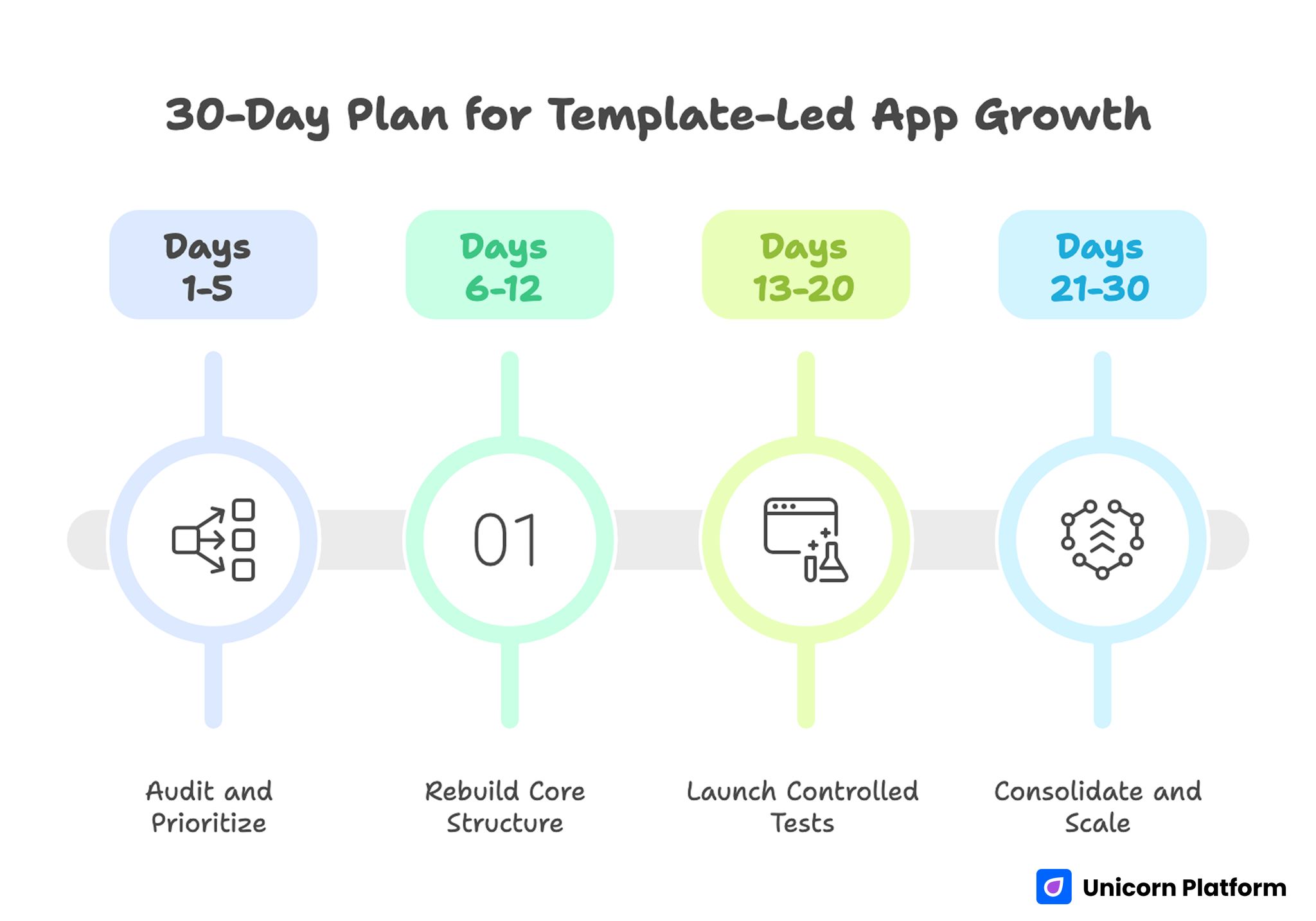
30-Day Plan for Template-Led App Growth
Days 1-5: Audit and Prioritize
Map active template variants by channel and objective. Identify intent mismatches, trust gaps, and route conflicts.
Define one primary objective and one quality metric for the next cycle. Confirm tracking consistency before major edits.
Days 6-12: Rebuild Core Structure
Rewrite first-screen and mechanism sections for clarity. Move trust cues closer to decision points and simplify CTA hierarchy.
Adjust form friction to match readiness stage and add clear expectation copy for post-submit flow.
Days 13-20: Launch Controlled Tests
Ship one main variant with one major hypothesis, such as first-screen relevance or trust placement. Keep other variables stable.
Monitor section-level behavior and activation signals, not only raw conversion counts.
Days 21-30: Consolidate and Scale
Promote validated patterns into your default template framework. Archive non-performing hypotheses with short rationale notes.
Create a shared reference doc so future launches begin with proven structure rather than ad hoc template edits.
Common Mistakes and Fast Fixes
Mistake 1: Choosing templates by appearance only
Fix: Select by objective fit, section flexibility, and conversion-path clarity. Visual polish should be treated as secondary during initial selection.
Mistake 2: Reusing one page for all traffic types
Fix: Keep shared architecture but run intent-specific variants where message needs differ. This preserves learning consistency while improving relevance.
Mistake 3: Stacking proof in one section
Fix: Distribute trust cues near the objections they are meant to resolve. Avoid placing all credibility assets in one late section.
Mistake 4: Asking for too much data too early
Fix: Use progressive qualification and keep first-touch friction proportionate. Gather deeper details only after users confirm core intent.
Mistake 5: Shipping without mobile QA depth
Fix: Include real-device checks for layout stability, form behavior, and CTA accessibility. Emulator-only checks miss too many interaction failures.
Mistake 6: Measuring success by front-end conversion only
Fix: Add activation and downstream quality metrics to decision reviews. Raw conversion numbers alone can hide performance regressions.
FAQ: Templates for Mobile Apps
How should teams evaluate templates for mobile apps before launch?
Start with objective fit and section-job clarity. A strong template should support one clear action path, mobile stability, and trust placement near decision points.
Are paid templates always better than free options?
Not always. Paid options can save time, but performance depends on structure adaptability, technical quality, and how well the page is customized for your audience.
How many template variants should one team run at once?
Run only as many as your team can measure and maintain with discipline. Fewer well-governed variants usually outperform many lightly managed pages.
Should one template serve both acquisition and reactivation campaigns?
Usually no. Shared architecture is useful, but first-screen framing and friction levels often need separate variants for different intent stages.
What is the first section to optimize when conversion drops?
Start with first-screen relevance and action clarity. If users cannot confirm fit quickly, lower-page optimizations rarely recover performance.
How should trust be added without cluttering design?
Map each trust cue to one key objection and place it where that objection appears. This keeps proof useful and avoids visual noise.
What is a good default for form length?
Collect only the minimum data needed for first-step routing. Add deeper qualification later when user confidence is higher.
How often should template pages be reviewed?
Review after major channel, offer, or audience changes, plus on a regular optimization cadence. Quarterly structural audits with ongoing tests is a practical baseline.
Can templates work for premium or complex app offers?
Yes, when structure and qualification logic are customized carefully. Complexity requires stronger clarity, not necessarily custom design from zero.
Which metrics matter most after template updates?
Track conversion plus activation quality signals, such as onboarding progress and retained usage. That combination reflects real growth impact.
Final Takeaway
Templates can accelerate app growth work when they are managed as conversion systems rather than visual assets. The teams that win usually align structure, message sequence, trust timing, and technical quality before scaling traffic.
A disciplined template workflow in Unicorn Platform helps you launch faster without sacrificing performance integrity. That balance is what turns quick launches into repeatable growth outcomes.


