Table of Contents
- Core Elements of a Responsive Landing Page
- Responsive Landing Page Example Patterns
- Common Mistakes on Responsive Landing Pages
- FAQ
A responsive landing page should load fast, read clearly, and keep its main CTA obvious on every screen size.
That sounds basic, but a lot of pages still fail in predictable ways. The headline breaks awkwardly on mobile. The hero image pushes the CTA too far down. The form feels easy on desktop but frustrating on a phone. The page technically resizes, but the conversion path gets weaker as the screen gets smaller.
This guide is built for the practical version of the problem. It shows what makes a landing page responsive, which page patterns usually work best, where teams make mistakes, and what to check before publishing.
sbb-itb-bf47c9b
Quick Answer
A responsive landing page usually does five things well:
- keeps the core message readable on mobile, tablet, and desktop
- makes the main CTA visible without forcing users to hunt for it
- preserves trust cues and proof when the layout collapses to smaller screens
- keeps forms, buttons, and spacing easy to use with thumbs and touch input
- loads cleanly without visual clutter, oversized media, or broken section order
If a page only "fits the screen" but loses clarity, trust, or action flow, it is not responsive in the way that matters.
What Makes a Landing Page Responsive
A responsive landing page is not only a desktop design that shrinks.
A good responsive page keeps the same decision path intact across devices. That means the visitor should still understand what the page is for, why it matters, and what to do next whether they arrive on a large monitor, tablet, or phone.
Core Elements of a Responsive Landing Page
1. Clear first-screen message
The headline, support copy, and CTA should still make sense on a small screen. If the first screen turns vague or crowded on mobile, the page becomes harder to trust immediately.
2. Stable visual hierarchy
The most important blocks should stay important after the layout changes. On many weak pages, proof and CTA blocks drop too far down once the desktop columns stack.
3. Touch-friendly interaction
Buttons, forms, and navigation need to be comfortable on a phone. Tiny tap targets and cramped fields make conversion harder even when the design looks fine in screenshots.
4. Mobile-readable content blocks
Short paragraphs, clear subheads, and scannable lists matter more on smaller screens. Dense copy is harder to recover from on mobile than on desktop.
5. Fast enough real-world loading
Responsive pages should not rely on oversized visuals or heavy section stacks that make the mobile experience slower and more fragile.
Responsive Landing Page Example Patterns
The best responsive landing pages usually follow a small number of strong patterns. You do not need to reinvent layout logic every time. You need a structure that survives device changes without losing conversion flow.
Example 1: SaaS or product-signup landing page
This is the most common responsive landing page pattern for startups.
What it usually includes
- one promise-led headline
- one supporting proof cue
- one primary CTA above the fold
- a product visual or screen preview
- a short proof strip or logo row
Why it works responsively
This pattern survives screen changes well because the message is simple. On mobile, the product visual can move below the hero copy without breaking the page as long as the CTA stays visible early.
What usually breaks
- hero screenshots that become too tall on mobile
- too much microcopy before the CTA
- desktop-first side-by-side layouts that stack badly
Example 2: Lead-generation or service landing page
This pattern is common for agencies, consultants, local services, and B2B lead capture.
What it usually includes
- clear audience-specific headline
- short explanation of the offer
- one short form or booking CTA
- trust cues such as testimonials, logos, or case outcomes
- FAQ or objection-handling section
Why it works responsively
The page can stay effective across devices if the form is short and the proof appears soon after the value proposition.
What usually breaks
- forms with too many fields on mobile
- trust blocks pushed too far below the first screen
- multiple equal-priority CTAs that create confusion on smaller screens
Example 3: Event or webinar registration page
This pattern needs strong message clarity and low-friction signup on every device.
What it usually includes
- event promise and topic
- date, time, or urgency context
- speaker or host credibility
- one registration CTA
- agenda or takeaways
Why it works responsively
If the page is structured well, the registration path stays clear even on smaller screens because the page has one obvious goal.
What usually breaks
- hero sections overloaded with too much event detail
- registration forms that feel long on mobile
- agenda blocks that become visually heavy when stacked
Example 4: Ecommerce or product-launch landing page
This pattern is useful when the page needs strong visual presentation and a clear action path.
What it usually includes
- product image or hero visual
- short value proposition
- price or offer context if relevant
- purchase or signup CTA
- reviews, features, and FAQs
Why it works responsively
It can work very well if the visual design stays disciplined and the CTA repeats in the right places.
What usually breaks
- huge images pushing everything useful below the fold
- crowded feature grids that collapse badly on mobile
-
weak spacing between product proof and the CTA
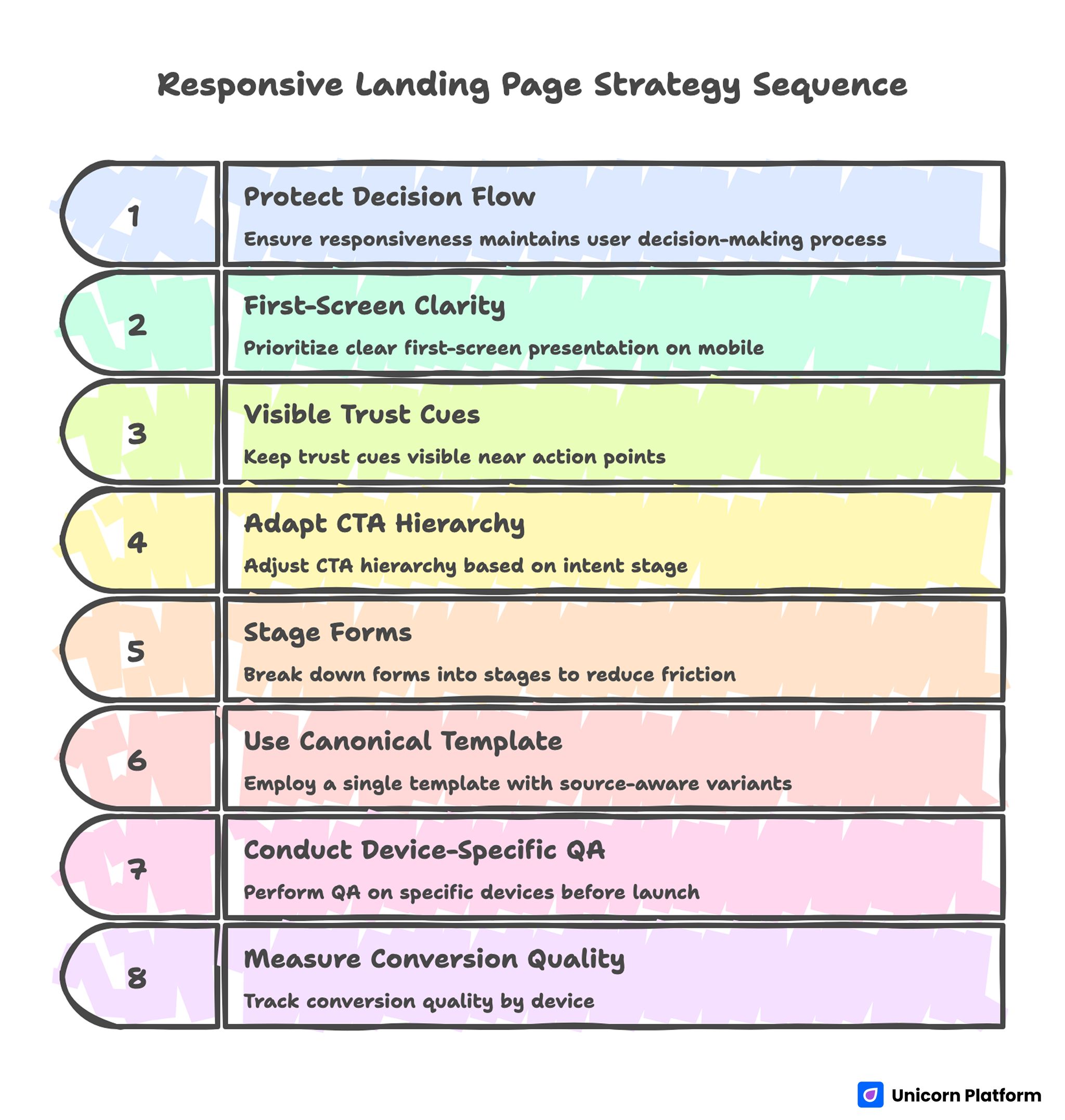
Responsive Landing Page Strategy Sequence
Mobile-First Checklist Before You Publish
If you only run one review pass, make it the mobile pass.
Use this checklist before you publish any landing page:
Messaging
- Can someone understand the page purpose in the first screen?
- Does the headline still read cleanly on a phone?
- Is the support copy short enough to scan?
CTA visibility
- Is the main CTA visible early on mobile?
- Does the CTA label still make sense out of context?
- Is the CTA repeated logically lower on the page?
Layout and spacing
- Do stacked sections still feel intentional?
- Are important sections too far apart after collapse?
- Does the page avoid giant dead space between blocks?
Forms and interaction
- Are fields easy to tap?
- Is the form short enough for mobile?
- Do dropdowns, checkboxes, and date pickers behave cleanly?
Proof and trust
- Is at least one trust cue visible early?
- Do testimonials still read well on mobile?
- Are logos, metrics, or reviews still legible?
Performance
- Do images feel appropriately sized?
- Does the page avoid heavy visual clutter?
- Does it still feel quick and stable on a phone connection?
CTA Placement by Device
CTA placement is one of the easiest things to get wrong when a page shifts between desktop and mobile.
Desktop CTA pattern
On desktop, the main CTA often works best:
- in the hero
- after the first proof or feature block
- near the end after objections are handled
The page has more room, so users can process more supporting context before acting.
Mobile CTA pattern
On mobile, the CTA usually needs to appear sooner and sometimes more often, because scroll depth is more expensive and context breaks faster.
Useful mobile CTA patterns include:
- one obvious hero CTA
- one repeated CTA after the first proof block
- one final CTA after FAQ or objection handling
The key is not to spam buttons. The key is to make action available when the user is ready.
Tablet CTA pattern
Tablet behavior often sits between desktop and mobile. The main risk is assuming the desktop layout still works perfectly. Test whether:
- the hero still feels balanced
- the CTA remains visible early enough
- the spacing does not become awkward in intermediate widths
Common Mistakes on Responsive Landing Pages
Treating responsive design as a technical checkbox
A page can pass a responsive preview and still convert poorly if the message flow breaks on smaller screens.
Letting the hero get too tall on mobile
A large image or oversized layout can push the CTA and proof too far down.
Using too many columns on desktop
Complex desktop grids often collapse into messy mobile stacks.
Hiding proof too late
If testimonials, logos, or trust blocks show up only after long scroll depth, the page can feel unproven on mobile.
Making the form too long
Long forms cost more on phones. If the page is mobile-heavy, shorten the form or stage it.
Designing for screenshots instead of real usage
A page can look polished in static previews and still feel difficult once people actually scroll, tap, and complete actions.
Short Responsive Audit List
If you want a fast quality-control pass, use this short audit before launch:
- Open the page on a phone first, not a desktop.
- Check whether the first screen explains the offer clearly.
- Confirm the main CTA appears early and stays easy to understand.
- Scroll to the first proof block and make sure it is still visible soon enough.
- Test the form with one hand on a phone.
- Check that spacing, headings, and images still feel clean on tablet width.
- Re-open on desktop and confirm the narrative still feels consistent.
If the page fails two or more of those checks, it needs another pass.
A Practical Responsive Section Order
A responsive page usually works best when section order is simple and stable.
A strong baseline looks like this:
- clear hero with one CTA
- short proof or trust cue
- core value or feature explanation
- deeper proof or examples
- objection handling or FAQ
- repeated CTA
That sequence is easier to preserve across devices than a more decorative, fragmented layout.
How to Apply This in Unicorn Platform
Unicorn Platform works well for responsive landing pages because teams can update sections quickly and check the page flow without turning every change into a development task.
A practical workflow is:
- start from a simple landing page structure
- test the first screen on mobile before polishing desktop
- keep one primary CTA per page goal
- place proof close to the first major claim
- trim sections that look good on desktop but feel heavy on mobile
If you want a stronger baseline for section order, A Step-by-Step Guide to a High-Converting Landing Page Structure is the best companion to this article. If you want to tune pages after launch based on actual user behavior, 10 User Behavior Tips to Optimize Landing Pages is the next useful step.
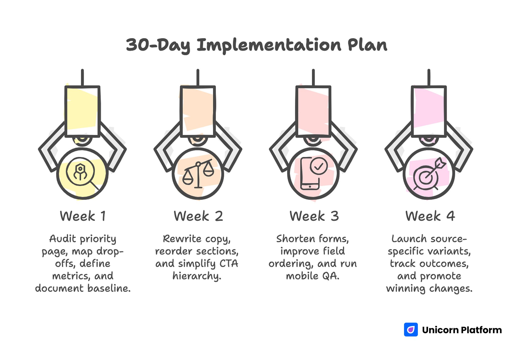
30-Day Implementation Plan
FAQ: Responsive Landing Page Examples
What is a responsive landing page?
A responsive landing page is a page that adapts to different screen sizes while preserving readability, hierarchy, trust, and CTA clarity.
What makes a landing page responsive?
The main factors are mobile-readable copy, stable section hierarchy, touch-friendly interaction, clean spacing, and CTA placement that still works on smaller screens.
Why do responsive landing pages still fail on mobile?
They often fail because the page technically resizes but the message, proof, and CTA flow become weaker on a phone.
What should be visible first on a responsive landing page?
The first screen should usually show the page purpose, a clear CTA, and at least one trust or relevance cue.
How many CTAs should a responsive landing page have?
Usually one primary CTA, repeated in logical places. The goal is clarity, not button overload.
Should forms be shorter on mobile landing pages?
Yes, in most cases. Mobile forms should usually ask for the minimum information needed for the next step.
What is the biggest mistake in responsive landing page design?
The biggest mistake is assuming that layout resizing alone makes the page responsive enough to convert well.
How do I test a landing page for responsiveness?
Check it on phone, tablet, and desktop. Focus on the first screen, CTA visibility, proof placement, form usability, and overall clarity.
Are templates useful for responsive landing pages?
Yes, if the template preserves hierarchy and CTA logic across devices rather than only looking attractive on desktop.
Does responsiveness affect conversion rates?
Yes. If the page becomes harder to read, trust, or act on as the screen gets smaller, conversion quality usually drops.
Final Takeaway
A responsive landing page is not only a page that resizes. It is a page that keeps the same decision path strong on every device.
That means clear first-screen messaging, visible CTAs, stable proof placement, mobile-friendly forms, and a layout that still feels intentional when sections stack.
If you treat responsiveness as part of conversion design instead of a final technical check, the page becomes much more likely to perform well after launch.