Table of Contents
- Why Responsive Pages Underperform Despite Good Design
- Form Experience: Small Frictions, Large Losses
- 30-Day Implementation Plan
- Common Failure Modes and Practical Fixes
- FAQ
A page that resizes correctly is not automatically a high-performing page. Many teams ship technically adaptive layouts and still lose conversions because message order, trust placement, and interaction flow break on smaller screens.
That gap is expensive. Mobile traffic now drives a large share of acquisition, and device switching is common across longer buying journeys. If the narrative feels clear on desktop but fragmented on mobile, users disengage before reaching commitment points.
High-performing responsive pages are built as decision systems. They preserve fit clarity, value communication, confidence cues, and action logic regardless of screen size.
Unicorn Platform helps teams move quickly with this approach because reusable blocks can be updated without rebuilding entire pages. Speed matters, but only when paired with structure and quality gates.
sbb-itb-bf47c9b
Quick Takeaways
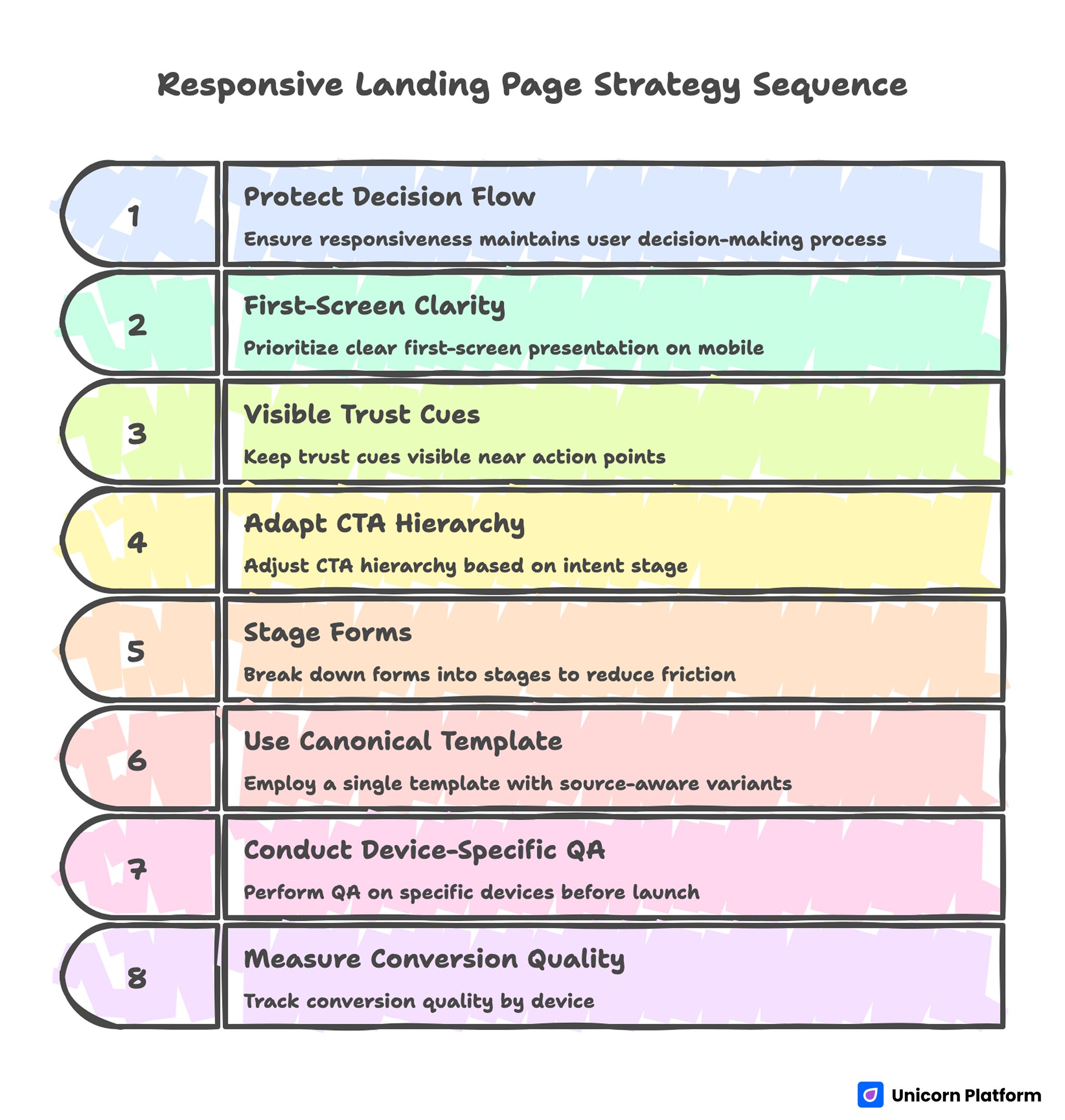
Responsive Landing Page Strategy Sequence
- Responsiveness should protect decision flow, not only visual layout.
- First-screen clarity is the highest-leverage conversion factor on mobile.
- Trust cues must remain visible near action points across breakpoints.
- CTA hierarchy should adapt by intent stage, not by design preference.
- Forms should be staged to reduce mobile friction without losing qualification quality.
- One canonical template with source-aware variants usually outperforms many disconnected designs.
- Device-specific QA before launch prevents avoidable revenue leaks.
- Measurement should include conversion quality by device, not just top-line submissions.
Why Responsive Pages Underperform Despite Good Design
Underperformance usually starts with message collapse. Headlines that are specific on wide screens become vague when line breaks force awkward phrasing. Visitors lose context in the first seconds.
The second issue is hierarchy drift. Important proof or CTA modules shift below early scroll depth, so high-intent users do not see key confidence signals before deciding whether to continue.
The third issue is interaction friction. Buttons are hard to tap, forms trigger awkward keyboard behavior, and field sequences feel longer on phones than teams expected during desktop review.
The fourth issue is channel mismatch. Teams often send multiple traffic sources to one generic version, even though source intent differs. This lowers relevance and weakens conversion quality.
The Responsive Decision Sequence
Strong responsive pages still follow one core sequence: relevance, value, confidence, and action.
Relevance clarifies who the offer is for. Value explains what practical result users can expect. Confidence reduces risk through proof and process clarity. Action presents the next step with minimal friction.
This sequence should remain stable across devices. Layout may compress, but the order and clarity of decisions should not change.
Teams refining architecture can use this landing page structure framework to lock section order before launching device-specific adjustments.
First-Screen Clarity Across Mobile and Desktop
The first screen has one practical job: confirm relevance and next step quickly. If visitors must scroll to understand value, early drop-off increases.
A reliable first-screen formula is simple: audience signal, outcome statement, one trust cue, and one clear CTA.
Desktop allows more supporting context, but mobile requires tighter phrasing. Teams should write mobile-first hero copy, then expand selectively for larger screens rather than shrinking desktop copy after the fact.
First-Screen Validation Questions
- Is the audience fit obvious in one short line?
- Is the outcome specific, not generic?
- Is one CTA clearly dominant?
- Is a confidence cue visible without deep scrolling?
If one answer is no, revise before scaling traffic.
Message Hierarchy That Survives Breakpoints
Copy hierarchy is as important as visual hierarchy. Each section should have one job and one main idea, regardless of screen size.
A practical pattern is: short heading, one explanatory paragraph, one proof cue, then action.
Avoid dense sections that depend on large-screen context. On smaller devices, dense copy often becomes perceived effort, and perceived effort reduces conversion intent.
Readability Rules for Responsive Copy
- Keep paragraphs concise and purpose-driven.
- Put outcome language early in each section.
- Use subheads that communicate function, not only theme.
- Ensure CTA labels stay clear even when shortened.
These rules improve scanning behavior on all devices.
Trust Placement and Confidence Design
Trust should appear where hesitation appears. Placing credibility elements too late forces users to decide before risk is reduced.
Useful trust elements include role-specific testimonials, contextual outcome snippets, reliability statements, and implementation expectations.
On mobile, compact trust blocks work best. Large testimonial walls increase scrolling effort and can hide the primary action.
For behavior-driven trust optimization after launch, this user behavior optimization guide helps prioritize high-impact adjustments.
CTA Hierarchy by Readiness Stage
Not all visitors are ready for the same action. Responsive pages should align CTA intensity with intent level.
Cold traffic may need low-friction discovery CTAs. Warm traffic may be ready for comparisons or qualification. High-intent traffic may convert on direct trial, booking, or purchase actions.
The critical rule is hierarchy: one primary CTA, one optional secondary route. Multiple equal CTAs increase hesitation and reduce completion quality.
Practical CTA Mapping
- Early awareness: learn or explore action.
- Mid intent: compare or evaluate action.
- High intent: start or book action.
Mapping this clearly improves routing quality across sources.
Form Experience: Small Frictions, Large Losses
Form design is where many responsive flows fail. Fields that feel acceptable on desktop become frustrating on mobile due to typing effort and keyboard interruptions.
First-step forms should collect only routing-critical information. Additional context can be captured after initial intent is confirmed.
Field order matters. Start with low-effort inputs, then request higher-friction details only if necessary.
Mobile Form QA Checklist
- Are labels always visible while typing?
- Is field order logical and short?
- Are validation messages immediate and clear?
- Does the submit action remain visible at key moments?
- Is confirmation feedback immediate after submission?
Teams that enforce this checklist usually reduce avoidable abandonment.
App and iOS Campaign Responsiveness
For app-focused campaigns, responsive quality includes platform-specific trust cues. Visitors often need quick reassurance about compatibility, onboarding effort, and privacy expectations.
Useful elements include visible App Store context, concise compatibility notes, and clear install or waitlist pathways.
Teams launching iOS-related campaigns can use this iOS no-code launch guide to align device-ready UX with fast publishing workflows.
Marketing Cloud and Multi-Campaign Execution
Campaign teams often need to publish many variants quickly. Without structure, this speed creates inconsistent messaging and noisy analytics.
A modular operating model solves this: one canonical template, campaign-specific message swaps, and consistent measurement setup.
Each variant should have one objective, one primary CTA, one trust path, and one hypothesis. This keeps interpretation clean.
Source-Aware Responsive Variants
Search, email, social, and retargeting traffic arrive with different intent depth. One generic page often underperforms across all channels.
Source-aware variants improve relevance while preserving governance. Keep structure stable and adapt headline framing, proof emphasis, and CTA tone by source.
For lifecycle and nurture campaigns that require continuity from message to page, this newsletter page framework can help align promise and action.
Variant Governance Rules
- Keep section order consistent across variants.
- Change one major variable per test cycle.
- Document expected behavior before launch.
- Archive low-performing variants to avoid reuse drift.
Governance prevents fast execution from becoming random experimentation.
Analytics Model for Device-Level Quality
Top-line conversion rate is not enough. Teams should track device-specific quality signals to detect hidden friction.
Layer one metrics include CTA clicks, form starts, and completions by device. Layer two includes qualification quality and follow-up engagement by device and source. Layer three includes downstream outcomes such as opportunity creation, installs, or purchases.
Each campaign should define one primary metric and one guardrail metric. Guardrails prevent improvements that look good in one stage but degrade later-stage outcomes.
Practical Metric Pairs
- Lead campaign: primary is qualified completion, guardrail is low-intent rate.
- App campaign: primary is install intent action, guardrail is onboarding drop-off.
- Sales campaign: primary is meeting conversion, guardrail is no-show trend.
This structure improves prioritization and planning quality.
Weekly Responsive Optimization Rhythm
A weekly operating rhythm improves learning speed and reduces noise. Without cadence, teams change too much at once and lose attribution clarity.
A practical cycle is straightforward. Monday: review device-level friction. Tuesday: choose one hypothesis. Wednesday: ship one focused change in Unicorn Platform. Thursday: run QA on real devices. Friday: decide rollout or rollback.
One major variable per cycle is usually enough for strong learning. Consistency over time outperforms sporadic full redesigns.
Monthly Freshness and QA Gates
Responsive pages degrade when proof becomes stale, offers shift, or device behavior changes with new OS updates.
Use monthly freshness reviews for active pages. Validate trust relevance, CTA clarity, form performance, and measurement integrity across devices.
Before scaling traffic, enforce release gates for readability, interaction quality, route integrity, and analytics events. This protects performance and reduces costly rework.
For teams that accelerate drafting using automation, controlled AI page drafting workflows can support speed if manual QA remains strict.
Scenario: Improving Mobile Conversion Without Redesigning Everything
A SaaS team had strong desktop results and weak mobile outcomes. The page was visually polished, but mobile users dropped before seeing trust cues and primary CTA.
Audit identified three issues: broad headline phrasing on small screens, proof blocks placed too low, and multi-field form friction.
The team rebuilt in Unicorn Platform using a mobile-first message hierarchy, compact trust modules near first action, and staged form inputs.
Within six weeks, mobile conversion quality improved and desktop performance remained stable. The biggest gains came from structural clarity, not visual complexity.
30-Day Implementation Plan
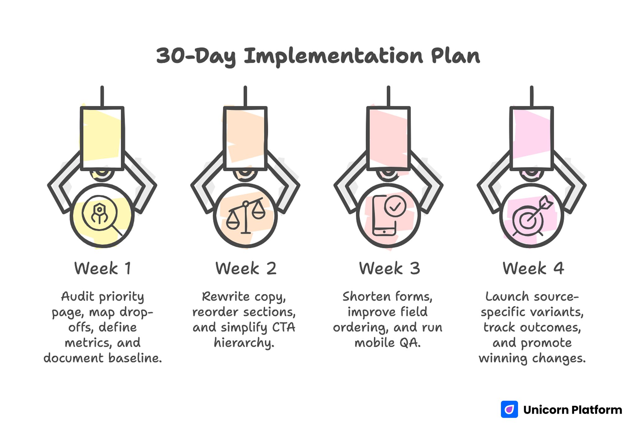
30-day Implementation Plan for Responsive Landing Page Strategy
Week 1: Baseline and Diagnostic
Audit one priority page on real devices. Map drop-offs by section and interaction step.
Define one primary and one guardrail metric. Document current baseline before edits.
Week 2: Core Messaging and Hierarchy Fixes
Rewrite first-screen copy for device-safe clarity. Reorder sections so value and trust appear before major commitment asks.
Simplify CTA hierarchy to one dominant path and one controlled secondary path.
Week 3: Form and Interaction Optimization
Shorten first-step form, improve field ordering, and tighten validation behavior.
Run full mobile QA with slower network simulation and keyboard flow checks.
Week 4: Source-Aware Variant and Review
Launch one source-specific message variant from the same template. Track quality outcomes by device and source.
Promote winning changes to the canonical template and archive low-performing variants.
90-Day Scale Plan
Month 2: Extend by Campaign Type
Create controlled variants for top campaign types: paid acquisition, lifecycle nurture, and retargeting.
Build reusable modules for trust, CTA logic, and form patterns to reduce production time without losing quality.
Month 3: Operationalize Reliability
Formalize release gates, ownership roles, and rollback criteria tied to guardrail decline.
Require decision logs for major changes so learning remains reusable across campaigns.
At this stage, scale should come from repeatable execution, not design churn.
Common Failure Modes and Practical Fixes
1) Desktop-First Messaging on Mobile
Copy that depends on wide layouts loses meaning on phones. Rewrite for concise, mobile-first clarity so the core promise stays intact within shorter line lengths.
2) Hidden Trust Signals
Credibility appears after deep scroll. Move proof closer to early decision points so users see confidence cues before they evaluate commitment.
3) CTA Competition
Multiple equal actions dilute intent. Keep one dominant route and one secondary fallback so visitors can decide quickly without scanning conflicting options.
4) Form Overload
Too many first-step fields increase abandonment. Use staged qualification and defer non-critical inputs until intent is already confirmed.
5) Channel Message Mismatch
One generic version serves all sources and underperforms. Use source-aware framing with stable structure so relevance improves without breaking measurement quality.
6) Weak Mobile QA
Testing only desktop misses real-device friction. Require pre-launch QA on actual devices, including slower network and keyboard behavior checks.
7) Inconsistent Confirmation Flow
Users submit without clear next-step expectations. Add immediate acknowledgment and follow-up clarity so intent stays high after conversion.
8) No Guardrail Metrics
Teams optimize one stage while harming another. Pair primary metrics with guardrails to catch downstream degradation early.
9) Stale Proof and Offers
Outdated evidence lowers trust over time. Run monthly freshness updates so claims stay relevant to current audience expectations.
10) Unclear Ownership
Fast edits create quality drift. Assign section owners and final QA sign-off so release accountability is explicit.
Pre-Launch QA Checklist
Confirm first-screen fit clarity, outcome specificity, and visible primary CTA across devices. Verify trust cues appear before major commitment points.
Check form interaction quality, validation behavior, and confirmation continuity on real mobile devices.
Validate analytics events for primary and guardrail metrics before scaling spend. Require final approval from content and QA owners.
FAQ: Responsive Landing Page Strategy
What is the most important responsive conversion factor?
First-screen decision clarity. If users cannot quickly understand relevance and next step, deeper improvements have limited impact.
Should every device get a different page structure?
No. Keep one strategic structure and adapt spacing, copy depth, and interaction details by breakpoint. This keeps brand consistency strong and test results easier to interpret.
How many CTAs should responsive pages show?
One dominant CTA and one secondary option are usually enough for clear routing. Additional equal-priority actions usually reduce confidence and increase drop-off.
What is the biggest mobile form mistake?
Asking for too much information at first touch. Short staged forms typically perform better because they reduce typing effort and hesitation.
How can teams improve trust on smaller screens?
Use concise, context-rich proof near action points and avoid long testimonial walls. Mobile users respond better when proof is scannable and tied to specific outcomes.
Should teams optimize by top-line conversion only?
No. Track device-level quality metrics and downstream outcomes to avoid misleading wins. This protects long-term performance when channel mix or device behavior changes.
How often should responsive pages be refreshed?
Monthly for active campaigns, with quarterly template-level reviews for structural updates. Frequent refreshes keep proof and CTA context aligned with current campaign priorities.
When should a variant be rolled back?
When guardrail metrics decline materially and targeted fixes do not recover quality in the planned window. Predefined rollback criteria prevent delay and protect acquisition efficiency.
How do source-specific variants avoid chaos?
Use one canonical template, controlled message changes, and documented hypotheses. This keeps experimentation fast without creating unmaintainable page sprawl.
What creates compounding responsive performance?
Stable architecture, disciplined QA, clean experimentation, and consistent ownership. Compounding gains come from repeatable execution, not from constant redesign cycles.
Final Takeaway
Responsive performance is not a CSS outcome. It is a conversion-system outcome shaped by clarity, trust placement, interaction quality, and disciplined operations.
Unicorn Platform enables this model by combining fast updates with reusable structure. Keep decision flow intact across devices, and responsive pages become a durable growth advantage instead of a technical afterthought.
