Mobile users expect fast, clear, and easy-to-navigate landing pages. To improve conversions and engagement, here’s what you need to focus on:
- Clear Messaging: Use short, action-driven headlines and concise text to instantly communicate value.
- Simple Navigation: Stick to a single-column layout with tap-friendly buttons and sticky CTAs.
- Optimized Visuals: Compress images, use responsive formats, and maintain a clear visual hierarchy.
- User-Friendly Forms: Keep forms short, with large input fields and autofill enabled.
- Page Speed: Minimize load times by reducing page size, enabling caching, and optimizing code.
These steps ensure your landing pages are mobile-friendly, fast, and effective at driving conversions.
3 Rules for creating a mobile landing page
1. Focus on Clear and Simple Messaging
Mobile users are often pressed for time and attention, so your messaging needs to grab them immediately. Keep it straightforward and easy to understand, especially on smaller screens.
Highlight What Matters Most
Place your most important content at the top of the page - this is the first thing users will see. Your mobile landing page should instantly explain what you offer and why it matters to them.
Here’s what to focus on for effective mobile messaging:
- Catchy Headlines: Use short, action-driven headlines that clearly convey your main offer.
- Easy-to-Scan Layout: Keep text concise, use clear subheadings, and leave enough space between elements so users can quickly grasp your message.
A great example of this is Nori’s mobile landing page. They use bold headlines and short, punchy text to immediately communicate their value to visitors.

Nori mobile landing page example with bold headlines Source
Track and Improve
Keep an eye on metrics like bounce rate, time spent on the page, and conversions to see how well your messaging works. Regular A/B testing can help you tweak and improve based on real user data.
Use simple language and a clear layout to ensure users instantly understand your message. Avoid long-winded paragraphs, technical jargon, or cluttered designs - they’ll only frustrate your audience.
Once your messaging is nailed down, the next step is making sure users can navigate your page with ease.
2. Make Navigation Easy for Mobile Users
Mobile users expect quick and easy access to your content. A well-thought-out navigation system can make a big difference by lowering bounce rates and boosting engagement.
Keep It Simple and Direct
For startups, having a simple navigation setup helps users find your key message quickly, without unnecessary distractions. Stick to essential pages that align with your conversion goals. Each section should guide users naturally toward your call-to-action (CTA).
A single-column layout is ideal for mobile landing pages. This design creates a clear and straightforward path, keeping users focused on the most important elements.
Smart Navigation Features
Consider adding these features to improve the mobile experience:
- Sticky navigation to keep CTAs visible as users scroll.
- Clear and descriptive menu labels that immediately inform users where they’ll go.
- Tap-friendly buttons and menus sized for smaller screens.
Refine Using Analytics
Tools like heatmaps and scroll tracking can help you spot and fix navigation issues. Pay attention to how users interact with your page and adjust navigation based on their actual behavior.
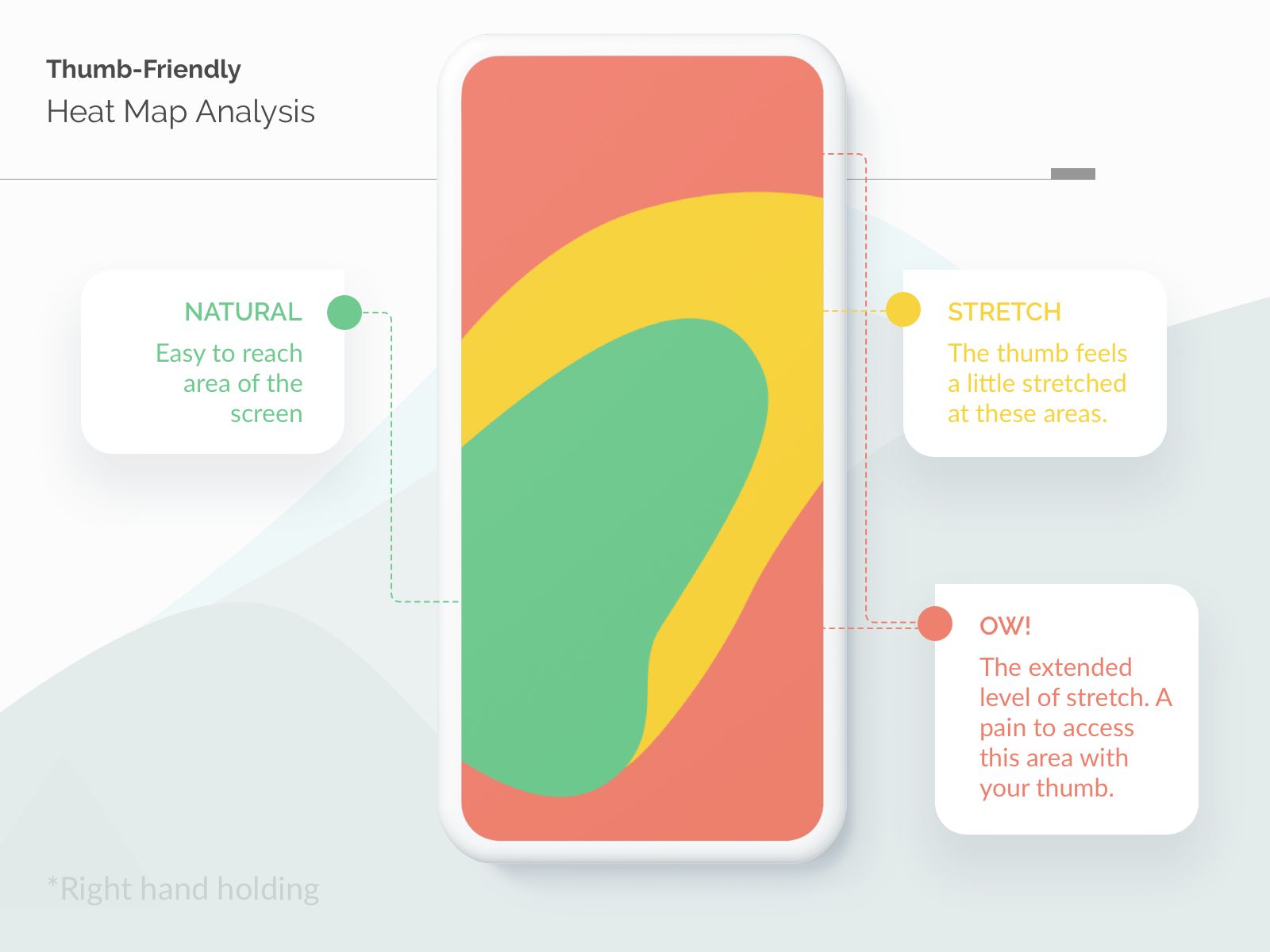
Mobile thumb-friendly heatmap analysis Source
Keep in mind, mobile users often browse with one hand while juggling other tasks. Your navigation should be so simple that users can find what they need without much effort.
Once your navigation is optimized, it’s time to focus on visuals that grab attention on smaller screens.
sbb-itb-bf47c9b
3. Optimize Visuals for Mobile Screens
Visuals are essential for engaging mobile users, but they need to be fine-tuned to balance impact and performance. Speed is key - Google found that 53% of mobile visitors leave a site if it takes more than 3 seconds to load.
How to Optimize Images
Compress your images to reduce load times without sacrificing quality. Use tools like image compressor by imagetotext.me to shrink file sizes while keeping visuals sharp and optimized. Fast-loading visuals not only look great but also help keep users on your site, lowering bounce rates and boosting conversions. A simple and effective way to do this is with a free online tool like Image Compressor by imagetotext.me. It supports popular formats (JPG, PNG, WebP, GIF, HEIC and more), allows batch uploads, lets you choose compression level with a slider or target file size, and provides instant previews of the result — so you can balance size and quality perfectly in seconds, right in your browser, no installation needed.
The Role of Visual Hierarchy
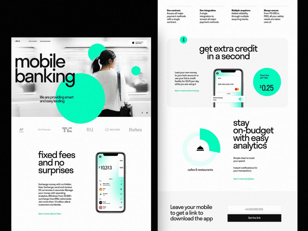
Mobile banking landing page design example highlighting CTAs and layout. Source
A well-thought-out visual hierarchy directs attention to the most important elements. Use contrasting colors and smart placement to guide users. HubSpot found that landing pages with optimized visuals can see a conversion lift of up to 27%.
| Visual Element | Optimization Tips for Mobile |
|---|---|
| Images | Compress files while keeping quality intact |
| Videos | Use lightweight formats and add thumbnail previews |
| CTAs | Highlight with bold, contrasting colors |
| Headlines | Use fonts that are easy to read on small screens |
A Real-Life Example
The Loan Expert page is a great case study. They use video content to simplify complex information while ensuring the page loads quickly.
Tips for Better Performance
Mobile users often deal with slow or unstable connections. Here are two practical strategies:
- Implement lazy loading and use modern image formats like WebP or AVIF to speed up load times.
- Maintain proper aspect ratios to prevent layout shifts that can disrupt the user experience.
4. Create Simple and User-Friendly Forms
Forms are often the last step between your mobile visitors and a conversion. For startups, every completed form could mean a new lead or customer. That’s why designing your forms well is so important.
Keep It Short and Straightforward
The best mobile forms are simple, asking only for the most important details like a name and email. Keeping things brief reduces the chances of users abandoning the form and keeps them engaged.
Design for Mobile Ease
A clean, single-column layout works best for mobile forms. It’s easier to read and complete without frustration. Here are some tips to improve usability:
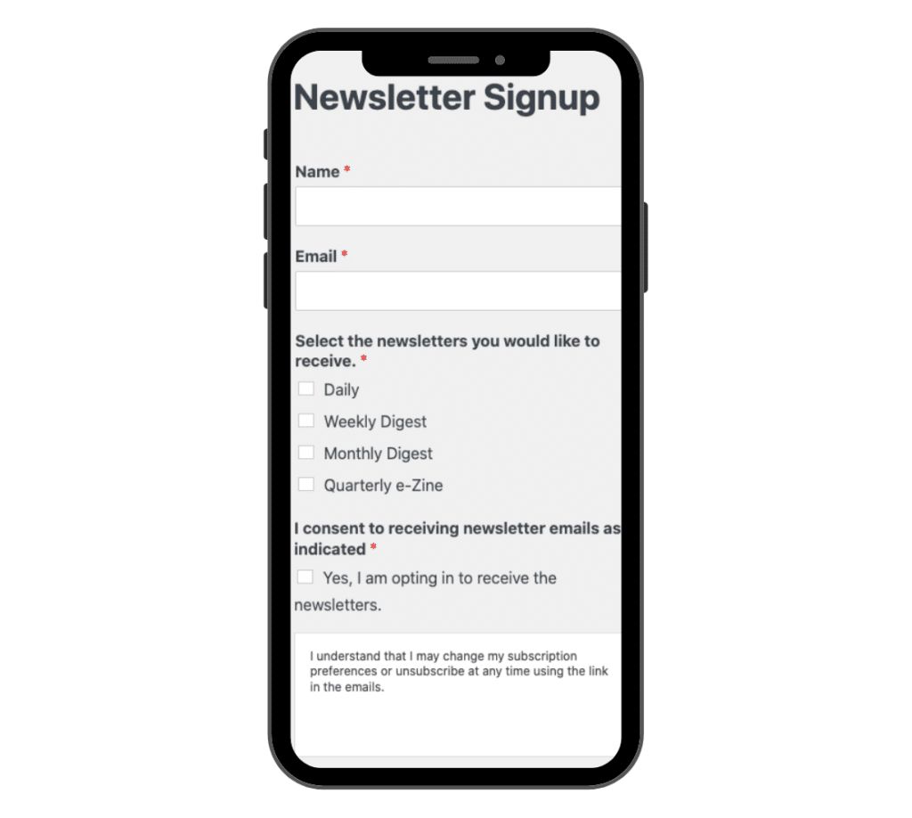
Mobile-friendly newsletter signup form layout. Source
- Make input fields at least 44px tall for easy tapping.
- Place labels above the fields instead of using placeholder text.
- Add enough space between elements to avoid accidental taps.
- Use clear, distinct buttons that are easy to press.
Use Mobile Features to Your Advantage
Take full advantage of mobile-specific tools to make filling out forms easier. Enable autofill and auto-formatting, and ensure the right keyboard type appears for each field (e.g., numbers for phone fields). If your form has multiple steps, include a progress bar so users know how far they’ve come.
Test and Refine
Test your forms on different devices to ensure they perform well everywhere. Pay attention to these areas:
- Field size and placement
- Visibility and clarity of error messages
- Button responsiveness and ease of use
Once your forms are optimized, you’ll be one step closer to turning visitors into customers. Just make sure your page loads quickly to keep their attention.
5. Improve Page Loading Speed
Page speed plays a huge role in keeping mobile users engaged. Mobile users want immediate access, and even a tiny delay can lead to frustration and drop-offs. Research backs this up - a one-second delay can cut conversions by up to 20%.
Keep Your Page Light
Aim to keep mobile pages under 1MB for quicker loading. Here’s how you can lighten your pages:
- Skip heavy features like image carousels.
- Minify your code and enable caching to speed things up.
- Use modern image formats to compress files efficiently.
- Turn on browser caching so repeat visitors experience faster load times.
Smart Image Optimization
| Technique | How to Do It | Why It Helps |
|---|---|---|
| Compression Tools | Use tools to shrink file sizes | Keeps quality intact while reducing size. |
| Responsive Images | Deliver image sizes tailored to devices | Avoids loading unnecessarily large images. |
Use Modern Tools
Take advantage of browser caching with tools like W3 Total Cache. For lightning-fast mobile pages, consider AMP-HTML.
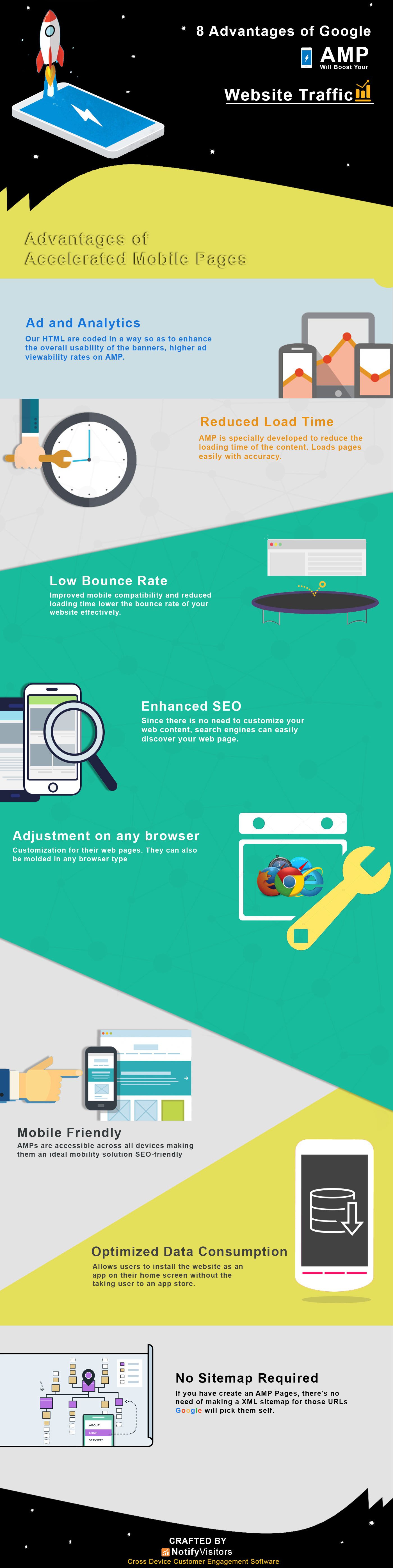
Infographic showing benefits of AMP-HTML for faster mobile pages. Source
Proven Results from Speed Improvements
Here’s an example: 1-800-Got-Junk? implemented speed optimizations and saw faster load times, which led to better mobile engagement.
Stay on Top of Performance
Use tools like Page Speed Insights to regularly check your site’s performance. Keeping an eye on your speed compared to competitors can help you stay ahead in your market.
Conclusion
Mobile optimization plays a major role in succeeding in today’s digital landscape. With 61% of users unlikely to revisit poorly optimized mobile sites and 40% opting for competitors instead, the design of your mobile landing pages can make or break your conversion rates.
What You Can Do Now
Begin with a mobile-first review of your landing pages. Tools like Page Speed Insights can help you pinpoint problem areas and prioritize what needs fixing.
Core Principles for Mobile Optimization:
- Keep designs clear and simple for smaller screens.
- Ensure usability by testing across multiple devices.
- Regularly track performance and make adjustments.
Although mobile trends change over time, these principles remain a reliable guide. They’re the backbone of mobile landing pages that keep users engaged and drive conversions.
Start with manageable changes, test frequently, and use user feedback to improve. Focusing on these basics will help you build mobile experiences that consistently perform well.