Table of Contents
- Dashboard-Style Page Architecture That Converts
- 30-Day Execution Plan
- Common Mistakes and Fast Fixes
- FAQ
Startup teams often build products that are operationally complex, but their landing pages do not have to be. When users arrive on a page and immediately face too many charts, claims, and actions, they postpone decisions or leave.
A strong dashboard-style landing page does the opposite. It compresses complexity into a clear decision path, so visitors understand the value quickly, trust the team, and know what action to take next.
The challenge is not adding more design elements. The challenge is sequencing information in a way that mirrors how real users evaluate startup software and services.
This guide gives you a practical system for 2026: how to structure dashboard-style pages, how to connect data storytelling with conversion logic, and how to run weekly improvements without creating constant redesign cycles. It is designed for teams that need measurable progress, not theory.
sbb-itb-bf47c9b
Quick Strategic Takeaways
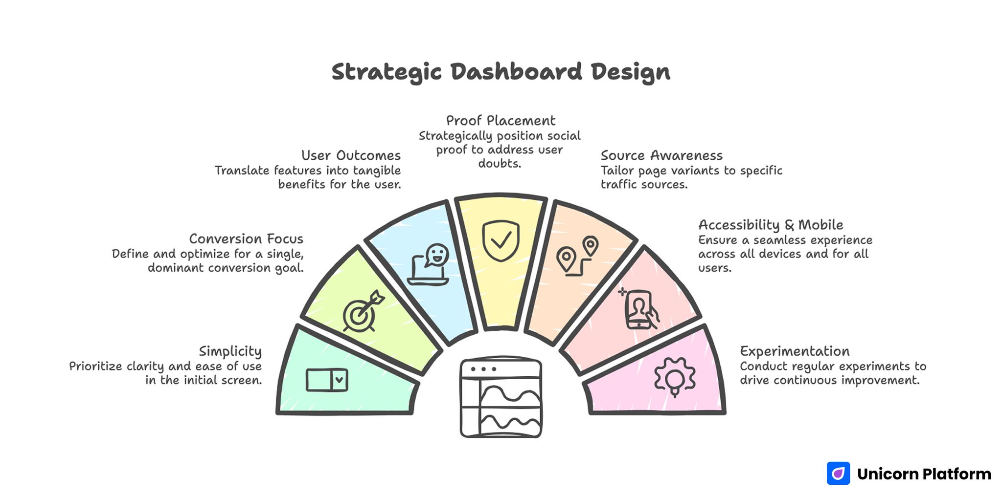
Strategic Dashboard Design
- Simplify before you beautify, especially in the first screen.
- Use one primary conversion goal per page and one dominant CTA path.
- Translate dashboard complexity into user outcomes, not feature lists.
- Place proof where hesitation appears, not where empty space exists.
- Build source-aware page variants instead of one generic page for all traffic.
- Treat accessibility and mobile QA as conversion fundamentals.
- Run one major experiment per week and document every decision.
Why Dashboard-Style Startup Pages Underperform
Many startup pages fail because they copy internal product structure instead of external buyer logic. Internal product teams think in modules, metrics, and workflows, while first-time visitors think in outcomes, risk, and implementation confidence.
This mismatch creates cognitive overload. Users see many elements but cannot tell which signals are critical, so they delay action.
Three patterns usually cause this. The page has too many competing messages, proof appears too late, and the CTA is disconnected from the user’s decision stage.
A better approach starts with a simple principle: each section should answer one user question, and the next section should naturally reduce the next layer of uncertainty. That sequencing keeps users moving forward instead of evaluating everything at once.
Decide What the Page Is Actually For
Before writing copy, define one primary objective. Dashboard pages are often forced to do everything at once, which lowers performance.
Choose one goal such as demo request, trial signup, onboarding call, or qualified lead capture. Then align section order, proof style, and CTA language to that single objective.
Also define the audience stage clearly. Cold visitors need context and trust. Warm visitors need faster action and fewer explanatory blocks. One structure cannot serve both equally well unless content priorities are explicit.
When objective and audience stage are vague, optimization becomes random. Clear scoping improves both conversion quality and experiment accuracy.
Dashboard-Style Page Architecture That Converts
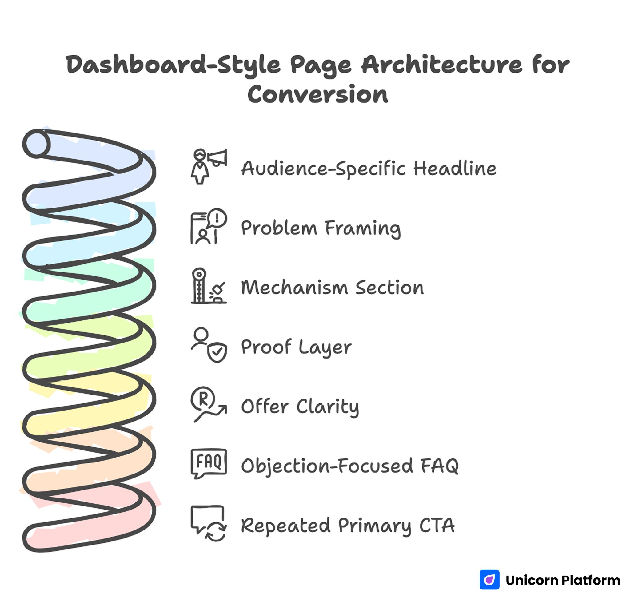
Dashboard-Style Page Architecture for Conversion
Use a clear structure before testing variations. Consistent architecture is what makes iterative learning possible.
A practical sequence includes the core blocks below. Keep their order stable while testing copy and proof details.
- audience-specific headline with concrete outcome
- short problem framing with urgency context
- mechanism section explaining how the solution works
- proof layer with role-relevant evidence
- offer clarity and risk-reduction notes
- objection-focused FAQ
- repeated primary CTA
This sequence works because it mirrors user evaluation order. It also helps teams isolate which section is blocking conversion when performance drops.
For teams refining the first conversion layer, this walkthrough on effective waitlist landing page structure is useful for tightening action flow and expectation setting.
First-Screen Clarity: The Most Important 8 Seconds
Dashboard pages often spend the first screen describing features instead of describing outcomes. That is a conversion leak because users still do not know if the product is relevant to their immediate problem.
A strong first screen should answer three questions quickly. Research from the Nielsen Norman Group shows that users typically scan web pages in an F-shaped reading pattern, focusing first on headlines and the first visible lines of content. That is why concise value statements and clearly visible actions in the first screen significantly influence whether visitors continue evaluating the page. Who is this for, what changes after adoption, and what is the next step.
Keep one dominant CTA visible and remove secondary actions that compete with the primary path. If needed, place secondary links as low-visual-priority options after the main value statement.
First-screen clarity is usually a bigger lever than adding additional sections. Teams can improve conversion by simplifying this block before touching deeper content.
Turning Data Complexity Into Decision Clarity
Dashboard products are naturally data-heavy, but landing pages should not mirror full product density. Instead of showing everything, present the few signals that help visitors evaluate fit and impact.
Use a “signal hierarchy” model. Start with strategic outcomes, then show representative metrics, then provide optional depth for technical evaluators.
For example, a growth dashboard page might first emphasize faster decision cycles and clearer attribution outcomes. After that, it can introduce example views, integration context, and operational workflow details.
This layered approach serves both executive and operator audiences without overwhelming either group. It also helps teams avoid writing separate pages for every role at the beginning.
Proof Design for Dashboard Products
Proof needs to be specific and role-aware. Generic testimonials are rarely enough for dashboard-driven startups because users want to understand reliability and practical implementation.
Build proof in three layers, each with a different decision job. Together they reduce both emotional and practical hesitation.
- outcome evidence tied to measurable change
- process evidence showing setup or adoption flow
- credibility evidence showing team capability and use-case fit
Place the strongest proof near the first major CTA, then reinforce it near final decision sections. Spreading proof across the page helps users validate claims as they evaluate details.
When teams are modernizing content structure for proof and conversion, this guide on startup site launch workflows can help maintain speed while improving decision clarity.
CTA Strategy for Dashboard Landing Pages
A dashboard page usually has more than one potential action, but it should have one primary action per audience path. Multiple equal-priority CTAs fragment attention and reduce commitment. Conversion research also supports this principle. According to studies summarized by the CXL Institute, landing pages with a clear primary action typically outperform pages with multiple competing calls to action because users can move through the decision path with less cognitive friction.
Choose a CTA that matches buying stage. Cold visitors often respond better to guided actions such as “See How It Works” or “Book a Short Walkthrough.” Warmer visitors can convert directly through “Start Trial” or “Request Access.”
Keep CTA language consistent across repeated placements. If the headline promises one outcome and CTA text asks for a different action type, trust declines even when the offer is strong.
Use secondary actions only when they support the main decision path. Secondary links should not feel like alternative funnels competing with the page goal.
Segmenting Page Variants by Traffic Source
One dashboard page rarely performs equally across paid ads, organic search, partner traffic, and warm referrals. Source-specific intent differences are too large.
Create variants with shared visual structure but adjusted narrative order. Paid traffic may need immediate value framing and stronger trust proof early. Organic traffic may need richer explanation and comparison depth before action.
Document variant hypotheses before launch. This keeps tests purposeful and prevents random copy swaps that produce noisy outcomes.
A simple variant system usually outperforms frequent full-page rewrites. Reuse modules and adjust only the sections tied to source intent.
SEO Support Architecture for Dashboard Funnels
Dashboard pages perform better in search when they are connected to a supporting content system, not isolated as stand-alone assets. Context around the core page improves relevance and qualified discovery.
Use a cluster model with three intent levels. Each level should route users naturally to the next decision step.
- discovery content that answers broad industry questions
- comparison content that helps evaluate options and tradeoffs
- conversion pages that connect outcomes to clear actions
Internal links should be contextual and decision-oriented. The purpose is to move users to the right next step, not to add links for density.
For teams building this model on a startup timeline, this resource on simple startup landing-page design helps keep content architecture practical without sacrificing clarity.
Accessibility and Mobile UX as Conversion Requirements
Accessibility is often treated as a compliance step, but for startup pages it is a direct conversion variable. If focus states are weak, keyboard order is broken, or form errors are unclear, users abandon.
Mobile quality is equally critical because significant startup traffic arrives from mobile channels. If first-screen text is dense, CTA visibility is poor, or forms are difficult to complete, campaign efficiency drops quickly.
Run a release gate for accessibility and mobile every week. A fixed checklist is easier to maintain than ad-hoc reviews.
- validate tab order and focus visibility
- verify heading hierarchy and contrast
- test form errors and recovery paths
- check CTA visibility in first mobile view
- confirm load performance on common devices
These checks are low effort compared with the conversion losses they prevent. Teams that skip them usually spend more time on reactive fixes later.
Analytics Hygiene: How to Keep Decisions Reliable
Many dashboard-page teams run tests but cannot trust results because event naming, source tags, and attribution rules are inconsistent. Without measurement discipline, optimization decisions become subjective.
Create a minimal analytics standard before scaling experiments. Define one primary metric per page, one secondary quality metric per test, and fixed naming conventions for events.
Also track downstream indicators, not only page interactions. If form completion rises but qualified lead rate drops, the test should not be considered a success.
Reliable measurement turns weekly edits into compounding learning. Unreliable measurement turns optimization into guesswork.
30-Day Execution Plan
Week 1: baseline architecture and tracking
Publish one clear dashboard-style page with one primary CTA and one proof module near the main action. Configure core events for clicks, form submissions, and confirmed next-step actions.
Week 2: first-screen and CTA refinement
Test one headline framing option and one CTA wording option while keeping layout stable. Evaluate results with both conversion and lead-quality signals.
Week 3: proof and friction improvements
Update proof quality with context-rich examples, then simplify form fields and error handling. Remove decorative sections that do not improve decisions.
Week 4: source-specific variant launch
Deploy one intent-specific variant for the highest-volume source. Compare results against baseline and document keep-or-revert decisions.
This plan keeps execution realistic for lean teams and preserves measurement clarity. It also helps founders prioritize the highest-impact work each week.
60-Day Operating Model for Compounding Gains
Days 1-20 should stabilize structure and eliminate obvious UX friction. Days 21-40 should run controlled message and proof experiments with fixed tracking rules.
Days 41-60 should consolidate winning blocks into reusable modules and define ownership for messaging, proof refresh, and analytics quality checks. That consolidation phase is what turns experiments into durable operating standards.
At the end of 60 days, your team should have a repeatable system, not just better copy. Repeatable systems are what create sustained conversion improvements.
90-Day Scale Readiness Check
Before increasing traffic budgets, validate that core quality signals are stable across at least two review cycles. Scaling unstable pages usually increases costs faster than results.
Use this readiness checklist before major budget increases. Treat it as a release gate, not a suggestion list.
- message consistency by channel
- proof freshness and relevance
- form reliability across devices
- lead quality stability by source
- tracking integrity and event accuracy
If instability appears in multiple categories, pause scale and fix foundations first. Growth should amplify a strong system, not expose unresolved weaknesses.
Common Mistakes and Fast Fixes
Mistake 1: copying product UI into landing layout
Users need decision clarity, not full interface depth. Reduce surface complexity and sequence information by evaluation stage.
Mistake 2: too many equal-priority CTAs
Competing actions dilute focus and lower completion. Keep one dominant action per variant and demote secondary paths.
Mistake 3: proof placed too late
If evidence appears after long feature sections, users lose trust earlier. Move strong proof near the first major action point.
Mistake 4: testing too many variables at once
Multi-variable edits create noisy outcomes. Change one major variable per cycle and log results clearly.
Mistake 5: one page for every source
Traffic intent varies by channel. Build source-aware variants while keeping design modules consistent.
Mistake 6: weak accessibility QA
Broken keyboard flow or unclear form states silently reduce conversion. Add accessibility checks to mandatory release gates.
Mistake 7: scaling before quality stabilizes
High traffic can hide weak lead quality. Gate scale decisions on downstream signal stability, not clicks alone.
FAQ: Dashboard Landing Pages for Startups
Should startup dashboard pages be long or short?
They should be as long as needed to resolve decision risk for the target audience. Clarity and sequencing matter more than raw length.
What is the first section we should optimize?
Start with first-screen clarity and CTA alignment. These usually have the highest early impact on conversion.
Can one dashboard page serve all acquisition channels?
Usually no. A shared base structure is useful, but source-specific narrative variants improve fit and performance.
How often should we refresh proof sections?
At least monthly, or sooner if offers or use cases change. Outdated proof weakens trust quickly.
Is accessibility worth prioritizing for early-stage teams?
Yes. Accessibility improvements reduce friction for all users and often improve conversion quality directly.
Which metric is most important after conversion rate?
Lead quality by source. Conversion increases without quality gains can hurt pipeline efficiency.
How many experiments should we run each week?
One major experiment per week is a practical cadence for most startup teams. It gives enough learning speed without breaking attribution clarity.
What is the biggest dashboard-page mistake?
Showing too much product detail before establishing outcome relevance and trust. Users need decision context before they can evaluate dashboard depth.
How should we decide when to scale traffic?
Scale only after message consistency, proof quality, and downstream lead signals stay stable for two review cycles. This reduces the risk of paying to amplify weak funnel behavior.
What keeps dashboard pages sustainable over time?
Stable architecture, clear ownership, consistent QA gates, and documented experiment decisions. These elements keep growth quality less dependent on individual contributors.
Final Takeaway
Dashboard-style landing pages are powerful when they simplify decisions instead of displaying complexity. The most effective startup pages translate data-heavy products into clear outcomes, credible proof, and low-friction next steps.
With Unicorn Platform, teams can run this process quickly and consistently through reusable sections, structured testing, and practical release discipline. That is how dashboard pages become dependable growth assets rather than one-time design projects.
If your team is also improving acquisition handoff quality, these SaaS lead generation strategy principles provide useful context for connecting page conversion with pipeline outcomes.