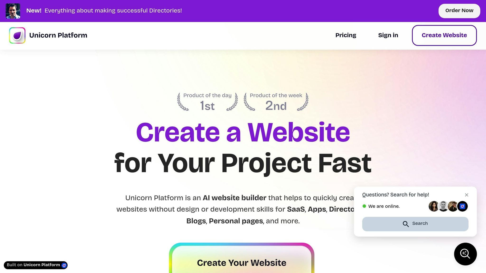
Building an effective landing page no longer requires coding skills. With tools like Unicorn Platform, you can create professional, high-converting landing pages in minutes using a simple drag-and-drop interface. Here’s what you need to know:
- Why Landing Pages Matter: Focused pages drive specific actions like signups, downloads, or purchases. They reduce distractions and guide visitors toward one clear goal.
- Key Elements for Success: A strong headline, clear call-to-action (CTA), simple forms, social proof, and fast load times are essential for conversions.
- Unicorn Platform Benefits: Pre-designed templates, full customization, and AI-powered tools make it easy for non-technical founders to build pages quickly.
- Customization Without Limits: You can tweak layouts, colors, fonts, and even add custom HTML/CSS for advanced needs.
- Mobile Optimization: Ensure your page looks great and functions seamlessly on mobile devices.
- Tracking and Improvement: Use analytics to monitor performance, test changes, and refine your page for better results.
Start with a clear goal, choose a template, and customize it to reflect your brand. Whether you're launching a product, running a campaign, or validating an idea, Unicorn Platform simplifies the process, letting you focus on growth.
Landing Page Live Tutorial l No-Code Website In 1 Hour
What Makes a Landing Page Convert
A landing page is a targeted tool designed to drive visitors toward one specific action. Unlike a homepage, which typically offers multiple options and pathways, a landing page eliminates distractions and focuses entirely on achieving a single goal - whether that's signing up, downloading a resource, registering for an event, or making a purchase.
The key to a high-converting landing page lies in building trust. Visitors make snap decisions about whether to stay on your page, so addressing their concerns right away is critical. Let’s break down the essential components that make a landing page successful.
Core Elements Every Landing Page Needs
The most effective landing pages share a few key ingredients that work together to guide visitors toward your desired outcome. Here’s what you need:
- A clear, benefit-driven headline: Your headline is the first thing visitors see, so it has to grab attention and communicate value instantly. For example, instead of a vague title, use something like, "Launch Your SaaS Product Faster Without Writing Code," which speaks directly to a specific need.
- A compelling call-to-action (CTA): The CTA is what drives action. Use action-oriented language that creates urgency or excitement, like "Start Building Now" instead of a generic "Submit." To make it pop, use contrasting colors and ensure the button is easy to spot.
- Simple lead capture forms: Keep forms short and sweet. If you’re offering a free trial, for instance, only ask for essential details like an email address and password to reduce barriers.
- Social proof: Incorporate testimonials, client logos, or user ratings to instill confidence. When visitors see that others trust your product, they’re more likely to take the next step.
- Strong visual hierarchy: Design your page so the most important elements - like your headline and CTA - stand out. Use size, color, and spacing to direct attention without overwhelming the visitor.
- Fast loading speed: Optimize images and minimize scripts to ensure your page loads quickly, especially on mobile devices. A slow page can cost you conversions.
How Landing Pages Help Startups Grow
For startups, landing pages are more than just a marketing tool - they’re a way to validate ideas, attract leads, and grow efficiently. Here’s how they can make an impact:
- Testing product ideas: Landing pages let you gauge interest in a concept quickly. By driving traffic to a page that explains your idea and tracking signups or pre-orders, you can assess demand before committing significant resources.
- Generating high-quality leads: A well-designed landing page can attract visitors who are genuinely interested in your offer. Whether it’s a free trial, a downloadable guide, or a product demo, these leads are more likely to convert because they’ve already shown intent.
- Running focused campaigns: When launching ads, directing traffic to a specific landing page with tailored messaging is far more effective than sending visitors to a homepage. This alignment between your ad and landing page content improves conversion rates.
- Reducing customer acquisition costs: A high-performing landing page converts visitors efficiently, meaning you can gain customers with fewer clicks. For startups with tight budgets, this can make a big difference.
- Adapting quickly: Landing pages are easy to tweak. Whether you’re testing new headlines, changing CTA colors, or updating testimonials, you can quickly adjust based on real-time feedback to better connect with your audience.
In short, landing pages are a powerful tool for startups, offering a focused way to test ideas, attract leads, and build connections with potential customers - all while keeping things simple and cost-effective.
How to Use Unicorn Platform's Drag-and-Drop Builder
Unicorn Platform makes it easy for founders and marketers to launch landing pages quickly. With its drag-and-drop builder, you can focus on crafting your message rather than worrying about coding.
Creating Your Account
Getting started is simple. Head over to Unicorn Platform's website and begin building. They offer a free plan, so you can explore the platform without needing to provide payment details upfront - ideal for trying it out before making a commitment.
When signing up, you'll just need to enter your email and create a password. Once logged in, you can dive straight into the builder and start working on your first landing page. The free plan gives you one published website and up to 10 blog posts, which is enough to get a feel for the platform.
If you want more features, you can upgrade to the Maker plan for $9/month (billed annually). This plan lets you connect a custom domain and removes Unicorn branding, plus it adds AI-powered design assistance. For startups looking to scale, the Startup plan at $29/month includes unlimited blog posts, HTML export, and the option to add a collaborator to your workspace.
Once you’re set up, it’s time to explore the editor and bring your page to life.
Navigating the Editor Interface
The editor is designed to be user-friendly, showing a live preview of your landing page as you work. This means you can see exactly how your page will look to visitors without needing to switch between editing and preview modes.
On the left side, you’ll find all the building blocks you need - text, images, buttons, forms, testimonials, and more. Simply drag an element onto your page, and you’ll see it placed instantly. Clicking on an element opens a properties panel where you can tweak text, colors, spacing, and alignment in real time.
The top toolbar offers quick access to essential tools like saving your work, previewing your page on different devices, and publishing. You’ll also find undo and redo buttons, which are great for experimenting with different layouts.
Once you're comfortable with the editor, you can speed things up by choosing a pre-designed template.
Finding and Selecting Templates
Unicorn Platform offers a library of pre-designed templates tailored to common startup needs. These templates are crafted with conversion in mind, featuring layouts and elements that help drive results.
When creating a new page, you can browse the template library to find one that fits your goal. Templates are organized by purpose, so whether you're launching a B2B SaaS tool or promoting an event, there’s likely a template designed for your needs. For instance, a B2B SaaS template might highlight features and include space for customer logos, while an event-focused template could feature prominent date information and a clear registration form.
Click on a template to view its layout and structure. Most templates include sections like hero banners, feature grids, pricing tables, testimonials, and call-to-action areas. Once you select a template, it loads into the editor, where you can fully customize it - changing text, images, colors, and more to reflect your brand.
Templates give you a solid starting point, but you’re not locked in. You can add new sections, remove parts you don’t need, or rearrange elements to match your vision. It’s a huge time-saver that still allows for complete creative freedom.
Customizing Templates to Match Your Brand
Turning a basic template into a landing page that feels like a natural extension of your brand is key to driving conversions. Once you’ve picked a template, it’s time to make it yours. With Unicorn Platform’s editor, you can tweak everything - colors, text, images - without needing any coding skills.
Picking the Right Template for Your Goal
Start with your goal in mind. The structure of your page should align with what you’re trying to achieve, and selecting the right template from the beginning can save you a lot of time.
- For lead generation, choose templates with forms front and center, paired with a clear value proposition. These templates often include a headline and form in the hero section, followed by sections that highlight the benefits of signing up.
- For product launches, pick templates that emphasize visuals. Look for features like image galleries, grids, or comparison sections to showcase your product. These designs often include space for product screenshots or demo videos.
- Event promotion templates should highlight the essentials - date, time, and location. Countdown timers, speaker sections, and registration forms are common features that make it easy for visitors to RSVP.
- Waitlist pages work best with simple layouts that focus on one action. These typically include a strong headline, a brief description of what’s coming, and a straightforward email capture form.
Consider how visitors will arrive at your page. If they’re coming from a Facebook ad, they might already know a bit about your offer, so a shorter page could work. On the other hand, visitors from organic search might need more details to build trust, making a longer page with testimonials and feature breakdowns a better choice.
Once you’ve chosen your template, it’s time to personalize it with your brand’s content, images, and colors.
Editing Text, Images, and Content
Replace placeholder content with your own, starting with the most visible elements and working your way down.
- Text: Click on any text element to edit it directly. Focus on making your headline stand out by using clear, concise language. Online readers tend to scan rather than read every word, so break up long paragraphs into smaller chunks. Use bold text to emphasize key points or benefits you want visitors to notice.
- Images: Swap out placeholder images by uploading your own or inserting a URL. For full-width sections, use high-quality images that are at least 1,920 pixels wide. For smaller elements like icons or team photos, smaller images are fine. Avoid overly staged stock photos - use real product screenshots or authentic team photos to build trust.
- Colors: Adjust colors through the properties panel. Set your brand’s primary color using hex codes for consistency across the page. Most templates use a primary color for buttons and accents, paired with neutral backgrounds and dark text. This approach ensures a clean, professional look without overwhelming visitors.
- Spacing and Layout: Fine-tune spacing to ensure the page feels balanced. If sections feel cramped, increase the padding. If there’s too much white space, reduce margins. You can also rearrange sections by dragging them to new positions. For example, if you want testimonials to appear earlier on the page, just move that section up.
Once your desktop design looks polished, it’s time to ensure it works seamlessly on mobile devices.
Making Your Page Work on Mobile Devices
After perfecting your desktop layout, it’s essential to check how your page performs on mobile. Unicorn Platform takes care of most mobile optimization, but you should still preview and test to catch any issues.
Use the preview toggle in the toolbar to switch between desktop, tablet, and mobile views. Review each version to ensure the layout adapts properly.
- Text and Buttons: Make sure text remains readable and buttons are easy to tap. Buttons should be at least 44 pixels tall for mobile users. Place your primary call-to-action button within the first screen of content so visitors don’t need to scroll to find it.
- Forms: Simplify forms for mobile. If your form has multiple fields, consider whether all of them are necessary - fewer fields mean higher completion rates. Ensure form fields are large enough to tap comfortably.
- Images: Check how your images appear on smaller screens. Text overlays on images might need larger font sizes to remain legible on mobile. Unicorn Platform allows you to set different font sizes for desktop and mobile, giving you control over how content looks on both.
- Navigation: On mobile, menus automatically collapse into hamburger icons. Make sure all menu items are accessible and consider simplifying the menu to focus on the most important links.
For the best results, test your page on an actual phone. Open the preview link, tap through buttons, fill out forms, and scroll through the page. Small issues that aren’t obvious in the editor often stand out on a real device.
Mobile optimization isn’t a one-and-done task. As you update your page, regularly check the mobile view to ensure everything works smoothly across devices. This habit will help you avoid launching a page that looks great on desktop but frustrates mobile users.
sbb-itb-bf47c9b
Adding Elements That Drive Conversions
Once you’ve nailed your design and chosen the right template, it’s time to focus on the elements that actually drive conversions. A visually appealing landing page is great, but without the right conversion tools, it’s just a pretty face. These components work to remove barriers, address concerns, and guide visitors toward taking action.
With Unicorn Platform’s drag-and-drop editor, adding these conversion-focused elements is a breeze - no coding required. Let’s refine your headlines, forms, and social proof to create a page that converts.
Writing Headlines and CTAs That Get Clicks
Your headline is the first thing visitors notice, so make it count. Focus on what your audience will gain. For example, "Build Your Landing Page in 30 Minutes" is far more effective than "The Future of Web Design" because it’s clear, actionable, and specific. Numbers, timeframes, and tangible benefits grab attention and set expectations. If you’re offering a free trial, say it upfront. If your product saves time or money, quantify it.
Keep your headline short - six to twelve words is ideal. Anything longer risks losing impact and readability. Test it out loud. If it feels clunky or overly wordy, simplify it.
Your call-to-action (CTA) button is equally important. The text should be action-driven and specific. Swap generic phrases like "Submit" or "Click Here" for something more engaging, such as "Get My Free Template", "Start Your Free Trial", or "Download the Guide". These phrases tell visitors exactly what they’ll get and encourage action.
Design matters too. Your CTA button should contrast with the rest of your page to stand out. If your page has a blue theme, try an orange or green button to draw attention. Place your main CTA above the fold - visitors should see it immediately without scrolling. For longer pages, repeat the CTA at logical points, like after highlighting a key benefit or following a testimonial.
Stick to one primary CTA to avoid confusion. If your goal is to collect email addresses, don’t clutter the page with buttons leading to social media or blog posts. Keep the focus clear and the path to conversion simple.
Setting Up Lead Capture Forms
Once your headlines and CTAs are dialed in, your forms need to seal the deal. Forms are where visitors become leads, but they can also be a major source of friction. The more fields you add, the more likely visitors are to abandon the form. Keep it simple - ask only for what you truly need.
For most landing pages, an email address is enough to start. If you’re hosting a webinar or event, you might also need a name for personalization. B2B pages may require a company name or job title to qualify leads, but don’t overcomplicate things without a good reason.
Unicorn Platform’s form builder makes it easy to create forms by dragging and dropping fields into place. Stick to the essentials, like an email field and a submit button. Place clear labels above or beside each field to avoid confusion, and ensure the form is mobile-friendly - fields should be at least 44 pixels tall for easy tapping.
If you need more information, consider using a multi-step form. Breaking a long form into smaller steps feels less daunting. For example, start with just an email address, then ask for additional details in the next step. This approach increases engagement and gives visitors a sense of progress.
Make sure your forms are connected to your email marketing tool or CRM using Unicorn Platform’s integrations. This way, new leads flow directly into your system without extra work. Always test the form to confirm everything is working properly.
Adding a short privacy note, like "Your email is safe with us", can help ease concerns. You don’t need a full legal disclaimer - just a simple reassurance to build trust.
Using Social Proof to Build Credibility
Once your landing page is set up to convert, social proof can help seal the deal. People are more likely to take action when they see others have done the same. Social proof - like testimonials, reviews, logos, and stats - builds trust and reduces hesitation.
Testimonials are most effective when they’re specific and relatable. Instead of vague praise like "Great product!", aim for something like "I built my landing page in under an hour and got 50 sign-ups in the first week." This kind of detail shows real results and feels more authentic. Whenever possible, include the person’s name, photo, and role or company to add credibility.
Logos from well-known customers can also boost trust. Place them in a section with a headline like "Trusted by" or "Used by teams at." Keep the logos uniform in size and style for a clean, professional look.
Usage stats are another powerful form of social proof. Highlight figures like "Join 10,000+ users" or "Over 50,000 landing pages created" to show popularity and reduce the fear of trying something new.
Third-party reviews from platforms like G2, Capterra, or Trustpilot carry extra weight because they’re independent. If you have positive reviews there, embed them on your page or link to your profile.
Video testimonials can be even more persuasive than text. Seeing and hearing someone share their experience creates a stronger emotional connection. Keep videos short - 30 to 60 seconds - and focus on the problem your product solved and the results achieved.
Place social proof strategically. Testimonials work well near your CTA to reassure visitors before they commit. Customer logos fit naturally after your main value proposition, while usage stats can go in the hero section to establish credibility right away.
Don’t overwhelm visitors with too much social proof. A few strong examples are more effective than a cluttered page. Choose the most impactful testimonials and stats, and give them room to shine.
Ultimately, social proof isn’t about bragging - it’s about helping visitors feel confident in their decision. When they see others like them benefiting from your product, they’ll be more likely to take the leap too.
Launching and Improving Your Landing Page
You’ve built your landing page, added all the right elements for conversions, and it’s looking sharp. Now it’s time to take it live and start seeing results. Launching isn’t just about making your page public - it’s about ensuring it’s professional, easy to find, and trackable. Once it’s live, the real challenge begins: tracking its performance and using that data to make it better.
Adding Your Custom Domain
A custom domain does more than just look good - it boosts your credibility. A URL like yourcompany.com/launch feels far more trustworthy than a generic subdomain. Visitors are more likely to interact with a page that reflects a polished, established brand.
Connecting your domain through Unicorn Platform is a simple process. If you already own a domain from a registrar like GoDaddy, Namecheap, or Google Domains, you’ll need to adjust your DNS settings. Log in to your domain registrar’s dashboard and find the DNS management section. Depending on whether you’re using a subdomain (e.g., launch.yourcompany.com) or a root domain (yourcompany.com), you’ll add either a CNAME record or an A record.
- For a subdomain: Add a CNAME record that points to the address provided by Unicorn Platform.
- For a root domain: Add an A record with the IP address listed in your Unicorn Platform settings.
You’ll find all the necessary details and step-by-step instructions in the custom domain section of your Unicorn Platform dashboard. Keep in mind that DNS changes can take anywhere from 15 minutes to 48 hours to fully propagate. During this period, your page might not be accessible at the new domain, so check back periodically.
Once your domain is connected, Unicorn Platform will automatically issue an SSL certificate to secure your site with HTTPS. This is critical - modern browsers flag non-HTTPS sites as insecure, which can scare off visitors and damage your credibility.
If you don’t already own a domain, you can purchase one through most registrars for about $10 to $15 per year. Choose something short, easy to remember, and directly tied to your brand. Avoid hyphens, numbers, or anything overly complicated that could confuse or frustrate users.
After setting up your domain, test your page on different devices and browsers to ensure everything - links, forms, images - works as it should. With your custom domain live, you can take your page a step further by optimizing it for search engines.
Setting Up Basic SEO
The most beautifully designed landing page won’t deliver results if no one can find it. Basic SEO ensures your page appears in search results when people are searching for solutions like yours. You don’t need to be an SEO guru - just focus on a few essentials.
Start with a clear page title (under 60 characters) and a meta description (150–160 characters). These should explain your offer and include relevant keywords. For example, a title like "Build Landing Pages Without Coding | Unicorn Platform" tells both search engines and visitors exactly what your page is about. A meta description could read: "Create high-converting landing pages in minutes with our drag-and-drop builder. Start free today."
Keep your URL clean and descriptive. Avoid random numbers or characters like yourcompany.com/page12345. Instead, go for something like yourcompany.com/landing-page-builder. This makes your page easier for search engines to understand and more appealing to visitors.
Structure your content with proper heading tags. Use an H1 for your main headline and H2s or H3s for subheadings. This logical hierarchy not only helps search engines but also improves accessibility for readers using screen readers.
Don’t forget about your images. Add alt text that describes what each image shows. For instance, instead of leaving it blank or using generic text like "image1", write something meaningful like "drag-and-drop landing page editor interface." This improves both SEO and accessibility.
Page speed is another critical factor. Search engines favor fast-loading pages, and visitors won’t stick around if your site is slow. Unicorn Platform automatically optimizes images and uses a CDN (content delivery network) to deliver your page quickly. However, you can further improve speed by compressing large image files before uploading them. Aim to keep load times under 3 seconds.
If your page targets a specific area, include local keywords naturally. For example, if you’re promoting an event in New York City, mention the city in your headline, description, and body text.
The key to good SEO is creating content that’s easy to read and genuinely helpful. When your page answers the questions your audience is asking, it naturally performs better in search results - and helps you achieve your goals.
Tracking Performance and Making Updates
Getting your landing page live is just the start. The real work lies in monitoring its performance and refining it to boost results over time. Data is your best friend here - it tells you what’s working and what isn’t.
Start by integrating an analytics tool like Google Analytics. This will help you track key metrics, such as how many people visit your page, where they’re coming from, how long they stay, and whether they take the action you want. Set up conversion tracking to measure specific actions like form submissions or button clicks.
Pay close attention to your conversion rate (the percentage of visitors who complete your desired action) and bounce rate (the percentage of visitors who leave without interacting). While benchmarks vary, most landing pages see conversion rates between 2% and 5%. A bounce rate above 70% might signal issues like slow loading times, mismatched messaging, or a cluttered design.
Check your traffic sources to understand where visitors are coming from - Google, social media, email campaigns, or paid ads. This insight helps you focus on what’s driving results and adjust what’s not.
Tools like Hotjar or Microsoft Clarity offer heatmaps that show where visitors click, scroll, and spend their time. If visitors aren’t scrolling past your headline, it might not be engaging enough. If they’re clicking on non-clickable elements, you may need to clarify your design.
A/B testing is a powerful way to improve your landing page. Test one element at a time - like the headline, button color, or form length - and see what performs better. For example, you could test "Start Your Free Trial" against "Get Started Free" to find out which gets more clicks. Run tests for at least one to two weeks or until you’ve gathered enough data to make a reliable decision.
Let the data guide you - don’t rely on personal preferences. If a headline you’re not crazy about converts better than the one you love, stick with what works.
Schedule regular reviews of your landing page’s performance - weekly or monthly, depending on traffic. Watch for trends and patterns. Are conversions slipping? Did a recent tweak help or hurt? Use these insights to make gradual improvements.
Keep your content fresh. Update testimonials, swap out old images, and adjust your copy to highlight new features or benefits. By consistently refining your page, you’ll ensure it continues to deliver results long after its initial launch.
Conclusion
Building a high-converting landing page doesn’t require technical know-how. Thanks to Unicorn Platform’s drag-and-drop editor, you can create professional-quality pages in just a few hours - no coding skills needed.
The platform provides everything you need: customizable templates, an easy-to-use live editor, and built-in tools for forms, SEO, and analytics. It’s designed to help founders and marketers work quickly and efficiently.
But speed is only part of the equation - control is what truly sets you up for success. You can tweak headlines, refine messaging, swap out images, and adjust your call-to-action whenever you need to. No more waiting on developers or navigating endless email threads. If you spot an issue, you can fix it immediately. Have a new idea? Test it on the spot. This hands-on approach ensures your landing page evolves in meaningful ways over time.
Once your page is live, the real work begins - continuous improvement. Your landing page isn’t static; it’s a dynamic tool that should adapt based on how visitors interact with it. Pay attention to the data you collect, such as conversion rates, bounce rates, and traffic sources. These insights guide you on where to focus your efforts. Even small adjustments, like refining your headline or simplifying your form, can lead to noticeable results.
Remember, your landing page is often the first impression of your brand. Whether you’re launching a product or running a campaign, make that impression count. With the right tools and a commitment to learning from your results, you can create pages that do more than just look good - they deliver real results.
Start by choosing a template that aligns with your goals. Customize it to reflect your brand, add elements that inspire action, and launch. Then, observe, analyze, and improve. Each update brings your page closer to becoming a powerful driver of growth for your business.
FAQs
What are the key elements of a landing page that converts visitors into leads?
To craft a landing page that drives results, make sure it includes these key components:
- Engaging visuals: Start with a striking hero image or video that aligns with your audience's interests and reinforces your message.
- Straightforward value proposition: Clearly explain what sets your offer apart and how it benefits your visitors.
- Strong call-to-action (CTA): Use clear, action-driven language for your CTA and position it prominently to grab attention.
- Trust-building social proof: Add testimonials, reviews, or case studies to establish credibility and gain your audience's trust.
Keep the design uncluttered and straightforward so visitors can easily grasp your message and take action without unnecessary distractions.
How can I optimize my landing page for mobile users?
To make your landing page work well for mobile users, start with a mobile-first design. This approach ensures your page looks good and functions smoothly on smaller screens. Keep your copy clear and concise, delivering your message quickly. Place your call-to-action (CTA) in a prominent spot, ideally above the fold, so users can see it right away without needing to scroll.
You might also want to use sticky headers or floating bars. These make navigation easier and provide quick access to key elements like your CTA. Finally, optimize your images and videos for faster loading times to create a smooth, hassle-free experience for mobile visitors.
How can I use analytics to improve my landing page's performance?
To improve the effectiveness of your landing page, begin by leveraging analytics tools to track critical metrics such as conversion rates, bounce rates, and time spent on the page. These metrics can reveal what’s working and what might need some tweaking.
Consider running A/B tests to evaluate different components like headlines, call-to-action buttons, or visuals. The results from these tests provide actionable insights, allowing you to fine-tune your page in ways that better connect with your audience and boost performance over time.

