Table of Contents
- What High-Performing Ecommerce Pages Consistently Do
- The 10-Block Architecture for Custom Ecommerce Landing Pages
- Messaging Frameworks for Stronger Ecommerce Decisions
- Cross-Industry Lessons That Transfer to Ecommerce
- 12 Applied Scenarios for Real Ecommerce Teams
- FAQ
Most ecommerce teams do not fail because they cannot publish landing pages. They fail because the pages they publish do not turn attention into confident purchase decisions. Traffic arrives, people browse, and intent fades before action because the page never resolves the core buying questions clearly enough.
A high-performing ecommerce landing page is not just a design deliverable. It is a decision system. It must tell the right visitor what this product is, why it matters now, whether it can be trusted, and what to do next with minimal friction. When one of those jobs is weak, conversion becomes inconsistent and expensive.
No-code tools remove build-time bottlenecks, but speed alone does not create outcomes. The leverage comes from combining fast production with strong page architecture, clear messaging, evidence sequencing, and disciplined iteration. That combination is what turns a custom landing page into a repeatable revenue asset.
This guide gives you an execution-ready framework for building custom ecommerce pages in Unicorn Platform, including section design, offer structure, trust positioning, mobile behavior rules, and a practical optimization cycle you can run each week. Treat it as a working system you can reuse across launches instead of a one-time draft.
sbb-itb-bf47c9b
Key Takeaways Before You Build
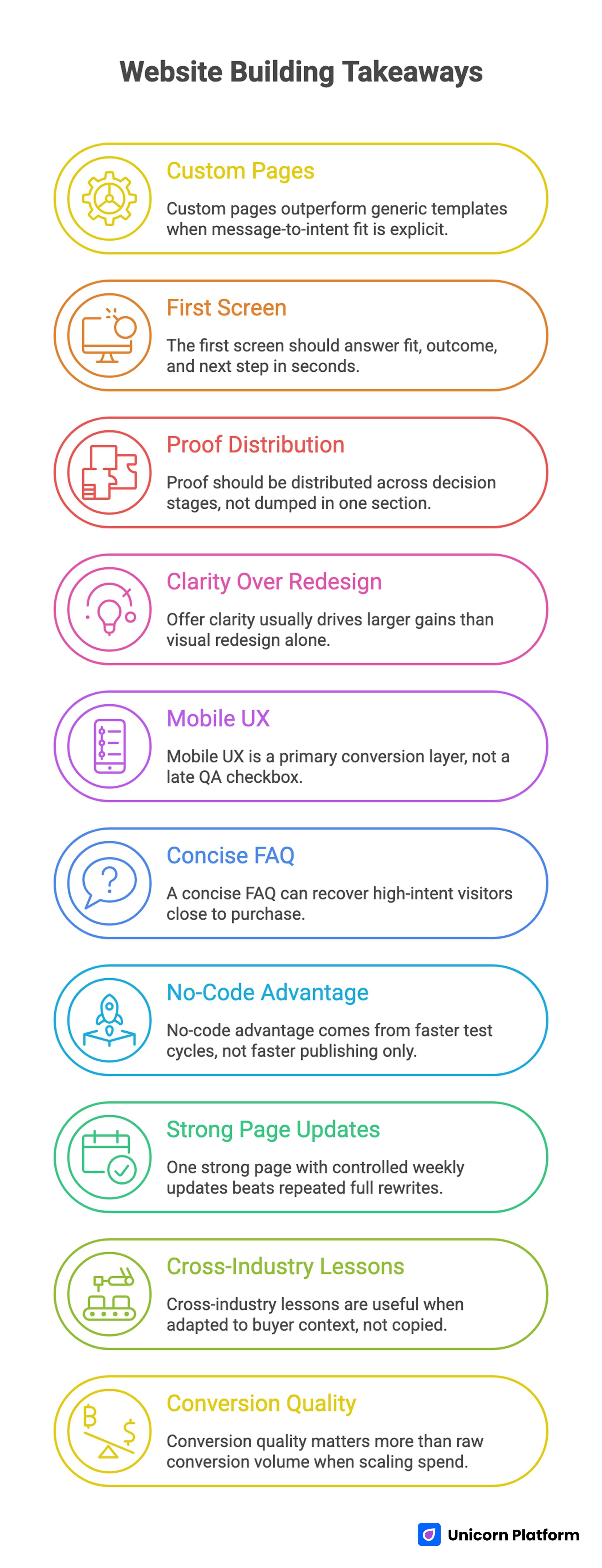
Key Takeaways for Building Custom Ecommerce Landing Pages
- Custom pages outperform generic templates when message-to-intent fit is explicit.
- The first screen should answer fit, outcome, and next step in seconds.
- Proof should be distributed across decision stages, not dumped in one section.
- Offer clarity usually drives larger gains than visual redesign alone.
- Mobile UX is a primary conversion layer, not a late QA checkbox.
- A concise FAQ can recover high-intent visitors close to purchase.
- No-code advantage comes from faster test cycles, not faster publishing only.
- One strong page with controlled weekly updates beats repeated full rewrites.
- Cross-industry lessons are useful when adapted to buyer context, not copied.
- Conversion quality matters more than raw conversion volume when scaling spend.
Why Most Ecommerce Landing Pages Underperform
Many pages are built as presentation assets, not decision tools. They look polished, include product imagery, and mention benefits, yet they still leave users uncertain. That uncertainty may be small on a per-visitor level, but across paid and organic traffic it compounds into meaningful revenue loss.
The most common pattern is message blur. Teams try to speak to everyone in one page version, so the language becomes broad and non-committal. Broad language may feel safe internally, but buyers need sharp relevance signals to decide quickly.
Another pattern is proof delay. Claims appear early while evidence is postponed until the lower half of the page. By the time users reach proof, many have already disengaged. Decision confidence is strongest when claims and evidence appear close together.
The third pattern is friction-heavy action design. Long forms, unclear offer tiers, hidden shipping or return details, and vague CTA labels all increase perceived risk. Users do not always abandon because they dislike the product; they abandon because the path to confidence feels unclear.
What High-Performing Ecommerce Pages Consistently Do
1. They open with specific relevance
The first screen states who the product is for and what practical change it creates. It does not rely on aspirational language alone. Users can evaluate fit immediately without decoding brand rhetoric.
2. They use outcome-first sequencing
Strong pages describe value through buyer outcomes before diving into technical detail. Feature depth still matters, but only after users understand why the product deserves attention.
3. They make trust visible early
High-performing pages include credibility cues near top claims: customer context, quality markers, guarantees, or concrete user outcomes. Trust appears as part of the narrative, not as a late-stage add-on.
4. They reduce interpretation load
Section jobs are clear. Headings guide decisions. Layout rhythm is predictable. Buyers can scan quickly and dive deeper where needed. This clarity supports both fast evaluators and detail-oriented shoppers.
5. They align CTA intensity with confidence stage
Early CTA language often invites exploration, while later CTA language supports commitment. This progression respects how confidence forms and avoids forcing hard decisions too soon.
6. They are designed for updates
Winning pages are built to evolve. Teams can adjust message blocks, proof modules, offer framing, and visuals quickly as campaigns shift. Update flexibility protects performance across product cycles.
The 10-Block Architecture for Custom Ecommerce Landing Pages
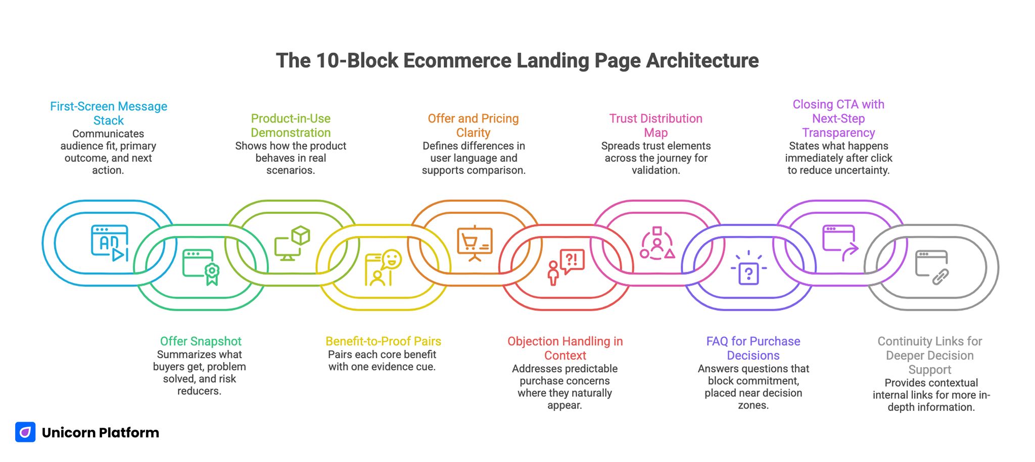
10-Block Architecture for High-Converting Custom Ecommerce Landing Pages
If you need a reusable structural baseline, use a framework like a high-converting landing page structure and adapt each block to your offer complexity and traffic intent. This keeps customization tied to buyer decisions rather than decorative page changes.
Block 1: First-screen message stack
Your top section should communicate audience fit, primary outcome, and expected next action. Keep headline language concrete and use a subheadline that clarifies mechanism or timeframe. Avoid category clichés that could describe any product.
A practical stack includes one primary CTA, one lightweight credibility cue, and one optional secondary action for users who need more context before buying. This balance helps you serve both fast buyers and careful evaluators without overcrowding the hero.
Block 2: Offer snapshot
Directly after the hero, summarize what buyers get, what problem it solves, and what risk reducers apply. This can include shipping clarity, guarantee context, or compatibility notes, depending on product type.
The point of this block is early certainty. Buyers should not need to scroll far to understand the purchase package.
Block 3: Product-in-use demonstration
Use visuals and concise explanation to show how the product behaves in real scenarios. Abstract claims convert poorly when users cannot visualize practical application.
For physical products, emphasize use context and setup simplicity. For digital products, show key workflow steps and first-value moment.
Block 4: Benefit-to-proof pairs
Each core benefit should be paired with one evidence cue. Evidence can be customer outcomes, measurable improvements, demonstration detail, or quality verification markers.
This pairing prevents claim fatigue and increases confidence continuity through the page. It also gives your team a clearer checklist for writing and QA.
Block 5: Offer and pricing clarity
If multiple options exist, define differences in user language. Explain who each option is for and what each one enables. Remove low-value distinctions that add cognitive load without improving decisions.
When possible, support offer comparison with a clean format rather than dense prose. Buyers decide faster when differences are visible at a glance.
Block 6: Objection handling in context
Address predictable purchase concerns where they naturally appear. If users worry about fit, answer near product explanation. If they worry about risk, answer near pricing or action sections.
Contextual objection handling usually outperforms isolated bottom-of-page reassurance. It resolves hesitation at the moment it appears instead of after momentum is lost.
Block 7: Trust distribution map
Spread trust elements across the journey: early credibility cue, mid-page usage proof, and near-action reassurance. One massive testimonial block is easy to skip and often less effective.
Use varied proof formats so readers can validate confidence in different ways. Different proof types help different buyer personalities move forward.
Block 8: FAQ for purchase decisions
FAQ should answer questions that block commitment. Focus on delivery timing, usage compatibility, returns, support, and expected outcomes. Keep answers concise first, then add detail where needed.
Place FAQ near lower decision zones where hesitation often appears. That placement turns FAQ into a practical conversion tool instead of a generic content block.
Block 9: Closing CTA with next-step transparency
Your final action section should state what happens immediately after click. This reduces uncertainty and improves completion quality. Users should know timeline, confirmation behavior, and first-use expectations.
Clear next-step framing generally converts better than pressure-heavy closing copy. It reduces uncertainty and improves purchase confidence at the final step.
Block 10: Continuity links for deeper decision support
Use contextual internal links where buyers need more depth. For example, if the page highlights one hero SKU, connecting to a deeper product landing page guide can support visitors who want stronger implementation context before committing.
Keep these links embedded naturally inside relevant sections and avoid isolated resource dumps. Readers should encounter them where deeper context is genuinely helpful.
Messaging Frameworks for Stronger Ecommerce Decisions
Headline construction by offer maturity
For new or unfamiliar products, emphasize the problem solved and expected first outcome. Buyers need orientation and confidence more than brand tone. Precision beats ambition in early-stage headline work.
For established offers, headline language can shift toward differentiation and speed-to-value, because baseline category awareness is already present. This helps your message feel specific instead of repetitive.
Subheadline clarity test
Before publishing, test the subheadline against four criteria. Run this check on every major update, not only at first launch:
- Is the buyer type clear?
- Is the value outcome clear?
- Is the mechanism believable?
- Is the effort expectation realistic?
If one of these is weak, rewrite before launch. Subheadline ambiguity often depresses performance across the entire page.
CTA ladder by confidence stage
Map CTA language to confidence progression. Early prompts can invite product exploration or solution fit checks. Mid-page prompts can reinforce bundle or scenario relevance. Late-page prompts can ask for direct purchase with clear expectations.
This structure reduces mismatch between page depth and action intensity. As confidence grows, your CTA language can ask for stronger commitment naturally.
Benefit copy with decision language
Avoid generic adjectives. Use decision-oriented language that helps buyers evaluate tradeoffs quickly. For example, clarify time saved, complexity reduced, or outcome reliability improved.
Decision language improves conversion quality by attracting buyers with realistic expectations. It also reduces post-purchase disappointment caused by vague promises.
Objection microcopy near interaction points
Place concise reassurance near forms, price selections, and checkout transitions. Address concerns like hidden fees, cancellation flexibility, and support timing.
Well-placed microcopy can reduce abandonment without adding major visual complexity. Small reassurance lines often carry outsized conversion impact.
Design Rules That Support Performance Without Over-Designing
Creative direction should support comprehension, not compete with it. Distinctive visuals can help memory and brand value, but only when users can still understand offer logic quickly.
Use hierarchy intentionally. Key decisions should be visually obvious. Section spacing should separate choices cleanly. Typography should improve scan speed rather than create decorative friction.
Limit simultaneous focal points. If every block demands equal attention, users struggle to prioritize next actions. Conversion-focused design guides attention in sequence.
For motion and interactive effects, apply a strict rule: if an effect does not improve understanding or confidence, remove it. A cleaner page usually converts better than a more animated page.
Cross-Industry Lessons That Transfer to Ecommerce
Real estate lesson: specificity builds trust
Real estate conversion pages often use concrete context in proof and value statements. Ecommerce teams can apply the same principle by adding usage context to testimonials and outcomes rather than using generic approval language.
Specificity lowers interpretation burden and improves trust quality for high-consideration purchases. It gives buyers practical reasons to believe your claims.
Real estate lesson: progressive commitment paths
Strong lead workflows in real estate frequently start with lower-friction commitment and deepen qualification later. Ecommerce can adapt this pattern for complex offers where direct checkout may be too early for some users.
Progressive commitment keeps intent alive while preserving opportunity for education. This approach is especially useful when offer complexity is high.
E-learning lesson: clear progression framing
E-learning pages convert through clear pathing: what users get first, what they can do next, and what result they should expect. Ecommerce pages can mirror this with usage roadmaps or first-week onboarding pathways.
When buyers see a practical value timeline, hesitation decreases. Clear progression helps users imagine successful product adoption.
E-learning lesson: blended proof strategy
Educational products often combine authority signals, outcome evidence, and process transparency. Ecommerce teams can use the same blend by combining product credibility, user outcomes, and clear usage expectations.
Blended proof supports both emotional confidence and rational decision criteria. That balance improves conversion quality, not only click volume.
Offer Architecture and Pricing Clarity
Offer structure can either accelerate decisions or slow them dramatically. If users cannot compare options quickly, they postpone action or leave to research alternatives.
Start by identifying the minimum set of options that map to real buyer segments. Remove redundant tiers with overlapping value. Define each option by use-case fit and expected result.
For bundles, describe outcome logic, not just item quantity. Buyers should understand why the bundle exists and who benefits most.
If promotions or deadline-based pricing are used, keep terms explicit and time-bound. Transparent urgency can increase action without undermining trust.
Trust Strategy: Where to Place Proof for Maximum Impact
Proof should be placed where decisions happen. A single dedicated testimonial area is rarely enough because users evaluate risk at multiple points.
Near the first-screen promise, include one compact credibility cue. Near feature-to-benefit sections, include usage evidence. Near pricing and CTA, include reassurance on risk, support, or satisfaction outcomes.
Use proof variety intentionally: customer context, practical outcomes, media references, quality standards, and guarantee clarity. Different users trust different signal types.
Refresh proof on a fixed cadence so evidence stays current for new visitors. Stale references reduce credibility even when product quality remains strong.
Mobile-First Conversion Rules for Ecommerce Landing Pages
A large share of ecommerce traffic arrives from mobile contexts. If your page is difficult to parse or interact with on smaller screens, conversion loss is immediate and often invisible in high-level reports.
Prioritize readable top sections, touch-friendly CTAs, clear separation between offer blocks, and simplified interaction paths. Remove decorative elements that crowd key decision space.
For forms and input fields, reduce required entries and ensure labels remain clear across device widths. Friction at mobile interaction points can erase gains from strong messaging.
Run mobile QA before campaign scale, not after. Fast fixes at this stage protect acquisition efficiency.
Mobile performance is not just a usability detail — it directly affects discoverability and engagement. As explained in Google’s Core Web Vitals framework, loading speed, visual stability, and interaction responsiveness influence both user satisfaction and search visibility. Treat performance metrics as conversion levers, not just technical diagnostics.
Iteration System: Weekly Optimization Without Chaos
Publishing once is not a strategy. Sustainable gains come from structured iteration. Keep core architecture stable and test one major variable at a time so results are interpretable.
A weekly cycle can include message review, proof refresh, one hypothesis launch, and performance analysis by intent segment. Avoid testing multiple unrelated variables in one release.
Document each change with expected behavior impact. Over time, this creates reusable decision rules that speed future launches.
If you need broader conversion diagnosis support, connecting this workflow to an ecommerce conversion optimization guide can help teams prioritize which section issues to fix first. Use it to focus each sprint on the highest-impact issues instead of random edits.
30-Day Build Plan for a Custom Ecommerce Landing Page
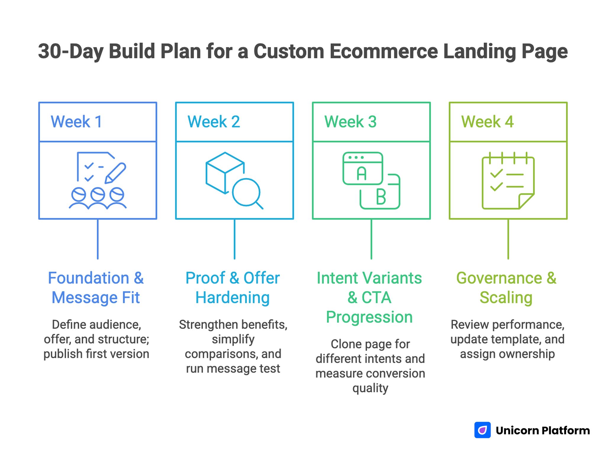
30-day Build and Optimization Plan for a Custom Ecommerce Landing Page
Week 1: Foundation and message fit
Define primary audience, core offer, and first-value outcome. Build the 10-block structure in Unicorn Platform with clear section jobs and mobile baseline checks.
By week end, publish a coherent first version with strong first-screen clarity and at least one distributed trust path. Do not delay launch waiting for visual perfection.
Week 2: Proof and offer hardening
Strengthen benefit-to-proof pairs and simplify offer comparisons. Tighten objection copy near pricing and action points. Remove low-value content blocks that add length without decision value.
Run one message test focused on headline or subheadline while keeping structure constant. A single-variable test gives cleaner signal and faster learning.
Week 3: Intent variants and CTA progression
Clone the core page into two variants by intent stage: exploratory and decision-ready. Adjust CTA intensity, proof emphasis, and objection depth by audience behavior.
Measure both conversion volume and downstream quality indicators. This prevents low-fit volume from masking true performance.
Week 4: Governance and scaling
Review section-level performance, mobile drop-off points, and completion quality by source. Promote winners into your base template and archive learnings into a reusable QA checklist.
Assign ongoing ownership so the page stays current as campaign priorities evolve. Clear accountability is the easiest way to prevent quality drift.
12 Applied Scenarios for Real Ecommerce Teams
1. Single hero product launch
Keep focus tight: one outcome, one use context, one primary CTA path. Avoid adding unrelated category detail that dilutes momentum.
2. Multi-SKU campaign with one traffic source
Use a decision router near top to direct users to the right product path quickly. Each path should preserve consistent narrative logic.
3. Subscription-first offer
Highlight continuity benefits and commitment flexibility early. Users need clarity on cadence and cancellation terms before they commit.
4. High-ticket product with longer consideration
Add deeper comparison logic and stronger risk-reduction proof near pricing. Long-consideration buyers need confidence architecture, not pressure copy.
5. Seasonal promotion with urgency
Use clear, factual timing and promotional conditions. Keep urgency transparent and avoid vague scarcity language.
6. Creator or influencer traffic
Match page language to source narrative so context feels continuous. Message mismatch between content and landing environment reduces trust quickly.
7. International audience
Clarify shipping regions, delivery expectations, and support timing by geography. Hidden regional constraints create avoidable abandonment.
8. New category education required
Add short educational blocks before hard CTA sections so buyers can evaluate fit with confidence. Overly aggressive early CTAs underperform when category familiarity is low.
9. High return-risk products
Emphasize fit guidance, usage expectations, and return transparency near key decisions. Clear expectations reduce both abandonment and post-purchase dissatisfaction.
10. Bundle upsell strategy
Position bundles around usage outcomes rather than discount framing alone. Buyers need a practical reason to choose higher value options.
11. Repeat customer campaign
Shorten educational depth and strengthen action pathways. Existing customers usually need relevance updates and offer clarity more than foundational explanation.
12. Low-bandwidth team launch
Ship a disciplined minimum version quickly, then iterate in weekly cycles. Controlled updates outperform delayed perfection in constrained environments.
Common Failure Modes and Fixes
Failure mode 1: Beautiful page, unclear offer
If users cannot summarize what they get and why it matters, rewrite top-stack messaging and offer snapshot immediately. Clarity at this step usually lifts performance faster than visual redesign.
Failure mode 2: Claim-heavy copy, light evidence
Add proof adjacent to each major claim. Claims without nearby validation reduce confidence and increase bounce.
Failure mode 3: Too many equal-priority actions
Consolidate early-page actions into one primary and one secondary path. Reduce competing CTA noise.
Failure mode 4: Overcomplicated pricing structure
Simplify option differences and align labels to buyer use cases. Interpretation cost is a silent conversion killer.
Independent ecommerce UX research from the Baymard Institute consistently shows that unnecessary complexity in pricing and checkout presentation increases abandonment rates. Simplifying option comparison and making total cost transparent reduces cognitive load and improves completion behavior.
Failure mode 5: Weak mobile readability
Improve heading clarity, spacing rhythm, and CTA visibility on small screens. Mobile friction often explains hidden campaign inefficiency.
Failure mode 6: Static page mindset
Move to a weekly test-and-learn cadence. Performance compounds when iteration is systematic.
Failure mode 7: No ownership after launch
Assign clear accountability for message quality, proof freshness, and release QA. Ownership prevents gradual quality drift.
FAQ: Custom Ecommerce Landing Pages Without Coding
What makes a custom ecommerce landing page truly custom?
A custom page is not defined by visual uniqueness alone. It is custom when messaging, offer structure, and trust design are adapted to a specific audience and campaign intent.
How long should an ecommerce landing page be?
Length should follow decision complexity. Short pages can work for simple low-risk offers, while complex or high-ticket offers usually need deeper explanation and stronger proof.
Should we use one page for all campaigns?
Usually no. A core template can stay stable, but high-impact campaigns benefit from intent-specific variants that align message and proof to source behavior. Shared architecture with targeted messaging is often the best balance.
How many CTAs should be on the page?
Use one primary pathway and one optional secondary action in early sections. Add stronger commitment actions after trust and clarity are established.
Where should testimonials go?
Place them near claims and decision points instead of grouping all testimonials in one isolated section. Contextual placement is typically more effective.
How should we present shipping and return info?
Surface high-impact policy details before final action areas. Buyers should not need to search footer pages to resolve risk concerns.
Can no-code pages support advanced conversion work?
Yes, when teams use no-code workflows with disciplined testing and QA. Tool speed becomes strategic when paired with structured iteration.
What should we test first after launch?
Start with first-screen message clarity and CTA wording. These often produce the fastest signal on fit and intent quality.
How often should proof be refreshed?
Review proof quality on a regular cadence, especially during active campaigns. Fresh, relevant evidence supports ongoing trust.
How can we reduce form abandonment?
Keep initial forms lean, clarify next steps, and remove unnecessary early fields. Progressive qualification usually improves completion.
What is the biggest mistake teams make with custom pages?
Treating customization as visual styling only. The real leverage comes from decision-focused structure, trust sequencing, and iterative improvement.
How do we keep quality high while moving fast?
Use a stable architecture, strict QA checks, and one-variable testing cycles. Speed and quality can coexist when process discipline is consistent.
Final Takeaway
A custom ecommerce landing page wins when it helps the right buyer make the right decision faster. That requires clear relevance, visible trust, low-friction action design, and a process for continuous improvement.
Unicorn Platform gives teams the operational speed to ship and iterate quickly. The performance difference comes from how rigorously that speed is managed through structured architecture, strong copy logic, and repeatable QA.
Build one strong version, validate with real behavior, and improve in focused cycles. That is how ecommerce landing pages become dependable conversion systems rather than one-off campaign pages.