Table of Contents
- What High-Performing Event Pages Consistently Do Better
- The 9-Module Page Architecture for Conference and Seminar Campaigns
- Messaging Frameworks That Improve Registration Quality
- 30-Day Build and Optimization Plan
- Applied Build Scenarios for Real Event Teams
- FAQ
Most event teams do the hardest work first: selecting topics, coordinating speakers, shaping programming, and planning operations. Then they treat the landing page like a final publishing task. That sequence looks efficient, but it usually leaks registration intent at the exact point where interest should convert.
A conference or seminar landing page is not a brochure. It is a decision environment. People arrive with limited attention and specific concerns: is this relevant for my role, will it be worth my time, can I trust the organizer, and what happens after I register. If those answers are slow, vague, or scattered, registrations stall.
This guide is built for teams that need speed without sacrificing clarity. It translates high-performing event-page patterns into a practical operating system you can deploy in Unicorn Platform. You can use it for single-day seminars, multi-track conferences, webinar-style educational events, and hybrid programs with multiple audience segments.
The focus here is not visual novelty for its own sake. The goal is conversion architecture: message clarity, proof timing, friction reduction, and iterative optimization. If your team can execute those consistently, your event page becomes a reliable growth asset instead of a one-cycle campaign artifact.
sbb-itb-bf47c9b
Key Takeaways Before You Build
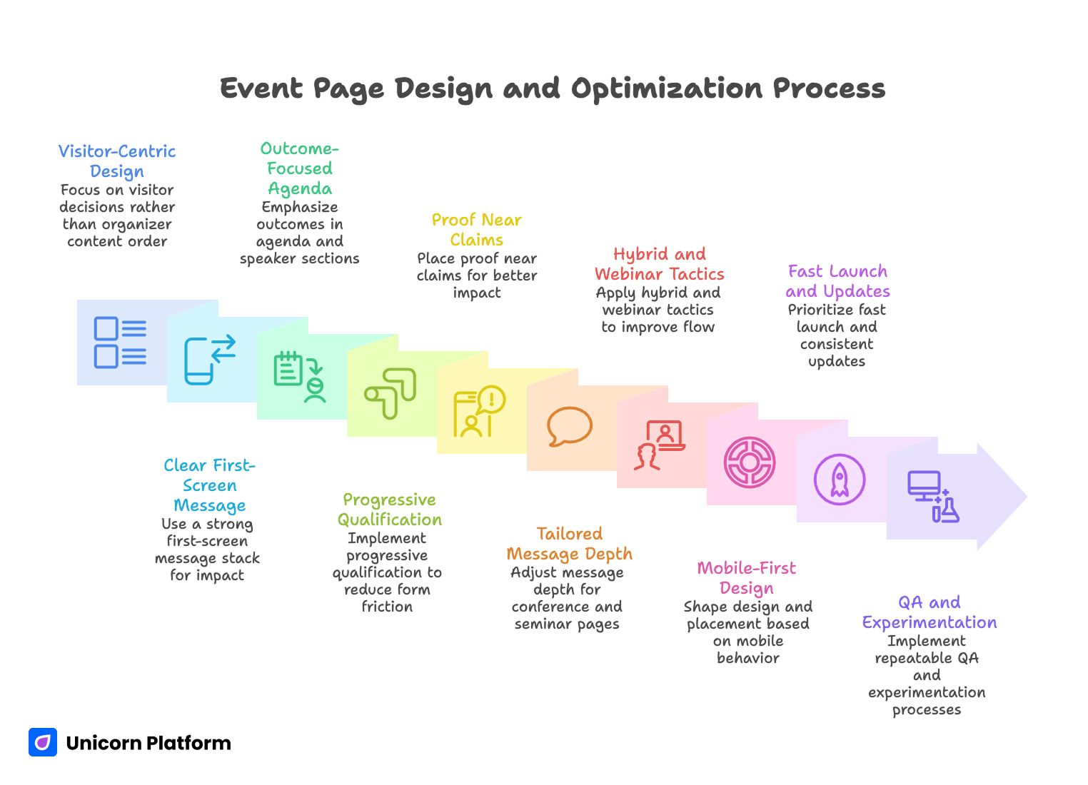
Event Page Design and Optimization Process
- The strongest event pages are designed around visitor decisions, not around organizer content order.
- A clear first-screen message stack is often a bigger lever than a full redesign.
- Agenda and speaker sections should emphasize outcomes, not just information.
- Form friction kills intent quickly; qualification should be progressive, not front-loaded.
- Proof works best when placed near claims, not buried in isolated trust sections.
- Conference pages and seminar pages can share structure, but not always the same message depth.
- Hybrid and webinar-informed tactics can improve event registration flow when applied with context.
- Mobile behavior should shape section design, spacing, and CTA placement from day one.
- Fast launch matters, but update cadence matters more after publish.
- No-code speed helps only when paired with a repeatable QA and experimentation process.
Why Event Landing Pages Underperform Even with Strong Content
Most underperforming event pages do not fail because of one obvious mistake. They fail because of cumulative ambiguity. The page may contain good information, but users still have to work too hard to assemble the story for themselves. Every extra interpretation step increases drop-off risk.
A common pattern is agenda-heavy, outcome-light content. Teams publish complete schedules and detailed session lists, but they do not explain what a specific attendee will be able to do differently after the event. Visitors see activity, not value transformation.
Another frequent issue is delayed trust. Teams assume credibility is obvious because the brand or speaker lineup is known internally. New visitors do not share that context. If proof appears too late, many people abandon before they encounter the strongest trust signals.
Finally, many pages ask for commitment before confidence. Long forms, unclear ticket differences, and aggressive CTA language can create resistance even when event quality is high. The result is poor conversion quality, higher cost per registration, and avoidable campaign waste.
What High-Performing Event Pages Consistently Do Better
They make relevance obvious in seconds
Winning pages do not force visitors to decode positioning. They state who the event is for, what practical outcome attendees can expect, and why the format fits that outcome. This relevance framing happens immediately, not after multiple scrolls.
They use summary-first orientation
Strong pages include an early orientation block so time-constrained visitors can evaluate fit quickly. A short section with core outcomes, event format, and audience fit often improves decision speed for both cold and warm traffic.
They pair information with interpretation
Agenda items, speaker names, and logistics details are necessary, but they are not sufficient. Effective pages add interpretation: why this section matters and what attendee problem it solves. That bridge from details to meaning drives confidence.
They segment by intent stage
Early sections reduce uncertainty. Middle sections build proof and mechanism understanding. Later sections handle objections and strengthen commitment. This sequence aligns with how confidence develops and prevents premature hard asks.
They keep structure predictable
Long event pages can still feel easy if section jobs are clear and transitions are deliberate. Predictable heading logic, visible content boundaries, and concise lead-ins reduce fatigue and improve scan behavior.
They treat FAQ as conversion infrastructure
High-quality FAQ blocks are not filler. They resolve last-mile objections around replays, team attendance, refund terms, timezones, and effort expectations. Good FAQ placement often increases completion among high-intent visitors.
They maintain proof freshness
Proof quality decays over time even when the event remains strong. Mature teams refresh testimonials, quotes, session examples, and visual evidence on a regular cadence. This keeps credibility aligned with current expectations.
They optimize for operational updates
Events change constantly. The best pages are designed to handle speaker additions, agenda shifts, and ticket adjustments without structural breakage. This is where no-code agility creates a concrete competitive advantage.
Conference vs Seminar vs Webinar: Message Depth by Format
Conference and seminar pages can use the same core modules, but each format needs different emphasis. Conferences usually require breadth clarity: multiple tracks, varied audiences, and stronger networking context. Seminar pages often require depth clarity: one core topic, one transformation pathway, and instructor credibility.
Webinar mechanics also add useful discipline. Webinar-oriented pages often do a better job with urgency framing, concise forms, and outcome-focused top sections. You can apply these strengths to seminar and conference campaigns without turning every event into a webinar-style template.
For hybrid events, clarity is even more important. Users need to understand participation mode, access differences, replay policy, and timezone implications without digging through fragmented sections. If this context is delayed, registration hesitation increases quickly.
The 9-Module Page Architecture for Conference and Seminar Campaigns
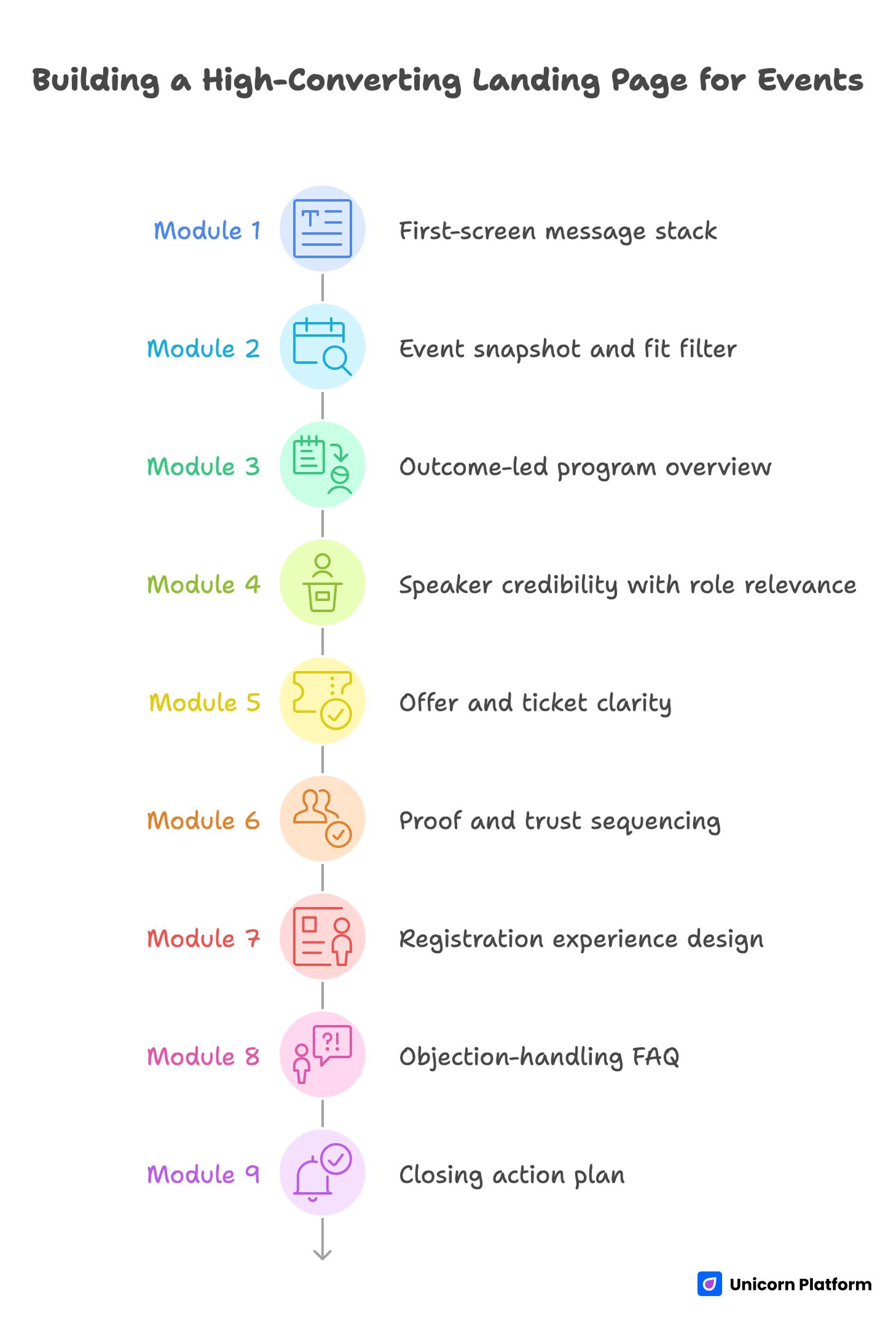
Building a High-Converting Landing Page for Events
If you need a reusable baseline, start with a structured framework such as a high-converting landing page structure and adapt module depth to event format and audience maturity.
Module 1: First-screen message stack
Your first screen must communicate audience fit, practical outcome, and next step. Keep headline language specific and outcome-led. The subheadline should clarify what attendees get, for whom, and in what format.
A minimal first-screen stack includes one primary CTA, one trust cue, and one low-friction secondary action. Avoid equal-weight competing CTAs in the hero unless audience behavior clearly supports dual intent.
Module 2: Event snapshot and fit filter
Immediately after the hero, include date, format, location/timezone, and attendee profile. This is not only informational; it improves lead quality by helping people self-qualify early.
When teams hide this information deep in the page, they often attract form completions from low-fit visitors who later churn. Front-loading fit context reduces downstream friction.
Module 3: Outcome-led program overview
Do not present agenda as a neutral list. Reframe each block around attendee outcomes. For example, instead of only naming a session, add one line about what capability the attendee will gain by joining it.
For conferences with multiple tracks, route visitors with track labels that reflect goals, not internal taxonomy. For seminars, use module-based progression so the learning path feels coherent.
Module 4: Speaker credibility with role relevance
Speaker bios should answer one practical question: why should this person guide this topic for this audience. Keep biographies concise and include one or two credibility markers tied to the session outcome.
Role relevance matters. A founder may care about strategy depth, while an operator cares about implementation detail. Where possible, align credibility framing to the likely role mix of your traffic.
Module 5: Offer and ticket clarity
Ticket complexity should match event complexity, not internal pricing logic. If your packages are hard to compare, hesitation rises. A simple feature-difference table with plain language usually outperforms dense pricing prose.
For seminars, one primary offer plus one team option often converts better than multiple minor tiers. For larger conferences, two or three tiers can work if boundaries are explicit and tied to attendee goals.
Module 6: Proof and trust sequencing
Place proof near decision points. A testimonial beside your top promise is stronger than a large proof block far below. Trust should be distributed across the reading journey, not concentrated in one section.
If this is a first-time event, use organizer track record, instructor outcomes, and pilot evidence honestly. Small, credible proof beats broad unsupported claims.
Module 7: Registration experience design
Your form should collect what is needed for action, not everything that might be useful later. Keep early friction low and gather additional qualification after initial commitment when possible.
If your campaign has segmented paths, studying an event registration landing page flow can help you simplify branching logic and reduce abandonment.
Module 8: Objection-handling FAQ
FAQ should answer real buying questions in plain language. Focus on concerns that block registration decisions: recordings, refunds/transfers, team passes, skill level fit, and support expectations.
Place this module near the lower decision zone, where users typically pause before commitment. Concise answer-first format works best.
Module 9: Closing action plan
End with a clear commitment prompt and a practical reminder of what happens next. Users should know exactly what they get after click, what confirmation to expect, and what timeline applies.
This final module should reduce uncertainty, not increase urgency pressure. Calm clarity usually converts better than aggressive closing copy for professional audiences.
Messaging Frameworks That Improve Registration Quality
Framework A: Headline system by event type
For conference pages, prioritize breadth with precision. Show the domain, target audience, and practical outcome range. Avoid broad prestige language that sounds impressive but uninformative.
For seminar pages, prioritize depth and transformation. Show one specific before-to-after shift and tie it to a timeframe or implementation context. Users should be able to imagine a concrete post-event state.
For hybrid or webinar-informed formats, clarify participation model and value parity early. If users are uncertain whether virtual access delivers equivalent value, they delay decision.
Framework B: Subheadline clarity filter
Before publishing any top-stack copy, validate these points:
- Is the audience explicitly named?
- Is the expected outcome tangible?
- Is the mechanism believable in the event format?
- Is the effort/commitment expectation realistic?
If one answer is weak, revise before launch. Small clarity fixes at this stage can prevent major downstream conversion issues.
Framework C: CTA ladder by confidence stage
Use softer CTA language early for exploratory users and stronger CTA language later for decision-ready users. A single hard CTA repeated across all sections can underperform when audience confidence is mixed.
Early CTA examples should support evaluation behavior. Mid-page CTAs can encourage agenda review or fit confirmation. Final CTAs should clearly invite registration with transparent next-step expectations.
Framework D: Objection-aware microcopy
Microcopy near forms and ticket options can resolve hidden friction quickly. Address common concerns directly: confirmation timing, replay availability, cancellation terms, and team participation.
Keep this language concise and factual. Overly persuasive microcopy can feel evasive. Users respond better when details are clear and operational.
Framework E: Proof placement map
Instead of one large testimonial block, distribute proof by section intent. Near top: credibility signal. Near agenda: relevance proof. Near pricing: decision confidence proof. Near final CTA: reassurance and implementation readiness.
This map aligns trust with decision stages and usually improves conversion quality compared with proof concentration.
Agenda Design That Drives Decisions, Not Just Page Depth
Event pages often over-index on quantity: many sessions, many tracks, many names. Quantity can signal scale, but it does not automatically increase registrations. People register when they understand practical payoff.
Write agenda blocks with outcome labels. Each session should communicate one capability gain, one problem solved, or one decision enabled. That transforms agenda from schedule inventory into value architecture.
For conferences, use track design as routing logic. Track names should map to real attendee priorities, not internal team labels. For seminars, sequence modules as a guided progression so users can see the learning arc and effort profile.
If the event has workshops or implementation labs, highlight deliverables clearly. Users are more likely to commit when they can visualize specific outputs rather than abstract insight.
Speaker Blocks That Build Trust Faster
A speaker section should work like a relevance engine. Name and title are baseline, but conversion lifts when bios include context tied to the event topic and audience need.
Use one concise credibility line per speaker with practical signal. A role alone is rarely enough. Attendees need to understand why this speaker can guide the decision or skill they care about.
Avoid oversized biography paragraphs. Long bios often reduce scanability and dilute key points. Structured short-format blocks with session-outcome alignment usually perform better.
If your speaker lineup is still evolving, design a modular section that can be updated quickly. Stale or inconsistent speaker info undermines trust faster than missing visual polish.
Offer and Pricing Structure for Conferences and Seminars
Ticket architecture should minimize interpretation cost. If a visitor cannot explain your ticket differences in one sentence each, the structure is likely too complex.
For seminars, simplify by default. One clear standard pass and one optional team pass can outperform multi-tier structures with marginal differences. Simplicity supports faster decisions.
For conferences, when multiple tiers are necessary, label tiers by use case rather than by abstract naming. Clarify what each attendee type gains and where each ticket is strongest.
Whenever price transitions or deadlines exist, describe them transparently with exact conditions. Clear terms create momentum without damaging trust.
Registration Flow: Balancing Friction, Qualification, and Speed
High-intent users do not need to be persuaded repeatedly, but they still need friction-free completion. Keep the first-step form lean and ask only for fields necessary to secure the registration pathway.
If additional qualification is important for sales or event operations, gather it in follow-up steps or post-registration workflows. Progressive data collection protects completion while preserving information quality.
For team registrations, include straightforward guidance on group options and billing flow. Ambiguity around team logistics can block otherwise qualified conversions.
When webinar-style mechanics apply, use concise form-adjacent value stacks and practical next-step notes. If your event strategy includes recurring community sessions, references like meetup and calendar landing page workflows can help you build reusable conversion paths between one-off and ongoing formats.
Mobile Experience: The Real Test of Event Conversion Readiness
A large share of event traffic arrives from mobile contexts: social feeds, community messages, and forwarded links. Desktop-perfect design does not guarantee mobile decision clarity.
Usability research from Nielsen Norman Group repeatedly confirms that users scan rather than read on small screens, and that dense layouts increase cognitive load. For event pages, this means unclear hierarchy or cramped sections can quietly suppress registrations even when messaging is strong.
Review first-screen legibility, CTA visibility, and spacing between key decisions on common phone widths. Dense layout and poor contrast can quietly suppress registrations even when messaging is strong.
Forms need extra discipline on mobile. Reduce optional fields, simplify labels, and ensure input behavior feels predictable across keyboards and autofill patterns.
Do not defer mobile QA to late-stage polish. It should be part of foundational launch criteria, because mobile friction can mask true demand quality.
Content Discoverability Without Over-Optimization
Event pages that rely only on paid traffic miss high-intent discovery demand. Practical discoverability comes from clarity: precise titles, structured headings, concise section summaries, and coherent internal navigation.
Write for human decision flow first. Clear architecture also makes the page easier to parse and revisit. This dual benefit improves both user experience and long-term content utility.
If your event runs repeatedly, keep URL logic stable and refresh content modules each cycle. Fragmented one-off pages often dilute authority and reduce cumulative performance.
Why Unicorn Platform Fits Conference and Seminar Workflows
Conference and seminar campaigns are dynamic. Details change as speakers confirm, schedules shift, and partner assets evolve. Teams need a page workflow that can absorb these changes without slowing momentum.
Unicorn Platform supports this with modular sections and straightforward editing. Marketing and event teams can ship quickly, update safely, and keep structure consistent across variants.
Speed alone is not enough, though. The advantage appears when teams pair fast editing with intentional testing. Stable architecture plus controlled iteration creates better learning than constant redesign churn.
For multi-audience events, section-based variants can be published without rebuilding the entire page. That helps teams align message depth to traffic source and intent stage with less operational overhead.
30-Day Build and Optimization Plan
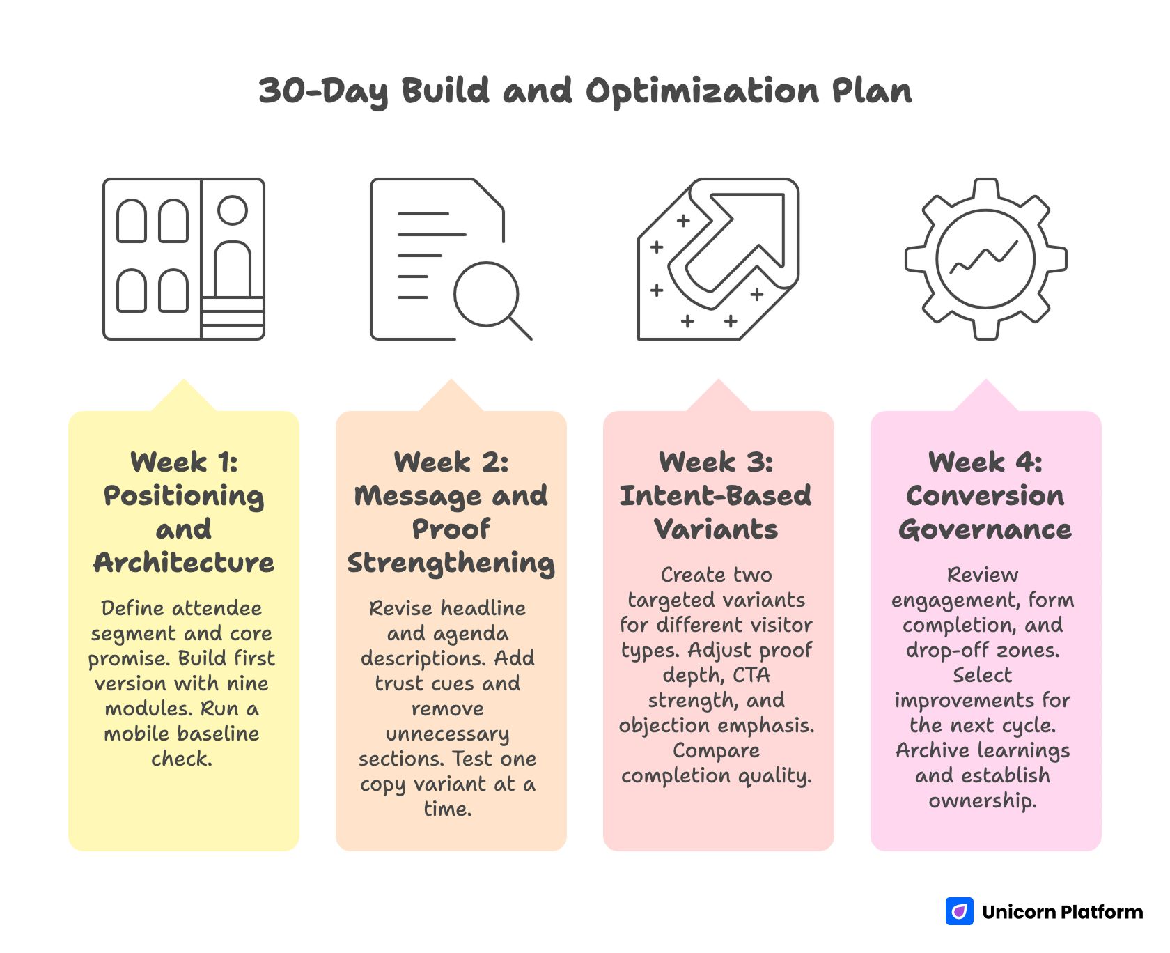
30-Day Build and Optimization Plan for High Converting Landing Page for Events
Week 1: Positioning and architecture
Define primary attendee segment and core transformation promise. Build first version with nine modules: message stack, snapshot, program, speakers, offer, proof, registration, FAQ, closing action. Run a same-day mobile baseline check.
By the end of week one, you should have one coherent page with clear module jobs, one primary CTA pathway, and no unresolved structural ambiguity.
Week 2: Message and proof strengthening
Revise headline/subheadline and agenda descriptions for outcome clarity. Add role-relevant trust cues near top claims. Remove any section that adds page length without adding decision value.
Test one copy variant at a time to preserve signal quality. Document hypotheses and expected behavior change before publishing updates.
Week 3: Intent-based variants
Create two targeted variants: one for exploratory visitors and one for high-intent evaluators. Keep architecture stable while adjusting proof depth, CTA strength, and objection emphasis.
Compare completion quality, not only volume. A smaller but higher-fit registration cohort can outperform larger low-fit volume in event outcomes.
Week 4: Conversion governance
Review section-level engagement, form completion patterns, and drop-off zones. Select one structural and one messaging improvement for the next cycle. Archive learnings into reusable templates and copy rules.
Establish ownership for ongoing updates so the page remains current as event details evolve.
Applied Build Scenarios for Real Event Teams
First-time seminar with low brand recognition
Lead with instructor credibility tied to the seminar outcome, not brand claims. Keep offer simple and include a brief expectation block for effort and suitability. Prioritize trust clarity over design complexity.
Multi-track conference with mixed audiences
Use track routing near the top to prevent relevance confusion. Pair each track with outcome language and one evidence cue. This reduces scan fatigue for visitors who need quick fit confirmation.
Hybrid event with virtual and in-person passes
Clarify access differences and value parity early. If virtual attendees receive different benefits, explain those differences transparently to avoid perceived mismatch.
High-ticket workshop day within a broader event
Separate workshop value proposition from general conference messaging. Users considering premium access need focused justification and practical deliverable detail.
Team registrations from companies
Add explicit team pathway language with billing and coordination clarity. Team buyers often pause when the process appears designed only for individuals.
Community-driven event with recurring sessions
Use lightweight recurring value framing and show continuity between sessions. Emphasize progression and practical cadence so returning attendees can plan participation.
Event with evolving speaker lineup
Design the speaker section as modular, easy-to-update blocks. Prioritize consistency and freshness over heavy visual complexity.
Niche technical seminar
Anchor messaging in concrete post-event capability gains. Avoid broad audience phrasing that weakens relevance for specialized users.
Founder-led event with limited operational team
Keep the page architecture simple and maintainable. Focus on message clarity, trust placement, and lean registration flow rather than multi-feature complexity.
International audience across timezones
Display timezone references and replay access policy prominently. Unclear scheduling context can silently suppress global registration intent.
Partner-sponsored event
Separate partner credibility from event value narrative. Sponsors can strengthen trust, but they should not dilute outcome clarity.
Last-minute campaign launch
Ship a clean minimum structure fast, then iterate in daily cycles. In compressed timelines, controlled updates outperform delayed perfection.
Common Failure Modes and How to Fix Them
Failure mode 1: Strong branding, weak decision clarity
If the page looks polished but users still hesitate, simplify top-stack language and strengthen relevance cues. Visitors should understand fit and expected value immediately.
Failure mode 2: Agenda overload with no interpretation
Long program lists without outcome statements create cognitive load. Add one practical value line per session block and group related items by attendee goal.
Failure mode 3: Proof concentration in one section
Single-location trust blocks are easy to miss. Redistribute proof near claims and decision points to support confidence throughout the page.
Failure mode 4: Ticket complexity beyond audience need
Over-engineered pricing structures increase hesitation. Collapse low-value distinctions and clarify use-case fit for each option.
Failure mode 5: Form asks too much too early
High field count at first touch reduces completion. Move nonessential qualification into follow-up steps and preserve initial momentum.
Failure mode 6: Mobile treated as afterthought
If mobile QA happens only before launch deadline, important issues survive publish. Build mobile checks into weekly optimization rhythm.
Failure mode 7: No post-launch operating cadence
Without structured review cycles, event pages decay quickly as details change. Assign ownership and maintenance intervals from the start.
FAQ: Conference and Seminar Landing Pages in 2026
What should be above the fold on an event landing page?
Include audience fit, practical outcome, event format context, and one primary action. Add one trust cue so users can assess credibility immediately. The first screen should reduce uncertainty, not introduce more interpretation work.
Should conference and seminar pages use the same template?
They can share architecture, but messaging depth should differ. Conference pages usually require broader routing and track clarity. Seminar pages usually require deeper topic-to-outcome explanation.
How long should an event landing page be?
Length should follow decision complexity. If the event has multiple tracks, pricing options, and mixed audiences, more depth is usually necessary. If it is a focused seminar, concise depth with clear structure often performs better than long generic copy.
How many ticket tiers should we offer?
Offer only as many tiers as visitors can compare quickly. Two or three clear options are usually easier to evaluate than a large matrix with minor differences.
What is the most important trust element for first-time events?
Specific credibility tied to the event outcome. Organizer history, instructor track record, pilot results, and concrete session relevance all work when presented honestly and clearly.
How should we handle urgency without hurting trust?
Use transparent operational urgency: real deadlines, real seat limits, real access conditions. Avoid vague pressure language without clear basis.
When should we ask qualification questions?
Ask the minimum needed for initial commitment first. Gather deeper qualification after registration or in follow-up steps to avoid early drop-off.
What makes a registration form feel easier on mobile?
Short field count, clear labels, predictable input behavior, and visible progress cues. Mobile users should complete without zooming, hunting, or re-reading.
How often should we update the page during campaign live period?
Run a regular cadence with focused changes. Weekly review and controlled updates usually produce clearer learning than constant unsystematic edits.
Can no-code workflows support serious event optimization?
Yes, when teams treat no-code tools as an iteration system, not a one-time builder. Consistent testing, QA discipline, and modular updates are what create sustained gains.
What if we have both webinar and conference goals in one campaign?
Use a shared framework with distinct intent paths. Webinar users may prefer fast signup and concise value framing, while conference users may need deeper agenda and track confidence before committing.
What is the fastest way to improve a weak event page this week?
Tighten the first-screen message stack, improve agenda interpretation, and reduce form friction. These three changes often unlock meaningful improvement without a full redesign.
Research from HubSpot consistently shows that reducing unnecessary form fields and clarifying value propositions improves landing page conversion rates. The same principle applies to conference and seminar registration flows, where early friction compounds quickly and discourages otherwise qualified attendees.
Final Takeaway
A conference or seminar landing page succeeds when it behaves like a decision system, not a static information page. Clear relevance, strong structure, contextual proof, and low-friction action pathways are the core mechanics that turn interest into qualified registrations.
With Unicorn Platform, teams can implement this system quickly and keep improving it as campaigns evolve. The advantage is not just fast publishing. The real advantage is fast, structured iteration with consistent quality control.
If you apply the frameworks in this guide, your event page will be easier to understand, easier to trust, and easier to act on. That is the foundation for durable registration performance across campaign cycles.