Table of Contents
- 8 Event Landing Page Examples To Borrow From
- Agenda and Speaker Blocks: What to Show Early
- Event Landing Page Template Ideas You Can Reuse
- Common Event Landing Page Mistakes
- FAQ
The best event landing pages make the value of attending clear fast, surface the agenda and speakers early, and reduce signup friction. That is why people usually search for examples and templates before they build one. They want to see what strong event pages include, what sections appear near the top, and what details help visitors decide to register instead of leaving.
A strong event page is not just a signup form with a headline. It is a decision page. Visitors want to know who the event is for, what they will get from attending, when it happens, who will be speaking, and how easy it is to register. If those answers are slow or scattered, conversion drops even when the event itself is good.
This guide shows event landing page examples by format, breaks down the sections that matter most, and gives you reusable template ideas you can adapt for conferences, webinars, workshops, launches, and community events.
sbb-itb-bf47c9b
Quick Answer
If you are building an event landing page, the core structure usually looks like this:
- headline with audience and outcome
- event format, date, and timing block
- one clear registration CTA
- agenda or session highlights
- speaker or host section
- proof, trust, or organizer credibility
- registration form or ticket section
- FAQ near the bottom
If those pieces are clear and easy to scan, the page is already much more likely to convert.
What Makes an Event Landing Page Work
An event landing page works when it answers the main decision questions quickly.
- Is this event for me?
- Is it worth my time or money?
- Can I trust the organizer or speakers?
- What do I need to do next?
Many weak event pages delay those answers. They start with general brand messaging, decorative visuals, or long intros that never clarify the event value clearly enough. The better pattern is much simpler: relevance first, then proof, then logistics, then action.
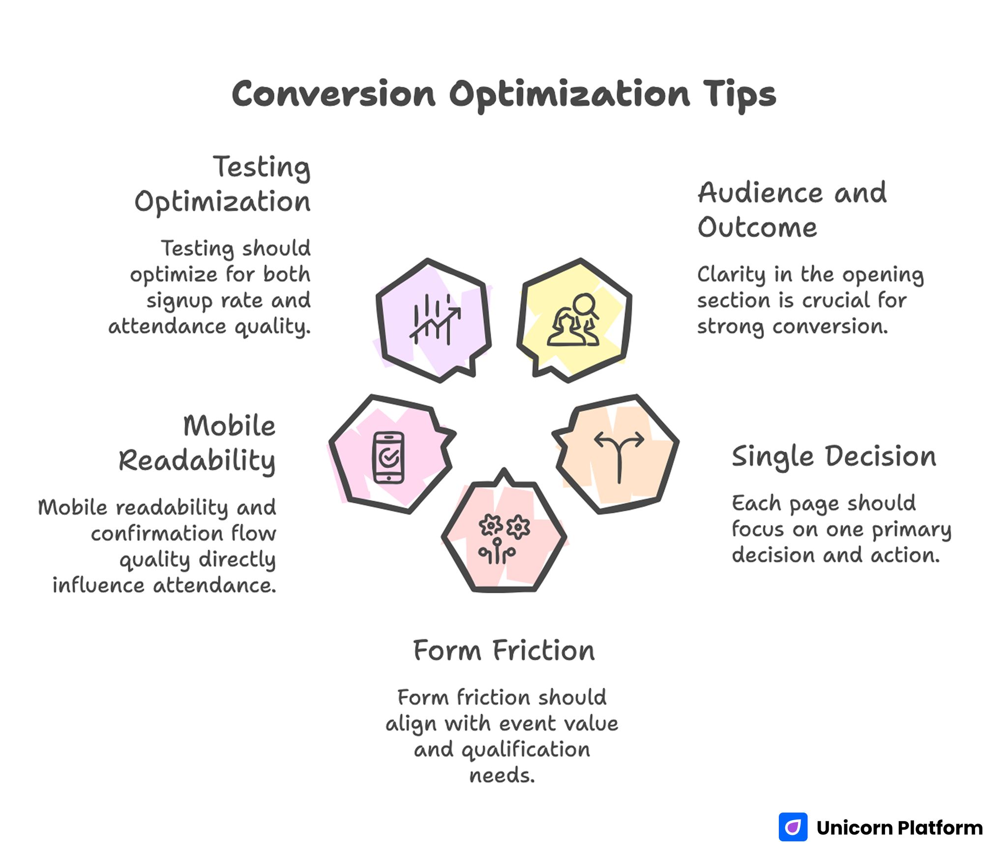
Conversion Optimization Tips
8 Event Landing Page Examples To Borrow From
The examples below are not tied to one brand. They are example patterns you can reuse depending on the kind of event you are promoting.
1. Webinar landing page
This is one of the simplest and most common event page formats.
What it usually includes:
- a direct promise in the headline
- one featured speaker or host
- three to five key takeaways
- a short form near the top
- reminder-friendly registration CTA
Why it works:
- webinar visitors often decide quickly, so the best pages reduce friction and explain value early
2. Conference landing page
Conference pages usually need more depth because the commitment is higher and the audience wants more detail.
What it usually includes:
- event positioning and audience fit
- date, city, or virtual format details
- agenda overview
- speaker highlights
- sponsor or organizer trust signals
- ticket or registration section
Why it works:
- attendees need both inspiration and logistics confidence before registering
3. Workshop landing page
Workshop pages tend to perform best when they focus on the learning outcome rather than broad event hype.
What it usually includes:
- who the workshop is for
- what attendees will learn or leave with
- short session flow
- instructor credibility
- limited-seat or cohort framing when true
Why it works:
- workshops usually sell depth, not breadth, so clarity matters more than spectacle
4. Product launch event page
Launch event pages often need stronger urgency and a clearer reason to show up live.
What it usually includes:
- announcement headline
- what will be revealed or demonstrated
- date and time
- host or presenter block
- registration CTA repeated more than once
Why it works:
- launch audiences need a reason to reserve time instead of waiting for a summary later
5. Community or meetup page
Community event pages work best when they feel easy and low-pressure.
What it usually includes:
- clear topic and audience
- simple location or virtual details
- friendly organizer identity
- RSVP CTA
- optional short agenda or discussion themes
Why it works:
- community events convert better when the experience feels welcoming, not overproduced
6. Paid event or ticketed seminar page
Paid event pages need stronger proof and more explicit value framing because the commitment is higher.
What it usually includes:
- outcome-led headline
- why this event is different
- speaker or instructor proof
- what the ticket includes
- pricing section
- FAQ about refunds, access, or replay
Why it works:
- a paid event page has to reduce uncertainty much more carefully than a free webinar page
7. Virtual summit page
Virtual summit pages often need clearer structure because they can become cluttered fast.
What it usually includes:
- main event theme
- who it is for
- featured sessions or tracks
- selected speaker cards
- registration CTA
- optional replay or access details
Why it works:
- visitors need a summary-first layout because there is more information to process
8. Local in-person event page
Local event pages usually convert better when logistics are not buried.
What it usually includes:
- event purpose
- address or venue details
- date and start time
- local trust signals
- parking, access, or venue notes
- RSVP or ticket CTA
Why it works:
- in-person events create extra friction if practical details are hard to find
Registration Page Structure That Converts Better
A strong registration page does not need every possible section. It just needs the right ones in the right order.
A practical event page structure looks like this:
- audience and event promise
- event format, date, and timing
- registration CTA
- agenda or benefits
- speaker or host credibility
- proof or organizer trust
- FAQ and friction reducers
This order works because it moves from relevance to confidence to action without forcing the visitor to piece the story together themselves.
Agenda and Speaker Blocks: What to Show Early
These two sections often decide whether the page feels credible.
Agenda blocks
Your agenda should not be just a schedule. It should tell people what they will get from attending.
A better agenda block usually includes:
- session name or section title
- what the attendee will learn
- what problem it helps solve
That is stronger than time slots alone.
Speaker blocks
Speaker sections work best when they explain why the person matters for this event.
Useful speaker elements:
- name and role
- why this person is relevant to the topic
- one sentence about what they bring to the event
Long biographies are rarely necessary. Short, relevant credibility works better.
Trust and Social Proof That Help Event Pages Convert
Trust matters on event pages because people are trading time, attention, and sometimes money.
Useful trust elements include:
- organizer credibility
- previous attendee quotes
- photos from past events
- known partner or sponsor logos
- clear statement about whether the event is live, recorded, free, or paid
The best pages place trust near moments of hesitation:
- close to the first CTA
- near ticket or registration blocks
- near FAQs about attendance, replay, or fit
CTA Placement and Signup Friction
Event pages often lose conversions because the CTA is either too hidden or the form asks for too much too early.
Good CTA placement
A strong event page usually repeats the CTA in at least three places:
- near the top
- after agenda or value summary
- near the bottom after FAQs or proof
Keep forms lighter than your team wants
If the event is free or low-friction, the form should usually stay short.
Often enough:
- name
- maybe one qualifying field if truly needed
If you need more information, collect it later instead of blocking the first registration step.
Event Landing Page Template Ideas You Can Reuse
The easiest way to speed up event launches is to think in templates.
Template 1: Simple webinar template
Use this if you need fast registrations for one topic and one speaker.
Template order:
- headline
- timing and format
- CTA
- three takeaways
- speaker
- FAQ
Template 2: Conference template
Use this for bigger events with more details and more evaluation friction.
Template order:
- event promise
- date and location
- CTA
- track or agenda summary
- speaker highlights
- trust proof
- ticket section
- FAQ
Template 3: Workshop template
Use this when the event sells transformation or skill-building.
Template order:
- audience and outcome
- who the workshop is for
- learning blocks
- instructor credibility
- CTA
-
FAQ
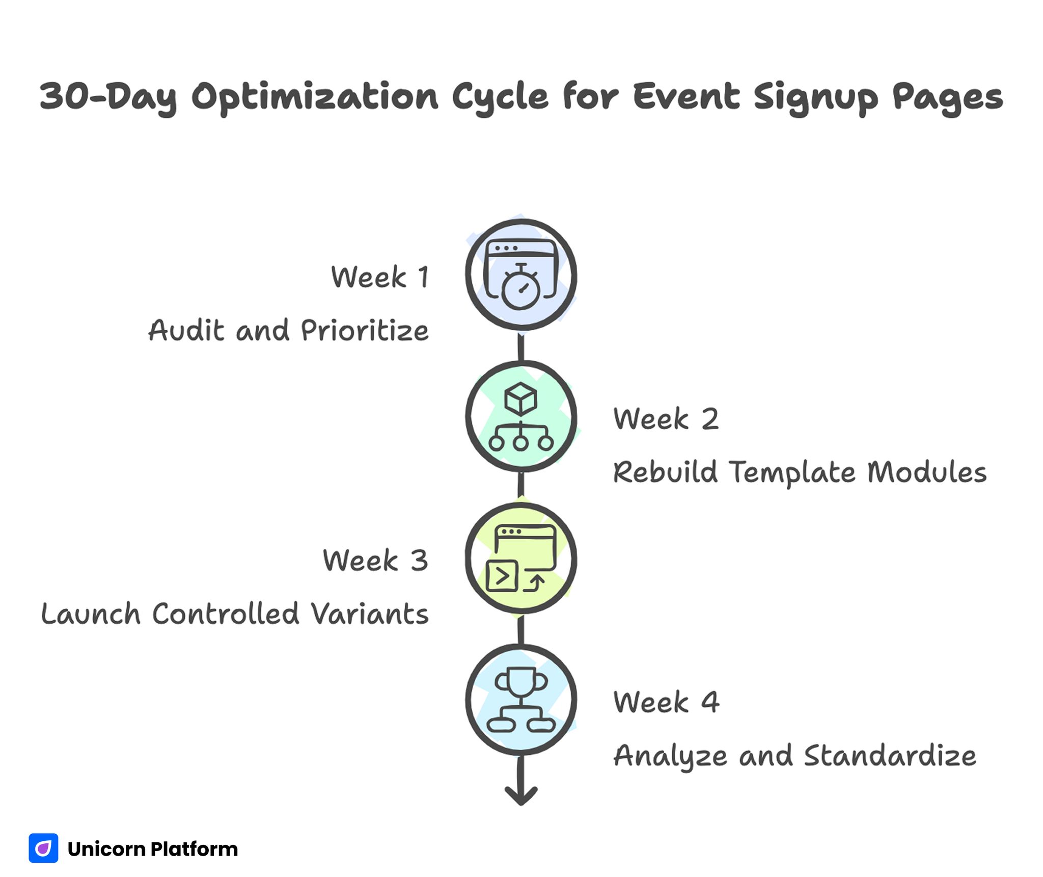
Optimization Cycle for Event Signup Pages
Common Event Landing Page Mistakes
Mistake 1: hiding the event value under branding language
Fix: state the outcome and audience in the first screen.
Mistake 2: burying date and format details
Fix: put timing and format close to the top so people can decide quickly.
Mistake 3: showing a schedule without showing the benefit
Fix: pair agenda items with outcomes or learning points.
Mistake 4: making the signup form too heavy
Fix: ask for the minimum needed to secure the registration.
Mistake 5: putting trust too low on the page
Fix: move speaker, organizer, or proof elements closer to the top CTA.
How To Apply This in Unicorn Platform
Unicorn Platform works well for event pages because most event landing pages do not need a heavy custom build. They need speed, reusable sections, and a structure that can be updated as event details change. This is the same approach used in other template-driven landing page systems, for example when you need to quickly launch something like a dating site landing page in minutes, where structure and speed matter more than custom development.
A practical event workflow in Unicorn Platform looks like this:
- duplicate a proven template
- update the headline, timing, and CTA first
- add agenda and speaker blocks second
- place one trust element near the top
- keep the form simple
- reuse the page for future events with a clean section order
If you are also improving section order, this guide on landing page structure is a useful companion because it helps keep the page easy to scan before you start adding more details.
FAQ: Event Landing Page
What should an event landing page include?
At minimum: a headline, date or format details, CTA, agenda or benefits, speaker block, and FAQ.
What is the difference between an event page and an event landing page?
An event landing page is more focused on one conversion action, while a broader event page may contain more general information and navigation.
How long should an event landing page be?
Long enough to answer the main questions about value, timing, trust, and registration, but not so long that the page loses focus.
Where should the registration form go on an event landing page?
Usually near the top or soon after the first value explanation, with repeated CTA access later on the page.
What makes an event landing page convert better?
Strong audience fit, visible event value, low signup friction, clear agenda highlights, and trust placed near decision points. These principles are similar to high-intent acquisition flows in other industries, such as high-performing dating app funnels, where precise targeting and clarity of intent significantly impact conversion behavior.
Should event landing pages include speaker bios?
Yes, but keep them short and relevant. Explain why the speaker matters for the event.
What is the best CTA for an event landing page?
Simple, direct CTAs usually work best, such as Register now, Save your seat, or Get your ticket.
Should I use templates for event landing pages?
Yes. Templates make it easier to launch faster and keep the structure clear across multiple events.
Are agenda blocks really necessary?
In most cases, yes. Even a short event benefits from showing what people will actually get.
Is Unicorn Platform good for event landing pages?
Yes, especially when you need to launch quickly, update event details easily, and reuse sections across multiple campaigns.
Final Takeaway
The best event landing pages are not complicated. They are clear. They help people understand why the event matters, who it is for, what they will get, and how to register without friction.
For this topic, the most important move was separating the event landing page intent from the old dating-site redirect source. Once the current URL is treated as a true event-page examples resource, it has a much better chance of matching the SERP and being worth the content investment.
Related Blog Posts
- Engage Attendees with Interactive Event Pages
- Webinar Landing Page: Creating an Engaging Registration Portal for Your Next Online Event
- Conference and Seminar Landing Page Builder Guide for High-Intent Event Registrations in 2026
- Webinar Registration Strategy in 2026: How Event Teams Turn Clicks Into High-Intent Attendees