Table of Contents
- The Core Page Architecture That Works
- Step-by-Step Build Workflow on GitHub
- 30-Day Optimization Plan
- Common Mistakes to Avoid
- FAQ
Building a personal website on GitHub is still one of the most reliable ways to create a professional digital home with full ownership. You control your content, your structure, and your release workflow without depending on social-platform rules or changing algorithms.
The problem is that many GitHub-based personal websites stop at technical setup. They publish successfully but fail to explain value clearly, so visitors see code links without understanding your focus, your impact, or the right next step.
A strong personal site solves both sides of the equation. It keeps technical credibility while making your story readable for mixed audiences, including recruiters, clients, collaborators, and non-technical decision-makers.
This guide shows how to build your personal website on GitHub with ease while keeping it clear, trustworthy, and conversion-ready. If you want practical examples of how project-led pages can be structured for mixed audiences, this GitHub personal page guide is a useful companion.
sbb-itb-bf47c9b
Quick Strategic Takeaways
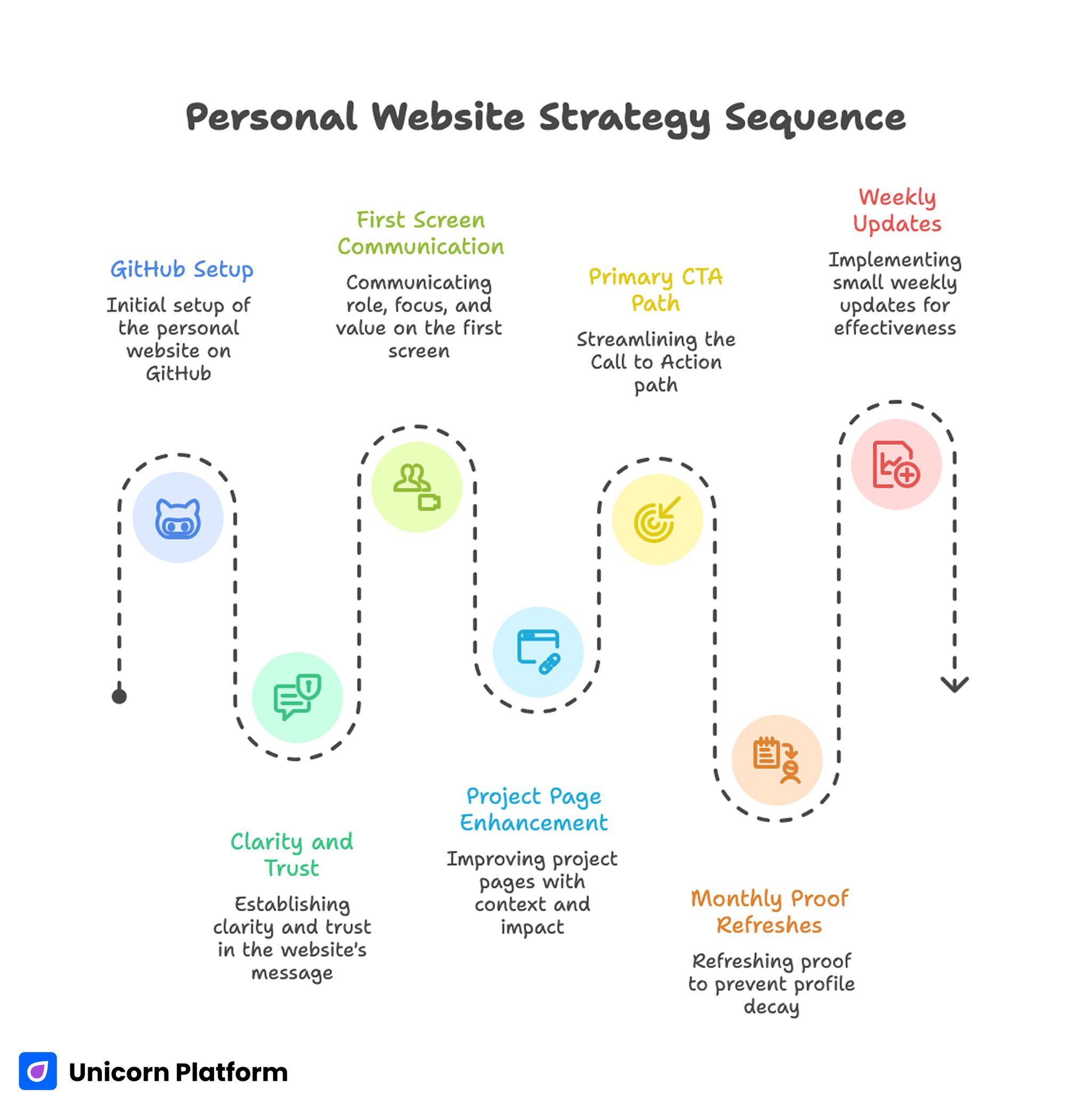
Personal Website Strategy Sequence
- GitHub setup is only the first layer; clarity and trust decide outcomes.
- A personal site should communicate role, focus, and value in the first screen.
- Project pages perform better when they include context and measurable impact.
- One primary CTA path usually improves opportunity quality.
- Monthly proof refreshes prevent profile decay and stale positioning.
- Small weekly updates are more effective than occasional full redesigns.
Why GitHub-Based Personal Sites Still Matter
GitHub Pages is attractive because it combines ownership, version control, and dependable publishing. For technical professionals, this creates a strong credibility base before any marketing tooling is added.
Research and documentation from GitHub confirm that GitHub Pages provides a reliable way to publish static websites directly from repositories while maintaining full version control and deployment transparency. This model makes it especially attractive for developers who want both publishing simplicity and long-term content ownership.
It also supports a disciplined workflow. You can treat profile updates like product iterations, with clear changes, review history, and predictable publishing behavior.
The real advantage appears when you connect this technical foundation to communication clarity. Visitors should not have to infer your value from repository names alone.
When technical proof and clear narrative are combined, a GitHub-based site becomes more than a portfolio. It becomes a professional decision page that helps the right opportunities move forward faster.
Define Your Objective Before You Build
Before you choose theme details or section styling, define one primary objective for your current site version. Objective clarity is what keeps section decisions coherent.
Common objectives include the most common outcomes professionals expect from a GitHub-based personal site. Choosing one objective first helps keep structure and messaging aligned:
- hiring visibility for a specific engineering role
- consulting inquiries for a focused technical scope
- academic and research credibility
- open-source collaboration opportunities
Pick one primary objective and one priority audience. You can support secondary pathways later, but initial focus improves conversion quality and messaging precision.
The Core Page Architecture That Works
A high-performing GitHub personal website usually follows a clear structure from identity to proof to action. This sequence keeps mixed audiences oriented while preserving technical depth.
Usability research from Nielsen Norman Group shows that users typically scan web pages rather than read them word by word. Clear visual hierarchy, structured sections, and concise summaries help visitors quickly understand relevance and decide whether to continue exploring the page.
1. Hero with role and domain clarity
Your hero should quickly explain what you build, for whom, and why it matters. Generic role labels are rarely enough, especially when your work sits in a specific domain.
A better framing pattern is role plus problem space plus practical value. This helps visitors self-qualify in seconds.
2. Selected projects with outcome context
Show only your strongest and most relevant projects in the primary view. Each project should include role clarity, technical challenge, and one practical result.
Curation is critical because equal-weight project lists reduce signal quality. Ordering your projects by strategic relevance improves decision speed.
3. Trust and credibility layer
Use concise credibility signals that support your stated focus. This can include open-source contributions, technical writing, talks, certifications, or measured outcomes.
Trust sections should support decisions, not become exhaustive archives. Relevance is stronger than volume for first-pass evaluation.
4. Focus pathway by audience intent
If your audience mix includes hiring and consulting pathways, guide each audience with clear section cues. This reduces friction and improves inquiry fit.
Intent pathways can be simple and still effective. A small amount of directional language near proof and CTA blocks often makes a major difference.
5. Primary CTA and contact process
End with one dominant action path tied to your main objective. Add response expectations so visitors know what happens after they reach out.
Clear post-submit expectations improve confidence and reduce low-value contact behavior. Visitors are more likely to complete forms when they understand what happens next.
Step-by-Step Build Workflow on GitHub
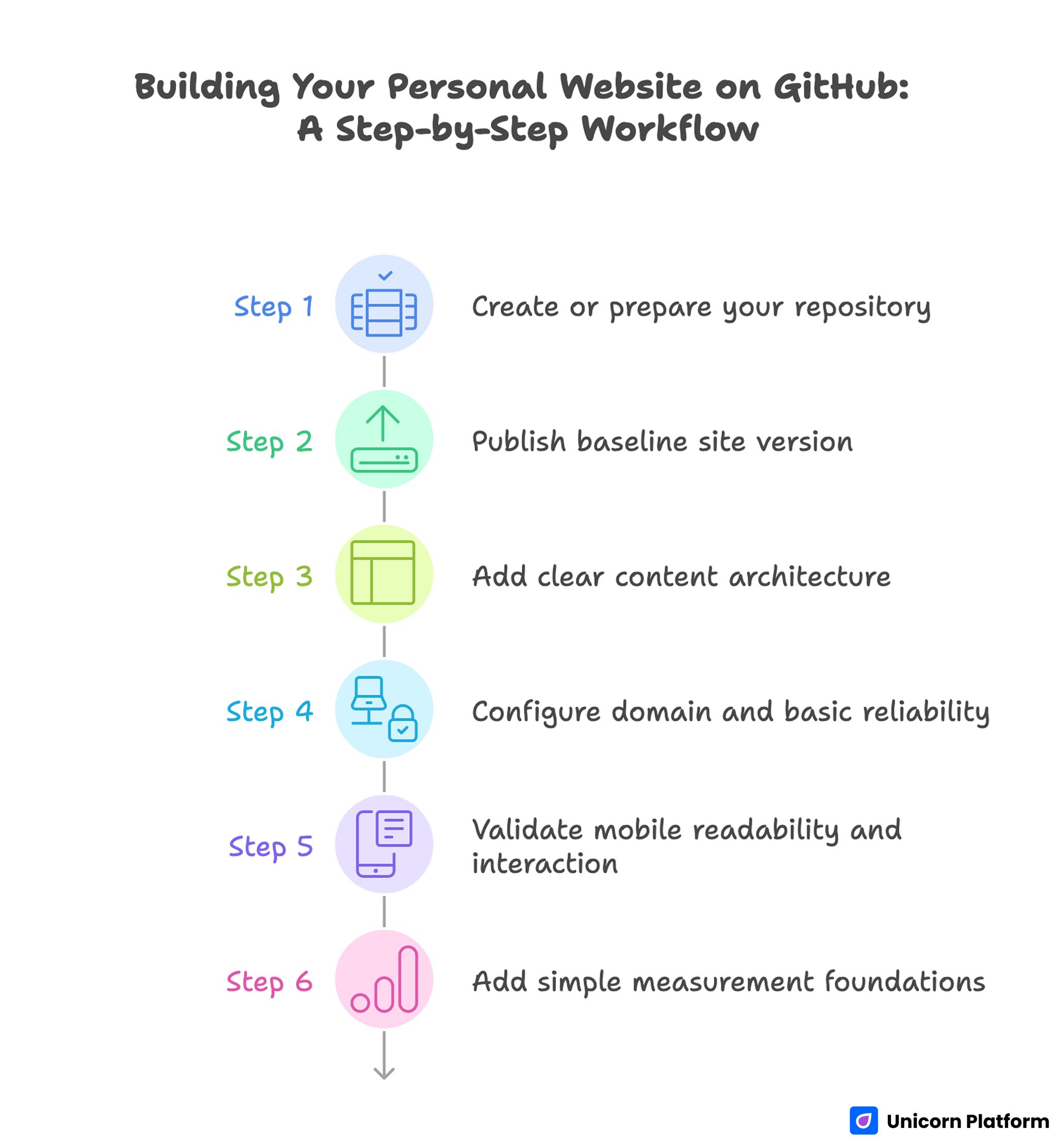
Step-by-Step Workflow for Building a Personal Website on GitHub
A practical build flow keeps setup and strategic structure aligned instead of treating them as separate phases. This prevents technically complete pages from launching with weak communication.
Step 1: Create or prepare your repository
Use a clean repository structure for your personal site. Keep naming conventions consistent so future maintenance stays simple.
Whether you start from a template or from scratch, establish a structure you can update quickly without hunting for key files. Consistent organization reduces maintenance errors over time.
Step 2: Publish baseline site version
Launch an initial version with core sections in place before adding advanced customization. Early publishing gives you a working baseline for iterative improvement.
A baseline launch is not about perfection. It is about establishing a usable profile that can be improved through measured updates.
Step 3: Add clear content architecture
Define hero, selected project, trust, and CTA sections as explicit content blocks. This creates a predictable reading flow for first-time visitors.
Avoid placing too many technical details above the fold. Lead with relevance first, then provide deeper detail paths.
Step 4: Configure domain and basic reliability
If you are using a custom domain, ensure DNS and HTTPS behavior are stable before broader promotion. Reliability issues can damage first impressions quickly.
Keep setup notes documented so future changes are faster and less error-prone. Documentation also improves collaboration if other contributors support your profile later.
Step 5: Validate mobile readability and interaction
Check text legibility, project-card scanning, and CTA visibility on common devices. Mobile interaction quality influences trust even for technical audiences.
A technically advanced profile that is hard to read on mobile still underperforms in real discovery channels. Readability quality is part of professional credibility.
Step 6: Add simple measurement foundations
Track entry pages, project clicks, and contact outcomes. You do not need complex analytics at the start, but you do need consistent signals.
Reliable metrics help you prioritize high-impact changes instead of redesigning based on assumptions. Small data-informed updates usually outperform broad speculative edits.
Writing Better Project Narratives
Most project descriptions fail because they explain implementation without explaining significance. Strong project narratives show what problem you solved and why your decision mattered.
Use this four-line summary model to keep project descriptions concise and decision-oriented. The structure below works well for both technical and non-technical readers:
- context and challenge
- your contribution and key decision
- implementation highlights
- measurable impact or clear outcome
This structure serves both technical and non-technical readers. Engineers can evaluate depth, and decision-makers can evaluate business relevance.
For stronger positioning across project and profile sections, this personal website quality guide can help keep narrative consistency while your portfolio grows.
Academic and Research Adaptation Layer
If your site supports academic pathways, structure content so expertise is readable without overwhelming first-time visitors. Clarity is critical when your audience includes both peers and non-specialists.
A practical academic section includes research focus, selected publications, talks, and teaching or mentorship context. Keep the top layer concise and link deeper resources where needed.
Publication lists should be curated by relevance to your current focus. Long unstructured lists reduce readability and make your positioning harder to understand.
The same clarity principles apply to research profiles as to consulting profiles. Visitors still need quick orientation, trust, and a clear next action.
Personal Brand Positioning With a Custom Profile Site
Custom profile sites are most effective when they connect identity to outcomes. Visual style supports this, but positioning clarity is the main performance driver.
A useful profile model combines who you help, what you build, how you work, and what results your work creates. This creates coherence across hero, project, and contact sections.
For non-technical audiences evaluating fit, this kind of coherence can be the difference between passive browsing and meaningful conversion.
If you are refining a broader brand narrative beyond GitHub projects, this personal professional website framework helps align profile messaging with trust and action flow.
Hosting and Operational Simplicity
Technical ownership is valuable only when updates remain easy to manage. A publishing system that is hard to maintain usually leads to stale content and declining credibility.
Keep operations simple with a repeatable update cadence and a clear change log. Document what changed, why it changed, and what result you expected.
Operational clarity also improves collaboration. If a designer or assistant supports your site later, documented structure reduces handoff friction.
When you need a practical path to keep hosting and updates straightforward, this personal website hosting workflow can help maintain reliability without unnecessary complexity.
Conversion Pathways for Different Audience Types
One personal site often serves multiple audiences. Conversion quality improves when each audience can find a relevant path quickly.
Hiring pathway
Emphasize role fit, project impact, and collaboration style. Hiring reviewers need confidence in both technical capability and team contribution patterns.
Consulting pathway
Emphasize problem scope, delivery approach, and expected outcomes. Client-side readers care about speed-to-value and execution reliability.
Academic pathway
Emphasize research focus, publication quality, and collaboration opportunities. Academic visitors evaluate depth and credibility through different signals.
Audience-specific paths can share a common structure while adapting proof emphasis and CTA framing. This preserves consistency while improving relevance.
30-Day Optimization Plan
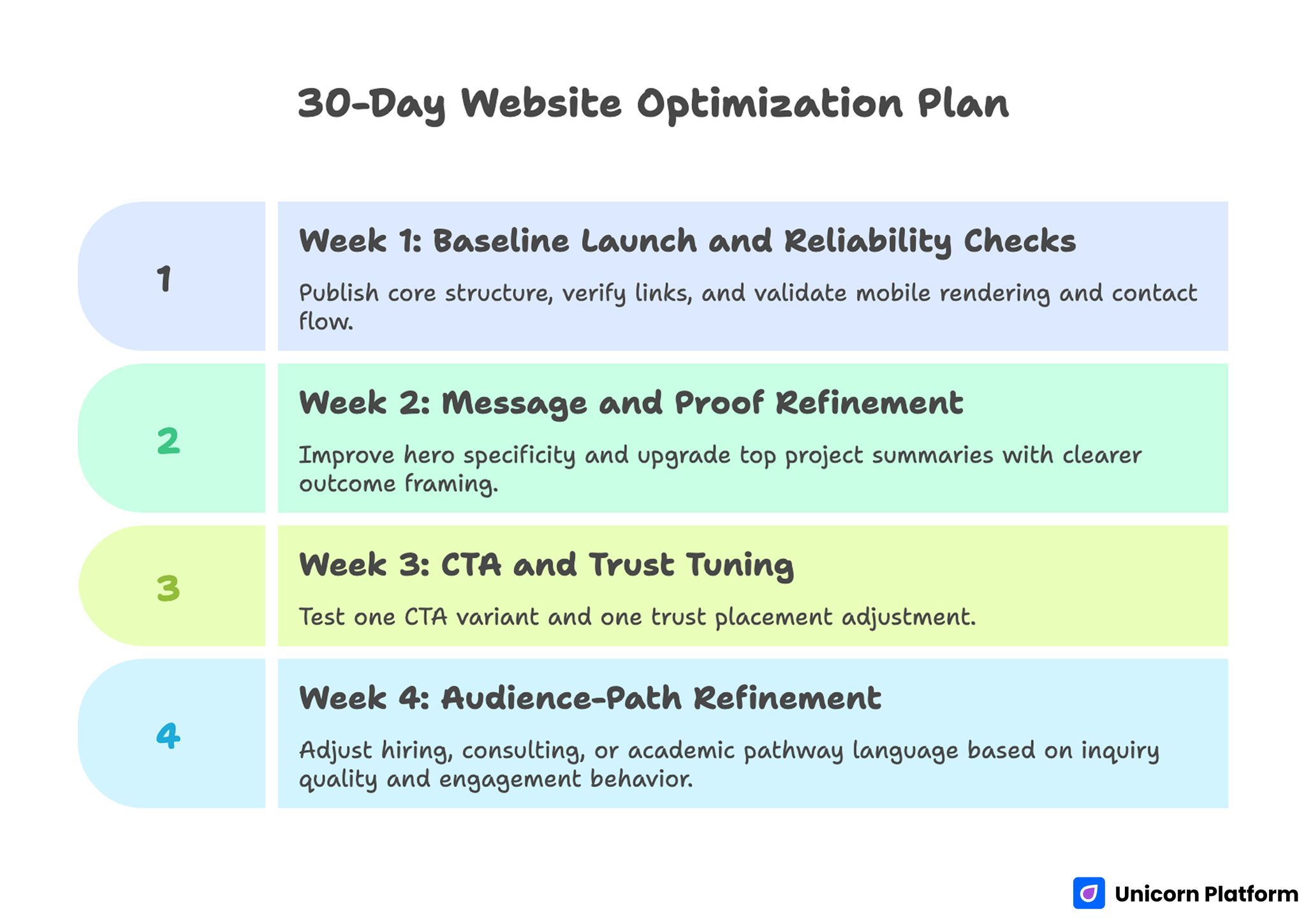
30-Day Optimization Plan for Improving a GitHub Personal Website
Week 1: Baseline launch and reliability checks
Publish core structure, verify links, and validate mobile rendering and contact flow. Baseline reliability avoids preventable first-impression failures.
Week 2: Message and proof refinement
Improve hero specificity and upgrade top project summaries with clearer outcome framing. Stronger framing usually improves visitor fit quickly.
Week 3: CTA and trust tuning
Test one CTA variant and one trust placement adjustment. Keep changes focused so results remain interpretable.
Week 4: Audience-path refinement
Adjust hiring, consulting, or academic pathway language based on inquiry quality and engagement behavior. Pathway wording should reflect the audience generating the best outcomes.
60-Day Growth Framework
Days 1-20: Stabilize clarity
Refine first-screen positioning and project ordering so high-value visitors find relevance quickly. Early relevance reduces bounce from qualified traffic.
Days 21-40: Expand authority support
Add one technical note or case write-up linked from relevant project cards to deepen credibility. This gives serious evaluators a clearer view of your decision process.
Days 41-60: Improve opportunity quality
Test qualification language in CTA and contact sections while reviewing inquiry fit rather than raw volume. Quality of conversation is a stronger signal than form count.
This progression supports steady improvement without overbuilding early. It keeps effort focused on high-impact changes.
Monthly Metrics That Matter
Track signals that reflect professional outcome quality, not only traffic volume. Better-fit opportunities are the core success metric for personal sites.
Recommended baseline metrics should be simple enough to maintain every month without heavy analytics overhead. Use the list below as a practical minimum:
- top entry pages by qualified visits
- project-card click-through behavior
- contact conversion by intent type
- inquiry quality by source
- returning visitor trend
Use these signals to prioritize one high-impact update each cycle. Focused changes produce better learning than broad redesign experiments.
Common Mistakes to Avoid
Mistake 1: Technical profile with no narrative context
Repository lists without outcome framing force visitors to guess your value. Add concise project narratives with decision and impact clarity.
Mistake 2: Vague hero messaging
Broad positioning attracts low-fit traffic. Rewrite first-screen content around domain, audience, and practical outcome.
Mistake 3: Equal-priority CTA overload
Too many competing actions reduce conversion clarity. Keep one dominant pathway and support it with clearly secondary options.
Mistake 4: Stale proof and outdated details
Old project status or outdated metrics weaken trust quickly. Run regular proof refreshes as part of your maintenance routine.
Mistake 5: No update documentation
Without a change log, teams repeat low-impact edits. Document intent and outcomes to improve iteration quality.
Mistake 6: Promotion before quality validation
Sending traffic to unclear pages wastes opportunity. Validate messaging, trust flow, and contact reliability before scaling outreach.
Mistake 7: One-size-fits-all audience path
Different visitors evaluate value differently. Adapt proof and CTA framing by intent while preserving core structure consistency.
FAQ: Building Your Personal Website on GitHub
Is GitHub Pages still a good option for personal websites in 2026?
Yes, especially for professionals who value ownership, version control, and straightforward publishing workflows.
How many projects should I feature on the main page?
Usually three to six curated projects are enough. Relevance and context matter more than volume.
Should I include technical detail for non-technical visitors?
Yes, but layer it. Provide quick summaries first, then deeper technical context for readers who need it.
Do I need a custom domain right away?
A custom domain helps professional perception, but you can start without it and add it once baseline messaging is stable.
What is the most important first-screen element?
A clear role-and-value statement tied to a specific audience problem is usually the most important first-screen element. It helps visitors decide whether to continue in seconds.
How often should I update a GitHub personal site?
A weekly light refresh and monthly strategic review is a practical baseline for most professionals. Consistency matters more than occasional major redesigns.
How can I improve inquiry quality from my site?
Use specific positioning, stronger proof context, and intent-based CTA and contact pathways.
Should hiring and consulting pathways be separate?
They can share one core page, but distinct messaging sections usually improve fit for both audiences.
What metrics should I prioritize first?
Project engagement behavior, contact conversion quality, and inquiry fit by source are strong starting signals.
Can no-code tools still work for technical personal websites?
Yes, when no-code speed is paired with clear structure, credible proof, and disciplined updates.
Final Takeaway
A GitHub personal website becomes powerful when technical credibility is paired with clear communication and intentional conversion flow. Strong setup is important, but ongoing clarity and proof quality are what create durable professional outcomes.
With Unicorn Platform, you can build that system quickly and improve it continuously. When each update is focused and documented, your site evolves from static profile to reliable opportunity engine.