Table of Contents
Publishing a site is easier than ever. Building one that is clear, trustworthy, and useful to real buyers is still difficult. Most weak sites are not technical failures. They fail because the team publishes pages without a decision path, without proof near friction points, and without a post-launch improvement cadence.
A practical build system solves this. It gives small teams a repeatable way to move from idea to publish without losing quality under time pressure. The core principle is simple: every section should help a visitor make one better decision, not just consume more content.
Unicorn Platform is strong for this operating model because editing and deployment are fast. Speed only creates value when it is paired with clear publishing standards and regular QA. If speed is not governed, it turns into content drift.
sbb-itb-bf47c9b
Quick Takeaways
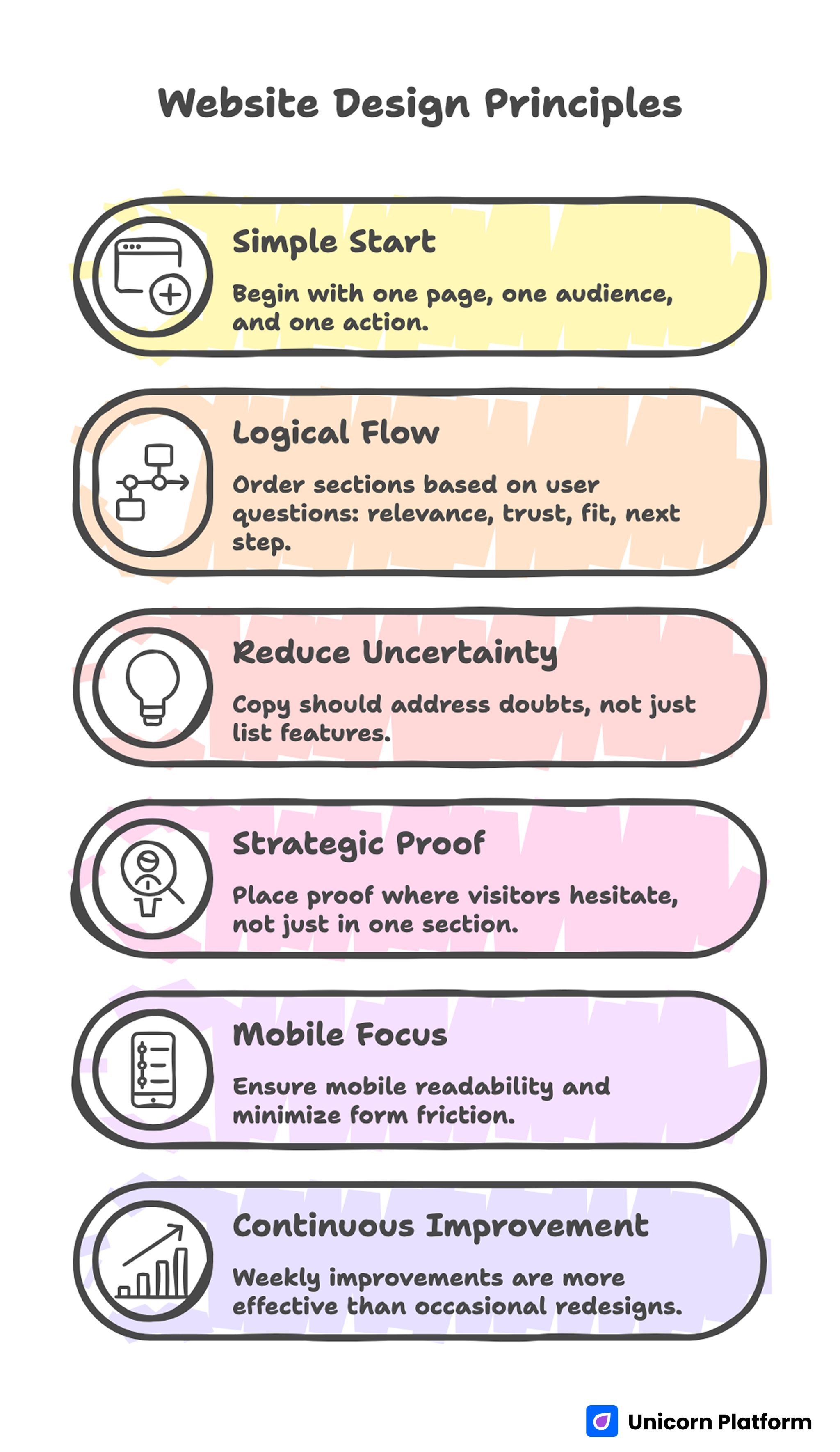
Web Design Principles
- A good site starts with one page job, one audience segment, and one primary action.
- Section order should follow user questions: relevance, trust, fit, and next step.
- Copy should reduce uncertainty, not just describe features.
- Proof should appear where visitors hesitate, not only in a testimonial section.
- Mobile readability and form friction should be release gates.
- Weekly improvements outperform occasional redesign projects.
Why "Simple" Sites Usually Underperform
Many teams hear “keep it simple” and interpret it as “keep it shallow.” They publish minimal pages with broad copy, generic visuals, and unclear actions. The page looks clean, but the visitor still does not understand what to do or why this offer is credible.
The opposite of complexity is not thin content. The opposite of complexity is clarity. Research from the Nielsen Norman Group shows that users scan pages quickly and rely on clear structure, headings, and visual hierarchy to understand value within seconds. Pages that lack clarity—even if visually simple—tend to underperform because users cannot confidently interpret what to do next. You can run a lightweight site while still giving users the exact information needed to evaluate fit, risk, and next steps.
Simple sites also fail when they mix too many goals on one page. A page trying to educate, qualify, sell, and recruit at the same time usually does none of those jobs well. Pick the primary job first, then design the path for that job.
The 5-Step Build System
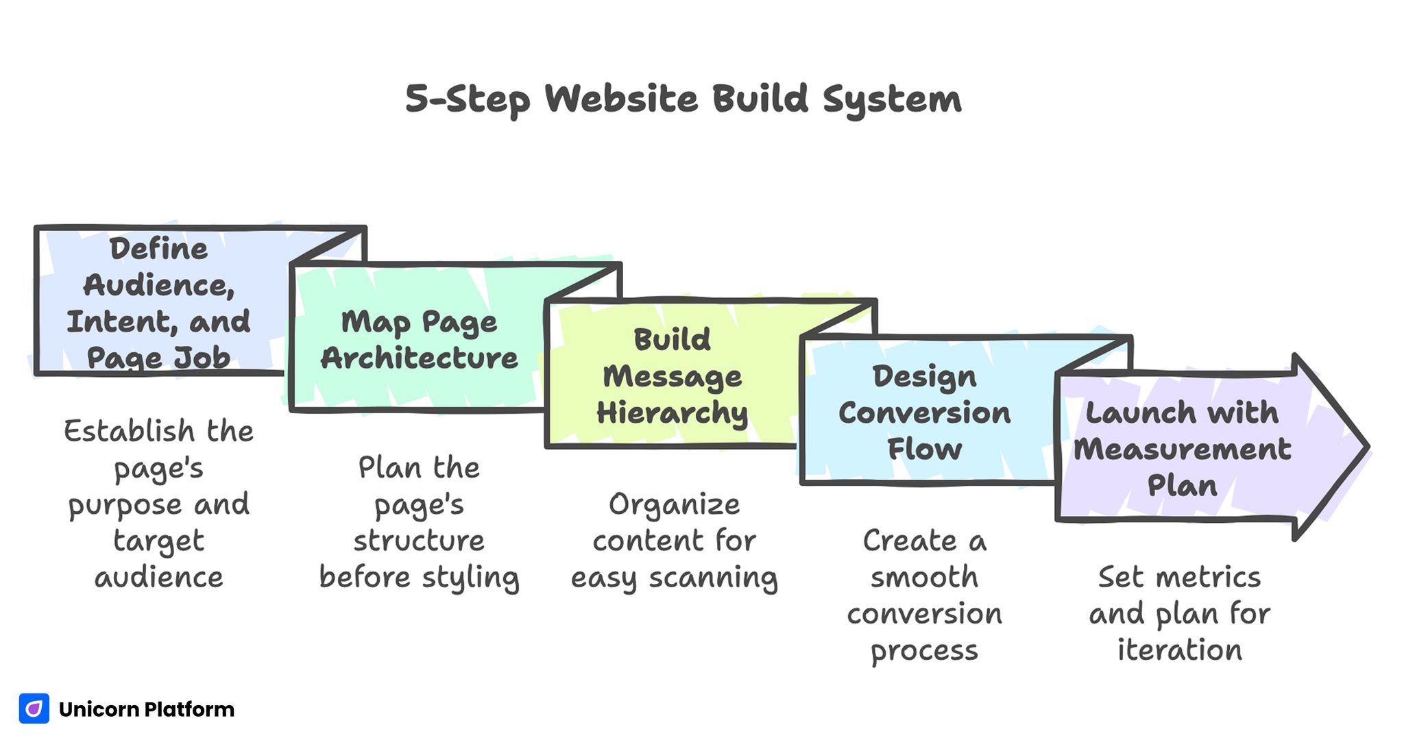
5-Step Website Build System
This framework keeps execution focused while giving enough depth to compete in demanding categories. It is deliberately simple so small teams can run it without heavy process overhead:
- Define audience, intent, and primary page job.
- Map page architecture before styling.
- Build message hierarchy and proof blocks.
- Design conversion flow and form logic.
- Launch with a measurement and iteration plan.
These steps are not a one-time checklist. They are a reusable cycle for each new page or revision sprint.
Step 1: Define Audience, Intent, and Page Job
Before any visual decision, write a one-sentence purpose statement for the page: who it serves, what outcome it offers, and what action should happen next. This sentence becomes the filter for every heading, block, and CTA.
For example, a local consultant page and a creator portfolio page may look similar visually, but the decision paths are different. One needs qualification and booking clarity. The other needs trust and project-fit framing. If you use the same section logic for both, one of them will underperform.
A useful planning method is intent-tier mapping. It prevents mixed messaging when one page attracts visitors at different readiness levels:
- Discovery intent: users are defining the problem and need orientation.
- Evaluation intent: users compare options and need proof.
- Decision intent: users need low-friction action and clear expectations.
When intent is mapped up front, copy and CTA wording become much easier to write because the page is no longer trying to speak to every possible visitor. It also makes post-launch analysis cleaner because each page has a narrower behavioral profile.
Step 2: Map Architecture Before Styling
Strong pages are built in wireframe logic before visual polish. Decide section order first, then apply style. Teams that skip this stage often rewrite the entire page after launch because the narrative flow is wrong.
For most service and product-introduction pages, a reliable structure is shown below. You can adapt it by segment, but the logic order should stay intact:
- Outcome-led first screen.
- Offer explanation in plain language.
- Proof for the main objection.
- How the process works.
- Fit criteria and boundaries.
- CTA with clear next-step expectation.
This sequence can be adjusted by intent stage, but it should never become random. Random section ordering increases cognitive load and weakens completion rates.
If your team is still choosing tooling and wants a frictionless publishing baseline, this guide on easy drag-and-drop site building for beginners is useful for setting up a practical production workflow. It helps reduce setup mistakes that usually appear in the first publishing sprint.
Step 3: Build Message Hierarchy and Proof Blocks
Visitors scan first and read second. Message hierarchy must make sense at a glance. Your H1 should define value and audience context, not brand vanity. H2s should represent decision checkpoints, not decorative themes.
Good hierarchy can be tested quickly. Read only headings and CTA lines out loud. If the decision path is unclear without body copy, the structure needs revision before design polish.
Proof must be specific enough to reduce risk. Generic testimonials like “great service” are weak because they do not resolve real objections. Better proof includes context, timeframe, and result direction. Even without exact numbers, clarity about before/after state is more persuasive than vague praise.
Use three proof formats across the page rather than one big proof block. This gives confidence cues to users at different decision stages:
- Early credibility cue near first-screen CTA.
- Mid-page objection-specific evidence.
- Late-stage reassurance near final action.
This distribution supports users at different commitment levels and improves both confidence and conversion quality. It also prevents the page from feeling like a late-stage sales pitch.
Step 4: Design Conversion Flow and Form Logic
A CTA is a promise, not a button label. If your button says “Get started” but the next step is a long, unclear form, trust drops immediately. Conversion flow quality depends on expectation matching from click to completion.
Choose one primary CTA per page job. Secondary actions can exist, but they should not compete for attention in the first decision zone. Too many early choices produce hesitation and fragmented behavior.
Form depth should match intent and offer complexity. For low-commitment actions, keep forms short and ask only what is required for the next step. For higher-ticket services, use staged intake: short form first, deeper qualification later.
For teams building client-facing service pages, this walkthrough on personal services websites in Unicorn Platform helps translate service packaging and booking logic into cleaner conversion paths. Use it as a reference when defining package clarity and intake expectations.
Step 5: Launch With a Measurement and Iteration Plan
Publishing without a measurement framework creates opinion-driven edits. Set baseline metrics before launch, then improve one major variable per cycle. If multiple high-impact changes are shipped at once, attribution becomes unreliable.
Track more than top-funnel conversion rate. Useful operational metrics include qualified inquiry rate, form completion rate, response lag, and step-two completion. These reveal whether the page is attracting the right demand, not just generating raw submissions.
A lightweight post-launch cadence works well for small teams. It keeps testing manageable while still producing measurable movement:
- Week 1: first-screen clarity and CTA expectation check.
- Week 2: proof placement and objection handling update.
- Week 3: mobile friction and form flow optimization.
- Week 4: source-specific message variant test.
This cadence keeps momentum high while reducing rework. It also creates a clear habit of evidence-based edits instead of reactive rewriting.
Personal Services Use Case: Structure That Filters Better Leads
Personal service sites often attract mixed-quality inquiries because they describe offerings broadly and hide fit criteria. A clearer page can improve lead quality without reducing total demand.
Start with a direct first-screen promise for the exact audience. Follow with short process clarity, service boundaries, and proof tied to common objections. Then present one high-intent action with clear response expectations.
When this structure is implemented correctly, users can self-qualify before contact. That lowers administrative overhead and improves conversion-to-client rates for lean teams.
Mobile-First Quality Gates
Mobile traffic is usually the first touchpoint, especially for local services and creator-led brands. If the first viewport is vague or the tap targets are cramped, the page loses momentum before trust is built.
Use release gates, not optional checks. If these checks stay optional, they are usually skipped during deadline pressure:
- First-screen message is understandable in under five seconds.
- Primary action is visible and thumb-friendly.
- Paragraph rhythm supports scanning on small screens.
- Form fields are limited and easy to complete on mobile keyboards.
- Proof modules remain readable without pinch zoom.
Teams that need stronger mobile conversion patterns can adapt ideas from this guide on responsive pages that win mobile visitors, especially for above-the-fold clarity and tap-flow design. The key is to test interaction comfort, not only layout appearance.
SEO and UX Should Run as One Workflow
Sites rank and convert better when search intent and page structure are aligned from the start. According to Google Search Central, aligning page content with search intent and structuring information around real user questions improves both visibility and engagement. Pages that clearly match intent are more likely to perform well in search while also guiding users toward meaningful actions. If SEO work happens independently from content architecture, pages may gain impressions while generating weak action quality.
A practical integrated workflow is listed below. The steps are short enough to run in weekly planning without adding heavy coordination cost:
- Map target intents by funnel stage.
- Convert each intent into user questions.
- Build section headings that answer those questions directly.
- Match CTA language to readiness level.
- Review search and conversion data together in the same cycle.
This approach improves discoverability without turning the page into keyword-heavy copy. It keeps writing reader-first while still respecting intent coverage.
Content System: What Pages You Actually Need
Many new sites launch with too many thin pages. A tighter page set performs better because each asset has clearer intent and stronger maintenance ownership.
For most small teams, a practical core includes the following pages. Start with this minimum set before expanding into supporting assets:
- Home or primary offer page.
- Service or product detail page.
- Proof page with focused outcomes.
- FAQ page for high-frequency objections.
- Contact or booking page with clear process expectations.
Add more pages only when there is a specific search or conversion reason. Page count is not a growth strategy by itself.
Common Failure Modes and Fixes
Failure 1: Broad headline, low relevance
Symptoms include high bounce from qualified traffic and weak engagement above the fold. The page sounds polished but does not define audience fit quickly.
Fix by rewriting the first-screen statement around a concrete user outcome. Keep one primary action and remove decorative claims that could apply to any brand.
Failure 2: Proof appears too late
Symptoms include decent scroll depth with low completion rate. Users are interested but remain unconvinced at the decision point.
Fix by moving one high-relevance proof unit near the first major objection. Make that proof specific to timeline, process, or result quality.
Failure 3: Form asks too much too early
Symptoms include CTA clicks with poor form completion. Users start the action but abandon due to friction or unclear value.
Fix with staged capture logic and clearer expectation copy around form fields. Explain what happens after submission in one direct sentence.
Failure 4: Desktop-first design breaks mobile flow
Symptoms include strong desktop metrics and weak mobile conversion quality. Sections read well on large screens but overload small-screen readers.
Fix by shortening paragraph density in decision sections, widening tap targets, and testing on real devices before each release. This usually improves both completion rate and session quality for mobile visitors.
Failure 5: No decision rhythm after launch
Symptoms include repeated ad-hoc edits with no measurable impact. Team effort rises while outcome quality stays flat.
Fix with a weekly review cycle, single-priority experiments, and documented change notes so each sprint compounds previous learning. Small improvements become meaningful when they are consistently captured and reused.
30-Day Execution Plan
Days 1-5: Planning and architecture
Define page jobs, audience segments, and primary actions for the top-priority pages. Draft section maps before visual edits and confirm message hierarchy against user questions.
Days 6-12: Baseline build
Publish the first structured version with clear headings, distributed proof, and one primary CTA per page. Validate form clarity and post-submit messaging.
Days 13-18: Mobile and friction audit
Run real-device testing on top entry pages, then fix spacing, readability, and interaction friction. Recheck key paths for first-time visitors.
Days 19-24: Intent-based variant
Create one variant for a high-value source such as paid traffic or referrals. Keep core architecture stable while adapting opening framing and evidence emphasis.
Days 25-30: Review and next-sprint decisions
Compare baseline versus current performance across conversion quality metrics. Keep what improved clarity, remove what added noise, and set the next four-week backlog.
Editorial QA Checklist Before Every Publish
Use this checklist to protect quality while moving fast. The goal is not bureaucracy; it is stable output quality under tight timelines:
- Page job is explicit and singular.
- First screen defines value and audience fit quickly.
- Section order follows user decision flow.
- Proof appears near friction points.
- CTA language matches next-step expectations.
- Mobile readability and form flow are verified on real devices.
- Tracking setup supports qualification analysis, not just clicks.
This process keeps speed aligned with outcomes. It also reduces cleanup work after launch by catching clarity issues before publish.
FAQ: Website Creation in 2026
How many pages should a new website launch with?
Launch with the smallest set that covers your core decisions and objections. A focused five-page system usually performs better than a larger set of thin pages that are hard to maintain.
Should I prioritize design or copy first?
Prioritize structure and messaging first, then apply visual design. Style is most effective when it supports a clear decision path rather than compensating for weak logic.
What is the best CTA for service businesses?
The best CTA sets a clear expectation for the next step, such as a consultation request or scope review. Generic labels work worse than direct, context-specific actions.
How long should my homepage be?
Length should match decision complexity, not arbitrary word targets. If users need more evidence to feel safe, add depth with clear section jobs instead of filler.
Where should testimonials be placed?
Place at least one credibility cue near the first action zone and another near final commitment areas. Proof should appear exactly where hesitation tends to occur.
Can no-code sites compete in serious markets?
Yes, if messaging, proof, and conversion design are executed with discipline. Tool choice matters less than process quality and iteration consistency.
How often should we update website content?
Run monthly quality checks for freshness and quarterly strategic updates for positioning and structure. High-performing pages are maintained assets, not one-time projects.
What should we track besides conversion rate?
Track qualified lead rate, form completion quality, response time, and downstream progression. These metrics reveal whether the page is attracting the right demand.
Is SEO still important for small service websites?
Yes, because intent-matched pages compound visibility and reduce dependency on paid channels. SEO is strongest when integrated with clear UX and conversion architecture.
What is the fastest way to improve a weak page?
Start with first-screen clarity, proof placement, and form friction. Those three changes usually produce the highest early impact with manageable implementation effort.
Final Takeaway
A high-performing site is not the product of one launch. It is the output of a repeatable system that combines clear structure, practical messaging, distributed proof, and disciplined iteration.
Teams using Unicorn Platform can move quickly without sacrificing quality when they define page jobs early, publish with strict QA gates, and improve in short measurement-driven cycles. That operating model scales better than redesign-heavy workflows and produces stronger conversion outcomes over time.