Table of Contents
- The Core Structure of a High-Performing No-Code Page
- A 10-Step Build Workflow for Reliable Launches
- 30-Day Execution Plan
- Common Failure Patterns and Practical Fixes
- FAQ
No-code website creation is now mature enough that speed is easy to achieve. The harder part is creating pages that look intentional, communicate value clearly, and convert the right visitors.
Many teams still treat no-code as a way to publish faster, then wonder why results stay average. Fast publishing alone does not create trust, clarity, or strong business outcomes.
A better model is to run no-code work as an operating system. You define structure before style, tie design choices to decision flow, and run launch reviews as hard gates rather than optional checks.
With Unicorn Platform, this approach lets teams move quickly without losing editorial quality or conversion discipline. The goal is not only to launch faster, but to improve outcomes with each release.
sbb-itb-bf47c9b
Quick Takeaways
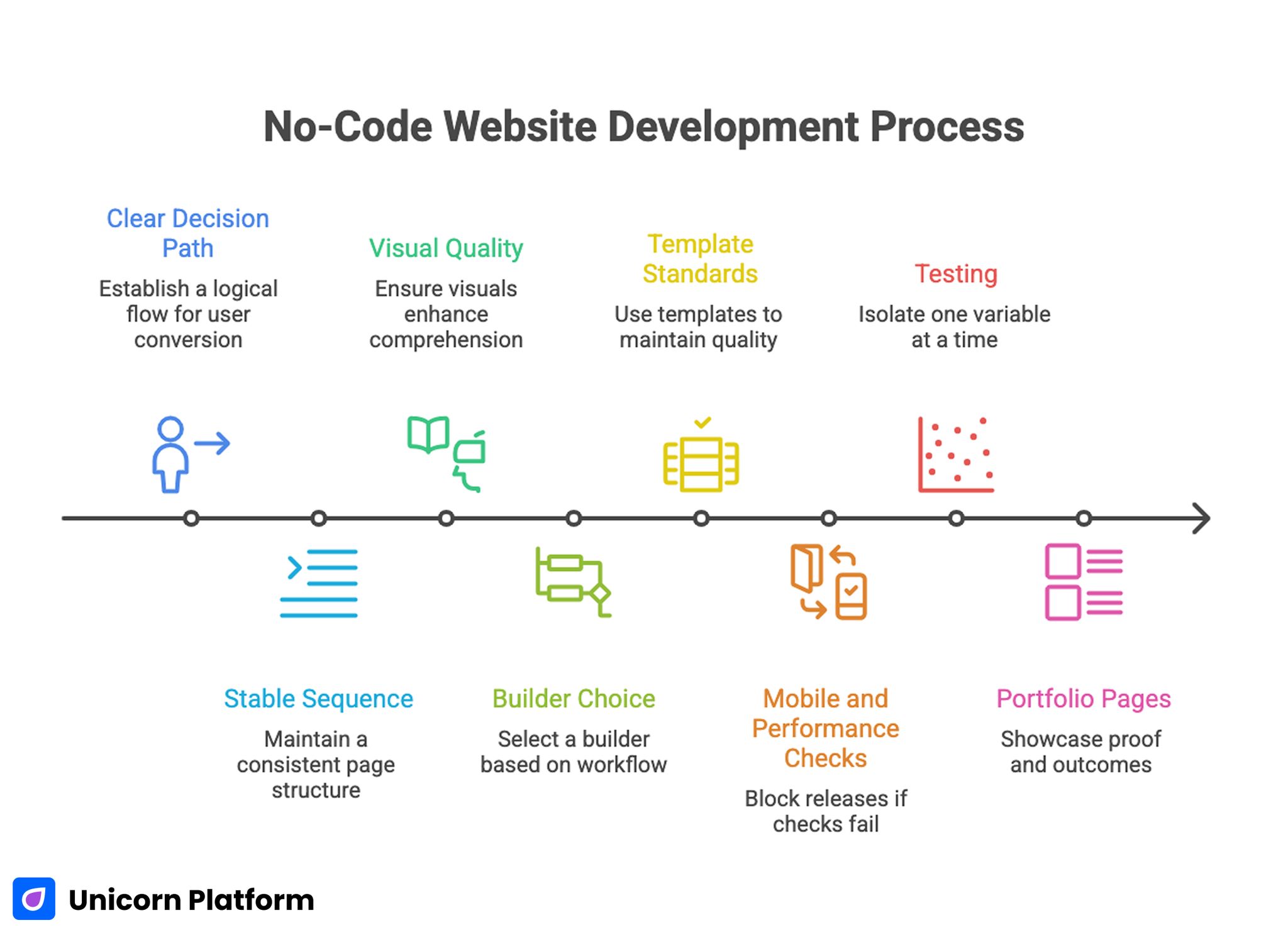
No-Code Website Development Process
- A great-looking site still needs a clear decision path to convert.
- High-performing pages follow one stable sequence from relevance to action.
- Visual quality should support comprehension, not decoration.
- Builder choice should be based on workflow fit, not feature lists.
- Templates should encode standards so quality does not drift.
- Mobile and performance checks should block releases when they fail.
- Testing should isolate one major variable at a time.
- Portfolio-style pages need proof and outcomes, not only visuals.
Why "Beautiful" No-Code Sites Often Underperform
Design quality is often interpreted as color, animation, and layout polish. Those details matter, but they are not enough. Users decide based on clarity, confidence, and effort required to take the next step.
A page can look modern and still perform poorly when visitors cannot quickly identify who it is for, what it offers, and why they should trust it. This is the most common reason well-designed no-code projects plateau.
The second issue is structural inconsistency. Teams publish quickly, but section logic changes every time a new person edits the page. Over time, this creates mixed messaging and lower conversion reliability.
The third issue is weak post-launch discipline. Teams iterate frequently, but without a clear hypothesis and metric model. Activity rises, learning quality falls, and performance improvements become hard to repeat.
Start With Outcome and Audience Before Layout
No-code workflows are most effective when page purpose is settled before components are selected. Define one primary outcome first, then build a structure that supports that outcome.
Outcome-first planning reduces random editing. It also prevents the common pattern where teams add elements because they are available in the builder, not because users need them to decide.
Audience definition should be specific enough to shape copy and proof decisions. Generic "for everyone" positioning always weakens conversion because it forces users to do interpretation work.
When teams are setting this baseline, the practical framework in create your web presence with simple drag-and-drop can help translate broad goals into a real first release. It is especially useful when a team needs to move quickly from concept to a publishable draft.
The Core Structure of a High-Performing No-Code Page
A reliable structure keeps editing decisions consistent across contributors. The sequence below works for most commercial pages, including landing pages, service pages, and portfolio-led lead generation pages.
1. Relevance
State who the page is for and what outcome is offered. Keep wording concrete so users can self-qualify quickly.
2. Mechanism
Explain how the offer works in practical terms. Avoid feature dumps and focus on the path from user intent to result.
3. Confidence
Support key claims with nearby proof. Specific examples, outcomes, and process transparency usually outperform broad testimonials.
4. Action
Present one dominant next step and one secondary low-friction option. Action copy should clearly describe what happens after the click.
This structure allows design experimentation while preserving decision flow. If your team needs deeper guidance on section sequencing, a step-by-step guide to a high-converting landing page structure is a useful reference.
Builder Selection Scorecard for Non-Technical Teams
A no-code platform should be selected for operating fit, not demo appeal. The fastest way to compare options is a weighted scorecard built around real team workflows.
Use six criteria:
- Narrative control: Can your team preserve page logic during edits?
- Reusability: Can sections and templates scale without copy-paste chaos?
- Governance: Can you assign ownership and approval clearly?
- Integration fit: Does the stack support your real routing and follow-up needs?
- Analytics clarity: Can you track progression through trust and action points?
- Performance reliability: Can pages stay fast after real content is added?
Run a practical pilot by building one identical page across shortlisted tools. Keep the same offer, page structure, CTA, and proof style. Evaluate after real traffic, not just sandbox previews.
This evidence-driven process reduces internal opinion loops and improves long-term platform decisions. It also creates a clearer basis for future optimization conversations.
Designing for "Stunning" Without Sacrificing Clarity
Teams often equate standout design with visual novelty. In practice, memorable pages come from coherence. Typography, spacing, color, and motion should reinforce meaning, not compete with it.
Start with a compact design system for each page family. Define heading scale, body spacing, component rhythm, and button hierarchy before building variants. This prevents visual drift and reduces editorial friction.
Contrast and readability should be treated as conversion variables. If scanning is difficult, users will miss key claims and move to alternatives even if the design appears polished.
Use motion sparingly and purposefully. Entrance animation can guide attention, but continuous visual movement near key decisions often reduces comprehension.
Teams building style-forward pages can use ideas from build beautiful websites without coding to align aesthetics with usability. The key is to apply those design ideas in service of comprehension and action.
Portfolio and Personal Brand Pages: What Actually Converts
Portfolio-driven pages are a common no-code use case, and they often look impressive while underperforming commercially. The missing layer is usually decision-oriented content.
A strong portfolio page should answer five practical questions quickly:
- Who do you help?
- What outcomes do you deliver?
- What evidence supports those outcomes?
- What does collaboration look like?
- What is the easiest next step?
Work samples should be contextualized. Instead of listing projects only by visual output, explain problem context, constraints, implementation approach, and measurable impact where possible.
Add a clear transition from credibility to action. Many portfolio pages stop after case examples and force users to hunt for the next step, which reduces intent capture.
For personal-brand pages, the headline should combine specialization with business relevance. Generic claims like "creative professional" or "full-service expert" reduce trust because they do not signal fit.
A 10-Step Build Workflow for Reliable Launches
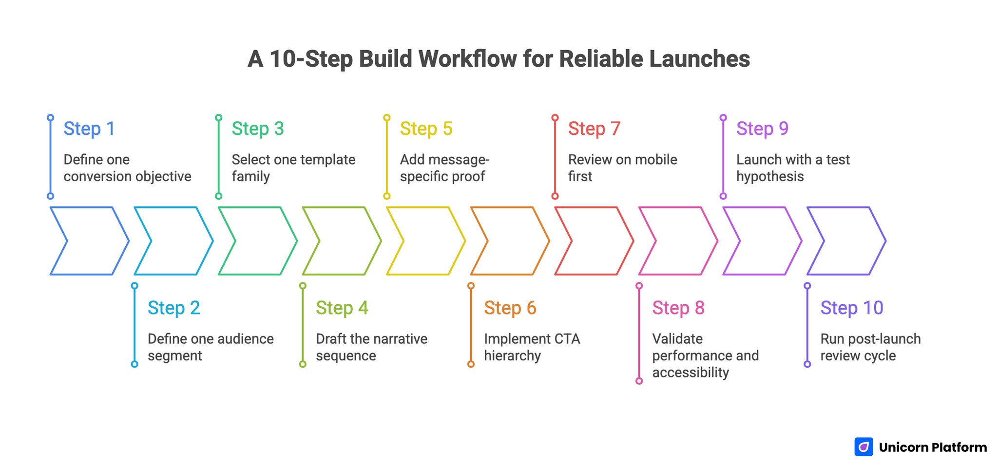
A 10-Step Build Workflow for Reliable Launches
The following workflow is designed for teams that need speed and quality at the same time. Each step reduces a specific type of launch risk.
Step 1: Define one conversion objective
Choose one primary page objective: consultation request, demo booking, signup, purchase, or waitlist. A single objective keeps message hierarchy clean.
Step 2: Define one audience segment
Document role, use case, urgency, and context. Use this to guide copy and proof selection.
Step 3: Select one template family
Use a stable layout baseline to reduce structural variance across contributors. This protects clarity as the team scales.
Step 4: Draft the narrative sequence
Map relevance, mechanism, confidence, and action before editing visual details. Structure first usually reduces rework later.
Step 5: Add message-specific proof
Place evidence near claims. Match proof type to uncertainty type.
Step 6: Implement CTA hierarchy
Use one dominant CTA and one secondary option. Clarify expected effort and outcome.
Step 7: Review on mobile first
Validate readability, interaction comfort, and form behavior on common device widths. Mobile quality should be treated as a release requirement.
Step 8: Validate performance and accessibility
Check media weight, contrast, heading structure, and keyboard accessibility. These checks protect both usability and conversion.
Step 9: Launch with a test hypothesis
Define one major variable you expect to influence outcomes and one metric that will evaluate it. This keeps test interpretation clean.
Step 10: Run post-launch review cycle
Document what changed, what happened, and what to test next. Written review notes compound into a useful internal playbook.
This workflow works because each step supports interpretation quality, not just release speed. Reliable learning is the main advantage.
Trust Design: From Generic Social Proof to Decision Support
Trust fails when it is disconnected from user doubts. Users evaluate credibility where uncertainty appears, not only at the end of a page.
Map claims to proof intentionally:
- Implementation claims need process evidence.
- Outcome claims need context-rich results.
- Risk-related claims need policy clarity and expectation setting.
Quote selection matters as much as quote volume. One specific testimonial tied to relevant context often outperforms ten generic lines.
Trust content also needs freshness governance. Outdated screenshots, old process references, and stale proof assets erode confidence faster than teams expect.
CTA and Form Strategy for Better Lead Quality
No-code builders make form creation easy, which often leads to oversimplified capture flows. This can increase raw submissions while lowering qualified outcomes.
Research from Baymard Institute shows that poorly structured forms and unnecessary fields are a leading cause of abandonment, while clear purpose and reduced friction significantly improve completion rates.
Use staged friction based on business model. Ask for minimal information at first action, but collect enough routing context to support quality follow-up.
Every form field should have a documented reason:
- Does this field improve routing?
- Does this field improve qualification?
- Does this field improve response relevance?
If a field does not change downstream action, remove it. Lean forms are easier to complete and easier to optimize.
Action text should reflect real next steps. Explicit labels improve confidence and reduce mismatch between user intent and team response.
Mobile and Performance Release Gates
Desktop-first review misses a large share of real-world friction. Mobile users encounter compressed layouts where clarity and proof sequencing can break.
A practical mobile release gate includes:
- first-screen value clarity
- visible trust cue before deep scroll
- tap target comfort for primary actions
- keyboard-safe form interaction
- stable performance under standard network conditions
Performance checks should focus on decision moments, not only aggregate load metrics. Delays near forms and CTAs often cause outsized conversion loss.
If your team is refining mobile-first conversion behavior, creating a high-converting mobile app landing page offers useful implementation patterns. Adapt those patterns to your own audience and offer context.
Measurement System That Supports Real Optimization
High-performing teams use layered measurement rather than single-metric reporting. This helps prevent local improvements from hiding broader quality problems.
According to HubSpot, teams that align engagement metrics with downstream revenue outcomes achieve more consistent growth than those optimizing only for top-of-funnel conversions.
A practical hierarchy:
- Clarity metrics: engagement with first-screen and mechanism sections.
- Interaction metrics: trust block engagement and CTA progression.
- Conversion metrics: qualified submissions or bookings.
- Business metrics: progression to revenue, retention, or successful onboarding.
Each release should include one primary metric and one guardrail metric. Guardrails protect against false wins such as higher submissions with lower fit.
Data review cadence should match release cadence. Weekly reviews keep momentum high, while monthly pattern reviews support strategic adjustments.
30-Day Execution Plan
Week 1: Baseline and structure lock
Audit top pages for sequence quality, trust relevance, and CTA clarity. Lock one control template for the priority page family.
Week 2: Trust and action refinement
Improve proof placement, rewrite low-clarity blocks, and tighten CTA labels. Validate mobile release gates before publishing updates.
Week 3: Controlled testing
Run one major variable test per page family. Measure both conversion and lead quality to avoid shallow optimization.
Week 4: Standardization and rollout
Archive weak patterns, document winners, and update template guidance. Apply validated patterns to adjacent pages.
This first month should improve both output quality and interpretation confidence. It should also reduce editing noise across the team.
90-Day Operating Model
Month 1: Stabilize
Create consistency in structure, proof standards, and release checks. Teams that stabilize these fundamentals usually improve faster afterward.
Month 2: Optimize
Run focused tests on first-screen message, mechanism clarity, and CTA intent alignment. Keep one major variable per test cycle.
Month 3: Scale
Expand validated modules, retire low-performing components, and formalize ownership across contributors. This is where scale becomes sustainable.
At 90 days, success should look like predictable qualified outcomes, not only higher publishing volume. Consistency is a better signal than isolated spikes.
Common Failure Patterns and Practical Fixes
Failure: visually strong page, weak conversion
Cause is usually decision ambiguity. Users appreciate design but do not understand fit, mechanism, or next step.
Fix by clarifying first-screen value, tightening mechanism copy, and moving proof closer to major claims. These changes usually improve both engagement and action rate.
Failure: frequent releases, unclear learnings
Cause is overlapping changes with no clear hypothesis. When too many elements move together, attribution becomes unreliable.
Fix by isolating one major variable per cycle and logging expected versus observed outcomes. This improves learning velocity.
Failure: high submission volume, low qualification
Cause is broad message framing and weak CTA expectations. Users click without understanding what happens next.
Fix by narrowing audience language and adding one routing-critical field in the form. Better qualification raises downstream efficiency.
Failure: desktop success, mobile drop-off
Cause is compressed hierarchy and interaction friction on smaller screens. Desktop assumptions do not always survive responsive behavior.
Fix by enforcing mobile pass/fail checks before launch and simplifying first-screen layout. Keep key information visible without deep scrolling.
Failure: quality drift as team grows
Cause is missing governance and unclear approval ownership. Teams then make contradictory edits without a clear decision framework.
Fix by assigning structure, trust, analytics, and release owners with explicit decision rights. Clear ownership is the fastest path to consistency.
FAQ: How to Build a Standout No-Code Website
Can a non-technical team build a high-performing website?
Yes. The key requirement is operational discipline, not coding experience. Teams that apply clear structure and quality gates can perform at a high level.
How long should a no-code page take to launch?
Initial versions can launch quickly, but strong pages still need planning, review, and measurement setup. Speed should not bypass clarity and trust checks.
What should we optimize first on an underperforming page?
Start with first-screen relevance and CTA clarity. These usually create larger early gains than visual refinements.
How many templates should we maintain?
Keep only the number needed for distinct intent categories. Too many templates increase governance overhead and reduce learning transfer.
Are long pages always better for SEO and AI discovery?
Not always. Depth helps when it improves decision support and intent coverage. Long content without structure usually reduces performance.
How often should trust assets be refreshed?
Monthly is a practical baseline. Update sooner when offers, pricing, positioning, or proof context changes.
Should every traffic source have a unique page variant?
Not automatically. Create variants where intent differences are meaningful enough to justify message changes.
What is the best way to avoid keyword-stuffed writing?
Write for user questions first, then review language for natural phrasing. If a phrase sounds unnatural in conversation, rewrite it.
Do we need advanced tools to run this process?
No. You need reliable tracking, clear ownership, and disciplined review habits. Tool complexity is secondary to process quality.
How do we scale without losing page quality?
Use template governance, documented standards, and explicit release roles. Scale should come from repeatable systems, not ad hoc edits.
Final Takeaway
No-code website creation becomes a competitive advantage when teams combine speed with structure. Strong design, clear decision flow, contextual proof, and strict release gates work together to create reliable outcomes.
With Unicorn Platform, teams can build standout pages quickly and still keep quality stable as output grows. That combination is what turns no-code publishing into long-term performance.