Table of Contents
- The Core Architecture for Startup Conversion Pages
- 30-Day Startup Landing Execution Plan
- 12-Week Operating Calendar for Startup Landing Programs
- Common Mistakes and Fast Fixes
- FAQ
Most startup teams do not lose momentum because they lack ideas. They lose momentum because website execution becomes noisy, slow, and hard to improve. Pages are launched quickly, but the message is broad, proof is weak, and the next action is unclear.
When that happens, traffic can look healthy while pipeline quality stays low. Teams respond by rewriting everything, adding more sections, or changing design direction every week, which creates even more instability.
High-performing startup pages are usually built with a simpler rule: keep structure stable, improve decision clarity, and test one major variable at a time. This approach gives teams faster learning cycles and cleaner conversion gains.
This guide explains how to build that system in 2026. It focuses on practical execution for lean teams that need speed, consistency, and measurable outcomes.
sbb-itb-bf47c9b
Quick Strategic Takeaways
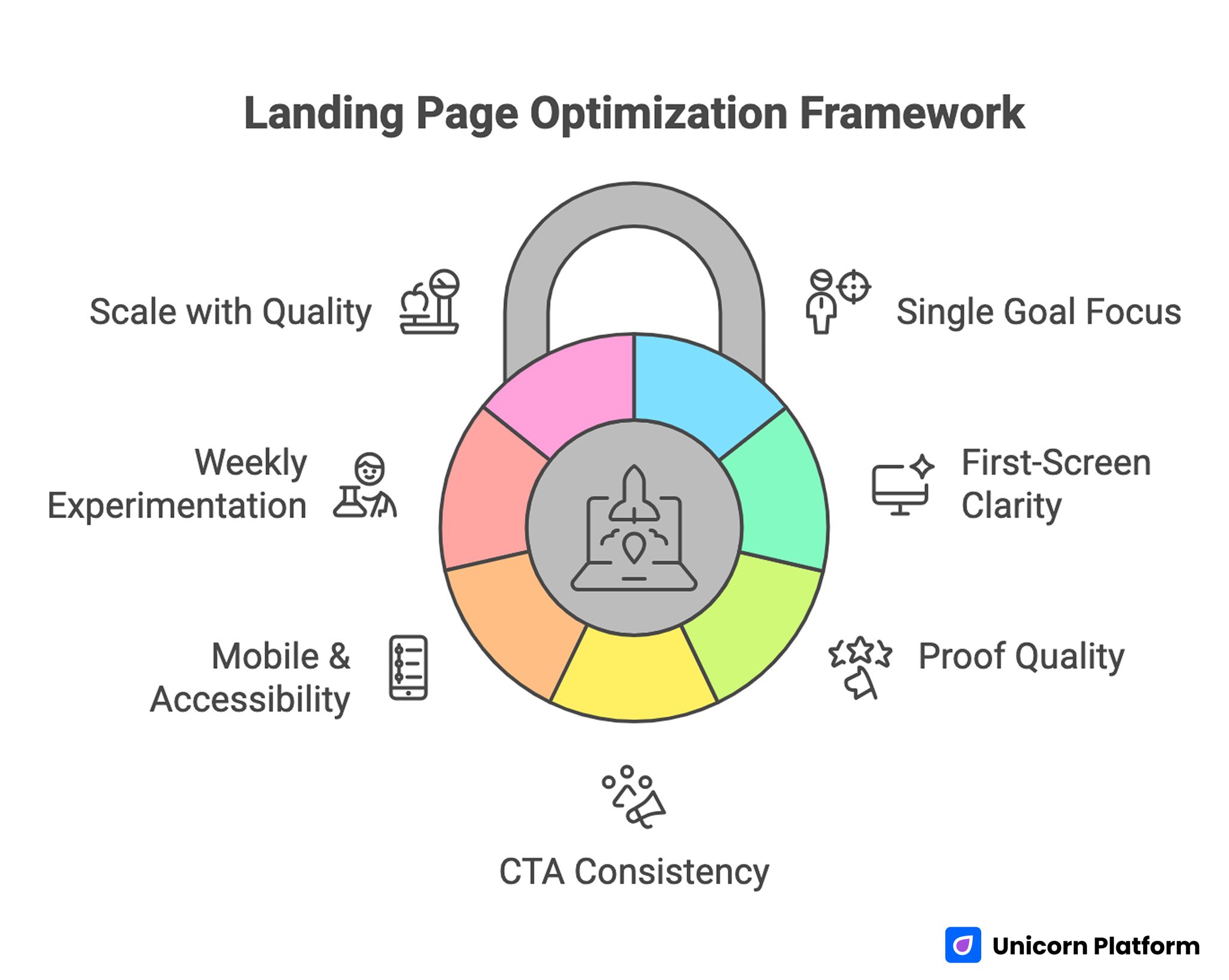
Landing Page Optimization Framework
- A landing page should drive one primary decision, not five competing goals.
- Strong first-screen clarity usually improves conversion faster than visual redesign.
- Proof quality and placement matter more than proof volume.
- CTA language should match buyer stage and stay consistent across placements.
- Mobile and accessibility checks are performance requirements, not optional polish.
- One major experiment per week creates better learning than frequent random edits.
- Scale should follow lead-quality stability, not only click growth.
Why Startup Landing Pages Underperform
Startup pages often underperform for operational reasons, not creative reasons. Teams move quickly but skip structure decisions, so each section is written in isolation and the final page feels fragmented.
A common pattern is mixing audience stages on one page. Cold users need context and trust before action, while warm users need faster paths and less explanation. When both are served with equal priority, neither converts efficiently.
Another pattern is message inflation. Founders add product vision, feature depth, pricing hints, partner logos, and multiple CTAs above the fold. Visitors then spend their first seconds decoding the page instead of deciding whether to continue.
The fix is not to make pages shorter by default. The fix is to sequence information by decision stage so users know what to do at each step.
Define the Page Job Before You Touch Design
Before writing copy or choosing sections, define the exact job of the page. If the job is unclear, every edit becomes subjective and experiments become hard to interpret.
Practical page jobs for startup funnels include demo request, trial start, waitlist join, partner inquiry, and qualification form completion. Each page should optimize one primary job and optionally one secondary low-friction action.
Then define audience stage for the primary traffic source. A page for paid cold traffic should explain value and reduce risk quickly. A page for warm referrals can compress explanation and emphasize action.
This step sounds simple, but it prevents the most expensive mistake in startup page work: optimizing for conflicting outcomes in the same layout. It also protects teams from rewriting core sections after campaigns are already live.
The Core Architecture for Startup Conversion Pages
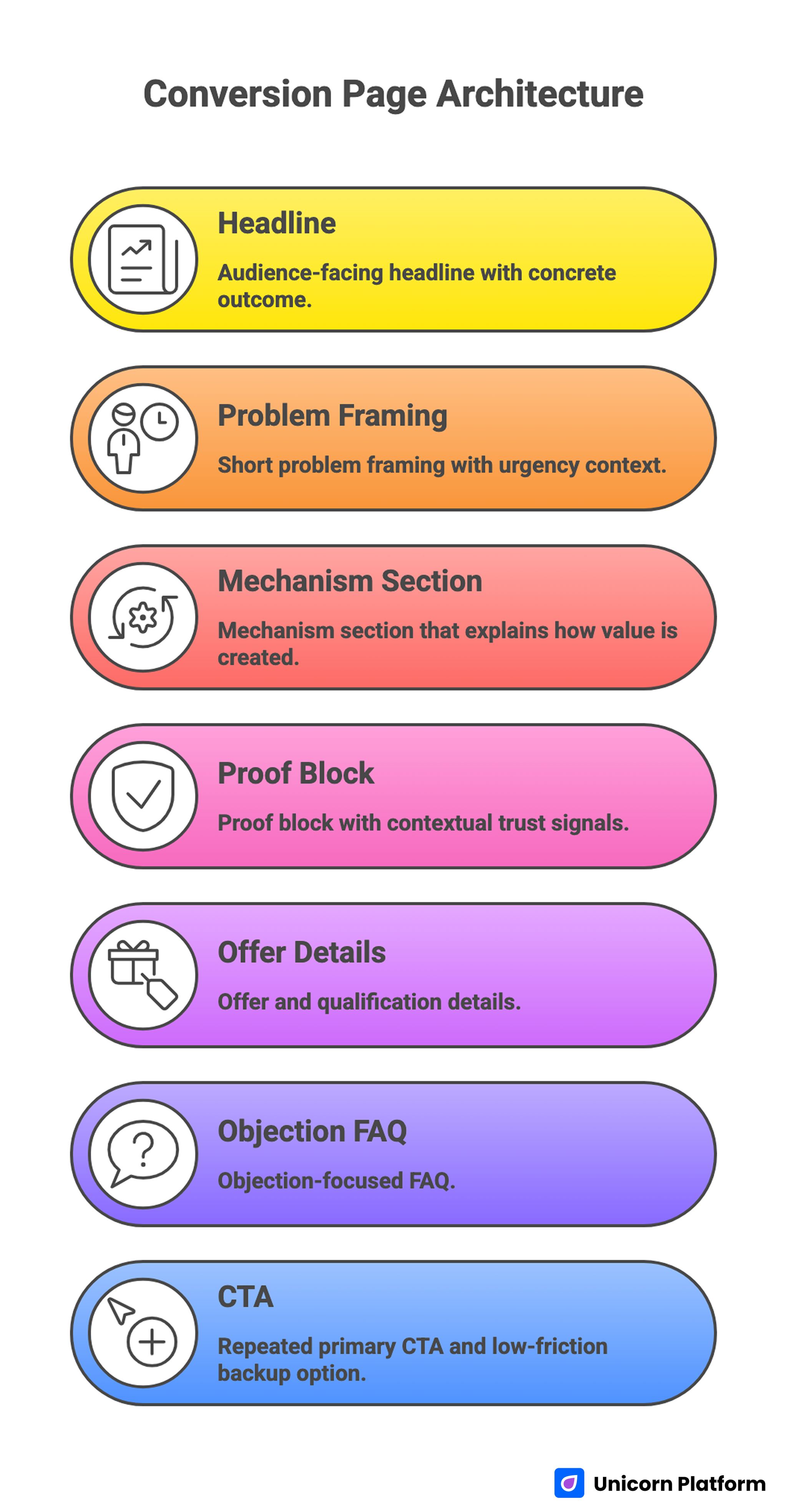
Conversion Page Architecture
A stable architecture gives teams a reusable baseline for testing. Without a stable baseline, every experiment changes too many variables.
Use this conversion-first sequence as a default architecture. Keep the order stable long enough to generate clean baseline data.
- audience-facing headline with concrete outcome
- short problem framing with urgency context
- mechanism section that explains how value is created
- proof block with contextual trust signals
- offer and qualification details
- objection-focused FAQ
- repeated primary CTA and low-friction backup option
This structure works because it mirrors how buyers reduce uncertainty. It also makes analytics interpretation easier because each section has a clear decision role.
For teams that need a quick baseline before deeper customization, this guide on startup landing page templates is a useful reference.
First-Screen Clarity Is the Highest-Impact Lever
Most startup landing pages leak conversion in the first view. The visitor sees claims, animations, and feature words but still cannot answer three key questions: who is this for, what changes for me, and what should I do next.
A high-performing first screen usually includes a precise audience cue, one concrete outcome, and one dominant CTA. If the page targets multiple personas, route each persona with clearly separated pathways instead of mixing all narratives into one headline.
Avoid abstract superlatives. Words like "best," "smart," and "all-in-one" rarely improve trust without supporting context. Use specific language that reflects real workflow change.
When first-screen clarity improves, downstream sections perform better because users arrive with stronger intent and less confusion. This is why headline and CTA work usually deliver faster wins than deep visual redesigns.
Messaging Standards That Improve Lead Quality
Good startup copy is not about sounding polished. It is about reducing interpretation work and aligning expectations before form submission.
Use three message standards consistently across every important page. Consistency makes your reviews faster and your test results easier to interpret.
- every major claim includes mechanism, not only promise
- every CTA describes the next step clearly
- every critical claim has nearby proof
A useful rewrite pattern is turning abstract growth language into concrete workflow outcomes. Instead of "grow faster," describe what gets faster, how much operational friction is removed, and what action users should take now.
This shift usually increases qualified leads because unfit traffic self-filters earlier. Better filtering at the page level reduces operational cost in sales and support workflows.
Offer Clarity and Qualification Without Overloading the Page
Startup teams often hide all pricing or qualification context because they fear losing conversions. In practice, complete opacity usually attracts lower-intent submissions and increases sales friction.
You do not need full price tables for every funnel. You do need enough context for realistic self-qualification. Useful signals include starting range, what first plan includes, setup effort expectations, and response-time windows.
Qualification clarity should feel helpful, not defensive. The goal is to reduce uncertainty and align expectations before users commit.
Teams that add clear qualification cues usually see fewer but higher-quality leads, which often improves downstream conversion economics. This tradeoff is usually positive because team time is spent on better opportunities.
Proof Architecture That Supports Real Decisions
Proof is often treated like decoration, but for startup pages it is one of the strongest conversion levers. The key is relevance and placement, not quantity. Industry research shows that trust signals such as testimonials, reviews, and real customer results are among the most effective elements for improving landing page conversion rates.
Use layered proof by decision stage. Early proof should establish baseline credibility quickly. Mid-page proof should connect outcomes to mechanisms. Late-stage proof should reduce implementation risk.
Practical proof elements include contextual testimonials, short case snapshots, before-and-after workflow examples, and transparent constraints. Constraints are important because realistic proof can build trust faster than exaggerated claims.
Place your strongest proof before or near the first major action request. If proof appears only near the bottom, high-intent users may never reach it.
When teams need stronger prelaunch signal quality and promoter behavior, this first-promoter growth framework is useful for aligning trust signals with early acquisition channels.
CTA Design and Placement Strategy
A startup page can have multiple CTA placements but should keep one primary action type. Competing primary actions create hesitation and lower completion rates.
According to Mailchimp’s landing page best practices, clear and visible calls-to-action significantly improve user understanding of the next step and increase the likelihood of conversion
Choose CTA language based on buyer stage. Cold traffic often responds to guided actions, while warm traffic can handle direct commitment language.
Keep wording consistent across placements. If one section says "See How It Works" and another says "Start Now" for the same path, users may interpret this as different commitments.
Secondary actions can be valuable when they protect momentum for hesitant users. Keep them visibly secondary and ensure they support, rather than replace, the primary conversion path.
Form Strategy for Lean Startup Teams
First-touch forms should optimize for high-quality intent capture, not maximum data collection. Long forms at first contact often reduce completion without improving qualification quality.
A practical first-step form includes only routing essentials. Deeper qualification can be collected after confirmation through follow-up flows or onboarding questions.
This two-step model keeps friction low while preserving sales and support quality. It also makes A/B testing clearer because each form field has a defined job.
Review form fields quarterly and remove anything that does not influence routing or qualification decisions. Small field changes often create meaningful gains in completion quality.
Mobile Performance and Accessibility as Growth Inputs
Early-stage startup traffic is often mobile-heavy due to social, community, and founder-led channels. If mobile readability, speed, or form interaction is weak, traffic efficiency declines quickly.
Accessibility quality is equally important. Weak focus states, poor keyboard order, and unclear error handling create silent conversion loss that many teams never diagnose.
Run a weekly release gate with a fixed checklist and assign one owner to confirm completion. Ownership prevents important checks from being skipped during busy launch windows.
- first-screen readability on mobile
- primary CTA visibility without long scroll
- form completion and error recovery behavior
- keyboard navigation order and focus visibility
- media load performance on common devices
These checks are fast, inexpensive, and usually higher impact than adding new visual effects. They also reduce emergency fixes that pull teams away from planned experiments.
Channel-to-Page Mapping for Cleaner Attribution
One generic page can be useful for initial validation, but once channels diversify, source-specific variants usually outperform a universal narrative. Intent differences become too large for one storyline to serve equally well.
Map each channel to one page variant and one primary metric. This keeps optimization aligned to intent rather than total traffic volume.
A practical mapping example appears below to keep implementation concrete. Teams should adapt the categories to their own traffic mix and sales model.
- founder social: authority-first narrative, metric = qualified CTA clicks
- community traffic: education-first narrative, metric = first-step completion
- outbound: proof-first narrative, metric = booked meetings
- partner referrals: trust-transfer narrative, metric = lead-quality score
Variant mapping also reduces conflict inside teams because each page has a clear purpose and measurable success signal. It removes many debates that come from trying to optimize one page for incompatible audiences.
For teams designing multi-path structures around product complexity, this dashboard landing page guide helps translate detailed product stories into clearer decision flows.
SEO Support Model for Startup Landing Programs
Landing pages perform better in search when supported by contextual content clusters. Publishing isolated conversion pages without supporting intent coverage often limits discoverability and trust.
Use a three-layer cluster model and keep each layer tied to one intent level. This structure helps content teams avoid publishing disconnected articles.
- discovery content for broad problem awareness
- comparison content for solution evaluation
- conversion pages for action and qualification
Internal links should be contextual and decision-based. Link placement should help users take the next step at the moment they need deeper context.
Avoid link dumping and avoid concentration of links in one section. A distributed linking pattern improves reader flow and topical authority simultaneously.
For teams building their first cluster around launch speed and workflow execution, this startup landing creation guide can serve as a practical anchor.
Analytics Framework for Reliable Optimization
Without measurement discipline, page optimization becomes opinion-driven. Teams celebrate click growth while missing lead-quality decline.
Define a lightweight analytics standard before scaling tests and keep it visible in your weekly review document. Shared visibility helps prevent accidental metric drift.
- one primary metric per page objective
- one secondary quality metric per experiment
- standardized event names across variants
- fixed source-tag taxonomy
- pre-launch tracking validation
Track downstream outcomes in addition to top-funnel metrics. If click-through improves but meetings booked or activation quality declines, the change is not a real win.
Reliable analytics is what turns weekly edits into a compounding advantage. Without it, teams confuse activity with progress and make slower decisions.
Weekly Experiment Design That Produces Clear Learning
Many teams run too many experiments at once and end up with unclear conclusions. A controlled weekly cadence produces better results with less effort.
Use one major variable per test cycle. Keep other high-impact elements stable so attribution remains clear.
High-value weekly test variables include headline specificity, CTA language, proof placement, form friction, and qualification context. Rotating these variables systematically reduces repetitive testing.
Document each test with hypothesis, change, primary metric, secondary metric, and decision. Over time, this log becomes your internal playbook and reduces repeated mistakes.
30-Day Startup Landing Execution Plan
Week 1: baseline and instrumentation
Publish one focused page with one primary action, one proof block near the first decision point, and reliable tracking for key events. Validate mobile and accessibility basics before activating major traffic.
Week 2: first-screen and CTA improvement
Test one headline variant and one CTA variant while holding architecture stable. Choose winners using both conversion rate and lead-quality checks.
Week 3: proof and form optimization
Upgrade proof context with real outcomes, simplify first-touch forms, and update FAQ from real objections. Remove sections that add noise without improving action confidence.
Week 4: first source-specific variant
Launch one channel-specific page variant and compare against baseline by source and device. Record keep-or-revert decisions and update template standards.
This plan keeps momentum high while preserving measurement quality. It also keeps workloads realistic for lean teams with overlapping responsibilities.
60-Day Compounding Program
Days 1-20 should stabilize structure and eliminate obvious friction points. Days 21-40 should run controlled tests with consistent measurement and documented outcomes.
Days 41-60 should consolidate winning blocks into reusable modules, formalize ownership, and archive weak variants. Archiving is important because low-performing legacy pages often create reporting noise.
At 60 days, the goal is a repeatable system, not just a better page draft. Repeatability is what allows teams to scale without quality collapse.
90-Day Scale Readiness Framework
Before increasing traffic spend, review foundational stability across channels. Growth should amplify a stable funnel, not expose unresolved issues.
Run a readiness review across these areas before increasing spend. Treat this review as a release gate, not a suggestion list.
- message-source alignment
- proof freshness and relevance
- form reliability and response quality
- lead-quality stability by channel
- tracking integrity and taxonomy consistency
If multiple areas remain unstable, delay scaling and fix the system first. This discipline protects budget efficiency and team confidence.
Template Governance for Growing Teams
As startup teams grow, landing page quality often drifts unless governance is explicit. Governance is not bureaucracy when it protects speed and reduces rework.
Define shared standards for claims, proof requirements, CTA naming, form field policy, and release QA. Keep standards concise and operational.
Require a measurable hypothesis before major changes. If a change has no hypothesis, it often creates noise rather than learning.
Governance helps small teams stay fast while preventing quality regression as output volume increases. Clear standards reduce rework and accelerate onboarding for new contributors.
Practical Scenario Playbooks
Scenario A: Founder-led SaaS with low demo quality
When demo requests are high but qualification is weak, start with clearer ICP cues in the hero, stronger proof above the first form, and tighter qualification context near CTA. This combination usually improves fit before leads reach sales.
This usually lowers low-intent volume while improving sales conversation quality. Teams often see better close rates even when total submissions decrease.
Scenario B: Product-led startup with weak trial activation
If trial signups are strong but activation is low, align page promise with first-run product outcome and add a "what happens after signup" block near CTA. Better expectation matching reduces early churn and support friction.
Expectation alignment often improves activation intent before users enter the product. This is especially important for product-led funnels with low-touch onboarding.
Scenario C: Services startup with mixed offers
If one page tries to sell multiple services, split into focused offer pages with one primary action each. Keep cross-links contextual so users move between aligned intents.
Focused offer pages usually improve both conversion clarity and lead routing quality. They also make source-level performance analysis much easier.
Scenario D: Marketplace startup with unclear value narrative
If users do not understand network effects, introduce a simple mechanism explanation and separate proof for supply and demand sides. Clear bilateral value framing reduces confusion for first-time visitors.
Role-specific variants help users self-identify quickly and reduce confusion-driven drop-off. They also help internal teams prioritize the right follow-up flows.
Section-Level Implementation Library
A reusable implementation library helps startup teams move from theory to repeatable execution. Instead of rewriting page logic from scratch each cycle, teams can improve specific sections with known patterns tied to measurable outcomes.
The goal is not template rigidity. The goal is controlled flexibility, where core decision flow remains stable while message and proof details evolve by audience and channel.
Hero construction framework
Hero sections should establish relevance and direction immediately. A strong startup hero usually combines four pieces: audience cue, outcome statement, time or effort expectation, and primary action language.
A useful format is: "For [audience], achieve [outcome] in [time/effort] with [mechanism]." This structure keeps copy grounded in value delivery instead of brand slogans.
When refining hero copy, test one variable at a time. For example, compare outcome framing versus mechanism framing while keeping CTA wording stable. This protects attribution quality and avoids false conclusions.
Mechanism section blueprint
After the hero, users need to understand how outcomes are produced. Mechanism sections should not become technical documentation, but they must provide enough clarity to reduce skepticism.
A practical mechanism section can use three short blocks: input, process, and result. Explain what the user brings, what happens in the workflow, and what concrete change they should expect.
If product complexity is high, use one short visual or structured list to support comprehension. Keep depth optional and avoid forcing all visitors through technical detail before trust is established.
Proof block matrix by decision stage
Proof blocks are most effective when mapped to specific hesitation points. Early-stage visitors usually need credibility confirmation, while later-stage visitors need implementation confidence.
A practical matrix can include:
- early proof: role-tagged testimonial and one quantified result
- middle proof: concise use-case summary with constraints
- late proof: implementation timeline and support expectation
Update proof blocks on a fixed cadence. Outdated proof can quietly reduce conversion even when traffic is stable, because users recognize stale context quickly.
CTA microcopy patterns
CTA microcopy should reflect intent stage and next-step commitment level. Generic actions like "Learn More" or "Get Started" often underperform because commitment expectations are unclear.
Cold-stage patterns can emphasize orientation, such as walkthrough or preview language. Warm-stage patterns can move to direct actions like trial start or consultation booking.
Consistency matters across the page. If CTA phrasing changes meaning between sections, users interpret this as risk and delay action.
FAQ design from live objections
FAQ sections should be built from real sales, support, and onboarding objections. Invented FAQ copy often sounds polished but fails to reduce actual friction.
Group questions by hesitation category: fit, effort, timeline, risk, and support. This grouping helps users navigate uncertainty quickly and helps teams update sections systematically.
Each answer should be short, specific, and action-oriented. If an answer requires more depth, provide a contextual internal route to a supporting resource in a nearby paragraph.
Thank-you and follow-up continuity
Landing page quality is incomplete without post-submit continuity. A strong thank-you flow reinforces value, confirms next steps, and sets realistic response expectations.
Use consistent language between page promise and follow-up communication. Message continuity reduces drop-off between form completion and activation behavior.
For lean teams, even a simple two-message follow-up sequence can improve downstream quality when timing and expectation clarity are strong.
12-Week Operating Calendar for Startup Landing Programs
A 12-week calendar gives teams enough time to establish baseline performance, run structured experiments, and consolidate winning patterns. Shorter cycles often stop before meaningful compounding appears.
The calendar below is intentionally practical. It is designed for startup teams with limited capacity and cross-functional responsibilities.
Weeks 1-2: baseline stabilization
Focus on architecture stability, basic message clarity, and event tracking reliability. Avoid major design changes in this window so the team can establish a trustworthy baseline.
Confirm that first-screen clarity, proof placement, form flow, and CTA hierarchy are all functional on mobile and desktop. Fix interaction blockers before running experiments.
Weeks 3-4: headline and CTA testing
Run controlled tests on headline framing and primary CTA language. Keep trust and form sections stable so outcome differences are attributable to message changes.
Review outcomes using both conversion and lead-quality metrics. Avoid selecting winners based on click-through alone.
Weeks 5-6: proof and qualification refinement
Strengthen proof specificity with role context, measurable outcomes, and realistic constraints. Update qualification language to improve fit before submission.
If lead quality is inconsistent by source, introduce one source-specific proof variation and compare results against the baseline variant.
Weeks 7-8: variant expansion by channel
Create one additional variant for a second major source channel. Maintain shared structure while adapting narrative order and CTA framing to channel intent.
At this stage, documentation quality becomes critical. Log hypotheses, changes, and outcomes in a shared format so future contributors can reuse proven patterns.
Weeks 9-10: form and follow-up optimization
Evaluate form friction and follow-up consistency. Remove non-essential first-step fields and improve confirmation messaging to set expectations clearly.
Review post-submit behavior, not just submission volume. Better follow-up continuity often improves activation and meeting quality without increasing top-funnel traffic.
Weeks 11-12: consolidation and scale gating
Consolidate winning sections into reusable modules and archive weak variants. Clean reporting and template hygiene improve future execution speed.
Before increasing budgets, run a formal readiness review for message consistency, lead-quality stability, and tracking integrity. Scale only if these foundations are stable.
Upgrade Triggers Beyond Free Plans
Free-first is a strong starting strategy, but startups should define clear upgrade triggers before operational friction grows. Trigger-based upgrades are more reliable than reactive upgrades.
Useful triggers include repeated publish delays, tracking limitations that affect decision quality, rising collaboration friction, and frequent QA failures during launch windows.
A practical threshold is seeing three or more recurring friction signals across two review cycles. At that point, upgrade decisions are usually operationally justified.
When upgrading, phase migration carefully. Preserve architecture and tracking first, then expand into feature-level changes once parity is validated.
Founder Decision Framework for Weekly Priorities
Founders often face competing requests and limited bandwidth. A simple priority framework helps keep page work tied to measurable impact.
Use this weekly order:
- fix reliability issues that block conversion
- improve first-screen clarity for highest-volume source
- strengthen proof near first major action
- run one controlled test on a high-impact variable
- document results and update reusable standards
This sequence prevents low-impact work from consuming the week. It also keeps teams focused on decisions that improve both conversion and lead quality.
Common Mistakes and Fast Fixes
Mistake 1: Multiple equal-priority CTAs
Competing actions dilute attention and create weak intent signals. Keep one primary action and demote secondary actions visually.
Mistake 2: Abstract messaging without mechanism
Vague copy increases interpretation burden. Rewrite core claims with specific process context.
Mistake 3: Proof placed too late
Users may disengage before reaching trust signals. Move high-relevance proof closer to first action requests.
Mistake 4: Long first-touch forms
Early friction reduces completions and can degrade quality. Keep first-step forms concise and qualify later.
Mistake 5: Accessibility and mobile QA skipped
Silent interaction failures reduce conversion across channels. Add fixed release checks every week.
Mistake 6: Random experiments without logs
Unstructured testing creates false confidence. Keep a documented hypothesis-decision loop.
Mistake 7: Scaling before quality stability
Budget growth amplifies funnel weaknesses. Gate scale behind lead-quality and reliability stability.
FAQ: Startup Landing Page Design
How long should a startup landing page be?
Length should match decision complexity, not arbitrary targets. Clear sequencing and relevance matter more than word count.
What should we optimize first?
Start with first-screen clarity and CTA alignment. These usually deliver the fastest reliable improvement.
Can free and no-code workflows support serious growth?
Yes, when teams run disciplined testing and quality controls. Process quality matters more than tool cost early on.
How many variants should we run at the beginning?
Begin with one baseline and one source-specific variant. Expand after tracking and QA remain stable.
Should we show pricing on startup landing pages?
You do not need full pricing depth, but you should provide enough context for self-qualification. Even minimal transparency usually improves trust compared with complete opacity.
How often should we refresh proof?
At least monthly, and sooner when offer, product, or audience changes affect relevance. Proof freshness should follow message changes and campaign shifts.
Is accessibility work worth it for lean teams?
Yes. Accessibility improvements reduce friction for all users and often improve conversion quality directly.
Which metric matters most after conversion rate?
Lead quality by source is usually the most useful secondary signal for startup optimization. It helps teams separate real progress from top-funnel noise.
How often should we run tests?
One major test per week is a practical pace for most startup teams. This cadence balances learning speed with execution stability.
When should we scale traffic?
Scale after message consistency, form reliability, and lead-quality indicators remain stable for at least two review cycles. Stability checks reduce the chance of scaling temporary wins.
Final Takeaway
Startup landing page performance is rarely about one perfect design. It is about running a repeatable system with clear structure, relevant proof, disciplined testing, and stable release quality.
With Unicorn Platform, lean teams can run that system quickly through reusable sections and fast iteration cycles. When execution discipline is high, startup pages become reliable growth assets instead of one-time launch artifacts.
For teams that want a fast operational baseline before deep optimization, this launch-your-site-in-3-steps workflow is a practical starting point.