Table of Contents
- Conversion Architecture for Food and Hospitality Pages
- 30-Day Execution Plan
- Common Mistakes and Fast Fixes
- FAQ
Most restaurant teams are not short on demand signals. People discover offers through search, social posts, maps, influencer mentions, and repeat customer referrals. The real leak happens one step later, when visitors land on a campaign page and cannot quickly decide what to do.
A visitor arrives hungry and curious, but the page delays practical answers. Delivery coverage is unclear. Reservation steps are hidden. Menu highlights look attractive but do not explain fit, timing, or price expectations. The result is predictable: users bounce, compare alternatives, and forget to come back.
High-performing restaurant campaign pages solve this with structure, not hype. They answer practical buying questions in the same order users ask them, then present a clear next action. That sequence raises conversion quality and reduces support friction.
This guide gives a complete operating playbook for 2026. It covers page architecture, offer framing, trust design, mobile execution, speed standards, analytics, and iteration systems that restaurant teams can run every week with Unicorn Platform.
sbb-itb-bf47c9b
Quick Strategic Takeaways
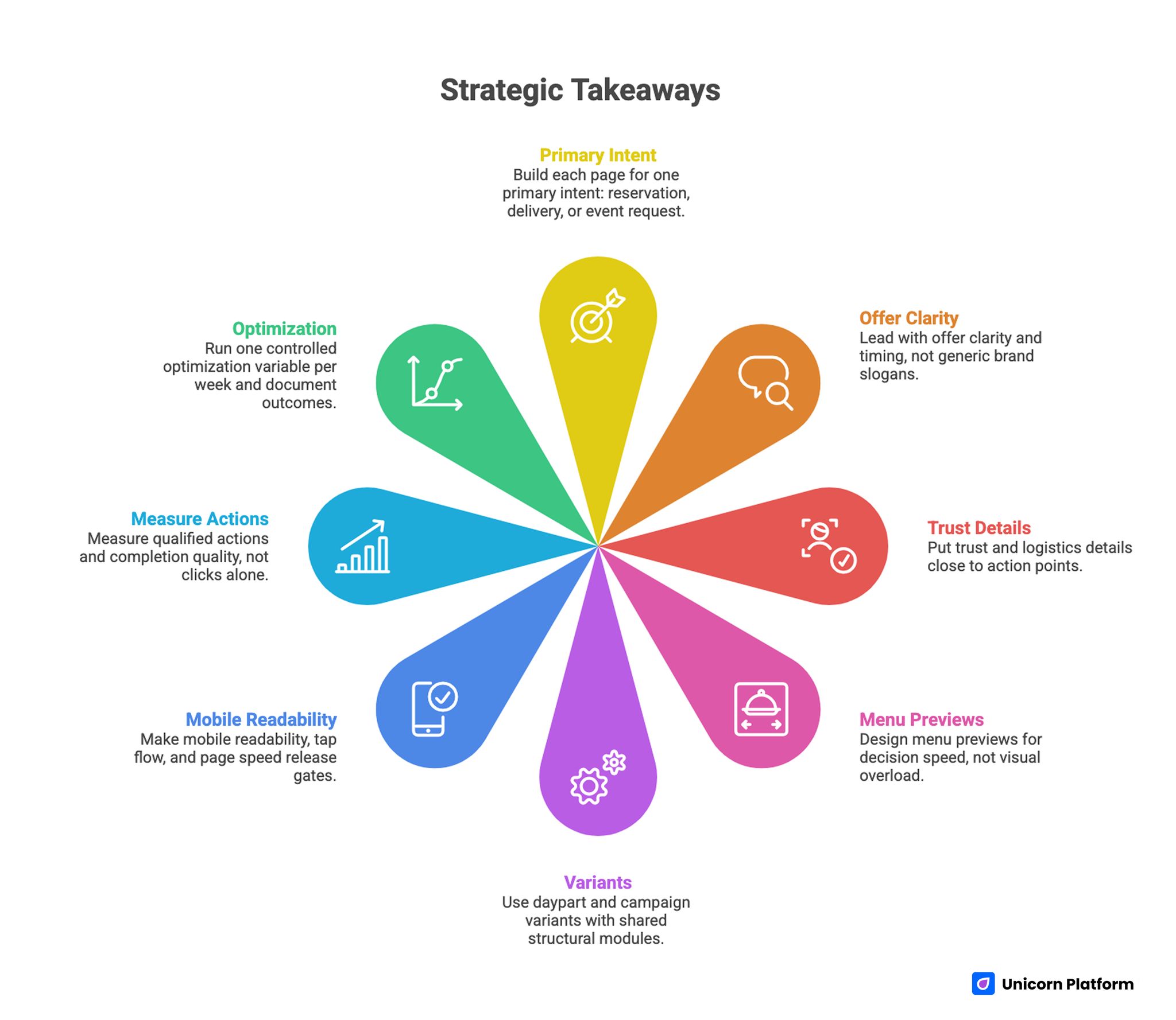
Strategic Takeaways for Building Restaurant Campaign Pages
- Build each page for one primary intent: reservation, delivery, or event request.
- Lead with offer clarity and timing, not generic brand slogans.
- Put trust and logistics details close to action points.
- Design menu previews for decision speed, not visual overload.
- Use daypart and campaign variants with shared structural modules.
- Make mobile readability, tap flow, and page speed release gates.
- Measure qualified actions and completion quality, not clicks alone.
- Run one controlled optimization variable per week and document outcomes.
Why Restaurant Pages Lose Conversion Even With Strong Branding
Many restaurant pages look polished and still underperform. The issue is usually not design quality or photo quality. It is decision friction.
Decision friction appears when users must hunt for core details before taking action. They want to know whether the offer fits their timeline, budget range, dietary constraints, and location. If those answers are buried, motivation drops fast.
Industry research also confirms that digital touchpoints now play a central role in restaurant purchasing decisions. Reports from National Restaurant Association show that a growing share of customers evaluate restaurants and place orders through online channels before visiting in person. When campaign pages fail to answer practical questions quickly, restaurants risk losing high-intent visitors during this critical decision window.
Another recurring issue is mixed intent on a single page. Asking users to choose between reservations, delivery, catering, and newsletter signup with equal visual weight creates hesitation. People convert faster when a page has one primary objective and one secondary fallback.
Strong conversion pages reduce cognitive load. Every section should remove one uncertainty and move visitors closer to a clear commitment step.
Start With One Intent Per Page
Before editing copy or visuals, define the page objective in one sentence. Example objectives include weekday reservations, same-day delivery orders, brunch pre-orders, or private event inquiries.
Once intent is fixed, remove or downweight competing actions. A reservation-focused page should not force delivery navigation ahead of booking details. A delivery-focused page should not prioritize long brand storytelling over order flow clarity.
This discipline improves both conversion and measurement quality. You can attribute performance changes to real page decisions instead of guessing across mixed goals.
Teams that need a conversion-first structure baseline before campaign customization can use the sequence in this reservation page blueprint to align action flow early.
Conversion Architecture for Food and Hospitality Pages
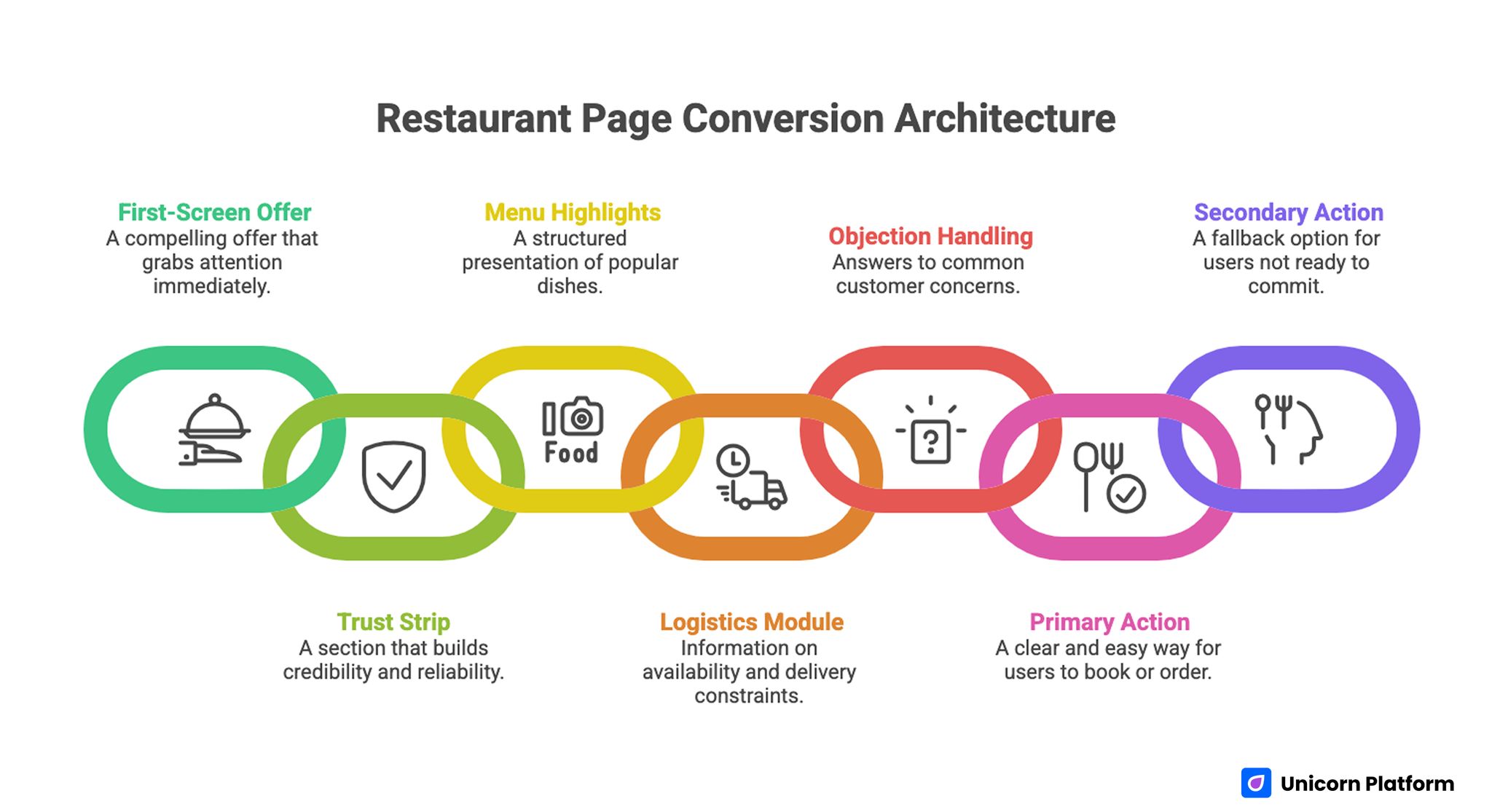
Restaurant Page Conversion Architecture
A dependable restaurant page architecture in 2026 includes seven blocks. It is simple, repeatable, and flexible across campaign types.
- First-screen offer statement with practical qualifier.
- Quick trust strip with proof and reliability cues.
- Menu or offer highlights with scanning-friendly structure.
- Logistics module covering availability and constraints.
- Objection-handling FAQ from real customer questions.
- Primary action section with minimal friction.
- Secondary fallback action for users not ready yet.
This order mirrors real user behavior. People first confirm relevance, then evaluate trust, then check practical fit, then commit.
A stable architecture also speeds production. With Unicorn Platform, teams can keep core modules constant and change campaign-specific messaging without rebuilding from scratch.
First-Screen Formula: Relevance in Three Seconds
A strong first screen should communicate four elements at a glance: what is offered, who it is for, when it is available, and what to do next. If any of these points are missing, visitors usually delay action.
A practical first-screen formula is shown below. It keeps copy short while preserving operational clarity.
- offer type + operational qualifier + immediate action
Users usually respond better to concrete clarity such as time windows, service area hints, or limited menu context than to broad claims about being the best in town. Specificity helps people decide quickly without additional research.
CTA labels should match intent stage. "Check Available Slots" works for reservation pages. "Order for Tonight" works for delivery. "Plan an Event Menu" works for catering and group dining requests.
The strongest first screens reduce ambiguity without overwhelming the visitor. Short, specific copy usually outperforms emotional but vague headlines.
Menu and Offer Presentation for Fast Decision-Making
Visitors do not need your full menu first. They need enough detail to decide whether they should continue.
Use a highlight layer before the complete menu. A compact set of featured items, bundles, or seasonal offers helps users orient quickly and move toward action.
Each featured item should include a clear name, one value cue, and one practical qualifier. Qualifiers can include prep-time expectations, serving size hints, or availability notes.
For delivery funnels, this food delivery conversion guide is useful when refining category shortcuts, CTA placement, and order-start flow.
Menu sections should stay scannable on mobile. Dense descriptions slow decisions and raise drop-off. Keep detail accessible through progressive disclosure instead of long initial text blocks.
Trust System Design Near Commitment Points
Trust works best when it appears at hesitation points, not only as a testimonial block near the bottom. Placement matters as much as content quality.
A high-impact trust system combines three layers. Together they address different concerns that block commitment.
- customer proof: recent ratings, review excerpts, or repeat-order signals
- operational proof: delivery reliability, service windows, and support responsiveness
- policy proof: cancellation, correction, and contact expectations
Context matters more than volume. A few relevant proof signals near CTA sections usually perform better than a large, generic proof wall far from the action path.
Trust signals should also be fresh. Outdated review counts or stale campaign claims reduce credibility faster than having fewer claims with current evidence.
Logistics Clarity: The Conversion Multiplier Most Teams Skip
Operational details often decide whether an interested visitor becomes a paying customer. If delivery range, pickup timing, booking windows, or deposit rules are unclear, conversion quality drops.
Build a dedicated logistics module with short, plain-language answers to common practical questions. Keep this module near the first action point so users do not need to scroll through unrelated content.
High-value logistics details include the points below. These answers reduce drop-off caused by operational uncertainty.
- service area and exceptions
- expected timing ranges by daypart
- minimum order and fee conditions
- booking lead times and cutoff windows
- payment options and confirmation process
When these points are explicit, support load drops and decision speed improves. Teams also spend less time resolving preventable pre-order confusion.
Reservation Flow Design for Higher Table Utilization
Reservation-focused pages need more than a "book now" button. Users want enough context to commit confidently.
Include seat availability expectations, party-size guidance, and special-date considerations. If policies differ for peak hours or event days, make those differences visible before the form step.
A practical reservation flow has three stages. Each stage removes a specific booking hesitation.
- selection: date, party size, and seating preference
- qualification: timing constraints or policy reminders
- confirmation: clear next steps and optional reminders
Reducing uncertainty at each step raises completion while lowering no-show risk. Clear expectations create better customer commitment behavior.
Delivery Flow Design for Faster Checkout Starts
Delivery intent is speed-sensitive. Users who cannot identify ordering logic quickly often abandon within seconds.
The top of the page should make zone coverage, timing expectations, and first action obvious. Category shortcuts and featured bundles should appear before long descriptive sections.
This execution pattern aligns well with the practical setup methods in this pizza campaign page guide, especially for local delivery promotions with short decision windows.
Checkout friction usually comes from unnecessary early fields and ambiguous fee visibility. Keep the first step lightweight and delay secondary data collection until after order intent is confirmed.
Event and Specialty Offer Pages
Event inquiries, custom cake requests, and seasonal group offers require a different page logic than everyday delivery or reservations. These buyers evaluate planning risk before they evaluate visual appeal.
Users evaluating event offers care about lead time, customization options, and budget scope. They need constraints and process clarity before they need inspirational galleries.
A strong specialty-page structure includes the elements below. This layout helps teams qualify leads without slowing inquiry flow.
- event type selector
- package baseline and optional add-ons
- lead-time requirements
- revision and approval policy
- concise inquiry form
This sequence filters low-fit requests early and improves sales team efficiency. Better qualification also improves response speed for high-fit opportunities.
Daypart and Local Variant Strategy
Traffic behavior changes by time window. Lunch, dinner, and late-night visitors do not evaluate offers the same way.
Daypart variants help align messaging to immediate intent. Lunch variants can emphasize speed and combo value. Dinner variants can emphasize atmosphere and reservation reliability. Late-night variants can emphasize availability and frictionless checkout.
Local variants also improve performance. Neighborhood-specific messaging with realistic timing cues typically converts better than city-wide generic pages.
With Unicorn Platform, teams can clone one base structure and adjust first-screen cues, highlights, and logistics modules by area or daypart while preserving brand consistency. This balance keeps production efficient without making every variant feel identical.
Copywriting Rules That Increase Action Quality
Restaurant conversion copy should prioritize practical confidence. Decorative language can support brand tone, but it should never replace operational clarity.
Action-focused copy usually follows this pattern. The goal is to move from interest to commitment with minimal ambiguity.
- what is offered
- when it is available
- why it is reliable
- what to do now
CTA-adjacent copy should answer one likely hesitation in one or two sentences. This keeps momentum and reduces decision stalls.
Avoid exaggerated claims that cannot be validated. Clear, realistic statements produce better long-term conversion outcomes than aggressive promises that increase post-purchase disappointment.
Visual Strategy for Conversion, Not Decoration
Food photography should help users decide, not just impress them. Relevant visuals depend on page intent.
Delivery pages benefit from packaged-product realism, portion cues, and item consistency. Reservation pages benefit from seating context, ambiance, and social atmosphere indicators.
Use fewer, stronger visuals instead of large galleries that dilute focus. Every major image should support the current section objective.
A practical visual QA standard asks one question: does this image reduce uncertainty or only fill space? If it does not help decision-making, it should be removed or replaced.
Mobile and Speed Standards as Release Gates
Most restaurant campaign visits happen on phones. Mobile quality is a conversion requirement, not a design preference. Usability research consistently shows that mobile usability directly influences task completion and conversion behavior. According to studies from Nielsen Norman Group, interfaces designed with mobile-first principles help users complete tasks faster and reduce interaction errors on smaller screens.
Set mandatory mobile checks before every release. Treat these checks as launch gates, not optional polish.
- first-screen headline readability in two quick scans
- visible action button before deep scroll
- tap targets sized for thumb interaction
- form fields with clear labels and error guidance
- image and script performance under moderate network conditions
Speed is equally critical. Slow loads cause immediate abandonment in high-intent food journeys. Optimize media, simplify heavy scripts, and monitor page weight continuously.
SEO and AI Retrieval Readiness for Restaurant Pages
Discoverability now depends on both traditional search behavior and AI-driven retrieval patterns. Pages that stay visible over time usually share structural clarity and practical completeness.
Support long-term visibility with the fundamentals below. These elements help both people and retrieval systems interpret your content correctly.
- clear heading hierarchy matching user intent stages
- adjacent question coverage for high-friction decisions
- practical definitions and policy transparency
- internal links that extend context naturally
Avoid writing for algorithm tricks. Durable visibility comes from useful, specific information that helps users make decisions faster.
Measurement Framework: Track the Right Outcomes
A useful restaurant analytics model separates interest from qualified conversion. This distinction prevents teams from overvaluing vanity engagement.
Track four stages in a fixed order. Consistent staging improves dashboard reliability across campaigns.
- engagement: action-button clicks and section interaction depth
- initiation: reservation starts or order starts
- completion: confirmed booking or paid order
- quality: average order value, no-show patterns, repeat behavior, support burden
Run one major test variable at a time. Testing headline, visuals, form design, and offer structure simultaneously destroys attribution clarity.
Weekly decision logs should capture hypothesis, change, expected effect, observed effect, and next action. Documentation turns campaign edits into compounding operational knowledge.
30-Day Execution Plan
Week 1: Baseline architecture and instrumentation
Launch one stable page structure with clear first-screen promise, trust strip, highlights, logistics module, and primary action flow. Confirm event tracking for key interaction points.
Establish baseline metrics for completion rate, initiation-to-completion drop-off, and support-question volume. Those baselines make week-over-week changes easier to interpret.
Week 2: Intent-specific variant rollout
Create one reservation-focused variant and one delivery-focused variant using shared structure. Adjust first-screen messaging and logistics emphasis by objective.
Evaluate conversion quality by variant, not just raw traffic. High volume without quality usually adds operational friction.
Week 3: Trust and policy optimization
Move trust and policy details closer to action sections. Test whether clearer reliability and policy cues reduce abandonment and support requests.
Use real customer objections from support channels to refresh FAQ content. This keeps objection handling tied to current buying behavior.
Week 4: Mobile friction and form simplification
Audit all critical paths on real devices. Remove non-essential first-step form fields and improve error guidance.
Conclude with one short decision memo to define keep/change/next-test actions for the next cycle. Clear documentation improves continuity when ownership rotates.
90-Day Scale Model
Scaling should follow stability, not excitement. If baseline quality is inconsistent, more traffic amplifies inefficiency.
Days 1-30 should stabilize structure and measurement. Days 31-60 should expand controlled daypart and local variants. Days 61-90 should consolidate winning modules into reusable section templates and retire weak variants.
This model keeps production fast while protecting conversion quality. It reduces the risk of scaling unstable page variants.
Teams that want a replicable event-campaign flow can apply these principles to an event registration landing page framework when launching private dining and seasonal reservation programs.
Common Mistakes and Fast Fixes
Mistake 1: One page trying to serve every objective
Fix by assigning one primary intent per page and reducing competing actions. Single-intent pages create faster and clearer decisions.
Mistake 2: Generic first-screen headlines
Fix by adding practical qualifiers such as timing windows, service area cues, or offer scope. Concrete details outperform broad claims.
Mistake 3: Trust proof isolated at the bottom
Fix by placing proof and policy reassurance near commitment moments. Confidence increases when risk answers appear at action points.
Mistake 4: Logistics hidden behind extra clicks
Fix by creating a dedicated logistics block visible before the first major action step. Operational clarity should never require extra searching.
Mistake 5: Overloaded first-step forms
Fix by collecting only commitment-critical data initially and moving secondary questions later. Short first steps increase completion probability.
Mistake 6: Mobile checks done too late
Fix by making mobile readability and interaction validation part of release approval. Launching without mobile QA usually wastes paid traffic.
Mistake 7: High test volume with low attribution clarity
Fix by running one significant variable per cycle with explicit hypotheses. Controlled scope protects attribution clarity.
Mistake 8: No operational learning loop
Fix by maintaining weekly decision logs and updating template modules based on evidence. Repeated documentation creates compounding process quality.
Pre-Publish QA Checklist
Before every major release, run a short QA pass that verifies conversion logic and operational clarity. A fast checklist prevents avoidable regressions.
Checklist items are listed below. Keep this list in the release template so it is applied consistently.
- first-screen offer is specific and immediately understandable
- primary action path matches the page intent
- logistics details are visible before commitment points
- trust and policy cues appear near CTAs
- menu or offer highlights are scannable on mobile
- form flow is short and error messages are clear
- page speed remains within target thresholds
- event tracking confirms engagement, initiation, and completion signals
Teams that run this checklist consistently reduce rework and improve campaign reliability. It also lowers emergency edits after launch.
FAQ: Build Restaurant Campaign Pages
How long should a restaurant campaign page be?
Length should match decision complexity. Delivery pages can stay concise, while event and specialty-offer pages often need deeper policy and qualification detail.
Should reservation and delivery live on one page?
Usually no. Separate pages by primary intent produce clearer decisions and cleaner analytics.
What matters more: visuals or copy?
Both matter, but clarity wins first. Strong visuals cannot offset missing logistics and weak action flow.
How many CTAs should the page include?
Multiple placements are fine if they support the same commitment path. Competing CTA goals usually reduce conversion quality.
What proof types work best for restaurants?
Context-rich reviews, reliable operations cues, and clear policy details typically outperform generic praise blocks. Buyers trust evidence that answers practical risks.
How often should we update these pages?
Weekly reviews are practical for active campaigns, with immediate updates when offers, hours, or delivery rules change. Short review loops prevent stale messaging.
Which metric is most useful after conversion rate?
Completion quality metrics such as repeat order behavior, no-show trends, and support burden provide stronger operational insight. These metrics reveal whether conversion gains are sustainable.
How can small teams scale variants without chaos?
Use one stable architecture, clone by daypart or local intent, and track changes through a documented weekly loop. This keeps scale manageable for lean teams.
Do we need separate pages for specialty cake or event offers?
Yes when requirements differ significantly. Specialized pages reduce low-fit inquiries and improve operational efficiency.
What is a realistic testing cadence for lean teams?
One major variable per week is sustainable and usually produces clearer decisions than high-volume experimentation. Fewer, cleaner tests beat noisy test calendars.
Final Takeaway
High-performing restaurant conversion pages are built as operating systems, not static designs. Clear offers, visible logistics, contextual trust, and low-friction action paths convert demand into reliable revenue.
Unicorn Platform makes this practical by enabling fast, structured iteration across reservation, delivery, and specialty campaigns. When teams combine architecture discipline with weekly measurement and QA, performance compounds instead of resetting every campaign cycle.

