Table of Contents
- The Core Page Structure That Converts
- 30-Day Optimization Plan for Small Nonprofit Teams
- Common Mistakes and Fast Fixes
- FAQ
Most nonprofit campaigns fail on the page, not in the mission. The cause is meaningful, the team is committed, and traffic arrives, but donation completion stays lower than expected. The gap usually comes from unclear messaging, weak trust placement, and unnecessary friction in the giving flow.
A high-performing fundraising page has one job: help a motivated visitor become a confirmed donor with confidence. That means the page must explain why this campaign matters now, what the contribution will do, and what happens after payment. If any of those points are vague, donors hesitate.
AI can speed up page production, but speed alone does not improve outcomes. Teams still need a repeatable framework for copy quality, proof quality, CTA clarity, and operational updates. Without that framework, campaign pages become inconsistent and difficult to improve.
This guide gives you that framework. You will get a practical structure, implementation checklist, testing model, and governance plan for nonprofit teams that need to launch fast and keep quality high.
sbb-itb-bf47c9b
Quick Strategic Takeaways
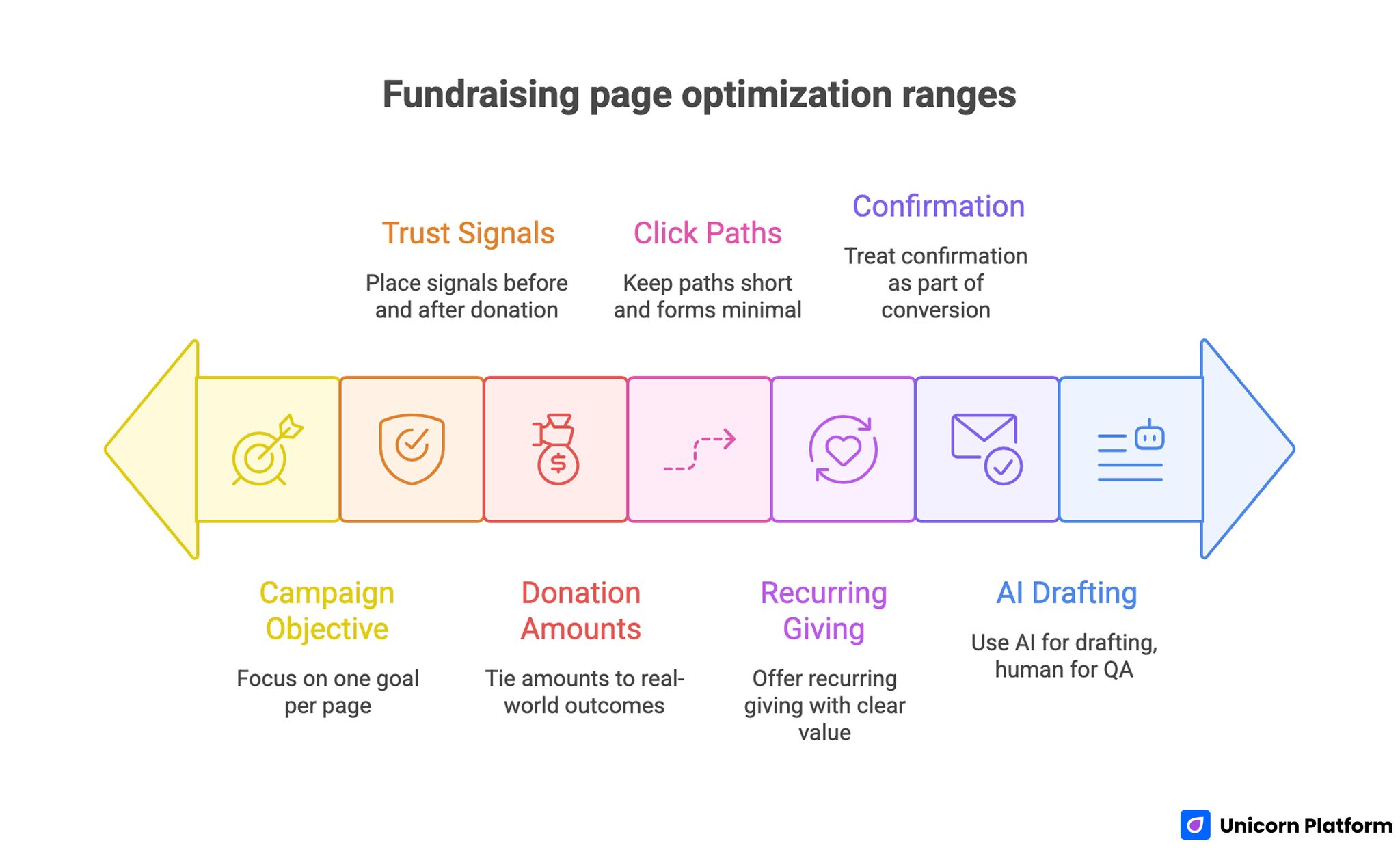
Fundraising Page Optimization Ranges
- Build each page around one campaign objective and one primary donor action.
- Place trust signals before and after the donation module, not only at the bottom.
- Tie suggested donation amounts to clear real-world outcomes.
- Keep click paths short and form fields minimal.
- Offer recurring giving with plain-language value framing.
- Treat post-donation confirmation as part of conversion quality, not an afterthought.
- Use AI to accelerate drafting, then apply strict human QA before publishing.
Why Donation Pages Underperform Even With Good Traffic
When traffic is strong but donations are weak, the issue is rarely one single design decision. It is usually a sequence failure. The page asks for money before establishing trust, explains the mission without concrete outcomes, or offers too many equal-priority actions that split attention.
Another common issue is message mismatch. If the ad or email promises urgent local impact but the page opens with broad institutional language, visitor confidence drops quickly. People need clear continuity from acquisition message to page message.
Donation friction is the third pattern. Long forms, unclear payment options, and too many click-through routes make the process feel risky or tiring. Even highly motivated supporters abandon when the path feels cumbersome.
The Donor Decision Model You Should Build Around
Donors usually move through five micro-decisions in order:
- Is this issue urgent and relevant?
- Is this organization credible?
- Will my contribution make a measurable difference?
- Is giving easy and secure right now?
- Will I be informed about results afterward?
Your landing page should answer those five questions in the same order. If you ask for commitment before those answers are visible, conversion rates decline.
This sequence is also why structure matters more than clever wording. A clean narrative flow reduces cognitive effort and helps people act while motivation is high.
Start With One Objective, One Audience, One Action
Before writing any page copy, define the campaign objective precisely. For example: emergency response donations, recurring monthly support, event-linked fundraising, or sponsor-backed matching campaigns. Different objectives require different message emphasis and CTA logic.
Then define the primary audience for that page variant. First-time donors need trust and clarity. Returning donors need progress proof and continuity. Institutional sponsors need accountability detail and budget transparency.
Finally, set one primary action for the page. Secondary actions can exist, but they should not compete visually with the main conversion path.
The Core Page Structure That Converts
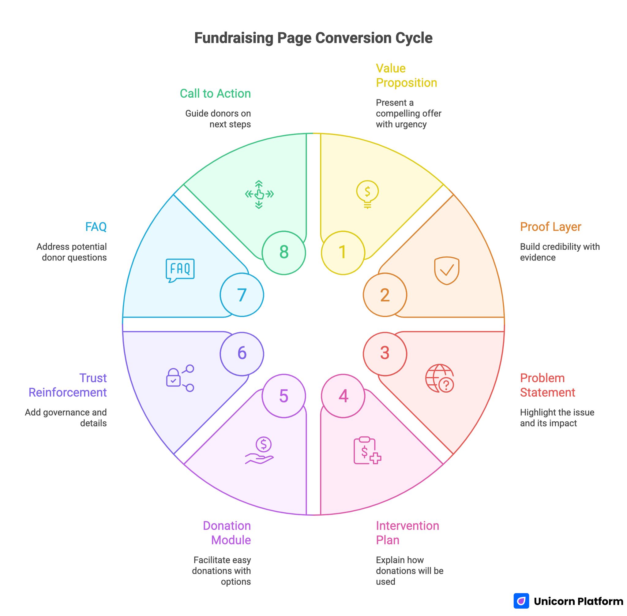
Fundraising Page Conversion Cycle
A strong fundraising page usually follows this architecture:
- First-screen value proposition with urgency and campaign context
- Short proof layer with credibility markers
- Problem statement and who is affected
- Intervention plan and what donations fund
- Donation module with suggested amounts and recurring option
- Additional trust reinforcement and governance details
- FAQ that removes late-stage hesitation
- Final call to action with clear expectation after donation
If your team needs a deeper framework for section sequencing, this guide on high-converting landing page structure is useful for refining hierarchy and flow.
First Screen: Clarity Beats Emotional Overload
The hero section should establish campaign focus in plain language. Avoid broad mission statements that could apply to any nonprofit. State the urgent problem, the intended outcome, and the immediate action.
A strong first screen also includes one trust anchor. That can be years of operation, partner support, known oversight model, or a recent campaign outcome summary. You do not need to overload the top section with details, but you must reduce uncertainty quickly.
Keep the first CTA direct and specific. "Donate now" can work, but outcome-linked variants such as "Fund one week of meals" often improve action confidence because they connect giving with impact.
Build Trust in Layers, Not in One Block
Trust should appear throughout the page, not in a single "about us" section. Add quick trust cues near the top, deeper evidence around the donation module, and operational transparency near the bottom.
Effective trust layers include:
- Recent campaign outcomes with timestamps
- Short beneficiary stories with consent
- Third-party audits or compliance indicators
- Named partners when relevant
- Clear contact details and response channels
Research from Stanford’s Web Credibility Project shows that users often judge the credibility of organizations based on website design, clarity, and transparency.
For teams expanding campaign infrastructure beyond one page, this nonprofit website design guide on building trustworthy nonprofit web experiences is practical for maintaining consistency across donation, impact, and update pages.
Donation Module Design: Reduce Friction Without Reducing Confidence
The donation block is where interest becomes commitment. Small usability mistakes here can erase strong top-of-page performance.
Keep the flow short. Ask only for information required to complete the donation and deliver receipt obligations. Additional profile details can be requested after confirmation, not before.
Use outcome-based donation presets when possible. Instead of unlabeled numbers, connect amounts to concrete campaign actions. This helps donors decide faster and raises average gift confidence.
Always include a recurring giving option with a clear explanation of ongoing impact. Do not hide monthly giving in tiny toggles. Present it as a transparent choice with simple language.
Visual and Content Elements That Improve Conversion
Fundraising pages perform better when they include purposeful visual support, not decorative design noise. Choose visuals that reinforce urgency, human context, or operational transparency.
Prioritize:
- One campaign-relevant hero image or short video
- Progress indicator when updates are reliable
- Outcome cards tied to donation amounts
- Clean iconography for trust and security cues
Keep copy concise where action is expected and detailed where credibility is evaluated. Overwriting near the donation module lowers completion because people postpone decisions when text is dense.
Keep Navigation Paths Short
Every additional route away from the donation path can reduce completion. That does not mean removing all navigation; it means controlling what competes with the primary action. Marketing research from HubSpot highlights that reducing navigation distractions and focusing pages around a single primary action significantly improves landing page conversion rates.
A practical model is limited navigation on campaign landing pages, with key trust and policy links available but visually secondary. The user should never wonder where to click next.
Avoid sending visitors into broad site menus before they finish the donation task. If educational context is necessary, provide it inline or in short expandable sections.
Mobile Performance Is a Revenue Variable
Many donation sessions begin on mobile from social posts, messaging apps, and email. If mobile load is slow or form interactions are awkward, campaign performance drops quickly.
Focus on mobile essentials first:
- Fast first content render
- Large tap targets for donation amounts
- Minimal required typing
- Payment options that work reliably on mobile
- Sticky but non-intrusive CTA behavior
Mobile optimization should be validated on real devices, not only desktop previews. Teams that test real-user friction usually find issues that analytics alone does not reveal.
AI Workflow for Fast Production Without Quality Loss
AI is useful for generating draft variants, campaign angle options, FAQ candidates, and rewrite alternatives for different donor segments. It can reduce writing cycle time significantly.
The risk is publishing fluent but generic copy. To prevent that, apply a strict section-level review process before release.
Use this operational workflow:
- Generate structured section drafts with campaign constraints.
- Replace abstract claims with verified campaign specifics.
- Insert proof near each major promise.
- Simplify language for fast scanning.
- Validate legal and financial accuracy.
- Run readability and CTA consistency checks.
This workflow protects authenticity while preserving AI speed advantages.
Scenario Playbooks You Can Reuse
Emergency Relief Campaign
Lead with immediate context, time sensitivity, and verified distribution plan. Keep donation options simple and emphasize immediate outcome per contribution level.
Education Support Campaign
Frame giving around student milestones, resource access, and measurable learning outcomes. Use recurring giving to support semester or annual continuity.
Community Health Campaign
Show local reach, partner implementation details, and operational oversight. Clarify both one-time and monthly support impact so donors can choose confidently.
In each scenario, the underlying mechanics stay the same: clear problem framing, credible intervention model, low-friction donation path, and visible accountability.
30-Day Optimization Plan for Small Nonprofit Teams
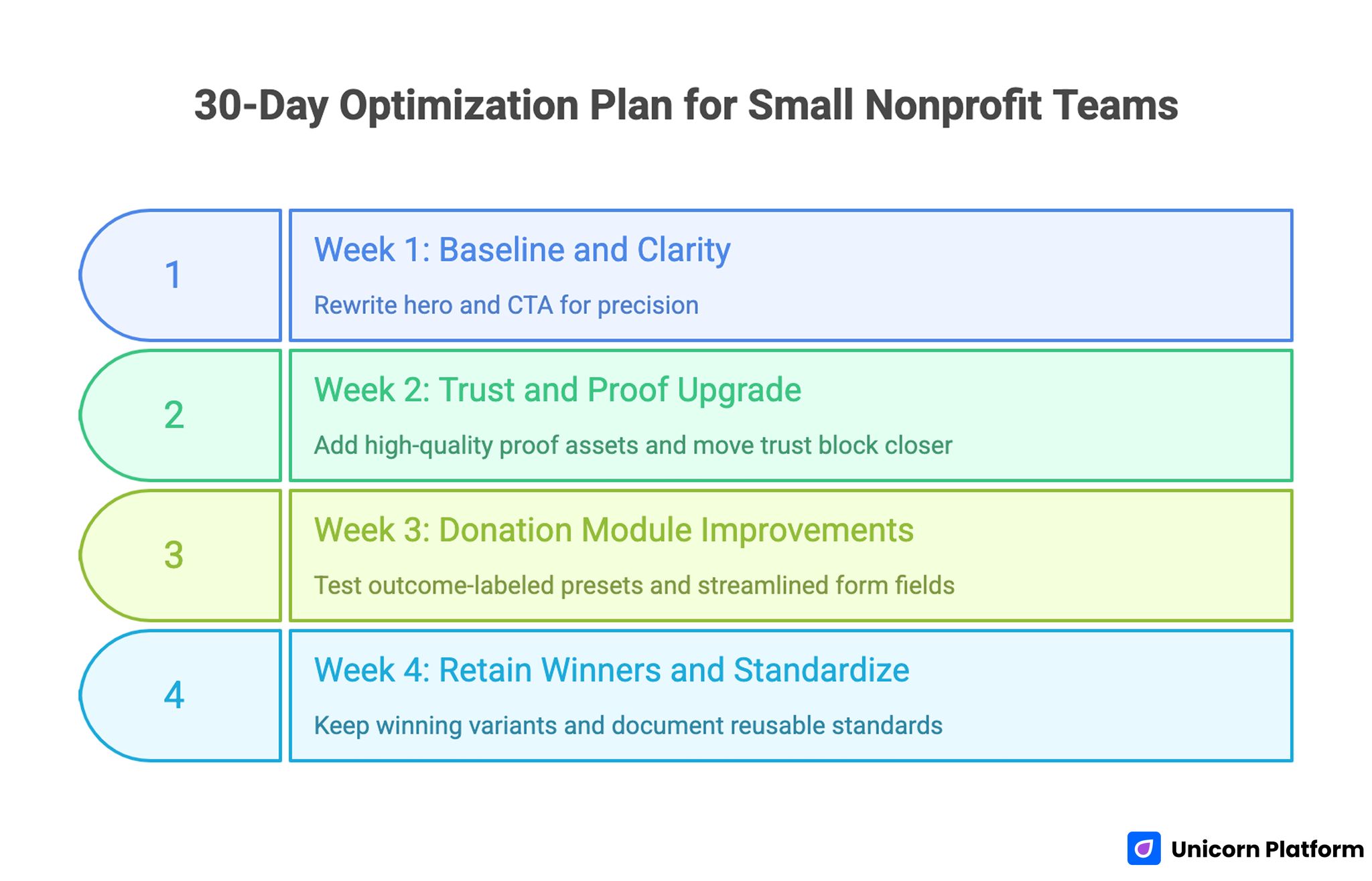
30-Day Optimization Plan for Small Nonprofit Teams
Week 1: baseline and clarity
Rewrite hero and CTA for precision. Remove generic phrases and ensure first-screen message matches acquisition channels.
Week 2: trust and proof upgrade
Add two high-quality proof assets and move one trust block closer to the first donation module. This change usually improves conversion confidence before donors evaluate payment options.
Week 3: donation module improvements
Test outcome-labeled presets, recurring toggle wording, and streamlined form fields. Keep the test scope narrow so the result is attributable to one clear change.
Week 4: retain winners and standardize
Keep winning variants, archive weak changes, and document reusable campaign standards for the next launch. Reuse only proven sections so future campaigns start from a stronger baseline.
This cadence keeps teams focused on practical improvements without overwhelming limited capacity. It also creates cleaner internal documentation for handoffs between campaign owners.
90-Day Scale Plan for Multi-Campaign Organizations
In month one, standardize reusable sections for hero framing, trust cues, donation modules, and post-donation confirmation language. In month two, build campaign-specific variants by audience type while keeping design and governance consistent. In month three, formalize ownership for metrics review, proof refresh cadence, and quarterly quality audits.
Scale should follow process maturity. Launching many pages without governance usually increases inconsistency and weakens donor trust over time.
Metrics That Actually Matter
Do not start with a bloated dashboard. Track a focused set of metrics tied to campaign decisions.
Primary conversion metrics:
- Donation completion rate
- Average gift value
- Recurring donation selection rate
- Form abandonment rate by step
Behavioral diagnostics:
- First-screen CTA click-through rate
- Scroll depth to donation module
- Mobile vs desktop completion delta
- Drop-off before payment confirmation
Use one major hypothesis per test cycle. If you change too many variables at once, learning quality collapses.
Common Mistakes and Fast Fixes
Mistake: broad mission headline with weak campaign relevance
Fix by naming the current campaign objective and immediate impact window directly in the hero. Donors should understand what is being funded in the first few seconds.
Mistake: asking for donation before showing enough credibility
Fix by placing concise trust evidence above the first donation block and deeper proof near the CTA. This sequencing lowers hesitation for first-time supporters.
Mistake: too many preset amounts with no context
Fix by reducing choices and tying each amount to a concrete, realistic impact statement. Clear labels help donors commit faster and reduce decision fatigue.
Mistake: recurring giving option is hidden or unclear
Fix by presenting monthly giving as a clear value path with plain-language explanation. Donors should see how recurring support creates continuity for the program.
Mistake: form fields create avoidable friction
Fix by collecting only essential data upfront and moving optional questions to post-donation follow-up. Shorter forms are usually the fastest way to improve completion on mobile.
Mistake: no clear post-donation communication promise
Fix by setting expectation for receipt timing, updates, and next campaign reporting touchpoint. A predictable follow-up model strengthens trust for repeat contributions.
Post-Donation Experience Is Part of Conversion
The donation click is not the end of the donor decision process. Confirmation experience influences whether supporters return, share, or become recurring contributors.
A strong confirmation step includes a genuine thank-you, receipt clarity, and a specific timeline for campaign updates. Donors should know what happens next and when they can expect proof of progress.
If your campaign includes event-driven participation, a dedicated registration flow such as this meetup and calendar landing page model can help separate attendance intent from donation intent while keeping journey continuity.
When event attendance and donations are measured separately, teams can optimize each conversion path without creating attribution noise in campaign reporting.
For broader fundraising page benchmarks and practical examples, this fundraising landing page template guide provides additional context for refinement.
Publish QA Checklist Before Going Live
Run this checklist for every campaign launch:
- First screen states one campaign outcome and one primary action.
- Donation module is functional on mobile and desktop.
- Preset amounts are connected to clear impact explanations.
- Recurring giving option is visible and understandable.
- Trust claims are current, verifiable, and accurately worded.
- Confirmation message includes update timing expectations.
- Core analytics events are tracking correctly.
A short release gate like this prevents avoidable errors and protects campaign credibility. It also reduces rework when campaigns are time-sensitive.
FAQ: How to Build a Fundraising Landing
What makes a fundraising landing page effective?
An effective page combines clear campaign framing, visible trust signals, low-friction donation flow, and transparent follow-up expectations. The best pages also make outcome logic obvious before users choose an amount.
Should I use one page for all fundraising campaigns?
A single page can work for early testing, but campaign-specific variants usually convert better because message and donor intent are better aligned. Separate variants are especially useful when acquisition channels and audiences differ.
Do recurring giving options really increase results?
Yes, when presented clearly. Recurring options work best when donors understand the ongoing impact their monthly contribution enables and how updates will be delivered.
How many donation presets should I show?
Use a small, intentional set of options with impact context. Too many unlabeled choices can slow decisions and reduce completion, especially on mobile devices.
Is a fundraising thermometer necessary?
It can help when data is updated reliably. If progress visuals are stale or inconsistent, they can reduce trust rather than improve it, so governance matters more than decoration.
Can AI replace nonprofit content teams for campaign pages?
No. AI can accelerate drafting, but human review is required for factual accuracy, tone integrity, and trust-sensitive messaging. Treat AI as a production assistant, not as final editorial authority.
What should I optimize first if conversion is low?
Start with hero clarity, trust placement near the first CTA, and donation module friction. Those changes usually produce the fastest gains because they affect the largest share of visitors.
How often should we update campaign pages?
At minimum, review weekly during active campaigns and refresh proof assets monthly for ongoing programs. High-volume campaigns may need more frequent proof updates to maintain credibility.
What post-donation element has the highest leverage?
A clear, credible confirmation flow with timeline-based updates often has strong impact on repeat giving and donor confidence. Supporters should know exactly when and where they will see progress reports.
How do I reduce mobile donation abandonment?
Simplify form fields, improve page speed, use large tap targets, and validate payment flow on real devices before launch. Small interaction fixes often produce meaningful completion gains.
Final Takeaway
Winning fundraising pages are operational systems, not one-time content pieces. Teams that combine clear donor decision flow, visible credibility, and disciplined iteration consistently outperform pages built only for appearance.
Use AI to move faster, but keep campaign truth and trust review human-led. If you apply this framework as a repeatable process, each new campaign starts from a stronger baseline and improves faster.
That is how nonprofit teams turn support intent into completed donations at scale. Over time, this discipline compounds into stronger donor retention and more predictable campaign performance.