Table of Contents
- First-Screen Blueprint for Fast Qualification
- 30-Day Optimization Plan
- Common Mistakes and Fast Fixes
- FAQ
Most course creators spend the majority of their energy on curriculum and far less on the page that introduces, frames, and sells that curriculum. That imbalance is expensive. Even a strong program underperforms when visitors cannot quickly understand who the course is for, what outcome it creates, and whether the offer feels trustworthy.
The highest-performing education pages are not flashy by accident. They are structured around decision flow. Every section answers a specific question in the order a cautious buyer naturally asks it: Is this for me? Is this credible? Is the effort realistic? Is the price fair? What happens if it does not work for me?
When those questions are answered early and clearly, conversion quality goes up. You see fewer low-fit enrollments, fewer refund-driven complaints, and better activation rates after purchase. This is the difference between traffic that clicks and students who finish.
This guide gives you a full operating framework for 2026: structure, copy, proof strategy, pricing logic, mobile execution, testing cadence, and governance. You can implement it with Unicorn Platform and iterate without losing editorial quality.
sbb-itb-bf47c9b
Quick Strategic Takeaways
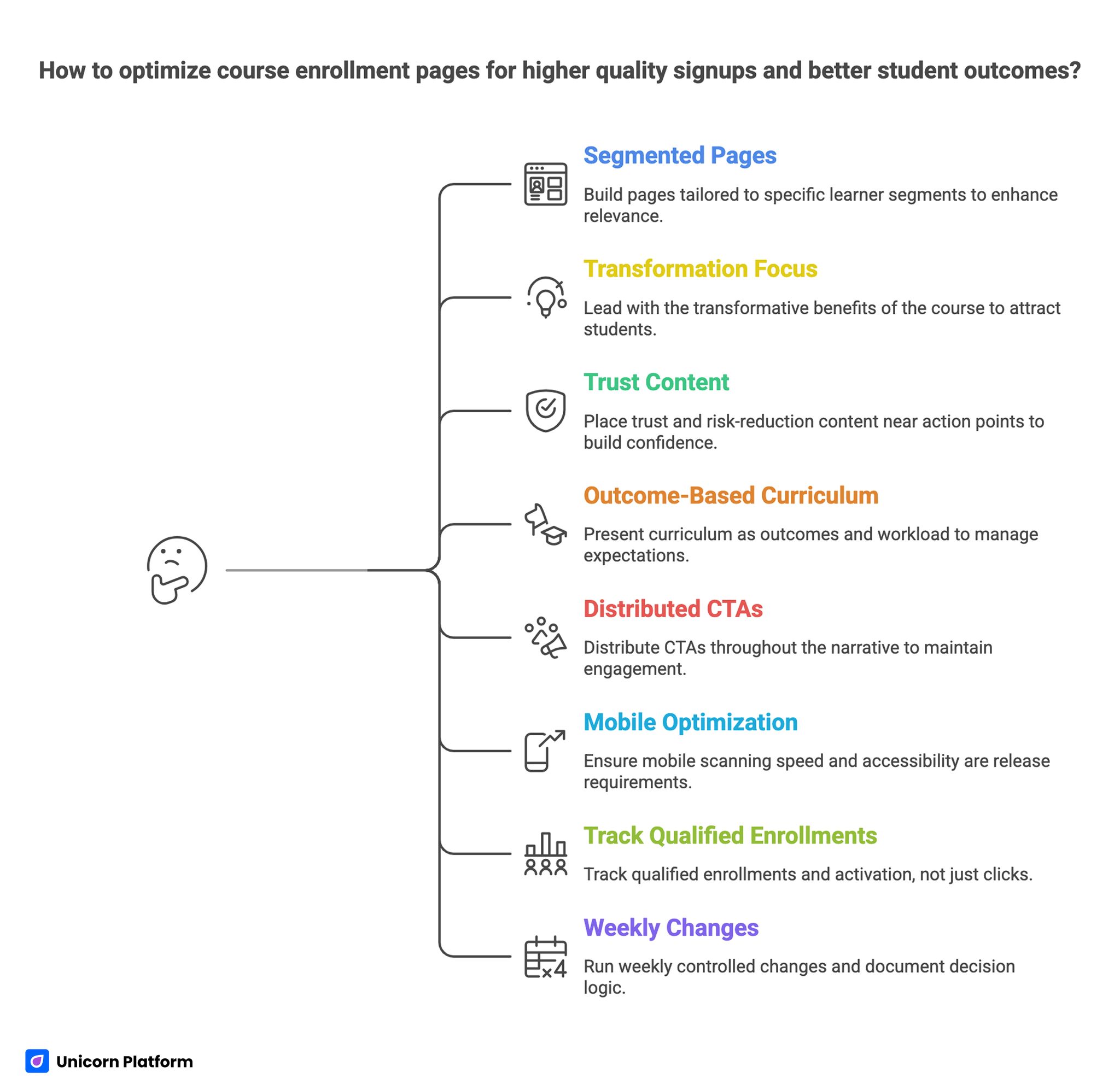
Quick Strategic Takeaways for Optimizing Course Enrollment Pages
- Build for one primary learner segment per page version.
- Lead with transformation and qualification, not feature lists.
- Place trust and risk-reduction content near action points.
- Present curriculum as outcomes and workload, not module titles alone.
- Distribute CTAs through the narrative with consistent commitment language.
- Make mobile scanning speed and accessibility release requirements.
- Track qualified enrollments and activation, not clicks alone.
- Run weekly controlled changes and document decision logic.
Why Many Course Sales Pages Underperform
Most underperforming pages have one common flaw: they are written from the creator's perspective rather than the learner's decision process. The page explains what the creator built, but it does not reduce the visitor's uncertainty quickly enough.
The result is predictable. Visitors scroll, skim, hesitate, and leave to keep comparing alternatives. They are not rejecting the topic. They are rejecting risk. If your page does not resolve effort risk, relevance risk, and trust risk, no design style can compensate for the gap.
The result is predictable. Visitors scroll, skim, hesitate, and leave to keep comparing alternatives. They are not rejecting the topic. They are rejecting risk. If your page does not resolve effort risk, relevance risk, and trust risk, no design style can compensate for the gap.
Research across education marketing campaigns shows that conversion performance varies widely depending on how well landing pages address these uncertainties. For example, streamlined inquiry forms and mobile-optimized enrollment pages can increase submission rates by more than 30% in education marketing funnels.
Another issue is sequencing. Teams often place value-driving sections too late. A visitor sees generic copy, broad promises, and a large buy button before seeing practical details. Asking for commitment before confidence usually creates bounce, not momentum.
A stronger approach uses one rule: every section must remove one objection and move users to the next decision step. This keeps writing, design, and analytics aligned.
Start With Audience Precision, Not Layout
Before touching design components, define the primary student profile for the page. If you try to persuade beginners, career changers, and advanced practitioners with one narrative, clarity drops for all three groups.
Set a primary audience statement with four elements. This makes every downstream content decision easier to align and review.
- current skill level
- business or career context
- immediate pain point
- target outcome within a realistic timeframe
Then define the anti-audience statement. That is not negative messaging; it is qualification clarity. People trust pages that help them self-select out when fit is weak.
Practical qualification language includes workload expectation, prerequisite skill, and expected tool familiarity. This improves conversion quality even when top-line conversion rate appears slightly lower. Better-fit students are easier to onboard and more likely to complete.
Offer Positioning: Promise, Path, and Proof
A course offer becomes easier to evaluate when it is framed as a system rather than a collection of lessons. You need three core elements visible early.
- Promise: the concrete transformation students can expect.
- Path: the structured process they will follow.
- Proof: evidence that the process works for people like them.
Many pages emphasize promise and skip path. Others present path but bury proof. High-performing pages keep all three visible in the first half of the narrative.
If your team needs a practical baseline for block order and conversion hierarchy, this implementation guide on high-converting landing page structure is a strong reference point before you start variant testing.
First-Screen Blueprint for Fast Qualification
The first screen decides whether the user keeps reading. It should answer three questions in seconds: What is this? Who is it for? What should I do next?
A reliable first-screen composition includes four essential blocks. Keeping these blocks visible above the fold reduces early confusion.
- a specific transformation headline
- a qualification subtitle
- one primary CTA with explicit commitment language
- one visual artifact that hints at delivery quality
Avoid vague motivational copy in the hero. Learners are not shopping for inspiration. They are evaluating fit and expected return.
Your primary CTA should match buyer readiness. "See Curriculum" or "Review Syllabus" works for colder traffic. "Apply for Cohort" or "Start Learning" is better for warm traffic where trust already exists.
Message Architecture That Converts Without Hype
Strong course copy is concrete, time-aware, and effort-aware. It avoids inflated claims because modern learners have seen too many overpromises.
Use this simple headline formula to keep claims concrete. The structure also helps different editors keep tone consistent.
- outcome + timeframe + starting point
Example pattern: "Build and launch your first analytics-backed campaign in six weeks, even if your current process relies on scattered tools." This style works because it names the target outcome, timeline, and starting context without overpromising.
Follow with a qualification subtitle that states who will benefit most and who may not. This reduces mismatched enrollments and increases trust.
When writing body copy, describe what changes in the learner's workflow, not just what lessons exist. Lessons are features. Workflow change is value.
Curriculum Presentation for Decision Confidence
Listing module titles alone does little to help a buyer decide. Most visitors want outcome clarity, effort estimate, and practical applicability.
Each module block should include practical decision details. Buyers should understand both value and effort before scrolling further.
- what the learner will produce
- how long the module typically takes
- common mistakes the module helps avoid
- the practical context where the skill is used
This format helps users see feasibility. It also prevents refund issues driven by misaligned expectations.
A useful pattern is to show "before vs after capability" for each major module. Buyers can map that to their own situation faster than they can interpret abstract lesson names.
Use Demonstration Assets to Reduce Post-Purchase Anxiety
Prospective students are trying to predict the learning experience before they pay. A short walkthrough video, dashboard preview, or sample lesson page can remove major uncertainty.
Focus these assets on learning mechanics, not cinematic editing. Show how lessons are accessed, how progress is tracked, where support appears, and what completion looks like.
This is where many pages gain a large advantage. They do not simply claim quality; they make quality inspectable.
If you are designing richer learning previews and smart onboarding paths, this educational product perspective on building smarter learning websites with machine-learning-aware workflows offers useful strategic depth.
Trust Stack Design: Social, Expert, and Operational Proof
Trust is not one testimonial carousel near the bottom of the page. It is a layered system presented at moments of hesitation.
A high-utility trust stack includes multiple proof types. Each one addresses a different hesitation and together they reduce commitment risk.
- outcome-focused student proof
- instructor credibility tied directly to the course topic
- operational proof such as support windows and response standards
- policy clarity around access and refunds
Student proof is strongest when it includes context. Instead of generic praise, highlight learner starting point, process, and measurable change.
Instructor sections should be specific. A long biography without relevance creates noise. Emphasize real teaching outcomes, practical experience, and why the instructor's method is reliable.
Operational proof matters because buyers are assessing delivery risk. Clear support pathways and turnaround expectations make the offer feel dependable.
CTA Distribution and Commitment Ladder
Top-performing education pages place calls to action throughout the narrative, but each one should represent the same core commitment. Inconsistent CTA wording creates ambiguity.
A practical distribution pattern places CTAs in three zones. This allows action prompts to match user readiness at different scroll depths.
- top: low-friction discovery action
- middle: informed evaluation action
- bottom: final commitment action
The commitment ladder should feel progressive, not repetitive. A visitor who just reviewed curriculum detail may be ready for a stronger action than a visitor who only saw the hero section.
Avoid adding multiple competing CTA goals on one page. If one CTA asks for immediate purchase and another asks for newsletter signup with equal weight, decision friction rises.
Pricing Clarity and Risk Reversal Strategy
Pricing is not only a number block. It is an expectation-management system. Confusion in this section causes low trust and lower close rates.
A strong pricing section answers core commitment questions. Clarity here often determines whether a qualified visitor continues or exits.
- what is included at each tier
- how long access lasts
- what support is included
- whether updates are included
- what refund or transfer policy exists
When possible, pair price with value framing in practical terms: hours saved, revenue capability, decision confidence, or role progression outcomes. Keep framing realistic and avoid claims you cannot validate.
Risk reversal should be explicit and easy to find. Hidden policy details damage trust, especially for first-time buyers.
FAQ as Objection Handling, Not Filler
A strong FAQ section is built from real buyer objections gathered from sales calls, support tickets, comments, and abandoned-checkout conversations. It should read like a decision aid, not a generic knowledge base.
Organize questions by hesitation type so readers can find answers quickly. This improves scan speed and lowers support burden.
- fit and prerequisites
- workload and schedule
- support and accountability
- access and technical requirements
- payment and policy details
Each answer should be direct, specific, and short enough to scan on mobile. Long defensive answers often signal unresolved offer clarity.
Update FAQ quarterly. Objections evolve as traffic sources, audience maturity, and category competition change.
Form Design for Enrollment Quality
Checkout and inquiry forms should capture enough information to qualify intent without creating early fatigue. Overlong forms reduce completion and often do not improve downstream quality.
Use staged data collection to reduce friction at the first commitment step. Gather only what is needed to move the learner forward.
- stage one: commitment-critical fields only
- stage two: onboarding detail after initial conversion
This keeps first-step friction low while preserving operational clarity for instructors and support teams. The approach balances completion rate and downstream qualification quality.
Field labels should be plain language and error states should explain exactly how to fix the issue. Ambiguous form feedback is a hidden conversion killer.
Mobile-First Execution Standards
A large share of education traffic begins on mobile. If first-screen messaging, curriculum blocks, and CTA placement are difficult to scan on small screens, you lose qualified users before they reach trust sections.
Set mobile checks as a hard release gate before publication approval. This prevents avoidable conversion loss from small-screen usability issues.
- headline readability within two quick glances
- visible CTA before deep scroll
- module blocks readable without pinch zoom
- form controls large enough for thumb interaction
- media loading performance on moderate connections
For teams building or refining enrollment pages quickly, this practical course page builder guide can help standardize production workflow while preserving conversion logic.
Mobile quality is not a polish layer. It is foundational conversion infrastructure.
Accessibility and Inclusion as Conversion Multipliers
Accessibility improvements consistently improve overall usability, not only compliance. Clear heading structure, color contrast, keyboard navigation, and explicit form labels help all users complete key actions with less effort.
Education audiences are broad across age, device conditions, and cognitive preferences. Pages that rely on tiny text, weak contrast, or overloaded layouts create avoidable exclusion.
Include accessibility checks in every release cycle. Periodic audits are useful, but routine checks prevent regression and protect conversion outcomes.
SEO and AI Discovery Readiness for Education Content
Discovery performance is strongest when your page demonstrates clear topical depth, clear intent mapping, and practical completeness. Thin or generic pages may still get impressions but struggle to sustain trust signals. Industry benchmarks support this approach. Across industries, the average landing page conversion rate is typically between about 2% and 6%, while high-performing pages exceed 10% or more when messaging, trust signals, and structure are optimized.
Build discoverability through structure quality rather than shortcuts. Strong structure helps both readers and retrieval systems understand intent.
- clear hierarchy that maps to user intent stages
- practical subtopics that answer adjacent questions
- concise definitions for high-confusion concepts
- original frameworks and implementation detail
The content should support both human readers and machine interpretation through explicit section purpose and strong semantic consistency. Consistent phrasing across related sections improves comprehension and topical depth.
Avoid writing for algorithm shortcuts. Durable visibility comes from usefulness, clarity, and relevance over time.
Channel-Aware Variants: One Framework, Different Narratives
Traffic from search, social, email, and partner channels arrives with different context. One universal narrative often underperforms once volume grows.
Use one stable page architecture and create controlled narrative variants by channel intent. Keep the component system consistent while adjusting opening copy, trust emphasis, and CTA wording.
Examples: These variants share architecture while changing emphasis for channel context.
- Search variant: stronger pain framing and educational qualification
- Email variant: faster path to enrollment decision with less orientation
- Partner variant: stronger credibility and transferability proof
Document variant hypotheses before launch. This avoids random edits and protects measurement quality.
Practical Use Cases
Use case 1: cohort-based career transition program
This audience usually needs confidence in outcomes, accountability, and schedule feasibility. The page should emphasize support cadence, instructor access, and realistic progression milestones.
A strong flow for this case starts with role-transition clarity, then moves into weekly workload transparency, then into alumni outcome patterns. Pricing should include support scope and cohort timeline so buyers can evaluate commitment realistically.
Use case 2: self-paced technical upskilling product
This audience often values speed, autonomy, and practical implementation. The page should emphasize lesson depth, project applicability, and immediate utility in active workflows.
Here the trust stack should include practitioner examples, implementation artifacts, and realistic time-to-first-result guidance. CTA language can be more direct because this segment typically arrives with higher intent.
Use case 3: certification preparation offer
Certification-focused buyers care about alignment, reliability, and exam relevance. The page should make assessment mapping and preparedness outcomes visible.
In this scenario, high-impact proof includes pass-rate context with transparent methodology, curriculum-to-exam mapping, and support coverage for difficult topics. Buyers evaluating certification paths usually need this specificity before committing.
30-Day Optimization Plan

30-Day Optimization Plan for Course Enrollment Pages
Week 1: baseline architecture and instrumentation
Standardize first-screen message, curriculum format, trust section placement, and CTA sequence. Confirm event tracking for hero CTA, curriculum interactions, FAQ expansion, and checkout starts.
Capture a baseline for qualified conversion rate, not only raw conversion volume. You need quality context before experimentation.
Week 2: message and qualification testing
Run one controlled headline test and one audience-qualification subtitle test. Keep all other variables fixed for attribution clarity.
Evaluate both conversion rate and lead quality indicators, including refund risk flags and onboarding readiness signals. A win in raw conversions is not useful if activation quality declines.
Week 3: proof and pricing iteration
Reposition trust components near primary commitment points and simplify pricing explanation. Test one version with stronger policy clarity and one with stronger outcome framing.
Monitor checkout completion and support-question volume. This often reveals whether pricing language is clear enough.
Week 4: mobile and form refinement
Audit mobile scan flow on real devices and simplify first-step form fields where possible. Validate input error messaging and field ordering.
Conclude with one decision log that states what to keep, what to change, and what to test next month. This short document protects continuity across contributors.
90-Day Scale Model for Education Teams
Scaling without operational discipline usually amplifies inefficiency. A practical 90-day model protects quality while increasing output.
Phase 1 (days 1-30): stabilize the core page
Lock a proven architecture and remove major friction in first-screen clarity, pricing transparency, and trust placement. Establish one shared QA checklist.
Phase 2 (days 31-60): expand controlled variants
Create source-specific variants with explicit hypotheses and consistent tracking. Keep one owner accountable for message consistency across versions.
Phase 3 (days 61-90): systemize and document
Build reusable section modules, archive underperforming variants, and formalize a monthly performance review. Convert successful patterns into templates that new team members can deploy quickly.
This model turns isolated content work into an operating system that compounds over time. It also reduces rework during seasonal campaign pressure.
Governance: Keep Optimization From Becoming Chaos
Performance declines when ownership is unclear. Even strong teams create conflicting edits when no single operating model exists.
Assign explicit owners for four responsibilities and publish those owners in your working doc. Clear ownership prevents conflicts and delayed releases.
- narrative clarity and value proposition
- curriculum and outcome accuracy
- proof freshness and policy integrity
- release QA for mobile, accessibility, and analytics
Run weekly decision reviews with concise documentation: hypothesis, change, expected effect, measured effect, and next action. This short log preserves institutional memory and accelerates onboarding.
Common Mistakes and Fast Fixes
Mistake 1: generic hero promise
Fix: replace broad motivation with one concrete transformation tied to timeframe and starting context. This makes relevance obvious in the first screen.
Mistake 2: module titles without outcomes
Fix: rewrite each module block to show deliverable, effort, and practical application. Learners should know what they can do after each segment.
Mistake 3: proof sections placed too late
Fix: move trust and policy clarity closer to pricing and action points. Confidence rises when reassurance appears at commitment moments.
Mistake 4: inconsistent CTA language
Fix: align all CTA labels to one commitment path and one action verb family. Consistent language reduces hesitation.
Mistake 5: overloaded first-step forms
Fix: reduce to essential fields and collect secondary data post-conversion. The first form should optimize completion, not full profiling.
Mistake 6: mobile checks skipped until launch
Fix: require mobile readability and interaction QA before publication approval. Release gates should include real-device verification.
Mistake 7: optimization based only on click metrics
Fix: track quality indicators such as activation, completion intent, and support burden. These signals expose weak-fit traffic early.
Mistake 8: no editorial governance
Fix: set one weekly optimization loop with clear ownership and documented outcomes. Repetition with documentation creates compounding improvements.
Pre-Publish Quality Checklist
Before each release, run one fast quality pass that checks message clarity, trust completeness, and conversion flow continuity. This step prevents small regressions from accumulating across frequent edits.
Use a compact final checklist:
- first-screen statement is specific and audience-qualified
- curriculum blocks include outcomes, effort, and application context
- trust and policy content appears near every major commitment point
- CTA wording remains consistent from top to bottom
- mobile readability and form behavior pass real-device review
- tracking events fire correctly for critical conversion actions
Teams that enforce this checklist usually reduce emergency fixes and support confusion after launch. It also keeps cross-functional contributors aligned when marketing, product, and education operations are all editing the same page.
FAQ: Build Course Enrollment Pages
How long should a course enrollment page be?
Length should match decision complexity, not arbitrary word targets. Programs with high price points or heavy commitment usually need deeper proof, clearer expectations, and richer objection handling. Keep sections scannable so added depth improves decisions instead of creating fatigue.
Should I show pricing publicly or require a call first?
Most education offers perform better with at least pricing orientation visible. Full opacity often creates low-trust clicks and lower-quality inquiries. If full pricing is variable, show a realistic range and explain what drives differences.
How many testimonials are enough?
Quality matters more than volume. A smaller set of context-rich testimonials with clear learner outcomes usually outperforms a large wall of generic praise. Prioritize proof that reflects your actual target segment.
Is a video required?
Not always, but a short walkthrough of learning experience and delivery mechanics can reduce uncertainty faster than text alone. When used, keep it concise and centered on learner questions.
What is the best CTA for colder traffic?
A lower-friction action such as reviewing syllabus details or seeing full curriculum often works better than immediate purchase requests. This is especially true when visitors are comparing several options.
How often should I update this page?
Review monthly at minimum, and sooner when pricing, support policy, curriculum, or audience targeting changes. Frequent small updates usually outperform occasional full rewrites.
Which metric should guide optimization priorities?
Prioritize qualified enrollment rate and early activation behavior. Raw click growth can hide fit problems. Pair conversion metrics with support load and refund indicators for full context.
How many experiments can a small team run safely?
One major variable per week is a practical cadence. It keeps learning steady without compromising attribution clarity. Small teams move faster when experiments are controlled and well documented.
What if my audience segments are very different?
Start with one core architecture and build separate narrative variants by segment. Keep section order consistent so you can compare results reliably. This gives you cleaner performance comparisons and simpler maintenance.
How do I reduce refunds from expectation mismatch?
Make workload, prerequisites, support model, and likely outcomes explicit before purchase. Clear expectation framing lowers post-purchase disappointment. Expectation clarity is one of the most reliable ways to reduce refund pressure.
Final Takeaway
High-performing education pages are built on clarity, sequence, and trust discipline. The best teams do not rely on hype or visual novelty. They run a repeatable system: precise audience fit, practical promise, visible proof, transparent pricing, low-friction action, and steady optimization.
Build one strong baseline, instrument it correctly, and improve it every week. That process consistently outperforms random redesign cycles and creates a durable enrollment engine for your course business.