If you need a waitlist template, the fastest way to choose well is to match the layout to the kind of launch you are running. A thin one-screen signup page behaves very differently from a SaaS-style prelaunch page with navigation, product context, and a bit more room for trust.
That is why this page compares Unicorn options by what they actually show on the page instead of treating them like six interchangeable skins. We reviewed the live templates on July 15, 2026 and looked at the exact first-screen promise, CTA wording, page depth, and how much rewriting each layout would need before launch.
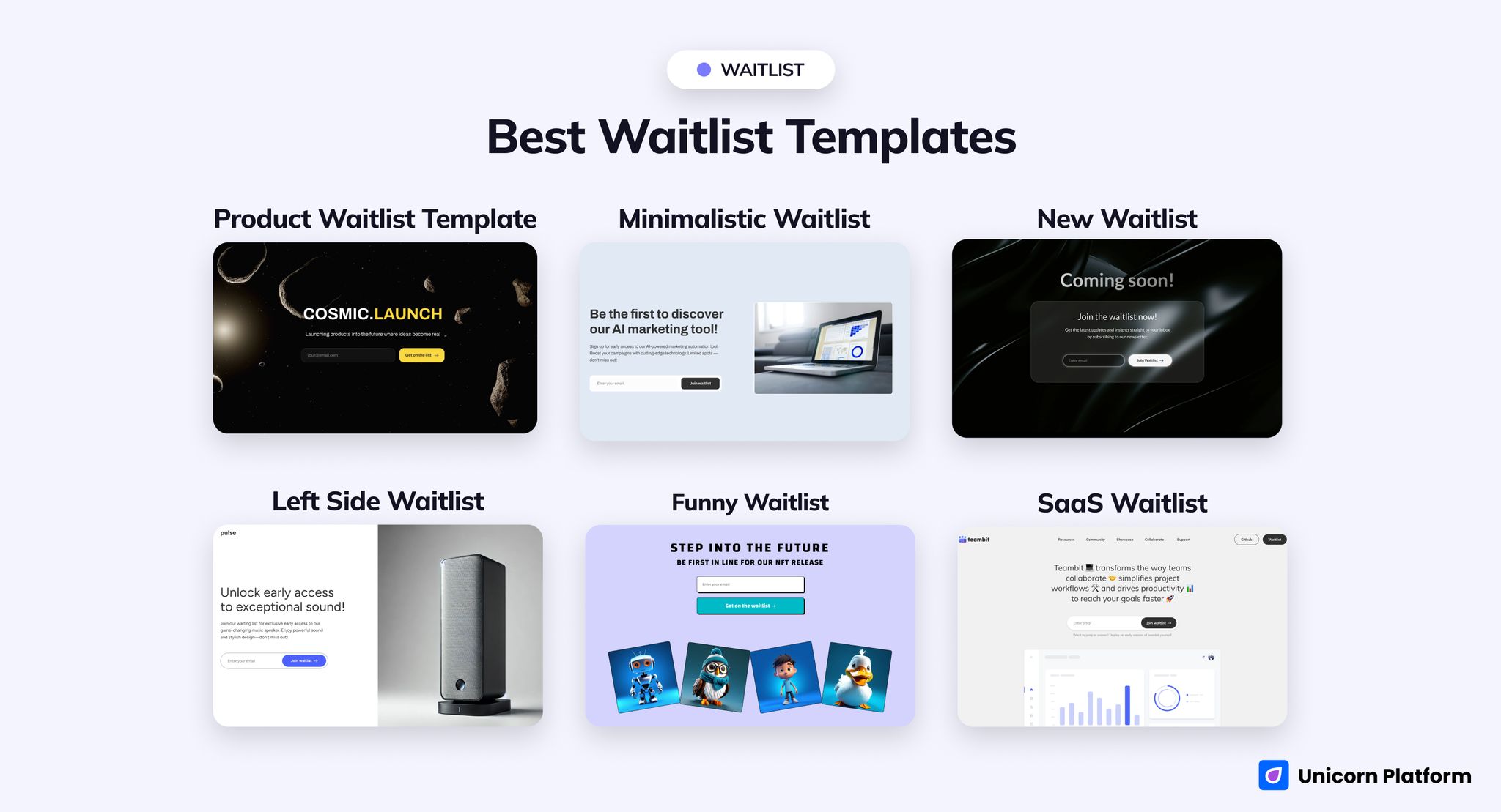
Gallery view of Unicorn prelaunch pages covering futuristic, minimal, playful, and SaaS-style launch layouts
Quick Answer
The safest overall pick for most startup launches is SaaS Waitlist.
It is the most complete option in the group because the live page already behaves like a lightweight software site. It opens with a long collaboration-focused headline, includes navigation links such as Resources, Community, Showcase, and Documentation, and gives the signup more context than the thinner one-screen layouts.
Choose another template only if you know you need a different launch motion:
-
Choose
Product Waitlistif you want the boldest product-reveal energy. -
Choose
New Waitlistif speed and minimal friction matter more than storytelling. -
Choose
Minimalistic Waitlistif you are launching an AI tool and want a cleaner product preview. -
Choose
Left Side Waitlistif your hero image needs to carry half of the persuasion. -
Choose
Funny Waitlistif you are launching something culture-led, community-led, or NFT-like.
If you want the shortest rule: start with the page that already matches your CTA, proof level, and product context. That will save more time than choosing a style first and rebuilding the structure later.
sbb-itb-bf47c9b
At a Glance: Best Picks by Scenario
Best overall for startups and SaaS
SaaS Waitlist
Best bold product reveal
Product Waitlist
Best for AI-tool or focused software launches
Minimalistic Waitlist
Best minimal signup page
New Waitlist
Best for visual-first product launches
Left Side Waitlist
Best for creator, NFT, or community-style drops
Funny Waitlist
How We Evaluated These Templates
We looked at these pages the way a founder or launch operator would: what happens above the fold, how quickly the CTA becomes obvious, how much product context the layout supports before the form, and whether the template helps a visitor understand what they are joining.
The main questions were:
- Is the first action obvious?
- Does the page feel like a pure signup surface or a product-led prelaunch page?
- Is there room for proof, screenshots, or trust cues without rebuilding the flow?
- Does the current live copy suggest SaaS, AI, consumer hardware, creator, or NFT-style positioning?
- How much rewriting will a real team need before going live?
That matters because a good waitlist landing page template does more than look polished. It should reduce launch work by already matching the type of decision your visitor needs to make.
The 6 Unicorn Picks
1. Product Waitlist Template
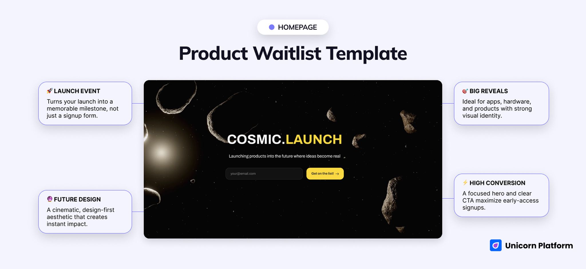
Futuristic product waitlist page with a bold hero, launch-focused copy, and early-access signup framing
- Best for: product reveals, early-access launches, design-forward startup launches
- Style: futuristic, cinematic, one-screen, launch-first
- Strongest sections: hero and frictionless signup CTA
- CTA style: early access / join the waitlist
- Social proof style: almost none by default
- Pricing block: no obvious pricing-first pattern
- FAQ block: not central in the current launch angle
- Launch speed: fast if your positioning is already clear
- Customize first: hero promise, product visual, and one credibility cue near the form
- Main limitation: too thin by default for launches that need trust-building or explanation
The live page opens on Cosmic.Launch with one blunt CTA: Get on the list! That tells you almost everything about the job this template is trying to do. It is built to create anticipation before it explains much else.
Use it when the reveal itself is part of the pitch. A design-led app, a hardware concept, or a product with strong visual identity can get away with this because the visitor already understands the category or is willing to learn later.
This is not the right shape for slower persuasion. There is almost no built-in room for proof, buyer reassurance, or a layered B2B decision path, so colder traffic will usually need added structure before launch.
2. New Waitlist
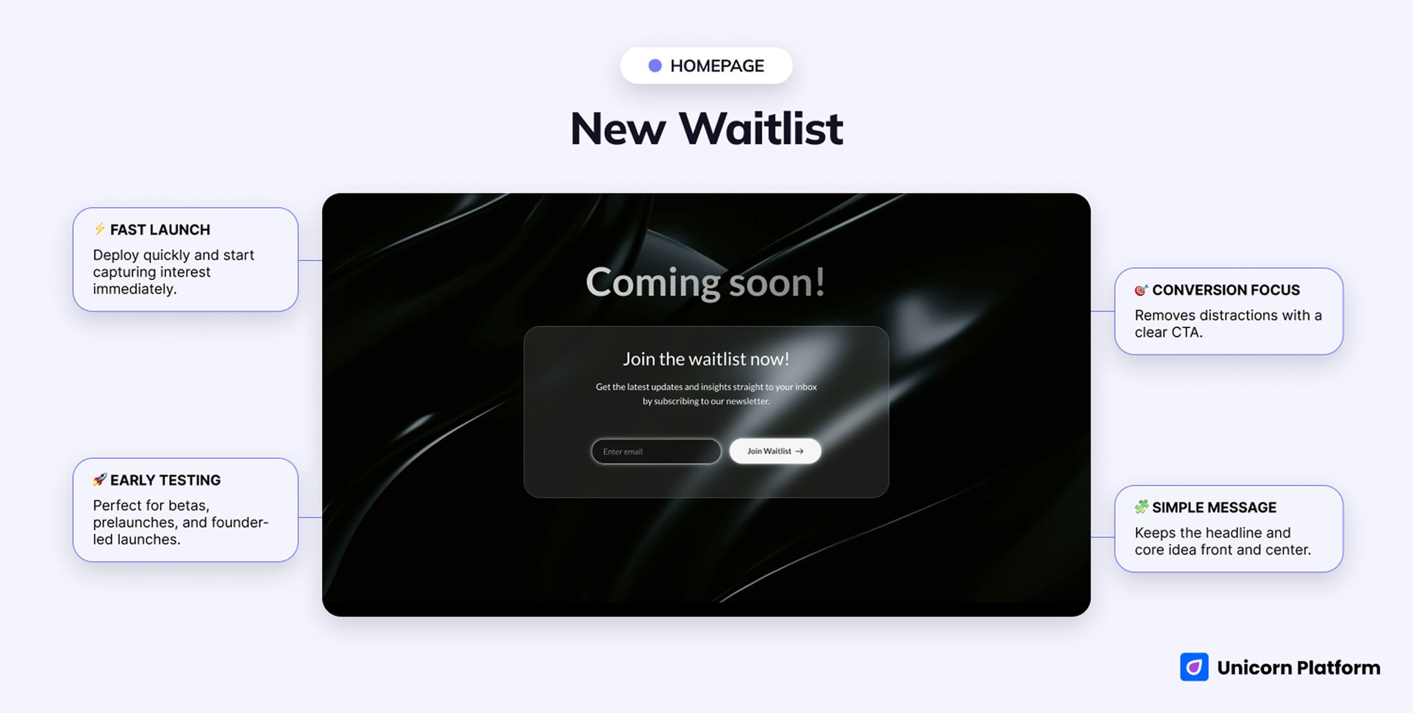
Minimal waitlist page with direct signup copy, one clear call to action, and very little distraction
- Best for: minimal signup pages, announcement-led launches, founder betas, simple prelaunch capture
- Style: direct, minimal, announcement-led, utility-first
- Strongest sections: hero and form
- CTA style: join waitlist
- Social proof style: very light to none
- Pricing block: no obvious pricing block
- FAQ block: no obvious FAQ block
- Launch speed: fastest in the cluster
- Customize first: headline, subheadline, and any newsletter-style wording
- Main limitation: too thin for launches that need proof, screenshots, or layered positioning
The headline on the live page is simply Join the waitlist now! and the form CTA repeats the same message with Join Waitlist. There is very little interpretation work for the visitor to do.
That directness is useful when the real conversion work happens after signup. Founder betas, early tests, and audience-building launches often do not need a full prelaunch story. They need a page that gets out of the way.
The downside is obvious. If your audience needs proof, product visuals, or a reason to believe beyond the headline, this page can start to feel unfinished unless you add that context yourself.
3. Minimalistic Waitlist
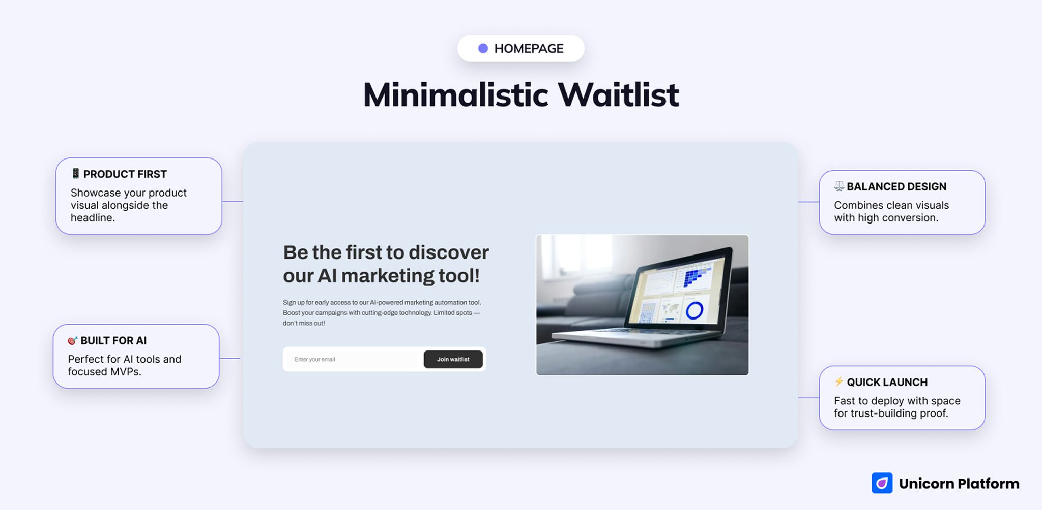
Clean product-shaped waitlist page with minimal visual noise and a focused early-access structure
- Best for: AI tools, focused software launches, polished MVP reveals
- Style: clean, product-led, split-layout, AI-friendly
- Strongest sections: first-screen product framing, supporting image, and focused signup path
- CTA style: waitlist signup / early access
- Social proof style: light unless you add it intentionally
- Pricing block: no obvious pricing-first pattern
- FAQ block: not a central default pattern
- Launch speed: fast
- Customize first: product visual, subheadline clarity, and one proof cue near the CTA
- Main limitation: still too light for evaluation-heavy products
The live headline says Be the first to discover our AI marketing tool! That one line already gives the page a more product-shaped frame than the bare announcement templates.
This is the better fit when you want a lean launch page but still need the visitor to feel that a real product is coming, not just a newsletter. AI tools, utilities, and focused software launches tend to benefit from that middle ground.
It still relies on clarity in the promise. If you soften the headline too much or fail to add one concrete proof cue, the page can slip back into looking like a stylish opt-in form rather than a real product launch.
4. Left Side Waitlist
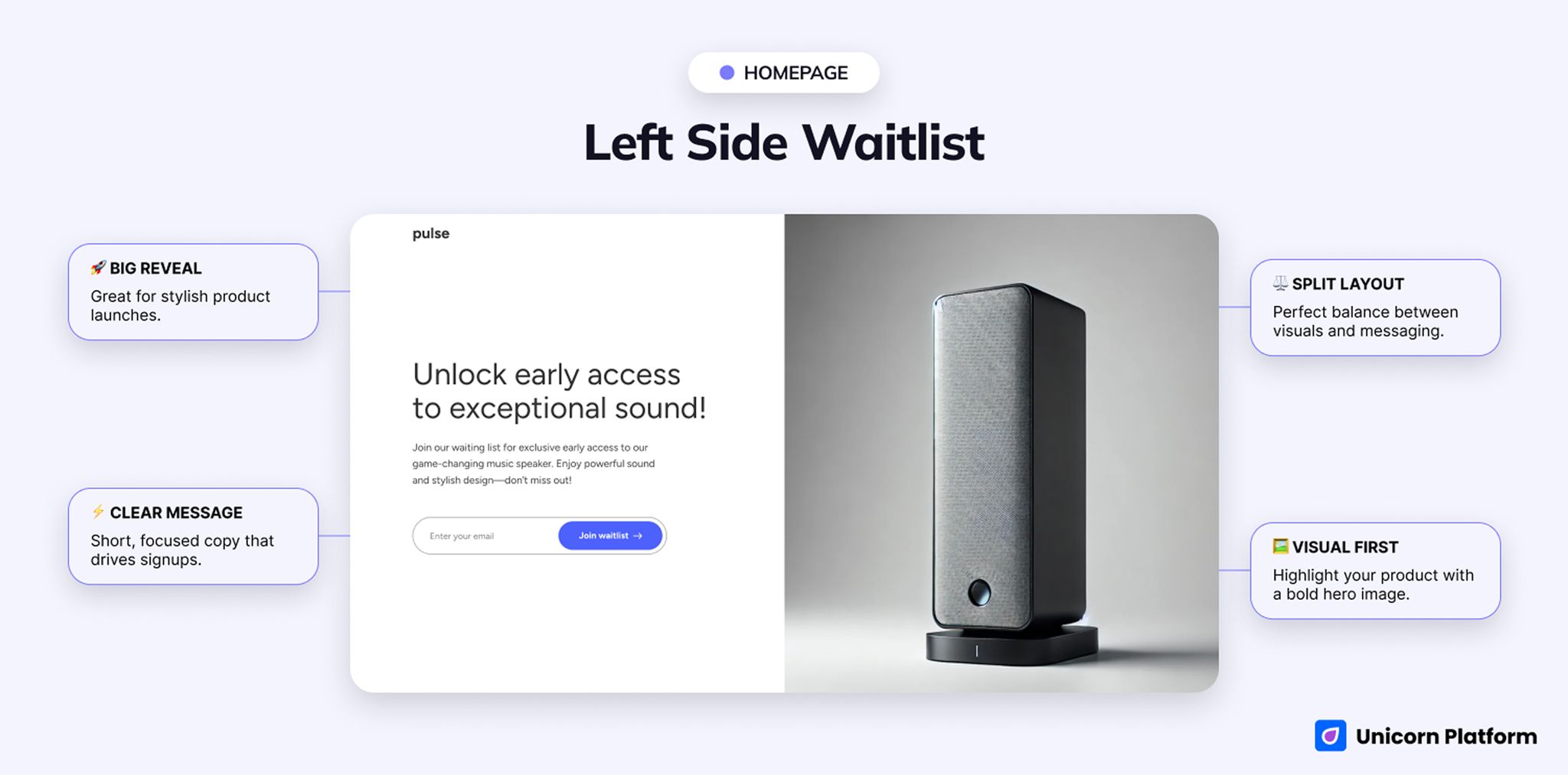
Split-layout waitlist page with product message on one side and a visual or signup focus on the other
- Best for: visual-first product launches, hardware-style reveals, app launches with a strong hero asset
- Style: split-layout, image-led, product-oriented
- Strongest sections: first-screen copy plus fixed product visual
- CTA style: join waitlist after a short value explanation
- Social proof style: lighter than a full SaaS page
- Pricing block: no obvious pricing block
- FAQ block: not a core pattern in the layout
- Launch speed: fast
- Customize first: hero image, headline, and the short explanation above the form
- Main limitation: weaker fit if you do not have a strong visual asset
The live page leads with Unlock early access to exceptional sound! That is a good example of why this layout works best when the visual and the category are already doing a lot of explanatory work.
For hardware, audio, consumer devices, or any launch with a strong hero asset, the split layout makes sense. You can let the image carry half of the persuasion while the copy handles the rest.
Without that kind of asset, the structure loses force quickly. Teams with several buyer types or more careful trust requirements will usually outgrow this format and want a fuller prelaunch page.
5. Funny Waitlist
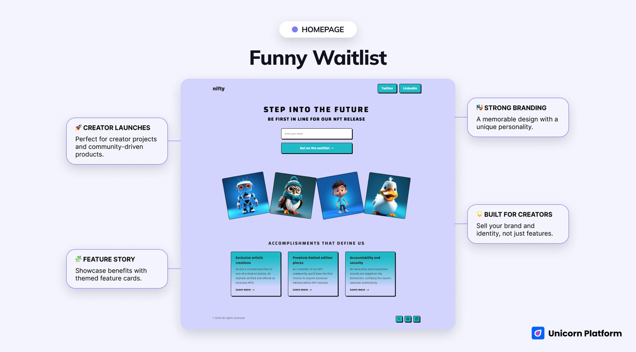
Playful waitlist page with a stronger personality and less traditional SaaS framing
- Best for: NFT drops, creator projects, community-led launches, highly stylized product reveals
- Style: stylized, personality-led, culture-heavy
- Strongest sections: themed hero plus feature-card section
- CTA style: playful waitlist join
- Social proof style: secondary to tone, theme, and feature cards
- Pricing block: no obvious pricing block
- FAQ block: not a core built-in strength
- Launch speed: fast if the brand voice is already clear
- Customize first: theme, supporting line, and feature-card relevance
- Main limitation: too niche for most mainstream startup or SaaS launches
The live page opens with Step into the Future and follows it with sections like Accomplishments That Define Us and Exclusive artistic creations. Even before you scroll far, the message is clear: this page is selling taste and theme as much as access.
That is a real advantage for creator products, collectibles, community projects, and launches where style is part of the offer. A themed first screen can be more memorable than another neat but anonymous software page.
For mainstream SaaS or B2B launches, though, this is the hardest one to repurpose. The current theme is so specific that many teams would spend more time neutralizing it than benefiting from it.
6. SaaS Waitlist
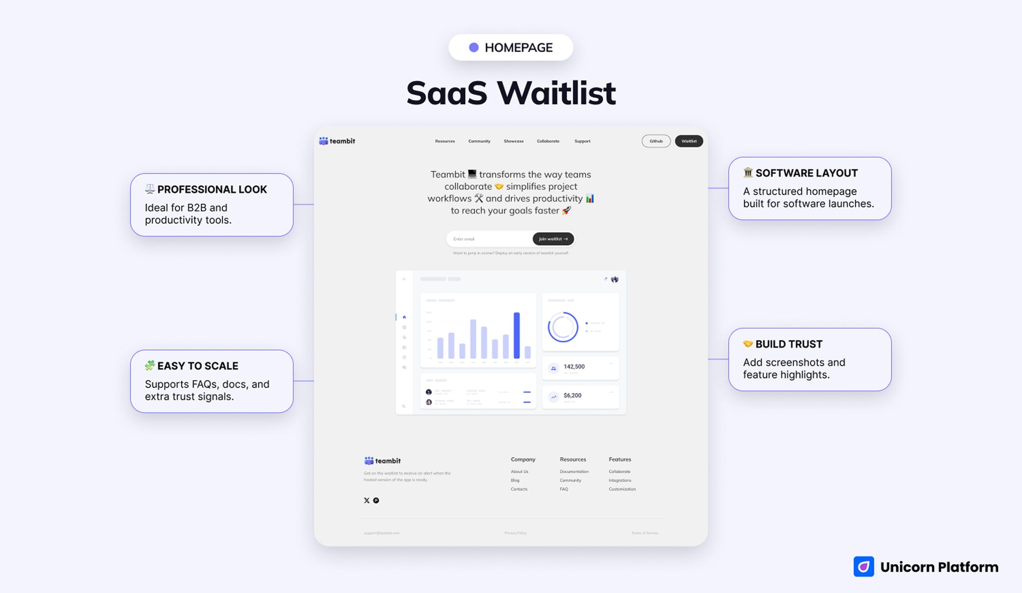
SaaS-style waitlist page with a calmer software frame, clearer explanation, and a structured early-access CTA
- Best for: SaaS launches, productivity tools, workflow products, open-source-friendly prelaunch pages
- Style: SaaS, structured, software-oriented, calmer than the reveal-style pages
- Strongest sections: navigation, product framing, and trust-ready prelaunch structure
- CTA style: join waitlist / get early access
- Social proof style: better natural fit for links, screenshots, community cues, and feature context
- Pricing block: not obviously pricing-led, but more compatible with added structure
- FAQ block: more compatible with added explanation than the thinner waitlist pages
- Launch speed: medium-fast
- Customize first: headline, product screenshot, and trust cues tied to your actual workflow
- Main limitation: more page than you need if the launch only requires a simple signup surface
The live version reads much more like a software homepage than a launch teaser. The hero headline is about transforming the way teams collaborate and improving workflows, and the page already includes links such as Resources, Community, Github, Blog, and Documentation.
That extra structure is exactly why it is the safest fit for productivity, collaboration, and workflow products. Visitors who need a little more confidence before they sign up get enough surrounding context to treat the page like a real product property.
The cost is weight. Smaller campaigns may not need that many cues, and a simple reveal can feel diluted if you force it into a more complete software frame.
[SCREENSHOT_SLOT: SaaS Waitlist / proof or feature explanation close-up] Alt: Close-up of a SaaS-oriented waitlist page section that supports product explanation or trust cues Caption: The value of this template is not just the form. It gives you more room to explain the product before the ask.
Side-by-Side Comparison Table
| Template | Best for | Style | Strongest section | Notable gap | Launch speed |
|---|---|---|---|---|---|
| Product Waitlist | Product reveals and early-access launches | Futuristic and bold | First-screen launch energy | Needs more explanation for careful buyers | Fast |
| New Waitlist | Minimal signup capture and announcement-led launches | Direct and utility-first | Hero plus form | Too thin for proof-heavy launches | Fastest |
| Minimalistic Waitlist | AI tools and focused product launches | Clean and product-led | Product promise plus visual preview | Still light for evaluation-heavy products | Fast |
| Left Side Waitlist | Visual-first product launches | Split-layout and image-led | Hero copy plus fixed product visual | Weak if you do not have a strong visual asset | Fast |
| Funny Waitlist | NFT, creator, and community-style drops | Personality-led and themed | Memorable hero plus feature cards | Too niche for most SaaS teams | Fast |
| SaaS Waitlist | SaaS and productivity launches | Structured and software-oriented | Navigation plus product context | Heavier than needed for simple campaigns | Medium-fast |
Best for Specific Launch Types
Best for a bold product launch
Choose Product Waitlist.
It is the strongest fit when the reveal itself is part of the conversion. If you want people to feel momentum quickly, this is the clearest match.
Best for a SaaS launch
Choose SaaS Waitlist.
It gives you a calmer, more credible software frame and more room to support the signup with screenshots, links, or product context.
Best for an AI tool launch
Choose Minimalistic Waitlist.
This template keeps the page lean while still feeling more product-shaped than a plain form-first waitlist.
Best for a high-personality prelaunch page
Choose Funny Waitlist.
If your launch is community-led or culture-led, this page will feel more memorable than a generic software layout.
Best for the simplest possible signup page
Choose New Waitlist.
It is the easiest option to ship quickly when your main goal is getting people onto the list without extra storytelling.
Waitlist Template vs Coming Soon Template
A waitlist template is the better choice when the main goal is collecting signups, setting early-access expectations, and moving people into a prelaunch sequence. The page should make the signup action feel like the natural next step, not just an optional button under a brand teaser.
A coming soon template is usually broader. It can work well when the page is mainly an announcement surface, a countdown page, or a light launch teaser that does not need strong qualification logic. If your launch needs that broader prelaunch framing, use this deeper coming soon page strategy guide rather than forcing that job onto a waitlist-first layout.
The simplest rule is this: if your page lives or dies on signups, start with a waitlist-first structure. If the page is mostly about signaling that something is on the way, a coming soon page template may be enough.
What to Customize First Before Launch
No matter which page you choose, start with the parts that change signup quality the fastest.
- Rewrite the first-screen promise so it names the audience and the reason to join now.
- Add one trust cue near the CTA, such as a product screenshot, a short credibility line, or a concrete expectation block.
- Tighten the form ask so it feels appropriate for the launch stage.
- Make the thank-you state and follow-up expectation clear.
- Remove any extra blocks that distract from the main conversion action.
If you need a deeper framework for the structure behind that work, this waitlist landing page guide is the right next step after you pick the layout.
When This Type of Template Is the Wrong Fit
These templates are not the best starting point when:
- you need a full product marketing site with several stakeholder paths
- your buyers need detailed pricing comparison before any signup
- the page is really a documentation, onboarding, or demo-booking surface
- your launch depends on heavy proof, case studies, or long-form objection handling
- the audience is not ready to join anything yet and needs broader education first
In those cases, a fuller SaaS or product page template will usually save you more work than stretching a thinner waitlist page too far.
Why Build This in Unicorn Platform
Unicorn Platform is a good fit for this kind of page because it lets teams launch quickly without turning every prelaunch update into a rebuild. That matters when positioning changes, signup copy needs tuning, or you want to test a lighter page against a more product-led version.
It is also useful when you want one repeatable system instead of separate one-off pages. You can start with the layout that best matches the launch, then keep the structure stable while updating screenshots, CTA copy, or proof cues as the product gets closer to release.
The main value here is not that every template works for every launch. It is that the right one can get you live faster with less structural rewriting.
FAQ
Which Unicorn layout is best when I need more than a bare signup form?
SaaS Waitlist is the best starting point. It already has the software-style context most teams end up needing anyway, including navigation, documentation-style links, and a calmer collaboration-product angle.
Which waitlist page is fastest if I only need to collect emails?
New Waitlist is the shortest route. The live page says Join the waitlist now! and stays focused on that one action almost the entire way through.
Which template works best if the reveal itself is the hook?
Product Waitlist Template is the clearest match. Cosmic.Launch plus Get on the list! gives it the strongest event-like energy in the group.
Which option is strongest for AI tools or focused software?
Minimalistic Waitlist is the cleanest fit when the product can be explained in one sharp line. Its live AI-marketing framing already feels closer to a product preview than to a generic signup page.
When should I avoid the themed or playful option?
Skip Funny Waitlist unless the brand voice is a major part of the launch. The live NFT-style framing is memorable, but for most standard startup launches it creates extra rewriting work.
Final CTA
If your launch depends on signups, choose the page shape before you choose the aesthetic. Start with SaaS Waitlist if you need product context, Product Waitlist if the launch should feel like an event, or New Waitlist if speed matters more than story. That is almost always faster than taking the wrong layout and trying to force it into a different job later.