Table of Contents
- A Practical Architecture for Travel Conversion Pages
- 30-Day Action Plan
- Common Mistakes and Fast Fixes
- FAQ
Many tourism brands collect design inspiration, build a beautiful homepage, and still miss booking targets. The visual layer improves, but traveler confidence does not. Visitors browse photos, check a few details, and leave to compare alternatives.
This happens because travel decisions are emotional and operational at the same time. Users want to feel the destination experience, but they also need practical clarity around timing, budget, inclusions, and risk policies before committing.
The best-performing travel sites are not random galleries of good design ideas. They are structured decision systems that help people move from inspiration to a clear next step.
This guide explains how to build that system in 2026 using Unicorn Platform. It focuses on repeatable execution: what page elements matter most, how to improve inquiry quality, and how to run weekly optimization without constant redesign cycles.
sbb-itb-bf47c9b
Quick Strategic Takeaways
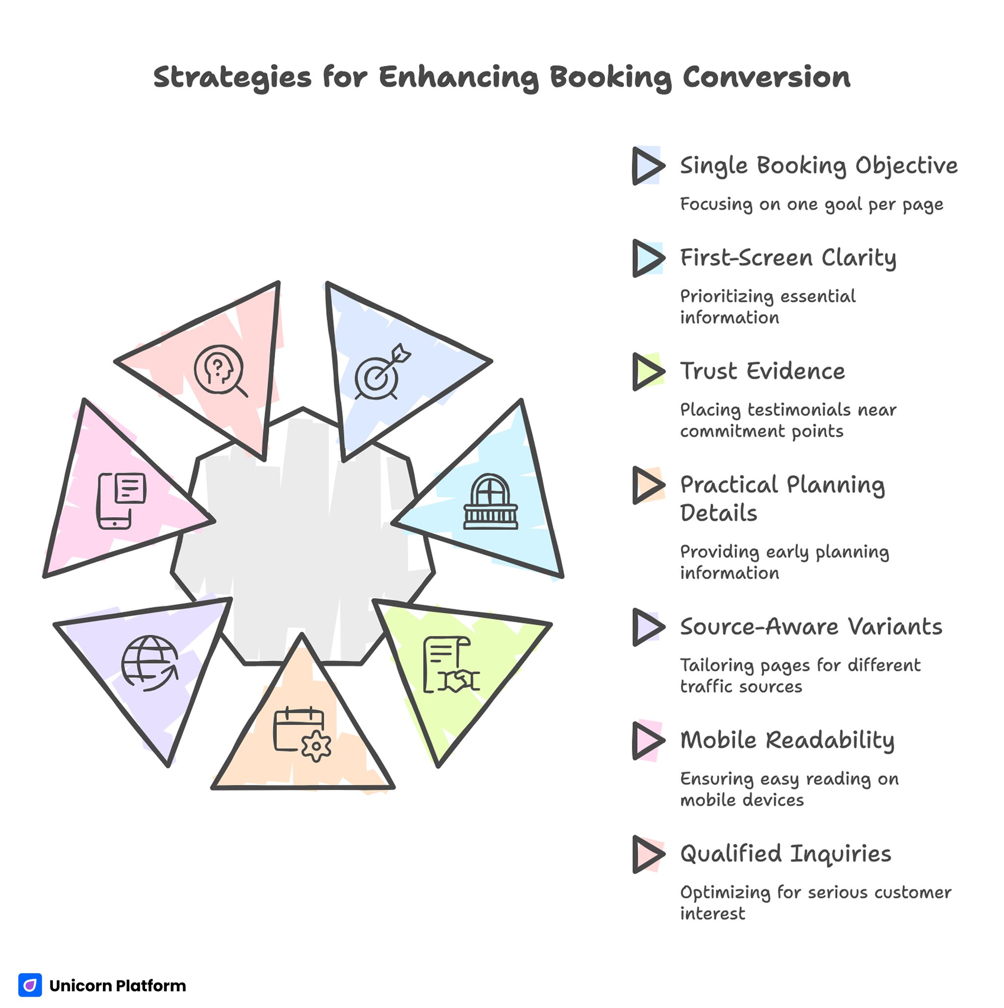
Strategic for Enhancing Booking Conversion
- Start with one booking objective per page and one primary CTA path.
- Prioritize first-screen clarity before adding extra design components.
- Place trust evidence near commitment points, not only near the footer.
- Show practical planning details early to reduce traveler hesitation.
- Build source-aware variants instead of one page for all traffic.
- Treat mobile readability and form flow as hard release gates.
- Optimize for qualified inquiries, not only top-funnel traffic.
Why Travel Website Redesigns Often Underperform
Tourism teams often overvalue visual polish and undervalue decision clarity. A strong hero image can increase engagement, but it does not automatically answer the traveler’s core questions.
Most underperforming pages fail in three ways. They open with broad lifestyle language instead of specific trip value. They delay key details like budget range and inclusion scope. They ask for inquiry actions before proving trust and logistics reliability.
A better model starts with user uncertainty mapping. Each section should reduce one specific hesitation and prepare users for the next decision.
Start With the Page Job, Not the Layout
Before choosing templates or section styles, define the exact job of the page. If the page job is unclear, every copy and UX decision becomes subjective.
Common travel page jobs include quote request, itinerary download, fixed-date booking, and consultation call booking. Each page should optimize one primary outcome and one secondary fallback action.
Then map audience stage. Cold search users need orientation and trust first. Warm referral users usually need faster commitment paths with less explanation.
This definition step prevents teams from forcing one page to serve incompatible intents. It also gives cleaner analytics because outcomes are tied to one decision path.
A Practical Architecture for Travel Conversion Pages
Use a stable structure before testing copy variations. Stable architecture makes improvements measurable.
A reliable sequence for tourism pages includes the blocks below. Keep this order stable for initial test cycles so you can diagnose where conversion breaks.
- destination-specific value statement with audience fit
- practical trip summary and expectation framing
- itinerary or experience mechanism in clear steps
- trust layer with reviews, proof, and policy clarity
- inclusion and exclusion transparency
- FAQ for common risk questions
- primary booking or quote CTA with timing expectations
This order mirrors how travelers evaluate offers. It also improves internal workflow because every section has a clear role during QA and optimization.
For teams refining visual sequence and page hierarchy, this guide on travel site design ideas can help align aesthetics with conversion flow.
First-Screen Clarity for Travel Buyers
The first screen should do more than sell a mood. It should quickly explain who the trip is for, what kind of experience is offered, and what action the visitor can take now.
Vague lines like “discover unforgettable adventures” rarely help users compare real options. A stronger approach names route type, travel format, and planning context in one concise statement.
When first-screen clarity improves, bounce decreases and deeper sections perform better because users understand what they are evaluating. This single change often improves both engagement quality and inquiry intent.
Trust Design: Evidence That Reduces Booking Risk
Trust is not one testimonial slider. Trust is a sequence of evidence elements that lower perceived risk at specific decision points.
For travel pages, useful trust components include contextual reviews, verified ratings, trip leader credibility, safety standards, and cancellation policy clarity. Each one answers a different uncertainty category.
Place trust where friction appears. If users hit pricing or form sections before seeing policy and social proof, inquiry completion often drops.
Teams improving trust structure often benefit from reviewing practical patterns in travel website UI decision flows to identify where confidence breaks during scanning behavior.
Inclusions, Exclusions, and Pricing Orientation
Travel buyers do not always need full detailed contracts on the landing page, but they need enough clarity to self-qualify. Without this, teams receive higher inquiry volume with lower intent quality.
A practical orientation block should include starting range, what is included, what is excluded, and a clear explanation of optional upgrades. This structure reduces confusion and shortens follow-up cycles.
Inclusion clarity also protects brand trust. Surprises after inquiry are one of the fastest ways to weaken conversion momentum.
Itinerary Framing That Supports Decisions
Itinerary sections should be scannable, specific, and expectation-focused. Long narrative paragraphs about destination beauty can inspire interest, but they rarely answer planning questions.
Use concise day-group blocks, transfer notes, accommodation level indicators, and activity intensity context. Add one line on who this route is best for and who may find it misaligned.
This approach improves both conversion quality and support efficiency because users arrive with better fit awareness. Better fit awareness reduces avoidable back-and-forth during quote qualification.
Content-to-Booking System for Organic Growth
Travel content performs best when it routes readers into aligned commercial pages. Publishing guides without conversion pathways creates traffic that rarely compounds into bookings.
According to data from the UN World Tourism Organization (UNWTO), digital channels increasingly shape how travelers research and plan trips, which makes structured content-to-booking pathways essential for modern tourism websites
A practical cluster model uses one destination pillar, planning support pages, comparison pages, and one conversion page with clear CTA options. Each content type has a distinct user intent and next-step destination.
Internal links should be contextual and decision-driven. Link from planning friction points to relevant conversion paths where users naturally need the next action.
For teams building this structure, this resource on content marketing for travel websites gives a useful operational baseline.
Channel-Specific Variants for Higher Inquiry Quality
One universal travel page can be useful for initial validation, but multi-channel acquisition usually requires intent-specific variants. Social discovery clicks and high-intent search clicks arrive with different information needs.
Keep one shared design system, then vary narrative order and proof emphasis by source. Paid social variants may need faster trust building. Organic comparison traffic may need deeper itinerary and inclusion detail before action.
Document each variant hypothesis before launch. Without explicit hypotheses, teams end up running cosmetic changes that produce noisy results.
Mobile-First Execution as a Revenue Safeguard
A large share of travel research starts on mobile. Industry research from Think with Google shows that a majority of travel planning journeys now begin on mobile devices, making mobile clarity and fast interaction critical for tourism conversions If first-screen text is unclear, CTA taps are awkward, or form steps are too heavy, users drop before they reach trust content.
Run mobile QA before every major update. Check heading readability, quick-facts visibility, tap comfort, image load behavior, and form completion flow.
Make mobile checks release gates, not cleanup tasks. Teams that defer mobile fixes usually pay for low-quality traffic leakage.
Form Strategy for Travel Inquiry Pages
First-step forms should capture intent and routing essentials without overloading users. Asking too many operational details early can reduce completion and create abandonment spikes.
Use progressive detail collection. Initial forms gather core trip interest and timing signals, then follow-up workflows gather deeper logistics.
This model keeps friction low while preserving lead quality. It also makes testing easier because each form field has a clear job.
Weekly Optimization Workflow for Lean Travel Teams
Tourism teams often have seasonal pressure, so optimization needs a lightweight cadence that survives busy periods. A weekly rhythm with one major test variable is usually sustainable and effective.
High-impact weekly test areas include hero clarity, trust placement, inclusion framing, CTA language, and form friction. Keep other high-impact components stable to preserve attribution quality.
Document every test with hypothesis, change, metric, and decision. Over time, this creates a reusable playbook and prevents repeated mistakes.
30-Day Action Plan
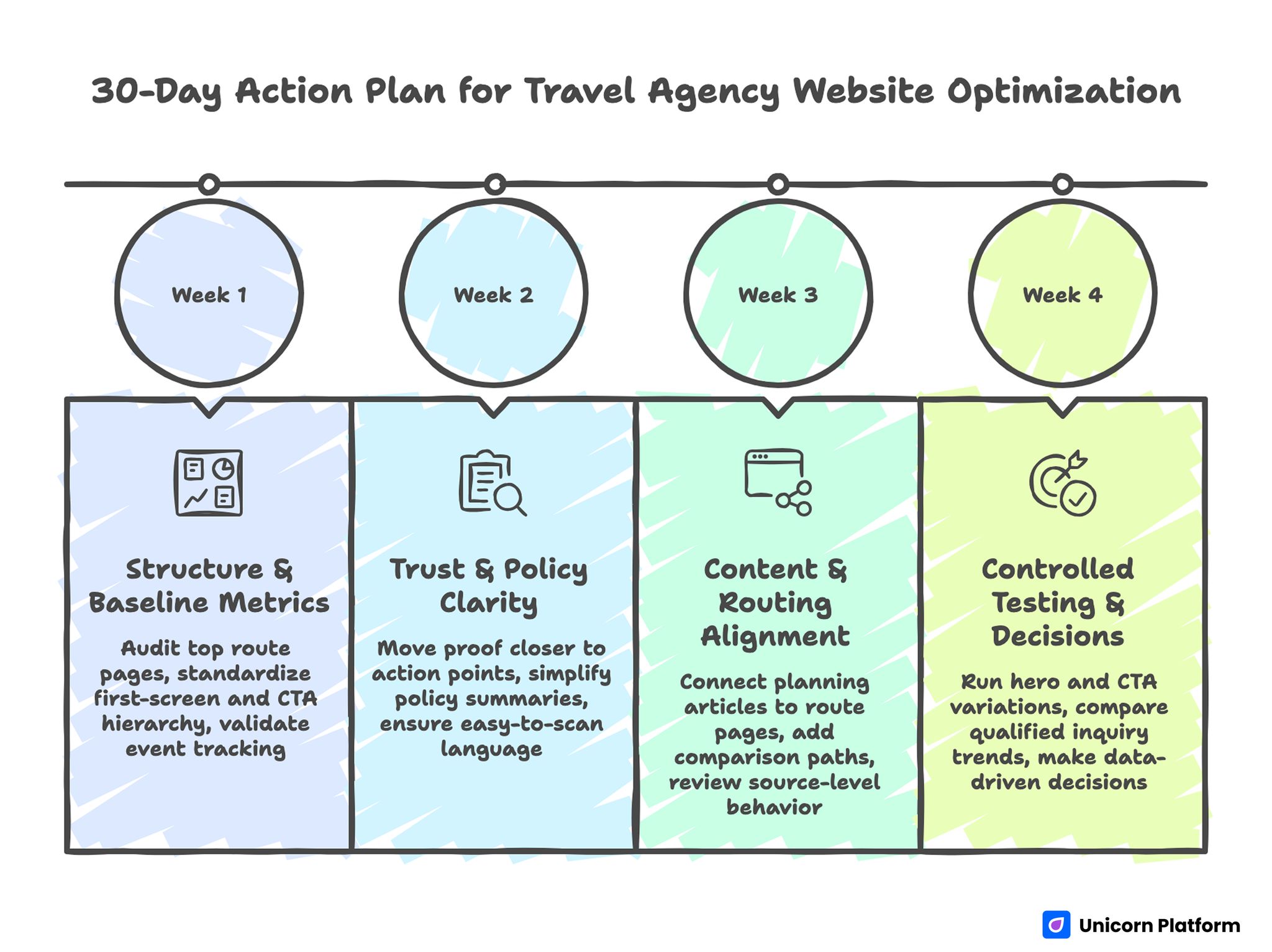
30-Day Action Plan for Travel Agency Website Optimization
Week 1: structure and baseline metrics
Audit top route pages using one conversion checklist, then standardize first-screen and CTA hierarchy. Validate event tracking for inquiry starts and completions.
Week 2: trust and policy clarity
Move key proof closer to major action points and simplify policy summaries near commitment sections. Ensure inclusion and exclusion language is easy to scan.
Week 3: content and routing alignment
Connect top planning articles to matching route pages and add one comparison path where users commonly hesitate. Review source-level behavior for intent mismatch.
Week 4: controlled testing and decisions
Run one hero variation and one CTA variation on different page sets. Compare qualified inquiry trends, not only form volume.
This plan keeps execution realistic for small teams while preserving measurement integrity. It also helps teams maintain momentum without overloading weekly capacity.
90-Day Scale Readiness Model
Before increasing acquisition spend, verify that conversion quality is stable across channels and devices. Scaling unstable pages usually amplifies inefficiency.
Run a readiness check on five areas before expanding budgets. The checklist keeps scaling decisions tied to quality evidence rather than short-term enthusiasm.
- message-source match
- trust evidence freshness
- inclusion/policy clarity
- form reliability and response expectations
- inquiry quality by source
If multiple areas are unstable, delay scaling and fix foundation sections first. Budget discipline is usually more profitable than rushed growth during quality drift.
Team Ownership Model for Sustainable Execution
Landing performance decays quickly when ownership is ambiguous. Clear role assignment keeps update quality stable while preserving speed.
A practical split includes messaging owner, accuracy owner, proof owner, and release QA owner. Each owner should have one measurable quality responsibility.
This model reduces approval bottlenecks and ensures content, policy, and UX stay aligned as campaigns evolve.
Seasonality and Campaign Timing Strategy
Travel demand shifts with school calendars, holidays, weather windows, and regional booking habits. Pages that ignore these timing patterns often underperform even when their structure is strong.
A practical approach is to keep one evergreen conversion foundation while adding seasonal modules for urgency and route relevance. Examples include departure-window highlights, seasonal inclusions, and date-specific availability indicators.
Seasonal messaging should be precise and trustworthy. If urgency language is broad or unsupported, users may delay instead of acting because confidence drops.
Use a lightweight seasonal update process:
- review top route demand windows monthly
- refresh seasonal proof and availability cues
- align CTA language to current booking horizon
- update FAQ entries for recurring seasonal objections
This process protects relevance without forcing full-page redesigns every quarter. It also improves conversion consistency because users see information that matches current planning behavior.
Common Mistakes and Fast Fixes
Mistake 1: treating examples as style-only inspiration
Visual references help, but they should be converted into decision standards. Build a scorecard that links layout choices to booking outcomes.
Mistake 2: delaying practical details too long
Users cannot self-qualify without inclusion, timing, and budget orientation. Surface key planning details earlier in the flow.
Mistake 3: stacking too many equal CTAs
Competing actions reduce commitment. Keep one primary action per page and demote secondary paths.
Mistake 4: using long first-step forms
Heavy forms reduce completion and often lower inquiry quality. Keep first touch concise and qualify later.
Mistake 5: weak mobile execution
Unreadable first-screen copy and awkward tap flow erode conversion quickly. Add mobile checks to mandatory QA.
Mistake 6: scaling before quality stabilization
More traffic does not fix weak conversion mechanics. Scale only when message and lead-quality indicators are stable.
FAQ: Travel Agency Website Strategy
How many route pages should a travel brand launch first?
Start with your highest-demand routes plus one comparison page. Expand after conversion quality stabilizes on the baseline set.
Should travel pages show pricing on the landing page?
You should provide orientation-level pricing context even if full quoting is customized. Transparency improves trust and self-qualification.
What is the best first optimization test?
For most teams, first-screen clarity and CTA wording produce the fastest measurable impact. These two levers usually influence both engagement depth and inquiry intent.
How often should trust blocks be updated?
At least monthly, and sooner when offers, policies, or route details change. Fresh trust signals maintain confidence during high-competition booking periods.
What metric matters most after inquiry volume?
Qualified inquiry rate by source is usually the most useful secondary metric. It reveals whether traffic growth is improving commercial quality or only increasing noise.
Do we need separate pages for each traffic source?
Not always at the beginning, but source-specific variants become important once traffic intent diverges. They are especially valuable when paid and organic channels behave differently.
How can we reduce low-intent inquiries?
Improve self-qualification cues through inclusion clarity, audience-fit messaging, and stronger trust placement. Better self-qualification usually improves both conversion confidence and sales efficiency.
Is mobile optimization still critical if desktop bookings are higher?
Yes, because many users discover and evaluate options on mobile before converting later. Weak mobile clarity can therefore lower total conversion even if desktop completion appears strong.
How many experiments should we run per week?
One major variable per week is a practical cadence for most lean travel teams. This rhythm balances experimentation speed with data reliability.
What keeps travel websites improving over time?
Stable structure, clear ownership, consistent testing, and disciplined documentation of decisions. These four elements keep performance improvements durable over time.
Final Takeaway
Strong tourism websites are not built by copying styles. They are built by translating inspiration into a consistent decision framework that improves booking confidence.
With Unicorn Platform, teams can run that framework quickly through reusable sections, controlled tests, and clear ownership. When process quality is strong, travel pages become reliable booking systems instead of static brand brochures.
For teams expanding into high-detail destination pages, this practical guide on safari lodge website structure can help adapt trust and logistics clarity to premium travel offers.
Related Blog Posts
- Travel Website Design: Creating an Experience That Inspires Wanderlust
- Travel Agency Website Examples Only Work When You Turn Inspiration Into a Booking System
- How Tour Operators Should Choose Web Design Partners and Build Sites That Convert
- How to Build a Travel Blog Website That Grows Traffic and Drives Revenue