Table of Contents
- What High-Performing GitHub Personal Pages Do Better
- The Core Structure for a GitHub Personal Page
- Building in Unicorn Platform: Practical Workflow
- Common Mistakes and Practical Fixes
- FAQ
A GitHub personal page can do more than display repositories. It can become your strongest professional asset if it helps visitors understand what you build, why your decisions matter, and how to work with you.
Many developer sites fail because they show code without context. Technical peers may understand the implementation details, but hiring managers, founders, and clients often need clearer outcome framing before they can evaluate fit.
A strong personal page closes that gap. It preserves technical depth while translating your work into readable proof for mixed audiences.
This guide explains how to structure a GitHub personal page so it supports hiring, consulting, collaboration, and long-term brand growth. You will get practical frameworks for project storytelling, README architecture, portfolio navigation, and conversion paths.
If you need a setup-first reference before optimization, this GitHub personal website guide is a useful starting companion.
sbb-itb-bf47c9b
Quick Strategic Takeaways
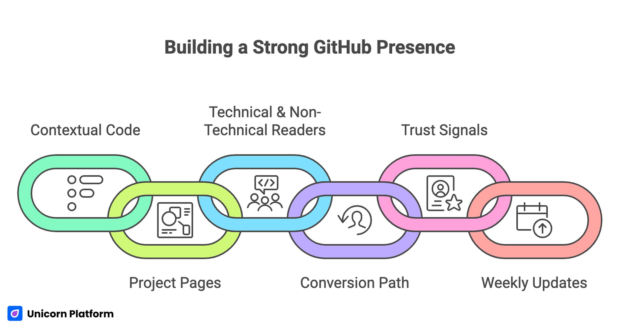
Building a Strong GitHub Presence
- Repositories alone are not enough; context turns code into credibility.
- Project pages should explain problem, decision, tradeoffs, and impact.
- A personal page must serve technical and non-technical readers together.
- One primary conversion path improves opportunity quality.
- README and profile structure are major trust signals, not minor details.
- Weekly updates keep portfolio relevance high as skills evolve.
Why GitHub Personal Pages Still Matter in 2026
Developers now have many visibility channels, but most are fragmented. A GitHub personal page gives you one controlled destination where your strongest work is presented intentionally.
That matters because opportunities often start with fast screening. Recruiters, team leads, and potential clients may spend only a few minutes deciding whether to continue. If your page is unclear, even strong projects can be ignored.
A well-structured page reduces that risk by making your strengths obvious quickly. It also helps referrals. When someone shares your page, they are sharing a coherent professional narrative instead of a raw list of links.
Over time this becomes compounding leverage. Each improved project entry, architecture note, and proof block increases trust for future visitors without requiring constant outbound effort.
What High-Performing GitHub Personal Pages Do Better
Top developer portfolios vary visually, but their logic is consistent. They make technical work understandable, verifiable, and actionable. For additional tips on building a personal developer portfolio, see GitHub Guides – Building a Personal Portfolio
1. They define focus early
Visitors see role, domain, and problem space in the first screen. This helps high-fit opportunities identify relevance immediately.
2. They curate projects strategically
Only selected projects are highlighted, and each one supports the same positioning direction. Random or outdated repositories are not allowed to dilute the narrative.
3. They explain decisions, not just features
Strong pages show constraints, tradeoffs, and architectural reasoning. This signals engineering maturity better than long stack lists.
4. They use layered depth
Every project has a quick summary and a deeper path for technical readers. This keeps pages scannable while preserving credibility for detailed evaluators.
5. They guide visitors to clear next actions
A defined CTA path for hiring, consulting, or collaboration reduces ambiguity and improves inquiry quality. It also shortens decision time for visitors who are ready to engage.
Defining Your Portfolio Objective Before Building
Before choosing layout or style, define the primary job of the page. Different goals require different project emphasis and CTA design.
Common objectives include the most frequent professional outcomes developers target with portfolio traffic. Selecting one objective first usually improves conversion clarity across every section.
- hiring for a specific engineering role
- attracting freelance or consulting work
- showcasing open-source credibility
- building authority in a technical niche
If your objective is unclear, the page usually becomes broad and low-converting. Start with one objective per version, then expand only when data supports it.
A second step is defining your priority audience. A CTO hiring for platform reliability evaluates different signals than a founder hiring a product generalist. Audience clarity improves section decisions everywhere else.
The Core Structure for a GitHub Personal Page
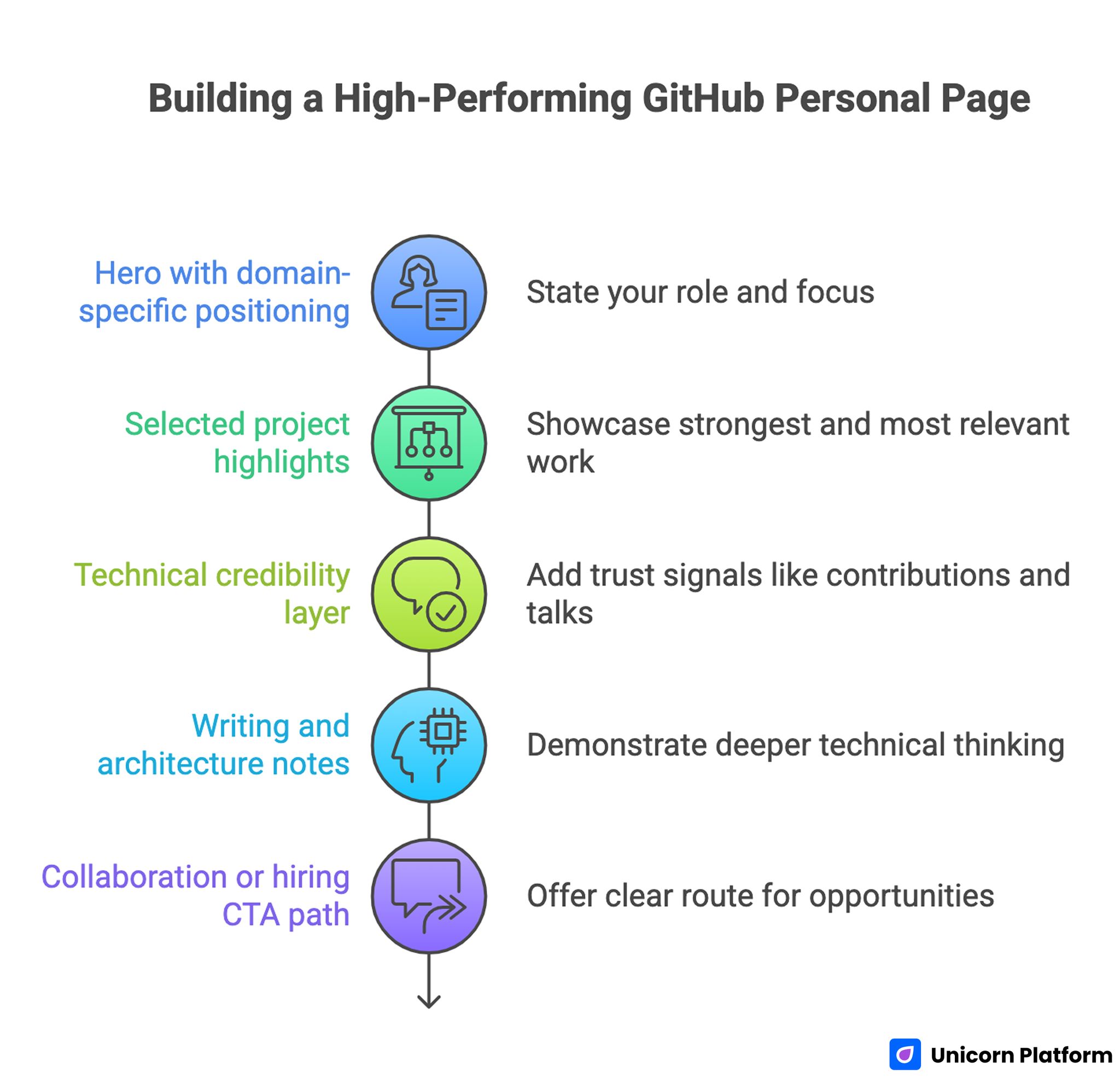
Building a High-Performing GitHub Personal Page
A high-performing developer page follows a clear sequence from identity to proof to action. This sequence keeps mixed audiences oriented from first scroll to final decision.
1. Hero with domain-specific positioning
State your role and focus in practical language. The hero should clarify what kind of systems you build and for what kinds of outcomes.
A generic hero like "software engineer" is too broad to differentiate. A specific line tied to domain and impact is easier to trust.
2. Selected project highlights
Show three to six projects that represent your strongest and most relevant work. Each project should include role clarity, core challenge, and measurable result.
If all projects are equally presented, users cannot tell what matters most. Deliberate ordering communicates confidence and priorities.
3. Technical credibility layer
Add concise trust signals such as open-source contributions, shipped libraries, architecture articles, talks, or certifications. Choose signals that directly support your stated domain focus.
This layer should support your positioning, not act as a long achievements list. Relevance beats quantity.
4. Writing and architecture notes
Include a section for deeper technical thinking. A short set of decision writeups demonstrates how you reason, not only what you built.
For teams that want stronger structure beyond project cards, this technical integration page framework can help map implementation depth to readable supporting content.
5. Collaboration or hiring CTA path
Offer one clear route for the opportunity type you want most. Explain what inquiries are a fit and what response timing to expect.
This step reduces low-fit requests and improves conversion quality from serious visitors. It also helps you respond faster because inquiry intent is clearer.
Building Better Project Narratives
The fastest way to improve a GitHub personal page is rewriting project summaries. Most developers write implementation-first descriptions that miss context.
Use a four-part project narrative to keep summaries specific without becoming heavy. This structure works well for both fast scanning and deeper technical review.
- problem context
- key technical decision
- implementation highlights
- measurable impact and lesson
This structure helps both engineers and non-engineers evaluate your work. Engineers can assess technical judgment, while non-technical readers can assess business relevance.
Weak vs strong summary pattern
Weak summary: "Built API service using Node and Redis."
Stronger summary: "Designed an API gateway with rate-limiting and caching, reducing median response time by 32% and improving incident traceability through structured logs."
The second pattern communicates decision quality and outcome, which is what decision-makers usually need.
README Strategy: Small Asset, Big Signal
README quality strongly influences perceived professionalism. For many visitors, README pages are the first technical artifact they see.
A strong project README should include essential context and navigation cues for new readers. This prevents confusion and increases the chance that visitors reach your most important proof sections.
- problem statement and intended users
- architecture overview at a high level
- quick start instructions
- key design choices and tradeoffs
- known limitations and planned improvements
This structure improves trust because it shows clarity, maintainability, and communication discipline.
Your profile README also matters. It should connect projects into one story, highlight current focus, and direct readers to your highest-value work first.
Project Types That Showcase Full Capability
A balanced GitHub portfolio usually benefits from different project archetypes. This helps visitors evaluate both depth and range.
Productized project
Shows your ability to build something complete and usable. It demonstrates delivery, not just experimentation.
Infrastructure or tooling project
Shows systems thinking, reliability patterns, and engineering rigor. This type of project helps reviewers evaluate how you manage complexity under constraints.
Documentation or knowledge project
Shows communication quality and ability to teach complex concepts clearly. Strong documentation artifacts can differentiate you in competitive technical markets.
These project types together create a fuller professional signal than repeating similar small demos.
Hiring vs Consulting Pathways
Different opportunities require different framing. A single generic contact section often underperforms because visitor intent varies.
Hiring-focused pathway
Emphasize ownership, team collaboration, and long-term system impact. Hiring managers want consistency, reliability, and ability to operate within evolving constraints.
Consulting-focused pathway
Emphasize speed-to-value, scoping clarity, and delivery confidence. Clients need to understand what you can solve now and how engagement works.
Use clear intent-based options so visitors self-qualify before submitting. This reduces operational overhead and improves response quality.
Navigation and UX for Mixed Audiences
Developer personal pages should be simple to navigate. Complex menus and dense layouts can hide your best work.
A practical navigation model keeps decisions simple for both technical and non-technical visitors. Use the structure below as a stable baseline and adapt only when behavior data shows clear friction.
- Home
- Projects
- Writing or Notes
- About
- Contact
This structure is intuitive for both technical and non-technical visitors. It also keeps maintenance manageable as your content grows.
When refining conversion hierarchy across these pages, this high-converting landing page structure guide can help you sequence trust and action points more effectively.
UX details also matter. Clear spacing, readable project cards, and predictable section rhythm increase comprehension and reduce bounce.
Mobile Quality as a Credibility Signal
Many reviews happen on mobile first. If your portfolio is hard to scan on small screens, trust can drop before users reach your strongest proof.
Mobile quality checklist should be treated as a release gate, not a final polish step. Fixing these issues before sharing reduces first-impression loss.
- concise first-screen positioning
- tap-friendly project cards and links
- readable summaries without zoom
- fast-loading visual assets
- clear CTA visibility in early scroll
Mobile performance is especially important for shared links from social platforms and chats where first impressions are quick.
SEO and Discoverability for Developer Portfolios
SEO for personal technical pages should focus on relevance and clarity, not broad keyword coverage. Narrow topical consistency usually performs better than generalized positioning. For more guidance on SEO tailored for developers, check out Moz Blog.
Use descriptive page titles, clean headings, and internal links between project pages and technical notes. This helps visitors and search systems understand your topic focus.
Match content to your intended niche. If your work centers on data infrastructure, your project summaries and notes should reinforce that positioning consistently.
Avoid generic positioning phrases that make your profile indistinguishable. Discoverability is stronger when your domain focus is explicit.
For broader personal-brand clarity outside technical audiences, this personal website strategy guide can help align messaging and conversion flow across profile pages.
Building in Unicorn Platform: Practical Workflow
Unicorn Platform works best when you treat your page as a modular professional system rather than a static profile. The platform advantage comes from fast iteration on high-impact sections.
Step 1: Set objective and audience
Define primary opportunity type and priority visitor segment. This alignment gives each later content decision a clear filter.
Step 2: Build core narrative sections
Create hero, selected projects, proof layer, and clear CTA path before polishing visuals. Conversion architecture should always precede decorative refinement.
Step 3: Rewrite top project summaries
Use outcome-driven narrative format so project value is clear in under 20 seconds. Fast clarity improves both retention and inquiry quality.
Step 4: Add intent-based contact pathways
Separate hiring, consulting, or collaboration options where relevant. Clear intent pathways reduce mismatched requests and improve response efficiency.
Step 5: Validate mobile and conversion flow
Test card readability, CTA visibility, and contact path behavior on real devices. Small mobile friction points often create disproportionate conversion loss.
Step 6: Launch with baseline tracking
Track top entry pages, project clicks, and inquiry quality notes. This data reveals whether page traffic is aligned with your intended opportunities.
Step 7: Run weekly focused updates
Update one high-impact element per cycle and document results. Focused change sets make outcomes easier to interpret.
30-Day Optimization Plan
Week 1: Baseline clarity
Launch with strong positioning, curated projects, and one dominant CTA path. Verify every project and contact link.
Week 2: Project narrative upgrades
Rewrite top three project summaries for clearer outcomes and decision rationale. Keep layout stable so content impact is measurable.
Week 3: Trust and depth improvements
Add one architecture note and strengthen proof block specificity. Prioritize quality over quantity.
Week 4: Audience pathway refinement
Introduce or improve hiring and consulting pathways based on observed visitor behavior and inquiry patterns.
60-Day Growth Plan for Developer Branding
Days 1-20: Stabilize core profile
Confirm performance consistency across devices and sources. Fix friction in first-screen messaging and project scanning.
Days 21-40: Expand authority support
Publish one to two technical notes tied to your niche and link them from relevant project cards.
Days 41-60: Improve conversion quality
Test CTA wording, contact qualification prompts, and project ordering based on inquiry outcome quality, not just click volume.
This phased plan keeps growth realistic while improving both visibility and opportunity fit.
Measurement Framework That Reflects Real Opportunity Quality
Traffic growth alone does not mean portfolio success. Track signals that show whether the right opportunities are finding you.
Recommended metrics should capture both visibility and professional-fit quality. Use the list below as a minimum baseline for monthly review.
- project card click-through rate
- deep-read behavior on technical notes
- contact conversion by intent type
- inquiry quality by source
- returning visitor trend
Review metrics with context. A lower total inquiry count can still be better if fit and conversion-to-conversation quality improve.
Common Mistakes and Practical Fixes
Mistake 1: Project list with no narrative context
Raw repository lists force visitors to infer value. Add concise context and outcome framing to every featured project.
Mistake 2: Generic hero positioning
Broad positioning attracts low-fit traffic. Rewrite first-screen messaging around domain, problem type, and practical value.
Mistake 3: Too many competing CTAs
Equal-priority actions dilute decision flow. Keep one dominant conversion path and support with secondary options where needed.
Mistake 4: Weak collaboration pathway
If contact intent is unclear, response quality drops. Add qualification prompts and response expectations.
Mistake 5: No update cadence
Stale project details weaken trust. Run weekly maintenance and monthly strategic review cycles.
Mistake 6: Inconsistent proof depth
Only shallow summaries reduce credibility for technical reviewers. Add deeper notes or architecture context for top projects.
Mistake 7: No documentation of iterations
Teams repeat low-impact edits without learning history. Keep a simple change log with hypothesis and observed results.
FAQ: GitHub Personal Page Strategy
What should a GitHub personal page include at minimum?
A clear positioning statement, curated project highlights with context, relevant proof signals, and one defined contact path are the essential minimum.
How many projects should I feature on the main page?
Three to six strong projects are usually enough. Prioritize relevance and depth over volume.
Should I include non-technical explanations on a developer page?
Yes. Mixed audiences review technical portfolios, so brief non-technical context improves understanding and opportunity quality.
Is a profile README really that important?
Yes. For many visitors it is the first trust signal, and it shapes how they interpret everything else in your portfolio.
How often should I update my personal page?
A weekly light update cadence with a monthly deeper review is a practical baseline for most developers.
How do I improve inquiry quality from my portfolio?
Strengthen positioning specificity, improve project narratives, and add clear intent-based contact pathways.
Should hiring and consulting audiences use the same page?
They can share a core page, but intent-specific sections usually improve conversion quality for both audiences.
What is the fastest high-impact improvement?
Rewrite your top project summaries with problem, decision, and outcome framing. This often produces immediate trust gains.
Do I need separate technical writeups?
At least one or two deeper notes are valuable because they show decision quality and engineering reasoning beyond UI snapshots.
Can no-code tools still work for technical portfolios?
Yes, when no-code speed is paired with clear content architecture and disciplined updates. Structure and proof quality matter more than tool complexity.
Final Takeaway
A GitHub personal page becomes valuable when it translates technical work into clear professional trust. Strong positioning, curated project narratives, and focused conversion paths are what turn code visibility into real opportunities.
With Unicorn Platform, you can build this system quickly and keep it improving over time. When you treat your personal page as an evolving opportunity engine, your projects become easier to evaluate, easier to trust, and far more likely to open the right doors.

