Table of Contents
- Define What the Website Must Accomplish
- Plan the Site Structure Around Decision Flow
- Run Monthly Optimization Sprints
- Common Mistakes That Reduce Personal Site Performance
- FAQ
Most personal websites fail for a simple reason: they are treated as design projects instead of decision systems. A nice layout can improve first impressions, but it does not automatically help visitors understand your value, trust your expertise, and take the next step. Opportunity quality depends on clarity, proof, and flow, not aesthetics alone.
A high-performing personal website gives the right people fast answers to five questions. Who is this person? What can they do for someone like me? Why should I trust them? What kind of work are they best at? What should I do next? If your pages answer these questions in a logical order, your site starts working as a business asset instead of a static profile.
This guide gives you a practical operating model for planning, launching, and improving a personal website in Unicorn Platform. The focus is execution: positioning, page architecture, proof design, conversion paths, measurement, and ongoing optimization. Use it whether you are building from scratch or fixing a site that already exists.
sbb-itb-bf47c9b
Key Takeaways
Strategies for Effective Personal Website Design
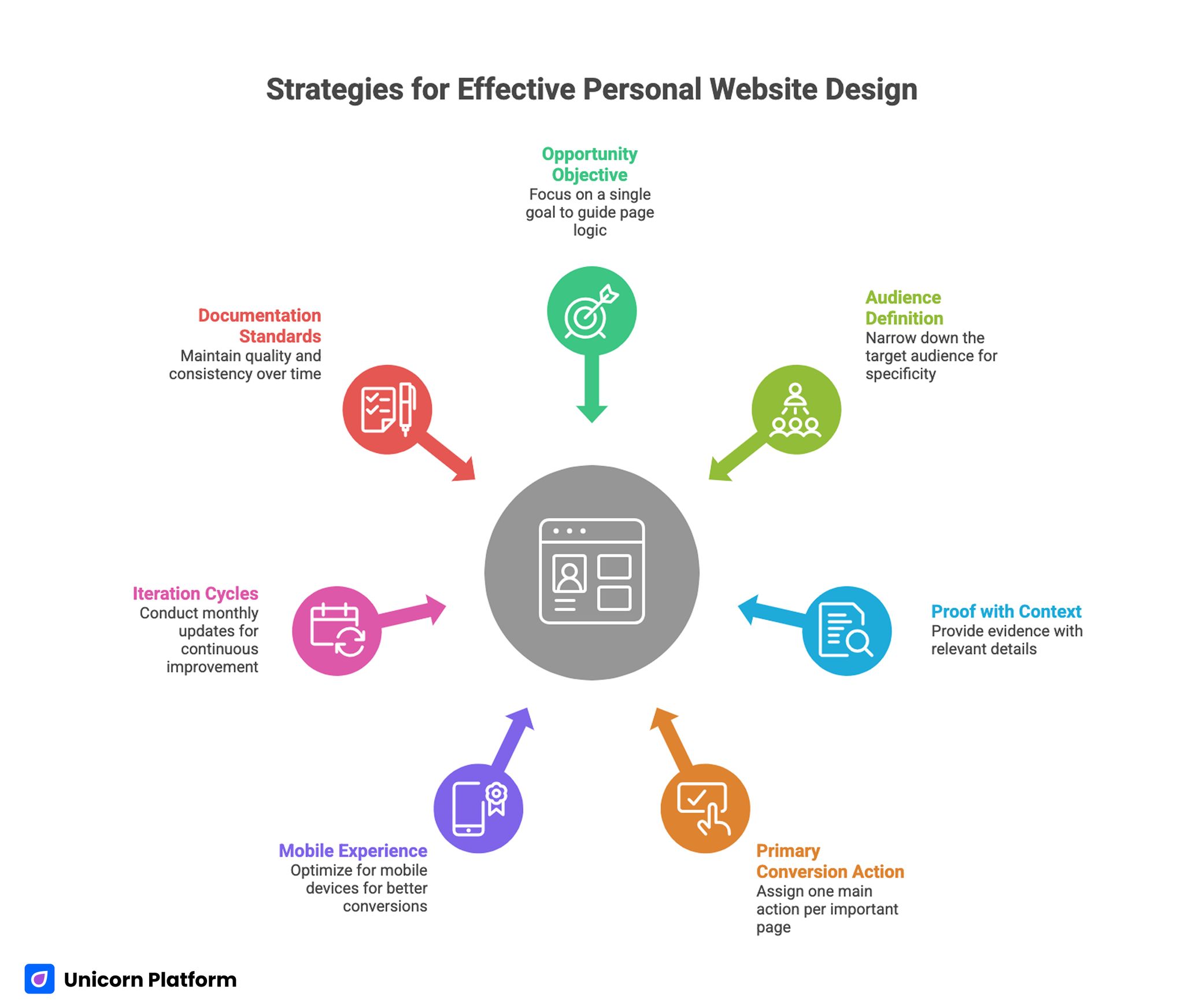
- Start with one opportunity objective and build page logic around it.
- Define your audience narrowly enough that your first screen feels specific.
- Use proof with context, not generic credibility claims.
- Give each important page one primary conversion action.
- Treat mobile experience and performance as conversion levers.
- Run monthly iteration cycles instead of occasional redesigns.
- Document your standards so quality does not drift over time.
Define What the Website Must Accomplish
Before choosing templates, fonts, or page blocks, define what success means in business terms. Your site can support many things at once, but one primary objective should lead the build. Without this anchor, navigation gets cluttered, messaging becomes broad, and conversion actions compete with each other.
Common primary objectives include client acquisition, job opportunities, speaking inquiries, partnership discovery, and audience growth. Each objective changes how you prioritize content. A consultant needs clear service fit and trust framing. A candidate needs capability and project depth. A creator needs audience value and content continuity.
Write a simple objective statement with timeframe and success criteria. Example: "Increase qualified intro calls from founder-led B2B teams over the next 90 days." This gives you a concrete filter for every later decision, from homepage copy to form fields.
If a section idea does not support the objective, park it for later. Focus beats completeness in early versions. As highlighted in Harvard Business Review, a strong personal brand significantly increases professional visibility and access to opportunities, reinforcing the importance of treating your personal website as a strategic career asset rather than a simple online profile.
Choose a Primary Audience, Then a Secondary Audience
Many personal sites try to speak to everyone. That usually produces language that sounds professional but feels generic. Clear positioning requires audience selection.
Start with one primary audience segment and one secondary segment. Your first screen, headline framing, and proof priorities should target the primary segment directly. Secondary visitors can still convert, but they should not dictate the core narrative.
Audience definition works best when it includes job context and decision pressure. "Startups" is too broad. "Seed-to-Series A SaaS founders who need faster GTM execution" is more actionable because it suggests known pain points and success criteria.
A practical audience definition template:
- Role or buyer type.
- Situation they are in right now.
- Problem they need solved.
- Risk they fear most.
- Outcome they value.
Once this is clear, content choices become easier because you are writing for specific decisions, not anonymous traffic.
Build a Positioning Statement That Can Be Understood in 10 Seconds
Your positioning statement should reduce ambiguity quickly. Visitors should not need to scroll through multiple sections to understand your fit.
A strong statement usually combines who you help, what you deliver, and how you approach the work. It should sound like practical language from a real operator, not a slogan.
Example format: "I help B2B product teams clarify complex offers and build conversion-focused page systems that improve qualified pipeline." The strength here is specificity and scope. The visitor can immediately decide if the offer is relevant.
Weak positioning signs include broad adjectives, unclear audience references, and no observable outcome language. If your current headline could describe thousands of professionals in different fields, rewrite it.
For a deeper framework on sharpening role and value communication, the guidance in personalize your online presence with a web profile is useful when refining message hierarchy.
After drafting your positioning statement, test it with three people from your target audience. Ask what they think you do, who you help, and what outcome you create. If they cannot answer consistently, continue refining.
Plan the Site Structure Around Decision Flow
Personal Website Structure Sequence
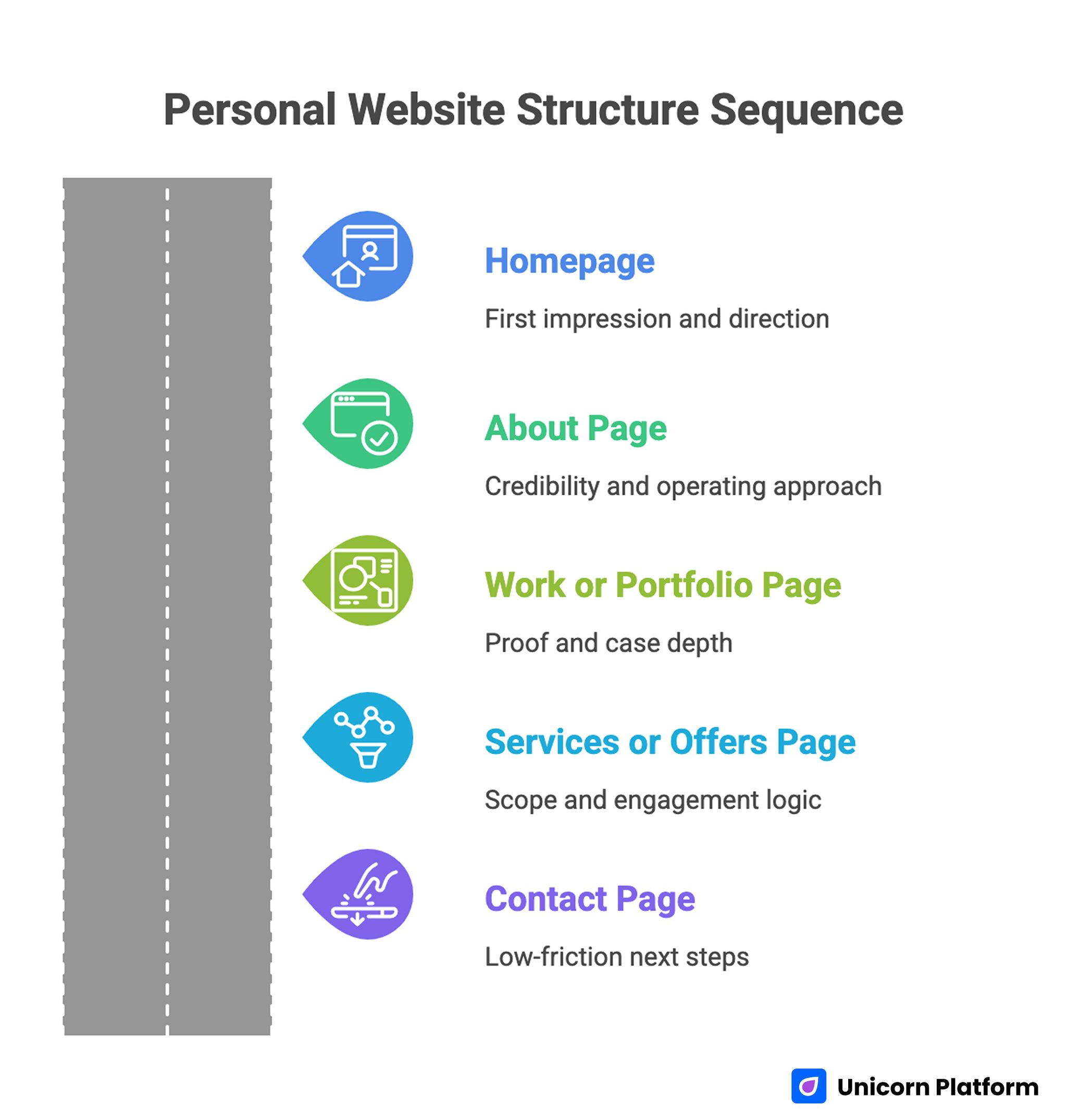
A common architecture mistake is using pages that mirror your internal thinking instead of visitor decision flow. Navigation labels such as "Work," "About," and "Services" are fine, but they need clear sequence and intent.
A reliable baseline structure for most personal websites:
- Homepage for first impression and direction.
- About page for credibility and operating approach.
- Work or portfolio page for proof and case depth.
- Services or offers page for scope and engagement logic.
- Contact page for low-friction next steps.
This structure can be expanded later, but keep launch architecture tight. Too many pages early on fragment authority and make updates harder.
A page map should include one job per page and one primary action. If a page tries to educate, sell, recruit, and subscribe at the same time, conversion quality usually drops.
Design the Homepage as a Decision Gateway
The homepage is not a biography. It is a gateway that routes visitors to the right next action with enough confidence to continue.
High-performing homepages usually follow this order: clear positioning, quick proof cue, relevant context, and focused action path. This order works because it matches natural evaluation behavior.
Your hero section should include one headline, one supporting sentence, one credibility signal, and one dominant CTA. Avoid rotating messages, overloaded badges, or multiple equal-priority buttons.
When testing first-screen structure and CTA balance, the playbook in personal landing pages that make meaningful first impressions is helpful for validating clarity under mobile constraints.
Below the hero, use short sections that reduce uncertainty in sequence. Start with what you help with, then show evidence, then explain process, then present a clear action. This progression keeps momentum without overwhelming visitors.
Write an About Page That Builds Trust Without Rambling
About pages often become long personal histories that do not support current goals. Visitors generally care about fit, approach, and reliability more than chronological detail.
A stronger About page includes:
- A short positioning summary.
- Your current focus and problem domain.
- Your working approach and collaboration style.
- Evidence of credibility relevant to the audience.
- A clear action invitation.
Personal story can still be valuable, but it should support trust and context rather than dominate the page. Keep narrative sections tied to lessons that matter for potential clients, employers, or collaborators.
Use direct language. Replace vague claims like "I am passionate about helping others" with specific statements about outcomes and method.
Turn Portfolio Entries Into Proof, Not Decoration
A gallery of screenshots rarely builds strong trust. Visitors need context to evaluate capability.
Each portfolio entry should answer practical questions: what challenge existed, what constraints mattered, what you changed, and what result followed. This does not require sharing confidential numbers. Qualitative outcomes can still be persuasive when they are specific.
A useful entry template:
- Context and objective.
- Scope of your role.
- Approach and key decisions.
- Outcome and business relevance.
- Reflection or improvement insight.
Select fewer entries with higher signal. Five strong projects usually outperform fifteen shallow ones.
If you are refining portfolio framing and credibility sequencing, build your best personal website with these easy tips offers practical ideas you can adapt without changing your core voice.
Keep your most relevant work first. Recency and relevance beat chronological archives for decision-focused visitors.
Build Offer Pages That Improve Self-Qualification
If your goal includes service inquiries, offer pages need to reduce mismatch early. Better self-qualification improves both conversion quality and your time efficiency.
Effective offer pages clearly state who the offer is for, what outcomes it targets, what the process includes, and what expected timeline looks like. Unclear scope attracts curiosity clicks but lowers fit quality.
Include boundaries, not just promises. Explain where you are strongest and where you are not the right fit. This may reduce raw inquiry volume while improving qualified conversations.
A practical offer-page structure:
- Problem and audience fit.
- Outcome framing.
- Delivery process.
- Proof and examples.
- Engagement flow and next step.
Use transparent language around first-step expectations. Visitors are more likely to submit when they know what happens after they click.
Place Trust Signals Where Doubt Appears
Trust sections are most effective when placed near points of decision tension. Many sites isolate testimonials at the bottom where fewer visitors reach them.
Map common visitor doubts and place specific proof near those moments. If a visitor may doubt your domain expertise, place a relevant case snippet near the claim. If they may doubt collaboration quality, place contextual testimonial quotes near your process section.
Useful trust signal categories:
- Client or stakeholder testimonials with role context.
- Case outcomes with clear scope.
- Recognizable publications or speaking references.
- Process transparency that reduces uncertainty.
Avoid overwhelming pages with badges and logos. Curated relevance outperforms volume.
Create CTA Logic That Matches Visitor Readiness
Calls to action should reflect visitor intent stage. A first-time visitor may not be ready to book a call but may be willing to read a case study or subscribe.
Each page should still have one primary CTA. Secondary options are useful, but they should not compete visually with the main action.
Examples of tiered CTA paths:
- Primary: book intro call.
- Secondary: review selected case studies.
- Tertiary: subscribe for insights.
Form design is part of CTA strategy. Ask only for information needed for the next step. Long forms can work for high-intent contexts, but short forms often improve completion for first-touch interactions.
After submission, confirm timeline and next action. Clear post-submit messaging reduces anxiety and improves response quality.
Use Visual Design to Support Message, Not Replace It
Design quality matters, but it should reinforce clarity rather than distract from it. Strong visual systems guide attention toward decision-critical content.
Prioritize readable typography, deliberate spacing, and predictable section rhythm. Overly experimental layouts can reduce comprehension and increase bounce when visitors are evaluating fit quickly.
Use visual hierarchy to emphasize what matters most: positioning headline, proof, and primary action. Decorative elements should never compete with those core elements.
Consistency builds trust. Repeating patterns for cards, testimonials, and CTA blocks makes the site feel reliable and easier to scan.
Make Mobile Experience a First-Class Requirement
Personal sites receive heavy mobile traffic from profile links, messaging apps, and social channels. Mobile issues can silently reduce opportunity quality even when desktop metrics look healthy.
Validate mobile experience at each release:
- First-screen clarity without pinch zoom.
- CTA visibility without excessive scrolling.
- Legible body text and section spacing.
- Fast image rendering on average networks.
- Form fields that are easy to complete on touch screens.
Test on real devices when possible, not only desktop emulation. Real-device checks expose interaction friction that emulators often miss.
A mobile-friendly site is not just responsive. It is intention-driven and readable in constrained conditions.
Get Technical Foundations Right Early
Technical quality shapes trust and discoverability. A site that looks good but has broken metadata, slow rendering, or unstable links loses momentum quickly.
Core setup checklist:
- Custom domain with clean URL structure.
- Secure HTTPS configuration.
- Correct title and description per page.
- Working canonical and sitemap behavior.
- Optimized media and caching settings.
- Error-free navigation and form submission.
When launching or rebuilding your foundation in Unicorn Platform, host your personal website easily with Unicorn gives a practical baseline for domain setup and publishing flow.
Technical checks should be repeated after major edits, especially template changes or large media updates.
Improve Discoverability with Topic Depth
Search visibility improves when your site demonstrates coherent expertise rather than random content volume. Publish around your domain focus and connect pages in meaningful clusters.
If your focus is product marketing, publish practical guides, case writeups, and framework articles within that scope. If your focus is design systems, publish process breakdowns, component logic, and implementation lessons. Depth within a clear domain usually performs better than broad unrelated posting.
Page structure should support scanning and answer clarity. Use direct subheads, short explanatory blocks, and practical examples. This helps both human readers and AI-mediated discovery systems understand your content faster.
Avoid publishing generic posts that do not reinforce your positioning. Each piece should strengthen topic authority and support your primary opportunity objective. Ahrefs research highlights that aligning content with clear search intent is one of the strongest drivers of visibility, meaning that personal websites perform better when each page directly answers a specific user need rather than covering broad, unfocused topics.
Build a Content Cadence That Compounds
A personal website grows through consistent high-signal updates, not occasional overhauls. A simple monthly cadence keeps credibility fresh and expands your discovery footprint.
Example monthly cycle:
- One deep practical guide tied to your core expertise.
- One case-based reflection with concrete lessons.
- One portfolio update or offer-page refinement.
- One measurement review and cleanup pass.
This rhythm creates compounding value. Your best pages improve over time, proof stays current, and visitors see active expertise rather than abandoned content.
Document each update with a short note: what changed, why it changed, and what result you expect. This habit improves future decision quality.
Measure What Actually Reflects Opportunity Quality
Vanity metrics can hide weak outcomes. Strong personal-site measurement should connect behavior to meaningful opportunities.
A practical measurement stack:
- Clarity metrics: first-screen engagement and key section scroll reach.
- Trust metrics: interaction with proof sections and case pages.
- Conversion metrics: qualified inquiries, reply rates, and accepted calls.
- Outcome metrics: offers, clients, partnerships, or recurring audience growth.
Review metrics by source and device. A site may perform well overall while underperforming on mobile referral traffic, or vice versa.
Use one primary metric for each quarterly cycle and two supporting guardrails. Too many equal-priority metrics lead to indecision.
Run Monthly Optimization Sprints
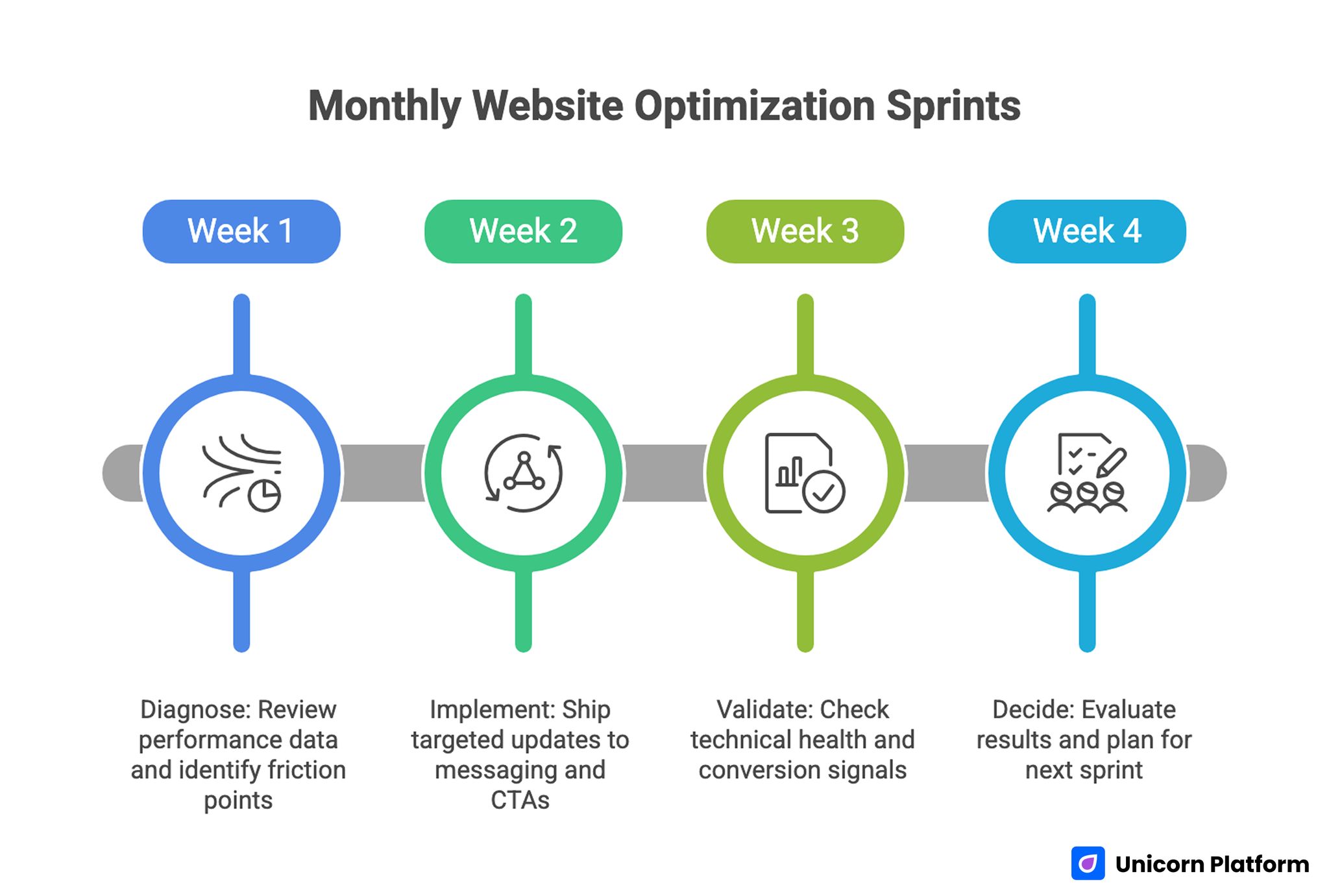
Monthly Optimization Sprints Model
A monthly sprint model keeps progress steady without overwhelming your workload.
Week 1: Diagnose
Review performance data, identify top friction points, and choose one high-impact hypothesis. Focus on the page or section closest to your primary objective.
Week 2: Implement
Ship targeted updates to messaging, proof placement, and CTA flow. Keep change scope controlled so outcomes remain interpretable.
Week 3: Validate
Check technical health, mobile behavior, and early conversion signals. Fix obvious regressions quickly.
Week 4: Decide
Evaluate results against your primary metric and guardrails. Scale what worked, roll back what failed, and document lessons for next sprint.
This cadence turns improvement into an operating habit rather than an occasional initiative.
Use a 30-60-90 Day Plan for New or Rebuilt Sites
A structured launch timeline reduces rework and keeps quality high.
Days 1-30: Foundation and Clarity
Define objective, audience, and positioning statement. Build core pages with clear roles and CTA logic. Complete technical baseline setup and mobile-first QA.
By day 30, your site should be publishable with coherent messaging and one clear opportunity path.
Days 31-60: Proof and Conversion Quality
Strengthen case content, testimonials, and offer-page scope clarity. Improve form logic and post-submit experience. Start measuring source-level and device-level behavior.
By day 60, visitors should be able to self-qualify quickly and take action with confidence.
Days 61-90: Optimization and Expansion
Run focused experiments on headline framing, proof sequencing, and CTA language. Publish one to two authority-supporting content pieces tied to your domain.
By day 90, you should have a repeatable workflow and clear evidence of what drives better opportunities.
Common Mistakes That Reduce Personal Site Performance
Mistake 1: Broad Messaging Across Every Section
When messaging is broad, visitors cannot determine fit quickly.
Fix: tighten audience references and outcome framing in first-screen and section intros.
Mistake 2: Proof Without Context
Testimonials and projects feel weak when scope and relevance are unclear.
Fix: add role context, problem framing, and concise outcome statements.
Mistake 3: Competing Calls to Action
Too many equal-priority actions create hesitation.
Fix: define one primary action per page and make secondary paths visually lighter.
Mistake 4: No Update Cadence
Even strong launch versions become stale without maintenance.
Fix: run monthly optimization cycles and quarterly structural reviews.
Mistake 5: Desktop-Only Quality Checks
Mobile friction can silently harm conversion quality.
Fix: include real-device testing and mobile-specific performance checks in every release.
Mistake 6: Content Not Tied to Opportunity Goals
Publishing unrelated topics dilutes authority and confuses visitors.
Fix: create a narrow content cluster aligned with your positioning and target audience.
Mistake 7: Missing Documentation
Without written standards, quality drifts as the site grows.
Fix: maintain a short operations note with page goals, proof standards, CTA logic, and review cadence.
Team and Solo Governance Model
Even if you are a solo operator, governance improves outcomes. Clear ownership prevents drift and makes updates easier to prioritize.
Minimal governance roles:
- Message owner: keeps positioning and audience language consistent.
- Proof owner: refreshes case content and testimonials.
- Conversion owner: monitors CTA and form performance.
- QA owner: validates technical and mobile quality before releases.
For solo professionals, these roles can be checklist responsibilities scheduled monthly. The key is explicit accountability, not organization size.
A short governance ritual helps:
- Review objective and primary metric.
- Check evidence freshness.
- Validate mobile and technical health.
- Confirm next sprint hypothesis.
Consistency in this process often matters more than sophistication.
Advanced Architecture for Multi-Intent Personal Sites
As your visibility grows, one audience path is rarely enough. You may receive recruiter visits, client inquiries, media requests, and peer collaboration traffic in the same month. If all of those visitors are pushed through one generic message path, conversion quality usually declines.
A better approach is multi-intent architecture with one shared narrative backbone. The backbone keeps your core positioning, tone, and proof standards consistent. Intent-specific paths then adapt details for each visitor type without creating contradictory messaging.
A practical multi-intent model can include:
- Core homepage with universal positioning and primary objective CTA.
- Intent blocks that route visitors to tailored next pages.
- Focused subpages for client, hiring, or collaboration paths.
- Shared proof modules that are filtered by relevance.
This structure gives you personalization through page logic, not through fragmented brand voice. Visitors still recognize one coherent identity while getting context that matches their decision stage.
Navigation labels should reflect user goals, not internal categories. "Hire me" or "Work together" can outperform broad labels when your audience needs immediate direction. At the same time, avoid over-segmentation. Too many menu options often reduce confidence because visitors must decode the structure before they can evaluate your offer.
Intent routing is especially important on homepage mid-sections. After your first-screen positioning, add a concise "Choose your path" block if you serve multiple opportunity types. Keep each option short, outcome-oriented, and supported by one proof cue. This helps visitors self-qualify quickly.
When adding intent-specific sections, preserve common trust language and process quality standards. If one path sounds deeply structured while another feels vague, your overall credibility weakens.
Advanced architecture checklist:
- One canonical positioning statement across all top-level pages.
- One primary objective for the quarter, even if multiple paths exist.
- One shared proof library with tagged relevance by audience type.
- One consistent CTA style system for all conversion actions.
- One monthly review to remove redundant or low-performing routes.
Content reuse becomes easier with this model. A strong case story can support both client and hiring routes by changing framing rather than rewriting from scratch. This reduces maintenance effort while preserving signal quality.
You can also use structured "decision summaries" at the top of deeper pages. For example: "Best for teams needing X, timeline Y, engagement style Z." These summaries are useful for busy visitors who scan quickly before deciding whether to continue.
Avoid hidden complexity in multi-intent builds. If one route requires many clicks before useful information appears, visitors will abandon despite strong content quality. Keep route depth shallow and purpose clear.
Finally, maintain a single source of truth for your operating profile. Define who you help, what you deliver, and what outcomes you optimize for. Use that profile as a filter whenever adding new pages or sections. This prevents drift as the site expands.
Quarterly Scorecard and Continuous Improvement System
Monthly updates keep momentum, but quarterly reviews reveal whether your website is truly improving opportunity quality. A quarterly scorecard turns scattered edits into an evidence-based growth system.
Your scorecard should evaluate four dimensions together:
- Opportunity quality outcomes.
- Behavioral quality across key pages.
- Technical reliability on critical journeys.
- Operational consistency in your update process.
Opportunity quality is the top layer. Track indicators such as qualified inquiry rate, accepted call ratio, progression to proposal or interview stages, and repeat engagement from high-fit visitors. These outcomes tell you whether the site is attracting the right people.
Behavioral quality provides diagnostic context. Monitor section engagement on first-touch pages, drop-off around proof blocks, and conversion path progression by traffic source. If visitors stop before your strongest proof, architecture or message flow likely needs adjustment.
Technical reliability protects every other gain. Include load behavior on mobile, broken-link checks, form completion success, and analytics event integrity. A technically unstable page can erase improvements from strong copy and better proof.
Operational consistency measures whether your system is improving over time. Track how many hypotheses were tested, how many decisions were documented, and whether high-performing patterns were adopted across pages.
A practical quarterly review agenda:
- Reconfirm primary objective and target audience assumptions.
- Compare key pages against current conversion and quality trends.
- Identify which changes produced measurable impact.
- Classify failures by root cause.
- Decide what to scale, retire, or retest next quarter.
Root-cause classification is important. A test can fail because of unclear messaging, weak proof relevance, technical friction, audience mismatch, or unreliable instrumentation. Classifying failures this way improves future hypothesis quality.
Keep scorecard reporting concise. Long narrative reports are less useful than clear decisions. For each major change, record what was changed, why it was changed, what happened, and what comes next.
Quarterly reviews should also include a content freshness audit. Personal websites lose trust when portfolio context, testimonials, or offers no longer reflect current work. Assign freshness dates to high-impact sections and include them in the scorecard.
If you work across multiple service lines, use weighted scoring to keep priorities clear. For example, give higher weight to sections driving your primary objective this quarter and lower weight to exploratory paths. This prevents secondary initiatives from consuming core optimization effort.
Simple weighted model example:
- Primary objective pages: 50%.
- Supporting discovery pages: 20%.
- Proof and trust modules: 20%.
- Technical and QA resilience: 10%.
The exact weights can vary, but explicit weighting improves decision discipline.
Include risk thresholds in the scorecard so intervention happens quickly when quality drops. Examples:
- Qualified inquiry rate falls below baseline for two consecutive weeks.
- Mobile form completion drops after a release.
- Bounce rate rises sharply on first-touch pages from core channels.
- A key proof section shows sustained low engagement.
When a threshold is triggered, run a focused diagnostic sprint before adding new experiments. Stabilize fundamentals first, then resume broader testing.
Over time, this scorecard approach compounds. You stop guessing which edits matter and start scaling changes with demonstrated impact. That is the point where your personal website becomes a durable growth asset instead of a periodic side project.
FAQ: How to Build a Personal Website
1) Do I need a personal website if I already have a strong LinkedIn profile?
Yes. Social platforms are useful discovery channels, but your own site gives you full control over narrative, proof, and conversion flow. It also protects your positioning from platform layout and policy changes.
2) How many pages should a personal website have at launch?
Start with a compact structure: homepage, about, work or portfolio, and contact. Add pages only when each new page has a clear role and measurable value.
3) What should I prioritize first if my current site feels weak?
Start with first-screen positioning clarity and proof quality near key decision points. These two areas usually produce the fastest gains in opportunity quality.
4) How often should I refresh portfolio content?
Monthly light updates and quarterly deeper revisions work for most people. Keep your most relevant projects current and archive low-signal entries.
5) Is it better to collect many testimonials or a few detailed ones?
A few detailed, contextual testimonials are usually stronger. Specificity about role, scope, and collaboration quality is more persuasive than volume.
6) What form length is best for service inquiries?
Use the shortest form that still captures key qualification information. You can collect deeper context after initial fit is confirmed.
7) Can one site serve hiring, consulting, and audience growth at the same time?
It can, but only with clear intent paths. Keep one primary objective for the current cycle and make other paths secondary but visible.
8) How do I know whether my positioning is too generic?
If someone in your target audience cannot explain what you do and who you help within ten seconds, positioning needs more specificity.
9) What is the biggest technical mistake on personal websites?
Neglecting performance and mobile interaction quality. Visitors may leave before reading your proof if pages load slowly or feel difficult to use.
10) What should my first optimization experiment be?
Test a clearer first-screen headline and supporting proof placement on your homepage. This often improves both engagement and conversion path entry.
Final Takeaway
A personal website becomes a powerful growth asset when it is built as a decision system. Clear positioning, contextual proof, focused CTA logic, and disciplined iteration produce stronger outcomes than visual polish alone.
Start with one objective, design for the right audience, and improve in monthly cycles. Over time, this approach compounds into better opportunities, faster trust, and a brand presence that remains credible as your work evolves.