Table of Contents
- 15 Personal Website Examples To Study
- Reusable Personal Website Anatomy
- Common Mistakes To Avoid
- Template Ideas by Personal Brand Type
- FAQ
The best personal websites make one thing obvious fast: who you are, what you do, and why someone should trust you. They do not rely on vague personal-brand language or pretty visuals alone. They give visitors enough clarity to decide whether they should keep reading, follow your work, hire you, or get in touch.
That is why examples matter so much for this topic. If you are building your own site, you usually do not need another abstract framework first. You need to see how different people solve the same problem in different ways: a creator site, a founder site, a designer portfolio, a writing-first site, or a simple one-page profile.
This guide starts with real personal website examples, then breaks down what they get right. After that, you will find a reusable site anatomy, common mistakes to avoid, and a practical workflow for building your own version in Unicorn Platform.
sbb-itb-bf47c9b
Quick Takeaways
- Strong personal websites lead with identity and relevance, not just style.
- The best examples make their next step clear: contact, subscribe, explore work, or book.
- You do not need a complex site to look credible. Simpler sites often convert better because they are easier to understand.
- Different professions need different page emphases: creators need media and personality, designers need work samples, consultants need proof and offer clarity, writers need readable archives.
- A good personal website usually combines five things: hero, proof, work, bio, and CTA.
- The right structure matters more than adding more pages.
What Makes a Strong Personal Website?
Before looking at examples, it helps to know what separates a memorable personal site from one that looks polished but underperforms.
A strong personal website usually does four things well.
- It introduces the person clearly.
- It shows the right kind of proof for the audience.
- It makes the work easy to explore.
- It guides visitors toward one obvious next step.
That sounds simple, but many personal sites still fail because they over-invest in aesthetics and under-invest in clarity. Visitors land on the homepage and still cannot tell whether the person is a designer, writer, consultant, educator, or founder. Or they can tell, but they cannot see proof quickly enough to care.
The examples below work because they reduce that confusion.
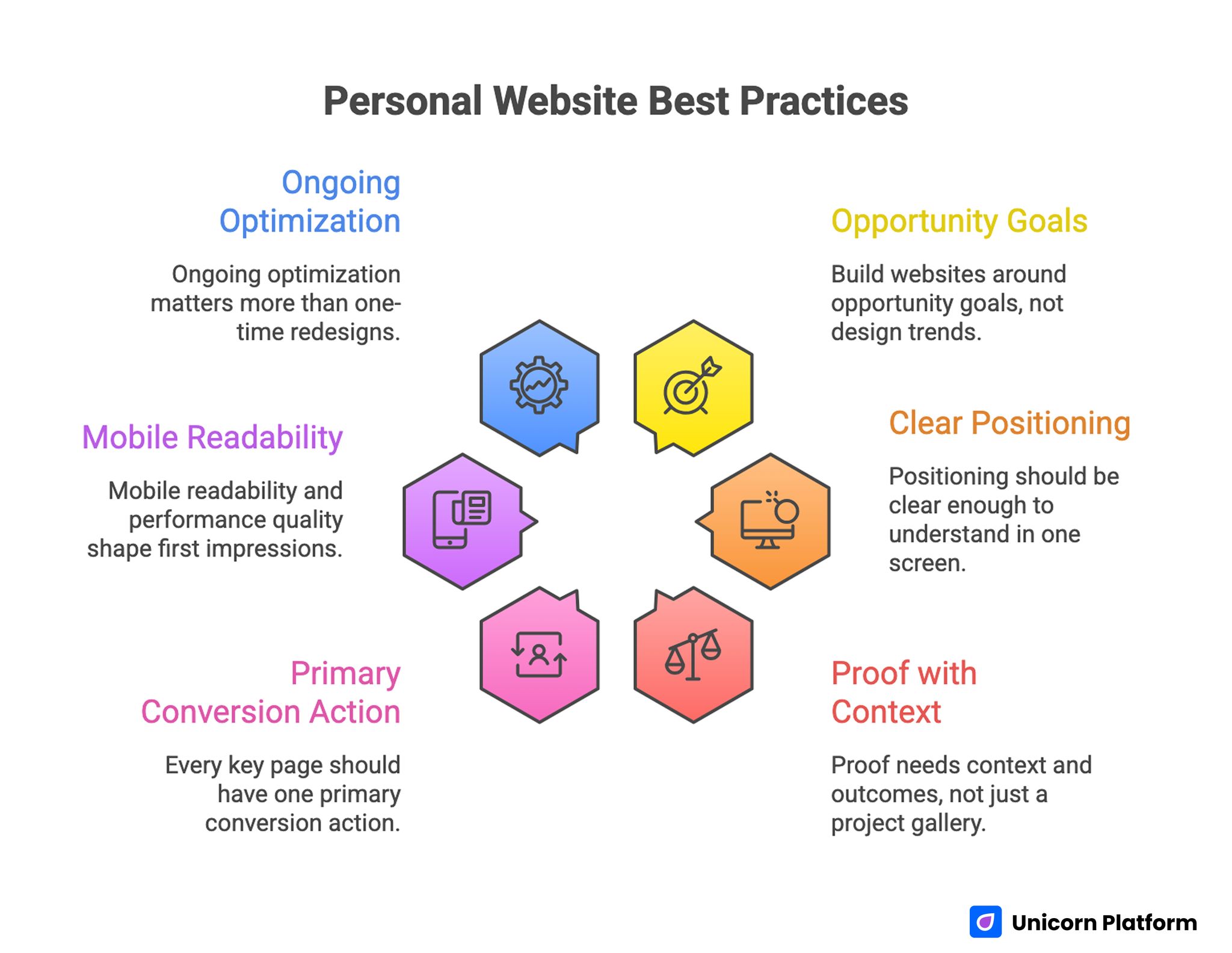
Personal Website Best Practices
15 Personal Website Examples To Study
Creators and Media Personalities
1. Jey Austen
Jey Austen's site is a strong reminder that a personal website does not need to look corporate to feel credible. The visual system is distinctive, the personality is obvious, and the work feels central instead of hidden.
Lesson to borrow:
- if you have a recognizable creative voice, let the design support it rather than flatten it
- keep navigation and structure simple enough that personality does not create confusion
2. David Kushner
David Kushner's website shows how a personal brand can feel multi-dimensional without becoming chaotic. The page uses strong visual storytelling to present different sides of the same public identity.
Lesson to borrow:
- if your work spans music, speaking, content, or multiple formats, use page sections to show different facets of your brand intentionally
- think in narrative bands, not just a long generic homepage
3. Sophia Amoruso
Sophia Amoruso's site leans into an editorial style, bold layout choices, and motion. It feels confident because the presentation fits the personality being communicated.
Lesson to borrow:
- if your personal brand depends on point of view and authority, editorial layout can work very well
- use asymmetry and motion carefully, but keep the message legible at all times
4. Ali Abdaal
Ali Abdaal's website is a good example of a broad creator brand that still stays understandable. He covers multiple topics and business lines, but the site gives each path a clear entrance instead of throwing everything into one scroll.
Lesson to borrow:
- if your brand covers several offers, sort them into clear entry points such as learn, watch, read, or join
- broad scope only works when the homepage still feels organized
5. Nahre Sol
Nahre Sol's website blends biography, video content, music, products, and teaching. It works because the content reflects one clear creative identity rather than a collection of unrelated pages.
Lesson to borrow:
- if your work spans performance, education, and products, anchor the whole site around one recognizable artistic or professional voice
- you can be multi-format without looking scattered
Designers and Creative Portfolios
6. Mark Clennon
Mark Clennon's site shows the power of image-first presentation. For visual work, visitors often want to feel the portfolio before they read a long explanation.
Lesson to borrow:
- if your output is highly visual, let the work lead the page
- keep supporting text concise and confidence-building rather than overly explanatory
7. Colin Moy
Colin Moy's personal site uses playful interaction well. It catches attention quickly, but the structure still stays readable and easy to navigate.
Lesson to borrow:
- interaction can help a personal site stand out, but only when it supports the brand instead of slowing comprehension
- playful elements work best when the site still makes contact and work exploration easy
8. Nick Velten
Nick Velten's site is a good example of a strong professional portrait and direct identity-first layout. A clear image plus a strong opening frame can do a lot of work when you want trust quickly.
Lesson to borrow:
- a strong headshot and a direct opening line can raise credibility fast
- personal sites do not always need a complex hero if identity and focus are already clear
9. Ben Celinski
Ben Celinski's portfolio presence works because the work is easy to browse and the personal brand does not disappear behind the projects. The portfolio feels usable, not decorative.
Lesson to borrow:
- treat the portfolio like a decision tool, not only a gallery
- make it easy for visitors to move from one sample to contact or inquiry
10. Indi Harris
A one-page personal site like Indi Harris's highlights how effective a compact structure can be. It reduces friction and keeps the user in one guided story.
Lesson to borrow:
- one-page structure can be the best option when your goal is clarity, not content volume
- use sections deliberately so the visitor always knows what to read next
11. Tobias Ahlin
Tobias Ahlin's site is a great example of a writing-forward creative personal site. The opening identity is simple, the tagline is clear, and the content archive does a lot of the credibility work.
Lesson to borrow:
- if your writing is part of your professional brand, show it prominently instead of hiding it under a blog tab
- recent posts can function as proof of expertise when the topics are sharp and relevant
Writers, Engineers, and Knowledge Brands
12. Julia Evans
Julia Evans's site is one of the clearest examples of a writing-first personal website. The tone is obvious, the topics are focused, and the site tells you quickly what kind of thinking lives there.
Lesson to borrow:
- if your brand is built on ideas, make the writing style and topic focus visible early
- clarity of voice is a design asset, not just a content asset
13. Eugene Yan
Eugene Yan's site works because it combines several kinds of proof without losing clarity. Writing, talks, prototypes, newsletter growth, and professional context all support one coherent identity.
Lesson to borrow:
- if you have multiple kinds of expertise proof, group them under one positioning frame so they strengthen each other
- visible proof of output can be as persuasive as testimonials for knowledge-driven brands
14. Lex Fridman
Lex Fridman's website is highly effective because it is direct. It makes research, podcasting, teaching, and contact pathways visible without trying to over-style the experience.
Lesson to borrow:
- clarity beats decoration when your reputation already carries weight
- if you have multiple content pillars, label them cleanly and let visitors self-select
15. Jay Mody
Jay Mody's site shows how a personal website can feel intimate and opinionated rather than overly polished. That can be a strength when your voice is part of why people return.
Lesson to borrow:
- not every personal site needs to feel corporate or conversion-heavy
- if your audience is there for perspective and writing, a more personal, blog-like experience can be the right choice
What These Personal Website Examples Have in Common
The best examples above are visually different, but they tend to share the same deeper patterns.
They introduce the person quickly
You should not have to scroll for thirty seconds to understand who the site belongs to and what kind of work they do. Good personal sites reduce that ambiguity in the first screen.
They show proof in the right format
Different professions need different proof.
- designers need visible work
- writers need strong archives and topic clarity
- consultants need outcomes and offer structure
- creators need media, personality, and audience trust signals
The strongest sites do not use proof randomly. They use the type of proof their audience actually needs.
They pick one main action
Visitors should know what the site wants them to do next. That could be:
- contact you
- subscribe
- book a call
- explore your work
- read more
Multiple possible actions can exist, but one should feel primary.
Reusable Personal Website Anatomy
If you are building your own site, this is the easiest structure to start with.
1. Hero
This is the identity block. It should answer:
- who are you?
- what do you do?
- who is it for?
A strong hero often includes:
- your name
- a one-line positioning statement
- a photo or recognizable visual cue
- one primary CTA
2. Proof
This section reduces doubt. Proof can take different forms:
- logos
- testimonials
- audience size
- publications
- product outcomes
- featured work
- client list
Use the proof your audience trusts most.
3. Work
This is where visitors understand what you have actually made or done. For some people, this is a portfolio grid. For others, it is a writing archive, a project list, or selected case studies.
Keep this section curated. Strong personal sites usually show enough work to prove range, but not so much that the homepage becomes cluttered.
4. Bio
Your bio should explain context, not repeat the hero. It should help visitors understand your background, your angle, and what makes your work relevant.
5. CTA
The final CTA should fit your current goal. Examples:
- book a call
- email me
- view selected work
- subscribe to the newsletter
- get the media kit
If your site is meant to create opportunities, your CTA should make the next step feel easy and specific.
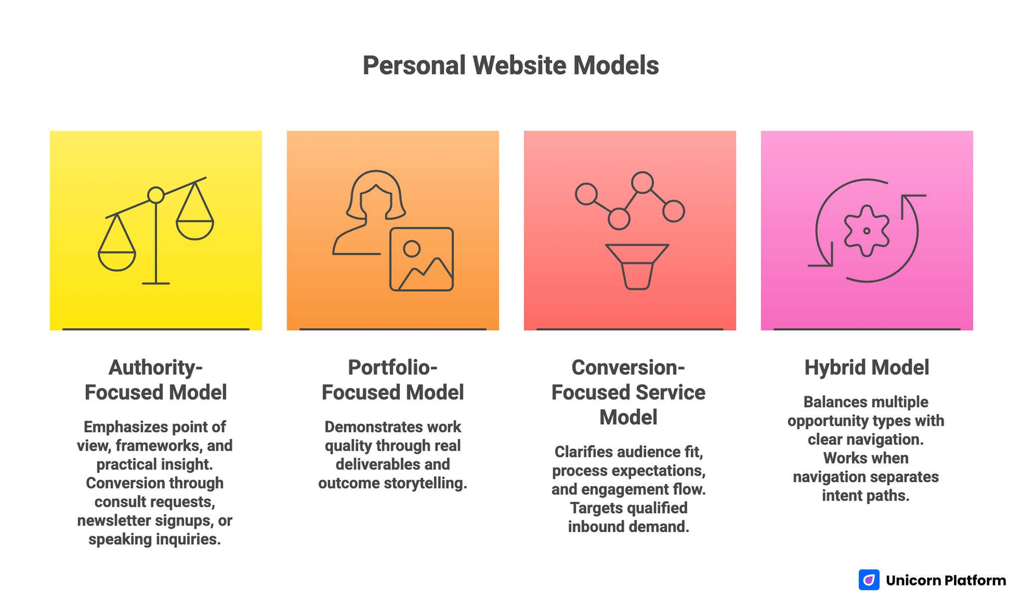
Personal Website Models
Common Mistakes To Avoid
1. Making the site too abstract
A personal site should feel like a person, but it still needs to communicate function. If the homepage is all mood and no clarity, visitors leave without understanding your value.
2. Showing everything at once
Not every project, appearance, thought, and link needs to be on the homepage. Curate first. A shorter, sharper site often performs better.
3. Using generic CTA copy
Contact me is sometimes enough, but often a more specific CTA works better. Examples:
- Book a project fit call
- See selected work
- Read the latest essays
- Join the newsletter
4. Forgetting mobile structure
A site that looks elegant on desktop but becomes confusing on mobile will lose a lot of first-time visitors. Personal websites are often discovered on phones first.
5. Treating design as the whole job
Design matters, but the page still needs decision clarity. A beautiful site that does not explain value clearly will still underperform.
Template Ideas by Personal Brand Type
For founders
Use a simple hero, one proof section, selected work or products, media features, and one clear CTA.
For designers and photographers
Lead with the portfolio, but add a fast identity statement and an easy path to inquiry.
For writers and educators
Make recent posts or flagship guides visible on the homepage. Let the archive prove consistency.
For consultants and coaches
Use clearer offer language, stronger proof, and one next-step CTA instead of an open-ended personal profile.
For multi-hyphenate creators
Organize the homepage into distinct paths. Do not make visitors guess which part of your work is most relevant to them.
How To Apply This in Unicorn Platform
A good way to build your first version in Unicorn Platform is to start with one-page clarity, not page count.
Use this simple workflow:
- write your one-line positioning statement
- choose one primary goal for the site
- add one proof section that matches your audience
- select 3 to 6 work examples, not 20
- write one bio section that explains your angle
- end with one clear CTA
If you want a faster starting point, this guide on building a one-page personal website is a strong companion. If you want a broader practical workflow, personal website design made simple is also useful when you are choosing structure and layout.
The goal is not to launch the biggest site possible. The goal is to launch a site that makes the right people understand you faster.
FAQ: Personal Website Examples
What should a personal website include?
At minimum, it should include a clear hero, some form of proof, selected work or content, a short bio, and one obvious next step.
How many pages should a personal website have?
Many strong personal websites work well with one page or a very small structure. More pages only help when they reduce confusion or support deeper content.
What makes a personal website look professional?
Clear structure, consistent typography, strong spacing, relevant proof, and a focused message usually matter more than flashy effects.
Should I use a portfolio layout or a one-page layout?
Use a portfolio layout if your work samples are the main proof. Use a one-page layout if your main goal is quick clarity and one simple conversion path.
Do I need a blog on my personal website?
Only if writing supports your brand. For writers, educators, and technical experts, a blog can be a strong trust asset. For others, it may be optional.
How often should I update my personal website?
Update it whenever your positioning, proof, or primary goal changes. Even small quarterly updates can keep a site much more effective.
Final Takeaway
The best personal website examples do not all look the same, but they all help visitors answer the same questions quickly: who is this person, what do they do well, why should I trust them, and what should I do next?
If you build your site around those questions, you do not need to copy anyone exactly. You only need to borrow the patterns that fit your own work, voice, and goals.
That is what makes a personal website actually useful: not just personality, but personality organized in a way that helps the right people decide.