Table of Contents
- A Practical Architecture for Machine-Learning-Ready Education Pages
- 30-Day Execution Plan
- Common Mistakes and Practical Fixes
- FAQ
Education brands rarely fail because they lack content. They fail because visitors cannot decide quickly whether the program is right for them. The page looks informative, yet core questions remain unresolved: Who is this for? What will I be able to do after finishing? How much time will it take each week? What support do I get when I get stuck?
When those answers are missing or delayed, user behavior is predictable. People skim, open competing tabs, and postpone decisions. Enrollment quality drops, refund pressure rises, and support teams spend time correcting expectations that should have been set before checkout.
Machine learning can improve this journey, but only when it is connected to clear page architecture and measurable user intent. Personalization engines do not rescue vague messaging. They perform best when they route users through a system that already has strong structure, practical proof, and transparent commitments.
This guide explains how to build that system in 2026. It covers architecture, event design, recommendation logic, authority strategy, hybrid stack decisions, testing cadence, and governance standards you can maintain with a lean team.
sbb-itb-bf47c9b
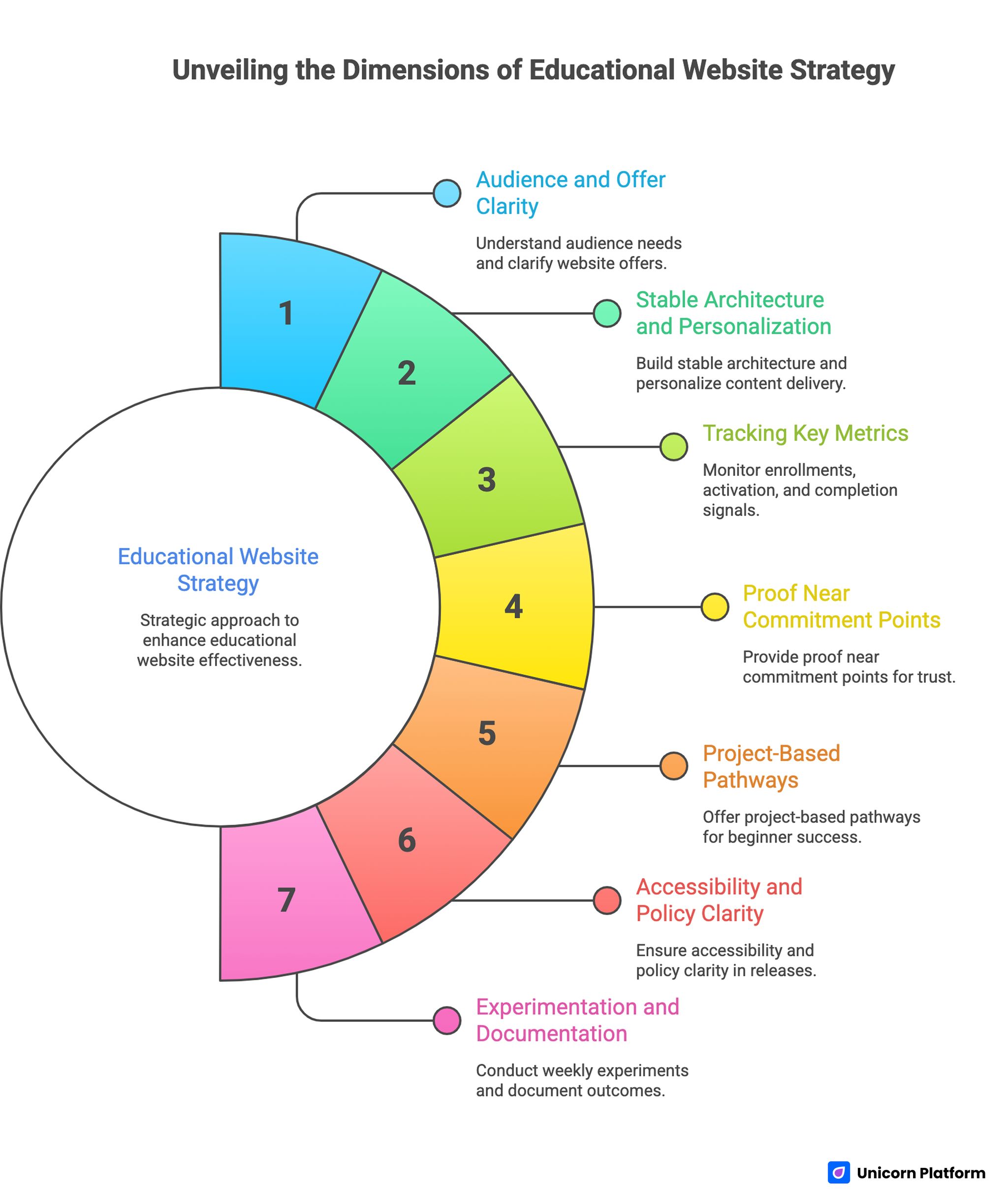
Quick Strategic Takeaways
Unveiling the Dimensions of Educational Website Strategy
- Start with audience and offer clarity before adding recommendation logic.
- Build one stable page architecture and personalize narrative emphasis by segment.
- Track qualified enrollments, activation, and completion signals, not clicks alone.
- Show proof near commitment points, not only in end-of-page testimonial blocks.
- Publish project-based pathways so beginners can see a realistic first win.
- Keep accessibility and policy clarity inside the release checklist.
- Run one meaningful experiment per week and document outcome decisions.
Why Most Education Sites Underperform Before Any AI Layer Is Added
Many teams jump to tooling decisions too early. They debate models, plugins, and dashboards before they define core offer logic. The result is a feature-rich website with weak decision flow.
Underperforming pages usually share four weaknesses. Value promises are broad, learner fit is unclear, curriculum is listed without outcome framing, and trust evidence appears too late. Visitors do not need more words. They need better sequencing.
Another problem is mixed audience targeting. A page trying to persuade total beginners, career switchers, and advanced operators with equal emphasis becomes generic for everyone. Clarity comes from deliberate prioritization, then controlled variants.
Strong results begin with a simple standard: each major section should remove one specific hesitation and guide the visitor to the next action. Once that baseline exists, machine learning can improve relevance at each stage.
Foundation First: Positioning, Routing, and Message Hierarchy
Before adding adaptive experiences, define one primary learner profile for each conversion page. Include starting skill level, practical goal, expected timeline, and typical blockers. This profile becomes the lens for copy, proof selection, and CTA language.
Then map a routing model for adjacent audiences. A practical system includes a primary path plus two secondary paths, each with explicit qualification cues. Visitors should know within seconds where they belong and where they do not.
If your team needs to tighten first-screen messaging and section order before personalization work starts, the framework in this high-converting landing page structure guide is a useful operational baseline.
Message hierarchy should follow buyer logic, not internal org structure. Place transformation promise first, then fit qualification, then practical deliverables, then trust and policy clarity. This order reduces uncertainty without adding unnecessary complexity.
A Practical Architecture for Machine-Learning-Ready Education Pages
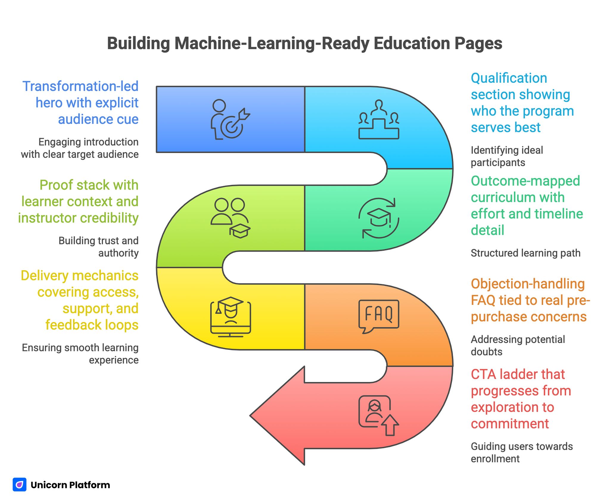
Building Machine-Learning-Ready Education Pages
A reliable education page architecture in 2026 has seven connected blocks. Teams can adjust depth by offer type, but this sequence remains stable across most categories.
- Transformation-led hero with explicit audience cue.
- Qualification section showing who the program serves best.
- Outcome-mapped curriculum with effort and timeline detail.
- Proof stack with learner context and instructor credibility.
- Delivery mechanics covering access, support, and feedback loops.
- Objection-handling FAQ tied to real pre-purchase concerns.
- CTA ladder that progresses from exploration to commitment.
This structure improves both conversion and analytics clarity. Each block has a defined job, so experiments become easier to attribute and governance becomes easier to maintain.
One additional benefit is production speed. Reusable sections let teams publish segment variants quickly without breaking narrative consistency.
Event Design: What to Measure So Personalization Has Direction
Recommendation logic without high-quality signals becomes noise. You need event instrumentation that reflects intent progression, not vanity engagement.
Track events by decision stage. This structure keeps reporting aligned with real learner decisions rather than generic engagement noise.
- stage 1 discovery: hero CTA clicks, section depth, qualification tab interaction
- stage 2 evaluation: curriculum expansion, proof block engagement, FAQ opens
- stage 3 commitment: checkout starts, form completion, payment completion
- stage 4 activation: first lesson start, first project submit, first support request
Tie each experiment to one or two primary outcomes. If every test is measured against ten KPIs, teams lose confidence in decisions and revert to subjective edits.
Event naming standards matter more than most teams expect. Consistent taxonomy prevents broken dashboards and makes historical comparisons trustworthy.
Personalization Patterns That Actually Help Learners
Personalization should reduce effort, not increase novelty. The most useful implementations are usually simple and transparent.
A high-impact pattern is pathway prioritization by learner context. For example, first-time visitors from broad search terms may see foundational tracks first, while returning users with prior lesson engagement see accelerated or project-first tracks.
Another pattern is adaptive proof ordering. Early-stage users often respond to relatable learner outcomes, while advanced users prioritize instructor depth and technical rigor. Reordering proof blocks by segment can improve confidence without changing the core offer.
A third pattern is adaptive objection handling. If behavior suggests hesitation around workload, the FAQ and curriculum summaries should elevate effort transparency and schedule examples.
Teams working on course-specific conversion flows can align these ideas with the execution model in this online course landing page guide, especially when refining the transition from discovery to enrollment.
Content Depth Strategy: From Information Pages to Learning Systems
Education websites often publish many pages but fail to connect them into coherent learning journeys. The result is traffic without progression.
A stronger model uses three linked layers. The first layer captures discovery intent through practical explainers. The second layer supports evaluation through comparisons, use cases, and curriculum detail. The third layer drives commitment through enrollment pages and clear next actions.
Each layer should pass visitors to the next with contextual prompts. Links should appear exactly where decision friction emerges, not as disconnected resource dumps.
Content depth is also a trust signal for AI retrieval systems. Pages that answer adjacent questions clearly and consistently are easier to interpret and more likely to remain visible across changing distribution channels.
Beginner Experience Design With Project-Led Momentum
Beginner audiences need confidence through progress, not theory density. Early wins reduce anxiety and increase commitment quality.
Project-led onboarding works well because it creates visible outcomes. Instead of presenting long concept lists, show learners what they will build in the first week, how long it takes, and what support is available when issues appear. Research on online learning effectiveness also shows that learners engage more consistently when education programs emphasize practical outcomes and applied projects rather than abstract theory. Studies discussed by Harvard Business School highlight that outcome-focused learning experiences significantly improve engagement and completion rates in digital education environments.
A practical beginner ladder includes three stages. Stage one delivers a guided quick win. Stage two introduces controlled variation. Stage three applies skills to a realistic mini-case. This cadence builds competence and reduces early drop-off.
Troubleshooting sidebars further improve retention. Beginners often leave after one confusing error, so fast recovery guidance can protect enrollment value better than additional promotional copy.
Authority Architecture: Turn Expertise Into Decision Confidence
In education, credibility is not decorative. It is a conversion asset that lowers perceived risk and shortens decision cycles.
Strong authority pages connect credentials to learner outcomes. Instead of listing achievements without context, explain how experience improves instruction quality, feedback standards, and student results.
High-performing authority sections typically include teaching philosophy, applied project history, selected publications with plain-language relevance, and examples of learner transformations. Each element should explain why it matters to student outcomes, not just reputation.
When shaping this trust layer, the structure used in this personal professional page framework is useful for keeping credibility clear, concise, and decision-oriented.
Authority content should stay current. Outdated proof weakens trust quickly, especially for high-ticket programs where buyers evaluate quality with more scrutiny.
Hybrid Stack Decisions: Unicorn Platform and WordPress Without Operational Drag
Many education teams run hybrid stacks, using Unicorn Platform for conversion-focused pages and WordPress for content libraries or legacy workflows. This model can work well when ownership boundaries are explicit.
Set responsibilities by function. Conversion pages, campaign variants, and rapid experiments stay in Unicorn Platform. Long-form archives, faculty directories, and specific plugin-dependent workflows remain in WordPress.
Plugin decisions should be judged by operational impact, not headline features. Any plugin that slows performance, complicates publishing, or creates governance confusion should be reviewed aggressively.
A practical review framework scores each plugin on five factors: page speed impact, editorial reliability, compliance value, integration necessity, and maintenance burden. This creates a defendable roadmap for removal, replacement, or retention.
Accessibility, Inclusion, and Compliance as Growth Infrastructure
Accessible design improves outcomes for all learners, not only for edge cases. Clear contrast, keyboard support, explicit form labels, and readable hierarchy reduce friction across devices and contexts. Usability research consistently shows that clarity of navigation, readable hierarchy, and accessible interaction design significantly affect how learners interact with online education platforms. According to studies by Nielsen Norman Group, educational websites with clear structure and accessible design help users complete learning tasks faster and with fewer errors.
Education audiences are broad, and many users interact in less-than-ideal conditions. Pages that assume perfect focus, bandwidth, or device quality quietly lose qualified candidates.
Build accessibility checks into every release cycle. Waiting for periodic audits allows regressions to accumulate and makes fixes more expensive.
Compliance messaging should also be clear where it affects commitment decisions. Policies around data handling, learner support, and refund windows belong near action sections, not hidden deep in footer documentation.
Scenario Applications
Scenario 1: Cohort-based career transition program
This segment usually needs reassurance around structure, accountability, and realistic outcomes. The page should emphasize weekly cadence, mentor touchpoints, and practical project milestones.
Proof should prioritize students with comparable starting points. Visitors considering a career change want to see believable trajectories, not generic success claims.
Scenario 2: Self-paced technical skills library
This audience values flexibility and implementation speed. The page should foreground module navigation clarity, immediate project utility, and transparent support boundaries.
CTA language can be more direct because intent is often higher. Even then, effort expectations must remain visible to protect completion quality.
Scenario 3: University-affiliated executive education
This audience evaluates credibility, relevance, and procurement fit. Authority sections should include faculty depth, applied outcomes, and sponsor-friendly policy clarity.
In this case, friction often appears in approval workflows rather than learner motivation. Pages should support both learner and stakeholder decision paths.
30-Day Execution Plan
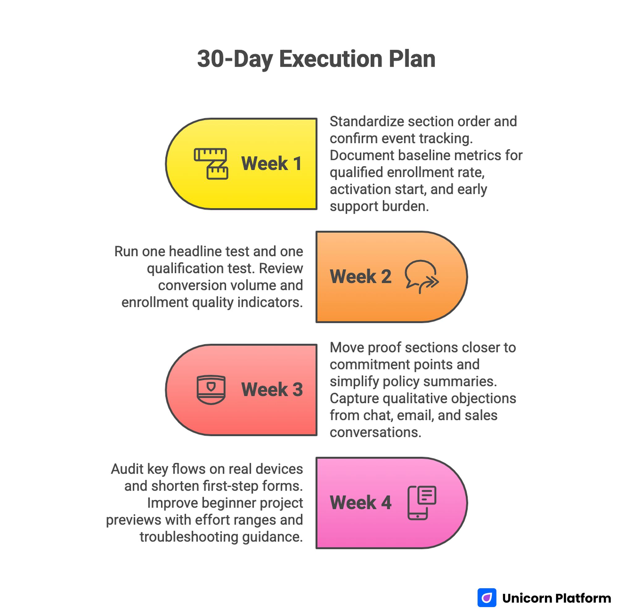
30-Day Execution Plan for Machine-Learning-Ready Education Pages
Week 1: Baseline architecture and instrumentation
Standardize section order across top conversion pages. Confirm event tracking for qualification interactions, proof engagement, CTA progression, and checkout starts.
Document baseline metrics for qualified enrollment rate, activation start, and early support burden. These metrics become the control for future decisions.
Week 2: Message and routing optimization
Run one headline test focused on transformation clarity and one qualification test focused on audience fit. Keep other variables stable for attribution quality.
Review not only conversion volume but enrollment quality indicators. High conversions with low activation usually signal messaging mismatch.
Week 3: Proof and policy placement
Move proof sections closer to commitment points and simplify policy summaries near pricing and enrollment actions. Test whether clearer risk framing improves completion and reduces support objections.
Capture qualitative objections from chat, email, and sales conversations. Those objections should directly shape the FAQ refresh.
Week 4: Mobile and beginner-path refinement
Audit key flows on real devices and shorten first-step forms where possible. Improve beginner project previews with effort ranges and troubleshooting guidance.
Finalize one decision memo with keep/change/next-test outcomes. This creates continuity and speeds the following sprint.
90-Day Scale Model for Education Teams
Scaling should begin only after baseline quality is stable. Expanding traffic to unstable funnels amplifies support load and margin pressure.
Days 1-30 focus on structural stability and measurement reliability. Days 31-60 expand segment variants with controlled hypotheses. Days 61-90 consolidate winning modules into reusable templates and retire weak versions.
This model gives teams both speed and control. You can ship quickly while preserving data integrity and editorial quality.
When teams need a templated production lane for new programs, this online course page builder playbook can accelerate deployment without sacrificing conversion logic.
Common Mistakes and Practical Fixes
Mistake 1: Treating personalization as a substitute for positioning
Fix by clarifying audience fit and outcome promise before any adaptive logic goes live. Relevance starts with messaging architecture.
Mistake 2: Publishing curriculum lists without workload context
Fix by adding time expectations, deliverables, and prerequisite clarity to each core module section. Learners should be able to self-qualify without contacting support.
Mistake 3: Keeping proof too far from action sections
Fix by placing learner outcomes, instructor credibility, and policy reassurance near pricing and CTA points. Confidence improves when risk reduction appears at commitment moments.
Mistake 4: Measuring success only with top-funnel metrics
Fix by combining conversion data with activation and completion indicators. Quality metrics prevent false wins.
Mistake 5: Running too many concurrent experiments
Fix by limiting weekly changes to one major variable and documenting decisions clearly after each cycle. Controlled scope improves attribution and speeds learning.
Mistake 6: Letting plugin sprawl erode page performance
Fix by setting quarterly plugin audits with explicit retention criteria and ownership accountability. This prevents silent performance decay across long publishing cycles.
Mistake 7: Ignoring accessibility until late in the cycle
Fix by making accessibility checks part of release gates so regressions are caught before launch. Teams that test early spend less time on emergency fixes later.
Mistake 8: Allowing authority pages to become static resumes
Fix by updating credibility content with practical teaching outcomes and recent learner impact evidence. Fresh proof keeps trust signals aligned with current offers.
Pre-Publish QA Checklist
A release checklist prevents regression during fast publishing cycles. It also helps cross-functional teams align on what "done" means.
Run this checklist before each major update. It should be short enough to run quickly and strict enough to stop weak releases.
- first-screen promise is specific and audience-qualified
- qualification cues and prerequisites are easy to scan
- curriculum blocks include outcomes, effort, and timeline
- proof and policy content appear near commitment moments
- CTA labels are consistent from top to bottom
- mobile readability and form interactions pass real-device checks
- event tracking confirms conversion and activation instrumentation
- accessibility basics pass heading, contrast, and keyboard checks
Teams that maintain this discipline usually improve both conversion efficiency and learner satisfaction over time. The operational benefit is fewer ad-hoc revisions after launch.
FAQ: Build Smarter Education Websites
How much machine learning is necessary for an education website?
Start with lightweight personalization tied to clear intent signals. Most teams get better results from better structure plus small adaptive improvements than from complex models deployed too early.
What should be optimized first when conversion quality is low?
Focus first on first-screen clarity, learner qualification, and proof placement. These changes usually improve both enrollment quality and downstream activation.
Should every program have separate page variants?
Not always. Begin with one stable architecture, then add variants only where audience behavior or acquisition intent clearly differs.
Which proof types are most persuasive for education offers?
Context-rich learner outcomes, instructor relevance, and transparent policy details tend to outperform generic testimonials. Buyers want signals that reduce practical risk.
How do we avoid over-personalization that feels intrusive?
Keep adaptive behavior transparent and tied to useful decisions, such as pathway prioritization or FAQ emphasis. Avoid personalization that changes core claims or hides important terms.
Is a hybrid Unicorn Platform and WordPress setup still viable in 2026?
Yes, if ownership boundaries are explicit and plugin governance is disciplined. Hybrid stacks fail mostly from process drift, not from technical incompatibility.
What metrics matter after enrollment conversion?
Track activation speed, first project completion, support intervention rate, and early retention markers. These metrics reveal whether you are attracting the right learners.
How often should authority pages be updated?
Quarterly is a practical minimum for active programs. Update sooner when credentials, outcomes, or teaching scope changes.
How can we improve beginner retention without expanding support headcount?
Improve onboarding clarity, provide structured project ladders, and add quick troubleshooting guidance near early milestones. These changes reduce avoidable support requests.
What is a realistic testing cadence for a small education team?
One major experiment per week with clear hypotheses is usually sustainable. Consistency beats high-volume experimentation that lacks clean attribution.
Final Takeaway
Smarter education websites are built through disciplined systems, not isolated features. Clear positioning, strong information architecture, credible proof, transparent commitments, and reliable measurement form the base layer that everything else depends on.
Machine learning becomes valuable when it improves learner decisions at the right moment, not when it adds novelty to an unclear funnel. With Unicorn Platform, teams can ship these improvements quickly, validate them with meaningful signals, and build a durable growth model that improves both enrollment quality and learning outcomes.