Table of Contents
- Build Around User Decision Stages
- Proof Systems That Build Trust Without Overclaiming
- Scenario Playbooks
- 30-Day Optimization Cycle
- Common Mistakes and Fixes
- FAQ
Fitness is a high-intent market with low patience for unclear offers. People click because they want progress, but they convert only when a page makes the path to progress feel realistic and credible.
Most teams do not fail because they lack motivation-heavy creative. They fail because their page does not answer practical questions early enough: who the program is for, how hard it is, what support exists, and what results are realistic in the first weeks.
That gap hurts both acquisition and retention. If users sign up with inflated expectations, early churn rises and paid traffic economics weaken.
A high-performing landing experience for a fitness product should therefore optimize two outcomes together: conversion and post-signup fit. This guide explains how to build that system with repeatable structure, better proof quality, and clean mobile execution.
sbb-itb-bf47c9b
Key Takeaways
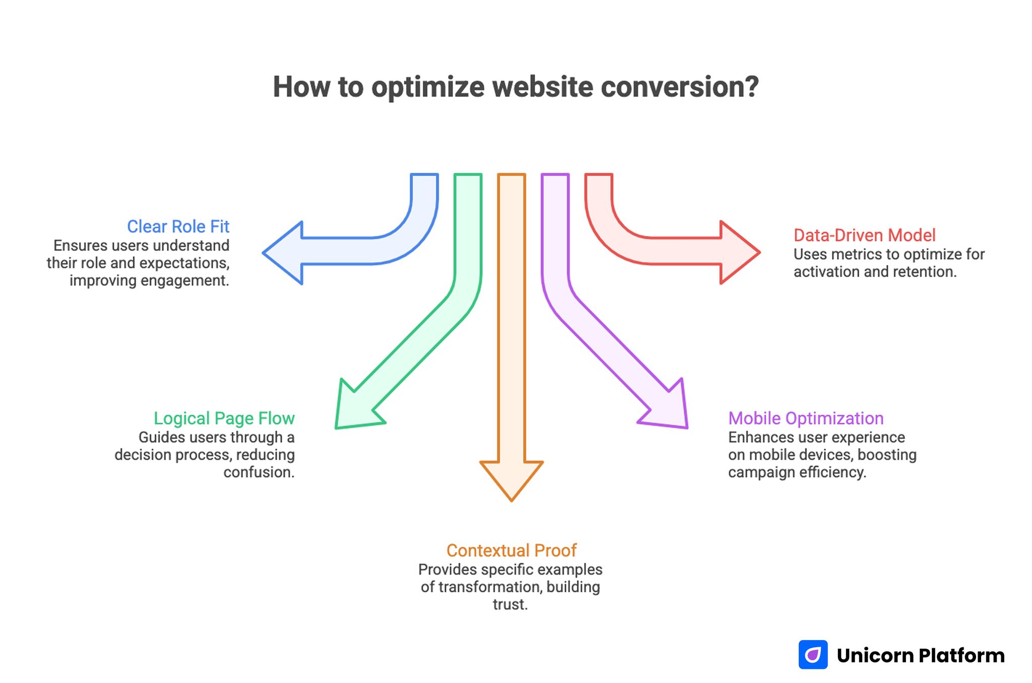
Key Takeaways for Optimizing Website Conversion
- Conversion improves when role fit and effort expectations are clear in the first screen.
- Strong pages follow decision order: relevance, method, proof, commitment, then action.
- Context-rich proof outperforms generic transformation claims.
- Mobile flow and load stability directly impact paid and social campaign efficiency.
- The best optimization model pairs trial metrics with activation and retention indicators.
Why Fitness Product Pages Underperform
Weak performance typically starts with overbroad promises. A page says users will get fitter quickly but does not define method, schedule, or support, so trust stays low.
Another issue is claim quality. Before-and-after messaging can attract attention, yet it fails when context is missing. Prospects need baseline information, time horizons, and adherence conditions to evaluate credibility.
The third issue is friction mismatch. Pages often ask for too much commitment too early or push one CTA for every traffic source regardless of intent stage.
Mobile usability compounds these problems. Discovery for this category frequently happens in short mobile sessions, so slow pages and dense blocks lead to immediate drop-off.
What Winning Competitor Pages Reveal
Across the top pages in this cluster, the strongest pattern is decision clarity. They make it obvious who should continue and who should skip, which saves user time and improves conversion quality.
Another shared pattern is modular structure. Teams use repeatable section blocks for offer framing, proof, and action while customizing message priority by audience segment.
The best examples also balance aspiration with implementation detail. They motivate users, but they also explain exactly what the first week looks like.
That balance matters because sustained growth in fitness comes from adherence, not only signups. Pages that attract the wrong expectations can inflate trials while weakening retention.
Build Around User Decision Stages
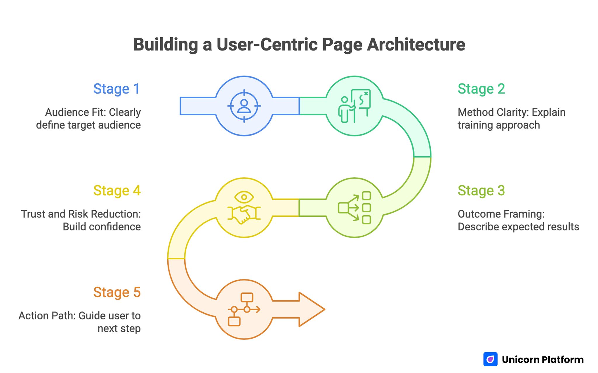
Building a User-Centric Page Architecture
A reliable page architecture should mirror how prospects decide under uncertainty. People rarely move from curiosity to commitment in one jump.
Stage 1: Audience Fit
State who the program is designed for in plain language. Include baseline context such as beginner, intermediate, return-from-break, or limited-time schedules.
When users can self-qualify quickly, they trust the rest of the page more and spend attention on evaluating value instead of decoding relevance. Faster qualification also reduces support questions from low-fit leads.
Stage 2: Method Clarity
After fit, explain training method and program logic. Users want to understand whether the approach is coach-led, habit-led, progressive overload, mobility-first, or mixed.
Method clarity reduces the perceived risk of committing to a program they may not sustain. Users are more likely to act when they understand how the program actually works.
Stage 3: Outcome Framing
Describe expected outcomes with practical ranges rather than hype. Focus on behavior and capability milestones as much as visual goals.
This keeps claims credible and attracts users who are likely to stay active after signup. Credibility at this step protects paid acquisition efficiency.
Stage 4: Trust and Risk Reduction
Trust is built through proof, support details, and transparent commitments. Users need confidence that guidance is reliable and that setbacks are handled with a plan.
A short section on adaptation for schedule interruptions or missed sessions can meaningfully improve perceived program realism. It signals that the product is built for real routines rather than ideal routines.
Stage 5: Action Path
Action should be clear and proportionate to readiness. Some users are prepared for trial start immediately, while others need a quick qualification step first.
One dominant CTA can coexist with one lower-friction secondary action when hierarchy remains obvious. This structure captures ready users while keeping uncertain users in the funnel.
First-Screen Messaging That Improves Conversion Quality
The opening section should answer four questions in seconds: who this helps, what system it uses, what first result to expect, and what next step to take. Missing one of these answers usually increases bounce from cold traffic.
Headline language should be specific without sounding rigid. Ambiguous phrases like "transform your life" can sound compelling but usually underperform compared with concrete outcome framing.
Support copy should clarify effort assumptions. If the plan requires a weekly time commitment, say it early.
For teams refining opening section sequencing, this mobile app landing conversion guide offers useful structure checks. It is especially helpful when mobile traffic dominates acquisition.
Offer Architecture by Readiness Level
Not all traffic arrives with the same intent. Ads, creator referrals, and organic visitors represent different readiness levels.
A practical structure is to keep one primary route and one secondary route. Clear route hierarchy helps users choose quickly:
- Primary route for ready users, such as a trial start.
- Secondary route for uncertain users, such as a short assessment.
This model preserves conversion momentum while reducing low-fit signups. It also keeps copy and design decisions simpler during iterative testing.
Offer detail should include format, frequency, and support scope. Lack of detail increases abandoned signups and later cancellations.
Proof Systems That Build Trust Without Overclaiming
Proof quality often decides whether motivated users continue to action. Generic testimonials are less persuasive than process-aware proof.
Use evidence that explains how progress was achieved: consistency pattern, coaching interaction, adaptation for constraints, and realistic timeline. Prospects trust mechanisms more than isolated outcomes.
Outcome statements should be paired with context so users can judge comparability to their own situation. Context is what turns proof into decision support.
For inspiration on reusable section logic, this resource on fitness landing page examples can help teams standardize proof blocks without copying page language. Reusable logic is more valuable than visual imitation.
Coaching and Community Evidence
Many users need support to sustain behavior change. If coaching or community is part of the product, describe concrete operating details such as response windows or check-in cadence.
When support claims are specific, prospects can evaluate fit before signup and retention quality improves after onboarding. Specificity here also lowers expectation mismatch after trial starts.
Expert and Safety Credibility
Fitness messaging now overlaps with health concerns for many audiences. Claims about intensity, recovery, or injury sensitivity should be handled with care and precision.
A health-trust perspective can improve this section. This review of healthcare web design standards is useful when strengthening responsible claim language and confidence cues.
CTA Design for Sustainable Growth
Strong CTA copy reflects commitment level and immediate user benefit. "Start your first week" is usually clearer than broad commands that hide effort expectations.
Placement matters as much as wording. Keep a primary CTA near key proof and another near offer details so users can act when confidence peaks.
Avoid equal-priority button clusters. Too many competing actions increase hesitation, especially on mobile.
Trial vs Subscription CTA Logic
Trial CTAs usually work best for new cold traffic. Direct subscription CTAs can perform for warm audiences with clear intent and high trust.
The choice should be validated with downstream quality metrics, not only top-of-funnel clicks. A short-term lift is not a win if activation drops.
Mobile UX and Performance Fundamentals
Short-session behavior dominates this category. If the page is visually heavy or difficult to scan, users leave before evaluating program fit.
Mobile-first execution needs readable typography, stable layout, and touch-friendly controls. Small friction points accumulate quickly in signup funnels.
Load behavior must be predictable. Slow first paint, media jank, or form lag can reduce conversion even when messaging is strong.
A robust page structure is easier to iterate when the underlying content order is stable. Teams can use this high-converting page structure guide to keep tests comparable over time.
Message Match Across Acquisition Channels
Paid search visitors often expect direct problem-solution language. Social traffic may respond better to identity and motivation framing before method details.
Channel-specific opening blocks solve this without rebuilding full pages. Keep the same core structure and adjust early section emphasis.
Message continuity from ad to page is especially important for cold audiences deciding within seconds. Broken continuity creates skepticism before method details are read.
Activation Alignment: The Missing Layer
Many teams optimize for trial starts and overlook activation quality. If users sign up but fail day-one onboarding, the page may be attracting mismatched expectations.
A stronger model connects landing promises to first-week product reality. Clarify expected session count, onboarding flow, and support availability before users commit.
This alignment reduces early churn and protects paid acquisition efficiency. It also gives product teams cleaner feedback on true onboarding friction.
First-Week Clarity Section
Add a short section that explains what users do during week one. Include time commitment, session type, and feedback loop.
Prospects who understand initial effort are more likely to become active users rather than passive trial accounts. Clear effort framing helps users commit to a realistic routine.
For wellness-adjacent audiences, a structured mental health landing framework can help teams communicate support and consistency cues more responsibly. Responsible language improves trust in sensitive use cases.
Scenario Playbooks
Scenario A: Strong Clicks, Weak Trial Starts
Traffic volume looks healthy, but trial conversion remains low. The page usually emphasizes motivation while delaying method and fit clarity.
A practical fix is to rewrite the first screen around audience profile, training model, and immediate next step. This usually improves conversion without changing deeper sections first.
Scenario B: Good Trials, Weak Activation
Trial starts rise, yet day-7 activity falls. This often indicates mismatch between landing promise and onboarding effort.
A practical fix is to surface first-week expectations and support details near CTA zones. Users convert more confidently when commitment is transparent.
Scenario C: Good Activation, Weak Paid Conversion
Users engage during trial but hesitate at paid conversion. Pricing and value communication are usually underdeveloped.
A practical fix is to clarify what changes after trial, what support continues, and why the paid plan produces better continuity. Pricing logic should reinforce consistency benefits, not only feature count.
30-Day Optimization Cycle
Week 1: Diagnose Friction
Audit top pages for fit clarity, proof quality, mobile usability, and CTA hierarchy. Select one primary bottleneck per page variant.
Week 2: Rebuild Core Modules
Standardize reusable modules for audience fit, method explanation, proof context, and action path clarity. Keep module jobs explicit so team members apply them consistently.
Week 3: Run Controlled Tests
Launch variants with one major change at a time and stable traffic windows. Multi-variable tests should be avoided at this stage.
Week 4: Measure and Promote Winners
Review outcomes across conversion and activation metrics, then roll winning modules into default templates. Archive losing variants with short notes for future reference.
Repeat monthly so improvements compound rather than reset each campaign. The same cadence helps teams keep messaging aligned with product updates.
Metrics That Predict Revenue Quality
Top-line conversion is useful but incomplete. Durable growth depends on whether signups become active and retained users.
Use a balanced metric stack. Combining these indicators gives a more honest view of growth quality:
- trial start rate by source,
- onboarding completion,
- day-7 active usage,
- trial-to-paid conversion,
- early cancellation reasons.
This model helps teams identify where promise, product, or pricing alignment breaks. That diagnosis guides faster and more reliable iteration.
Team Governance for Fast Iteration
High-velocity production needs clear ownership. Assign one owner for positioning, one for proof integrity, one for analytics interpretation, and one for QA.
Each test should have a short log: hypothesis, change, outcome, and next action. Documentation prevents repeated low-value experiments.
When governance is disciplined, page quality improves at the same speed as publishing velocity. Fast publishing then becomes an advantage instead of a risk.
Common Mistakes and Fixes
Mistake 1: Broad promises with no method detail
Fix by describing training logic and expected effort in plain language. Clarity increases trust and reduces low-fit conversions.
Mistake 2: Testimonials without context
Fix by pairing outcomes with time horizon, baseline, and adherence conditions. Context is what makes proof believable.
Mistake 3: One CTA for all intent levels
Fix by keeping one dominant action and one lower-friction secondary route. This supports both ready and uncertain users.
Mistake 4: Mobile treated as desktop adaptation
Fix by designing the flow for mobile behavior first, then scaling to larger screens. Small-screen friction has outsized conversion impact.
Mistake 5: Claim language that feels unsafe or absolute
Fix by using responsible phrasing around intensity, recovery, and limitations. Precision improves confidence for skeptical users.
Mistake 6: No feedback loop after launch
Fix by linking page variants to activation and retention outcomes, not just click metrics. Downstream signals should guide iteration.
FAQ: Landing Pages for Fitness Apps in 2026
1) What should a fitness product page explain first?
Start with who the program is for and what first practical outcome users can expect. Immediate fit clarity improves qualified conversion.
2) How much detail is too much in the hero section?
Keep hero copy concise, then place method and effort details immediately below. Users need quick orientation before deeper evaluation.
3) Should pages prioritize visuals or copy?
Both matter, but copy hierarchy usually determines conversion quality. Visuals support trust when they reinforce message clarity.
4) Is social proof enough to increase conversions?
Proof helps, but only when it includes context and process detail. Generic praise rarely resolves decision uncertainty.
5) What is the best CTA for cold traffic?
A low-risk trial or short guided start generally performs well. CTA wording should clarify immediate next steps.
6) How often should these pages be updated?
Review monthly and refresh quickly when retention signals or audience objections change. Waiting too long lets weak assumptions persist across campaigns.
7) What metric should teams prioritize first?
Track trial starts and onboarding completion together. This pair quickly shows whether conversion gains are durable.
8) How can teams reduce early churn from landing traffic?
Align page promises with week-one experience and support details. Expectation accuracy improves activation.
9) Should health-adjacent disclaimers appear on landing pages?
If claims could be interpreted as medical or high-risk guidance, clear responsible language is essential for trust. Precision protects both users and brand credibility.
10) What is the fastest high-impact improvement?
Rewrite the opening section around audience fit, method, and immediate action path, then simplify form friction. This is often the fastest way to improve qualified conversions.
Final Takeaway
Winning pages in fitness do not rely on motivation alone. They combine honest positioning, credible proof, and low-friction action to attract users who are likely to stay engaged.
When conversion, activation, and retention are optimized as one system, growth becomes more predictable and more profitable over time. Teams also make better roadmap decisions when acquisition and retention data point in the same direction.