Table of Contents
- A Decision-First Structure for Event Conversion
- Form Strategy: Lower Friction Without Losing Qualification
- Scenario Playbooks
- 30-Day Optimization Cycle
- Common Mistakes and Practical Fixes
- FAQ
Event campaigns move faster than most content workflows. Speakers change, agenda blocks shift, paid traffic windows open and close, and teams still expect stable registration performance.
Many pages fail because they are built as generic announcements instead of decision environments. Visitors arrive with one question: should this go on my calendar. If the answer is not obvious in the first screen, momentum disappears.
High-performing event pages do not rely on design polish alone. They combine clear audience fit, practical session value, logistics confidence, and low-friction action.
This guide gives you a repeatable operating model to improve registration quality across webinars, workshops, conferences, and community events. The focus is not just more submissions, but better attendance and stronger downstream outcomes.
sbb-itb-bf47c9b
Key Takeaways
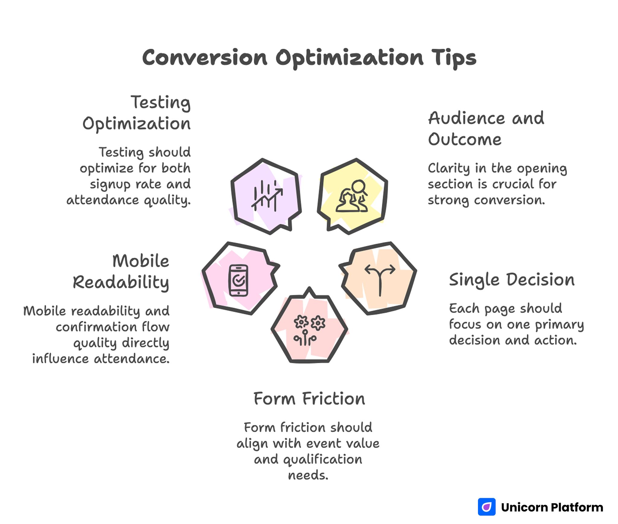
Conversion Optimization Tips
- Strong conversion starts with audience and outcome clarity in the opening section.
- One page should support one primary decision and one primary action.
- Form friction should match event value and qualification needs.
- Mobile readability and confirmation flow quality directly influence attendance.
- Testing should optimize for both signup rate and attendance quality.
Why Event Pages Underperform Even With Good Traffic
Poor results usually come from message mismatch. Ads and emails promise specific value, while the page opens with broad brand language that delays practical details.
A second problem is logistics opacity. Prospects hesitate when date, timezone, format, or replay policy is hard to find. That hesitation grows quickly in busy calendars where alternative events are easy to compare.
A third issue is over-collecting form data. Teams often ask for job title, company size, phone, budget, and extra qualifiers before earning enough trust. Each extra field increases drop-off risk.
The final issue is weak post-submit planning. A page can convert clicks but still produce low attendance if confirmation and reminders are unclear.
What Top Competitors Do Better
Leading pages in this cluster consistently apply a one-goal structure. They avoid competing CTAs, keep section purpose clear, and remove unnecessary distractions near action points.
They also balance clarity with depth. Prospects can scan quickly, but they can also validate details about agenda, speakers, and outcomes without leaving the page.
Another shared pattern is operational readiness. Strong pages are built for updates and testing, not as static one-time assets. Teams can revise copy, schedule blocks, and proof elements quickly without rebuilding from scratch.
Event Page vs Event Website: Use the Right Asset
An event website can host broad information about brand, sponsorships, and archives. A campaign page should focus tightly on one conversion action tied to one event offer.
When both assets exist, routing should match intent. Exploration traffic can go to broader pages, while paid and high-intent traffic should land on focused conversion paths.
Keeping this separation prevents content sprawl and improves message continuity from click to submit. It also keeps reporting cleaner because each asset has a distinct conversion role.
A Decision-First Structure for Event Conversion
A reliable page architecture follows how people decide, not how teams prefer to present internal priorities. Decision order should guide section order on every campaign page.
Stage 1: Relevance
Open with who the event is for and what practical outcome attendees should expect. Role-based language works well here because it helps prospects self-qualify quickly.
Stage 2: Value Proof
After relevance, show why the session is worth the time. Use concrete outcomes, agenda highlights, and session-level takeaways rather than abstract claims.
Stage 3: Trust
Trust is built through speaker credibility, organizer reliability, and logistical transparency. People need confidence that the event will be useful and professionally run.
Stage 4: Action
Action should be obvious and low-friction. One primary CTA with clear next-step messaging outperforms pages with several competing conversion paths.
Above-the-Fold Essentials That Raise Registration Intent
The first screen should answer five questions immediately: who this is for, what attendees gain, when it happens, how they attend, and what to do next. Missing any of these details usually increases bounce during high-intent visits.
Headline quality matters most when it combines audience and outcome. Subhead support should clarify format and timing in plain language.
Include one trust cue near the opening CTA, such as known speaker names, prior attendee count, or clear organizer identity. Early confidence reduces exploratory bouncing.
For teams building webinar-focused variants, this guide on meetup and calendar landing flows can help tighten first-screen sequencing. The same logic works well for live demo events with shorter decision windows.
Agenda Design That Converts Without Overloading
Agenda blocks should explain value progression, not just timestamps. People want to know what they will learn, not only when each segment starts.
Each session item should include a short outcome line. This helps prospects evaluate fit quickly and improves perceived practical value.
For multi-track or hybrid formats, separate tracks visually and keep selection logic simple. Confusing agenda layout reduces confidence and delays registration decisions.
Session Depth Calibration
Short events need concise agenda framing with concrete takeaways. Longer events need clearer navigation so prospects can find relevant segments without scanning huge text walls.
Calibration is important because too little detail feels shallow, while too much detail can hide the core promise. Content density should support clarity rather than inflate perceived complexity.
Speaker and Host Credibility Blocks
Speaker sections should prioritize relevance over volume. One well-explained expert profile is more persuasive than a long grid of names with minimal context.
Helpful profile elements include role, domain experience, why their perspective matters for this event topic, and one practical promise about what attendees will learn. This combination makes speaker sections useful at decision time, not decorative.
If sponsor logos are used, keep them secondary to session value. Sponsorship can add trust, but it should not dominate attention near conversion areas.
For conference-style pages where multi-speaker presentation is critical, this conference and seminar builder resource is useful for structuring speaker and agenda hierarchy. It helps teams keep complexity manageable without flattening core value.
Form Strategy: Lower Friction Without Losing Qualification
Form design should reflect event intent. Top-of-funnel awareness events can usually convert with minimal fields. Selective programs may need one or two additional qualifiers.
A simple rule works well: ask only for data required to deliver access and support immediate follow-up. Extra profiling can happen after registration through segmented emails.
Field labels should remove ambiguity. Instead of generic questions, use clear wording about how information will be used.
Smart Qualification for B2B Events
When qualification is necessary, choose high-signal fields tied to routing decisions, such as role type or team stage. Several low-value fields usually reduce completion rate without improving lead quality.
Error Handling and Completion Confidence
Inline validation and clear error states prevent abandonment. If users submit and see unclear warnings, trust drops and they often leave.
A short confirmation expectation near the button helps reduce uncertainty. Prospects should know what message arrives next and when.
Mobile-First Registration UX
Large portions of event traffic come from mobile social, creator newsletters, and messaging apps. Small-screen usability directly affects campaign efficiency.
Mobile pages should prioritize concise section intros, readable spacing, and accessible form controls. Long dense blocks and tiny tap targets are common causes of drop-off.
CTA placement should stay visible without blocking important details like time, format, and policy notes. Balance visibility with readability.
Performance quality is part of UX. Slow loading or unstable layout can erode trust before users evaluate event value.
Trust and Urgency Without Manipulation
Urgency works when it is tied to real constraints such as limited seats, cohort size, or event date proximity. Artificial countdown pressure can increase skepticism.
Trust messaging should be concrete: prior outcomes, clear agenda benefits, and realistic expectations about session depth. Precision in this block reduces skepticism from experienced buyers.
When attendance capacity is limited, explain selection or waitlist policy clearly. Transparent constraints increase confidence more than vague scarcity language.
A reservation-style decision framework can help teams place urgency and trust cues responsibly. This reservation page blueprint is helpful for that section-level planning.
Confirmation and Reminder Workflow
Registration is only the first conversion step. Attendance depends heavily on what happens after submit.
Confirmation should be immediate and explicit. Include time, timezone, delivery channel, and next action in the first communication.
Reminder cadence should match event complexity. A short webinar may need two reminders, while in-person and multi-day formats usually need logistical reminders with clear preparation instructions.
Keep message language consistent between landing page, confirmation screen, and inbox emails. Consistency reduces confusion and support load.
Channel Message Match and Variant Strategy
Each traffic source carries a different expectation. Paid search visitors often expect direct utility, while social visitors may respond better to narrative framing and speaker appeal.
Instead of one universal page, use a shared template with channel-specific opening blocks and proof ordering. This preserves production speed while improving post-click relevance.
Variant strategy is especially important for recurring events where ad fatigue and audience familiarity change over time. Rotating openings and proof emphasis can preserve relevance without breaking brand consistency.
Testing Plan That Improves Conversion Quality
Testing should focus on high-impact variables first: opening headline, agenda framing, form length, CTA wording, and trust cue placement. These variables usually move conversion more than minor visual adjustments.
Run controlled tests with stable traffic windows and one primary change per variant. Multi-variable changes make interpretation unreliable and slow down learning.
Track immediate conversion and downstream behavior together. A variant that increases registrations but lowers attendance may not be a true win.
Suggested Test Sequence
- First-screen message clarity.
- Form length and field order.
- Agenda depth and structure.
- CTA label and placement.
- Reminder and confirmation language alignment.
This sequence moves from highest leverage to finer optimization details. Starting with low-leverage tests wastes traffic and delays useful learning.
Measurement Framework for Event Teams
A reliable KPI stack includes both volume and quality indicators. Signup count alone can hide weak event fit and poor pipeline outcomes.
Track registration rate by source, form completion rate, confirmation delivery success, attendance rate, and post-event action metrics such as replay watch, demo request, or community join. A mixed metric view makes tradeoffs visible before scaling budget.
For B2B events, include pipeline relevance signals so growth and sales teams share one interpretation of quality. Alignment here prevents channel wins that fail to translate into revenue outcomes.
A cross-vertical pattern from high-trust consumer pages is useful here as well. Lessons from dating-site landing experiences can inform social proof sequencing and profile-based confidence design.
Scenario Playbooks
Scenario A: High CTR, Low Form Completion
Traffic quality appears strong, but users abandon during signup. The page usually asks too much too soon or delays logistical clarity.
A practical fix is to shorten fields, move key event details above form interaction, and clarify confirmation timing near the CTA. This update typically lifts completion by removing avoidable uncertainty.
Scenario B: Good Registrations, Weak Attendance
Submit rate looks healthy, yet attendance drops on event day. This often indicates weak reminder cadence or unclear timezone communication.
A practical fix is to standardize confirmation format, add calendar-friendly reminders, and mirror key logistics on thank-you and email touchpoints. Repetition across channels improves attendance reliability.
Scenario C: Strong Attendance, Weak Post-Event Action
Attendees show up but do not continue to next business steps. The page and session may lack explicit transition planning.
A practical fix is to preframe post-event next actions in page copy and carry those actions into closing slides and follow-up emails. This continuity raises post-event conversion without adding promotional pressure.
30-Day Optimization Cycle
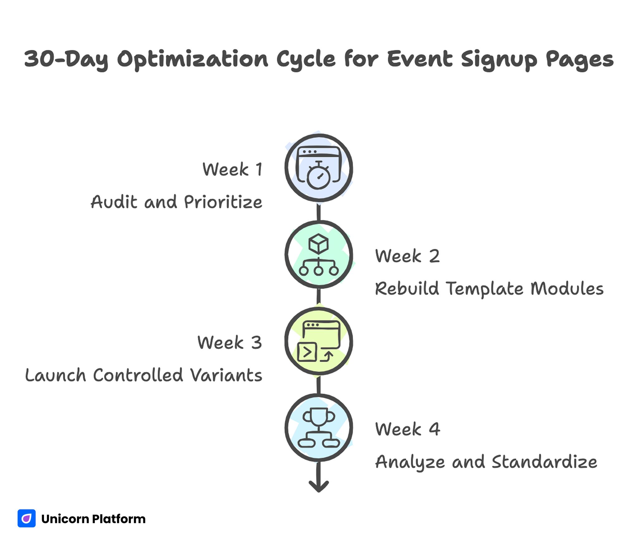
30-Day Optimization Cycle for Event Signup Pages
Week 1: Audit and Prioritize
Review top event pages for message clarity, form friction, mobile readability, and logistics visibility. Select one bottleneck per page type.
Week 2: Rebuild Template Modules
Create or update reusable modules for hero relevance, agenda outcomes, speaker trust, and low-friction form design. Document module purpose so team members apply them consistently.
Week 3: Launch Controlled Variants
Deploy updated pages with channel-aligned copy and one major variable change. Keep testing windows stable for clean readouts.
Week 4: Analyze and Standardize
Evaluate results across registration and attendance metrics, then promote winning variants into default templates. Archive failed tests with short notes to prevent repeat mistakes.
Repeat this cycle monthly, especially during seasonal peaks or major event series. Consistent cadence keeps templates accurate as audience expectations shift.
Common Mistakes and Practical Fixes
Mistake 1: Brand-first opening that delays attendee value
Fix by leading with audience and outcome clarity before organizational narrative. Prospects should understand immediate value before they read broader context.
Mistake 2: Multiple competing CTAs
Fix by selecting one primary action per page and placing supporting actions in lower-priority zones. Clear hierarchy improves decision speed.
Mistake 3: Overbuilt forms for early-stage events
Fix by collecting only essential registration data and moving deeper qualification to post-submit workflows. Lower friction usually increases qualified volume.
Mistake 4: Agenda without practical outcomes
Fix by adding short takeaways under each session block. Outcome language helps visitors evaluate relevance quickly.
Mistake 5: Weak mobile readability
Fix by validating the full journey on real devices before launch. Readability, form usability, and confirmation clarity should be tested end to end.
Mistake 6: No attendance-quality feedback loop
Fix by reviewing attendance and post-event behavior for each variant, then updating templates based on evidence rather than assumptions. This feedback loop is what turns one-off wins into repeatable performance.
FAQ: Event Signup Pages in 2026
1) How much information should appear before the form?
Include enough context for a confident decision: audience, outcome, format, timing, and one trust cue. Most prospects should not need to scroll far to validate fit.
2) What form length is best for events?
Use the minimum fields needed for access and immediate follow-up. Longer forms are justified only when qualification is essential to event quality.
3) Should webinars and conferences share one template?
They can share a structural backbone, but opening message and agenda depth should differ by event type and intent. Format-specific adaptation improves relevance without increasing production complexity.
4) Where should speaker profiles appear?
Place key speaker proof after core value and before deep agenda sections. Profiles should reinforce why the event is worth time investment.
5) How often should CTA buttons repeat?
Repeat naturally at major decision points such as after the hero, agenda overview, and trust section. Repetition should support flow, not create clutter.
6) How can teams improve attendance after registration?
Standardize confirmation details, deliver timely reminders, and keep timezone and access instructions consistent across every touchpoint. Most attendance problems here come from communication inconsistency rather than lack of demand.
7) What is the most common cause of message mismatch?
Channel teams and landing-page teams often optimize separately. Shared intent mapping prevents conflicting promises.
8) Which KPI should teams prioritize first?
Track registration rate and attendance rate together. This pair quickly reveals whether growth is qualified or fragile.
9) Should pages include urgency language?
Yes, when urgency reflects real constraints such as limited seats or schedule deadlines. Transparency is more persuasive than pressure tactics.
10) What is the fastest high-impact improvement?
Rewrite the first screen around role-specific value and simplify the form. This often improves both conversion and attendance quality in one release.
Final Takeaway
Event conversion improves when teams design pages as decision systems rather than promotional flyers. Clear relevance, trustworthy logistics, and low-friction action produce better registrations and stronger attendance outcomes.
With a repeatable structure, disciplined testing, and consistent post-submit communication, teams can ship faster and compete more effectively across every campaign cycle. The same system also improves forecasting because conversion and attendance become more predictable.

