Table of Contents
- Why Event-Landing Pages Underperform Even With Good Traffic
- Core Architecture for High-Converting Event-Landing Pages
- 30-Day Execution Plan
- Common Failure Modes and Direct Fixes
- FAQ
Most teams can publish a registration page quickly. Far fewer teams can publish one that consistently attracts the right audience, converts with clear expectations, and protects attendance quality. That difference is where event growth performance is usually won or lost.
A strong event page is not just a design asset. It is a decision system that aligns audience fit, session value, logistics confidence, and registration friction into one coherent flow. If any of those parts is weak, signups can grow while attendance and post-event outcomes decline.
Many event programs underperform because execution is fragmented. One team writes broad promotional copy, another team builds a form, and another team handles reminders, but no one owns end-to-end decision quality from first visit to event day.
This guide provides a practical framework for building and improving event-focused pages in Unicorn Platform. The goal is reliable registrations, stronger attendance behavior, and better downstream conversion.
sbb-itb-bf47c9b
Key Takeaways
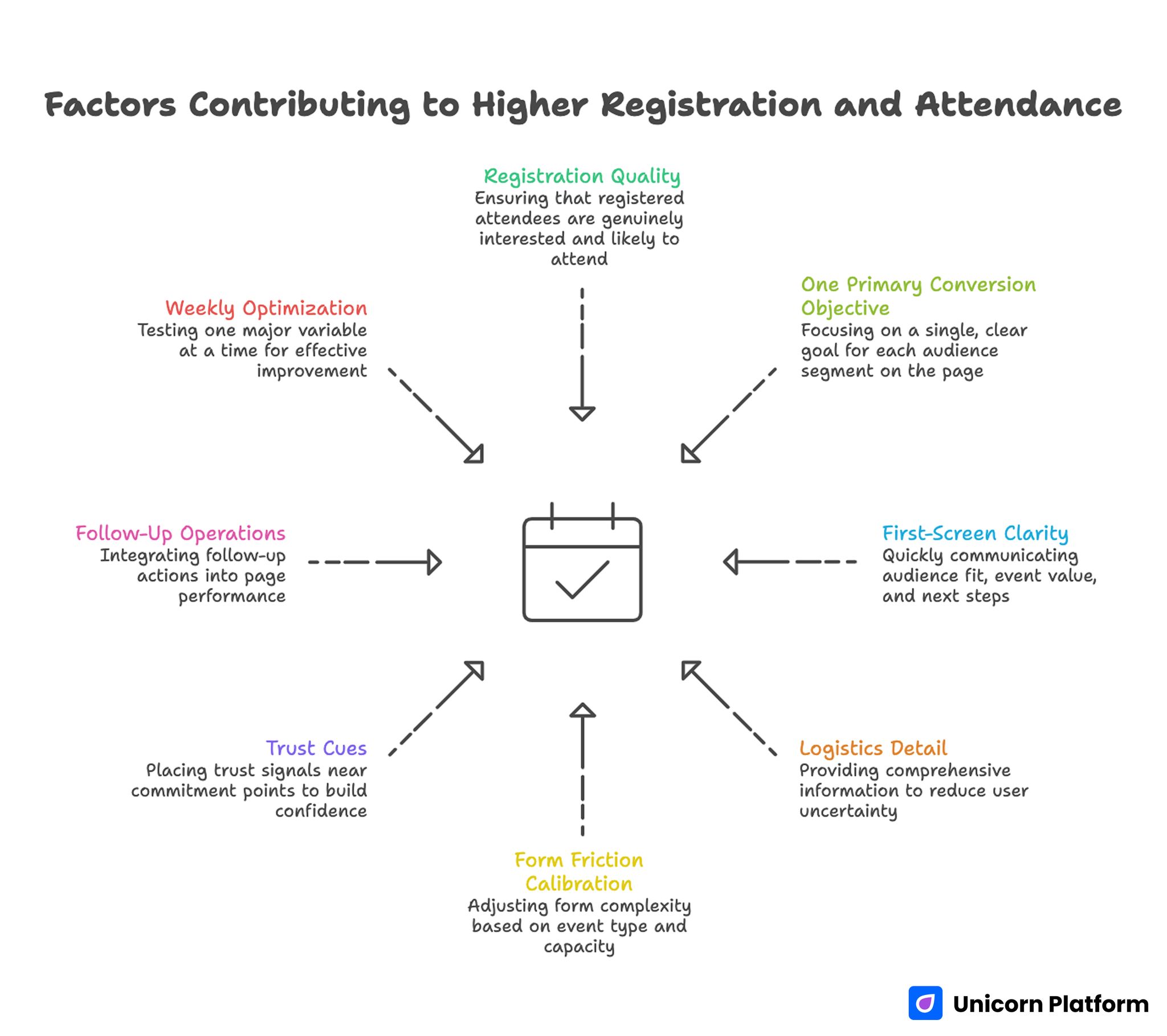
Factors Contributing to Higher Registration and Attendance
- Registration volume is useful, but registration quality is the core success signal.
- One page should prioritize one primary conversion objective per audience segment.
- First-screen clarity should explain audience fit, event value, and next step quickly.
- Logistics detail should reduce uncertainty before users reach the form.
- Form friction should be intentionally calibrated to event type and capacity goals.
- Trust cues should be placed near commitment points, not isolated in one block.
- Follow-up operations are part of page performance, not a separate workflow.
- Weekly optimization works best when one major variable is tested at a time.
Why Event-Landing Pages Underperform Even With Good Traffic
Most underperformance starts with mixed intent messaging. Pages try to promote brand story, event theme, speaker authority, sponsor visibility, and registration urgency all at once. Visitors struggle to identify the main value proposition and delay action.
The second issue is missing logistics confidence. People do not register only because the topic sounds interesting. They also need confidence in format, timing, access process, and expected outcomes. If these details are unclear, completion quality drops.
The third issue appears after signup. Confirmation and reminder sequences are often generic or delayed, which weakens commitment and increases no-show risk. A page can convert well on paper while event attendance quality deteriorates.
This is why page performance should be managed as a full system. The page, registration form, confirmation flow, and reminder cadence are tightly connected.
Event-Landing Page vs Event Website: Role Clarity First
A dedicated event-focused page and a full event website serve different jobs. A dedicated page is usually optimized for one decision: register now with confidence. A broader event website often supports exploration across many sections and user paths.
When conversion speed matters, dedicated pages usually perform better because message hierarchy stays focused. Users can evaluate fit, value, and logistics without navigating unrelated content.
A broader event website can still be useful when the event has many tracks, sponsors, or ongoing updates. In that case, the dedicated page can act as the registration-focused entry point while the larger site supports deep exploration.
Use role clarity before design work. If a page is meant to drive one registration action, build and optimize it as a conversion asset, not as a general information hub.
Define Event Goal and Audience Before Writing Copy
Copy quality depends on strategic clarity. Before drafting, define the single primary goal for this event cycle. Common options include qualified registrations, live attendance quality, demo-booking volume after session, or partner lead capture.
Then define the primary audience segment. A founder workshop and an enterprise operations webinar may share a format, but they require different value framing, objection handling, and form design.
If audience intent is mixed, create controlled variants by source or segment while preserving one structural framework. This reduces messaging conflict and improves attribution.
Goal Alignment Checklist
- Is one conversion objective clearly primary?
- Is audience language specific and recognizable in the first screen?
- Is the event outcome practical, not abstract?
- Is the CTA aligned with commitment readiness?
- Is there one quality metric tied to this page role?
Teams that complete these checks early usually reduce revision cycles and improve test clarity. They also make later optimization decisions faster because success criteria are defined before launch pressure increases.
Core Architecture for High-Converting Event-Landing Pages
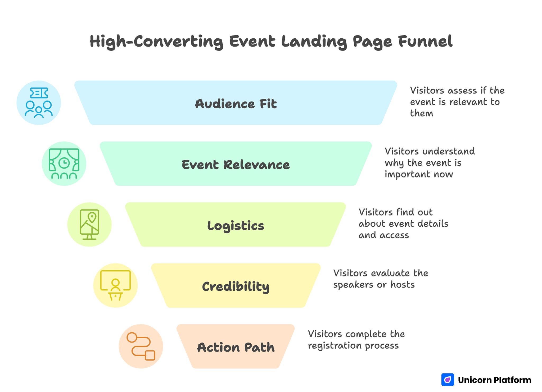
High-Converting Event Page Funnel
A reliable page should answer critical registration questions in decision order. If visitors need to search for basics like format, timing, or relevance, conversion quality declines.
A practical architecture includes five stages:
- Audience fit and event outcome.
- Why this session matters now.
- Core logistics and access expectations.
- Speaker or host credibility near commitment points.
- Simple action path with clear post-submit continuity.
This structure keeps cognitive load low and reduces pre-registration uncertainty. It also helps internal teams prioritize edits without breaking conversion flow.
When your team needs a reusable framework for section sequencing, this high-converting landing page structure guide is useful for assigning clear section jobs before detailed copy writing. It is especially useful when several contributors are editing the same page under tight deadlines.
A stable structure also helps cross-functional editing. Teams can update details without breaking the core decision flow.
First-Screen Messaging That Improves Registration Quality
The opening block should qualify intent quickly. Visitors should understand who the event is for, what they will gain, and what action to take next in one screen.
A reliable pattern is audience + outcome + format + timing. This gives enough clarity for qualified users to continue while filtering low-fit traffic.
Avoid generic event language such as "don’t miss this" without concrete participant value. Urgency can increase clicks, but weak clarity often reduces meaningful registrations.
Add short helper text near CTA buttons to clarify commitment level, confirmation timing, and access details. These small cues reduce hesitation with minimal visual cost.
First-Screen Writing Rules
- Lead with practical attendee outcome, not internal branding language.
- Keep claims tied to realistic session scope.
- Clarify event format and timezone early.
- Avoid stacking multiple equal-priority CTAs.
- Ensure button labels describe the next immediate outcome.
Consistent use of these rules usually improves both conversion rate and attendance quality. It also reduces no-show risk because registrants understand commitment expectations before they submit.
What to Include: Logistics, Speakers, and Proof Without Clutter
High-performing pages balance persuasion with operational clarity. Attendees need enough detail to decide confidently without reading a wall of information.
Essential detail blocks typically include date and time, format and duration, agenda highlights, speaker context, and attendance expectations. Omitted logistics create uncertainty that lowers completion.
Speaker sections should focus on relevance, not biography length. Users want to know why this speaker is credible for the promised outcome.
Proof elements can include past event outcomes, attendee feedback themes, or recognizable partner context. Keep proof concise and close to registration decision points.
Information Priority Model
- Must-have before form: topic outcome, audience fit, time commitment.
- Strongly recommended before form: format, host credibility, agenda preview.
- Helpful after form area: deeper background, partner context, extended FAQs.
This priority model keeps the page focused while still addressing core objections. It prevents important decision details from being buried under lower-impact content.
Form Strategy for Better Registrations and Better Attendance
Registration form design should match event risk and capacity constraints. Short forms improve completion, but overly minimal forms can reduce qualification quality for high-value events.
Use staged qualification where possible. Capture required attendance-routing data first, then collect deeper details in confirmation or follow-up steps.
For many events, first-step capture can include email plus one qualifying field such as role, intent, or team context. This keeps friction reasonable while supporting segmentation.
For capacity-limited sessions, moderate qualification can protect attendee quality. The key is transparency: explain why fields exist and how data improves attendee experience.
Form QA Checklist
- Does each required field map to a real operational decision?
- Are field labels clear on mobile and desktop?
- Is validation behavior fast and understandable?
- Does submit action work consistently across common browsers?
- Does confirmation copy clearly state next steps?
Run this checklist before scaling promotion to avoid preventable drop-off. Minor form issues can become costly very quickly when paid traffic volume increases.
CTA and Registration Flow Design
Clear CTA design is more than button color. It includes action wording, placement logic, and continuity cues after action.
Use one dominant CTA for the primary conversion path. Secondary actions can exist, but they should support a different readiness stage rather than compete directly.
Position CTAs at high-confidence moments: after value framing, after key logistics, and near proof segments. This gives users multiple chances to commit without disrupting narrative flow.
Registration flow should minimize surprise. Users should know whether they are instantly confirmed, placed in review, or added to a waitlist.
Mobile and Performance Execution for Event Pages
A large share of event registrations starts on mobile devices, especially from social and email channels. Mobile friction can silently reduce registrations even when desktop performance looks strong.
Prioritize first-screen readability, tap-target comfort, and stable CTA visibility across common mobile widths. Avoid heavy visual elements that delay first meaningful interaction.
Performance and clarity should be reviewed together. Fast load time is helpful, but unclear hierarchy still hurts decision speed.
When your team needs deeper mobile implementation guidance, this responsive landing-page workflow helps align section hierarchy and conversion flow across devices. Mobile clarity improvements often deliver immediate gains for event registration programs.
Use real-device QA for form inputs, timezone display, calendar links, and confirmation behavior before launch. Emulators are useful, but live device checks expose friction patterns that affect real registrants.
Promotion and Follow-Up: Page Performance Does Not End at Submit
A registration submission is the start of commitment, not the finish line. Follow-up quality determines whether registrations translate into real attendance.
Confirmation should include immediate acknowledgement, event logistics summary, and one clear next action such as calendar add or agenda preview. This immediate clarity protects intent in the critical first minutes after signup.
Reminder cadence should be predictable and useful. Send updates that reinforce value, reduce uncertainty, and prepare attendees for participation.
Post-registration flows should also support segmentation. Tailored reminders by role or use case often improve attendance quality compared to one generic sequence.
Measurement Framework for Event-Landing Pages
Tracking only registrations creates blind spots. High-performing teams track conversion quality signals that predict attendance and downstream impact.
Use a three-layer model:
- Discovery: source-level click quality and engagement.
- Decision: form-start rate, completion rate, and objection patterns.
- Outcome: attendance rate, participation quality, and post-event next-step actions.
Each cycle should define one primary metric and one guardrail metric. This prevents local improvements that harm broader outcomes.
Practical Dashboard Cadence
- Daily: technical issues, link failures, and major drop-off anomalies.
- Weekly: source quality and registration-quality movement.
- Monthly: attendance outcomes and funnel contribution trends.
Cadence discipline helps teams separate real signal from short-term noise. It also prevents overreaction to day-to-day fluctuations that are not decision-relevant.
If you are optimizing attendee decision flow and friction points, this guide on user behavior patterns for landing pages is useful for prioritizing high-impact adjustments. Apply one improvement at a time so attribution remains clean.
30-Day Execution Plan
A structured month-long cycle helps teams improve performance without untracked changes. It also creates clearer ownership and better documentation for future events.
Week 1: Foundation and baseline
Define goal, audience, and page role. Build baseline page in Unicorn Platform with clear section jobs, form routing, and confirmation logic.
Complete mobile and browser QA before scaling traffic. Fixing usability issues early is usually cheaper than patching under active promotion.
Week 2: Messaging and CTA optimization
Test one first-screen framing variant and one CTA wording variant while keeping structure stable. This keeps result interpretation reliable and avoids experiment noise.
Review source-level completion quality and adjust trust placement near commitment points. Focus changes on the sections where hesitation is highest.
Week 3: Logistics and follow-up refinement
Improve agenda clarity, format details, and timezone visibility based on common attendee objections. These edits usually improve both completion quality and attendance confidence.
Refine reminder sequence timing and message relevance using early engagement data. Keep reminder copy practical and action-oriented rather than promotional.
Week 4: Consolidation and readiness
Keep winning variants, remove weak versions, and finalize launch-week response process. Archive decisions so the next event cycle starts from proven patterns.
Document rollback rules for high-risk edits and assign clear owners for live updates. Clear incident ownership reduces operational mistakes during peak traffic windows.
Common Failure Modes and Direct Fixes
Failure mode 1: Broad promotional copy without practical outcome
Users cannot quickly determine whether attendance is worth their time. Rewrite opening copy around audience fit, concrete value, and commitment context.
Failure mode 2: Missing or weak logistics detail
Visitors hesitate because format and timing are unclear. Move core logistics earlier in the page and clarify access flow near the form.
Failure mode 3: Overly heavy first-step form
Completion drops because friction appears before trust is established. Reduce first-touch fields and move deeper qualification into follow-up.
Failure mode 4: Speaker section is long but not relevant
Attendees see biography detail but not credibility tied to session outcomes. Rewrite speaker blocks around practical relevance and expected attendee gains.
Failure mode 5: Confirmation and reminders are generic
Registrations convert but show-up quality declines. Build role-aware follow-up messaging with clear timeline and participation cues.
Failure mode 6: Optimization decisions rely on volume only
Signup count rises while attendance and downstream actions remain weak. Pair volume metrics with quality guardrails and segment-level review.
FAQ: Event-Landing Pages
How long should event-landing pages stay active before an event?
Run the page long enough to gather stable signal on source quality, message fit, and attendance intent. For many teams, that means several weeks of measured iteration before event day.
What should event-landing pages include at minimum?
At minimum, include audience fit, session value, event timing and format, speaker credibility, one clear CTA, and clear post-submit expectations. This baseline is usually enough for confident registration decisions.
Should event-landing pages be separate from the main event website?
Often yes, especially when registration conversion is the primary objective. Dedicated pages usually provide clearer decision flow and stronger conversion focus.
How many fields should event registration forms include?
Use the minimum fields needed for operational routing and attendance quality. Collect deeper detail later unless immediate qualification is essential.
Where should speaker and proof sections appear?
Place them near commitment points where users evaluate risk. Proof is most effective when it supports decisions right before CTA interaction.
How do I improve attendance after someone registers?
Use immediate confirmation, clear logistics reminders, and value-focused pre-event messages. Attendance quality improves when follow-up feels useful and predictable.
Should I use multiple CTAs on one event page?
Use one dominant CTA for the primary goal. Secondary actions should support different readiness states without competing for attention.
How often should event pages be updated during promotion?
Weekly updates with clear hypotheses are usually effective. High-frequency untracked edits often create noise and reduce learning quality.
Can one event page serve both paid and organic traffic?
Yes, when one dominant intent is preserved and message continuity holds from source click to registration confirmation. If intent diverges significantly across channels, separate variants are usually safer.
Can Unicorn Platform support this full event conversion workflow?
Yes. Unicorn Platform supports rapid page iteration, and results improve most when teams combine that speed with strict structure, QA discipline, and quality-based measurement.
Final Takeaway
Strong registration performance is created by systems, not by isolated design tweaks. Teams that align fit clarity, logistics confidence, form strategy, and follow-up operations consistently produce better attendance outcomes.
When event-focused pages are treated as full decision systems, they become reliable growth assets rather than one-off campaign pages. That system mindset is what keeps outcomes stable across repeated event cycles.