Table of Contents
- What Top Ebook Landing Page Examples Have in Common
- Copywriting Patterns That Increase Ebook Conversion
- 30-Day Optimization Plan for Ebook Campaigns
- Common Mistakes and Practical Fixes
- FAQ
Most ebook campaigns fail for a simple reason: the page asks for an email before it earns trust. Teams can spend weeks producing a strong guide, then lose momentum on a landing page that sounds generic, buries value, or creates form friction too early.
High-performing ebook landing pages work because they make one promise clear, prove that promise fast, and guide users through a short action path. When message clarity, proof timing, and CTA flow are aligned, conversion goes up without aggressive tactics.
This guide breaks down what strong ebook landing page examples consistently do better, how to apply those patterns in Unicorn Platform, and how to optimize the page after launch so results keep improving instead of plateauing.
If your ebook is part of an audience-building funnel, the next step often benefits from a dedicated newsletter subscription landing page that keeps the value narrative consistent after the first download.
sbb-itb-bf47c9b
Quick Strategic Takeaways
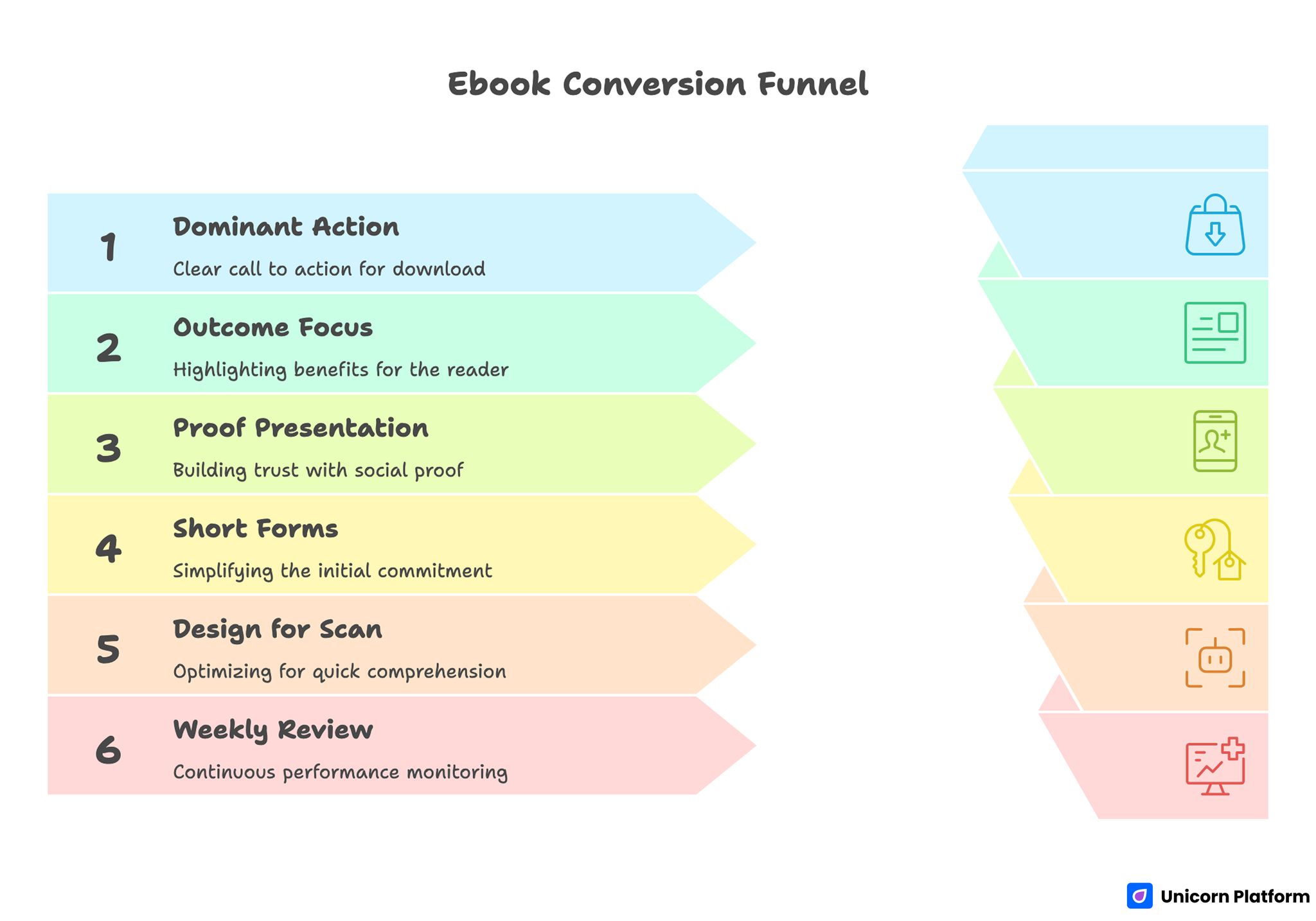
Ebook Conversion Funnel
- One page, one dominant action: download now.
- Lead with reader outcome, not asset format.
- Show proof before the first serious commitment moment.
- Keep forms short, then qualify later in the funnel.
- Design for scan behavior: headline, benefit stack, proof, CTA.
- Review performance weekly, not quarterly.
Why Ebook Landing Pages Underperform
Most underperforming pages share the same structural problem: they describe the ebook but never frame the reader transformation. Visitors care about what changes after they read, not just what chapters are included.
Another common issue is delayed credibility. Pages often place testimonials, logos, author context, or real-world applicability too low, which means users hit the form before they feel confident.
Teams also lose conversions when they confuse navigation with persuasion. If users can branch into too many paths, the core action loses priority and the page starts behaving like a mini website instead of a conversion asset.
What Top Ebook Landing Page Examples Have in Common
Strong pages across SaaS, education, coaching, and agency verticals repeat the same conversion logic, even when design style differs.
1. Outcome-first positioning in the first screen
The headline clarifies who the ebook is for and what concrete result it supports. "Free ebook" is not the value proposition. The value is the problem it helps solve and the speed or confidence it provides.
2. Fast specificity in the preview section
High-converting pages summarize what is inside with practical detail. They usually preview frameworks, checklists, templates, or implementation steps so users can evaluate usefulness before sharing details.
3. Trust before friction
Credibility appears close to decision points. This can include expert context, customer proof, known brand mentions, or quality cues that show the content is substantial rather than thin lead magnet material.
4. Minimal initial form friction
Most strong pages request only the data required for delivery. Qualification can happen on the thank-you page or in follow-up sequences, which protects conversion while still supporting downstream quality. \
Research from the Baymard Institute shows that complex or poorly structured form fields are one of the top causes of abandonment in online funnels, reinforcing the recommendation to minimize initial form friction and optimize form usability across devices.
5. Clear post-submit expectation setting
Users understand what happens next: instant download, inbox delivery, bonus material, or a related next step. That clarity reduces hesitation and improves completion.
According to the Nielsen Norman Group’s research on web reading behavior, users scan pages in F- and Z-shaped patterns, which underscores the importance of a strong headline, clear benefit stack, and intentionally ordered proof and CTA sections to match how visitors actually consume content.
The 10-Part Ebook Landing Page Framework
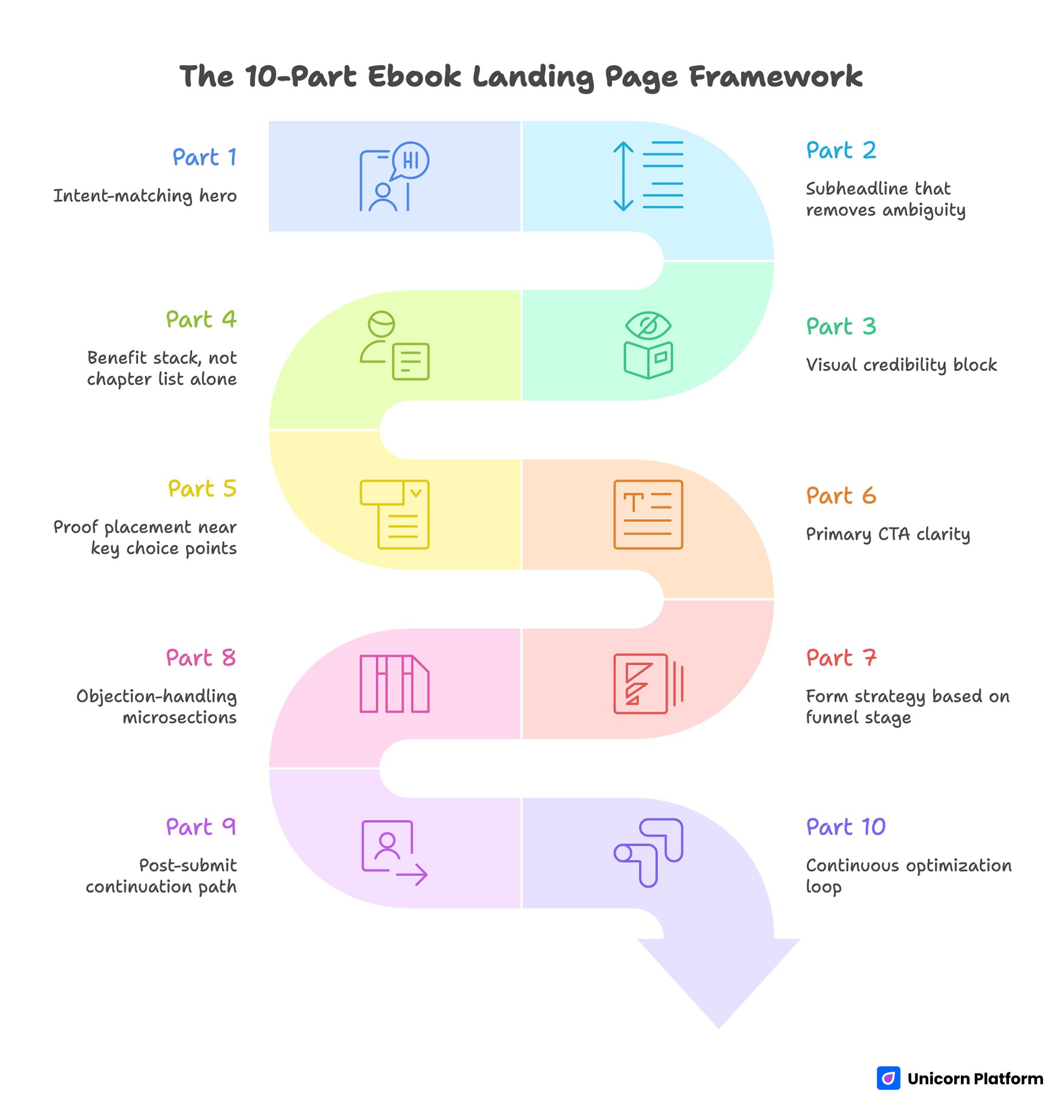
The 10-Part Ebook Landing Page Framework
Use this framework when building or revising pages in Unicorn Platform.
Part 1: Intent-matching hero
Write the hero around the reader's decision context. A founder comparing channels needs a different promise than a content manager trying to improve lead quality.
A practical hero formula is: audience + constraint + outcome + timeframe. This is specific enough to feel relevant without making claims you cannot validate.
Part 2: Subheadline that removes ambiguity
Use the subheadline to clarify scope. Mention what the reader will learn, what level the guide is for, and how the material is structured.
This keeps users from abandoning because they are unsure whether the resource is too basic, too advanced, or too broad.
Part 3: Visual credibility block
Include a clean ebook cover, but support it with substance. A strong visual block can also include a chapter snapshot, key diagram, or short callout of practical tools included in the guide.
Pages that rely only on cover art often look polished but weak on confidence. The goal is visual trust plus content trust.
Part 4: Benefit stack, not chapter list alone
Chapter names help orientation, but benefit framing drives conversion. Explain how each major section helps users make better decisions or execute faster.
For teams building broader acquisition systems, this same logic aligns with a clear lead generation landing page structure where each section reduces a specific conversion objection.
Part 5: Proof placement near key choice points
Place trust signals where users evaluate whether to continue. This usually means one proof element near the hero and a deeper proof section before the main form block.
Useful proof formats include short testimonial excerpts, role-based endorsements, specific use cases, and concise authority context for the author or company.
Part 6: Primary CTA clarity
Choose one main CTA and keep the copy aligned with intent. "Get the guide" can work better than vague button text because it confirms exactly what users receive.
Avoid CTA copy that mixes multiple goals. If you want downloads, do not dilute the primary action with equal-priority trial, demo, and contact prompts in the same view.
Part 7: Form strategy based on funnel stage
Early-stage educational offers usually perform best with short forms. Start with email, then optionally collect one lightweight segmenting field if your follow-up workflow benefits from it.
If you need deeper qualification, move that step after conversion. Keeping the first commitment small improves completion and protects momentum.
Part 8: Objection-handling microsections
Short microsections can remove final hesitation. Common objections include "Is this too basic?", "Is this relevant to my niche?", and "Will this be actionable or generic?"
Answer these directly with concise copy blocks near the form and again on mobile in shorter formats.
Part 9: Post-submit continuation path
High-performing pages do not end at form submission. The thank-you state should guide users to the next meaningful action, such as a related article, onboarding sequence, or deeper resource.
When you build multi-step content journeys, make sure topic depth stays coherent with your broader content marketing types strategy so users do not feel disconnected after downloading.
Part 10: Continuous optimization loop
Conversion wins usually come from steady iteration, not one major redesign. Weekly reviews on message fit, proof visibility, and form performance often outperform infrequent large changes.
Build a simple decision log so every test has a hypothesis, result, and follow-up action. This prevents teams from repeating weak ideas and helps new contributors ramp quickly.
Example Archetypes You Can Model (Without Copying)
Instead of copying any single page style, model the underlying conversion intent behind each archetype.
1. The tactical playbook page
This page style promises immediate implementation. It works well when your ebook includes templates, scripts, or workflows users can apply the same week.
Use a strong "what you can do by Friday" angle, highlight 3-5 practical outcomes, and keep visual examples close to the CTA so users can connect promise to substance.
2. The research-backed insight page
This format emphasizes credibility and decision support. It is effective for B2B campaigns where stakeholders need confidence before sharing details.
Lead with the business problem, add a short methods or perspective section, then show how the ebook helps teams decide faster with less trial and error.
3. The template library page
Template-focused pages convert when they make effort reduction obvious. Users should quickly see how much work is saved, what format is included, and what skill level is expected.
Strong template pages often include visual previews and short context statements that explain when to use each template, not just what each one is called.
4. The authority-led creator page
Creator and influencer-led pages perform when they balance personality with implementation depth. Audiences respond to trust and voice, but they still need clear structure and outcomes.
If this model matches your audience behavior, review how high-performing personal landing pages sequence creator trust, offer clarity, and action guidance without overwhelming the first screen.
Copywriting Patterns That Increase Ebook Conversion
Strong copy is specific, directional, and decision-focused. Use these patterns to tighten your page.
Pattern 1: Problem to payoff bridge
Start with one painful reality the audience already feels, then connect to the practical outcome your ebook enables. This keeps the page grounded in user context instead of abstract claims.
Pattern 2: Precision over hype
Replace adjectives with detail. "Comprehensive" and "ultimate" rarely convert by themselves. Specificity around what readers will learn, implement, or avoid usually performs better.
Pattern 3: Reader language, not internal language
Write in the language your audience uses in meetings and planning docs. Internal product terms can create cognitive friction if visitors are unfamiliar with your team vocabulary.
Pattern 4: Time-to-value clarity
Give users a realistic expectation of when value appears. If they can apply part of the ebook in one day, say that. If implementation takes multiple steps, frame it clearly.
Pattern 5: Objection-aware microcopy
Use small lines around the form to remove uncertainty, such as delivery timing, unsubscribe clarity, and what follow-up emails include.
Microcopy is not decorative. It is the final confidence layer before action.
Design Patterns That Improve Trust and Scan Flow
Many teams over-focus on aesthetics and under-focus on decision flow. High-converting design is not about visual complexity; it is about directing attention in the right order.
Visual hierarchy standards
Use one dominant H1, clear H2 decision blocks, and short supporting paragraphs. Readers should grasp the value path in under ten seconds.
Keep CTA styling consistent. If every button style is different, users lose visual priority cues and action confidence drops.
Section rhythm
Alternate between proof, explanation, and action prompts to maintain momentum. Long runs of dense text can reduce conversion even when the content is useful.
Use strategic white space to separate decision blocks. Compression often makes pages feel harder to trust, especially on mobile devices.
Content preview quality
A short "inside the ebook" section should include enough detail to show depth without overwhelming users. Two to four focused preview cards often work better than long chapter dumps.
Preview design should reinforce outcomes. Users care less about chapter names and more about what each section helps them accomplish.
Mobile and Performance Requirements
Ebook traffic frequently comes from social, search, and email on mobile devices. If mobile readability, form input, or load speed are weak, conversion loss is immediate.
Mobile UX checklist
- Keep first-screen copy concise and outcome-centered.
- Ensure form fields are easy to tap and complete.
- Keep CTA visible without requiring deep scrolling.
- Avoid oversized media that delays first interaction.
Performance checklist
- Compress images and ebook preview graphics.
- Remove nonessential script weight from landing pages.
- Validate Core Web Vitals after each major update.
- Test form completion on mid-range mobile devices.
Teams that pair message optimization with technical hygiene typically get more stable conversion performance than teams that test copy alone.
Building in Unicorn Platform: Fast Without Losing Quality
Unicorn Platform is most effective when teams use reusable conversion modules instead of building each page from scratch.
Recommended production workflow
- Draft the hero, benefit stack, and CTA before design refinements.
- Add trust blocks and preview cards mapped to likely objections.
- Implement the shortest viable form and delivery flow.
- Launch with event tracking for clicks, form starts, submissions, and thank-you page visits.
- Run weekly revisions using one clear hypothesis at a time.
This workflow keeps execution speed high while preserving decision quality. It also helps teams ship multiple ebook campaigns without redesigning core page logic each cycle.
30-Day Optimization Plan for Ebook Campaigns
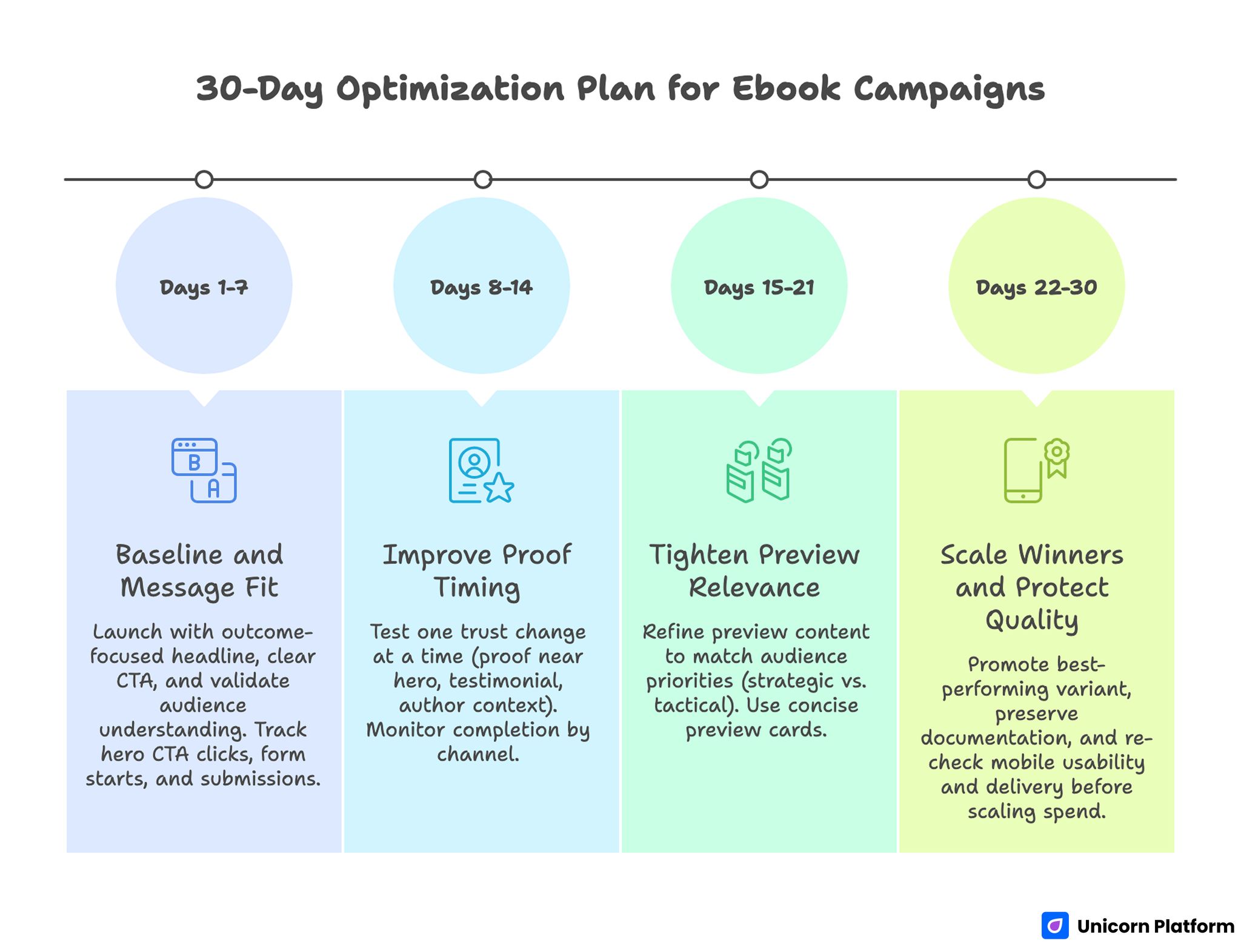
30-Day Optimization Plan for Ebook Campaigns
Days 1-7: Baseline and message fit
Launch with the strongest outcome-focused headline and one clear CTA. Validate that users understand who the ebook is for within the first screen.
Track hero CTA clicks, form starts, and form submissions. If users click but do not submit, adjust proof placement and form friction first.
Days 8-14: Improve proof timing
Test one trust change at a time: proof near hero, role-specific testimonial copy, or stronger author context. Avoid changing multiple variables in one test window.
Monitor completion by channel. A variation that wins on email traffic may underperform on paid social, so segment analysis matters.
Days 15-21: Tighten preview relevance
Refine preview content to reflect audience priorities. If your traffic is mostly founders, prioritize strategic sections; if it is practitioners, prioritize tactical sections.
Use concise preview cards that show implementation depth. This often increases perceived value without increasing visual clutter.
Days 22-30: Scale winners and protect quality
Promote the best-performing variant while preserving documentation. Keep a changelog that records what changed, why it changed, and what impact followed.
Before scaling spend, re-check mobile form usability and delivery reliability. Conversion gains disappear quickly if operational details fail under higher traffic.
Measurement Model: What to Track Beyond Conversion Rate
Raw conversion rate is useful, but it is not enough for ebook funnel decisions. You also need indicators that show whether conversions are qualified and durable.
Track at least these metrics:
- CTA click-through rate by source
- Form start to submit ratio
- Download confirmation rate
- Follow-up email open and click quality
- Secondary action rate after download
- Qualified pipeline contribution for business-focused campaigns
This combination helps teams avoid optimizing for low-intent volume. A page that converts slightly less but produces stronger downstream actions can be the better growth asset.
Common Mistakes and Practical Fixes
1. Headline focuses on format, not outcome
Readers do not download ebooks because they like ebooks. They download because they expect a better decision or result.
Fix: Rewrite the first screen around audience pain and expected payoff, then support with specific preview detail.
2. Value is buried below design-heavy sections
Strong visuals cannot compensate for slow value communication. If users cannot see relevance quickly, they bounce.
Fix: Move the value summary and one proof element higher. Keep decorative content secondary to conversion logic.
3. Form asks for too much too soon
Long forms create friction before confidence is established, especially for top-of-funnel educational offers.
Fix: Reduce first-step fields and move deeper qualification to post-conversion pathways.
4. Proof is generic and detached from context
General praise does not answer real objections. Users need proof connected to their likely situation.
Fix: Use short, specific proof snippets tied to role, use case, or implementation outcome.
5. No clear post-download path
When users submit and then receive weak follow-up direction, conversion value decays.
Fix: Build a clear thank-you state and first follow-up step aligned with the promise made on the landing page.
6. Teams optimize too infrequently
Quarterly redesign cycles are too slow for active acquisition channels.
Fix: Run weekly micro-iterations with one hypothesis per cycle and a documented learning loop.
Weekly Ebook Landing Page Scorecard
Teams improve faster when review conversations are structured. A lightweight scorecard keeps the group focused on conversion factors that matter instead of subjective design opinions.
Use a 1-5 score for each category:
- message fit in first screen
- benefit specificity in preview blocks
- trust signal relevance to the target audience
- form friction for current traffic intent
- post-submit continuity and next-step clarity
- mobile readability and tap usability
Start each weekly review by scoring the current page before discussing new ideas. This creates a baseline and helps teams compare changes over time rather than reacting to isolated feedback.
After scoring, choose only one or two low-performing categories for the next test cycle. If everything is changed at once, the team loses visibility into what actually improved conversion behavior.
A practical decision rule is simple: if first-screen message fit scores below 4, prioritize headline and subheadline revisions before any visual redesign work. If trust relevance scores below 4, adjust proof placement and proof specificity before testing new CTA language.
Keep scorecards tied to channel segments. A variation that performs well for warm email traffic can still underperform for paid social visitors who have lower familiarity and need stronger context in the first view.
Within four to six weeks, this scorecard method usually gives teams clearer testing priorities and a stronger shared vocabulary for quality. It also helps new contributors understand why specific layout and copy decisions were made.
FAQ: Ebook Landing Pages
What is an ebook landing page?
An ebook landing page is a focused conversion page built to exchange clear value for a specific user action, usually an email submission. It should prioritize one action path and remove distractions that belong on broader site pages.
How long should an ebook landing page be?
Length should follow decision complexity rather than arbitrary word targets. A practical page gives enough detail to build confidence while staying easy to scan on desktop and mobile.
Should I gate every ebook behind a form?
Not always. If awareness and distribution are the primary goals, ungated access can make sense, while gated flows often work better for lead capture and segmented nurturing.
How many form fields should I use?
Start with the minimum required for delivery and early segmentation. Add more fields only when the downstream value clearly outweighs conversion friction.
Where should social proof appear?
Place one credibility signal near the first screen and a deeper trust block before the main form section. This timing supports user confidence at the moments where hesitation typically appears.
What CTA text usually performs better?
Specific CTA text tied to immediate value generally outperforms generic button language. Phrases that clearly state what users receive can reduce uncertainty and improve completion.
How do I improve conversion without redesigning the entire page?
Prioritize headline clarity, proof timing, and form simplicity before changing visual style. Small focused changes in these areas often produce the largest lift.
What metrics matter after the download?
Track follow-up engagement quality, not just form submissions. Open behavior, click depth, and next-step actions reveal whether the page is attracting the right audience.
Can no-code tools handle serious ebook funnel optimization?
Yes, if teams pair no-code speed with disciplined testing and documentation. Rapid editing is useful only when each iteration has a clear hypothesis and measurable outcome.
How often should ebook landing pages be updated?
Weekly review cadence is a strong baseline for active campaigns. Monthly structural reviews can then consolidate wins and retire low-impact experiments.
Final Takeaway
The best ebook landing page examples do not win because they look similar. They win because they follow strong decision architecture: clear promise, proof at the right moment, low-friction action path, and continuous improvement after launch.
When your team applies that architecture in Unicorn Platform, ebook pages become repeatable growth assets instead of one-off campaign files. Build with intent, iterate with evidence, and scale only what proves it can convert quality outcomes consistently.