Table of Contents
- Conversion Architecture for Payment App Landing Pages
- Security Messaging That Builds Confidence Without Overclaiming
- 30-Day Operating Plan for No-Code Teams
- Common Failure Modes and Practical Fixes
- FAQ
Payment apps are evaluated differently from most digital products. Users do not only ask whether the interface looks good or whether features sound useful. They ask whether money movement will feel safe, predictable, and reversible if something goes wrong.
That means landing-page quality has a larger impact in payments than in many other categories. Weak trust framing can kill conversion even when media buying is strong and the product itself is excellent. Strong trust framing can improve conversion without changing acquisition spend.
No-code tools now let teams build and iterate these pages quickly, but speed alone is not enough. You still need a structure that matches user intent, evidence that reduces risk perception, and tracking that shows where confidence breaks in the journey.
This guide provides that full system. It explains how to design a payment app landing page without coding while maintaining professional quality standards that can compete in high-trust markets.
sbb-itb-bf47c9b
Key Takeaways
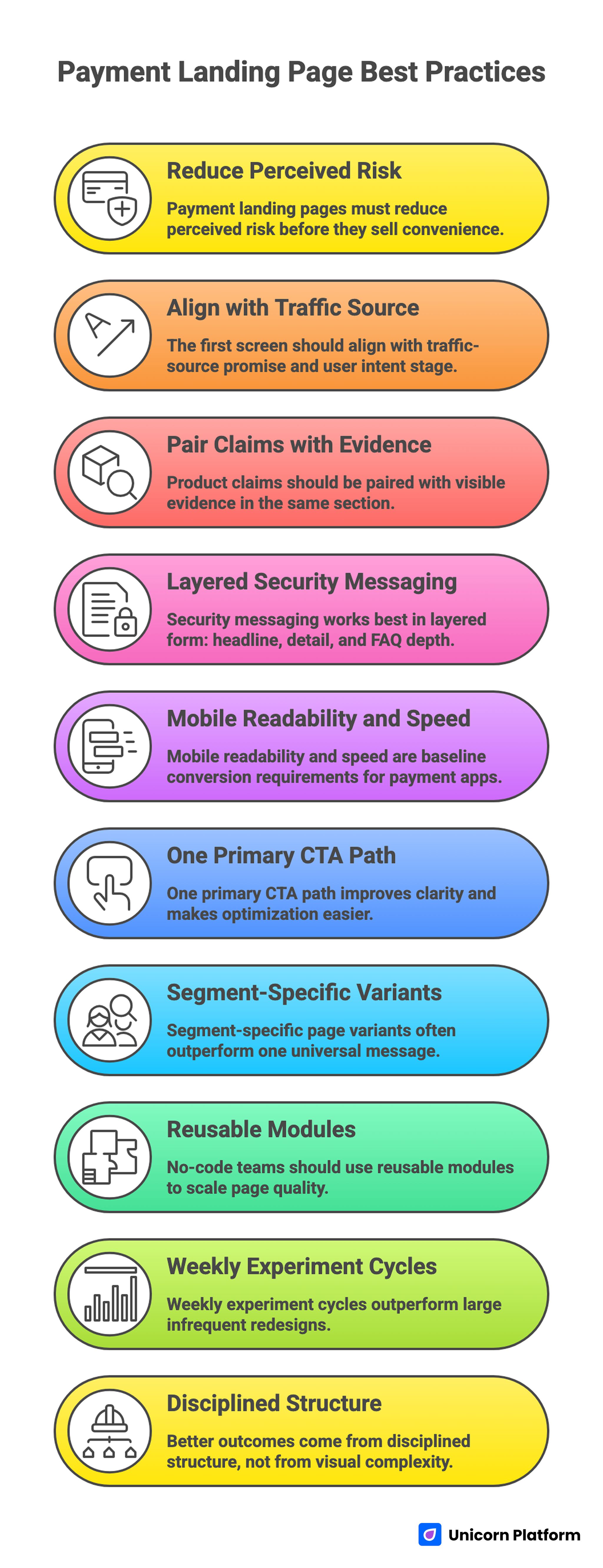
Key Takeaways for High-Converting Payment App Landing Pages
- Payment landing pages must reduce perceived risk before they sell convenience.
- The first screen should align with traffic-source promise and user intent stage.
- Product claims should be paired with visible evidence in the same section.
- Security messaging works best in layered form: headline, detail, and FAQ depth.
- Mobile readability and speed are baseline conversion requirements for payment apps.
- One primary CTA path improves clarity and makes optimization easier.
- Segment-specific page variants often outperform one universal message.
- No-code teams should use reusable modules to scale page quality.
- Weekly experiment cycles outperform large infrequent redesigns.
- Better outcomes come from disciplined structure, not from visual complexity.
Why Payment App Landing Pages Need a Dedicated Framework
In many SaaS categories, users are willing to test first and evaluate trust later. In payments, trust is often evaluated before users commit to the first action. This changes how landing pages should be ordered.
A payment app page should answer three questions fast. Is this secure enough for money movement? Is it simple enough to use without operational friction? Is it reliable enough to fit daily or business-critical workflows?
If those questions remain unresolved in early sections, users hesitate, compare alternatives, or abandon. The design challenge is not only persuasion. It is controlled de-risking.
Core Intent Types and Why One Page Usually Isn’t Enough
Most payment products attract multiple user segments with different priorities. A freelancer collecting invoices has different concerns than an operations lead managing payout workflows. A consumer transfer user cares about speed and fee transparency, while a finance manager cares about controls and traceability.
Trying to satisfy all of these users in one message block often creates vague copy. Specificity drops, trust weakens, and CTA relevance falls.
A better model is one core page plus segment-specific variants. The architecture can stay consistent, but headline framing, proof emphasis, and objection handling should adapt to each high-value intent.
Strategic Decisions Before You Build
Landing-page performance is usually decided before visual work starts. If the strategy layer is unclear, teams spend time refining design while conversion fundamentals stay broken.
Define audience and urgency context
State exactly who the page is for and what urgency they feel. Is the user trying to speed up settlement, reduce failed payment friction, simplify reconciliation, or launch a new payment flow for customers? This context shapes headline language and proof selection.
Choose one primary conversion action
Pick one main action for the page: start free account, request demo, install app, or begin integration onboarding. Secondary actions are acceptable, but one path should dominate hierarchy.
A single primary action improves user clarity and makes analytics interpretation much cleaner.
Build a value-to-proof map
For each claim in your page narrative, define the evidence that validates it. If you say setup is fast, show implementation time context. If you say controls are strong, show permission and audit capabilities with concrete language.
This map prevents unsupported claims and improves trust density across the page.
Lock a risk-reduction sequence
Before copy drafting, define where you will answer security, compliance, fee, and support concerns. Risk topics should appear progressively, not dumped in one legal-looking section near the bottom.
Users should feel confidence increasing as they scroll.
Conversion Architecture for Payment App Landing Pages
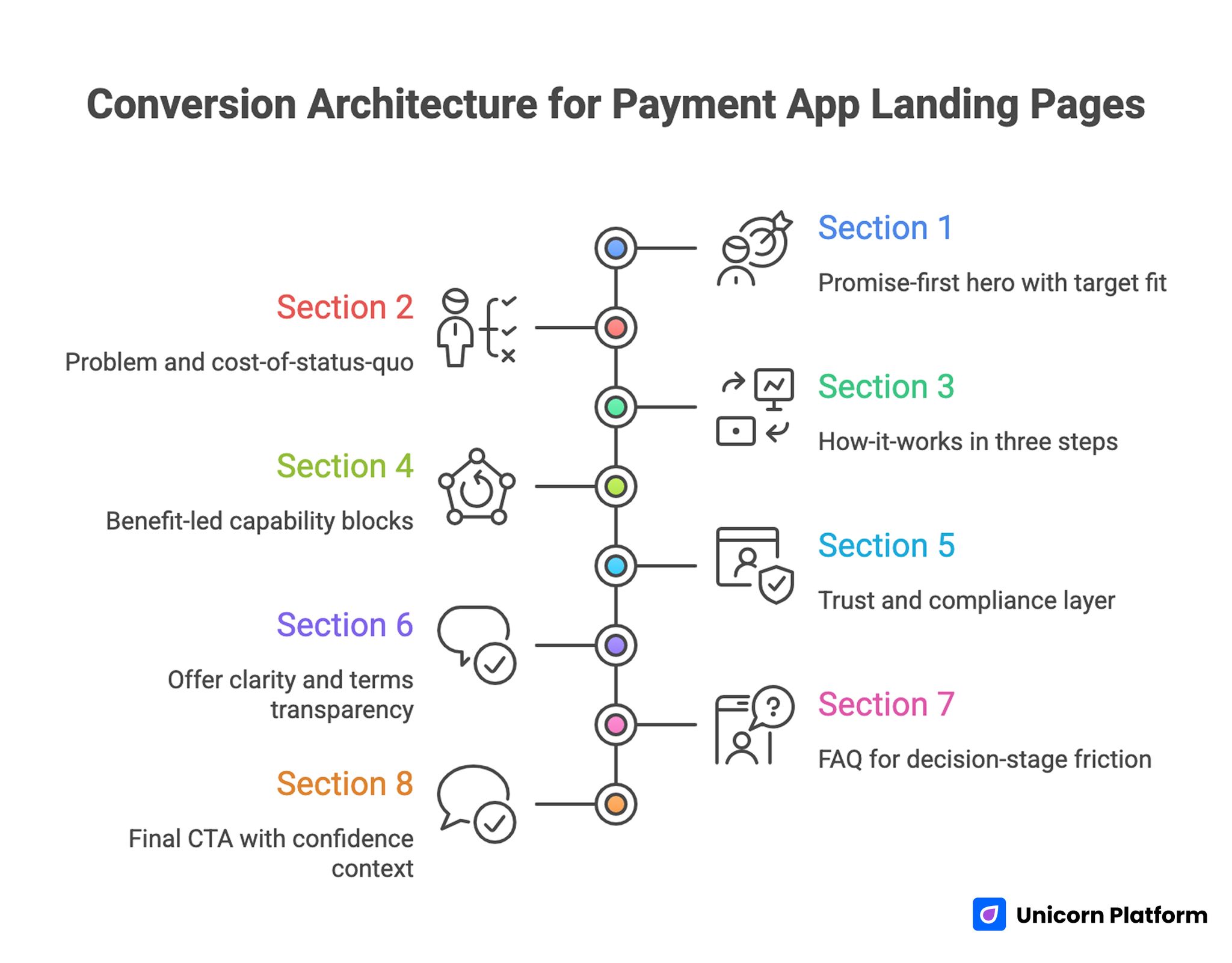
Conversion Architecture for High-Performing Payment App Landing Pages
A strong architecture gives no-code teams consistency and speed. If you want a deeper baseline for section ordering, adapt this model with a step-by-step guide to a high-converting landing page structure.
1. Promise-first hero with target fit
The headline should express one practical outcome for one user type. Avoid broad claims like "smarter payments for everyone" because they dilute relevance.
Pair the headline with one support line that clarifies mechanism or operational result. Then present one clear primary CTA with optional low-friction secondary action.
Data from landing page conversion research shows that pages with a single clear CTA significantly outperform those with multiple competing actions, and pages that manage distraction points effectively see notably higher conversion rates.
2. Problem and cost-of-status-quo
Show what users lose with current payment workflows: delays, reconciliation errors, approval bottlenecks, unclear fee paths, or poor visibility. Keep this concise and tangible.
A short cost-of-status-quo section creates motivation without fear-based exaggeration.
3. How-it-works in three steps
Complex payment products convert better when process clarity is visible early. A three-step flow usually works well: connect, execute, monitor.
Each step should emphasize user control and expected outcome, not just feature names.
4. Benefit-led capability blocks
Present core capabilities as outcomes first, then explain the mechanism behind each outcome. This keeps messaging customer-centered while still supporting technical credibility.
Use real operational scenarios where possible, such as vendor payout control, subscription charge visibility, or dispute-handling speed.
5. Trust and compliance layer
Trust should be distributed across the decision flow. Add security language, governance cues, and social proof near relevant claims and CTA zones.
Do not force users to scroll deep before seeing evidence that the product is reliable.
Research into ecommerce landing page best practices highlights that incorporating social proof — such as testimonials, user‑generated content, and trust indicators — significantly boosts visitor confidence and encourages action. This evidence supports placing relevant proof and reassurance cues near decision points to reduce hesitation and improve conversions.
6. Offer clarity and terms transparency
Explain onboarding expectations, fee logic, support access, and any regional constraints in clear language. Ambiguity in these areas is a major source of drop-off.
Transparency often improves conversion quality even if headline conversion rate shifts slightly lower.
7. FAQ for decision-stage friction
Answer practical objections with concise, direct responses: account safety, transfer timing, refund handling, limits, integration process, and support timelines.
Strong FAQ sections help recover users who are close to action but still uncertain.
8. Final CTA with confidence context
Close with a short value summary, one reassurance element, and one action path. Keep the final section clean and specific.
The goal is commitment confidence, not dramatic closing copy.
Security Messaging That Builds Confidence Without Overclaiming
Security is often treated as a badge list. That rarely works by itself. Effective security communication combines clarity, relevance, and progressive depth.
Use a three-layer model.
Layer 1: Immediate reassurance in plain language
At headline level, reassure users that control and visibility are core product priorities. Keep wording simple and specific to user experience.
Layer 2: Operational controls near value claims
Where you discuss business outcomes, add concrete control details: permissions, alerts, approval paths, traceability, and account safeguards.
This ties security to daily workflow value rather than abstract policy language.
Layer 3: Detail answers in FAQ and support paths
For users who need deeper confidence, include direct answers on account protection, transfer status behavior, dispute handling, and escalation support.
Depth should be accessible without overwhelming first-time readers.
Avoid exaggerated claims that cannot be validated. In trust-sensitive products, overstatement damages conversion more than modest clarity.
Copywriting Framework for Payment Conversion
Payment-app copy should feel precise and grounded. A useful model is Problem, Promise, Proof, Path.
Problem statements should describe real friction users recognize instantly. Promise statements should describe one meaningful result in practical terms. Proof should verify claims using credible context. Path should make the next action obvious and low-friction.
Headlines deserve repeated testing because they influence nearly every downstream metric. Strong headlines typically include audience fit, operational benefit, and speed or control implications.
Subheadlines should clarify rather than repeat. A clear mechanism line often reduces skepticism and improves scroll depth.
Microcopy matters in trust moments. Button labels, field descriptions, error messages, and policy snippets all shape perceived reliability.
Design Standards for No-Code Payment Pages
No-code pages can look polished quickly, but they can also feel generic when structure is not intentional. Strong design in payments is built on readability, hierarchy, and confidence cues.
Use consistent spacing and section rhythm so users can predict where information appears. This lowers cognitive load and helps users process long-form pages.
Typography should prioritize legibility across devices. Payment decisions are detail-sensitive, so text clarity is more important than stylistic novelty.
Color and emphasis should highlight decision areas. Reserve strongest contrast for key proof and CTA zones. Visual over-emphasis everywhere weakens action hierarchy.
For teams building campaign-driven product pages, this design discipline pairs well with tactical launch workflows like how to quickly build a high-converting product landing page.
Mobile-First UX for Payment Journeys
Payment landing traffic often arrives from mobile channels where attention windows are short. First-screen clarity and interaction reliability are critical.
Start by validating headline readability, CTA visibility, and media behavior on real devices. Desktop simulation alone misses many practical issues.
Keep touch targets comfortable, forms concise, and key trust cues visible before long scroll depth. Mobile users should not need to hunt for basic reassurance.
Load performance also carries trust weight. Slow pages create uncertainty before users even assess the offer.
When adapting app-focused interaction patterns, the practices in creating a high-converting mobile app landing page are useful for balancing clarity, speed, and conversion intent.
Segment-Specific Variant Strategy
If one page serves too many intents, conversion messaging usually becomes generic. Segment variants let you keep structure while improving relevance.
A freelancer-oriented variant can emphasize invoice speed, payment reminders, and cash-flow visibility. A small-business operations variant can focus on approvals, team roles, and reconciliation clarity. A marketplace variant can prioritize payout reliability and status transparency.
Keep modules reusable across variants. Change only the parts that affect perceived relevance: hero framing, proof examples, and objection order.
This approach scales efficiently in no-code environments and usually improves both conversion rate and lead quality.
SEO and User-Intent Coverage for Payment Pages
Even when paid acquisition is primary, strong SEO support reduces long-term dependency on rising ad costs. Payment landing pages can capture valuable intent when they answer real decision questions.
Build semantic coverage around user concerns, not just one exact phrase. Include practical topics such as setup speed, fee transparency, reconciliation visibility, support responsiveness, and control features.
Heading structure should follow decision flow, and internal paths should guide users from awareness to confidence to action.
For post-launch prioritization, use behavioral diagnostics from user behavior tips to optimize landing pages to decide which sections need refinement first.
Measurement Framework: From Click to Quality Outcome
A payment landing page is only as good as your ability to learn from real behavior. Without clean measurement, teams optimize for superficial metrics and miss true conversion blockers.
Track metrics in three layers. First, engagement events such as hero CTA clicks, section interaction depth, and FAQ usage. Second, conversion events such as signup completion, verification starts, and activation milestones. Third, quality events such as account usage depth, retention behavior, and support load by acquisition source.
Analyze source segments separately. A single aggregate conversion number hides intent differences and can lead to poor optimization choices.
Use fixed weekly review cycles. Identify one core friction point, ship one focused change, and measure impact before launching additional edits.
Retargeting Logic for Payment App Traffic
Retargeting performance improves when message sequencing reflects user behavior on the page.
Users who bounce early usually need better value framing and simplified first-screen clarity. Users who engage with trust sections but do not act may need stronger offer detail or onboarding transparency. Users who begin signup and stop may need reassurance around setup effort and support access.
A practical sequence is value reminder, proof reinforcement, then friction reduction. Repeating the same generic message across all touches usually underperforms.
Keep campaign and landing copy aligned. Mixed promises reduce confidence in high-trust categories.
Pre-Publish QA Checklist for Payment Landing Pages
Before scaling traffic, run a quality gate that tests copy, UX, trust framing, and instrumentation together.
Use this checklist:
- Confirm the first screen matches source-message intent.
- Validate one primary CTA path with no conflicting priorities.
- Check that major claims are paired with visible proof.
- Review security and fee clarity near decision points.
- Test mobile behavior on real iOS and Android devices.
- Verify form, signup, and event tracking flows end to end.
- Confirm FAQ covers the most common trust objections.
- Ensure support and escalation pathways are clearly visible.
A disciplined pre-publish check reduces expensive traffic waste and creates cleaner conditions for your first optimization cycle.
30-Day Operating Plan for No-Code Teams
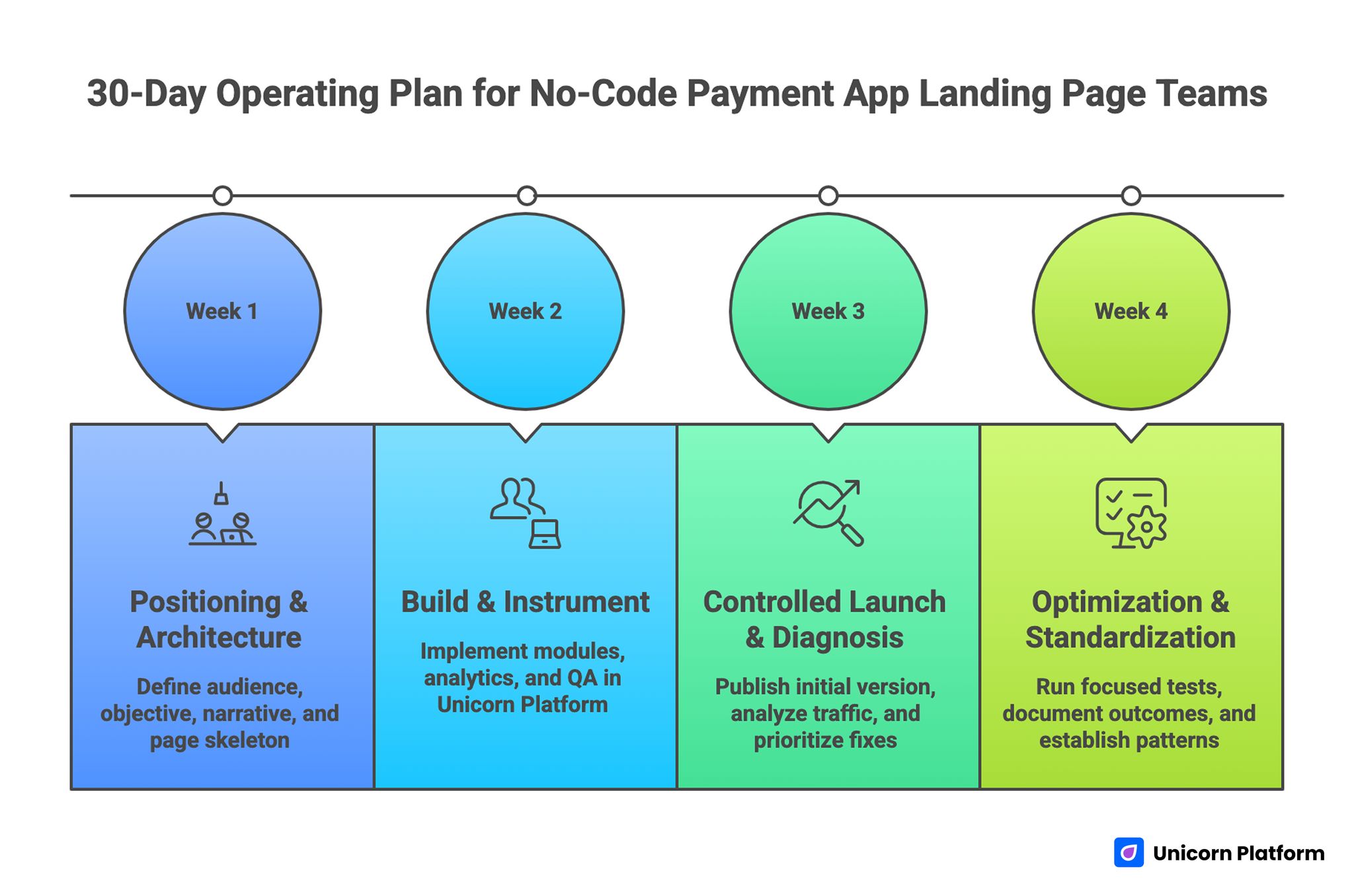
30-day Operating Plan for Optimizing Payment App Landing Pages
Week 1: Positioning and architecture
Define audience segment, primary conversion objective, and narrative ladder. Build page skeleton and evidence inventory before visual polish.
By the end of week one, each section should have a defined job and required proof inputs.
Week 2: Build and instrument
Implement page modules in Unicorn Platform with mobile-first layout constraints. Configure analytics events, attribution tags, and conversion checkpoints.
Run structural QA for message consistency, readability, and CTA path reliability.
Week 3: Controlled launch and diagnosis
Publish initial version and route controlled traffic. Identify where trust confidence drops and where CTA intent weakens.
Prioritize fixes in headline specificity, proof placement, and friction points around onboarding action.
Week 4: Optimization and standardization
Run two focused tests on headline framing, trust placement, or action language. Keep tests isolated enough to preserve interpretation quality.
Document outcomes so future variant pages start from validated patterns.
Common Failure Modes and Practical Fixes
1. Convenience-first messaging without trust context
Users see speed claims but no confidence foundation.
Fix: pair convenience benefits with visible control and reliability evidence early.
2. Security copy hidden too low on page
Trust concerns remain unresolved during key decision moments.
Fix: distribute trust cues across hero-adjacent, offer, and FAQ sections.
3. Too many equal-priority CTAs
Users hesitate because action hierarchy is unclear.
Fix: define one primary conversion path and demote secondary actions.
4. Generic copy across different user segments
Message relevance drops and conversion quality suffers.
Fix: launch segment variants using reusable structure with adapted framing.
5. Weak mobile execution
Small-screen readability and interaction friction reduce completion.
Fix: reorder sections for mobile behavior and validate on real devices.
6. Incomplete tracking and attribution
Teams cannot identify where and why conversion breaks.
Fix: instrument all key interaction and activation checkpoints before scale.
7. Launch-once mindset
Pages are treated as static assets instead of optimization systems.
Fix: run weekly evidence-based improvement loops and maintain experiment logs.
FAQ: Designing Payment App Landing Pages Without Coding
Can a no-code payment landing page look enterprise-grade?
Yes. Enterprise-grade perception comes from clarity, trust architecture, and operational consistency, not from manual coding alone.
What should be in the hero section for payment apps?
Include one outcome-led promise, one supporting mechanism line, and one clear primary CTA tied to user intent.
How many trust elements should I include?
Include only relevant trust signals and place them near decision points. Quality and context matter more than quantity.
Should pricing or fees appear on the landing page?
If fee clarity affects early trust, include concise fee guidance and link to deeper details where needed.
How long should a payment app landing page be?
Length should match decision complexity. Many payment offers need scannable long-form pages to resolve trust and operational concerns.
Do I need separate pages for each audience type?
If audience concerns and use cases differ significantly, segment variants usually improve relevance and conversion efficiency.
Which metrics matter first after launch?
Track first-screen engagement, CTA progression, signup completion, and early activation quality by traffic source.
How often should we update the page?
Weekly review and focused iteration cycles usually outperform infrequent large redesigns.
What is the fastest fix for weak conversion?
Improve headline-message match and bring trust cues closer to CTA zones before changing visual style.
Can this process work for small teams without designers?
Yes. With reusable modules, clear QA rules, and disciplined testing, small teams can execute high-quality payment pages effectively.
Final Takeaway
You can design a payment app landing page without learning to code and still achieve professional, high-conversion outcomes. The winning pattern is straightforward: trust-first messaging, structured decision flow, mobile-ready UX, and continuous optimization after launch.
Use Unicorn Platform for speed, but keep editorial and QA standards strict. Publish with clear intent, measure behavior by segment, and improve through focused iterations until performance compounds.