Table of Contents
- A Practical First-Screen Formula
- 30-Day Implementation Plan
- Common Failure Modes and Practical Fixes
- FAQ
Most creators already know how to get attention. They publish consistently, build audiences, and generate steady traffic from social, search, and referrals. The real issue appears after the click, when visitors land on a page that is too broad, too generic, or too crowded with equal-priority options.
When that happens, conversion quality suffers even if traffic quality is strong. People are interested, but the page does not reduce decision friction fast enough. They hesitate, open multiple tabs, or postpone action because the next step is not obvious.
High-performing creator pages solve this by acting as decision systems rather than static profile surfaces. They guide visitors through relevance, trust, and action in a deliberate sequence. With that system in place, creators can scale campaigns faster without losing clarity, quality, or brand integrity.
sbb-itb-bf47c9b
Quick Takeaways
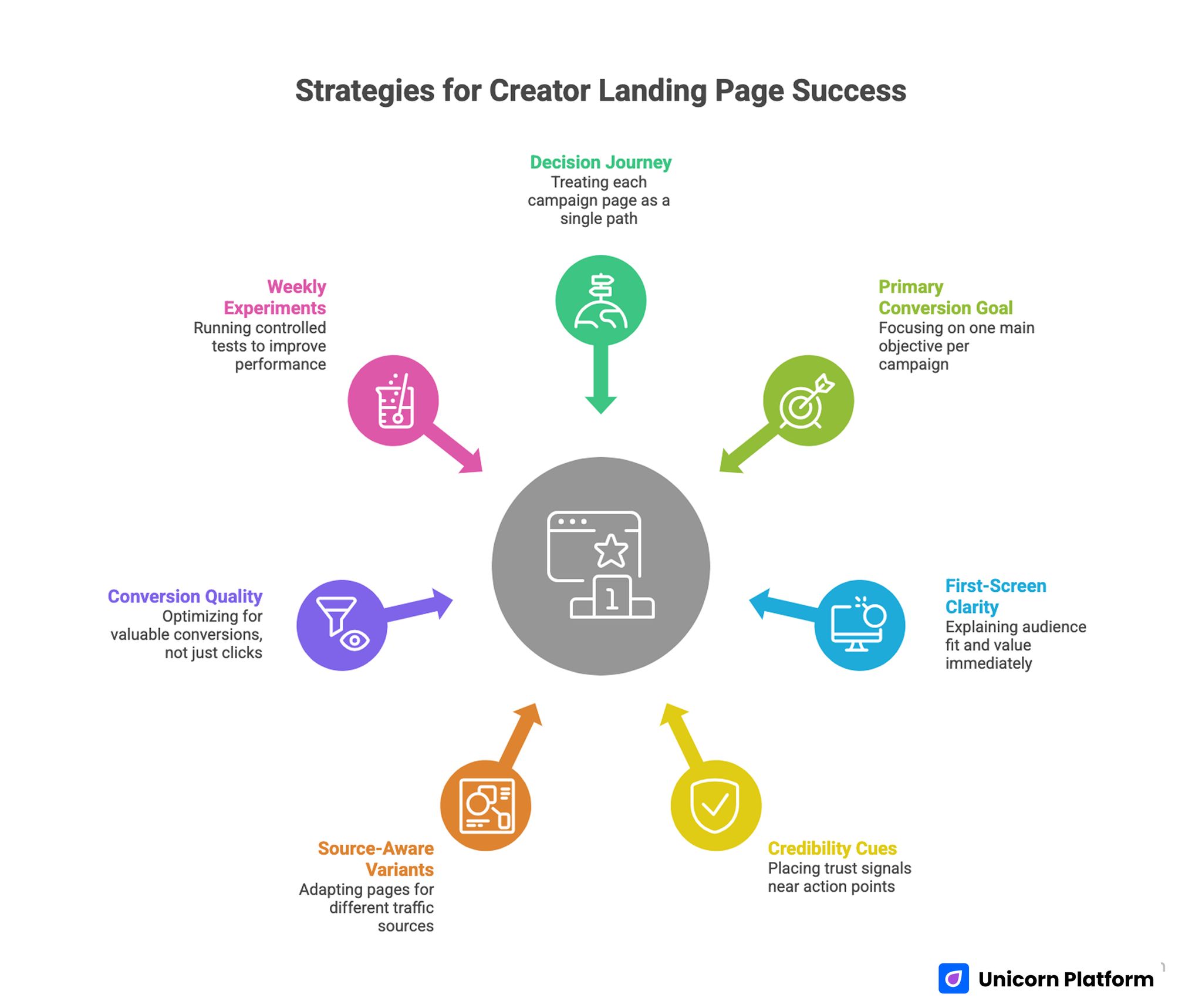
Strategies for Creator Landing Page Success
- Treat each campaign page as one decision journey, not a list of unrelated destinations.
- Prioritize one primary conversion goal for each campaign window, then support it with one secondary path.
- Use first-screen clarity to explain audience fit, expected value, and immediate next step.
- Place credibility cues near action points so trust appears when it is needed most.
- Build source-aware variants from one stable structure to avoid operational chaos.
- Optimize for conversion quality and downstream business outcomes, not raw clicks.
- Run controlled weekly experiments and monthly freshness updates to keep performance compounding.
Why Creator Pages Underperform Even With Strong Audiences
Underperformance often starts with a strategy mismatch. Many creators attempt to satisfy first-time visitors, returning followers, buyers, partners, and community prospects in the same screen without hierarchy. This creates cognitive overload because every option seems equally important.
The challenge is amplified by the rapid expansion of the creator economy itself. According to research by Goldman Sachs, the global creator economy could approach $480 billion by 2027, meaning more creators are competing for attention and need clearer conversion systems to turn audience reach into reliable revenue.
The second issue is weak offer clarity. Visitors see a page that looks polished, but they cannot quickly answer three practical questions: what is offered, who it is for, and why they should act now. Without clear answers, intent decays before trust can form.
The third issue is operational drift. During launches and collaborations, pages are edited rapidly by different contributors. Messaging changes, proof ages out, and CTA priority shifts without a control process. The page still looks active, yet conversion behavior becomes inconsistent from one campaign to the next.
The Conversion Sequence That Makes Creator Pages Work
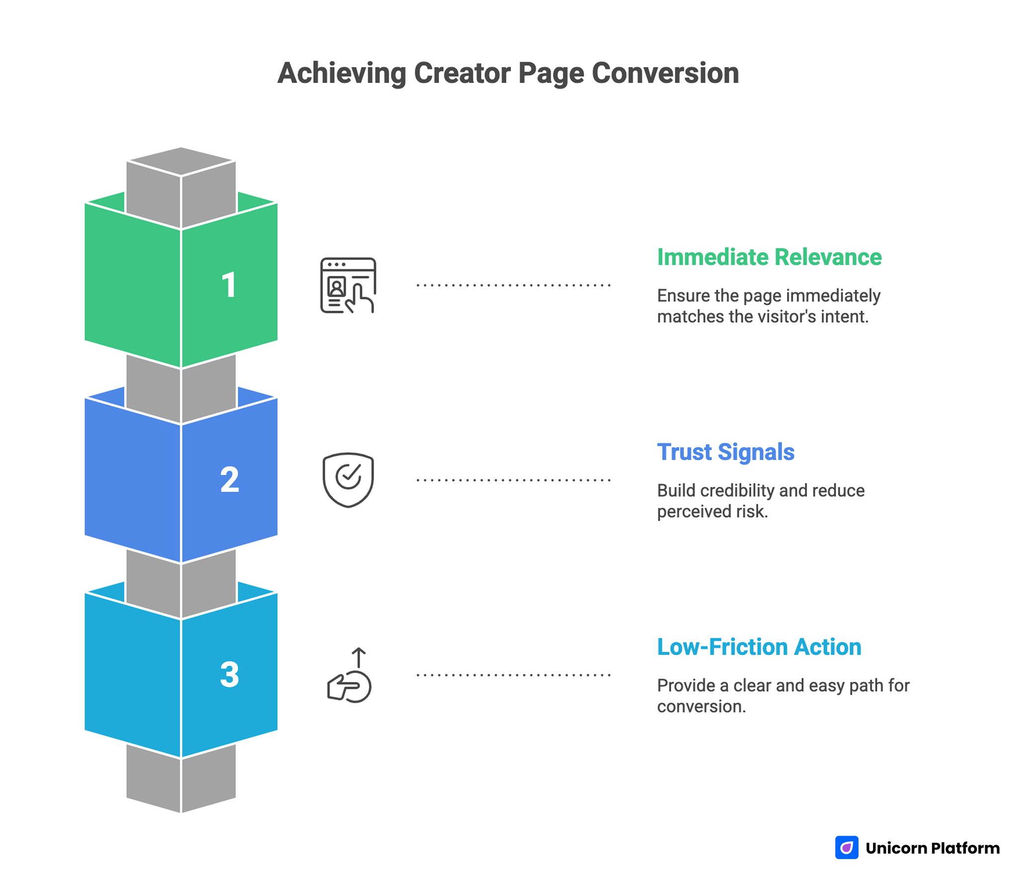
Achieving Creator Page Conversion
Strong conversion pages usually follow the same decision sequence. First, the visitor needs immediate relevance to see whether the page matches current intent. Next, the visitor needs trust signals that reduce perceived risk. Finally, the visitor needs a low-friction action path that feels appropriate for readiness level.
If this sequence is broken, the page feels harder than it should. Asking for commitment before context feels aggressive. Showing deep evidence before relevance feels confusing. Presenting many equal CTAs without guidance feels noisy.
This sequence also creates better team execution. Copy, design, and growth roles can align around section jobs instead of subjective opinions. Fewer decisions become ad hoc, and launch velocity improves because structure is repeatable.
Define One Primary Goal Per Campaign Window
A single campaign window should prioritize one primary business outcome. For creators, common primary goals include email subscriber growth, product purchases, sponsorship inquiries, consultation bookings, or community trial signups.
Secondary actions can remain available, but they should not compete with the primary path in visual weight or copy emphasis. If two top-level goals are equally highlighted, visitors choose neither with confidence.
Primary-goal discipline improves testing quality. When one objective is clear, page changes can be evaluated against one main metric and one guardrail metric. That produces cleaner learning and better decisions under time pressure.
Offer Architecture for Creator Businesses
Creator businesses rarely run one monetization route. Most operate a layered model with audience building, mid-funnel education, and revenue actions happening in parallel. Offer architecture should make those layers visible without overwhelming new visitors.
A practical architecture includes three tiers. Tier one is low-friction entry, such as newsletter subscription or free resources. Tier two is paid but accessible, such as mini products, workshops, or templates. Tier three is premium engagement, such as consulting, partnership packages, or sponsorship programs.
The key is ordering by readiness rather than by personal preference. New visitors usually need a lower-commitment step first, while warm visitors can move directly toward higher-intent actions. Clear ordering improves both conversion volume and lead quality.
First-Screen Messaging: The Highest-Leverage Section
The first screen should communicate audience fit, value promise, and next step in seconds. Identity statements alone are rarely enough. Visitors need outcome context to justify continued attention.
Outcome-led framing often outperforms abstract positioning because it reduces interpretation burden. Instead of describing the creator in broad terms, the page should describe what the visitor can achieve and how quickly they can start.
Keep first-screen composition strict. One dominant CTA, concise support copy, and one proof cue usually outperform cluttered layouts with multiple equal calls to action.
A Practical First-Screen Formula
Use this formula for reliable clarity:
- Audience + intent signal: who this page is for right now.
- Outcome statement: what practical value the visitor gets.
- Time or effort framing: how quickly they can realize that value.
- Primary action: the most important next step.
- One credibility cue: enough trust to justify the click.
This formula is simple, but it works because it matches real user behavior under limited attention windows.
Trust Design: Evidence Placement Matters More Than Volume
Trust is not built by adding endless logos, testimonials, or metrics without context. Visitors need proof that is specific, current, and relevant to the decision they are being asked to make.
Use evidence that connects to the active objective. If the page is optimized for sponsorship inquiries, proof should show collaboration outcomes, audience fit, and process reliability. If the page is optimized for product conversion, proof should show customer results, practical utility, and delivery credibility.
Place trust cues close to key actions. Evidence buried at the bottom may never be seen by high-intent visitors who hesitate earlier in the flow.
For creators who want to strengthen profile-level authority before campaign conversion, this personal web profile guide is a useful reference for structuring credibility narrative.
Link Hierarchy and Attention Control
Pages lose conversion power when every link appears equally important. A clear hierarchy reduces cognitive effort and helps visitors commit faster.
Use one dominant CTA for the current campaign objective. Add one strategic secondary CTA for visitors who are not ready for the primary action. Place tertiary links lower with reduced emphasis so they remain available without hijacking attention.
Review active links at least monthly. Campaign remnants often stay live and dilute current objectives. Removing obsolete destinations can lift conversion without adding any new content.
A Simple Link Priority Model
- Priority 1: one action tied to current business objective.
- Priority 2: one fallback action aligned with adjacent intent.
- Priority 3: supportive links for exploration, positioned below key conversion blocks.
This model keeps choice available while preserving decision momentum.
Copy Architecture That Preserves Voice and Conversion
Strong creator copy should feel human and distinctive while still guiding decisions with precision. Many pages fail because they swing too far toward personality without conversion clarity, or too far toward sales language without authentic voice.
A practical copy architecture gives each section a job. The first screen earns attention. The next block establishes trust context. Middle sections handle objections and explain offer fit. The action block reduces friction and clarifies what happens after the click.
This job-based approach keeps voice consistent because creators can write naturally within defined section goals. It also helps collaborators edit safely, since each block has a clear purpose and measurable outcome.
Copy Prompts for Faster Drafting
- First screen: "Who is this for, what result can they expect, and what is the next action?"
- Trust block: "What specific evidence removes the biggest hesitation at this stage?"
- Offer block: "What is included, what is not included, and who is the best fit?"
- Action block: "What happens immediately after the click or form submission?"
Using prompts like these improves speed and reduces vague copy that sounds polished but does not move behavior.
Source-Aware Variants Without Brand Drift
Traffic sources carry different intent states. Visitors from social channels often arrive with shallow context and need immediate trust framing. Visitors from search often arrive with problem-awareness and need clearer educational orientation.
Build source-aware variants from one stable base template. Change only high-impact surfaces, such as headline angle, proof order, and CTA wording. Keep section architecture consistent so performance differences remain interpretable.
This approach avoids brand drift and reduces production overhead. Teams can move quickly without introducing structural noise that makes attribution impossible.
Email Subscriber Path: Designing for Owned Audience Growth
For many creators, email remains the strongest owned channel for compounding growth. A subscriber path should not rely on generic prompts like "join my newsletter" without context. This emphasis on owned audiences is supported by research from HubSpot, which consistently finds that email marketing delivers one of the highest returns among digital channels, averaging about $36 in revenue for every $1 spent.
State exactly what subscribers receive, how often they receive it, and why the content is useful. Specificity increases trust and attracts higher-quality subscribers who match the offer.
Post-signup continuity is equally important. The first message should confirm the page promise with clear onboarding value. Mismatch between promise and delivery reduces retention even when signup volume looks strong.
If your subscriber strategy depends on deeper editorial cadence, these personal blog website examples can help shape stronger value communication.
Product Revenue Path: Converting Interest Into Purchases
Product conversion improves when the page removes uncertainty about fit, effort, and expected benefit. Visitors should understand what they get, who it is for, and how quickly they can apply it.
Lead with practical outcomes instead of feature lists. Features can support confidence, but outcomes usually drive decision intent. Add concise reassurance around delivery, support, and access to reduce friction near checkout transitions.
For higher-ticket creator offers, qualify clearly instead of trying to convert everyone. Better qualification often lowers top-funnel volume while improving close rate and customer satisfaction.
Partnership Inquiry Path: Improving Lead Quality
Partnership leads become inconsistent when inquiry paths are buried or under-specified. A dedicated sponsor or collaboration route creates better intent filtering.
Include relevant audience context, collaboration categories, timeline expectations, and decision process clarity. This helps brand contacts self-qualify before submitting, reducing low-fit outreach.
Form design should prioritize routing value rather than form length. Collect enough context to prioritize responses quickly, then gather deeper information during follow-up.
Portfolio and Proof Surfaces for Creator Credibility
Many creators have strong work history but present it in fragmented formats that do not support conversion. A focused portfolio surface can bridge this gap by showing outcomes, constraints, and implementation quality in one narrative.
Use selected case snapshots with clear context: objective, approach, and result. This structure communicates capability better than broad claims.
When portfolio evidence is central to your conversion strategy, this project showcase page guide can help organize proof blocks so they support business decisions instead of acting as visual filler.
Form Design and Post-Click Continuity
Forms are often treated as technical widgets, but they are conversion-critical narrative points. A form should confirm that the visitor made the right choice, not introduce uncertainty at the final step.
Good form design balances clarity and qualification. Ask only for information needed to route the lead or action properly. Every unnecessary field increases abandonment risk, especially on mobile traffic.
Post-click continuity matters just as much as form completion. Confirmation messages, thank-you pages, and first follow-up interactions should reinforce the value promised earlier on the page. If this handoff feels generic or delayed, trust can decline immediately.
Creators should map a clear continuity chain for each objective path: conversion event, confirmation context, first-value delivery, and next-guided action. This turns single conversions into durable relationships instead of isolated transactions.
Mobile Conversion Standards for Creator Traffic
Creator traffic is often mobile-first, especially during active social campaigns. A page that feels clean on desktop may still fail on mobile if action visibility, readability, or interaction comfort is weak.
Set explicit mobile standards before launch. Validate first-screen clarity, tap target spacing, CTA visibility, form behavior, and scrolling continuity on real devices.
Track mobile-specific drop-off by source. Aggregate metrics can hide severe friction isolated to one traffic channel or one device class.
Performance Strategy: Speed in Service of Decisions
Performance work should focus on decision speed, not only page speed scores. Visitors must see meaningful value and action cues quickly, even before all visual assets complete loading.
Prioritize lightweight first-screen assets and defer non-essential media. Ensure CTA elements remain interactive early in the render sequence.
Use campaign-level monitoring instead of one-time audits. Performance quality can regress during creative updates if asset governance is missing.
Analytics Model for Revenue Quality
Clicks can be useful leading signals, but they do not represent business quality on their own. A stronger model tracks full-path outcomes tied to objective clarity.
For each campaign, define one primary metric and one guardrail metric. Example: primary metric could be qualified inquiries submitted, while guardrail could be response-to-close efficiency or unsubscribe rate.
This framework prevents teams from scaling variants that inflate top-funnel activity while damaging downstream outcomes.
Core Metric Layers
- Layer 1: page actions (CTA clicks, form starts, submissions).
- Layer 2: quality filters (qualified lead rate, activation rate, retention indicators).
- Layer 3: business outcomes (revenue contribution, partner close quality, repeat purchase behavior).
Metric layering helps teams see where performance improves and where it silently degrades.
Weekly Experiment Operating System
A reliable weekly cadence beats sporadic redesign bursts. The process should be simple enough to run under campaign pressure without skipping documentation.
Use a five-step loop: review current signals, choose one hypothesis, ship one high-impact change, evaluate against one primary and one guardrail metric, then log the decision.
Single-variable discipline is critical. Multi-variable edits produce noisy outcomes and make learning fragile.
Test Ideas With High Practical Value
- Headline angle: outcome-first vs authority-first framing.
- Proof placement: near first CTA vs mid-page trust block.
- CTA copy: clarity-driven language vs urgency-driven language.
- Offer order: low-friction entry first vs direct monetization first.
- Form scope: shorter route form vs qualification-first form.
Run one major test at a time for each objective path.
Freshness Governance: Prevent Slow Performance Decay
Creator pages can degrade quietly when proof, offers, and audience context become outdated. The page still looks active, but trust weakens because signals no longer match current reality.
Implement a monthly freshness cycle for high-traffic pages. Update at least one proof block, one offer block, and one routing element based on recent campaign data.
Prioritize updates by conversion impact, not aesthetics. A minor wording change in a high-friction CTA can outperform large visual changes elsewhere.
Team Governance for Fast and Accurate Launches
Governance is useful for solo creators and small teams alike. It reduces avoidable errors and keeps quality stable during high-volume publishing periods.
Define three ownership lanes: messaging owner, proof owner, and final QA owner. One person can hold multiple lanes, but accountability should remain explicit.
Set a release checklist with non-negotiable checks: objective clarity, CTA hierarchy, proof recency, route validity, mobile behavior, and analytics instrumentation.
Campaign Planning and Capacity Control
Creators often run overlapping launches and overestimate editing capacity. Without planning constraints, rushed updates create inconsistent messaging and weak test integrity.
Use a campaign calendar with fixed checkpoints for strategy lock, copy freeze, QA pass, and launch review. This prevents last-minute conflict between active objectives.
Capacity planning should also limit simultaneous experiments. Too many concurrent tests can consume production time while reducing confidence in conclusions.
Mid-Flight Remediation: What to Change First When Performance Drops
When results decline during a live campaign, broad redesigns usually increase risk. Controlled remediation is faster and easier to attribute.
Start by identifying the weakest stage in the decision sequence: relevance, trust, or action friction. Apply one targeted change in that stage and evaluate impact before touching other blocks.
If the signal improves, scale gradually. If it fails, revert quickly and test the next hypothesis. This process protects learning continuity and avoids panic-driven page churn.
Scenario: Stabilizing a Creator Funnel in Eight Weeks
A creator with strong short-form reach saw unstable outcomes across email growth, product sales, and sponsor inquiries. Traffic volume was healthy, but page behavior showed drop-offs near first decision points.
The team audited the page using the relevance-trust-action sequence. They found three issues: unclear first-screen outcome framing, overloaded link hierarchy, and proof blocks that had not been updated in months.
They moved to one stable template in Unicorn Platform and launched source-aware variants with controlled differences. They simplified CTA hierarchy, added context-specific proof near actions, and adopted weekly single-variable tests.
By week eight, conversion quality improved across all three objectives. The largest gains came from clearer first-screen value and explicit routing for partnership inquiries.
30-Day Implementation Plan
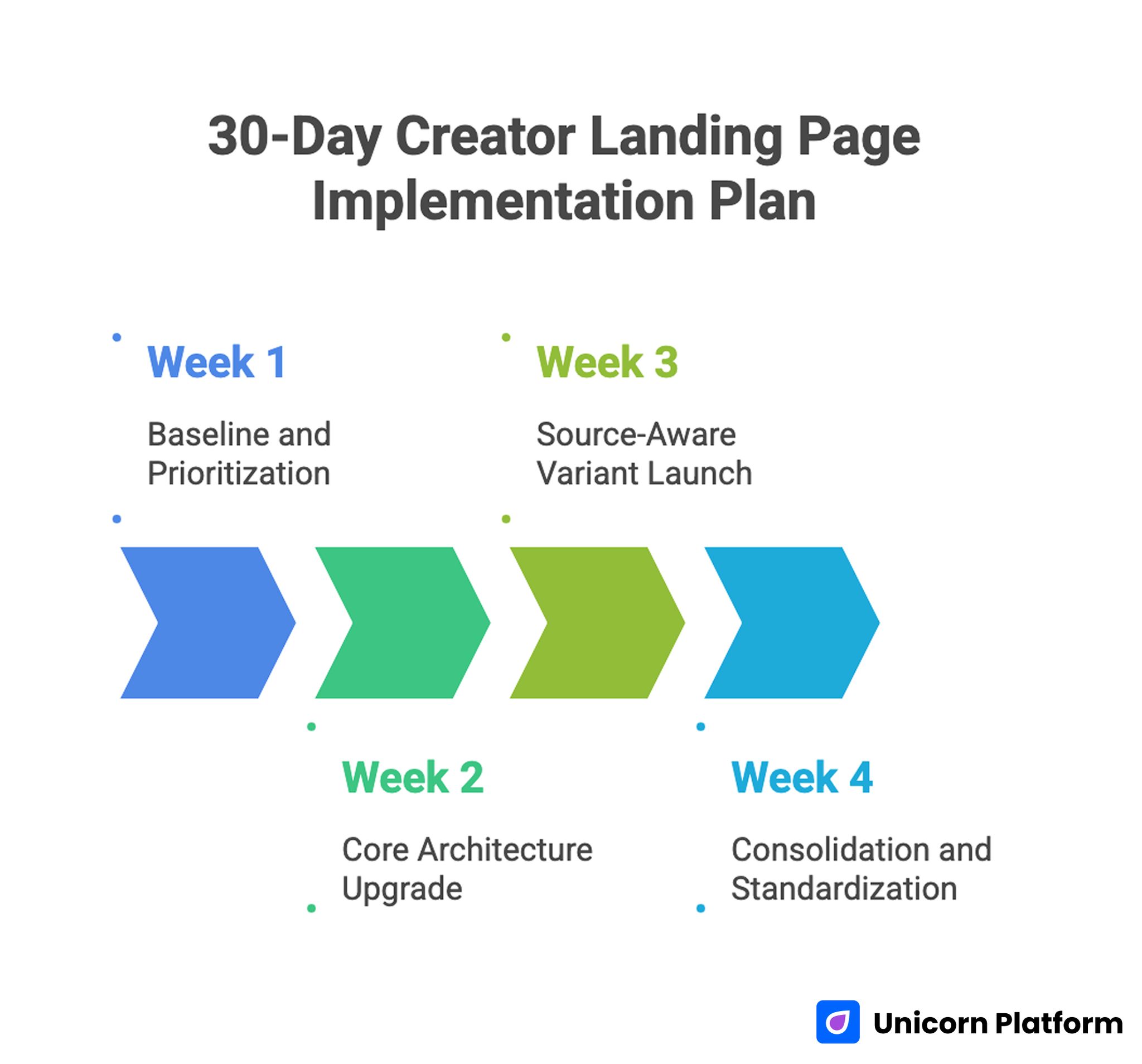
30-Day Creator Landing Page Implementation Plan
Week 1: Baseline and Prioritization
Audit top pages for sequence breaks in relevance, trust, and action. Select one canonical template and define one primary objective for the current cycle.
Map active links into priority tiers and remove outdated or conflicting routes. Set baseline metrics for page action, quality filter, and business outcome.
Week 2: Core Architecture Upgrade
Rewrite first-screen messaging for audience fit and outcome clarity. Tighten CTA hierarchy to one dominant action plus one strategic secondary path.
Refresh proof blocks with current, objective-relevant evidence. Validate full mobile interaction flow on real devices before release.
Week 3: Source-Aware Variant Launch
Create one variant from the same template for the highest-impact source. Modify only headline angle, trust order, and CTA language.
Run one controlled experiment with clear success and rollback thresholds. Document results in a decision log with next-step recommendation.
Week 4: Consolidation and Standardization
Promote validated improvements to the canonical template. Archive low-performing variants and remove unsupported assumptions.
Schedule next month freshness tasks and confirm ownership for each section lane. Ensure analytics dashboards reflect the updated objective map.
90-Day Scale Plan
Month 2: Expand Objective Coverage
Extend the template system to additional conversion paths, such as product-first or partnership-first flows, while keeping structural consistency.
Introduce modular blocks for recurring campaign needs so teams can launch faster without rewriting core architecture.
Month 3: Operational Maturity
Formalize release governance, remediation triggers, and reporting cadence. Add automated checks for route integrity and measurement continuity.
At this stage, scale should come from repeatable quality, not from ad hoc page redesigns.
Common Failure Modes and Practical Fixes
1) Equal-Priority Link Stacks
Visitors face too many similar choices and delay action because the page does not communicate priority. Enforce one dominant action, one secondary action, and clearly de-emphasized tertiary paths so behavior follows intent.
2) Identity-Only First Screen
The page explains who the creator is but not what the visitor gains from continuing. Shift first-screen copy toward concrete outcome value, clear audience fit, and a specific next step.
3) Proof Buried Too Deep
Trust appears after visitors have already hesitated and intent has started to drop. Place objective-relevant evidence adjacent to key actions so confidence builds before commitment is requested.
4) One Message for All Sources
Intent mismatch lowers conversion quality when social, search, and email visitors see identical framing. Create source-aware variants with controlled differences in headline, proof order, and CTA emphasis.
5) Mobile Interaction Friction
Drop-off rises on smaller screens when tap targets, forms, or CTA visibility are not tested under real conditions. Run real-device checks for interaction comfort and route continuity before every major launch.
6) Stale Evidence Signals
Outdated wins and old context reduce credibility even when the page design still feels polished. Execute monthly freshness updates tied to current objectives and replace weak proof with current, relevant evidence.
7) Weak Post-Conversion Continuity
Onboarding or follow-up does not match page promise, so early trust decays right after conversion. Align confirmation messaging, first delivery touchpoint, and next-step guidance with the original conversion intent.
8) Noisy Experiment Design
Multiple simultaneous edits make learning unreliable and encourage false conclusions. Run one major variable per cycle with clear guardrail metrics so performance shifts can be attributed with confidence.
9) Ownership Ambiguity
Frequent edits create quality drift when responsibility for message, proof, and QA is unclear. Define explicit section ownership lanes and require release sign-off before traffic is scaled.
10) Metric Tunnel Vision
Click metrics can rise while lead quality, retention, or close rates decline in the background. Evaluate performance through quality filters and downstream outcomes so optimization aligns with business value.
Pre-Launch QA Checklist
Before publishing, confirm objective clarity, route hierarchy, and current proof alignment. Verify that first-screen copy communicates audience fit, value outcome, and clear action.
Validate mobile readability, tap comfort, form behavior, and CTA visibility on real devices. Ensure all action routes resolve correctly without dead-end transitions.
Confirm analytics instrumentation for one primary metric and one guardrail metric. Require final owner sign-off before pushing high-volume traffic.
FAQ: Creator Landing Page Strategy
What should creators optimize first?
Start with first-screen value clarity and CTA hierarchy. These two areas usually produce the fastest improvements in conversion behavior. They also make analytics cleaner because subsequent performance changes are easier to attribute.
Should a creator page include many options?
Only when hierarchy is strict. Most campaigns convert better with one dominant path and a clearly secondary fallback option. Too many equal-priority choices can reduce confidence and increase abandonment.
How often should proof be updated?
At least monthly for high-traffic pages, and more frequently during active launches or partnership windows. Fresh evidence preserves trust and prevents slow conversion decay across recurring visitors.
Is one template enough for different channels?
Yes, if channel variants modify emphasis rather than core structure. Shared architecture improves consistency and attribution quality. Controlled differences let teams move faster without turning each channel into a separate design system.
Which metric matters most?
Use one primary metric tied to current objective and one guardrail metric to protect downstream quality. This pairing balances growth velocity with business reliability.
How can partnership inquiries become more qualified?
Use a dedicated inquiry route with clear scope, audience context, and response expectations so low-fit contacts self-filter earlier. That usually improves response speed and partner close efficiency.
What is the biggest mobile mistake creators make?
Assuming responsive layout alone guarantees conversion. Real-device interaction quality determines whether intent becomes action. Small issues like cramped tap targets or hidden form cues can materially reduce outcomes.
How many tests should run each week?
One major test per objective path is usually enough for clear learning and manageable execution. If teams need more velocity, they should parallelize across different pages rather than stack variables on one page.
When should a live variant be rolled back?
Roll back when pre-defined guardrail metrics deteriorate materially and recovery signals do not appear after a focused remediation pass. A quick rollback preserves traffic quality while the next hypothesis is prepared.
What produces compounding performance over time?
Stable architecture, disciplined experimentation, freshness governance, and strong continuity between page promise and post-conversion experience. Compounding performance comes from reliability in execution, not from constant full redesigns.
Final Takeaway
Creator growth becomes more durable when conversion pages are treated as operating systems, not one-off campaign artifacts. Structured decision flow, clear hierarchy, relevant proof, and controlled testing turn attention into reliable business outcomes.
Unicorn Platform supports this approach by enabling fast iteration on stable structures. Keep the architecture consistent, adapt message emphasis by intent source, and evaluate success with quality metrics that reflect real business value.