Table of Contents
- Core Conversion Patterns Seen in High-Performing Ecommerce Pages
- Conversion Architecture for No-Code Ecommerce Landing Pages
- 30-Day Operating Plan for No-Code Ecommerce Teams
- Common Failure Modes and Practical Fixes
- FAQ
Most ecommerce landing pages do not fail because products are weak. They fail because the page does not align with buyer intent at the moment users arrive. Visitors see broad brand messaging, generic CTAs, and missing proof, then leave before they understand why the offer is worth action.
That pattern is expensive. It increases paid acquisition costs, lowers conversion efficiency, and weakens post-click quality signals that matter for long-term channel performance. A custom ecommerce landing page solves this when it is built around message match, trust architecture, and friction control.
No-code tools make this work faster, but speed alone is not a strategy. You still need strong section logic, clearer copy, and disciplined testing after launch. This guide provides a complete operating framework for doing that without relying on custom development.
sbb-itb-bf47c9b
Key Takeaways
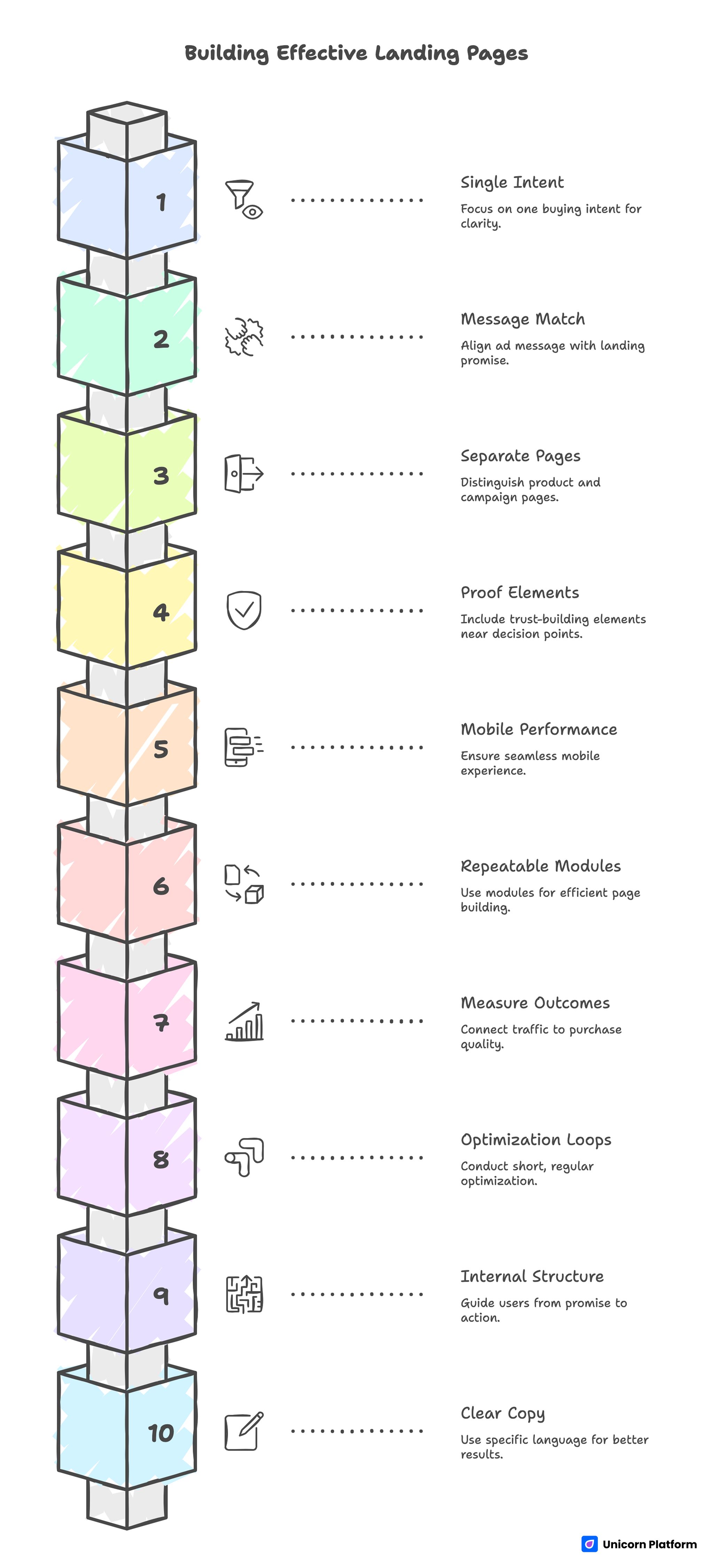
Key Takeaways for Building a High-Converting Landing Page
- Landing pages should be built for one buying intent, not for everyone.
- Conversion quality improves when ad message and landing promise match exactly.
- Product pages and campaign landing pages have different jobs and should be treated separately.
- Proof and risk-reduction elements must appear near decision points.
- Mobile performance is a conversion requirement, not a cosmetic detail.
- No-code workflows are strongest when teams use repeatable page modules.
- Measurement must connect traffic source to purchase-quality outcomes.
- Short weekly optimization loops outperform occasional major redesigns.
- Internal page structure should guide users from promise to confidence to action.
- Better copy usually comes from clearer specificity, not louder claims.
Why Custom Ecommerce Landing Pages Matter More Than Ever
Ecommerce competition has intensified across paid and organic channels, which means post-click quality now determines a larger share of performance. Teams can buy traffic quickly, but they only keep economics healthy when landing pages convert with consistency.
A custom landing page gives you control over narrative order. You decide which problem to frame first, which proof to show next, and how to present the action path. This control is difficult to achieve on broad category pages that must serve many audiences at once.
Custom pages also make experimentation cleaner. You can test one offer, one audience angle, and one CTA path without interfering with the structure of your core store navigation.
Landing Page vs Product Page: Use the Right Page for the Right Job
Many teams send campaign traffic directly to product collection pages and expect high conversion. Sometimes this works for warm audiences, but it often fails for users who need context before they buy.
A product page is designed for deep evaluation of a known item. A landing page is designed to persuade around a specific promise and move users into one next step. When these jobs are mixed, users receive either too much choice or too little explanation.
The best approach is a clear division of labor. Use landing pages for campaign intent and product pages for final purchase validation. Then connect them intentionally.
Core Conversion Patterns Seen in High-Performing Ecommerce Pages
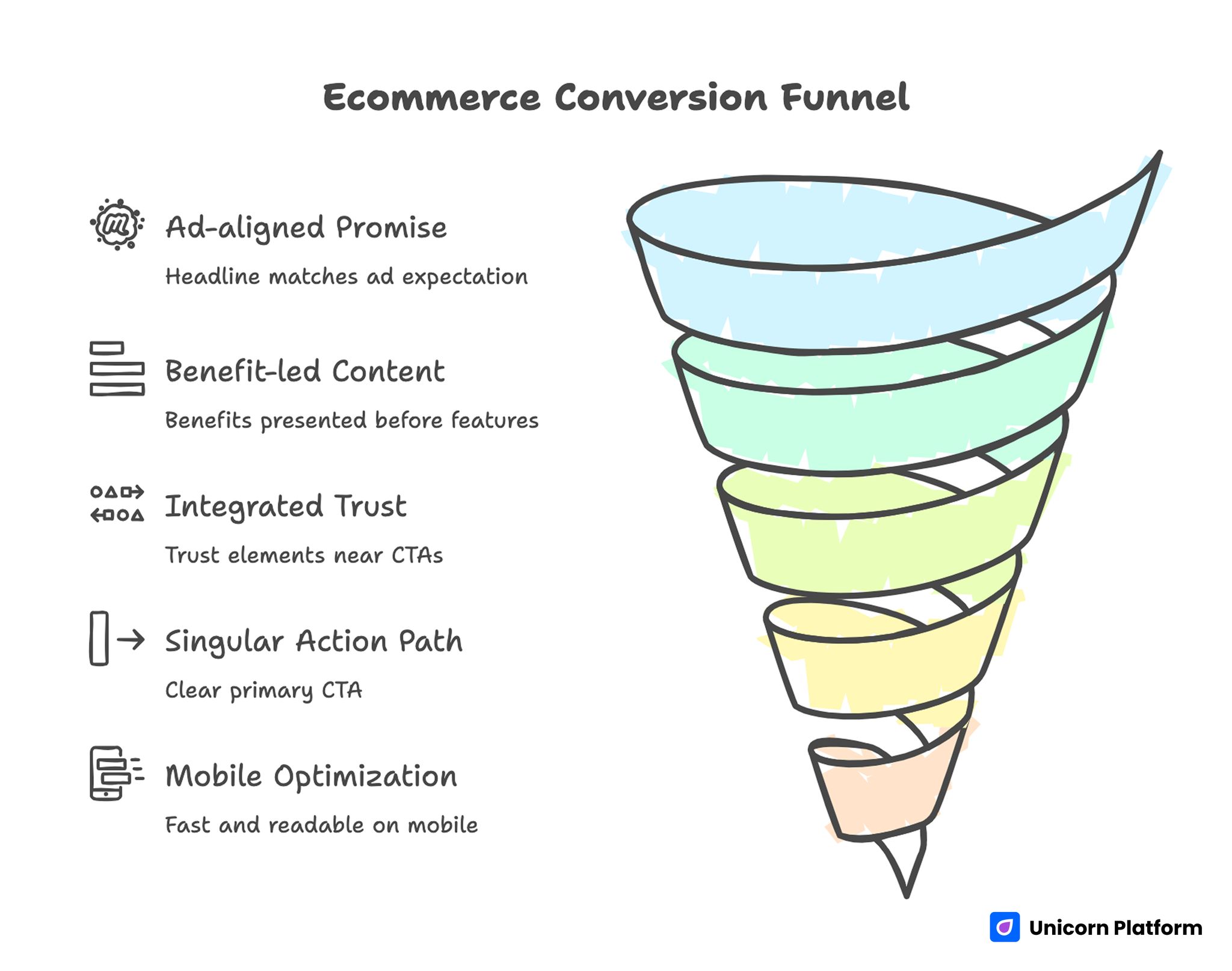
Ecommerce Conversion Funnel
Top-performing pages usually look different visually, but their conversion logic is similar. They reduce uncertainty quickly, prove claims clearly, and remove friction before checkout commitment.
According to research on high‑performing ecommerce landing pages, focused alignment between user intent and landing page structure significantly improves conversion outcomes and user engagement by guiding shoppers directly to what they want and reducing friction throughout the journey.
1. Ad-aligned promise in the first screen
The headline should reflect the expectation created by the ad, email, or influencer mention that drove the click. Message mismatch increases bounce even when the offer is strong.
A focused first screen includes one promise, one supporting detail, and one clear action. Competing claims in the hero section often reduce comprehension.
2. Benefit-led content before deep feature detail
Buyers decide emotionally and validate rationally. This means early sections should express practical benefits in customer language, then back those claims with product specifics.
Feature depth still matters, but placing it too early can slow decision momentum.
3. Trust integrated into decision flow
Trust elements work best near moments of hesitation. Reviews, guarantees, shipping clarity, and policy transparency should appear close to CTA and pricing sections, not isolated in one distant block.
When trust arrives too late, users often drop before reaching it.
4. Clear singular action path
High-performing pages avoid action overload. If users are asked to compare too many parallel choices too early, conversion clarity drops.
One primary CTA can still coexist with secondary options, but hierarchy must be explicit.
5. Mobile speed and readability discipline
A large share of ecommerce traffic evaluates offers on phones. Slow load, cluttered sections, or weak tap targets reduce purchase intent quickly.
Mobile performance should be validated on real devices before campaign scale.
According to research from BigCommerce on ecommerce page performance, optimizing for mobile speed, readability, and thumb‑reachable interactions correlates with higher conversion rates and lower cart abandonment, especially for traffic driven from paid and social channels.
Strategic Pre-Build Decisions That Prevent Rework
Strong pages are usually decided before they are designed. If strategy is unclear, teams over-edit visuals while core conversion issues remain unresolved.
Define one audience and one intent stage
Start by identifying the exact user group for the campaign page and the stage of awareness they are in. Cold traffic needs more framing and trust. Warm traffic needs faster access to specifics and purchase actions.
One page can still support a broad category over time, but each campaign launch should anchor to one primary intent.
Choose one primary conversion objective
Decide the main goal upfront: add-to-cart, checkout start, bundle claim, quiz entry, or lead capture before purchase. Secondary outcomes can exist, but one should dominate design hierarchy and event tracking.
Without this decision, test results become hard to interpret because multiple goals compete.
Build an offer narrative ladder
A useful sequence is promise, proof, mechanism, risk reduction, and action. This structure gives users a logical path from curiosity to confidence.
If the offer is complex, add a short education block after the first proof section rather than placing heavy explanation in the hero.
Prepare proof assets before writing final copy
Collect testimonials, UGC snippets, before-after visuals, usage data, and policy details early. Writing quality improves when evidence exists during drafting.
Evidence-led drafting also reduces exaggerated language and keeps positioning credible.
Conversion Architecture for No-Code Ecommerce Landing Pages
A repeatable architecture helps teams launch faster while maintaining quality standards. If you want a deeper structural reference, use a step-by-step guide to a high-converting landing page structure.
Section 1: Promise-first hero
Use a headline that names the buyer outcome clearly. Add one supporting line that explains what makes the offer practical now. Keep one dominant CTA and avoid competing hero actions.
Section 2: Problem and relevance bridge
Briefly frame the pain point users recognize in their own words. Then transition to the improved state your product creates. This section should validate intent, not over-explain background.
Section 3: Product demonstration and value proof
Show product use in realistic context through images, short videos, or annotated frames. Each visual should connect to a specific user benefit.
Section 4: Benefit-to-feature mapping
List outcomes first, then tie each outcome to product mechanics. This keeps copy buyer-centered while preserving technical credibility.
Section 5: Social proof and trust cues
Place testimonials, review excerpts, guarantees, and policy clarity close to decision points. Trust should reinforce the action path continuously.
Section 6: Offer and pricing clarity
Explain exactly what users get, what it costs, and what conditions apply. Hidden details cause drop-off even when interest is high.
Section 7: Objection-handling FAQ
Use concise answers for shipping, returns, compatibility, timelines, and support expectations. This section often recovers users near conversion.
Section 8: Final CTA block
Restate the main value proposition, reduce perceived risk, and repeat one clear action. Keep the close concise and specific.
Copy Framework for Higher Purchase Intent
Copy quality is usually the fastest path to better conversion. A useful framework is Problem, Promise, Proof, Path. It keeps narrative aligned to buyer decisions.
Problem language should mirror real user frustration without dramatic overstatement. Promise language should express a concrete benefit with realistic scope. Proof should validate claims with clear evidence. Path should tell users exactly what happens next.
Headline development deserves iteration. A strong headline combines audience fit, practical outcome, and a clear reason to act now. Vague superlatives tend to reduce trust in competitive categories.
Subheadlines should add detail, not repeat the headline. They work best when they clarify mechanism, timeline, or category fit.
Microcopy also influences conversion more than many teams expect. CTA labels, form hints, and shipping-policy snippets reduce cognitive friction in critical decision moments.
Visual and UX Standards That Keep Pages from Looking Generic
No-code layouts can look interchangeable when teams rely on default section flow without adapting structure to the offer. Distinctive pages are built through better hierarchy and clearer decision design, not through decorative overload.
Use consistent spacing systems and predictable content rhythm so users can scan long pages quickly. Random section density makes decision flow feel unstable.
Prioritize readability in typography choices. Body text should remain comfortable on mobile, and headline scale should emphasize hierarchy without pushing key elements below the fold.
Visual emphasis should guide action. Reserve strongest contrast for value proof and CTA zones. If everything is bold, nothing feels important.
For practical build speed in conversion campaigns, teams often map this design discipline to proven product-launch workflows such as how to quickly build a high-converting product landing page.
Mobile-First Execution for Ecommerce Campaigns
Mobile users often arrive from short-attention channels and decide quickly whether a page deserves more time. That means first-screen clarity and interaction ease are foundational.
Start with tap-target reliability, compressed media, and section ordering designed for thumb-driven scanning. Mobile layouts should not be a reduced desktop version. They should be intentionally sequenced for small-screen decision behavior.
Keep forms short, reduce typing effort, and maintain a visible action path as users move through proof and offer sections.
Measure real-device behavior before scale. Lab testing is helpful, but practical issues often appear only on actual phones and mixed network conditions.
When teams need deeper implementation checks, the mobile-specific framework in creating a high-converting mobile app landing page can be adapted effectively for ecommerce landing flows.
SEO and Intent Alignment for Long-Term Efficiency
Even heavily paid ecommerce programs benefit from strong landing-page SEO. Organic discoverability lowers blended acquisition costs and provides more resilient demand over time.
Map keyword targets by decision stage. Early-stage users often search problem and category language, while high-intent users search offer-specific and comparison terms. Landing pages should reflect this journey without forcing unnatural phrasing.
Use clean heading hierarchy and semantic coverage of related user questions. Pages that answer adjacent objections often perform better than pages that only repeat one core phrase.
Internal linking should support the buyer journey. Route visitors toward comparison content, product specifics, and policy pages based on what they need at each stage.
To prioritize which sections to improve first, apply behavioral analysis methods from user behavior tips to optimize landing pages.
Measurement Framework: From Clicks to Revenue Quality
No-code speed creates leverage only when measurement quality is strong. Without reliable tracking, teams optimize based on assumptions and often overreact to short-term fluctuations.
Track performance in three layers. First, engagement metrics such as first-screen CTA clicks, scroll depth, and section interactions. Second, conversion metrics such as add-to-cart, checkout starts, and purchase completions. Third, quality metrics such as average order value, refund behavior, and repeat purchase rate by source.
Analyze by segment, not only in aggregate. A page may look healthy overall while underperforming for specific channels or audience cohorts.
Run weekly decision cycles. Review one priority friction point, ship one focused change, and validate impact before stacking additional edits.
Retargeting Alignment for Non-Converting Visitors
Retargeting is most effective when messages reflect what users did on the landing page. Generic reminders often underperform compared with behavior-specific follow-up.
Users who bounced early usually need clearer promise framing. Users who engaged with proof but skipped CTA often need stronger offer clarity or risk reduction. Users who reached checkout steps may need policy reassurance or urgency cues.
Sequence retargeting messages over multiple touches. Start with value clarity, follow with social proof, and then address commitment friction.
Keep ad and landing message aligned. If retargeting promise and page content diverge, trust drops and conversion suffers.
30-Day Operating Plan for No-Code Ecommerce Teams
Week 1: Positioning and page architecture
Define audience, intent stage, and primary conversion objective. Build section map and gather proof assets before visual refinement.
By the end of week one, the team should have a complete content skeleton from hero to final CTA with clear section roles.
Week 2: Build, instrument, and QA
Implement page in Unicorn Platform with mobile-first constraints. Configure analytics events, source tracking, and conversion checkpoints.
Run QA on live devices to validate readability, media behavior, and CTA destinations.
Week 3: Launch and diagnose
Publish a controlled version and route initial campaign traffic. Identify where message match breaks and where users hesitate before action.
Prioritize high-impact fixes in headline clarity, trust placement, and CTA context.
Week 4: Optimize and expand
Run two focused tests on hero framing, proof sequencing, or offer presentation. Keep experiments isolated enough to interpret cleanly.
Document outcomes so next iterations start from evidence rather than assumptions.
Common Failure Modes and Practical Fixes
1. Message mismatch with ad intent
Users click expecting one value proposition but land on broad generic copy.
Fix: Mirror campaign promise in the headline and first supporting section.
2. Feature-first narrative too early
Users see capability lists before understanding why the offer matters.
Fix: Lead with buyer outcomes, then map features as supporting proof.
3. Trust separated from action points
Testimonials and guarantees are present but not near CTA and pricing sections.
Fix: Distribute trust elements throughout decision zones.
4. Weak mobile readability
Important information is buried or difficult to scan on small screens.
Fix: Reorder sections for mobile behavior and simplify first-screen content.
5. Overloaded CTA choices
Users face too many equally weighted actions and postpone decisions.
Fix: Set one primary action and demote secondary paths.
6. Incomplete tracking setup
Teams can see visits but not where conversions break.
Fix: Track interaction and conversion checkpoints at section level.
7. One-time launch mindset
Teams publish once and treat the page as finished.
Fix: Operate with weekly optimization loops and documented experiments.
Pre-Publish QA Checklist for Ecommerce Landing Pages
Before paid traffic or major email sends, run a release checklist that validates message, UX, and tracking together. This prevents teams from scaling pages that look complete but still contain conversion blockers.
A practical pre-publish checklist includes:
- Confirm headline promise matches acquisition message from ads or email.
- Verify the first screen shows one primary CTA without competing actions.
- Check that every major claim is paired with visible proof in the same section.
- Validate shipping, return, and guarantee information near offer blocks.
- Test all CTA destinations and checkout paths on real mobile devices.
- Confirm event tracking for CTA click, add-to-cart, checkout start, and purchase.
- Review form and button behavior under slower network conditions.
- Ensure FAQ answers key objections that appear in support and sales conversations.
This short process usually prevents expensive launch errors. It also creates cleaner test conditions, because teams can attribute early performance changes to strategy and messaging rather than to broken paths or missing instrumentation.
60-Day Experiment Roadmap After Launch
Strong ecommerce pages improve fastest when tests run in sequence. Random edits make it difficult to identify which changes actually influence conversion quality.
Days 1 to 20 should focus on first-screen clarity. Test headline framing and supporting copy while keeping offer and trust blocks stable. The goal is to improve initial comprehension and CTR to primary CTA.
Days 21 to 40 should focus on trust and risk reduction. Test social-proof placement, guarantee language, and shipping transparency near action areas. This phase often increases conversion completion by reducing hesitation before checkout.
Days 41 to 60 should focus on value presentation and order quality. Test bundle framing, savings communication, and product-comparison cues that help users choose confidently. Track not only conversion rate but also average order value and refund behavior.
Keep each test scoped to one primary hypothesis, one success metric, and one defined time window. This discipline makes your no-code workflow far more effective because decisions remain evidence-led instead of opinion-led.
FAQ: Building Custom Ecommerce Landing Pages Without Coding
Do I need a separate landing page for every campaign?
Not always, but each campaign with a distinct audience or offer usually performs better with a dedicated or heavily adapted landing variant.
Can a no-code landing page convert as well as a custom-coded page?
Yes, when positioning, trust architecture, mobile experience, and testing discipline are strong.
How long should an ecommerce landing page be?
Length should match decision complexity. Many offers benefit from scannable long-form pages that answer objections and validate trust.
What should appear in the first screen?
Include one clear outcome-led headline, one supporting value line, and one primary CTA that matches campaign intent.
How many testimonials should I include?
Use a focused set with context relevance. Quality and specificity matter more than high volume.
Should I show pricing on the landing page?
If pricing clarity is key to decision confidence, show it directly. If your model requires guided selection, explain the path and expectations clearly.
Which metrics matter first after launch?
Start with first-screen engagement, CTA behavior, and conversion completion by source. Then track order quality and retention-related outcomes.
How often should I update the page?
Weekly review cycles with focused changes usually produce better results than occasional full redesigns.
What is the fastest improvement if conversions are weak?
Tighten message match in the hero and bring trust signals closer to CTA zones before changing visual style.
How do I avoid generic-looking no-code pages?
Use clear hierarchy, consistent modules, and offer-specific content structure instead of relying on default template flow.
Final Takeaway
You can build a custom ecommerce landing page without coding and still achieve premium conversion performance. The winning system is clear: audience-intent alignment, evidence-led structure, mobile-first execution, and disciplined iteration.
Unicorn Platform gives teams the speed to launch and test quickly, but long-term results come from quality standards and consistent measurement. Publish with intent, optimize with evidence, and treat each page as a continuously improving revenue asset.


