Table of Contents
- Design Goal Setting Before Wireframes
- Core Structure for Coming-Soon-Page Design
- 30-Day Execution Plan
- Common Failure Modes and Direct Fixes
- FAQ
Most teams can ship a placeholder page fast. Far fewer teams can design one that attracts qualified attention, captures meaningful demand, and sets clear expectations before launch. That difference is where prelaunch momentum is usually won or lost.
A prelaunch layout is not just a visual announcement. It is a conversion system that should align message clarity, trust cues, commitment friction, and post-signup continuity. If those parts are disconnected, traffic may rise while lead quality weakens.
Many pages underperform because design is treated as decoration instead of decision architecture. Teams focus on style, animations, and countdown effects, but they do not define what users should understand and do in the first few seconds.
This guide gives a practical framework for building and optimizing prelaunch layouts in Unicorn Platform. The objective is simple: better-quality signups, stronger launch readiness, and fewer avoidable rewrites.
sbb-itb-bf47c9b
Key Takeaways
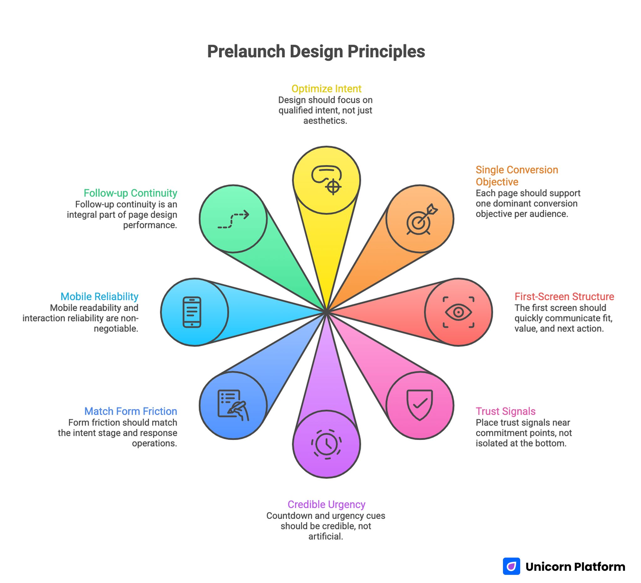
Prelaunch Design Principles
- Prelaunch design should optimize qualified intent, not only page aesthetics.
- One page should support one dominant conversion objective per audience segment.
- First-screen structure should communicate fit, value, and next action quickly.
- Trust signals should be placed near commitment points, not isolated at the bottom.
- Countdown and urgency cues should be credible, not artificial.
- Form friction should match intent stage and response operations.
- Mobile readability and interaction reliability are non-negotiable.
- Follow-up continuity is part of page design performance.
Why Coming-Soon-Page Design Often Fails
Most failures begin with unclear positioning. Visitors land on a page and see broad hype without concrete value. They may remember the brand look, but they still do not know why they should subscribe now.
The second failure is weak information hierarchy. Critical details such as launch scope, timeline expectations, and next-step value appear too late or not at all. Users abandon because uncertainty remains high.
The third failure is CTA confusion. Some pages offer multiple equal-priority actions with no clear path, while others hide the primary action beneath visual blocks that distract from commitment.
The final failure appears after conversion. Confirmation and follow-up messaging are generic, so signup intent decays before launch day. This is why design quality should include post-submit continuity, not only visual polish.
What Effective Coming-Soon-Page Design Actually Does
High-performing pages reduce uncertainty in a consistent sequence. They clarify who the offer is for, what users get by joining early, and what happens after submission.
They also frame urgency responsibly. Instead of forcing pressure, they explain timeline boundaries and participation benefits in practical terms. Credible urgency builds trust; artificial urgency weakens it.
Another shared pattern is focused action hierarchy. Strong pages keep one primary conversion route and reserve secondary actions for different readiness states.
Finally, they maintain brand coherence without sacrificing readability. Visual identity supports decision-making, rather than competing with it.
Design Goal Setting Before Wireframes
Design decisions should start from conversion objective, not mood boards. Before layout work begins, define what action quality means for this page.
Common objectives include waitlist signups, beta applications, launch reminders, or early access requests. Each objective changes what information should appear first and how friction should be calibrated.
Then define one primary audience for the variant. A creator tool prelaunch and an enterprise product prelaunch need different message emphasis, even if both use minimal visual styles.
When source intent differs, use controlled variants while preserving one core structure. This keeps analytics and governance manageable.
Objective Alignment Checks
- Is one conversion action clearly primary?
- Is first-screen value relevant to one audience type?
- Does CTA wording match readiness stage?
- Are timeline expectations explicit?
- Is one quality metric tied to this page objective?
Teams that complete these checks early usually reduce redesign cycles and improve launch confidence. They also create clearer ownership when updates need to happen quickly.
Core Structure for Coming-Soon-Page Design
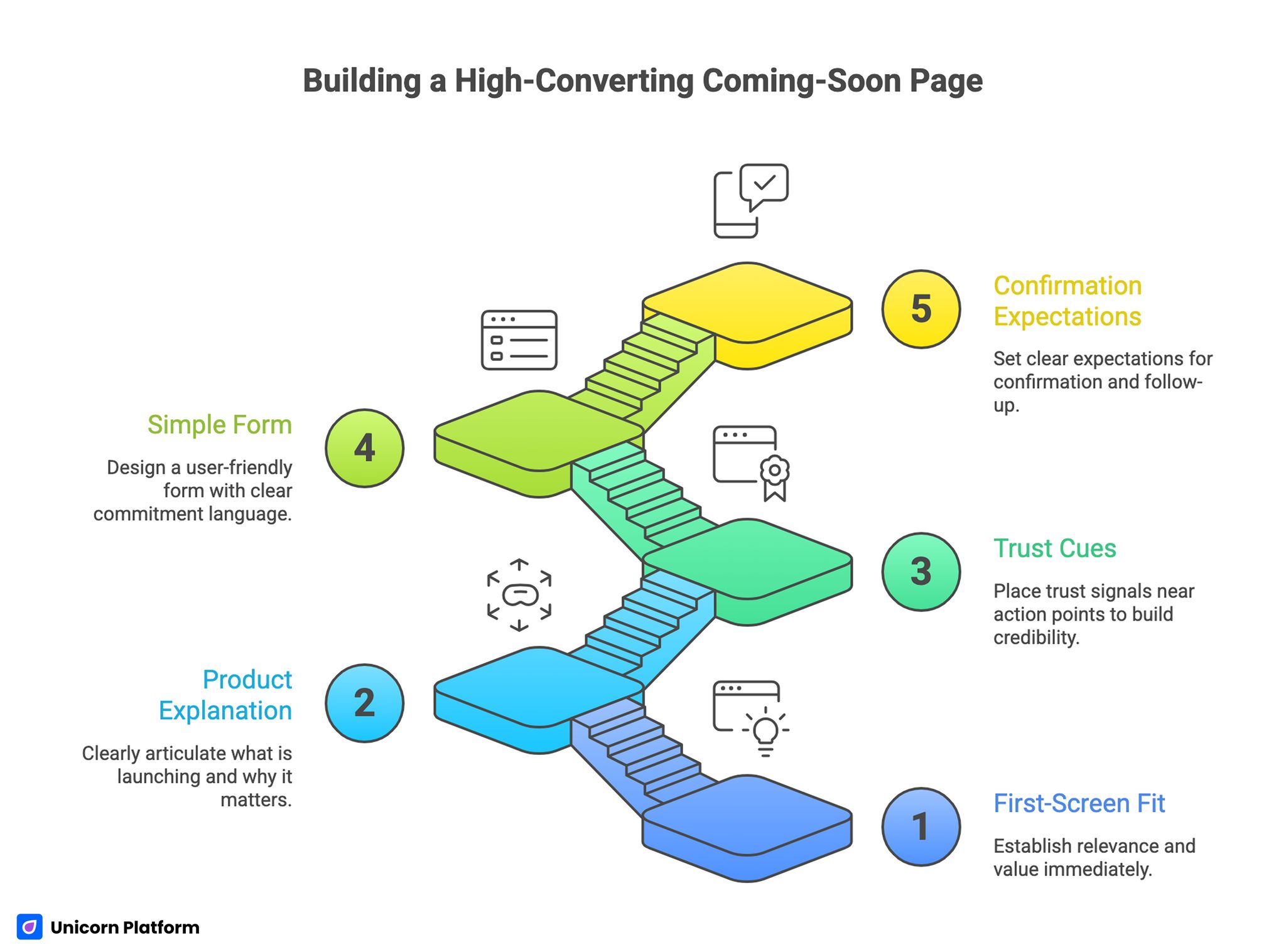
Building a High-Converting Coming-Soon Page
A strong prelaunch page should answer key questions in decision order. If users must search for essential context, conversion quality declines.
A practical structure includes:
- First-screen fit and value statement.
- Short explanation of what is launching and why it matters.
- Trust and credibility cues near action points.
- Simple form with clear commitment language.
- Confirmation expectations and follow-up cadence.
This sequence keeps cognitive load low and supports cleaner optimization later. It gives users confidence that the page is organized around their needs.
If your team needs a repeatable section model, this landing page structure guide is useful for assigning section jobs before detailed copy iteration. This is especially helpful when multiple contributors are editing in parallel.
A stable structure also makes collaboration easier across content, design, and growth teams. Teams can update details without breaking conversion logic.
First-Screen Design Rules That Improve Conversion Quality
First-screen design should prioritize comprehension over ornament. Visitors should immediately understand audience fit, practical benefit, and next action.
A reliable first-screen pattern combines role context, concrete outcome, and expectation cue near the CTA. This reduces ambiguity while keeping the interface clean.
Avoid vague lines like "something big is coming" without user impact. Curiosity can attract clicks, but unclear value reduces qualified commitment.
Use helper microcopy to explain what happens after signup. Small lines about response timing and update cadence can reduce hesitation significantly.
First-Screen QA Checklist
- Is the headline specific enough to self-qualify users?
- Is the subheadline tied to practical outcome?
- Is primary CTA visible without scrolling on mobile?
- Is CTA support copy clear and low-friction?
- Are visual elements helping, not distracting from action?
These checks improve both conversion rate and list quality. They also reduce low-context signups that are harder to activate later.
Visual Hierarchy and Brand Expression Without Clutter
A high-performing layout can still feel distinctive, but hierarchy must stay dominant. Typography, spacing, and contrast should lead attention to the decision path.
Use one dominant visual focal point near the value statement, then reduce decorative intensity around form zones. This keeps attention on conversion-critical content.
Brand personality can be expressed through color, tone, and supporting media. The key is to avoid visual competition around CTA areas.
Motion should be purposeful. Subtle transitions can support scanning flow, while constant animation near input fields usually increases friction.
Template Selection and Block Library Strategy
Design speed matters in prelaunch, but speed without structure usually creates inconsistency. A template should be selected for decision logic first, then customized for brand expression and campaign context.
A practical template should support clear first-screen hierarchy, modular trust blocks, flexible form placement, and reliable mobile behavior. If a template cannot support these core needs without heavy rework, it usually becomes a long-term maintenance problem.
Use a block library strategy to avoid reinventing page sections each cycle. Define reusable modules for headline patterns, proof blocks, timeline callouts, and confirmation states. Reusable modules reduce production time while preserving quality standards.
Template governance should include versioning. Keep one baseline version for stable production and one experimental version for controlled tests. This prevents accidental drift when teams iterate quickly.
Template Evaluation Checklist
- Does the first screen support one dominant action path?
- Can trust and proof blocks be moved near form sections easily?
- Are typography and spacing readable on small screens by default?
- Can countdown and urgency modules be toggled without layout breaks?
- Does the template preserve clean loading behavior under real mobile conditions? These checks help teams choose templates that scale operationally, not just visually.
Content Block Design for Higher-Quality Signups
Each section should have one decision job. When one block tries to explain everything, users are forced to interpret missing context and action confidence drops.
A practical block sequence starts with fit and value, then moves to trust and logistics, then to action and continuity. This structure mirrors how users evaluate risk before committing.
Copy density should be tuned per block. First-screen content should be concise and directional. Mid-page trust and logistics can carry more detail, but each paragraph should still move decision clarity forward.
Callout blocks are useful when they answer frequent objections quickly. Examples include timeline clarification, response expectations, and what users receive after signup. These callouts reduce support load and improve confidence.
Use visual contrast intentionally for block prioritization. High-priority action blocks should stand out, while supporting information should remain accessible without competing for attention.
Countdowns, Scarcity, and Credible Urgency
Countdown timers can improve action when they reflect real operational milestones. If the timeline is flexible or uncertain, rigid countdowns often hurt trust.
Urgency should be grounded in concrete constraints such as limited onboarding capacity, phased rollout, or fixed event dates. Generic scarcity language tends to underperform for sustained engagement.
When using countdowns, pair them with expectation clarity. Users should understand what changes at the end of the timer and what they gain by acting now.
Credibility beats intensity. A calm, specific urgency model usually outperforms aggressive pressure tactics.
Form Design for Prelaunch Signal Quality
Form design should balance momentum and qualification. Asking for too much early can suppress valid demand. Asking for too little can increase low-quality volume.
A staged approach works best in most cases. Capture minimum routing signal on first touch, then gather deeper information through follow-up steps.
For many prelaunch pages, first-touch capture can be email plus one lightweight qualifier such as role or use case. This provides segmentation value without heavy friction.
If qualification needs are strict, explain why each field matters. Transparent rationale improves completion quality compared to silent complexity.
Form Reliability Checklist
- Does every required field map to a real operational decision?
- Are errors recoverable without data loss?
- Are labels and placeholders readable on mobile?
- Is submit behavior stable across common browsers?
- Does confirmation state set clear next-step expectations?
Run this checklist before scaling paid or partner traffic. Minor reliability issues can become expensive during higher-volume campaigns.
Mobile-First Execution for Coming-Soon-Page Design
A significant share of prelaunch traffic arrives on mobile devices. If hierarchy collapses on smaller screens, conversion quality drops before users ever revisit on desktop.
Prioritize readable first-screen text, stable CTA visibility, and comfortable touch targets. Avoid heavy hero media that delays first meaningful paint.
Test real-device behavior for keyboard interactions, form focus states, timezone display, and confirmation transitions. Emulators are useful, but they miss practical friction patterns.
If your team is improving cross-device structure, this responsive landing-page workflow can help keep section hierarchy consistent across breakpoints. Consistent behavior across devices protects conversion quality under traffic spikes.
Mobile clarity is not a secondary task. It is a direct conversion lever.
Internal Linking Strategy for Prelaunch Topic Depth
Internal links should appear where users need deeper implementation detail, not as an end-of-page list. A useful link should support the current decision step.
For prelaunch programs, effective pathways usually connect structure guidance, waitlist conversion strategy, and behavior optimization patterns. This creates both better navigation and stronger topical coherence.
Anchor text should stay natural and context-specific. Repetitive anchor templates weaken readability and trust.
Plan links during outlining so narrative flow stays coherent and link placement remains spaced. Late link insertion often creates cluttered reading flow.
If your team is refining prelaunch signup quality, this waitlist landing page guide can help align design choices with follow-up operations. It is useful when signup volume is healthy but readiness quality is weak.
SEO-Safe Prelaunch Design and Indexing Controls
Prelaunch pages often become long-lived assets, so SEO and design decisions should be aligned from the start. A visually clean page can still underperform in discovery if metadata, indexing rules, and internal link logic are inconsistent.
Define whether the page is intended for organic discovery, campaign support, or both. That decision affects title strategy, description framing, crawl behavior, and how much supporting content should be linked.
For discoverable pages, keep metadata specific and realistic. The title should reflect practical prelaunch value, while the description should explain what users gain by joining early. Misaligned snippets can increase clicks but reduce qualified engagement.
Indexing controls should match lifecycle stage. During early private validation, limited indexing may be appropriate. During public prelaunch growth, broader discoverability may be valuable if message clarity is stable.
Use internal links to connect users to deeper implementation guidance without breaking narrative flow. This improves both user path continuity and topical authority.
Post-Signup Continuity and Launch Readiness
Submission is the start of relationship quality, not the end of conversion. Weak post-signup communication can erase gains from a strong page.
Confirmation should include acknowledgement, realistic timeline cues, and one low-friction next action such as calendar add or onboarding preference selection. Clear handoff language keeps early intent from decaying.
Follow-up cadence should be predictable and useful. Messages should reinforce progress and reduce uncertainty, not repeat generic promotion.
When continuity is clear, attendance and activation quality usually improve before launch. It also reduces support questions that stem from timeline confusion.
Measurement Framework for Coming-Soon-Page Design
Aesthetic quality should be evaluated alongside outcome quality. Beautiful pages that generate low-fit demand are not high-performing pages.
Use a three-layer metric model:
- Discovery: source quality and first-screen engagement.
- Decision: form starts, completion quality, and drop-off points.
- Outcome: follow-up engagement and launch-readiness signals.
Each cycle should define one primary metric and one guardrail metric. This prevents local optimizations from harming downstream performance.
Review Cadence
- Daily: technical issues, broken flows, and major anomalies.
- Weekly: source-level conversion-quality movement.
- Monthly: readiness quality and segmentation outcomes.
Cadence discipline helps teams keep design decisions tied to business outcomes. It prevents reactive edits driven by short-term noise.
If your team is diagnosing friction patterns, this user behavior optimization guide is useful for prioritizing high-impact adjustments. Apply one significant change per cycle to keep attribution clear.
Launch-Week Change Controls
Traffic spikes during launch week increase both opportunity and risk. Rapid ungoverned edits can break routing, tracking, or message continuity.
Use a readiness gate 48 to 72 hours before scaling distribution. Verify message continuity, CTA reliability, form stability, routing integrity, and confirmation accuracy.
Assign clear owners for messaging, mechanics, and QA. Clear authority shortens incident response time.
Prioritize incident handling by business impact: conversion integrity first, messaging regressions second, cosmetic issues third. This protects results when update velocity is high.
30-Day Execution Plan
A structured monthly cycle improves performance without noisy change. It also creates a repeatable process for cross-functional collaboration.
Week 1: Baseline and structure
Define objective, audience, and page role. Build baseline page in Unicorn Platform with clear section jobs and reliable form flow.
Run device and browser QA before distribution scale. Correcting issues early is usually cheaper than patching under active spend.
Week 2: First-screen and CTA optimization
Test one headline framing variant and one CTA support-copy variant while keeping structure stable. Controlled testing improves learning quality.
Review source-level quality signals and adjust trust placement near commitment zones. Focus first on sections where hesitation is highest.
Week 3: Qualification and continuity refinement
Adjust first-touch field set based on routing performance and lead quality. Keep field changes limited per cycle so impacts remain measurable.
Refine confirmation and follow-up sequencing using early engagement behavior. Clear sequencing improves prelaunch readiness and reduces churn.
Week 4: Consolidation and governance
Keep winning variants, remove weak versions, and finalize maintenance standards. Archive decisions so future launches start from proven patterns.
Document rollback rules and ownership for live updates. Clear authority shortens response time during incidents.
Common Failure Modes and Direct Fixes
Failure mode 1: Visual style dominates message clarity
Users remember design but cannot explain value. Rebuild first-screen content around fit, outcome, and next-step clarity.
Failure mode 2: Urgency feels artificial
Countdowns drive clicks but reduce trust. Tie urgency to real operational constraints and transparent timing.
Failure mode 3: Overloaded first-step form
Completion falls before trust is built. Reduce required fields and move deeper qualification to follow-up.
Failure mode 4: Trust cues appear too late
Visitors reach form without confidence. Place proof and process transparency near high-friction decision points.
Failure mode 5: Post-signup flow is generic
Initial intent decays after conversion. Improve confirmation clarity and value-focused reminder cadence.
Failure mode 6: Decisions rely on vanity metrics
Submission volume rises while launch readiness remains weak. Pair volume metrics with quality guardrails and segment-level outcomes.
FAQ: Coming-Soon-Page Design in 2026
What should coming-soon-page design include at minimum?
At minimum, include clear audience fit, practical value, one primary CTA, trust context near form interaction, and explicit post-submit expectations. This baseline supports confident decisions.
How different is coming-soon-page design from a normal landing page?
Prelaunch pages prioritize expectation setting and commitment preservation before product availability. They need stronger timeline clarity and follow-up continuity than many standard campaign pages.
Should every coming-soon-page design use a countdown timer?
No. Use a countdown only when the timeline is credible and operationally tied to a real milestone.
How many form fields should a prelaunch page use?
Use only fields needed for first-stage routing. Collect deeper context later unless strict early qualification is required.
Where should proof elements appear on a prelaunch layout?
Place proof near action points where users evaluate risk, especially around CTA and form sections. Timing matters as much as proof quality.
How often should I update a prelaunch page design?
A weekly cadence with one major variable per cycle usually produces cleaner learning than frequent untracked edits. High-frequency changes often reduce clarity.
Can one prelaunch page serve both paid and organic sources?
Yes, if one dominant intent is preserved and source-message continuity is maintained through confirmation. If intent diverges heavily by source, separate variants are usually safer.
How do I measure whether my prelaunch page is healthy?
Track source quality, conversion quality, and follow-up engagement signals rather than form count alone. This gives a more reliable picture of readiness.
How do I improve signup quality without hurting conversion too much?
Improve first-screen fit clarity, place trust cues near commitment points, and use staged qualification. These improvements usually raise quality without relying on aggressive friction.
Can Unicorn Platform support this full workflow?
Yes. Unicorn Platform supports fast iteration, and outcomes improve most when speed is paired with strict structure, QA discipline, and quality-focused measurement.
Final Takeaway
Strong prelaunch performance comes from decision architecture, not visual novelty alone. Teams that align message clarity, trust placement, qualification logic, and continuity operations consistently create better launch readiness.
When coming-soon-page design is treated as a complete conversion system, it becomes a durable growth asset instead of a temporary placeholder. That systems approach is what compounds launch performance over time.
