Table of Contents
- Why Sales Pages Underperform Mid-Campaign
- 30-Day Implementation Plan
- Common Failure Modes and Fixes
- FAQ
Most sale campaigns fail after the first spike. Launch-day traffic looks strong, click metrics appear healthy, and then conversion drops as the week progresses. In many cases, the offer is not the issue. The issue is post-click clarity: users cannot quickly understand value, trust terms, and next action in one coherent path.
A strong campaign page should be treated as a conversion system, not a temporary creative asset. It must handle urgency, trust, offer hierarchy, and checkout flow under real traffic pressure. If those elements are unstable, paid efficiency and revenue quality degrade quickly.
In Unicorn Platform, teams can manage this with reusable structure and controlled variants. The advantage is operational speed with consistency: fast launches, fast fixes, and clearer attribution.
sbb-itb-bf47c9b
Quick Takeaways
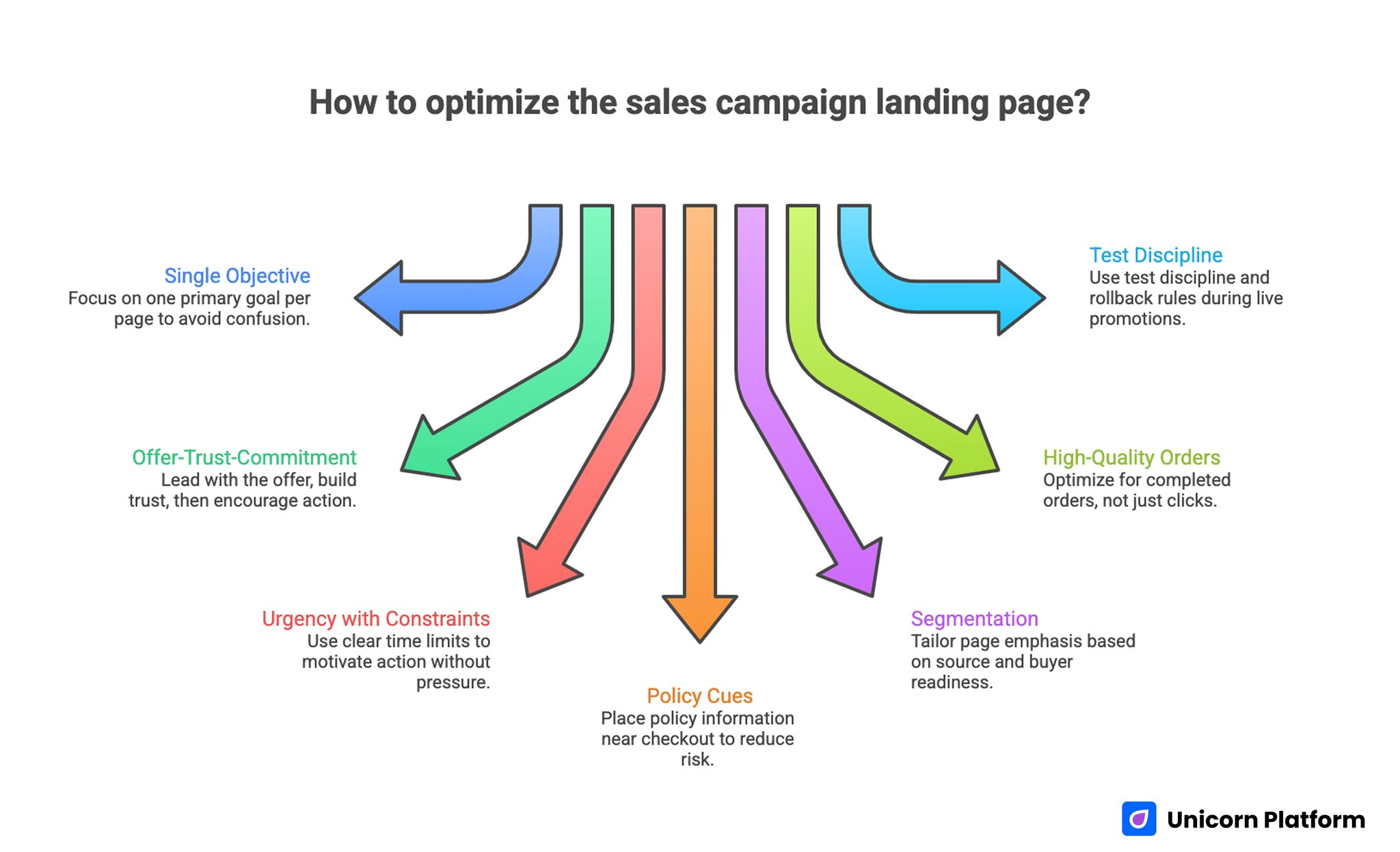
Key Takeaways for Sales Campaign Landing Page Conversion Optimization
- Keep one primary campaign objective per page.
- Lead with offer relevance, then trust, then commitment action.
- Use urgency with clear constraints, not vague pressure language.
- Place policy and risk-reduction cues near checkout decisions.
- Segment page emphasis by source and buyer readiness.
- Optimize for completed high-quality orders, not click volume.
- Use test discipline and rollback rules during live promotions.
Why Sales Pages Underperform Mid-Campaign
Performance usually drops when pages mix too many goals. Teams add multiple product groups, multiple CTAs, and multiple urgency messages to one page. Users hesitate because priority is unclear.
Another issue is trust placement. During promotions, buyers are more sensitive to return terms, delivery timing, and checkout reliability. If these details are hidden or delayed, drop-off increases before payment.
Operational inconsistency also contributes. Fast edits made during campaign windows can break message continuity between ad and page. When source promise and page framing diverge, conversion quality declines even if traffic remains strong.
The Conversion Sequence for Sales Campaigns
High-converting promotion pages follow a predictable sequence: immediate offer clarity, concise proof and risk control, clear product focus, and low-friction action path. This order reduces cognitive load and helps users decide faster.
If urgency appears before value clarity, users may perceive pressure and bounce. If product detail appears before trust cues, users may delay commitment. The sequence matters as much as visual quality.
For teams structuring campaign pages consistently, this landing page structure framework is useful for aligning each section to one decision function.
Offer Hierarchy Design
Every campaign page should answer one question quickly: what is the primary offer and why does it matter now. If multiple offers compete in the same viewport, conversion focus weakens.
Use hierarchy rules: one hero offer, one supporting set, and one dominant action. Secondary options can exist but should never compete equally with primary path.
Offer hierarchy should also align with inventory and margin strategy. Promoting low-availability items without clear fallback paths can create friction and support burden.
Urgency Framework Without Trust Damage
Urgency can improve conversion when it is specific and verifiable. It hurts conversion when it feels manipulative or inconsistent.
Use concrete urgency signals: end date/time, stock window, launch-phase boundary, or fulfillment cutoff. Avoid generic pressure copy that lacks operational grounding.
Urgency should be paired with confidence cues nearby so users can decide quickly without feeling risk is hidden.
Trust and Risk-Reduction Placement
Promotional contexts amplify trust sensitivity. Buyers want assurance that discounts do not come with hidden constraints.
Place trust blocks near commitment points: return terms, shipping expectations, payment confidence, and support access. Keep wording concise and practical. Research shows that around 19% of shoppers abandon purchases specifically because they do not trust a website with their payment information, making visible security signals and transparent policies critical conversion factors.
For ecommerce-heavy sale programs, this ecommerce conversion mistake framework helps prioritize high-impact risk-reduction fixes.
Product Selection and Focus Rules
Large assortments often reduce conversion quality when shown too early. Campaign pages perform better when curated around clear purchase intent.
Use focused product groups tied to the hero offer. Introduce broader exploration only after primary decision path is established.
Selection logic should reflect source intent. Search visitors often need fast specificity. Social visitors may respond better to visual proof before deep catalog options.
Messaging Standards for Campaign Clarity
High-converting sales copy is specific, complete, and actionable. It should communicate what is included, why now, and what happens after purchase.
Weak copy leaves unanswered questions that surface at checkout. Strong copy resolves those questions earlier and reduces abandonment.
Keep claims realistic and verifiable. Promotional exaggeration can increase clicks while reducing completion quality and long-term trust.
CTA Strategy and Action Path Design
Pages with multiple equal-priority CTAs usually underperform. A single dominant CTA with one controlled fallback performs better under campaign pressure.
CTA text should match user intent stage. Action labels should be explicit enough that users know what happens next without ambiguity.
Place key actions at predictable intervals through the page to support both scanning and deeper reading behaviors.
For product-focused sale flows, this product landing page guide can support CTA and block sequencing decisions.
Checkout Rescue Design
Many campaigns lose users near checkout because confidence drops late. Rescue elements can recover these sessions when placed correctly.
Industry research consistently shows that checkout friction is one of the largest revenue leaks in ecommerce, with average cart abandonment rates around 70%, often caused by hidden costs, complex checkout steps, or trust concerns.
Useful rescue elements include concise policy reminders, transparent shipping cues, and clear support fallback. These should appear adjacent to action points, not in distant footer zones.
Checkout rescue design should be measured directly by stage progression metrics, not only page-level conversion.
Mobile Performance Under Campaign Load
Promotional traffic is often mobile-first. Weak mobile action visibility or unstable form behavior can erase campaign efficiency quickly.
Mobile checks should include first-screen offer readability, CTA contrast, tap comfort, and checkout continuity. Real-device validation is mandatory before and during peak windows.
Campaign teams should monitor mobile-specific drop-off daily during active periods and adjust quickly where needed.
Source-Specific Variants With Shared Templates
Different channels create different expectations. Paid search users often need immediate specificity. Social users often need stronger proof context. Email users often need urgency plus fast action.
The right model is one stable template with source-specific emphasis changes. This preserves governance and supports clean testing.
In Unicorn Platform, teams can launch these variants quickly while keeping section logic consistent.
Revenue-Quality Metrics Model
Campaign success should be measured by more than clicks and add-to-cart events. Quality metrics reveal whether growth is sustainable.
Track completed order rate, average order value quality, return tendency, and repeat behavior by variant. Pair each front-end metric with at least one downstream guardrail.
When teams optimize only top-funnel signals, they often scale pages that look efficient but reduce profitable outcomes.
Experimentation Framework for Sale Campaigns
Campaign testing should be disciplined even under time pressure. Use one major variable per test with one primary metric and one quality guardrail.
Common high-impact tests include offer framing, trust-strip placement, and CTA hierarchy. Avoid launching multiple structural changes in one cycle.
Maintain a test register with hypothesis, audience, change, metric pair, and rollout decision. This protects learning quality across campaign waves.
Mid-Flight Remediation Loop
When a live campaign underperforms, avoid full redesign reactions. Use a short remediation loop.
Step one: identify weakest stage (offer clarity, trust, or checkout). Step two: change one block. Step three: validate against one primary metric and one guardrail. Step four: either scale or revert quickly.
This loop keeps decisions measurable and avoids chaotic changes that break attribution.
Governance and Ownership Model
Speed without ownership creates inconsistency. Assign section-level owners for offer integrity, proof recency, policy correctness, and final QA.
Set launch gates and approval sequence before campaign begins. During peak windows, this prevents low-quality edits from going live.
Ownership clarity improves both speed and reliability because teams know who decides and who verifies.
Rollback Rules for High-Velocity Campaigns
Every major variant should include predefined rollback triggers before launch. Triggers may include completion decline beyond threshold, checkout error spikes, or guardrail degradation.
Assign one rollback owner with authority to revert quickly. Delayed rollbacks can damage revenue quality for days.
Use phased rollout where possible. Expand only after early signals confirm stability.
Scenario: Promotion Program Stabilization
A growth team running weekly sales campaigns saw high variance in checkout performance. Analysis showed mixed offer hierarchy, delayed trust cues, and ad-to-page message mismatch.
The team shifted to one canonical template in Unicorn Platform, introduced source-specific emphasis variants, and adopted one-variable testing plus rollback rules.
Within six weeks, completion stability improved and quality metrics became more predictable. The largest gains came from structure and governance discipline rather than new creative volume.
Promotion-Type Playbooks for Consistent Execution
Different campaign types require different emphasis even when they share the same conversion structure. Flash promotions often need fast clarity and immediate action confidence. Seasonal campaigns usually need stronger value framing and broader product context. Clearance pushes need transparent constraints and expectation management.
A single static message model across all promotion types usually creates mismatch. Users from a flash campaign want speed and certainty. Users from a seasonal campaign may need additional proof before buying. Users from clearance campaigns may be more sensitive to return and inventory terms.
Create promotion playbooks with fixed section priorities per type. For flash events, prioritize hero clarity, urgency context, and checkout trust early. For seasonal campaigns, prioritize curated selection and benefit framing. For clearance programs, prioritize policy clarity and stock transparency. This reduces decision friction and improves operational consistency.
Keep the playbooks modular so teams can launch quickly under time pressure. Modules should define what changes and what must remain stable. Stable elements include trust blocks, action hierarchy, and quality guardrails. Variable elements include offer copy, urgency framing, and product grouping.
Inventory and Margin Alignment Before Launch
Campaign pages should align with inventory and margin logic before traffic scale starts. Conversion optimization without inventory awareness can push out-of-stock items and frustrate users. It can also increase volume for low-margin combinations that look efficient in front-end metrics but underperform financially.
Use a pre-launch alignment pass with merchandising and operations. Confirm hero offers have real fulfillment confidence and fallback options if stock shifts. Ensure high-priority products support target margin ranges under expected discount conditions.
Include margin-aware guardrails in campaign evaluation. If conversion rises while contribution quality declines, the variant should be reviewed before broader rollout. This protects revenue quality and prevents short-term wins from damaging long-term economics.
Inventory alignment should continue during live windows. If a campaign changes mid-flight, page emphasis and product order may need quick updates. Having predefined fallback blocks avoids rushed edits that hurt trust.
Support and Returns Feedback as Conversion Inputs
Support tickets and return reasons reveal friction that analytics alone may not explain. Repeated questions about shipping, refunds, or product expectations usually indicate page clarity gaps. Ignoring these signals allows hidden conversion issues to persist across campaigns.
Create a weekly feedback intake with three outputs: top concern category, likely page-stage source, and one testable content change. If users ask the same question after purchase, that answer belongs earlier in the pre-purchase flow.
Returns data can also improve offer decisions. If one urgency pattern drives high sales but poor satisfaction, the issue may be expectation mismatch rather than product quality. Page messaging should then be adjusted to improve accuracy and reduce low-fit purchases.
Teams that include support and return signals in optimization loops usually improve both completion and repeat behavior. This creates more stable growth than page-only testing.
Campaign Calendar Governance and Capacity Planning
High-frequency promotion teams often overlap campaigns, which creates message collisions and QA pressure. Without calendar governance, teams ship faster but with lower consistency, and performance volatility increases.
Use a campaign calendar that includes launch windows, owner assignments, QA checkpoints, and rollback authority. This makes dependencies visible before deadlines become urgent and reduces last-minute content conflicts.
Capacity planning should be built into this calendar. If the team cannot support multiple major experiments in one week, reduce test volume and protect quality. Over-scheduling experiments usually produces noisy data and higher error rates.
A governance calendar should also define post-campaign review windows. Learning is lost when teams move directly to the next launch without documenting outcomes. Scheduled reviews help convert short-cycle tests into durable template improvements.
Offer Readability and Decision Compression
Promotional pages perform better when users can understand the offer in seconds. Long explanatory copy can be helpful in some contexts, but first-screen decision compression is critical during high-intent sale windows.
Offer readability depends on hierarchy, wording, and visual priority. The user should immediately understand what is on sale, who it is for, and what action to take next. If any of these are unclear, users delay and comparison behavior increases.
Decision compression does not mean oversimplification. It means removing non-essential complexity from the first interaction and layering detail where needed. This supports both fast buyers and cautious evaluators without breaking flow.
Use concise validation questions during QA: Is the offer clear in one glance? Is urgency specific and credible? Is the next step obvious? If any answer is no, adjust before scaling traffic.
30-Day Implementation Plan
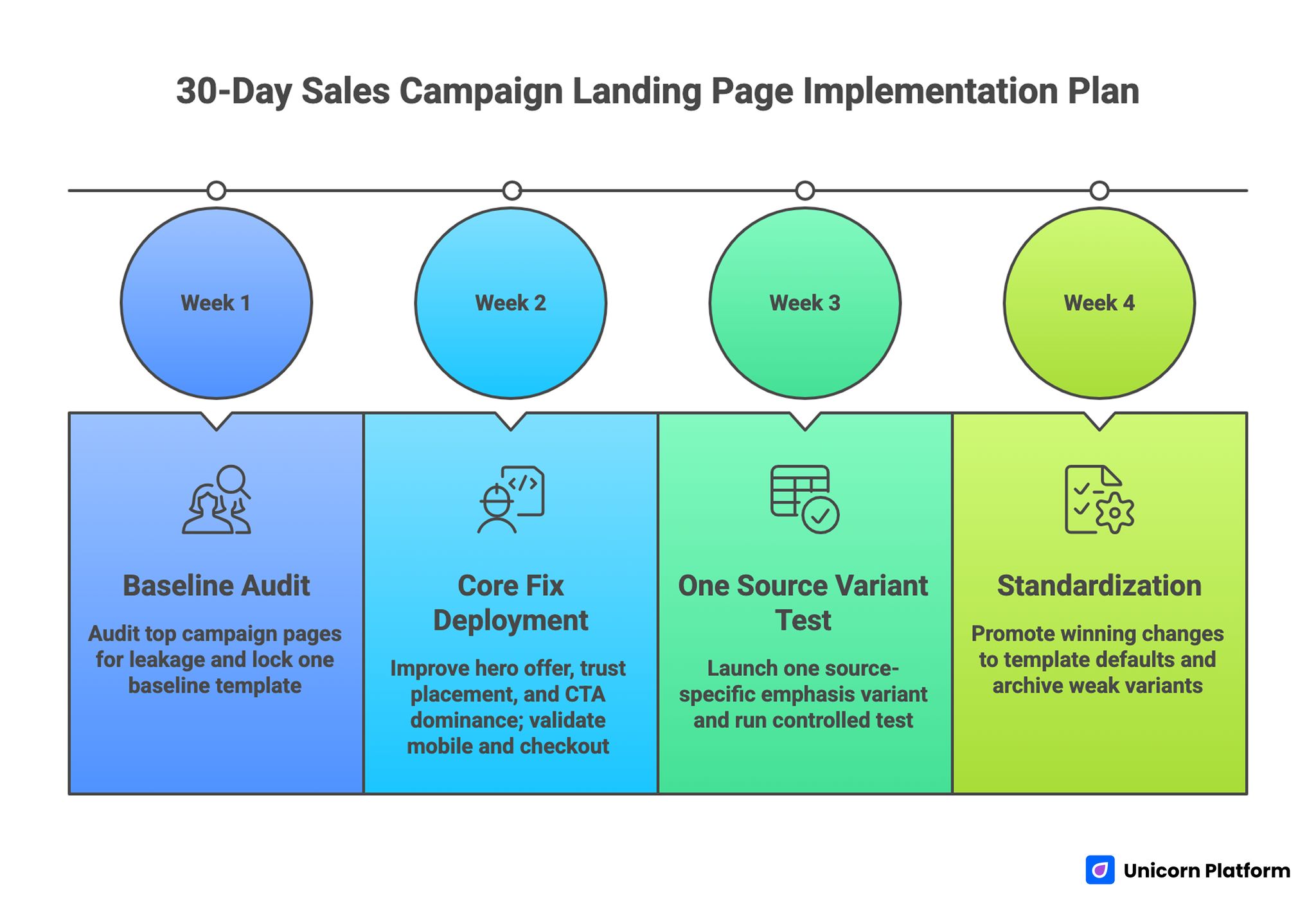
30-Day Sales Campaign Landing Page Implementation Plan
Week 1: Baseline Audit
Audit top campaign pages by stage leakage: offer clarity, trust confidence, or checkout friction. Lock one baseline template.
Week 2: Core Fix Deployment
Improve hero offer hierarchy, trust placement near actions, and CTA dominance. Validate mobile and checkout behavior.
Week 3: One Source Variant Test
Launch one source-specific emphasis variant from the same template. Run one controlled test with quality guardrail.
Week 4: Standardization
Promote winning changes into template defaults. Archive weak variants with rationale and update next-cycle backlog.
90-Day Scaling Plan
Month 2: Controlled Expansion
Add promotion-type variants (flash, seasonal, bundle) while preserving structure and QA gates.
Month 3: Institutionalize Reliability
Formalize governance artifacts, freshness cadence, and rollback protocols. Train contributors on release standards.
Goal at this stage is faster launches with lower quality volatility.
Common Failure Modes and Fixes
1) Too Many Offers in First Screen
Problem: users cannot identify primary value. Fix: one hero offer with clear hierarchy.
2) Urgency Without Clarity
Problem: pressure feels manipulative and reduces trust. Fix: use specific, verifiable urgency constraints.
3) Trust Signals Buried Late
Problem: hesitation appears before confidence forms. Fix: place policy and trust cues near action zones.
4) CTA Competition
Problem: multiple equal actions dilute commitment. Fix: one dominant action plus one fallback path.
5) Mobile Action Friction
Problem: high drop-off on small screens. Fix: enforce mobile launch checks and real-device validation.
6) Multi-Variable Testing Noise
Problem: attribution becomes unreliable. Fix: one major variable per cycle with guardrail metric.
7) Message Drift Across Channels
Problem: ad promise and page framing diverge. Fix: source-specific message maps with template consistency.
8) Missing Rollback Discipline
Problem: weak variants remain live too long. Fix: predefined triggers and explicit rollback ownership.
9) Stale Proof and Policy Content
Problem: campaign trust erodes over time. Fix: monthly freshness audits and decay-priority updates.
10) Metric Tunnel Vision
Problem: clicks rise while profitable outcomes decline. Fix: optimize with revenue-quality guardrails.
Pre-Launch QA Checklist
Before launch, validate offer-message alignment, urgency accuracy, trust-proof recency, and action hierarchy. Confirm checkout and policy continuity from page to payment.
Run mobile checks on real devices for readability, tap targets, CTA visibility, and checkout stability.
Verify source tagging and stage tracking for quality attribution. Require sign-off from offer owner and QA owner before release.
FAQ: Sales Campaign Landing Pages
What should campaign teams optimize first?
Start with offer hierarchy and trust placement near first action. Those two elements usually create the largest immediate lift in completion quality.
How many primary CTAs should a sale page have?
Use one primary CTA and one controlled fallback when necessary. Extra equal-priority actions usually reduce commitment clarity.
Is stronger urgency always better?
No, stronger urgency is not always better. Urgency helps when it is specific, credible, and consistent with actual campaign constraints.
Which metric matters most?
Completed high-quality orders should anchor evaluation. Guardrail metrics are needed to ensure conversion gains do not reduce revenue quality.
How often should campaign templates be refreshed?
Review core sections monthly with a decay-priority lens. High-visibility trust and policy blocks should be refreshed first when relevance declines.
How do we reduce checkout abandonment quickly?
Strengthen trust cues near checkout actions and simplify path logic. Small late-stage clarity improvements often create measurable recovery quickly.
Should each source get a unique page design?
Use one shared structure across sources for governance consistency. Vary only high-impact emphasis blocks such as hero framing, proof order, and CTA copy.
What is the biggest mobile mistake in sales campaigns?
Assuming responsive layout alone is enough is a common mistake. Mobile conversion depends on action visibility, readable offers, and stable checkout behavior.
When should a variant be rolled back?
Roll back when predefined quality or completion thresholds are breached. Fast rollback protects campaign economics and preserves learning quality.
What creates compounding campaign gains?
Compounding gains come from stable templates, disciplined testing, and clear ownership. Feedback loops from support and downstream metrics keep improvements durable over time.
Final Takeaway
Sales campaign performance improves when pages are managed as systems, not one-off launches. Clear offer hierarchy, trust-aware sequencing, and disciplined operations produce better conversion quality under pressure.
Unicorn Platform supports this model through fast iteration on stable templates. Keep structure consistent, adapt emphasis intentionally, and optimize for profitable outcomes so campaign gains compound over time.