Table of Contents
- What Top Booking Landing Page Examples Consistently Do Well
- Building Booking Pages in Unicorn Platform: Execution Workflow
- 30-Day Optimization Plan for Booking Pages
- Common Mistakes and Practical Fixes
- FAQ
Booking intent is expensive to acquire and easy to lose. When people click a booking offer, they are often close to action, but small friction points can still break momentum before the reservation is complete.
Most teams assume conversion loss is caused by weak traffic quality, but many losses happen on the page itself. If the page is unclear, overloaded, or hard to use on mobile, high-intent visitors drop before they confirm.
The strongest booking landing page examples solve this with clear decision flow. They confirm relevance fast, reduce uncertainty before commitment, and make the booking action obvious at every stage.
This guide shows how to build that standard in Unicorn Platform with practical structure, copy rules, calendar UX requirements, and weekly optimization loops. You can use it for service businesses, consultations, classes, demos, events, and appointment-driven funnels.
If you want a technical walkthrough for the booking sequence itself, start with this reservation landing page blueprint and then use this article to improve strategic depth and ongoing performance.
sbb-itb-bf47c9b
Quick Strategic Takeaways
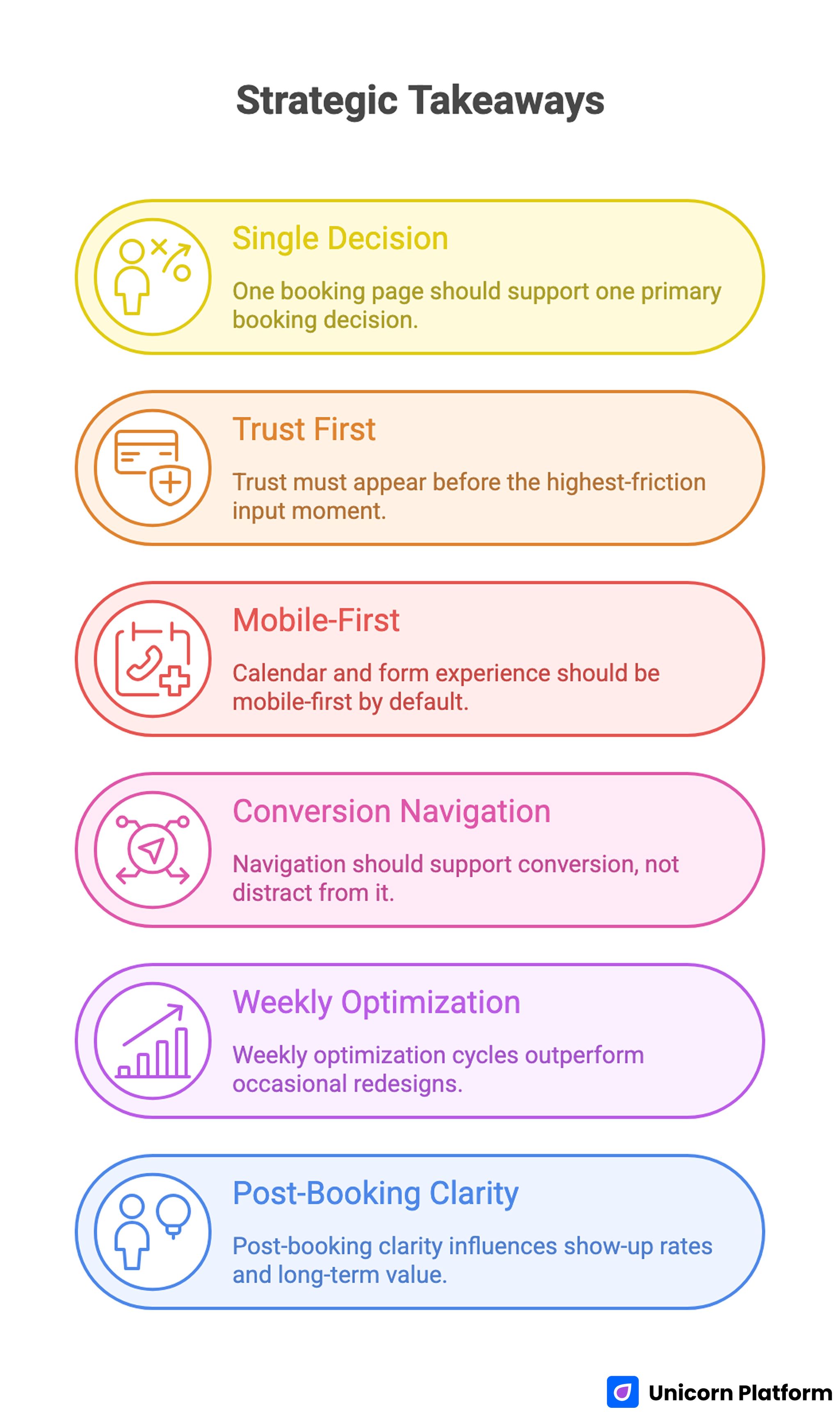
Quick Strategic Takeaways
- One booking page should support one primary booking decision.
- Trust must appear before the highest-friction input moment.
- Calendar and form experience should be mobile-first by default.
- Navigation should support conversion, not distract from it.
- Weekly optimization cycles outperform occasional redesigns.
- Post-booking clarity influences show-up rates and long-term value.
Why Booking Pages Need Different Conversion Logic
A booking page is not a general awareness page. It sits near the action point, so users evaluate clarity, trust, and effort much faster than they do on top-of-funnel content.
That difference changes the structure requirements. Instead of broad storytelling, booking pages need concise sequencing that answers practical questions in the order users ask them.
The first question is relevance. Users need to know if the offer matches their context, and they need that answer in seconds.
The second question is confidence. Users ask whether the outcome is credible, whether the process is professional, and whether any hidden friction appears after they start.
The third question is effort. If booking feels harder than expected, users postpone action or leave the page.
High-performing booking landing page examples align section order to these three questions. That alignment is usually the reason they convert more consistently across channels.
What Top Booking Landing Page Examples Consistently Do Well
Strong pages across coaching, consulting, healthcare, fitness, events, and B2B services share repeated behavioral patterns. The visual style can vary, but the conversion logic remains similar.
1. First-screen value is specific
The hero does not just ask users to book. It explains what booking delivers and why the session is worth the commitment.
2. Booking context appears early
Visitors quickly see session length, format, and expected outcome. This reduces confusion and prevents low-intent form starts.
3. Trust is placed before form friction
Credibility appears where hesitation happens, not in a distant section. Small but relevant trust blocks often outperform large testimonial dumps placed too late.
4. Calendar and form are simplified
Only essential information is requested for first-step conversion. Extra qualification can happen after booking, where commitment is already established.
5. Confirmation experience is clear
Users know what happens after they submit. Good pages reduce uncertainty with immediate confirmation, reminder expectations, and simple reschedule guidance.
Recent landing page performance data from Hostinger shows that top‑performing pages can achieve conversion rates above 10% — often due to clear value messaging, strong CTAs, and minimal distraction — reinforcing the importance of relevance and UX clarity in booking flows.
The 9-Block Booking Page Architecture
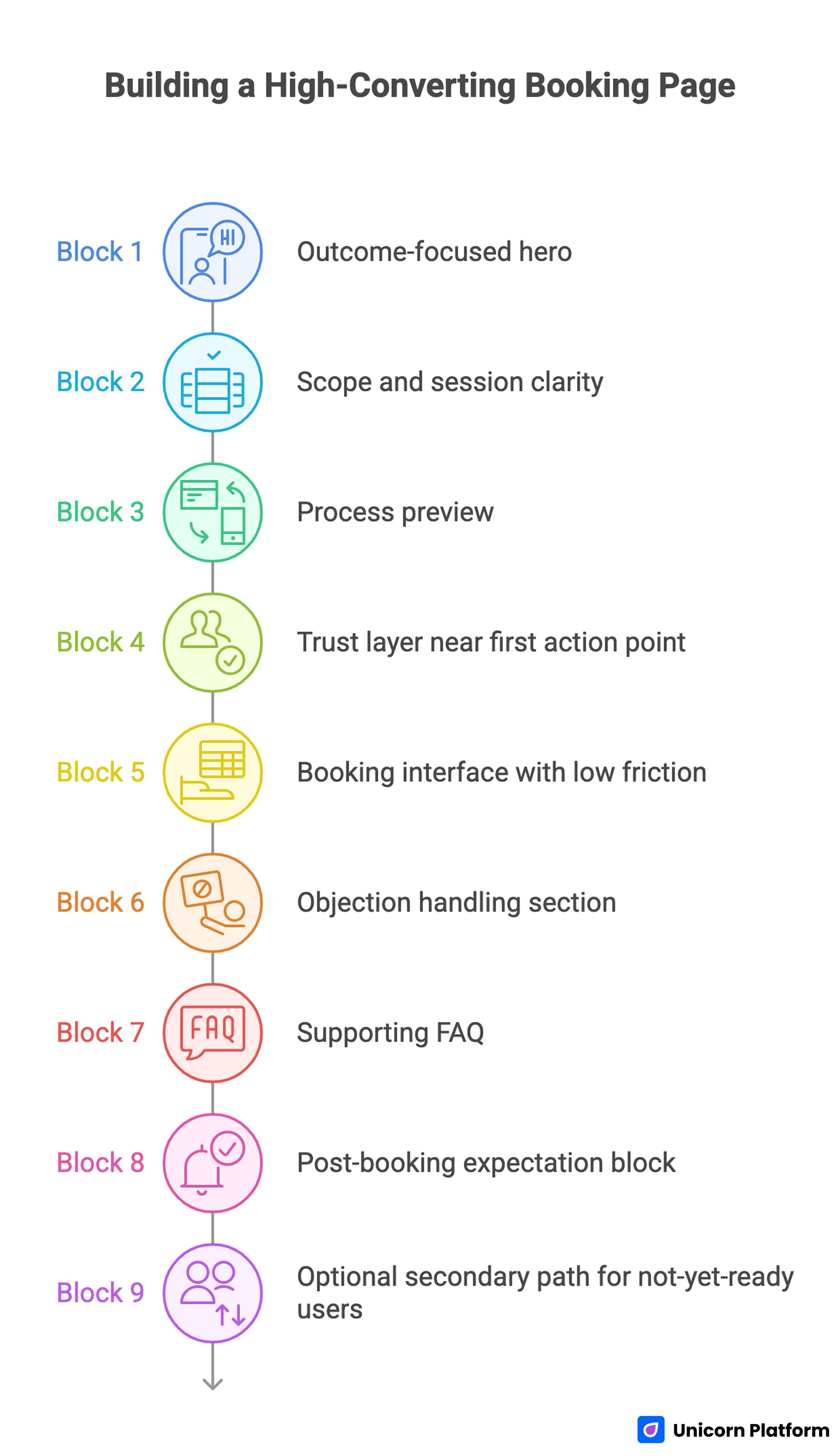
The 9-Block Booking Page Architecture
Use this architecture to build or rebuild booking pages in Unicorn Platform. It works across most appointment-driven offers and can be adapted by audience segment.
Block 1: Outcome-focused hero
The headline should describe the session result, not just the meeting format. A clear promise sets the frame for every section that follows.
Supporting copy should confirm audience fit, session scope, and immediate relevance. Generic booking language usually underperforms because it fails to answer why this session matters.
Block 2: Scope and session clarity
Before users scroll deeply, they should see core logistics. Include duration, delivery format, expected preparation, and whether follow-up is included.
This information prevents low-quality bookings and reduces back-and-forth communication later. Clarity improves both conversion efficiency and operational quality.
Block 3: Process preview
Show users what happens before, during, and after the booking. A short three-step preview can reduce anxiety for first-time visitors.
Process transparency also signals professionalism. Visitors are more likely to commit when they can picture the experience clearly.
Block 4: Trust layer near first action point
Place credibility cues close to the first booking action. Use short evidence formats that are specific to audience concerns.
Good trust options include role-specific outcomes, concise testimonials, relevant credentials, or selective client context. Overly broad praise rarely resolves real objections.
Block 5: Booking interface with low friction
The calendar and form should be visible, predictable, and fast to complete. Ask for only the fields you need at this stage.
When forms are overloaded, users delay submission even when they want the session. Protect momentum by keeping the first commitment simple.
Block 6: Objection handling section
Address common blockers directly. Typical concerns include cancellation rules, rescheduling options, payment timing, and expected outcomes.
Concise objection handling near booking controls often improves conversion more than adding new visual sections. Users value clarity at decision points.
Block 7: Supporting FAQ
A focused FAQ should answer operational questions that repeatedly slow conversions. Use direct answers with plain language and avoid legal-style complexity unless necessary.
Effective FAQ design reduces support load and keeps users on-page. It also improves confidence for visitors who need one extra detail before committing.
Block 8: Post-booking expectation block
Explain what users receive after submission. This can include confirmation timing, calendar invite behavior, preparation guidance, and reminder sequence details.
Strong post-booking clarity improves show-up rates and reduces cancellation risk. It also strengthens perceived quality of the entire service experience.
Block 9: Optional secondary path for not-yet-ready users
Some visitors need a lower-commitment path before booking. A secondary action can help, but it should never compete with the primary booking goal.
Keep hierarchy explicit so primary conversion remains dominant. Secondary options should support qualification, not distract from the main path.
Navigation Rules That Protect Booking Conversion
Navigation is often treated as a design detail, but it has direct conversion impact on booking pages. Too many choices increase cognitive load exactly when users need focus.
Use a reduced navigation model for booking-focused pages. Keep only the links that help users evaluate and complete the booking decision.
A practical navigation pattern is a persistent primary CTA plus short in-page anchors for trust, process, and FAQ. This helps users move between key sections without losing booking orientation.
When teams need more depth on conversion sequencing across sections, this high-converting landing page structure guide is useful for mapping page architecture to decision flow.
Avoid dead-end navigation choices that move users away from booking context without a clear return path. Every link on a booking page should have a conversion purpose.
Calendar and Form UX That Improves Completion
The booking interface is where intent becomes action, so UX details matter more than visual novelty. Even small usability issues can reduce completion quickly.
Best practices from conversion experts at OuterBox Design emphasize that clear navigation, intuitive call-to-action placement, and mobile-first form design significantly improve engagement and reduce abandonment on booking pages.
Core requirements for booking forms
- Minimal required fields for first-step conversion
- Clear timezone display and local-time handling
- Visible slot availability without hidden interactions
- Immediate error clarity when input is invalid
- Confirmation feedback without page ambiguity
Common UX mistakes to remove
- Forcing users through too many steps before slot selection
- Hiding availability behind unclear controls
- Requiring unnecessary personal data early
- Using vague button labels that do not confirm action
Practical improvement sequence
Start by reducing unnecessary fields. Then validate timezone handling and mobile tap targets, and only after that test copy or layout changes.
This sequence works because friction reduction usually has higher impact than stylistic experimentation on booking completion.
For event-style bookings with recurring schedules, this meetup and calendar landing page workflow can help teams structure scheduling logic without introducing unnecessary complexity.
Copywriting Framework for Booking Intent
Booking users want certainty and momentum. Copy should remove ambiguity while reinforcing value, not slow the page with brand-heavy narrative.
Sequence that converts
- Problem context users recognize
- Practical benefit of booking now
- Proof that outcome is realistic
- Clear next step with minimal friction
Message quality rules
Use concrete language over promotional intensity. Specificity about outcomes, format, and expected value usually outperforms broad claims.
Keep sentence rhythm concise and direct. Booking pages perform better when readers can scan and decide quickly without interpretation effort.
CTA language standards
CTA text should describe the action users are taking. Phrases such as "Reserve My Session" or "Book My Consultation" often reduce uncertainty better than generic button labels.
Support text around CTA should answer immediate concerns, such as confirmation timing or cancellation flexibility. This reduces hesitation at the final step.
Mobile-First Standards for Booking Pages
A large share of booking traffic arrives from mobile devices. If mobile interaction is weak, conversion losses appear quickly even when desktop performance looks healthy.
Mobile quality baseline
- Primary CTA visible in early scroll depth
- Calendar controls usable with one thumb
- Form labels readable without zoom
- Fast load behavior on standard mobile networks
- Confirmation state clear on small screens
Why mobile checks must happen before scale
Teams often discover mobile friction after paid campaigns are active. That delay wastes budget and distorts test outcomes.
Mobile QA before launch protects channel economics and produces cleaner optimization signals. It also reduces avoidable frustration for high-intent visitors.
For campaigns that combine booking with registration workflows, this event registration landing page guide provides additional structure for form logic and action hierarchy.
Building Booking Pages in Unicorn Platform: Execution Workflow
Unicorn Platform is strongest when teams use repeatable systems instead of one-off page builds. A structured workflow keeps speed high without sacrificing quality.
Step 1: Define one booking objective
Choose one primary conversion target per page. Mixed objectives weaken copy focus and make performance diagnosis harder.
Step 2: Map traffic promise to page promise
Document what users saw before the click. Your first-screen message should continue that promise with tighter specificity.
Step 3: Build hero, scope, and trust first
Prioritize the sections that influence first decision quality. Fine visual polish can come later after conversion logic is stable.
Step 4: Implement calendar and form with minimal friction
Ask only for first-step essentials and confirm timezone clarity. Protect completion speed before adding optional qualification.
Step 5: Add objection handling and FAQ near action points
Place support content close to where hesitation appears. Keep answers concise, operational, and easy to scan.
Step 6: Instrument events before launch
Track CTA clicks, booking starts, booking completions, and post-booking behavior. Reliable events are required for useful optimization.
Step 7: Run weekly optimization cycles
Use one hypothesis per cycle and document result quality by source. This keeps tests interpretable and supports cumulative learning.
Step 8: Scale only validated variants
Replicate winning logic to adjacent audiences, then revalidate. Do not assume one winner works equally well for all source types.
30-Day Optimization Plan for Booking Pages
Week 1: Baseline and reliability
Launch with clear first-screen relevance, trust near booking entry, and low-friction form controls. Validate event tracking and confirmation flow end to end.
Week 2: Message and trust tuning
Test one headline or subheadline angle and one trust placement change. Keep the rest of the page stable so impact remains measurable.
Week 3: Interface friction reduction
Simplify form inputs, improve calendar visibility, and tighten microcopy near action controls. Focus on removing hesitation at high-intent moments.
Week 4: Segment-specific variant
Duplicate the winning structure for one high-value segment and adapt copy to that audience context. Compare booking quality by source and downstream behavior.
60-Day Scale Model for Stable Growth
Days 1-20: Stabilize core winner
Confirm performance consistency across device types, weekdays, and traffic channels. Short-term spikes are not enough for scale decisions.
Days 21-40: Expand with controlled variants
Build one additional version for a distinct audience or offer type. Keep architecture stable while adapting message, proof, and objection emphasis.
Days 41-60: Systematize winning modules
Convert strong sections into reusable building blocks for future campaigns. Standardized modules improve launch speed and reduce quality drift across teams.
Measurement Framework: Track What Predicts Business Quality
Booking conversion rate is useful but incomplete. You also need metrics that show whether booked sessions are valuable and reliable.
Track this minimum set each week:
- Booking start rate by source
- Booking completion rate by source
- Form abandonment points
- No-show rate by page variant
- Reschedule rate by variant
- Qualified outcome rate after session
Interpretation should follow sequence, not isolated snapshots. A high completion rate with high no-show rates can indicate expectation mismatch rather than true page success.
Common Mistakes and Practical Fixes
1. Generic booking promise
When the hero says only "book now," users do not see clear value and delay action. Rewrite first-screen copy around one audience problem and one specific outcome.
2. Trust appears too late
Users reach booking controls before confidence is established, which increases hesitation and form abandonment. Move concise proof closer to the first booking action.
3. Form asks for too much too early
Excessive first-step fields increase friction and reduce completion, especially for mobile traffic. Capture essential data first and collect additional details after confirmation.
4. Timezone and schedule details are unclear
Unclear timing creates avoidable support requests and dropped bookings. Display local-time behavior clearly and confirm session length before submission.
5. Navigation distracts from the main action
Too many equal-priority links split attention at the decision moment. Reduce navigation to support booking flow and keep primary CTA persistent.
6. Post-booking expectations are vague
Users who do not know what happens next are more likely to cancel or miss sessions. Add immediate confirmation guidance, reminder timing, and preparation steps.
7. Teams optimize without a fixed rhythm
Random edits make performance hard to interpret and slow learning. Run weekly hypothesis-based iterations with clear documentation and source-level analysis.
FAQ: Booking Landing Page Examples and Optimization
What is a booking landing page?
A booking landing page is a focused conversion page built to turn scheduling intent into confirmed reservations. It should reduce friction, answer practical questions, and guide users toward one clear booking action.
How is a booking landing page different from a homepage?
A homepage supports broad exploration across multiple paths, while a booking page supports one decision path with minimal distractions. Booking pages should prioritize conversion flow over general site navigation.
How many fields should a booking form include?
Include only the fields required to complete a reliable first-step booking. Additional qualification can happen after confirmation to protect completion rates.
Where should trust elements appear on a booking page?
Place trust cues before and around key commitment moments, especially near the first booking action. Early trust timing usually improves completion more than adding more proof lower on the page.
Should booking pages include a FAQ section?
Yes, if operational questions repeatedly slow decisions. A concise FAQ can remove friction, reduce support load, and keep users on-page until they confirm.
What is the best CTA style for booking pages?
Use clear action-oriented CTA text that confirms the next step, such as reserving or scheduling. Generic CTA wording often underperforms because it creates uncertainty at the final decision point.
How often should I update a booking landing page?
Weekly review cycles are a strong default for active campaigns. Monthly structural reviews can consolidate wins and retire low-impact experiments.
What metrics matter beyond booking completion rate?
No-show rate, reschedule rate, and qualified outcome rate are critical for understanding business quality. These indicators reveal whether conversion gains are durable and valuable.
Can no-code tools support serious booking optimization?
Yes, if teams pair no-code speed with clear standards, strong tracking, and disciplined test cadence. Without that operating model, frequent edits can become noise instead of progress.
When should I build a separate page variant?
Create a separate variant when audience intent, offer framing, or source behavior differs enough to require distinct messaging. Keep core architecture stable and adapt only high-impact sections first.
Final Takeaway
The best booking landing page examples win because they make action easy at the exact moment intent is highest. They combine relevant messaging, visible trust, low-friction booking controls, and clear post-booking expectations in one coherent system.
With Unicorn Platform, teams can build this system quickly and improve it continuously. When weekly optimization is tied to real behavior data, booking pages stop being static campaign assets and become a reliable conversion engine.