Table of Contents
- Core Architecture for Beauty Conversion Pages
- 30-Day Execution Plan
- Common Mistakes and Practical Fixes
- FAQ
Beauty businesses usually do not have an attention problem. They have a conversion-clarity problem. Social content can drive discovery, but users still leave without booking when the page does not answer practical questions quickly.
Most visitors arrive with one decision in mind. They want to know whether the service fits their need, whether they trust the provider, and how to book in the shortest possible path. If that sequence is unclear, interest turns into indecision.
High-performing beauty pages solve this with structure. They lead with offer relevance, then trust, then process clarity, and then an action path that feels easy to complete on mobile.
This guide explains how to build that system in 2026 with Unicorn Platform. It focuses on repeatable decisions that improve booking quality and campaign efficiency.
sbb-itb-bf47c9b
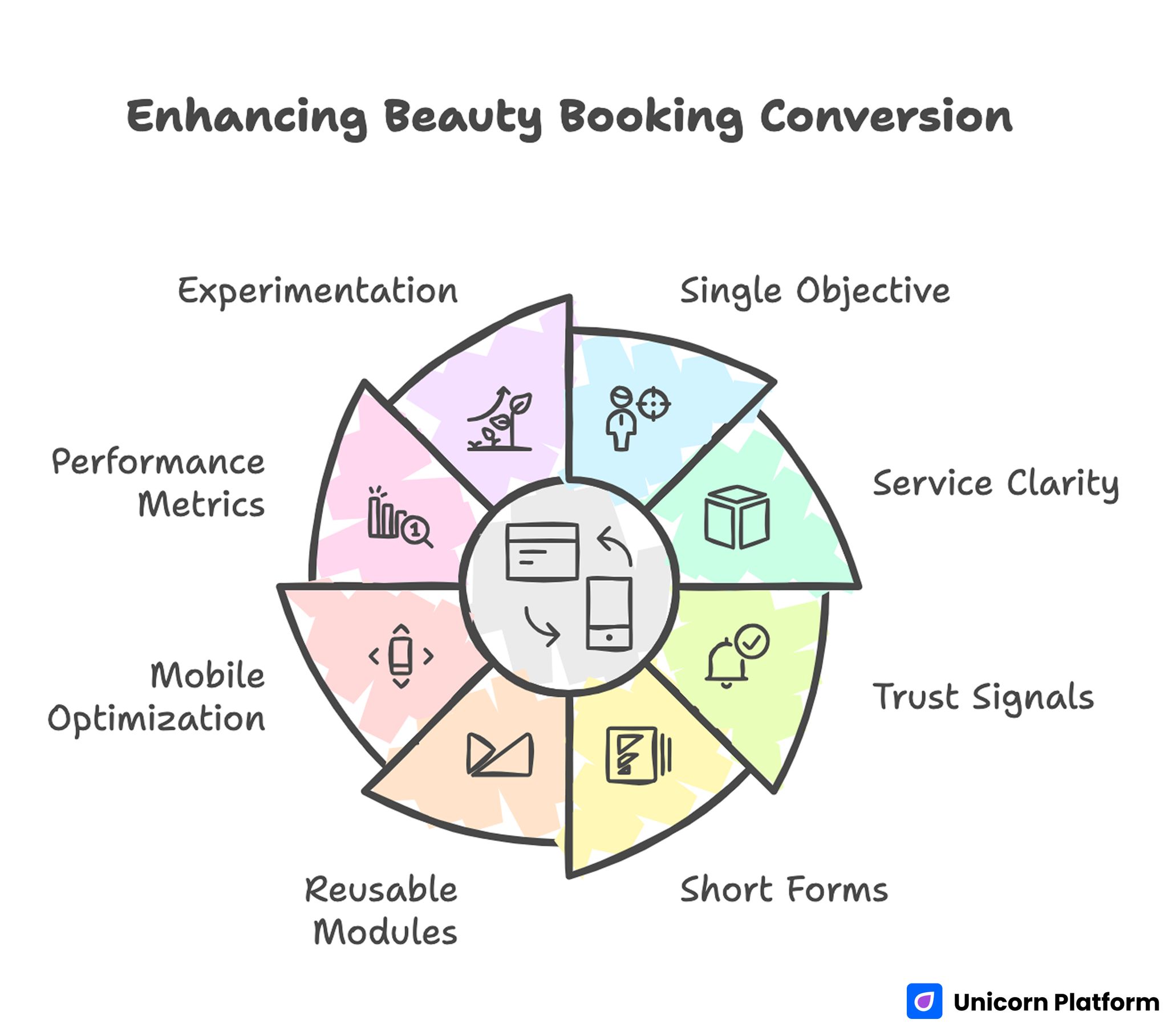
Quick Strategic Takeaways
Enhancing Beauty Booking Conversion
- Build each campaign page around one primary objective and one primary CTA.
- Open with service fit and timing clarity before brand storytelling.
- Place trust signals near booking actions, not only at the bottom.
- Keep first-step forms short and stage deeper qualification later.
- Use reusable modules for fast campaign updates without structural drift.
- Validate mobile readability and form flow before every publish.
- Optimize for completed bookings and show rates, not clicks alone.
- Run one major experiment per cycle and document outcomes.
Why Beauty Landing Experiences Underperform
Underperforming pages usually fail in hierarchy, not aesthetics. They look polished but force users to work too hard for simple answers about service scope, price orientation, and next steps. Research shows that many users have strong intent but quickly abandon pages that don’t provide clarity around booking and process details.
Another issue is mixed intent. A single page tries to drive appointments, product sales, newsletter signups, and social follows with equal weight. When everything is important, nothing feels clear.
A third issue is delayed trust. Users often see mood imagery first and proof later, even though trust is the gatekeeper in high-consideration beauty services.
A stronger rule is simple. Every section should remove one concrete hesitation and move users one step closer to action.
Start With Intent Mapping Before Design
Before selecting visuals or templates, define the page goal in one sentence. Examples include same-week consultation bookings, treatment-specific appointment requests, or concern-led product sales.
Then define audience state. New visitors need reassurance and process context, while returning visitors usually need speed and familiarity.
A practical mapping model includes service fit, expected timeline, and visit or purchase requirements. This model helps users self-select and reduces low-fit submissions.
Intent mapping also improves internal teamwork because marketing, front desk, and service staff can evaluate one aligned conversion path instead of disconnected edits.
Core Architecture for Beauty Conversion Pages

Beauty Conversion Page Modules
A reliable 2026 architecture for beauty campaigns includes seven modules. The sequence stays consistent while content shifts by offer and audience.
- first-screen promise with service qualifier
- concise service or offer snapshot
- trust strip with context-rich proof
- process clarity block explaining what happens next
- objection FAQ based on real client questions
- primary booking or purchase CTA path
- backup contact option for uncertain users
This order mirrors how beauty clients decide. They check fit, then trust, then logistics, and then commitment.
With Unicorn Platform, teams can keep this structure stable and adapt only high-impact variables such as headline angle, social proof context, and local availability cues.
First-Screen Clarity for Fast Decisions
The first screen should answer four questions quickly. What is offered, who it is for, when it is available, and what action to take now.
A strong formula combines offer plus qualifier plus action. Qualifiers should be practical, such as treatment focus, timing window, or location context.
CTA language should match readiness. Exploratory traffic often responds to consultation-led actions, while warm traffic often responds to direct booking prompts.
Consistency across CTA wording matters. If labels change meaning across sections, users slow down because commitment expectations become unclear.
Service Presentation Without Overload
Beauty pages perform best when users can evaluate options quickly. Dense service lists and long descriptive blocks often delay decision-making.
Use concise service cards with one clear benefit and one practical qualifier. Examples include session length, typical outcome window, or required preparation.
For concern-led pages, group offers by user problem rather than internal category names. Clients think in outcomes, not internal service taxonomy.
Teams running product-led beauty funnels can improve concern-to-offer clarity with the structure in this product landing page guide.
Progressive disclosure is useful here. Give users enough information to choose a direction, then offer deeper detail after initial engagement.
Trust Design That Converts in Beauty Categories
Trust in beauty is built through specific proof, not generic praise. Users want to see credible evidence that services are safe, consistent, and appropriate for their concerns.
A high-impact trust stack includes provider credibility, real result context, and clear service expectations. Each element should connect to decisions users are actively making.
Result examples should be relevant, recent, and ethically framed. Overstated promises reduce credibility and increase post-booking dissatisfaction.
Trust modules perform best near commitment points. Reassurance is strongest when it appears right before booking or checkout actions.
For clinics with treatment positioning similar to aesthetic care, the trust and service framing in this med spa strategy reference can help with section design.
Skincare Funnel Model
Skincare conversions improve when each page targets one concern clearly. Broad pages that mix unrelated concerns often create confusion and low-quality inquiries.
Concern-specific pages should align hero, proof, and CTA around one treatment or routine objective. This reduces cognitive load and improves message match from ads.
When teams need to launch quickly, this workflow for building skincare pages fast works best when every section reinforces one narrative from first screen to action.
Routine-stage segmentation can also improve conversion quality. Users evaluating cleanse, treat, and protect stages need different evidence and recommendations.
Haircare and Salon Booking Model
Haircare bookings are often time-sensitive and style-specific. Users compare availability, stylist fit, and expected outcome quickly, especially on mobile.
A strong salon page should show service scope, stylist credibility, and booking flow within the first meaningful scroll. Delaying these details increases abandonment.
For multi-service salons, separating first-time consultation paths from returning-client paths usually improves both completion rate and booking quality.
Teams combining appointment services with retail add-ons can borrow selective merchandising patterns from this fashion landing page playbook while keeping one primary booking objective.
Form Strategy for Booking Quality
Form design should protect both conversion and operational quality. Asking too little creates intake noise, while asking too much suppresses valid bookings.
A staged model usually performs best. Step one captures intent-critical details, and later steps gather deeper preferences if needed.
Field labels should use customer language. Ambiguous internal terms create hesitation and increase support workload.
Error states should explain how to fix issues immediately. Generic error messages are a common cause of mobile abandonment in beauty funnels.
Visual Hierarchy and Conversion Discipline
Beauty is a visual category, but visual density should never hide action paths. Every major image should support a decision, not just atmosphere.
Use image ordering intentionally. Lead with relevance images tied to the current offer, then place aspirational brand imagery after the first action path.
CTA contrast and spacing should remain strong even in image-heavy sections. If action elements blend into creative blocks, booking flow weakens.
Consistency of visual rhythm across campaigns helps returning users navigate quickly. Familiarity is an underused conversion advantage.
Mobile and Performance Readiness
Most beauty discovery journeys begin on phones. If first-screen clarity, tap targets, or form interaction are weak, qualified users leave early.
Release checks should include real-device validation for readability, CTA visibility, field usability, and fallback contact routes. Emulator-only checks miss frequent real-world friction.
Performance should be judged by action readiness. Users should be able to begin booking before non-critical media completes loading.
Teams should hold launches when mobile regressions are found. Small interaction failures can erase campaign profitability in high-competition channels.
Measurement Framework for Beauty Revenue Outcomes
Raw submission volume is not enough to judge page quality. Strong optimization requires stage-based outcomes tied to real business value.
Track engagement behavior, booking completion, show-up rate, repeat intent, and add-on purchase patterns. This model reveals quality differences across channels and offers.
Each experiment should have one primary metric and one diagnostic metric. Clear test scope produces better decisions and less internal debate.
Weekly reporting should capture hypothesis, change, result, and next action. Documentation turns repeated launches into compounding performance gains.
30-Day Execution Plan
Week 1: baseline architecture and tracking
Launch one campaign page using the seven-module structure and confirm stage-level measurement from click to booking completion.
Capture baseline metrics for booking quality, show rate, and pre-visit support questions.
Week 2: first-screen and trust tests
Run one first-screen clarity test and one trust-placement test while holding other major variables stable.
Evaluate outcomes with quality-focused metrics, not top-funnel clicks alone.
Week 3: form and process optimization
Reduce first-step form friction and improve process transparency based on front-desk feedback and behavior data.
Refresh FAQ content using repeated objections from client conversations.
Week 4: mobile QA and variant rollout
Run real-device QA, fix regressions, and deploy one source-specific variant built from winning modules.
Conclude with a keep-change-next memo that sets priorities for the next cycle.
90-Day Scaling Model
Scale only after baseline quality stabilizes. Expanding traffic into unstable funnels increases operational friction and low-fit demand.
Days 1-30 should stabilize structure and measurement. Days 31-60 should expand concern and location variants with controlled hypotheses. Days 61-90 should consolidate winning modules into reusable templates and retire weak variants.
This model keeps launch speed high while preserving consistency across campaign cycles.
Common Mistakes and Practical Fixes
Mistake 1: one page trying to serve too many goals
Fix by assigning one primary objective and routing secondary actions through clearly labeled alternatives.
Mistake 2: visual-first hero with weak offer clarity
Fix by adding service qualifiers and practical timing cues in the first screen.
Mistake 3: trust content too far from booking actions
Fix by placing result context and provider proof near commitment points.
Mistake 4: unclear post-booking expectations
Fix by adding a short process timeline that explains response, preparation, and next steps.
Mistake 5: oversized first-step forms
Fix by collecting essential details first and staging deeper qualification later.
Mistake 6: mobile checks treated as optional
Fix by making mobile interaction and readability checks mandatory before release.
Mistake 7: high-volume tests without attribution discipline
Fix by running one major variable per cycle with explicit hypotheses.
Mistake 8: no operational learning loop
Fix by maintaining weekly decision logs and updating reusable modules from evidence.
Pre-Publish QA Checklist
Before each release, run a short QA routine for clarity, trust, process, and interaction reliability. Keep this checklist in the publishing workflow to prevent drift during fast campaign windows.
Checklist items:
- first-screen offer and qualifier are immediately clear
- primary action aligns with campaign intent
- trust and process cues appear near commitment sections
- first-step form fields are essential and user-friendly
- fallback contact path is visible and tested
- mobile interaction and readability pass on real devices
- performance supports fast first action
- tracking confirms stage-level funnel measurement
Teams that enforce this checklist usually reduce rework and improve booking consistency.
FAQ: Beauty Conversion Pages in 2026
How many goals should one beauty campaign page have?
One primary goal is usually best for clarity and conversion quality. Secondary goals can exist, but they should not compete with the main action path.
What matters more than raw form submissions?
Completed booking quality and show-up progression matter more because they reflect real business outcomes.
Where should trust proof appear?
Trust proof should appear near booking decisions where hesitation is highest, not only in lower-page sections.
Should first-step forms collect full details?
Usually no. Staged intake captures intent first and reduces abandonment while preserving quality.
How often should proof and service details be updated?
Monthly is a practical baseline, with immediate updates when offers, schedules, or staffing context changes.
Do concern-specific variants improve performance?
Yes, when variants are based on clear intent differences and keep the same structural discipline.
What is a sustainable testing cadence for lean teams?
One major variable per week is usually sustainable and provides cleaner attribution than simultaneous multi-variable testing.
How can teams reduce low-fit bookings quickly?
Move fit cues and process expectations higher on the page so users can self-select earlier.
Should educational and booking pages stay separate?
They should be connected. Educational pages should route users to intent-matched booking paths with clear next steps.
What keeps beauty conversion performance improving over time?
Consistent architecture, stage-based measurement, and documented weekly decisions create durable improvement.
Final Takeaway
Beauty conversion performance improves when pages reduce uncertainty at the right moment. Clear offer qualifiers, contextual trust, process transparency, and low-friction action flow are what turn attention into qualified bookings.
Unicorn Platform helps teams maintain this system with reusable structure and fast no-code execution. When creative quality and conversion discipline stay aligned, results improve predictably across campaigns.
