Table of Contents
- 10 Proven Patterns From High-Converting Ecommerce Pages
- 30-Day Optimization Plan
- Common Mistakes to Avoid
- FAQ
Ecommerce landing pages do not fail because products are weak. They fail because the page does not match user intent at the exact moment the click happens. Visitors arrive with one expectation, see a generic page, and leave before they understand why the offer is relevant.
That gap is expensive. It increases acquisition costs, lowers conversion quality, and creates noisy data that makes optimization harder than it needs to be. Many teams respond by changing design themes repeatedly, but design churn rarely solves the root issue.
The winning approach is structural. High-performing ecommerce pages connect message, proof, offer, and action into a flow that feels obvious to the buyer. This guide breaks down that flow in detail, using practical patterns that can be implemented quickly in no-code workflows.
sbb-itb-bf47c9b
Key Takeaways
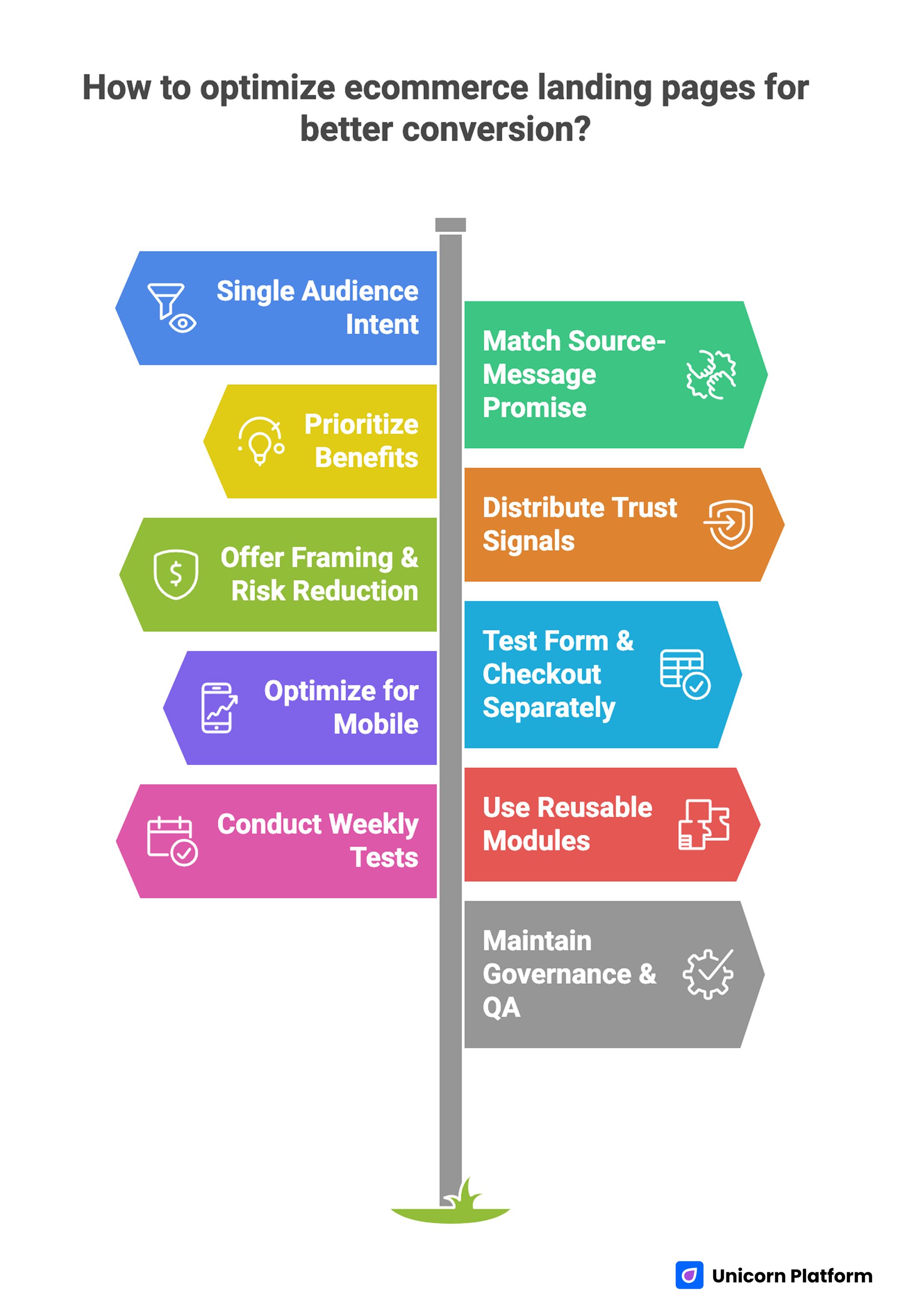
Key Takeaways to Optimize Ecommerce Landing Page for Better Conversion
- Ecommerce landing pages should serve one audience intent per page.
- The first screen must match source-message promise without ambiguity.
- Conversion improves when benefits are clear before feature depth.
- Trust signals should be distributed near decision points.
- Offer framing and risk reduction often move conversion more than visual effects.
- Form and checkout friction should be tested separately, not together.
- Mobile behavior is a primary conversion driver, even for desktop-heavy categories.
- Reusable modules lower cost and improve speed across campaigns.
- Weekly controlled tests beat occasional large redesigns.
- Governance and QA discipline are required for consistent scaling.
Why Ecommerce Landing Pages Need Their Own Strategy
A store homepage and a campaign landing page are not the same product. A homepage supports broad navigation and category exploration, while a landing page supports one focused conversion path for one traffic source or buyer segment.
When campaign traffic lands on broad navigation pages, users face choice overload and message dilution. They may browse, but they often do not convert because the page does not reinforce the exact reason they clicked.
A focused landing page reduces that ambiguity. It frames the offer in source context, validates trust quickly, and guides users to one practical next step. This is why ecommerce brands with similar products can show very different conversion performance. For example, a campaign promoting phone cases will convert differently depending on whether the page emphasizes style, protection level, or device compatibility, even when the product itself is similar.
The Conversion Model Behind Strong Ecommerce Pages
Strong pages usually follow the same decision path even when visual style differs.
First, they confirm relevance in the first screen. Second, they translate product into buyer outcomes. Third, they reduce risk with contextual proof. Fourth, they make action easy and predictable.
Most underperforming pages break this sequence. They either over-explain too early, under-explain core value, or postpone trust until after users have already disengaged.
A repeatable page model is easier to optimize because teams know where each section contributes to conversion.
Most underperforming pages break this sequence. They either over-explain too early, under-explain core value, or postpone trust until after users have already disengaged. Research from Nielsen Norman Group on landing page usability confirms that clarity of value proposition and alignment with user expectations in the first screen significantly impact engagement and task completion rates
10 Proven Patterns From High-Converting Ecommerce Pages
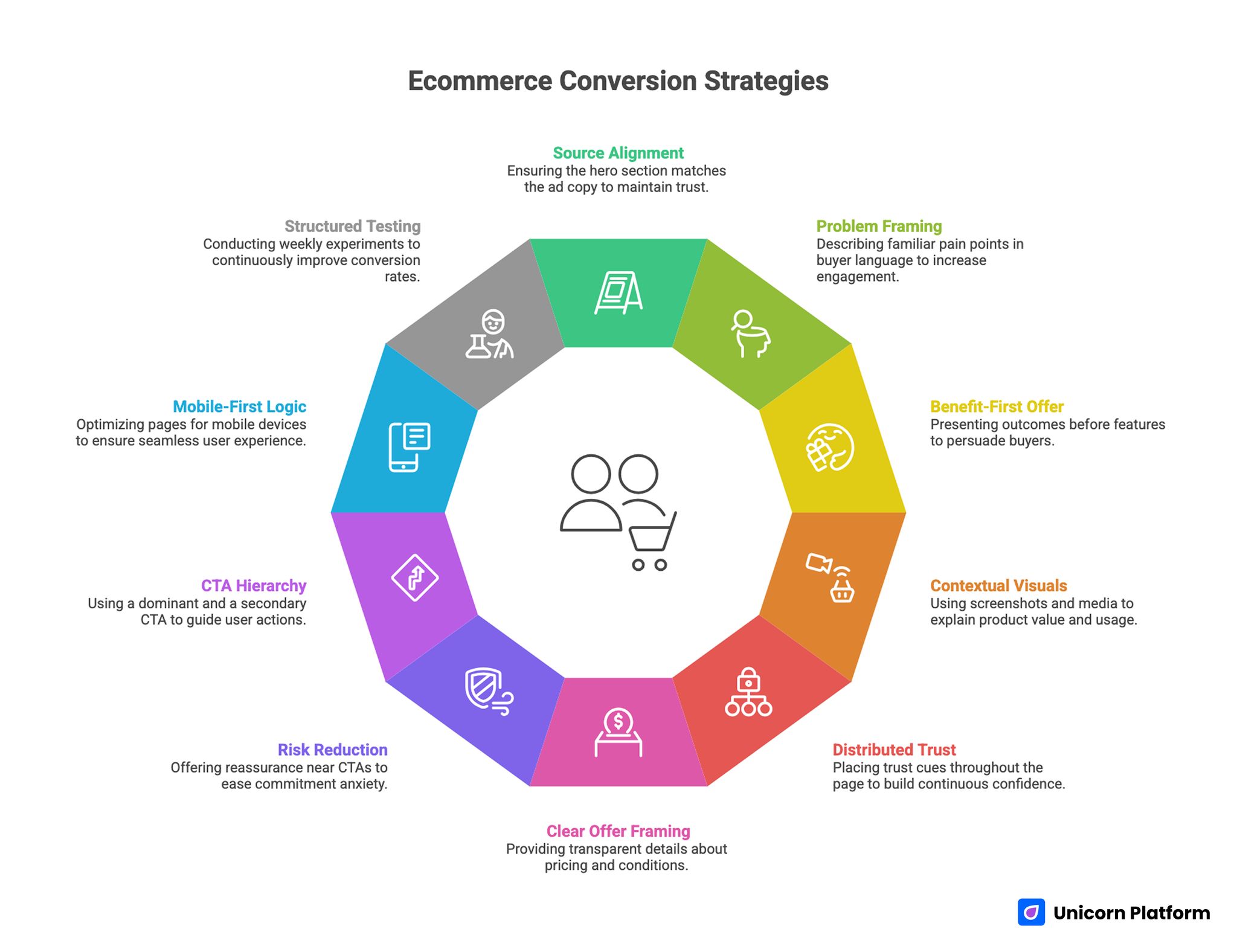
Ecommerce Conversion Strategies
1) Source-aligned hero sections
The hero should mirror the promise that generated the click. If ad copy says "improve checkout conversion in 7 days," the first screen should confirm that outcome clearly.
Misalignment at this stage creates immediate drop-off, even when the product is strong. Source-message continuity is one of the fastest conversion improvements available.
2) Problem framing in buyer language
Buyers respond faster when pages describe familiar friction clearly. Instead of abstract product claims, identify a specific operational pain that users already recognize.
A short, practical problem statement creates momentum for the value narrative and increases engagement with deeper sections.
3) Benefit-first offer explanation
Feature lists can be useful, but they convert best when framed through outcomes first. Buyers need to understand what changes for them before they evaluate how the system works.
A good structure is outcome headline followed by mechanism detail. This keeps copy persuasive without oversimplifying the product.
4) Contextual product visuals
Screenshots and media should explain decisions, not just aesthetics. Effective visuals show what users will do, what changes, and why it matters.
Captions are essential. Without context, visuals can look polished but still leave users uncertain about practical value.
5) Trust distributed across the page
Trust is more effective when placed near decision moments. Reviews, guarantees, policy clarity, and implementation reassurance should appear where objections naturally occur.
One isolated trust section is often missed. Distributed trust cues create continuous confidence.
6) Clear offer framing
Users should understand exactly what is included, how pricing works, and what conditions apply. Hidden or vague offer details create conversion hesitation.
Transparent framing can improve both conversion and downstream satisfaction by setting expectations early.
7) Risk reduction before action
Near CTA sections, include practical reassurance such as return terms, setup support, response speed, or cancellation clarity. These details reduce commitment anxiety.
Risk-reduction language should be simple and concrete, not legalistic or promotional.
8) CTA hierarchy by readiness
High-performing pages usually keep one dominant action and one optional secondary path. A crowded CTA stack forces unnecessary decisions.
Stage-appropriate CTA wording improves conversion fit. Early-stage users may prefer "See how it works," while high-intent users may respond better to direct purchase or demo actions.
9) Mobile-first interaction logic
Mobile visitors evaluate quickly and abandon quickly when friction appears. Section order, tap target comfort, and load speed are all conversion-critical.
Mobile optimization should be validated on real devices and varied network conditions, not only in desktop preview modes.
10) Structured testing cadence
Strong teams do not rely on one launch. They run controlled weekly experiments that isolate one key variable at a time.
Focused testing creates cleaner learning and prevents redesign loops driven by opinion rather than evidence.
Cross-Vertical Lessons That Improve Ecommerce Pages
Patterns from adjacent industries can improve ecommerce execution when adapted carefully.
CRM landing frameworks often excel at explaining value progression and implementation confidence. Ecommerce teams can apply this by clarifying onboarding flow and practical outcomes instead of only emphasizing product highlights.
Restaurant landing pages tend to handle trust and immediacy well, especially in action sections. Ecommerce teams can adapt this by presenting clear fulfillment expectations and reducing ambiguity around what happens after conversion.
Fitness pages often perform well in motivation and transformation framing. A similar approach can work in ecommerce when claims are grounded in realistic customer outcomes and supported with credible proof.
Cross-industry inspiration is useful when teams borrow logic, not language. The goal is to adapt conversion mechanics while keeping message authenticity aligned to your offer.
Cost-Efficient Execution for Lean Teams
Landing page cost grows fastest when teams rebuild from scratch each campaign. Cost control improves when modules are reused and tests are documented.
A practical cost model includes four buckets: build, validation, optimization, and maintenance. Build covers strategy and implementation. Validation covers proof quality and launch QA. Optimization covers planned experiments. Maintenance covers periodic updates as offers and traffic mix evolve.
This model helps leadership understand that landing pages are performance assets, not one-time design outputs. It also makes prioritization easier because teams can decide which activities drive the biggest quality gains per effort hour.
Reusable module libraries reduce both cost and inconsistency. When hero, proof, offer, and FAQ blocks are standardized, teams can launch new pages faster while preserving conversion structure.
Form Strategy and Lead Quality in Ecommerce
For many ecommerce offers, conversion quality depends on how the form or checkout handoff is designed. High form completion with poor lead fit can still reduce business value.
A staged approach usually works better. Initial forms should capture intent and essential context with minimal friction. Additional qualification details can be collected in follow-up or secondary steps.
Field clarity matters. Ambiguous labels and unnecessary required fields increase abandonment even among high-intent users. Simple language and clear expectations near submit actions improve confidence.
Where direct checkout is the goal, keep the path short and predictable. Extra steps should only be added when they clearly improve trust or reduce post-purchase issues.
Field clarity matters. Ambiguous labels and unnecessary required fields increase abandonment even among high-intent users. Large-scale usability research from the Baymard Institute shows that checkout complexity and poorly structured form fields remain one of the primary drivers of cart abandonment in ecommerce.
SEO Layer for Ecommerce Landing Programs
Landing pages can support organic acquisition when intent mapping is intentional.
Each page should target one primary query intent and include related subtopics that answer practical buyer questions. This approach supports both discoverability and conversion readiness.
Internal links should guide progression logically. For structural planning and section sequencing depth, a step-by-step guide to a high-converting landing page structure is a useful companion when planning ecommerce variants.
SEO language should stay natural. Over-forcing exact phrasing tends to hurt readability and trust, especially in long-form landing pages where users are already evaluating credibility.
Mobile and Performance Standards
Mobile performance is not optional in ecommerce conversion. Even desktop buyers often discover offers from mobile channels first.
The first mobile screen should communicate value clearly and display a clear action path. If users need multiple scrolls to understand relevance, acquisition efficiency declines.
Performance improvements often come from straightforward actions: compressed media, stable layout behavior, and reduced script bloat. These changes usually create better perceived trust before users even process deeper content.
Teams should maintain a device checklist for launch readiness. Real-device testing is necessary because emulated environments miss many practical interaction issues.
Measurement Framework: From Click to Revenue Quality
High-performing teams measure beyond top-line conversion rate. They track where users lose confidence and whether conversions produce quality outcomes.
A practical three-layer measurement model helps:
- engagement metrics (hero interaction, scroll progression, section-level behavior)
- conversion metrics (CTA clicks, form completion, checkout starts)
- quality metrics (AOV, refund behavior, repeat purchase, qualified lead rate)
Source-level analysis is critical. Aggregate performance can hide major channel differences and lead to incorrect optimization decisions.
For behavior-led optimization prioritization, user behavior tips to optimize landing pages provides a practical framework for connecting interaction signals to content changes.
30-Day Optimization Plan
Week 1: Establish clean baselines by source and segment. Confirm tracking integrity and identify the most significant friction point in the conversion path.
Week two should test message clarity variables such as headline framing and CTA wording. Keep tests isolated so results remain interpretable.
Week 3: Focus on trust and offer structure. Test proof placement and risk-reduction language near action points.
Week 4: Address interaction friction, including form simplification and section sequencing based on observed drop-off behavior.
A short experiment log should be maintained each week with hypothesis, change, metric, and result. This documentation accelerates future launches and prevents repeated mistakes.
60-Day and 90-Day Scaling
By day sixty, teams should have validated modules and messaging patterns. Scaling should preserve these winners while adapting them to adjacent segments.
Days 31-60 priorities:
- launch one segment-specific variant
- compare source-level conversion and quality metrics
- standardize high-performing modules
Days 61-90 priorities:
- expand into additional segment variants
- improve handoff continuity from page to follow-up flow
- optimize for qualified outcomes, not only conversion volume
Controlled scaling is generally more stable than broad expansion because learning remains high quality and implementation risk stays lower.
Ecommerce Landing Page Economics: Where ROI Actually Comes From
Many teams evaluate landing page economics using only a top-line conversion rate. That metric is useful, but on its own it hides the most important question: are the conversions creating healthy downstream business outcomes. A page that raises raw conversion while reducing average order value or increasing refund rates can still hurt overall performance.
A stronger model is to review four linked economics layers. Acquisition economics covers cost per visit and source mix quality. Conversion economics covers progression from first-screen engagement to completed action. Revenue economics covers average order value and upsell behavior. Retention economics covers repeat purchase and post-purchase satisfaction signals.
Looking at all four layers changes decision quality. For example, a page variant with slightly lower conversion rate can be more profitable if it attracts higher-intent buyers who convert into better order quality. This is often visible in ecommerce categories such as t-shirts, where higher-intent visitors may purchase bundles or premium variants instead of single low-margin items. Without multi-layer analysis, teams often optimize for the wrong outcome and then wonder why revenue impact remains weak.
Practical ROI planning starts with a baseline table that includes:
- source-level traffic volume
- source-level conversion rate
- average order value by source
- refund or cancellation trend
- contribution margin by campaign segment
This table should be updated weekly during active tests. The goal is to catch early signs that page changes are improving headline metrics while hurting economics in the background.
Budget allocation decisions also improve when page economics are explicit. If one channel sends lower volume but stronger quality and margin, it may deserve more spend even when CTR appears lower than another source. Good landing pages help this analysis by providing clean source-to-outcome data.
Cost control in landing programs depends on execution discipline as much as on ad spend. Teams waste budget when they launch broad redesigns without hypotheses, run overlapping experiments, or fail to document what changed. This produces noisy results and repeated mistakes.
A cost-efficient operating model limits each experiment cycle to one main variable and one primary success metric. Keeping experiments narrow allows faster interpretation and prevents overreaction to temporary fluctuations.
Another important ROI lever is module reuse. When a proof block, CTA frame, or offer section consistently performs well, it should be standardized and reused across similar campaigns. Reuse lowers production cost and reduces quality variance across pages.
Teams that scale landing programs successfully usually maintain a small internal library of validated modules. Each module should include use-case guidance, expected performance context, and known limitations. This makes future launches faster and reduces dependence on individual memory.
Economics reviews should include cross-functional stakeholders, not just marketing. Sales and support teams often detect early quality signals that analytics dashboards cannot explain alone. For example, a rise in low-fit inquiries may indicate message mismatch even if form conversion appears stable.
Monthly economics reviews are a practical cadence for most teams. Weekly reviews can focus on active experiments and friction signals, while monthly reviews can evaluate broader profitability trends and budget allocation changes.
A useful monthly review agenda can include:
- top three sources by qualified revenue contribution
- segment-specific conversion and retention changes
- module-level winners and underperformers
- required updates to offer framing or trust messaging
- next-month test priorities by expected business impact
When these reviews are consistent, landing page optimization becomes a predictable growth practice instead of a reactive design task. Teams gain clearer confidence in where to invest effort, and leadership gets a more accurate view of which page changes are truly moving business outcomes. This rhythm also improves execution morale because decisions feel grounded in evidence, not in subjective preference cycles that reset direction every few weeks.
Governance and QA for Consistency
No-code speed can create inconsistency if governance is weak. A lightweight model with explicit ownership usually solves this.
Assign one owner for message quality, one for analytics reliability, and one for launch QA. In smaller teams, roles can overlap, but responsibilities should remain clear.
Weekly reviews should answer fixed questions:
- Which channels changed most this week?
- Where did conversion friction increase?
- Which one change is highest priority?
- Which metric confirms success?
Pre-launch QA should cover message clarity, CTA function, form path, mobile behavior, tracking events, and follow-up automation status.
Common Mistakes to Avoid
1. One generic page for all traffic
Segment differences are ignored, so relevance drops and conversions weaken.
2. Feature-heavy copy with weak outcomes
Users cannot quickly connect capability to practical value.
3. Trust isolated in one section
Evidence is disconnected from claims and decision moments.
4. Overloaded CTA structure
Competing actions create hesitation and lower completion.
5. Mobile treated as secondary
Early mobile friction reduces top-funnel efficiency.
6. No source-level diagnostics
Channel-specific issues remain hidden inside aggregate metrics.
7. Launch-and-forget behavior
Performance stalls because no structured testing loop exists.
FAQ: Ecommerce Landing Pages
How is an ecommerce landing page different from a product page?
A landing page is campaign-focused and built for one conversion path, while a product page is broader and often supports deeper exploration.
How long should an ecommerce landing page be?
Length should match decision complexity. Scannable long-form pages often perform well when section roles remain clear.
Should every campaign have its own landing page?
When audience intent or offer framing differs significantly, dedicated variants usually improve conversion quality.
What should be tested first after launch?
Start with first-screen message fit and CTA clarity, then move to trust placement and form friction.
How many testimonials should be included?
A smaller set of contextual, role-relevant proof usually outperforms high-volume generic quotes.
Should pricing always be visible?
Visibility depends on offer model. If transparency improves qualification, include it. If scope varies, explain the path clearly.
Which metrics matter most in month one?
Track engagement progression, conversion behavior, and quality outcomes by source.
Can no-code tools handle serious ecommerce programs?
Yes, when paired with clear strategy, governance, and disciplined optimization.
How often should pages be updated?
Weekly focused tests and monthly structural reviews are a practical baseline.
What creates compounding performance over time?
Reusable modules, documented experiments, and consistent QA discipline.
Final Takeaway
Ecommerce landing page performance is a system outcome, not a design accident. Clear intent alignment, outcome-focused messaging, distributed trust, and disciplined optimization drive reliable growth.
With Unicorn Platform, teams can execute this system quickly and iteratively. Build fast, validate rigorously, and improve each cycle to convert more traffic into higher-quality revenue outcomes.