Table of Contents
Travel websites are judged in seconds. A visitor lands, scans one screen, and decides whether to keep exploring or return to search results. That first decision is rarely about beauty alone. It is about relevance, confidence, and clarity.
Many travel brands invest in premium visuals and still struggle with booking quality. The page looks impressive, but users cannot quickly understand route fit, policy expectations, or what to do next. Without those answers, inspiration does not become action.
High-performing travel websites are built as decision systems. They combine emotional storytelling with practical planning information in the right order. They remove uncertainty before asking for commitment.
This guide shows how to build that system in 2026 with Unicorn Platform. It focuses on operational design choices that improve booking outcomes, not only aesthetic direction.
sbb-itb-bf47c9b
Quick Strategic Takeaways
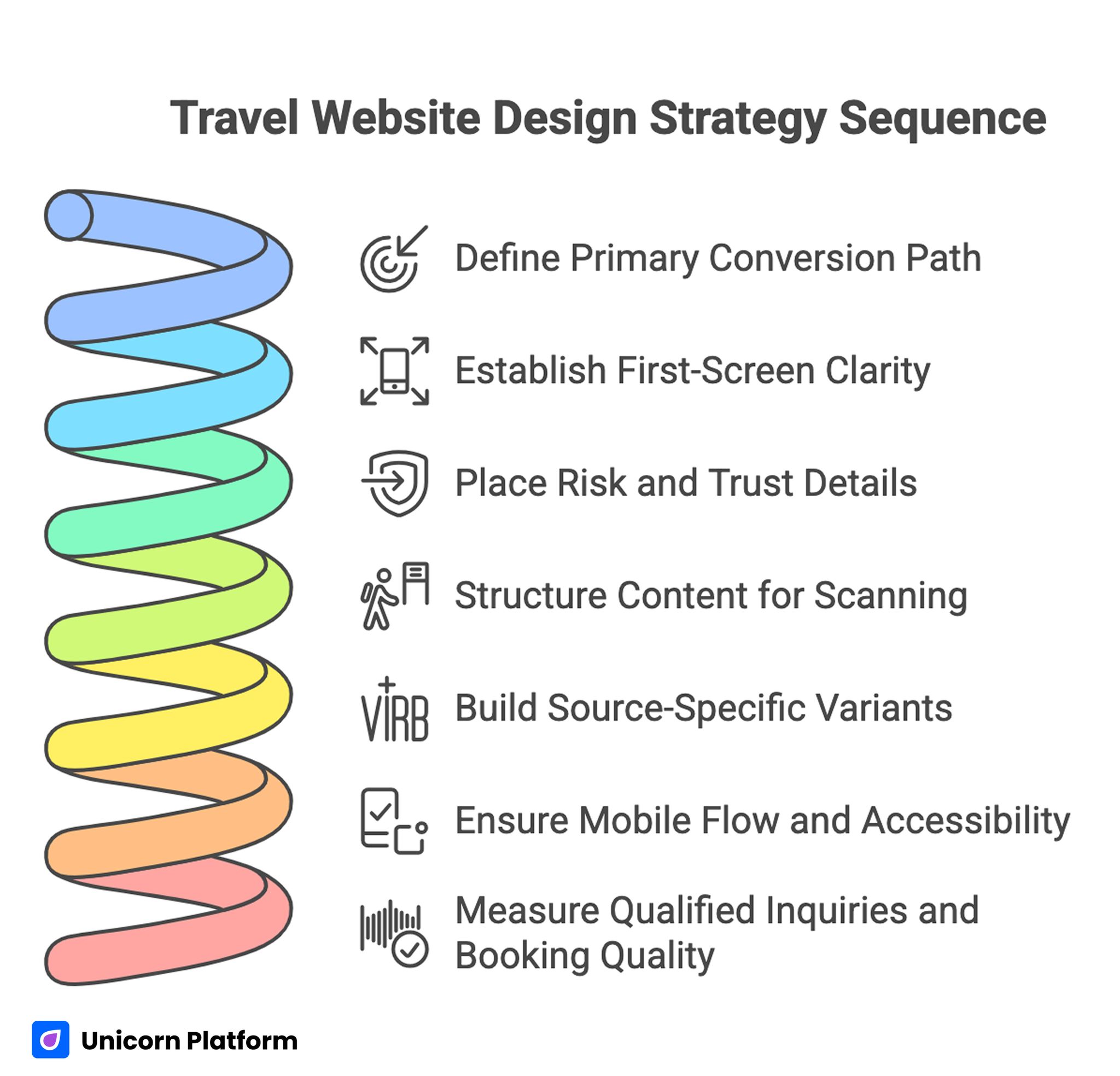
Travel Website Design Strategy Sequence
- Define one primary conversion path per page and optimize everything around it.
- Use first-screen clarity to establish destination fit and next action immediately.
- Place risk and trust details near commitment points, not at the bottom.
- Structure itinerary, pricing orientation, and policy content for scanning speed.
- Build source-specific page variants as channel intent diverges.
- Treat mobile flow and accessibility as mandatory release checks.
- Measure qualified inquiries and booking quality, not just page traffic.
Why Many Travel Sites Look Good but Sell Poorly
Most underperforming travel pages do not fail because of weak design tools. They fail because business priorities are not translated into page structure.
The common pattern is familiar. Teams focus on hero media, animations, and style consistency, but practical traveler questions are delayed. Budget orientation appears too late. Inclusion details are vague. Trust proof is generic. CTA language is unclear.
When these fundamentals are weak, users hesitate and comparison behavior rises. A page can be visually strong while conversion confidence remains low.
A better approach starts with a simple operating rule: each section must reduce one specific hesitation and guide users to the next decision step. This keeps creative work aligned with measurable traveler decisions.
Start With Page Intent Before You Touch Layout
Before selecting components, define what the page should accomplish. A travel page trying to educate every audience and close every offer usually becomes confusing.
Choose one primary objective such as quote request, consultation booking, fixed-date reservation, or itinerary download. Then map content depth and CTA language to that objective.
Audience stage must also be explicit. Cold users need orientation and trust. Warm users need speed, specifics, and low-friction action. Mixing both journeys equally in one narrative reduces performance for both groups.
Intent definition protects teams from subjective edits and gives analytics a clear success model. It also makes weekly review conversations faster because decision criteria are explicit.
Decision-First Architecture for Travel Pages
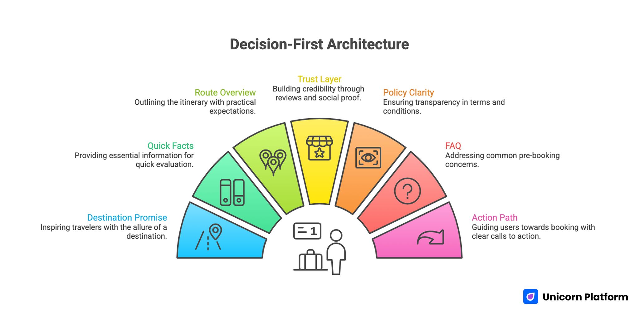
Decision-First Architecture for Travel Pages
Use a repeatable sequence that mirrors traveler evaluation behavior. Consistent architecture allows faster testing and cleaner attribution.
A strong sequence for most route pages is listed below. Teams can adjust depth by route complexity while preserving this order.
- destination promise and traveler-fit cue
- quick facts panel (duration, style, budget orientation)
- route or itinerary overview with practical expectations
- trust layer (reviews, ratings, guide credibility, social proof)
- policy and risk clarity (inclusions, exclusions, cancellation)
- FAQ based on real pre-booking objections
- one primary action path plus one secondary fallback
This sequence combines inspiration and practicality without overwhelming users. It is also easier to maintain across seasonal updates and campaign changes.
For teams refining the editorial side of this flow, this no-code travel blog design guide helps align top-of-funnel storytelling with conversion pathways.
First-Screen Design for Immediate Relevance
The first screen should answer three questions quickly: where this offer fits, who it fits best, and what the user can do now. If any of these are unclear, drop-off risk increases.
A strong travel hero block usually includes one specific route or experience promise, one concise planning cue, and one visible action. Generic inspirational language can support tone, but it should not replace practical orientation.
Clarity gains at the top of the page often improve every downstream metric because users continue with stronger intent. Better first impressions usually reduce low-fit inquiries later in the funnel.
Quick Facts Blocks That Reduce Friction
Travel decisions are detail-sensitive. Users want to know timing, effort level, and budget range before they commit to deeper exploration.
A compact quick-facts block near the top section usually improves confidence. It should highlight route duration, group type, activity intensity, and inclusion basics in scannable format.
This block is especially useful for mobile users who need fast clarity before long-scroll sections. It also reduces low-fit inquiries by enabling earlier self-qualification.
Itinerary Structure That Supports Decision Speed
A long narrative itinerary may be informative, but it can hide key decisions. Travelers need route clarity in a format they can scan quickly.
Organize itinerary content by day clusters or phase blocks with short summaries. Include practical elements such as transfer patterns, activity windows, and flexibility notes.
Add one short section on who this route serves best and where it may not fit. Honest fit guidance builds trust and improves lead quality.
Trust and Risk Clarity Near Action Points
Trust content should be contextual, not decorative. According to the Expedia Group Traveler Value Index, travelers prioritize trust signals such as transparent policies, clear inclusions, and reliable reviews when deciding where to book travel experiences. Reviews and ratings matter most when users are close to price or inquiry decisions.
A strong trust stack combines social proof, operational proof, and policy proof. Social proof can include verified ratings and traveler feedback. Operational proof can include guide credentials and support responsiveness. Policy proof should explain cancellations and rescheduling in plain language.
When risk clarity is delayed, cautious but qualified users abandon before converting. Place policy summaries close to primary CTAs to reduce that drop-off.
Teams improving this layer often benefit from reviewing conversion-focused patterns used by tour operator web design specialists for trust placement and booking-path reliability.
Pricing Orientation Without Overload
Travel pages do not always need exhaustive pricing tables, but users need enough context to self-qualify. Complete opacity usually increases low-intent inquiries.
A good orientation block includes starting range, inclusion scope, and optional extras. It should also clarify what happens after inquiry, including timing and confirmation steps.
This level of transparency improves efficiency for both users and sales teams. Better-qualified leads usually convert with fewer clarification cycles.
CTA Design and Language Consistency
A travel page can include repeated action points, but it should keep one primary action intent. Competing CTA types can fragment decision flow.
Use action language that reflects stage and commitment level. “Check Available Dates” and “Request a Tailored Quote” communicate clearer intent than vague labels like “Learn More.”
Keep wording consistent across major placements. Inconsistent CTA language can feel like different commitments and increase hesitation.
Form Flow for Better Inquiry Quality
Inquiry forms should capture routing essentials without creating early friction. Overly detailed first-step forms reduce completion and do not necessarily improve quality.
Use staged qualification. Collect core trip intent and timeline first, then gather deeper details in follow-up communication or step two forms.
This approach balances completion rate with operational usefulness. It also supports cleaner form testing because each field has a defined purpose.
Channel-Specific Variants for Multi-Source Traffic
Once traffic sources diversify, one universal page often becomes inefficient. Social clicks, search clicks, and referral clicks arrive with different context and urgency.
A practical solution is source-aware variants built from one stable architecture. Keep the design system consistent, then adjust narrative emphasis and trust detail by source intent.
Document each variant hypothesis before launch. Clear hypotheses reduce random edits and improve decision confidence during weekly reviews.
Content-to-Booking System for Organic Performance
Travel content should not be isolated from commercial pages. Guides, comparisons, and route pages should form one intentional user journey.
Use a three-layer content model and assign each page to one clear intent stage. This prevents overlapping content that competes for the same user decision.
- discovery pages for broad destination and planning questions
- comparison pages for route and package evaluation
- conversion pages for booking and quote actions
Links between layers should be contextual and useful at the moment they appear. This improves topical authority while helping users progress naturally toward action.
Mobile-First Execution Standards
Mobile is often the entry channel for travel discovery. Research from Think with Google shows that mobile devices play a central role in travel discovery and planning, making mobile usability and fast-loading travel pages critical for conversion performance. If readability, tap flow, or form usability is weak, qualified users are lost before deeper evaluation begins.
Set mobile checks as release criteria for every update. Validate first-screen clarity, quick-facts visibility, tap spacing, media performance, and form completion behavior on real devices.
Mobile quality is not a design preference. It is a direct revenue protection measure.
Accessibility as Conversion Infrastructure
Accessibility improvements often produce broader UX gains. Clear focus states, keyboard navigation flow, and readable error messages reduce friction across user groups.
Travel pages with strong accessibility fundamentals are easier to use under real-world conditions, including small screens, variable connection quality, and rapid scanning behavior. These fundamentals also reduce support issues caused by incomplete form submissions.
Include accessibility verification in weekly QA, not only in occasional audits. Regular checks catch regressions before they affect campaign efficiency.
Analytics Framework for Travel Teams
Page optimization needs reliable measurement or teams will optimize for vanity metrics. Traffic and clicks can rise while qualified booking outcomes remain flat.
Track a balanced set of metrics and review trends week over week. Single-day spikes can be misleading in seasonal categories like travel.
- landing-to-inquiry rate by destination
- qualified inquiry rate by source
- booking-start rate by device
- form abandonment by field position
- quote-to-booking conversion trend
Combine these with section-level event tracking for key blocks such as quick facts, trust panels, and CTA interactions. Section data helps teams identify whether content, trust, or action flow is limiting performance.
Weekly Optimization Loop That Compounds
A simple weekly operating loop is usually enough for lean travel teams. Keep one major test variable per cycle to preserve attribution clarity.
A practical loop for lean teams is shown below. The goal is consistent learning, not complex process overhead.
- Monday: review performance and choose one hypothesis
- Tuesday: ship one controlled page change
- Wednesday-Thursday: monitor behavior and quality signals
- Friday: keep, refine, or revert and document rationale
This rhythm keeps momentum high while avoiding experimentation noise. It also ensures that each change has a clear owner and decision deadline.
30-Day Action Plan
Week 1: baseline structure and intent alignment
Audit top route pages using one checklist. Standardize first-screen orientation, quick-facts placement, and primary CTA language.
Week 2: trust and policy optimization
Move trust proof closer to action points and simplify policy summaries near commitment sections. Confirm inclusion/exclusion clarity on top pages.
Week 3: content and routing improvements
Connect destination guides to matching route pages and comparison pages. Improve contextual links where users typically hesitate.
Week 4: controlled tests and governance
Run one headline test and one CTA test on separate page sets. Review qualified inquiry quality by source and document decisions in shared playbook.
This plan is realistic for small teams and establishes a foundation for scale. It balances speed with quality control in high-change environments.
90-Day Scale Readiness Model
Before expanding budgets, evaluate whether conversion quality is stable across major channels. Scaling unstable pages often amplifies existing weaknesses.
Run a readiness review across these areas before increasing spend. The checklist prevents scaling decisions based only on top-funnel growth.
- message-source fit and first-screen clarity
- trust content freshness and relevance
- inclusion/policy transparency
- mobile form reliability
- qualified inquiry consistency by source
Delay budget expansion when multiple categories are unstable. Foundation fixes usually produce better ROI than immediate spend increases.
Ownership Model for Sustainable Quality
Travel page quality declines when ownership is unclear. A lightweight role model keeps updates fast and accountable.
Assign at least four responsibilities and keep those owners visible in the workflow doc. Visibility reduces delays during high-volume campaign periods.
- narrative owner for messaging and hierarchy
- accuracy owner for pricing, itinerary, and policy details
- proof owner for review and social proof relevance
- release QA owner for mobile/accessibility checks and final publish gates
Clear role boundaries reduce rework and keep booking pages aligned with operational reality. They also reduce cross-team confusion when urgent content updates are required.
Seasonal Optimization Strategy
Travel demand changes by season, and page messaging should adapt accordingly. Static pages can lose relevance even if structure is strong.
Maintain one evergreen base architecture and layer in seasonal modules such as departure windows, weather expectations, and limited availability cues. This approach preserves consistency while keeping pages contextually relevant.
Update seasonal blocks on a monthly cycle and confirm that urgency claims are supported by real data. Unsupported urgency often damages trust.
Migration and Upgrade Playbook
As teams mature, workflow complexity increases. Moving from ad-hoc pages to structured systems requires controlled migration.
Use phased migration to protect performance and preserve tracking continuity. Phasing makes troubleshooting easier when results shift.
- audit baseline page performance and event taxonomy
- recreate one high-impact template with parity checks
- validate tracking before traffic transfer
- shift traffic incrementally by source
- deprecate weak legacy pages after stability confirmation
This method protects attribution confidence and reduces launch risk during transitions. It also helps teams avoid changing messaging and analytics simultaneously.
Destination Comparison Pages That Shorten Decision Cycles
Travel buyers often compare multiple options before taking action. If comparison support is missing, users leave your site to evaluate competitors and may not return.
A dedicated comparison-page pattern helps retain these evaluators. It also improves qualified inquiry quality because users reach action pages with clearer expectations.
A practical comparison layout includes:
- traveler profile fit by route
- duration and pace differences
- inclusion and exclusion contrasts
- seasonality and weather implications
- pricing orientation ranges
- policy and flexibility distinctions
Comparison pages should stay neutral and useful. Overly promotional copy can reduce trust because users are looking for decision clarity, not pressure.
In Unicorn Platform, these pages can share reusable modules with route pages while changing only comparison logic and CTA paths. This keeps operations efficient and brand consistency stable.
When comparison content is connected to relevant route pages, bounce often decreases and time-to-decision shortens. Teams gain stronger inquiry quality without increasing form friction.
Governance and Documentation for Long-Term Travel Programs
Travel websites evolve continuously as routes, policies, and seasonal offers change. Without documentation discipline, teams repeat experiments and reintroduce old errors.
A simple governance layer prevents that drift. Keep one shared changelog with hypothesis, section changed, expected impact, actual result, and next decision.
This log should be reviewed weekly with owners from messaging, policy accuracy, proof freshness, and QA. Shared review improves consistency and accelerates onboarding for new contributors.
Documentation also protects continuity during team transitions. When ownership changes, historical context remains available and high-performing patterns are easier to preserve.
Over time, this governance model turns scattered edits into compounding operational knowledge. That is the difference between short-term redesign activity and a durable booking optimization program.
Common Mistakes and Fast Fixes
Mistake 1: inspiration-only redesigns
Fix by converting visual references into measurable section standards tied to booking outcomes. Teams should define expected metric impact before publishing the revised section.
Mistake 2: vague route messaging
Fix by naming traveler profile, trip style, and planning context in first-screen copy. This change usually improves fit recognition and lowers early bounce.
Mistake 3: trust content buried too deep
Fix by placing reviews and policy clarity near pricing and inquiry actions. Trust details should appear where hesitation is strongest, not only in summary sections.
Mistake 4: heavy first-step forms
Fix by reducing initial form scope and collecting deeper detail in follow-up stages. This preserves completion rate while keeping qualification quality manageable.
Mistake 5: one page for every source
Fix by deploying source-aware variants with shared architecture and explicit hypotheses. Consistent structure makes performance differences easier to diagnose.
Mistake 6: mobile checks postponed
Fix by making mobile readability and form behavior hard release requirements. Mobile checks should be completed before any major budget allocation.
Mistake 7: scaling without quality checks
Fix by gating budget expansion behind stable qualified inquiry metrics. Stable quality signals are a better scale trigger than raw traffic growth.
FAQ: Travel Website Design
How much detail should a travel landing page include?
Include enough to resolve major decision risk for the target traveler. Keep detail structured and scannable rather than dense.
What should we optimize first?
Start with first-screen clarity and primary CTA language. These usually produce the fastest measurable gains.
Should travel pages include pricing information?
They should include pricing orientation and inclusion context even when full quoting is customized. Minimal transparency usually improves trust and self-qualification.
How often should trust content be refreshed?
At least monthly, and sooner when route, policy, or service details change. Fresh trust content keeps conversion confidence high during peak seasons.
Is mobile still critical if bookings finish on desktop?
Yes. Mobile is often the first evaluation channel and influences later desktop conversion.
How many variants should we run early?
One baseline plus one source-specific variant is usually enough to start. Additional variants should be added only after attribution quality is stable.
Which metric matters most after inquiry volume?
Qualified inquiry rate by source provides the clearest quality signal. It shows whether traffic growth is improving booking potential or just increasing noise.
How many tests should a small team run each week?
One major variable per week is a practical and reliable cadence. This schedule balances learning speed with operational control.
How can we reduce low-fit inquiries?
Improve self-qualification with clearer audience cues, inclusion detail, and trust placement. Better self-qualification usually lowers support friction and improves sales efficiency.
What keeps travel website performance improving long-term?
Stable architecture, explicit ownership, disciplined testing, and documented weekly decisions. Consistency across these areas is what drives long-term booking performance.
Final Takeaway
High-performing travel websites are built on structured decisions, not random inspiration. The most effective teams combine emotional destination storytelling with practical clarity, trust architecture, and low-friction actions.
With Unicorn Platform, teams can execute this system quickly through reusable sections and controlled iteration. That combination turns travel pages into reliable booking assets rather than static inspiration galleries.
For teams that need deeper route-detail frameworks in premium categories, this practical safari lodge design guide is a useful extension.
Related Blog Posts
- Travel Website Design: Creating an Experience That Inspires Wanderlust
- Travel Agency Website Examples Only Work When You Turn Inspiration Into a Booking System
- How Tour Operators Should Choose Web Design Partners and Build Sites That Convert
- Travel Agency Website Strategy That Turns Visits Into Qualified Bookings