Table of Contents
- Core Fundraising Page Template Blueprint
- 30-Day Optimization Plan for Active Campaigns
- Common Mistakes to Avoid
- FAQ
Fundraising landing pages have one job: help a motivated visitor become a confident donor. Many pages fail because they focus on design decoration or long storytelling without making the donation decision easy, clear, and trustworthy.
Donor behavior is sensitive to credibility and friction. If a visitor cannot quickly understand impact, trust where funds go, and complete the donation without confusion, intent drops fast. Even small friction points can reduce results when campaigns are time-bound.
A high-performing fundraising page is not built around one emotional headline. It is built around a full conversion system: mission clarity, proof, urgency, risk reduction, and a smooth action path. This guide explains how to create that system with a reusable template you can adapt across campaigns.
sbb-itb-bf47c9b
Key Takeaways
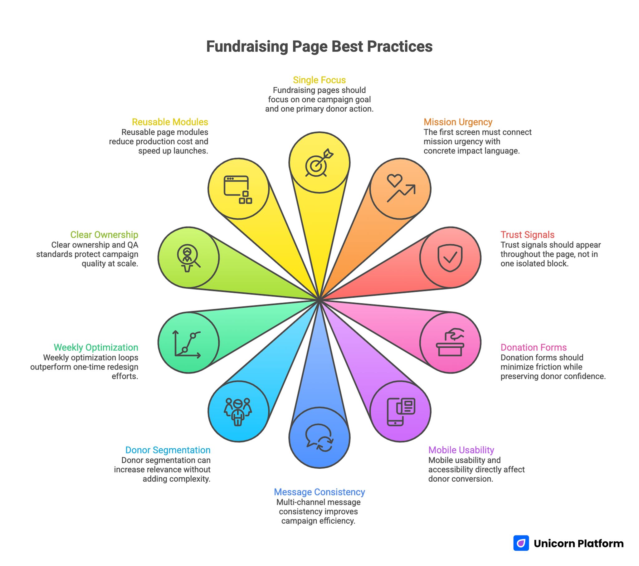
Fundraising Page Best Practices
- Fundraising pages should focus on one campaign goal and one primary donor action.
- The first screen must connect mission urgency with concrete impact language.
- Trust signals should appear throughout the page, not in one isolated block.
- Donation forms should minimize friction while preserving donor confidence.
- Mobile usability and accessibility directly affect donor conversion.
- Multi-channel message consistency improves campaign efficiency.
- Donor segmentation can increase relevance without adding complexity.
- Weekly optimization loops outperform one-time redesign efforts.
- Clear ownership and QA standards protect campaign quality at scale.
- Reusable page modules reduce production cost and speed up launches.
Why Fundraising Landing Pages Need a Dedicated Structure
A nonprofit homepage and a fundraising campaign page serve different purposes. A homepage supports broad exploration, while a fundraising page should guide one focused decision with minimal distraction.
Donors often arrive from email, social posts, communities, or referrals with a specific expectation. If the landing page does not match that expectation immediately, trust weakens before the visitor reads the full story.
Fundraising pages therefore need tighter structure than generic marketing pages. They must communicate mission relevance, prove credibility, and enable action in a sequence that feels natural to both first-time and returning donors.
Strategic Setup Before Page Build
Strong campaigns start with strategic clarity, not with design blocks. Before building the page, define audience, goal, and conversion path in concrete terms.
Start with one campaign objective. Are you funding a specific program, supporting emergency response, or building recurring donor volume. A single objective creates clearer messaging and cleaner measurement.
Define donor segments next. New donors and returning donors often need different reassurance signals. New donors may require stronger credibility context, while returning supporters may respond better to progress updates and urgency framing.
Map objections before writing copy. Typical blockers include uncertainty about fund usage, concerns about payment safety, and doubt about campaign impact. Your page should answer these concerns before the donation button feels risky.
Core Fundraising Page Template Blueprint
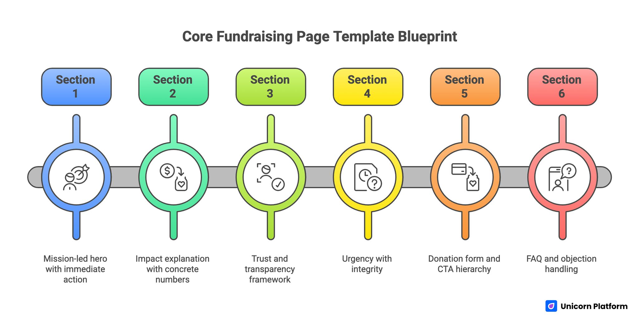
Core Fundraising Page Template Blueprint
A reusable template helps teams launch quickly while preserving conversion quality. If your team needs a deeper section-order reference for page flow, start from a step-by-step guide to a high-converting landing page structure.
1. Mission-led hero with immediate action
The hero should state the campaign objective in plain language and connect it to a measurable human outcome. Avoid abstract slogans that sound inspiring but do not tell donors what changes because of their gift.
Place one clear primary CTA in this section. If secondary actions are included, keep hierarchy obvious so the donor does not lose focus.
2. Impact explanation with concrete numbers
After the hero, explain how donations translate into outcomes. Clear impact mapping improves confidence because donors can see what their contribution enables.
Keep this section specific. Examples such as program reach, services delivered, or timelines create stronger trust than broad promises.
3. Trust and transparency framework
Trust should be visible before users reach the form. Include credibility signals such as nonprofit status clarity, transparent allocation language, partner references, or financial accountability highlights.
Donors do not need a long legal section here. They need clear confidence cues that reduce hesitation.
4. Urgency with integrity
Urgency helps conversion when it is honest and contextual. Show timelines, campaign milestones, or resource gaps without manipulative pressure language.
Credible urgency increases action because donors understand why timing matters now.
5. Donation form and CTA hierarchy
The form should be easy to complete and visually calm. Too many fields or competing form options can reduce completion rates even among high-intent donors.
Support common donation amounts and one flexible amount option, then keep the remaining steps predictable.
6. FAQ and objection handling
Address practical concerns directly, including where funds go, donation security, tax receipts, and recurring donation management. Strong FAQ sections often recover donors who pause at the final step.
Copywriting Framework for Fundraising Conversion
Fundraising copy should balance emotional resonance with operational clarity. Emotional language attracts attention, but conversion depends on trust and specific impact explanation.
A useful writing model is Need, Outcome, Proof, Action. Need clarifies the problem. Outcome shows what a donation changes. Proof validates credibility. Action tells the donor exactly what to do next.
Avoid overloading paragraphs with mission rhetoric. Donors make decisions faster when each section answers one clear question.
Strong examples usually combine short impact statements with practical details. This makes the message persuasive without feeling inflated.
Trust Design Across the Full Donor Journey
Trust should not be treated as a single block labeled "credibility." It works best as a distributed layer that appears where uncertainty naturally increases.
Near the hero, donors need confidence that the campaign is real and urgent. Near the form, they need confidence that payment and donation handling are safe. After conversion, they need confidence that follow-up and impact communication will continue.
Use simple, concrete trust components:
- transparent impact examples
- organization credentials and governance cues
- clear donation handling language
- concise privacy and security reassurance
- post-donation communication expectations
When trust is layered this way, donors feel guided rather than pushed.
Donation Form Design: Reducing Friction Without Losing Quality
Form completion depends on perceived effort and perceived safety. A short form is helpful, but short alone does not guarantee conversion if confidence is missing.
Start with essential fields and remove any optional data collection that does not improve immediate donor experience. If extra information is needed for operations, collect it later through follow-up.
Label every step clearly. Donors should know what happens after clicking the main CTA, including confirmation, receipt, and communication timeline.
Payment method visibility can also improve confidence. When supported options are presented clearly, users are less likely to abandon at the last step.
Mobile and Accessibility Standards for Fundraising Pages
Fundraising traffic often arrives from mobile channels. If mobile readability and interaction quality are weak, campaign performance can decline even with strong message content.
Mobile essentials include readable first-screen copy, visible CTA placement, comfortable tap targets, and fast media performance. Real-device checks are required because desktop preview alone misses common friction.
Recent research highlights that nearly half of all online donations now come from mobile devices, yet many donation pages fail to deliver a smooth mobile experience, with slow loading and poor tap targets causing high abandonment rates, reinforcing the need to prioritize mobile usability and form simplicity in fundraising landing page design.
Accessibility should be treated as part of conversion quality, not as a separate compliance step. Clear contrast, readable typography, and logical heading order help all users complete the donation path with less effort.
Accessibility improvements often increase overall completion rates because they reduce cognitive friction across the board.
Multi-Channel Message Alignment
Campaign performance depends on continuity from source to page. When email, social, and ad messaging promise one outcome but the landing page leads with another angle, donor confidence drops quickly.
Create one core campaign message map and adapt channel phrasing without changing the underlying promise. This keeps context stable and improves first-screen relevance.
Use UTM structure and source tags consistently so performance can be compared cleanly across channels. Without clean source mapping, optimization decisions become guesswork.
Event-focused teams can also learn from concise registration flows used in meetup and calendar landing pages when designing low-friction action paths for time-sensitive fundraising pushes.
Measurement Framework Beyond CTR
Click-through rate is useful but insufficient for fundraising performance decisions. Teams should track behavior across the full donor path.
A practical measurement model includes:
- first-screen engagement and scroll progression
- donation form starts and completions
- average donation amount by source
- recurring donor opt-in behavior
- drop-off points before and during form completion
Review metrics by source and donor segment, not only in aggregate. A campaign can look healthy overall while underperforming with high-value donor segments.
According to recent analysis of nonprofit donation data, donation pages convert at an average rate of about 22%, while many sites still underperform, underscoring the importance of optimizing donation flow, simplifying forms, and aligning donation page experience with user intent to close the large gap between page visits and completed gifts.
Behavior-led analysis helps prioritize meaningful fixes. For practical optimization diagnostics, apply the workflow from user behavior tips to optimize landing pages to connect interaction signals with content changes.
30-Day Optimization Plan for Active Campaigns
Week 1: Establish baseline performance. Validate tracking and identify the largest friction point from first-screen to form completion.
Week 2: Test message fit in the hero and CTA context. Keep experiments isolated so changes can be interpreted clearly.
Week 3: Focus on trust placement and impact explanation clarity. Test whether moving transparency cues closer to action points improves completion.
Week 4: Reduce interaction friction in form flow and mobile UX. Prioritize fixes that affect high-intent donor behavior first.
Document each change with hypothesis, metric, and outcome. This creates a reusable campaign playbook for future launches.
60-Day and 90-Day Scaling Model
Once baseline performance stabilizes, scaling should focus on relevance and consistency. Broad redesigns usually add risk without improving learning quality.
Days 31-60 priorities:
- create one donor-segment variant page
- compare source-level donation quality
- standardize winning modules across campaigns
Days 61-90 priorities:
- expand to additional segment variants
- improve post-donation communication continuity
- optimize recurring donor conversion paths
Scaling works best when teams preserve validated structure and adapt only the sections that affect audience relevance in each cycle.
Cost and Resource Planning for Fundraising Pages
Fundraising pages are often underestimated in budget discussions. Teams plan for design and copy, but under-resource measurement, QA, and iterative improvement.
A more accurate model includes four stages: build, validation, optimization, and maintenance. This lifecycle approach helps teams allocate effort where conversion gains are most likely.
Reusable modules reduce long-term cost. When hero patterns, trust blocks, and donation form structures are standardized, new campaigns can be launched faster without rebuilding core logic.
Cross-functional review also improves cost efficiency. Fundraising, marketing, and operations teams often see different failure signals, and combining that input leads to better optimization choices.
Governance and QA for Campaign Reliability
No-code speed can create inconsistency when ownership is unclear. A lightweight governance model keeps output quality stable while preserving pace.
Assign clear owners for messaging quality, analytics integrity, and launch QA. In small teams, one person may own multiple roles, but responsibilities should still be explicit.
Pre-launch QA should confirm:
- first-screen message alignment with campaign source
- CTA and form path functionality
- trust and transparency visibility
- mobile readability and interaction behavior
- event tracking reliability
- confirmation and follow-up flow readiness
Weekly review rituals should evaluate performance changes, prioritize one high-impact test, and define success metrics before publishing updates.
Donor Retention Economics and Post-Donation Journey
Many fundraising teams focus heavily on first donation conversion and underinvest in what happens immediately after that moment. This creates a hidden performance ceiling, because long-term campaign sustainability depends on retention quality, not just on first-touch conversion volume.
A landing page should be designed with downstream donor behavior in mind. If the page promise, donation flow, and post-donation communication are disconnected, first-time contributors may not return even when campaign intent is strong.
The first confirmation experience matters more than most teams expect. Donors should receive immediate, clear confirmation that the contribution was processed, paired with a concise statement about what happens next. Unclear post-donation communication can reduce trust even when the donation itself succeeds.
Retention-aware page design starts before the form. Set realistic impact expectations on the page so donors do not feel a mismatch later. Campaign language that over-promises short-term outcomes may improve first conversion temporarily, but it often harms donor confidence in follow-up cycles.
A practical post-donation sequence can include:
- immediate confirmation with transparent receipt details
- short impact summary connected to campaign objective
- follow-up timeline with clear update expectations
- optional recurring contribution invitation with context
- support pathway for donor questions
This sequence works because it reduces uncertainty at each stage and keeps the donor relationship active after the initial transaction.
Recurring donor conversion should be treated as a distinct optimization path. The best timing is usually after trust is reinforced, not immediately after payment completion. A soft recurring option tied to impact continuity often performs better than aggressive upsell language.
Economics improve when teams track retention signals alongside campaign conversion metrics. Useful indicators include second-donation rate, recurring opt-in rate, donor reactivation speed, and unsubscribe patterns after campaign communication.
Segment-level analysis is important here. New donors, returning donors, and campaign-specific supporters usually respond differently to post-donation messaging. Treating all donors as one group often hides opportunities to improve long-term value.
Monthly retention reviews can prevent silent performance decline. These reviews should compare message consistency between landing pages and follow-up emails, confirm impact updates are delivered on schedule, and identify where donors disengage after first conversion.
Teams that combine this retention review with campaign planning usually make better budget decisions. Instead of assuming each new campaign must rely on fresh acquisition spend, they can forecast value from repeat supporters and allocate effort across both donor acquisition and donor continuity. That balance often creates more stable results during slower fundraising periods because existing trust relationships continue producing measurable impact. It also supports clearer board-level reporting on campaign efficiency.
When retention logic is built into landing-page strategy, campaign economics become more stable. Teams are not forced to replace all results with new top-funnel spend, and optimization decisions become less reactive because donor value is measured across a fuller lifecycle.
Common Mistakes to Avoid
1. Generic mission messaging
Visitors do not see clear campaign relevance or outcome clarity. They leave before reaching trust or impact sections because the opening does not connect to the current campaign moment.
2. Impact claims without specificity
Donors feel uncertain because results are described broadly. Replace broad claims with concrete outcome framing so supporters understand what their contribution actually changes.
3. Trust content isolated in one section
Confidence cues are not present when decision friction appears. Reintroduce credibility elements near key decision points so reassurance is available exactly when hesitation rises.
4. Overloaded donation forms
Too many fields create avoidable abandonment. Keep the first step minimal, and move optional data collection to post-donation workflows.
5. Mobile and accessibility treated as secondary
High-intent donors experience friction before completion. Accessibility and mobile checks should be part of pre-launch QA, not a post-launch cleanup task.
6. Weak source-level measurement
Channel-specific performance differences remain hidden. Without this visibility, teams keep scaling channels that produce traffic but not sustainable donor value.
7. Launch-and-forget mindset
Campaign performance stalls because structured iteration is missing. Establish a fixed review cadence with prioritized experiments so improvements compound over time.
FAQ: Fundraising Landing Pages
What makes a fundraising landing page different from a general nonprofit page?
A fundraising page is campaign-specific and optimized for one clear donation action, while a general page supports broader exploration.
How long should a fundraising landing page be?
Length should match donor decision complexity. Scannable long-form structure often works well when each section has a clear purpose.
Should we include suggested donation amounts?
Yes, in most cases. Suggested amounts reduce decision friction, especially when impact context is clear.
How many CTAs should the page have?
One primary CTA should dominate. Secondary actions can exist, but they should not dilute donation focus.
What should we test first after launch?
Start with first-screen message fit, then test trust placement and form friction.
How important is mobile optimization for fundraising campaigns?
It is critical. Many campaigns receive major traffic from mobile channels where friction appears quickly.
What metrics matter beyond click-through rate?
Form completion rate, average donation value, recurring donor adoption, and source-level donation quality are key.
Can no-code tools handle high-performing fundraising pages?
Yes, when teams combine no-code speed with clear structure, QA discipline, and consistent optimization.
How often should campaign pages be updated?
Weekly focused updates and monthly structural reviews are a practical baseline.
What creates compounding fundraising page performance?
Reusable modules, documented experiments, and strong cross-team ownership.
Final Takeaway
A fundraising landing page converts when it balances emotion with clarity, urgency with trust, and speed with structure. Teams that apply this system consistently create better donor experiences and stronger campaign outcomes.
With Unicorn Platform, you can build and iterate quickly while keeping professional quality controls in place. Launch with focus, optimize with evidence, and scale what works across future fundraising campaigns with stronger consistency quarter after quarter.