Table of Contents
- Why Most SaaS Conversion Pages Leak Qualified Demand
- Hero Design: Set Stakes, Scope, and Direction
- 30-60-90 Day Rollout Plan
- Common Failure Patterns and Fixes
- FAQ
B2B software buyers are faster, less patient, and more risk-aware than they were a few years ago. If a conversion page hides fit, effort, and expected outcomes, qualified visitors leave even when the product is strong.
High-performing teams treat the page as a decision system instead of a design artifact. The goal is not only more submissions, but better-fit conversations that move through onboarding, activation, and revenue stages with less friction.
When teams align structure with buyer decision flow, they usually see cleaner attribution and fewer contradictory tests. This approach works especially well in Unicorn Platform because sections can be revised quickly while preserving a stable architecture.
A practical connection to pipeline work is your demand framework itself. If you need a tighter acquisition-to-revenue model, the playbook in effective SaaS lead generation strategies helps align page decisions with qualification outcomes.
sbb-itb-bf47c9b
Quick Takeaways

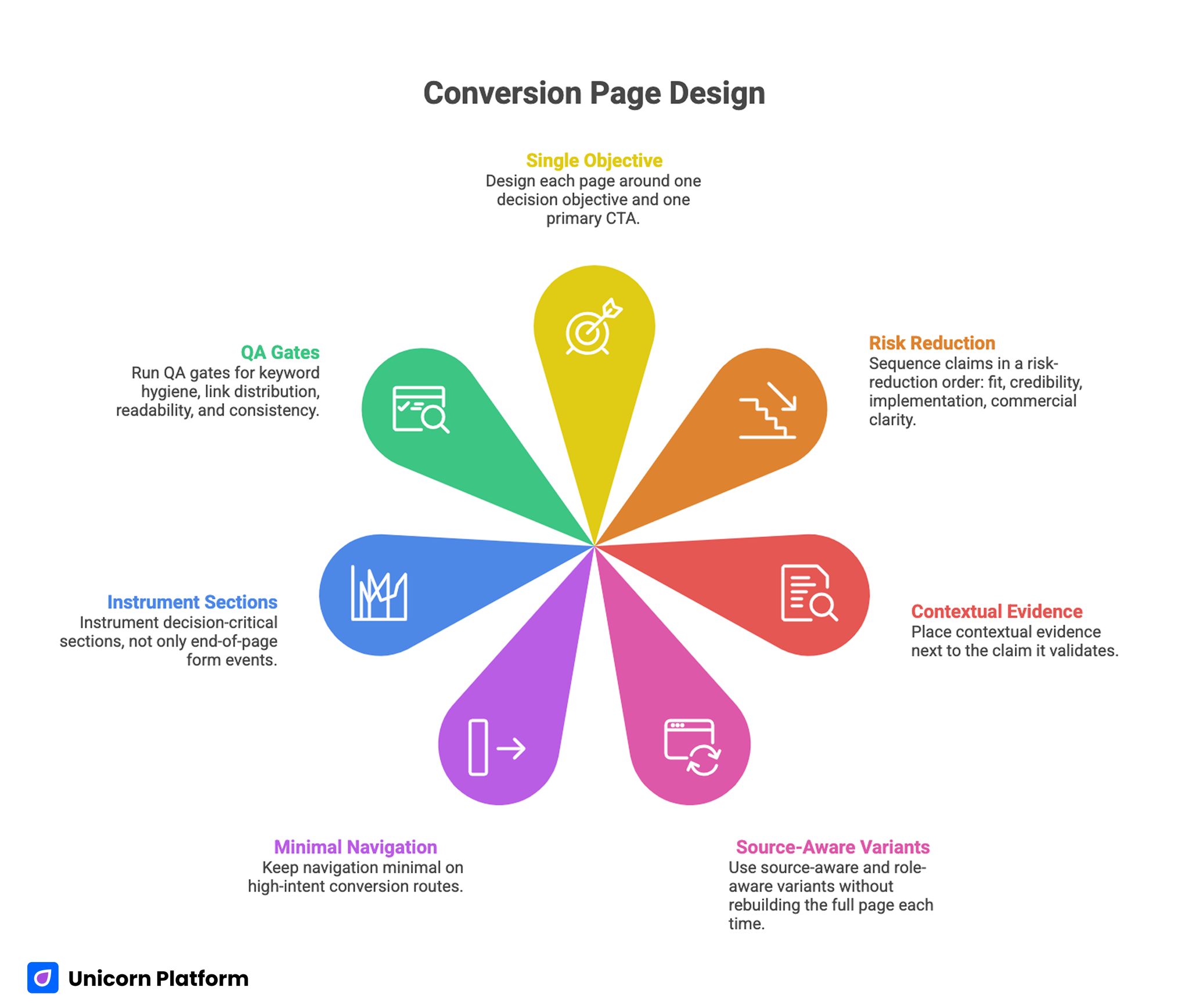
Conversion Page Design
- Design each page around one decision objective and one primary CTA.
- Sequence claims in a risk-reduction order: fit, credibility, implementation, commercial clarity.
- Place contextual evidence next to the claim it validates.
- Use source-aware and role-aware variants without rebuilding the full page each time.
- Keep navigation minimal on high-intent conversion routes.
- Instrument decision-critical sections, not only end-of-page form events.
- Run QA gates for keyword hygiene, link distribution, readability, and consistency.
Why Most SaaS Conversion Pages Leak Qualified Demand
Many teams still optimize for surface metrics such as click-through or form volume. That approach hides the real issue: a large share of responses fail to convert into productive next steps because the page did not pre-qualify intent clearly.
Three leaks appear repeatedly. First, message framing is too broad, so buyers cannot tell whether the product fits their workflow and constraints. Second, proof is delayed or generic, so confidence arrives too late. Third, implementation details are vague, so users defer action until they can get clarity elsewhere.
These leaks are expensive because they consume ad budget, sales capacity, and product onboarding time. A tighter architecture reduces that waste before the first call even happens.
Choose One Decision Goal Per Page
A page cannot maximize trial starts, enterprise demos, webinar signups, and pricing exploration at the same time. Each additional goal dilutes hierarchy, weakens CTA emphasis, and creates ambiguous outcomes in measurement.
Define one primary objective and one secondary fallback. A product-led route may prioritize trial start with a secondary path to live support, while a higher-complexity route may prioritize qualification call with a secondary path to technical documentation.
This discipline improves both clarity and experimentation quality. Teams can isolate what changed and why, instead of interpreting mixed signals from conflicting calls to action.
Structure the First 15 Seconds of Evaluation
Most buyers make a continuation decision in the first screen and early scroll. That window should answer four questions in sequence: who this is for, what problem it solves, why the claim is credible, and what action is expected next.
A reliable first-screen stack is simple. Start with audience and problem scope, add a concrete value statement, include one contextual trust cue, and present one dominant CTA with low ambiguity.
Avoid decorative cleverness that delays interpretation. Precision in language generally outperforms broad slogans, especially for evaluation-stage traffic.
Build Role-Aware Variants Without Fragmenting the System
Economic buyers, operators, and technical evaluators do not process value through the same lens. Trying to satisfy all of them with equal weight on one route usually produces generic copy and weak qualification.
Instead of creating disconnected pages, keep one shared architectural backbone and vary emphasis by route. One variant can prioritize cost control and rollout predictability, another can prioritize workflow speed and team adoption, and another can prioritize integration confidence.
This model keeps governance manageable. Teams preserve shared modules while adjusting opening narrative, proof assets, and CTA framing by audience role.
Hero Design: Set Stakes, Scope, and Direction
Strong hero sections do more than announce a product category. They define stakes and boundary conditions so the right readers continue and the wrong readers self-filter early.
A practical format is outcome + context + time expectation. For example, you can frame the operational outcome, specify the team environment where it applies, and clarify expected ramp period to first usable value.
CTA placement should reinforce decision intent. Primary action belongs in the hero, while secondary actions can appear lower only when they support the same route objective.
CTA System Design for Different Readiness Levels
Not every visitor arrives with equal readiness. Your call-to-action system should capture high intent quickly while preserving momentum for visitors who need one additional layer of confidence.
Use a primary CTA tied to the page goal, then a contextual secondary CTA for visitors who need deeper validation. Secondary options should not compete visually with the primary decision path.
For complex software categories, low-friction micro-commitments can improve qualification quality. Short readiness forms, integration checklists, or tailored onboarding previews often reduce later-stage drop-off.
Proof Architecture: Match Evidence to Risk Type
Social proof works best when it is specific and proximal to the claim it supports. Generic logos and undifferentiated testimonials can add familiarity, but they rarely remove decision risk on their own.
Map evidence to buyer concerns. Performance claims need measurable before/after context, implementation claims need setup transparency, and reliability claims need operational details that show repeatability.
Use compact proof modules throughout the page instead of one isolated proof block at the bottom. The page becomes easier to trust because confidence signals appear exactly where uncertainty emerges.
Feature-to-Outcome Translation That Supports Action
Feature grids are useful for breadth, but conversion decisions depend on practical outcomes. Buyers need to see what changes in daily work, not only which capabilities exist.
Translate each major capability into a short operational result with a realistic scenario. Include who benefits, what process step improves, and how quickly value is typically visible.
This translation also helps internal alignment. Product, marketing, and sales teams can use the same outcome language across campaigns, pages, and follow-up conversations.
Interactive Components: Use Them to Reduce Friction, Not Add Noise
Interactive elements can increase comprehension when they clarify fit and effort. Lightweight calculators, workflow previews, and guided comparisons are useful when they answer real qualification questions.
Interactivity fails when it is ornamental, heavy, or disconnected from decision flow. Slow animations and complex widgets can lower completion rates even when visual polish looks strong in review sessions.
Apply a friction budget to every interactive element. If a component does not improve decision clarity measurably, simplify or remove it.
Navigation and Page Flow for High-Intent Routes
Top navigation is often overbuilt on conversion-focused pages. Too many escape paths can reduce progression because users are invited to browse instead of decide.
Use a minimal navigation model for high-intent routes and keep core sections in a coherent flow. The sequence should move from fit to proof to implementation clarity to commercial action.
This structure is easier to test and maintain. Section-level changes can be measured without destabilizing the entire page experience.
Visual and Motion Systems With Commercial Purpose
Visual style should reinforce hierarchy, not compete with it. Strong contrast, spacing consistency, and typographic rhythm improve comprehension more than trend-driven decoration.
Motion can guide attention if used sparingly around decision points. Micro-motion near CTA clusters, proof transitions, and form steps can support flow when performance remains stable on mid-range devices.
Visual systems work best as reusable operational assets. A modular system allows fast launches across campaigns without repeated redesign work.
Mobile Execution Standards That Protect Conversion Quality
A large share of evaluation traffic starts on mobile, even for enterprise software categories. If first-screen clarity, form usability, or performance degrades on smaller screens, qualification quality suffers early.
Define mobile standards before production. CTA visibility, scroll readability, tap target sizing, and form progression should be validated on real devices instead of emulator-only checks.
Mobile should not be a reduced copy of desktop. It needs intentional pacing so users can evaluate confidence signals quickly and continue without cognitive load.
Source Continuity: Keep Promise and Page Aligned
Traffic source and page framing must tell the same story. If acquisition copy emphasizes fast rollout but the page focuses only on long-term transformation, trust breaks before form interaction.
Create route variants that mirror the promise language of each major source segment. Consistent framing from click to page to first response improves both conversion and handoff quality.
For directory-driven discovery, alignment quality is usually the deciding factor. The workflow in no-code guide to web directory submission for improved SEO is useful when you connect listing claims directly to dedicated conversion variants.
AI-Assisted Drafting With Human Decision QA
AI can accelerate copy iterations and section prototypes, but unsupervised generation often introduces generic phrasing and weak differentiation. Human review is still essential at risk-sensitive sections such as proof claims, implementation timelines, and pricing language.
A robust workflow uses AI for structured drafts, then applies role-based editorial review before publication. Marketing validates narrative clarity, product validates technical truth, and sales validates objection handling.
This process protects both credibility and speed. Teams can publish quickly in Unicorn Platform while keeping message quality defensible under live buyer scrutiny.
Measurement Model: Optimize for Pipeline Progression
Form completion alone is not enough. A better model tracks qualified response rate, meeting attendance, activation movement, and downstream revenue progression by source and page variant.
Instrument section-level behavior where decisions happen. CTA clicks, proof interaction depth, form-step abandonment, and revisit patterns provide stronger diagnostic signals than aggregate traffic statistics.
Measurement should be reviewed cross-functionally on a fixed cadence. Shared interpretation prevents local optimizations that improve one metric while degrading commercial outcomes elsewhere.
Governance Model for Ongoing Quality
Sustainable performance requires a repeatable operating rhythm. Without governance, pages drift into mixed messaging and ad hoc edits that are hard to evaluate.
A practical cadence combines weekly anomaly checks, monthly section audits, and quarterly architecture reviews. Weekly checks capture sudden conversion issues, monthly audits fix structural drift, and quarterly reviews realign strategy with market changes.
Documentation is the force multiplier. A concise log of hypotheses, changes, and outcomes prevents repeated mistakes and accelerates onboarding for new contributors.
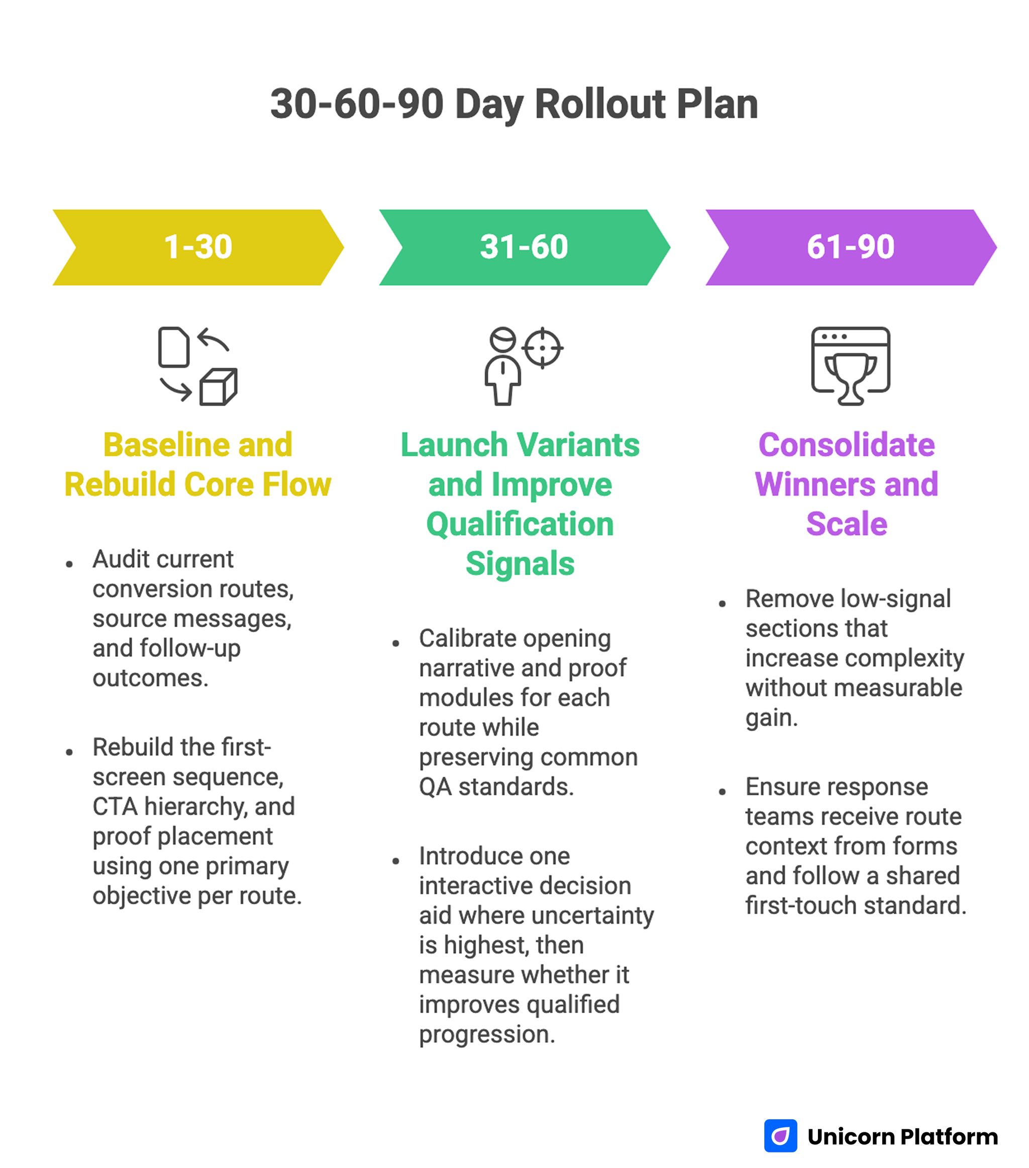
30-60-90 Day Rollout Plan

30-60-90 Day Rollout Plan for SaaS Conversion Page Optimization
Days 1-30: Baseline and Rebuild Core Flow
Start with an audit of current conversion routes, source messages, and follow-up outcomes. Identify where fit clarity, trust timing, and implementation transparency break down.
Rebuild the first-screen sequence, CTA hierarchy, and proof placement using one primary objective per route. Keep initial scope tight so baseline comparison remains clean.
Days 31-60: Launch Variants and Improve Qualification Signals
Deploy role-aware and source-aware variants on the same structural backbone. Calibrate opening narrative and proof modules for each route while preserving common QA standards.
Introduce one interactive decision aid where uncertainty is highest, then measure whether it improves qualified progression. Avoid launching multiple major experiments simultaneously.
Days 61-90: Consolidate Winners and Scale
Promote winning variants into reusable templates with clear ownership and update rules. Remove low-signal sections that increase complexity without measurable gain.
At this stage, operational alignment matters most. Ensure response teams receive route context from forms and follow a shared first-touch standard.
Common Failure Patterns and Fixes
Failure: Broad Opening Claims
Visitors cannot map the promise to their working reality, so they defer action. Rewrite openings with audience scope, operational outcome, and realistic timeline.
Failure: Proof Detached From Claims
Evidence appears too late or without context, so trust remains weak. Pair each major claim with nearby, scenario-specific validation.
Failure: CTA Competition
Multiple equal CTAs split attention and reduce progression quality. Keep one dominant action and demote alternates to contextual support.
Failure: Source-Page Mismatch
Acquisition messages and on-page framing conflict, causing credibility loss. Align promise language and expected next step across click, page, and follow-up.
Failure: Mobile Friction in Critical Steps
Users drop during interaction because key actions are hard to complete. Simplify mobile form flow and preserve CTA visibility across scroll depth.
Failure: Test Overload Without Attribution
Teams launch too many changes at once and cannot isolate impact. Run fewer tests with tighter hypotheses and explicit decision rules.
FAQ: SaaS Conversion Page Architecture in 2026
1) How long should a SaaS conversion page be?
Length should match decision complexity, not arbitrary targets. Use only the depth needed to resolve fit, credibility, and implementation concerns for the intended route.
2) Is one CTA always enough?
One primary CTA is usually best for clarity. A secondary action can help lower-readiness visitors when it supports the same decision path.
3) Should pricing always be visible?
Pricing visibility depends on sales model and traffic stage. Even when full pricing is not shown, commercial framing should reduce ambiguity about who the offer is for.
4) What proof format performs best?
Contextual proof tied to specific claims is generally strongest. The format matters less than relevance, credibility, and placement near decision points.
5) How many variants should a team run?
Run only the number you can govern with quality. Most teams perform better with a small set of well-instrumented variants than with broad, uncontrolled fragmentation.
6) What is the fastest improvement for weak lead quality?
Clarify audience scope and page objective first. That change often improves qualification faster than visual redesign work.
7) When do interactive elements help most?
They help when users need to estimate effort, fit, or expected return. If interactivity slows the page or distracts from action, it should be simplified.
8) How often should this page be reviewed?
Review weekly for anomalies and monthly for structural health. Strategic architecture should be revalidated quarterly with sales and product input.
Final Takeaway
Winning in 2026 depends on disciplined decision architecture, not aesthetic novelty alone. Teams that align hierarchy, proof timing, source continuity, and operational handoff consistently generate better-fit pipeline from the same traffic.
Unicorn Platform makes this practical because iteration speed is high, but speed is valuable only when guided by strict structure and QA. Treat each route as a commercial system, and performance compounds over time.

