Table of Contents
- What Practical Community Advice Repeats Most Often
- Building in Unicorn Platform: Practical Workflow
- 30-Day Optimization Plan
- Common Mistakes to Avoid
- FAQ
Personal website advice often sounds polished but vague. Community discussions are different because people usually describe real friction, like unclear messaging, weak proof, and confusing contact flows.
That is why community-style insights are useful for personal website strategy. They expose where real visitors get stuck and what changes actually improve trust and action quality.
This guide translates those practical lessons into a clear build and optimization system. The focus is simple: help you create a personal website that is specific, credible, and easy to act on.
If you want a broad quality baseline before you start editing, these personal website improvement tips are a strong companion and align well with the framework below.
sbb-itb-bf47c9b
Quick Strategic Takeaways
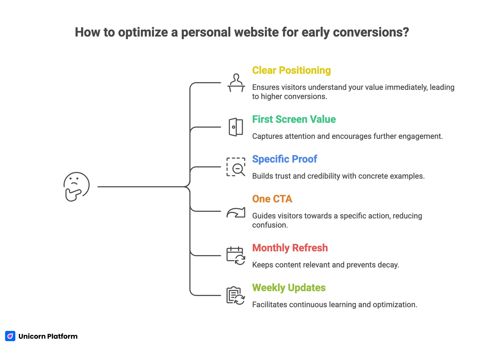
Quick Strategic Takeaways for Optimizing High-Converting Personal Website
- Clear positioning beats decorative design in early conversions.
- Visitors should understand your value in the first screen.
- Proof works best when it is specific and context-rich.
- One primary CTA usually outperforms multiple equal actions.
- Monthly refresh habits prevent message and proof decay.
- Small weekly updates produce clearer optimization learning.
Why Community Feedback Improves Personal Websites
Personal websites usually fail for predictable reasons. Visitors cannot tell what you do, they do not see evidence fast enough, or they are unsure what action to take after reading.
Community comments surface these gaps quickly because they come from user perspective, not internal assumptions. When the same feedback appears repeatedly, it usually points to a structural issue, not a cosmetic one.
The strongest outcome from this approach is prioritization. Instead of redesigning everything, you identify one high-friction point and fix it with focused updates.
What Practical Community Advice Repeats Most Often
Across creator, consultant, and personal-service contexts, practical feedback usually points to the same core themes. These themes are reliable because they align with conversion behavior patterns, not with passing trends.
1. The headline is too broad
Generic headlines reduce relevance immediately. Visitors need to know who you help and what outcome you create.
2. The page has proof, but not useful proof
General praise rarely removes decision risk. Visitors respond better to role-specific outcomes and clear context.
3. There are too many CTA options
When every action appears equally important, people delay decisions. A single dominant CTA with supportive secondary paths usually performs better.
4. Service descriptions are vague
If visitors cannot understand scope, timeline, and expected result, inquiry quality drops. Clear service framing improves self-qualification.
5. The site is not maintained
Outdated offers, stale testimonials, and broken links reduce trust quickly. Consistent refresh habits are a major competitive advantage.
Positioning Framework for Personal Websites
Positioning is the highest-leverage section on most personal pages. If this part is unclear, strong design and proof still struggle to convert.
Use this structure to rewrite your first-screen message:
- who you help
- what problem you solve
- how you solve it
- what outcome clients or collaborators can expect
Example:
Weak: "I help businesses grow online."
Strong: "I help local service businesses improve website messaging so they can attract more qualified inquiries each month."
This format improves fit quickly because visitors can self-identify without guessing. It also reduces low-quality messages from people outside your target scope.
For teams refining first-screen conversion behavior in detail, this personal landing page guide is useful for tightening headline, proof timing, and CTA placement.
Trust Architecture That Converts Better
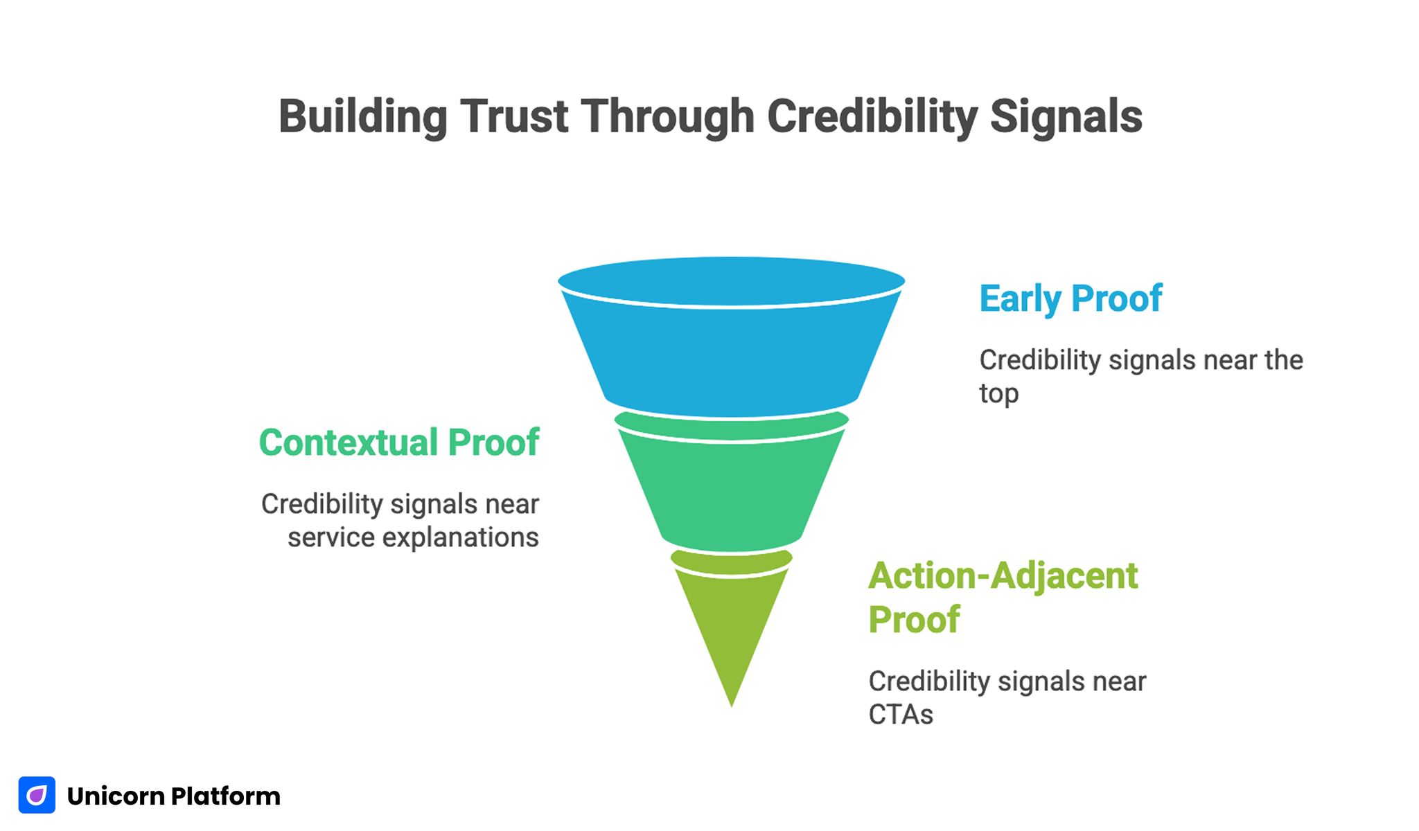
Trust Architecture that Improves Conversion on Personal Websites
Trust on personal websites is not one testimonial section. It is a sequence of credibility signals placed at moments where decision friction appears.
Use a three-layer trust system:
- early proof near first-screen positioning
- contextual proof near service or work explanation
- action-adjacent proof near CTA and contact form
This structure keeps confidence high throughout the scroll. It works better than placing all testimonials at the bottom where many visitors never reach.
Research from Stanford University’s Web Credibility Project shows that visitors often evaluate website trustworthiness based on visible credibility signals such as testimonials, professional presentation, and transparent information.
When collecting testimonials, ask for specific details about problem, process, and result. Specific proof consistently outperforms broad compliments.
One Clear Action Path for Better Inquiry Quality
Community feedback often highlights CTA confusion. Personal websites lose conversion quality when there are too many equal-priority buttons competing for attention.
Choose one primary CTA aligned to your current objective. Examples include "Book a Discovery Call," "Request a Proposal," or "Discuss Collaboration."
Research from HubSpot consistently shows that clear and focused calls to action improve conversion behavior because visitors can quickly understand the next step. When a page presents too many equally weighted options, decision friction increases and fewer users complete the intended action.
Keep secondary options available, but visually subordinate. This preserves flexibility without diluting the main decision path.
If your site serves service-based offers, patterns from this personal services website guide can help align CTA hierarchy with trust and scope clarity.
Personal Service Website Structure That Works
If your website supports consulting or service inquiries, use a structure that makes decision quality easy.
Recommended section sequence:
- headline with role and audience fit
- service scope and practical outcomes
- selected proof with context
- process and timeline clarity
- FAQ for common objections
- primary CTA and contact flow
This sequence helps visitors evaluate fit before they submit. Better fit leads to better conversations and lower pre-sales friction.
Writing Service Descriptions That Pre-Qualify Leads
Service descriptions should be practical, not promotional. Strong descriptions answer who the service is for, what is included, and what results are realistic.
A useful format is:
- audience and use case
- deliverables or engagement model
- timeline and process expectations
- likely outcomes and limits
When service blocks are clear, contact quality improves because visitors self-select based on fit. This reduces low-value inquiries and speeds follow-up decisions.
Contact Flow Design for Conversion Readiness
A contact flow should gather enough context without creating unnecessary friction. Long forms often reduce completion, especially on mobile.
For most personal sites, a short form works best:
- name
- inquiry type
- short message
Add response-time guidance after submission. Clarity about next steps increases confidence and improves follow-through.
Channel-to-Page Message Alignment
A frequent issue in community feedback is message mismatch between traffic source and landing content. Visitors click a clear promise but land on a generic page.
Align your page framing by source intent:
- social traffic: short narrative and fast credibility
- referral traffic: proof-first and quick contact path
- search traffic: intent-matched headings and outcome clarity
Message continuity improves trust because visitors feel the page delivers what was promised before the click.
For creators designing stronger overall positioning systems, this great personal website examples guide provides useful benchmarks for clarity and trust sequencing.
Building in Unicorn Platform: Practical Workflow
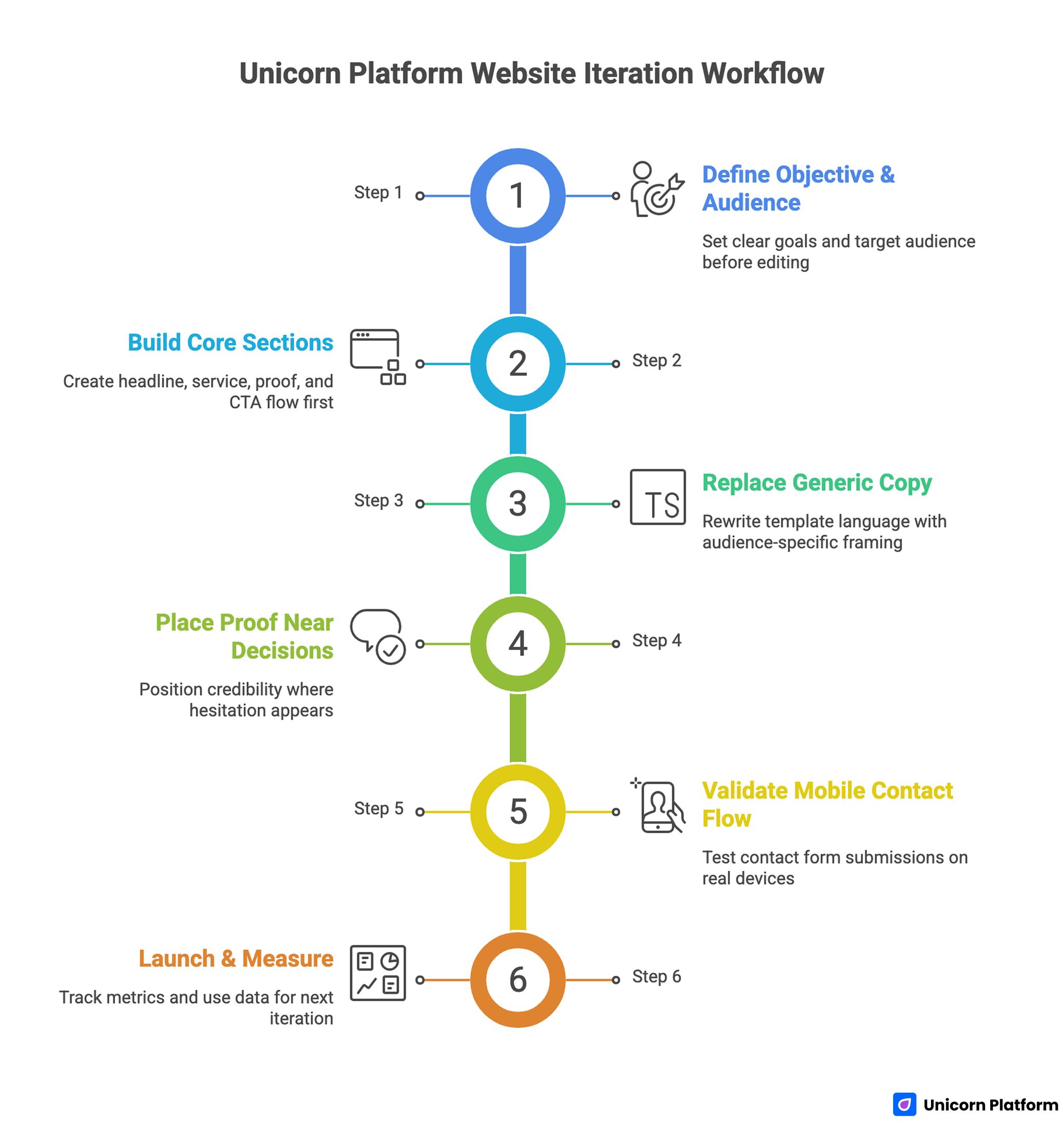
Unicorn Platform Website Integration Workflow
Unicorn Platform is effective when used as a structured iteration system, not just a publishing tool. The fastest gains come from focused section updates tied to observable friction.
Step 1: Set one objective and one audience
Write these down before editing. This keeps every change aligned with conversion purpose.
Step 2: Build core sections first
Start with headline, service or work block, proof, and CTA flow. Visual polish should follow structural clarity.
Step 3: Replace generic copy
Template language should be treated as placeholder text. Rewrite with role-specific audience and outcome framing.
Step 4: Place proof near decisions
Position credibility where hesitation appears, not in one isolated block. Use concise proof with real context.
Step 5: Validate mobile contact flow
Test on real devices and complete form submissions end to end. Mobile friction frequently hides in small interaction details.
Step 6: Launch and measure
Track CTA clicks, form completion, and inquiry quality notes. Use those signals to choose the next focused update.
30-Day Optimization Plan
Week 1: Baseline and reliability
Publish core structure, verify links, and validate contact flow. Fix technical quality issues before promotion.
Week 2: Message clarity improvements
Test one headline variant and refine service descriptions for clearer outcomes. Keep layout stable so copy impact is measurable.
Week 3: Trust and proof upgrades
Strengthen testimonial specificity and reposition proof closer to high-friction points. Measure changes in inquiry fit, not only clicks.
Week 4: CTA and contact refinement
Test one CTA wording variation and one contact-form adjustment. Compare response quality by source.
60-Day Growth Framework
Days 1-20: Stabilize positioning
Improve first-screen relevance and remove sections that do not support the primary objective. Make decision flow easier for first-time visitors.
Days 21-40: Improve trust depth
Add case-style proof snippets and clearer process language. Strong trust context usually increases lead quality before it increases lead volume.
Days 41-60: Add audience variants
Create one segment-specific message variant for your highest-value audience. Keep core structure fixed and adapt only high-impact sections.
This model keeps optimization practical while preserving consistency. It also reduces burnout by focusing on one major improvement cycle at a time.
Monthly Metrics That Matter
Track metrics that reflect professional outcomes, not only traffic growth. The goal is better opportunities, not just more sessions.
Recommended monthly set:
- page-level CTA click-through rate
- contact form completion rate
- qualified inquiry share
- top source quality by inquiry fit
- returning visitor trend
Use this review to select one high-impact update for the next cycle. Focused prioritization improves learning speed and conversion stability.
Community-Driven Distribution Without Trust Damage
Many people try to use community platforms for quick traffic, then damage trust by posting links with little context. A better approach is contribution-first distribution, where your page is presented as supporting evidence after useful participation.
Start by identifying a small set of communities where your audience already discusses the problems you solve. Instead of promoting your site immediately, contribute short practical answers and reference relevant examples from your own work when they directly add value.
When sharing your website, connect the link to a specific discussion need. For example, if a thread asks about positioning for personal service pages, link to the exact section that addresses positioning clarity and explain why it is relevant.
This context-first style improves traffic quality because visitors arrive with aligned intent. It also reduces backlash risk because your contribution feels useful rather than promotional.
A second improvement is feedback capture. Community responses can be turned into optimization signals if you categorize them by friction type, such as unclear offer, weak trust evidence, or confusing CTA language.
Build a lightweight monthly feedback table with three columns: recurring comment theme, likely page section affected, and update hypothesis. This lets you convert informal comments into practical experiments instead of treating feedback as noise.
Feedback is most useful when combined with analytics, not used alone. If community comments mention trust concerns and your data shows drop-off near proof sections, you have a strong signal for where to test next.
Community distribution should also align with your capacity. It is better to engage consistently in two channels than to post sporadically in many channels with no follow-up.
Consistency creates compounding trust. Regular helpful participation plus occasional relevant website sharing usually outperforms aggressive link posting with no relationship context.
Feedback-to-Update Loop for Sustainable Improvement
A sustainable update loop keeps your website current without constant redesigns. Use a repeating cycle: collect comments, classify friction, run one focused change, and review outcome quality after a short observation window.
Choose one friction category at a time so impact remains interpretable. If you change headline, proof, and CTA simultaneously, you will not know which change improved outcomes.
After each update, record what changed and how inquiry quality shifted. Over several cycles, this log becomes a practical playbook for future iterations and improves decision speed for collaborators.
When this loop is maintained, community input stops feeling chaotic. It becomes a structured source of user-language insight that strengthens positioning, trust flow, and conversion consistency over time.
Common Mistakes to Avoid
Mistake 1: Vague homepage positioning
Visitors cannot determine fit quickly, so they leave. Rewrite first-screen copy around audience and measurable outcome context.
Mistake 2: Weak proof detail
General praise does not reduce decision risk. Replace vague endorsements with specific role-based results.
Mistake 3: Too many CTA choices
Equal-priority options create hesitation and dilute conversion flow. Keep one dominant action path with clear support language.
Mistake 4: No update cadence
Even strong pages become stale without refreshes. Maintain weekly light updates and monthly strategic reviews.
Mistake 5: No inquiry quality review
Submission volume alone can hide poor-fit traffic. Track lead quality indicators and optimize for relevance.
Mistake 6: Promotion before quality checks
Scaling traffic to unclear pages wastes opportunity. Validate messaging, trust placement, and contact reliability before outreach.
Mistake 7: Random redesign cycles
Large simultaneous changes make results hard to interpret. Use single-variable updates and document outcomes.
FAQ: Reddit-Inspired Personal Website Improvements
Why use community-style feedback for personal websites?
Because it reveals real visitor friction quickly. Repeated feedback patterns usually identify structural issues worth fixing first.
What is the fastest high-impact change for most personal sites?
Improve first-screen positioning clarity. A more specific headline often increases both relevance and trust immediately.
How many testimonials should I include?
Use a small set of specific, context-rich testimonials. Quality and relevance are more valuable than large testimonial volume.
Should I include multiple CTAs for different audiences?
You can include secondary options, but one CTA should remain dominant. Clear hierarchy improves decision speed and conversion quality.
How often should I refresh a personal website?
A weekly light update and a monthly strategic review is a practical baseline. This cadence keeps your profile current without overwhelming workload.
How do I improve inquiry quality, not just quantity?
Strengthen positioning specificity, proof relevance, and contact qualification language. These three levers usually produce the fastest quality gains.
Do community insights replace analytics?
No, they complement analytics. Community feedback helps identify likely friction points, while analytics confirms which changes improve outcomes.
What should I test first in month one?
Start with headline clarity and proof placement. These areas influence first impression and conversion readiness the most.
Can no-code platforms support serious optimization?
Yes, when updates are structured and measured. Speed becomes valuable when each change has a clear hypothesis and review process.
What if my audience includes hiring, consulting, and collaboration?
Keep one core structure and adapt message blocks by intent. This preserves consistency while improving relevance for each audience type.
Final Takeaway
Community-style advice is useful because it highlights practical friction that polished strategy often misses. Personal websites improve fastest when you focus on clarity, proof relevance, and one obvious next action.
With Unicorn Platform, you can apply these improvements quickly and iterate without technical drag. When updates are focused, measured, and consistent, your personal website becomes a reliable source of better opportunities.