Table of Contents
- Why Landing Pages Underperform Even With Good Offers
- Section-by-Section Execution Framework
- A 30-Day Structure Optimization Plan
- Common Structural Mistakes and Fast Fixes
- FAQ
Most teams do not lose conversions because they lack design talent. They lose conversions because their page structure does not match how people make decisions under uncertainty. Traffic arrives, users scan quickly, and key context appears too late.
When structure is weak, teams start chasing tactical fixes. They change button colors, swap hero images, and rotate headlines every week, but performance remains unstable. The issue is not one element. The issue is the order of information and the logic of progression.
A strong landing page should work like a guided decision path. Each section should answer one question, reduce one risk, and move users toward one clear next step. If sections overlap jobs or compete for attention, users hesitate.
This guide gives a practical framework you can run in Unicorn Platform to design, audit, and improve structure with less guesswork. The focus is simple: clearer decision flow, stronger conversion quality, and faster iteration cycles.
sbb-itb-bf47c9b
Key Takeaways
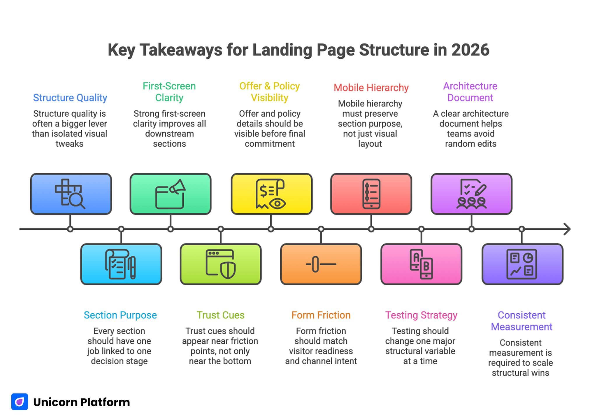
Key Takeaways for Landing Page Structure in 2026
- Structure quality is often a bigger lever than isolated visual tweaks.
- Every section should have one job linked to one decision stage.
- Strong first-screen clarity improves all downstream sections.
- Trust cues should appear near friction points, not only near the bottom.
- Offer and policy details should be visible before final commitment.
- Form friction should match visitor readiness and channel intent.
- Mobile hierarchy must preserve section purpose, not just visual layout.
- Testing should change one major structural variable at a time.
- A clear architecture document helps teams avoid random edits.
- Consistent measurement is required to scale structural wins.
Why Landing Pages Underperform Even With Good Offers
The most common failure is sequence mismatch. Pages present features before fit, urgency before value, or CTA pressure before trust. Users can sense when information is out of order, and hesitation increases.
The second failure is section overload. Teams try to include every argument in every block, so no section becomes decisive. Users scroll through dense content without understanding what matters right now.
The third failure is missing objection timing. Risk concerns about price, delivery, implementation effort, or support are handled too late. By the time reassurance appears, many visitors have already dropped.
The fourth failure is path ambiguity. Multiple actions are shown with equal visual priority, and users cannot tell which route is intended for their situation. Confusion usually lowers both conversion rate and lead quality.
The final failure sits in analytics discipline. Teams review top-line conversion but skip quality signals such as accepted leads, retained customers, or post-submit engagement depth. Without quality metrics, structural decisions become unreliable.
What a Strong Landing Page Structure Must Achieve
A conversion-focused structure should do five jobs in sequence: establish relevance, clarify value, reduce risk, direct action, and preserve momentum after action. This sequence is stable across industries, even when visuals and tone differ.
It should also minimize interpretation burden. Users should not need to infer who the offer is for, what outcomes to expect, or what happens after click. Clear structure turns cognitive effort into decision confidence.
Good structure is not rigid templating. It is a system that allows controlled variation without breaking logic. You can adapt messaging for different campaigns while keeping section responsibilities clear.
In practical terms, structure should answer these questions before final CTA:
- Is this page for me right now?
- What practical outcome can I expect?
- Why should I trust this promise?
- What effort or risk is involved?
- What exactly happens next?
When these questions are answered in order, conversions become more consistent and optimization decisions become easier to validate.
Core Anatomy of a High-Performing Page
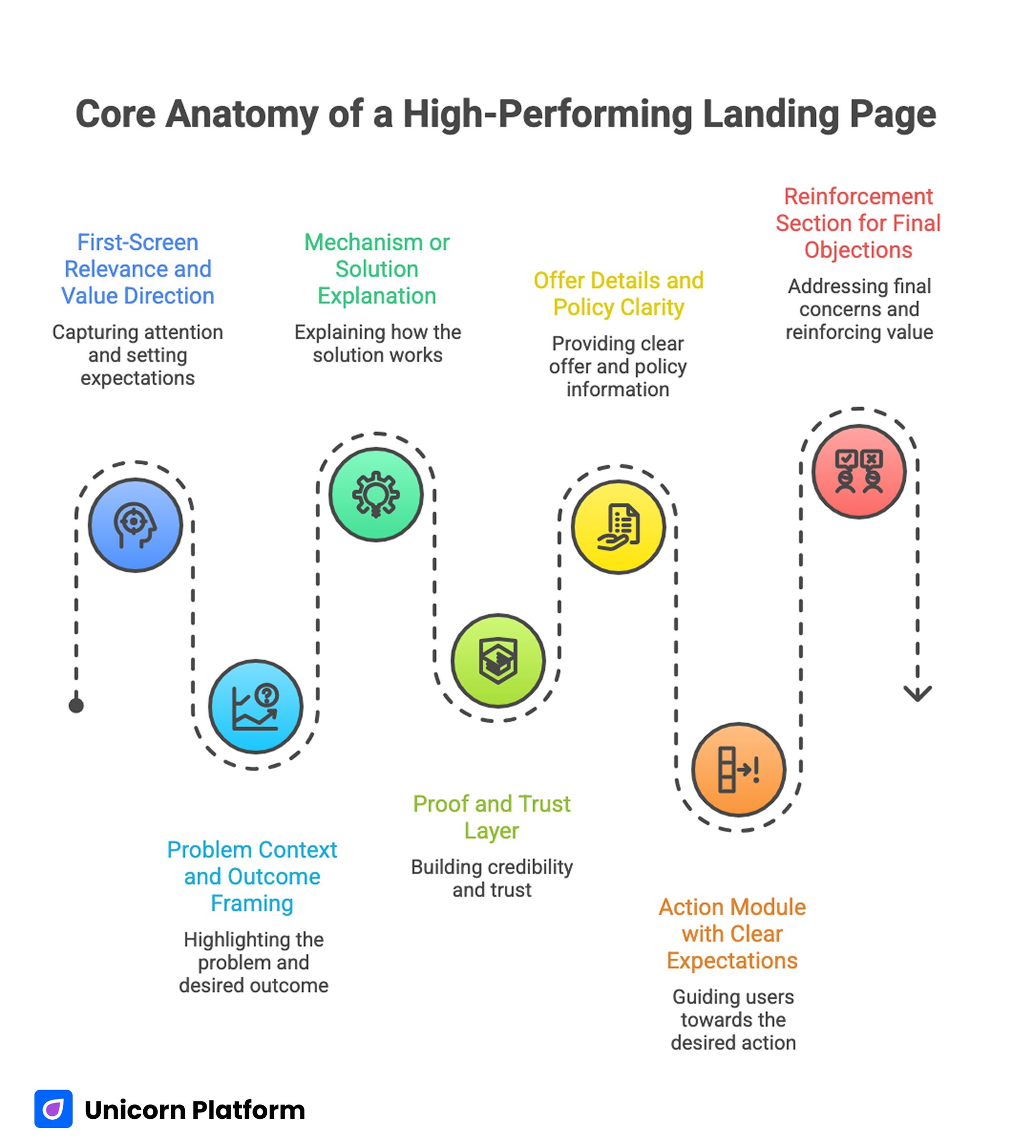
Core Anatomy of a High-Performing Landing Page
Most reliable pages use a shared anatomy, even when brand style and offer type differ. The important part is not copying layouts. The important part is giving each block one clear function.
A practical anatomy includes:
- First-screen relevance and value direction.
- Problem context and outcome framing.
- Mechanism or solution explanation.
- Proof and trust layer.
- Offer details and policy clarity.
- Action module with clear expectations.
- Reinforcement section for final objections.
Teams can use this anatomy as a baseline and scale variants by intent stage. If your team needs a reusable model for section jobs before writing copy, this step-by-step landing page structure guide provides a useful planning workflow.
Documenting anatomy before design reduces rewrite cycles. It also keeps content, growth, and design teams aligned when multiple people edit the same page.
Section-by-Section Execution Framework
1) First-Screen Block: Fit, Value, and Next Step
The opening block should help the right user self-qualify quickly. It should communicate audience fit, practical outcome, and one dominant action without forcing users to scroll for basic clarity.
A reliable first-screen pattern includes one focused headline, one supporting line that clarifies outcome, one confidence cue, and one primary CTA. Anything beyond that should be secondary.
Most first-screen failures come from trying to explain everything at once. When too many claims compete in the same visual area, users remember none of them.
2) Problem-to-Outcome Block: Why This Matters
After first-screen clarity, users need context. This block should frame the current pain, define the desired improvement, and connect your offer to that improvement.
Keep this section practical. Abstract transformation language creates curiosity but often weakens action confidence. Users need to understand how daily work or outcomes change in concrete terms.
This section is also where you can set boundaries. Clarifying who the offer is not for often increases trust among high-fit users.
3) Mechanism Block: How the Outcome Happens
This block explains how your product, service, or process delivers the promised outcome. It should translate internal complexity into clear user logic.
Use short sequences or simple process steps rather than long feature dumps. Decision clarity increases when users can see progression from starting point to result.
If your mechanism requires setup effort, state that clearly and show what support exists. Honest effort framing often improves conversion quality.
4) Trust and Proof Block: Confidence at the Right Moment
Proof should be mapped to likely objections. Generic social proof can help, but targeted proof tied to specific concerns usually performs better.
Common trust concerns include reliability, implementation time, data handling, support access, and outcome realism. Choose proof elements that answer those concerns directly.
Distribute proof signals instead of placing every trust element in one area. A scattered but intentional trust layer supports decisions throughout the page.
5) Offer and Policy Block: Terms Without Friction
Offer clarity is not only about price. Users also evaluate what they get, when they get it, and what happens if expectations are not met.
This section should explain terms in plain language. Hidden conditions and vague policy lines may increase short-term clicks but often reduce qualified conversions.
For lead forms, this block should also clarify response expectations. For direct sales pages, it should clarify delivery, return, or support boundaries.
6) Action Block: One Dominant Route
The action block should match readiness stage. Cold audiences may need lower-commitment actions, while warm audiences may prefer direct conversion routes.
Regardless of stage, route hierarchy should stay clear. A primary CTA can be supported by one secondary option, but visual weighting should remove ambiguity.
Supporting microcopy should answer immediate anxiety: time required, what users receive next, and any commitment expectations.
7) Reinforcement Block: Final Objection Handling
Before final commitment, many users need one more confirmation step. This block can include concise FAQs, guarantee reminders, or implementation clarifications.
Avoid repeating earlier claims without new value. Reinforcement should resolve remaining uncertainty, not restate the headline.
A strong final section improves completion among users who are interested but cautious.
CTA Placement and Frequency Rules
CTA strategy is about decision timing, not button quantity. Repeating a CTA every few lines can feel pushy and reduce trust.
Use a practical placement model:
- Primary CTA in first-screen block.
- Contextual CTA after mechanism clarity.
- Reinforcement CTA near final objection handling.
Each placement should follow a completed decision stage. Asking for action before users receive needed context usually lowers qualified outcomes.
CTA labels should reflect the real next step. Clear wording such as "See demo", "Start setup", or "Get pricing" can reduce uncertainty more effectively than vague high-energy text.
Form Structure and Friction Management
Forms should collect only information needed for routing and next-step execution. Extra fields can look harmless internally but often reduce completion quality externally.
A useful rule is progressive commitment. Ask for minimum viable information at first conversion, then collect additional context after initial trust is established.
Field order matters. Start with low-friction inputs, then move toward deeper qualification only when needed. This keeps momentum while still enabling downstream quality control.
Error handling and helper text also affect conversion reliability. Clear validation, visible field labels, and concise privacy context reduce avoidable abandonment.
How to Adapt Structure by Traffic Intent
One universal page rarely serves all traffic sources equally. Intent stage and click context should influence section emphasis, not just headline wording.
For cold discovery traffic, increase value context and proof depth before asking for heavy commitment. Users in this stage often need stronger relevance and risk framing.
For warm retargeting traffic, shorten educational sections and prioritize objection resolution plus action speed. These users already know the category and need cleaner decision closure.
For brand search or high-intent traffic, reduce narrative overhead and make offer terms plus action route immediately clear. Over-explaining can delay decisions for users who are already ready.
When your campaigns include mixed sources, create controlled variants with shared architecture. This preserves governance while improving message fit.
Mobile Structure and Speed Priorities
Mobile execution should preserve structural logic, not simply shrink desktop layout. The order of decision-critical content must remain clear on smaller screens.
Prioritize single-column scanning, readable type sizes, clear spacing around CTAs, and stable tap targets. If users cannot act comfortably on mobile, conversion quality drops regardless of strong copy.
Media behavior needs strict control. Heavy visuals and layout shifts can hide key value statements or push action areas below practical attention zones.
A practical mobile checklist includes first-screen clarity, stable load sequence, predictable form behavior, and visible action routing. Teams that need a repeatable responsive process can use this responsive landing page workflow to keep structure intact across breakpoints.
Real-device QA should be part of release criteria. Emulator-only checks miss many interaction issues that appear under normal network and device constraints.
Measurement Model for Structural Decisions
Without clean measurement, structure changes become subjective. You need both front-end and downstream signals to evaluate whether a structural edit actually improved outcomes.
Track front-end behavior such as CTA clicks, scroll depth by section, form starts, and form completions. These indicators reveal where users disengage in the sequence.
Pair that with quality signals such as lead acceptance, onboarding completion, purchase retention, or support burden by source segment. This prevents low-quality conversion gains from being misread as wins.
Keep event definitions stable during tests. If tracking logic changes mid-cycle, decision confidence drops and teams often draw the wrong conclusions.
Governance System for Teams Managing Multiple Landing Pages
Once teams start running many campaigns, structure quality usually declines unless governance is explicit. Different owners launch pages quickly, local edits accumulate, and section logic drifts across the portfolio.
A governance system keeps speed while protecting consistency. The goal is not heavy process. The goal is ensuring every page still follows a decision sequence that users can trust.
Start with a shared architecture document that defines standard section jobs and acceptable variations by intent stage. Contributors should know which blocks are mandatory, which are optional, and which conditions justify adding custom sections.
Then create reusable content standards:
- Approved headline patterns for each intent stage.
- Approved trust-signal formats mapped to common objections.
- Standard policy language for delivery, returns, or response timing.
- CTA naming rules aligned with real next steps.
- Form-field standards by conversion objective.
These standards reduce inconsistencies that often confuse users. They also reduce review bottlenecks because editors can validate changes against predefined rules.
Ownership should be distributed but clear. One owner for conversion logic, one for technical quality, and one for brand and editorial consistency is usually enough for most teams. Shared ownership without role clarity often leads to contradictory edits and delayed launches.
Version logging is another high-leverage habit. Keep a simple record of what changed, why it changed, and what signal moved after release. This creates institutional memory and prevents repeated experiments that already failed.
Governance becomes especially important when agencies, freelancers, or multiple internal squads contribute pages in parallel. A stable structure system keeps outcomes predictable even when execution resources change.
Pre-Launch QA Checklist for Structure Integrity
Many pages fail because QA focuses on visual bugs while decision flow remains broken. A structure-focused checklist catches issues that design polish alone will miss.
Use this checklist before launch:
- First-screen block answers fit, value, and next step in one scan.
- Section order follows decision progression from context to commitment.
- Trust cues appear near major friction points, not only near footer areas.
- Offer terms and policy boundaries are visible before final action.
- Primary CTA route is clear across desktop and mobile layouts.
- Form fields match routing needs and avoid unnecessary friction.
- Mobile hierarchy preserves section purpose, not just layout shape.
- Event tracking reflects section-level behavior and quality outcomes.
Run this checklist with at least one reviewer who did not write the page. Fresh readers detect ambiguity faster because they mirror first-visit behavior.
A strong QA pass should end with a short launch brief: page objective, target segment, major hypothesis, expected signal, and rollback condition. This keeps post-launch decisions grounded and prevents reactive edits driven by incomplete data.
A 30-Day Structure Optimization Plan
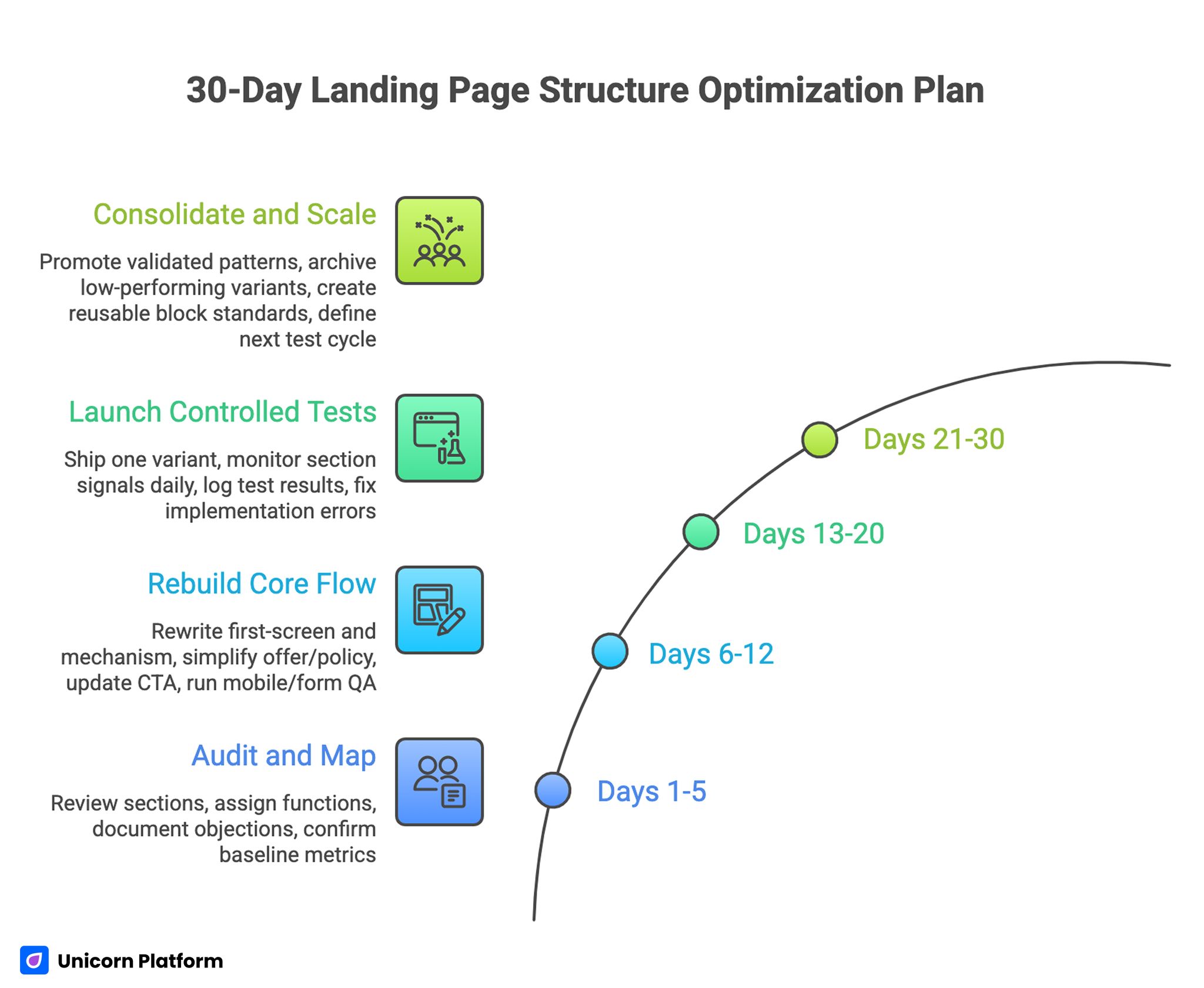
30-Day Landing Page Structure Optimization Plan
Days 1-5: Audit and Map Section Jobs
Review current page sections and assign each one a single function. Remove duplicated jobs and identify missing decision stages.
Document top objections from analytics, sales notes, or support logs. Map each objection to a section where it should be resolved.
Confirm baseline metrics for both conversion and quality outcomes before edits start.
Days 6-12: Rebuild Core Flow
Rewrite first-screen and mechanism sections for clarity and progression. Align trust cues with actual friction points instead of placing all proof in one cluster.
Simplify offer and policy language so users can evaluate terms without interpretation effort. Update CTA hierarchy to one dominant route.
Run mobile and form QA early, not after copy finalization.
Days 13-20: Launch Controlled Tests
Ship one primary variant with one major structural hypothesis. Avoid simultaneous multi-variable edits across unrelated sections.
Monitor section-level signals daily to detect early friction. Keep a structured test log with hypothesis, edited block, expected signal, and decision threshold.
If behavior drops sharply, fix implementation errors first before rewriting strategy.
Days 21-30: Consolidate and Scale
Promote validated patterns into your standard architecture. Archive low-performing variants with clear notes on why they underperformed.
Create reusable block standards for first-screen copy, trust placement, form logic, and CTA modules. This improves future launch speed and consistency.
Use behavioral insights to define the next test cycle. For deeper friction diagnosis, the methods in this user behavior optimization guide help prioritize what to change next.
Common Structural Mistakes and Fast Fixes
Mistake 1: Feature-heavy opening block
Fix: Lead with fit and outcome first, then move to mechanism detail after relevance is established.
Mistake 2: Trust only in lower sections
Fix: Move targeted proof near first major CTA and near policy-sensitive decisions.
Mistake 3: Too many equal-priority actions
Fix: Define one primary route per page variant and support it with clear visual hierarchy.
Mistake 4: Form asks for too much too soon
Fix: Collect minimum viable data first and expand qualification after initial commitment.
Mistake 5: Mobile layout breaks decision flow
Fix: Reorder sections for small-screen scanning and protect first-screen clarity during load.
Mistake 6: Testing without architecture stability
Fix: Keep section order stable while testing one major variable at a time.
FAQ: Landing Page Structure
What is the most reliable landing page structure for conversion-focused campaigns?
A reliable structure starts with fit and value, then moves to mechanism, proof, terms, and action. The exact design can vary, but the decision sequence should stay clear.
How many sections should a page usually have?
There is no universal number. Use as many sections as needed to resolve key objections without repeating the same claim in multiple blocks.
Should every page include testimonials?
Not always, but most pages need some form of trust evidence. Choose proof formats that address your audience's specific risks.
Where should CTAs be placed?
Place CTAs after key decision points: early for clarity, mid-page after mechanism understanding, and near the end after objection handling.
How long should the first section be?
It should be long enough to establish fit and value quickly, but short enough to keep scanning momentum. Clarity matters more than word count.
Is a short form always better than a long form?
Short forms usually increase submission volume, but not always lead quality. Match field depth to your routing needs and buyer readiness.
How should structure change for mobile users?
Preserve decision order, simplify visual density, and make action zones easy to access. Mobile adaptation should protect logic, not just compress layout.
Can one page work for both cold and warm traffic?
It can, but separate variants often perform better when intent differences are significant. Shared architecture with adjusted emphasis is usually the best balance.
How often should structure be reviewed?
Review structure after major campaign changes, offer updates, or behavior shifts. Quarterly reviews plus ongoing test cycles usually keep performance stable.
What should teams test first when conversion stalls?
Start with first-screen relevance and route clarity. If users do not understand fit and next step early, downstream optimizations rarely recover performance.
Final Takeaway
Strong page performance is rarely the result of one clever section. It comes from consistent structure decisions that reduce uncertainty at each stage of the user journey.
When teams define section jobs, map objections to the right blocks, and test major changes with discipline, conversion quality becomes more predictable. That is how structure work shifts from reactive editing to a reliable growth system.
