Table of Contents
- A Decision-First Structure for Course Enrollment Pages
- Pricing, Risk Reduction, and Policy Clarity
- Scenario Playbooks
- 30-Day Optimization Cycle for Course Pages
- Common Mistakes and Practical Fixes
- FAQ
Online education demand is still strong, but buyer behavior has changed. Prospective students compare more options, evaluate credibility faster, and abandon pages that feel vague or overloaded.
The issue for most teams is not traffic volume. The real problem is that page structure, offer clarity, and trust signals are not aligned to the way people decide to enroll.
High-performing course pages work because they reduce uncertainty at each decision step. They clarify who the program is for, what outcome students can expect, and what commitment is required before the enrollment button appears.
This guide translates those winning patterns into a repeatable framework for creators, education startups, and training teams. The goal is simple: improve conversion quality without sacrificing speed.
sbb-itb-bf47c9b
Key Takeaways
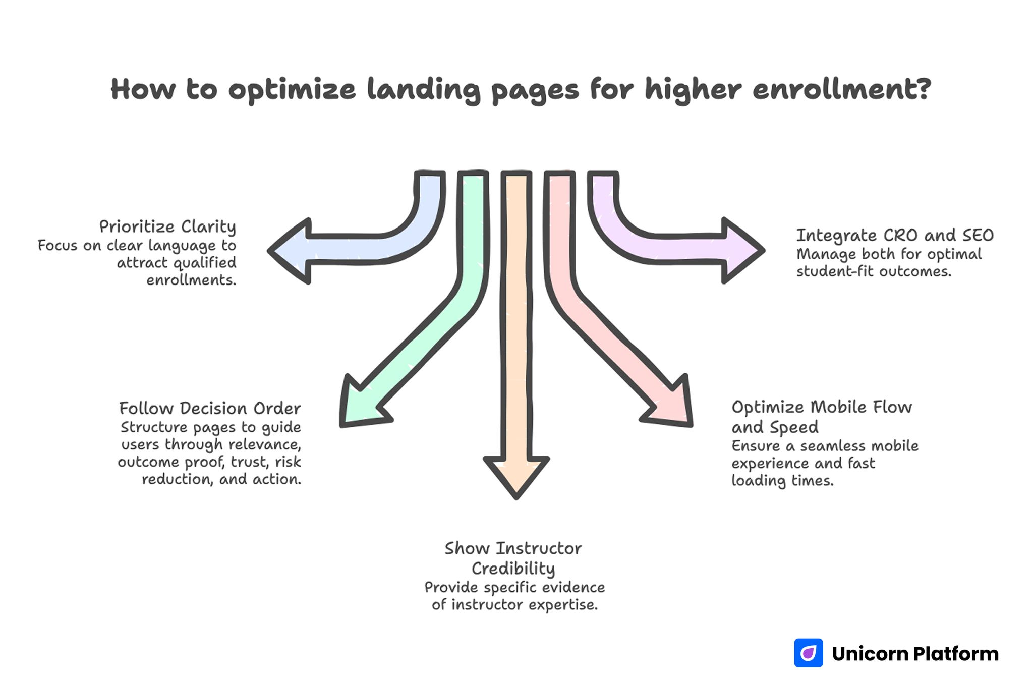
Key Takeaways For Optimizing Landing Pages
- Qualified enrollments rise when pages prioritize clarity over promotional language.
- Strong course pages follow decision order: relevance, outcome proof, trust, risk reduction, then action.
- Instructor credibility should be shown through specific evidence, not generic authority claims.
- Mobile flow and page speed are enrollment variables, not technical afterthoughts.
- CRO and SEO should be managed as one operating system tied to student-fit outcomes.
Why Many Course Pages Underperform
Most weak pages fail for one of three reasons. They promise transformation without defining measurable outcomes, they blur audience level, or they hide essential enrollment details until too late.
Learners who cannot self-qualify quickly will postpone decisions. That hesitation is amplified in crowded categories where alternatives are one search away.
Another common issue is narrative imbalance. Pages spend too much space on inspiration and too little on how the course works in practice, who gets results, and what effort is required.
When structure fails, even excellent curriculum can look risky. Prospects interpret missing details as uncertainty, which depresses enrollment intent.
What Top Competitors Consistently Do Better
Across leading course pages, the strongest pattern is operational consistency. Winning pages are built with reusable conversion modules, but each module is adapted to audience intent and program type.
Those pages also combine breadth and depth effectively. They remain skimmable, but they still answer practical objections in enough detail to support real purchase decisions.
Finally, they treat proof as a system rather than a single testimonial block. Social evidence, instructor background, curriculum outcomes, and support expectations are positioned where confidence drops naturally.
A Decision-First Structure for Course Enrollment Pages
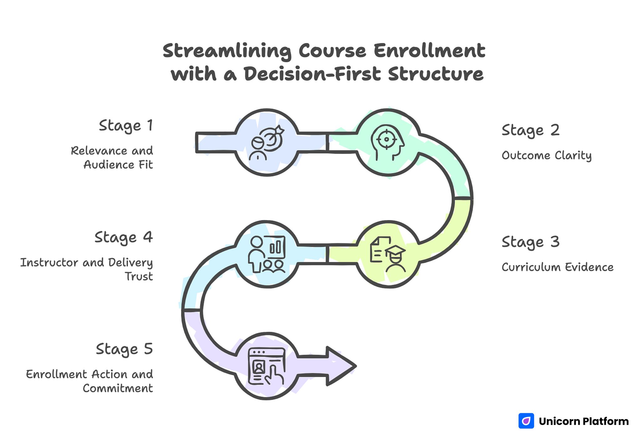
Streamlining Course Enrollment with a Decision-First Structure
A practical enrollment page should mirror the learner decision path. People decide in stages, and each stage requires specific information to move forward.
Stage 1: Relevance and Audience Fit
Start by naming the learner profile clearly. Define baseline skill level, preferred use case, and the type of student who benefits most from the program.
This first block should be direct and concrete. A prospect should know in seconds whether the course is for beginners, career switchers, active practitioners, or advanced specialists.
Stage 2: Outcome Clarity
After relevance is confirmed, show what students will be able to do after completion. Outcome language should describe capabilities, not broad aspirations.
Use observable statements such as workflows learners can execute, deliverables they can produce, or decisions they can make confidently after training. Observable outcomes make claims easier to trust.
Stage 3: Curriculum Evidence
Module lists alone are rarely persuasive. Map each major section to a practical application so prospects can connect content with real-world use.
If possible, add examples of assignments, templates, or guided projects that prove the curriculum is built for execution, not passive consumption. This evidence helps prospects picture day-to-day learning experience.
Stage 4: Instructor and Delivery Trust
Trust is built through relevance and transparency. Explain why the instructor is qualified to teach this specific topic and how students are supported during the learning process.
Support model details should be visible here: office hours, review cycles, response expectations, community access, or mentorship boundaries. Clear support scope reduces anxiety before payment.
Stage 5: Enrollment Action and Commitment
Only after the confidence layers are clear should the page emphasize enrollment action. The primary CTA should match program type and buying temperature.
Lower-ticket self-serve programs can use direct checkout. Premium or high-commitment programs often perform better with application flows that filter fit before payment.
Course Offer Positioning That Improves Qualified Enrollments
Offer framing should reduce confusion, not increase urgency pressure. Students need to understand scope, duration, pace, and expected effort before they commit.
A clear positioning model includes cohort format, estimated weekly time, outcomes at completion, and who should avoid enrolling right now. This structure improves cohort fit before checkout starts.
This last element is often overlooked. A short "not ideal for" section prevents low-fit purchases and improves satisfaction after onboarding.
Curriculum Presentation That Moves From Features to Capability
Many teams publish detailed syllabi but still convert poorly. The problem is that raw content lists do not communicate progression or practical confidence.
Translate each curriculum section into capability language. Instead of naming topics alone, explain what learners can produce or solve after that stage.
Use progression cues to show learning momentum. Prospects should see how early modules build foundations and later modules convert those foundations into applied results.
For teams refining section order and proof placement, this practical course landing page build guide can support faster page iteration. Apply it when planning hero, curriculum, and CTA sequencing.
Instructor Proof Without Overclaiming
Instructor credibility should feel relevant, current, and specific to the promise of the program. Generic bios and broad achievements rarely answer enrollment objections.
Effective proof usually combines recent work examples, teaching outcomes, and scope boundaries. Prospects trust instructors who define what they teach well and what they do not cover.
Personal brand positioning matters in this context, especially in creator-led education categories where instructor trust drives conversion. This personal homepage design guide is useful when reshaping authority sections for clarity.
Keep the tone factual. Overstated claims can increase clicks in the short term but reduce trust when prospects evaluate details.
Social Proof Strategy for Education Offers
Testimonials work best when they address real objections. Surface student comments that discuss workload realism, outcome usefulness, instructor support, and confidence after completion.
If reviews are broad and emotional but not specific, add short context labels so prospects understand the learner profile behind each quote. Context improves trust because readers can compare themselves to the quoted students.
Case snippets should include enough detail to be credible without exposing sensitive learner data. Precise improvement narratives are better than generic praise.
Pricing, Risk Reduction, and Policy Clarity
Enrollment friction often appears near pricing sections. People hesitate when they are uncertain about value, fit, or downside protection.
Clarify exactly what is included, how long access lasts, and what support boundaries apply at each pricing tier. Hidden conditions increase abandonment.
If refunds, trial periods, or transfer options exist, place concise policy summaries close to the CTA. That proximity helps learners evaluate risk at decision time rather than after checkout intent forms.
Choosing Between Direct Enrollment and Application Flow
Direct enrollment is usually effective for lower-friction offers with clear audience fit and predictable outcomes. Application-first flows are better when programs are high-ticket, selective, or effort-intensive.
The choice should be driven by student readiness and support capacity, not by preference alone. Misaligned flow choice can hurt both conversion and completion quality.
Mobile-First UX for Course Pages
Course discovery increasingly begins on mobile, including high-intent sessions. A page that reads well on desktop can still fail commercially if mobile interactions are dense or slow.
Prioritize mobile information hierarchy first. The opening screen must establish audience fit, core outcome, and next-step clarity without long scroll friction.
Interaction controls should support quick decisions. Buttons, accordion blocks, and table elements need to remain usable on smaller screens without accidental taps or hidden text.
Loading behavior also matters because prospects compare alternatives rapidly. Speed delays and layout shifts lower confidence before users even evaluate offer quality.
Technical Performance and Conversion Reliability
Performance work should be tied to enrollment outcomes, not treated as isolated engineering hygiene. Fast pages do not automatically convert better, but slow pages consistently underperform.
Set a lightweight performance baseline for each template variation and verify it before launch. This keeps campaign speed high while protecting core usability.
Review media usage carefully in curriculum previews and testimonial sections. Visual richness helps trust, but only when it does not compromise first interaction speed.
Template and Platform Selection Criteria for Education Teams
Tool selection should be based on operational needs, not just template counts. Education teams need fast editing, modular sections, and predictable conversion controls across multiple offers.
A practical evaluation checklist includes publishing speed, mobile quality, analytics visibility, and ease of collaboration between content and growth teams. These operational factors influence launch consistency more than visual novelty.
Budget-constrained teams can still build reliable systems by focusing on execution fundamentals first. This comparison of free website platforms for startup launches is helpful when evaluating tradeoffs.
The best setup is the one your team can update weekly without quality drift. Speed plus governance beats one-time visual polish.
CRO and SEO as One Enrollment Engine
Separating SEO content planning from conversion optimization often creates mixed messaging. Pages attract visitors with one expectation and present an enrollment narrative built for another audience.
A stronger approach starts with intent mapping. Define primary learner intent, supporting questions, and target action for each page before drafting copy or selecting modules.
From there, combine educational depth with conversion structure. Informational sections should reduce uncertainty and naturally guide qualified prospects toward enrollment decisions.
Shared Metrics That Protect Quality
Track metrics that reflect both growth and student fit. Conversion rate alone is not enough for education offers where completion and satisfaction determine long-term brand value.
Use a shared dashboard that includes qualified enrollment rate, checkout completion, refund signals, support ticket themes, and early-course engagement indicators. Teams should review the same dashboard to avoid channel-specific bias.
When metrics are interpreted together, teams can avoid short-term optimization that increases low-fit enrollments. Combined interpretation keeps growth and student outcomes aligned.
Scenario Playbooks
Scenario A: Strong Traffic, Weak Enrollment Intent
Traffic sources look healthy, but CTA interaction remains low. In most cases, page openings are descriptive yet fail to define audience level and tangible outcomes.
Fix this by rewriting first-screen copy around learner fit and immediate post-course capability. Then position one trust cue directly below the core promise.
Scenario B: Good CTA Clicks, Poor Checkout Completion
Prospects show interest but drop during final commitment. This pattern often indicates pricing or policy ambiguity near the enrollment decision point.
Fix this by clarifying what each pricing option includes, summarizing risk terms near CTA modules, and simplifying nonessential checkout distractions. Fewer unresolved questions usually improve completion rate quickly.
Scenario C: Good Sales, Weak Student Retention
Conversion rate looks strong, yet early-course disengagement and refund requests increase. The page likely overpromises relative to learner readiness or available support.
Fix this by adding clear prerequisites, weekly effort expectations, and explicit support scope so prospects self-qualify before paying. This adjustment raises enrollment quality even if raw volume stays flat.
30-Day Optimization Cycle for Course Pages
Week 1: Friction Audit
Audit high-traffic pages for unclear audience positioning, weak outcome language, missing trust context, and mobile readability issues. Prioritize one bottleneck per page type.
Week 2: Template Refinement
Update templates with standardized modules for relevance, outcomes, curriculum proof, instructor trust, and policy confidence. Keep module usage rules documented for faster team execution.
Week 3: Controlled Experiments
Run focused tests with stable traffic windows. Change one major element at a time so outcome interpretation remains reliable.
Week 4: Decision Review
Review results against conversion and quality indicators, then standardize winning patterns. Archive unsuccessful variants with short notes so future teams avoid repeating the same mistakes.
Repeat this cycle monthly to keep enrollment pages aligned with student behavior and market expectations. Consistent cadence prevents gradual message drift across cohorts.
Common Mistakes and Practical Fixes
Mistake 1: Promise-heavy copy with unclear outcomes
Fix by translating every core promise into an observable learner capability. Outcome specificity improves trust and helps prospects decide faster.
Mistake 2: Generic audience positioning
Fix by defining skill level, use case, and readiness criteria in the opening section. Precise fit language reduces low-intent page interactions.
Mistake 3: Testimonials without decision context
Fix by using proof snippets that reference workload, support quality, and post-course application. Relevance beats volume in social evidence blocks.
Mistake 4: Hidden policy and support details
Fix by placing refund and support summaries near enrollment actions. This reduces late-stage hesitation and improves perceived transparency.
Mistake 5: Desktop-first layouts that break on mobile
Fix by validating core interactions on real mobile devices before launch. Mobile hierarchy and tap clarity are essential for conversion stability.
Mistake 6: Optimizing for enrollments only
Fix by pairing conversion goals with retention and satisfaction indicators. Balanced measurement protects long-term program reputation.
FAQ: Online Course Landing Pages in 2026
1) What should a course landing page explain first?
Start with who the program is for and what practical outcome learners should expect. Prospects need immediate fit confirmation before they evaluate deeper details.
2) How detailed should the curriculum section be?
Include enough depth to show progression and application, not just topic names. Learners should understand what they can do after each major section.
3) Should I use direct checkout or an application form?
Choose direct checkout for low-friction offers with clear fit and choose applications for premium or selective programs. The right flow depends on readiness filtering and support capacity.
4) Where should testimonials appear?
Place key proof near major claims and near enrollment decisions. This reinforces confidence when prospects naturally question credibility.
5) How can I reduce refund risk before launch?
State prerequisites, time commitment, and support boundaries clearly before purchase. Honest expectation setting improves post-enrollment satisfaction.
6) What matters more: design quality or copy quality?
Both matter, but copy hierarchy usually decides whether users understand and trust the offer. Visual polish helps only when clarity is already strong.
7) How often should course pages be updated?
Review core pages monthly and refresh immediately when offers, cohort format, or learner objections change. Frequent updates prevent message drift.
8) Which KPI should education teams track first?
Track qualified enrollments, then pair that with early engagement and refund indicators. This combination reveals whether growth is healthy or fragile.
9) Can free tools still support strong conversion outcomes?
Yes, if your workflow prioritizes clarity, speed, and governance discipline. Tool cost matters less than execution consistency.
10) What is the fastest high-impact improvement?
Rewrite the first screen to clarify audience fit, core outcome, and next action in plain language. That change often improves both engagement and conversion quality quickly.
Final Takeaway
Great course pages do not win by sounding bigger than competitors. They win by helping the right learners make confident, informed decisions with less friction.
If your team applies decision-first structure, outcome-specific messaging, transparent trust layers, and monthly optimization discipline, enrollment quality will improve alongside conversion performance. That combination supports stronger retention and brand trust after enrollment.