Table of Contents
- Why Healthcare Websites Underperform in Practice
- Core Structure for a High-Converting Healthcare Website
- 30-Day Improvement Plan
- Common Mistakes and Fast Fixes
- FAQ
Most healthcare businesses do not lose leads because patients lack intent. They lose leads because website structure creates uncertainty at critical moments. Visitors cannot quickly confirm care fit, insurance details, provider credibility, or next steps, so they leave before booking.
This problem gets worse when teams treat healthcare sites like generic business pages. In medical contexts, users evaluate risk faster and more carefully. They need practical clarity, not just attractive branding.
Strong medical website design is a conversion and trust system. It should reduce anxiety, guide the patient to the right action path, and provide clear operational expectations. If those parts are weak, traffic can rise while booking quality and patient confidence decline.
This guide gives a practical framework you can apply in Unicorn Platform. It focuses on structure decisions that improve patient experience, compliance readiness, and measurable conversion outcomes.
sbb-itb-bf47c9b
Key Takeaways
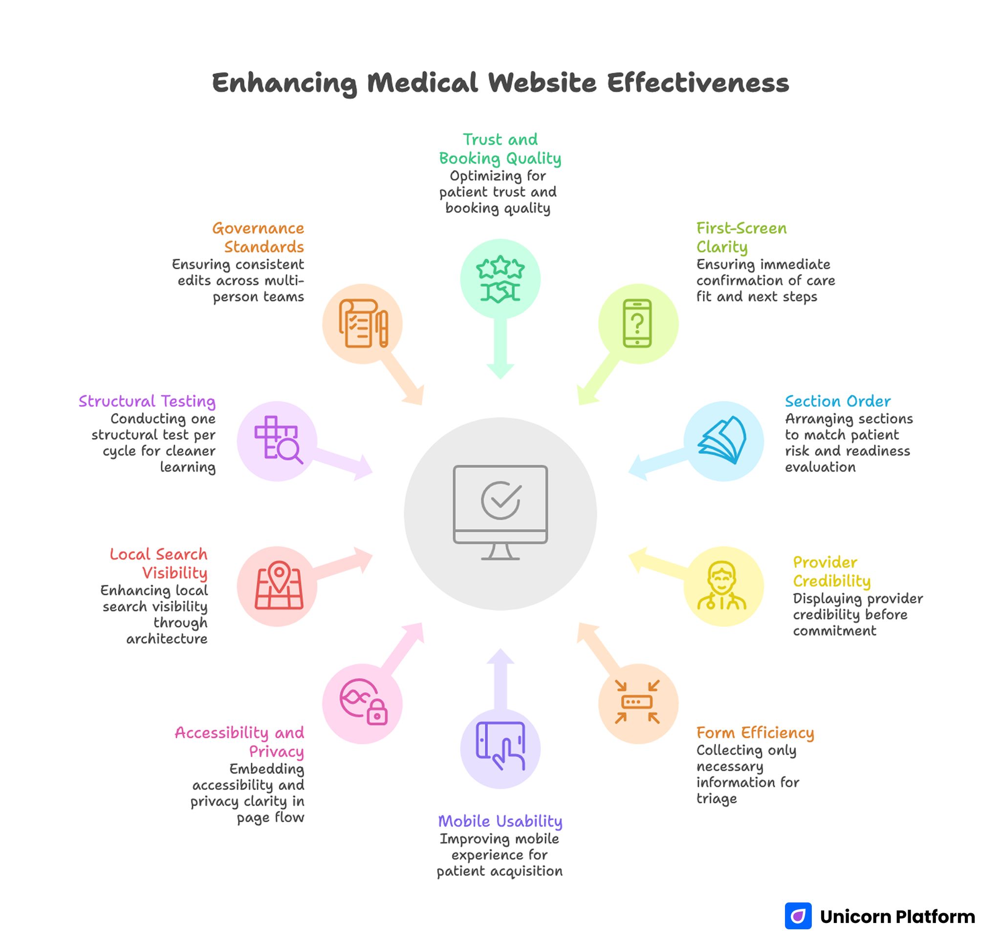
Enhancing Medical Website Effectiveness
- Healthcare websites should optimize for trust and booking quality, not only traffic.
- First-screen clarity must confirm care fit and next steps immediately.
- Section order should match how patients evaluate risk and readiness.
- Provider credibility should be visible before form or booking commitment.
- Forms should collect only information needed for first-step triage.
- Mobile usability is a direct patient-acquisition variable.
- Accessibility and privacy clarity should be embedded in page flow.
- Local search visibility depends on clean service and location architecture.
- One structural test per cycle produces cleaner learning than broad redesigns.
- Governance standards help multi-person teams avoid inconsistent edits.
Why Healthcare Websites Underperform in Practice
The first issue is clarity mismatch. Pages often mix broad marketing language with fragmented service details, so users cannot quickly decide whether the clinic is relevant for their condition or goal.
The second issue is trust timing. Credentials, outcomes context, provider profiles, and process transparency appear too late. Patients are asked to submit forms before confidence has been built.
The third issue is pathway confusion. Many sites push multiple equal-priority actions such as call, chat, schedule, and download. Without a clear path, users delay decisions.
The fourth issue is operational opacity. If insurance acceptance, appointment flow, response timing, or visit format are unclear, qualified users pause because uncertainty feels risky.
The final issue is measurement quality. Teams track total submissions but not lead validity, show-up rates, or downstream appointment value. That makes website decisions harder to improve over time.
What Medical Website Design Must Achieve
A high-performing healthcare page should do five jobs in sequence: establish fit, build confidence, clarify process, reduce risk, and guide one clear next step. This sequence helps patients make decisions without feeling rushed.
It should also translate clinical complexity into plain language. Patients should understand services, expected outcomes, and practical logistics without interpreting internal terminology.
Most importantly, structure should reflect the patient journey, not the organization chart. Users think in terms of symptoms, concerns, and next actions, not departmental labels.
A simple quality check is whether a first-time visitor can answer these questions quickly:
- Is this clinic or provider relevant to my need?
- Can I trust the team and process?
- What happens if I contact or book now?
- How soon will I receive a response?
- What information should I prepare before my visit?
If these answers are not obvious, structure needs revision before design polishing. Resolve this before investing time in visual refinements.
Choosing the Right Healthcare Web Design Partner or Team Model
Many clinics choose partners based on visual portfolio alone. That is not enough. Healthcare sites require stronger execution in trust architecture, accessibility, compliance-aware content, and patient conversion logic.
When evaluating a healthcare web design partner, focus on process depth rather than style samples only. Ask how they map patient objections, structure appointment pathways, and validate form quality after launch.
You also need clarity on collaboration model. A small practice may work well with one specialist plus internal reviewer, while multi-location groups often need shared governance across content, legal review, and operations.
Strong selection criteria include the execution factors below. These filters usually predict long-term outcomes better than portfolio aesthetics.
- Experience with healthcare user journeys and patient intent stages.
- Structured approach to service-page architecture and booking pathways.
- Ability to support mobile and accessibility standards at launch.
- Clear QA process for trust, privacy, and conversion integrity.
- Post-launch optimization workflow with measurable hypotheses.
A partner who can explain these mechanics in detail is usually a stronger long-term choice than one who only presents visual direction. Strategic clarity reduces expensive redesign cycles later.
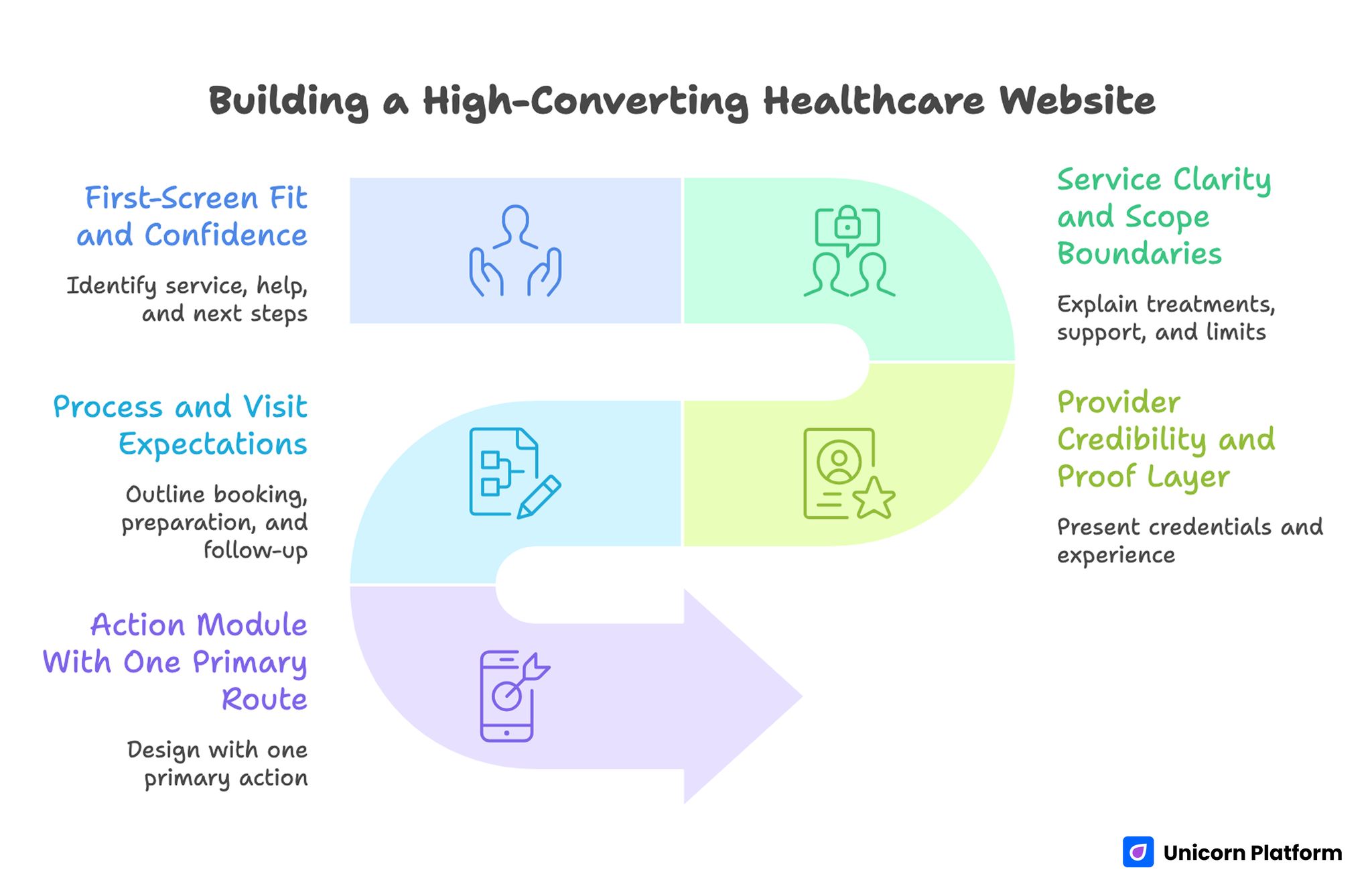
Core Structure for a High-Converting Healthcare Website
Reliable healthcare pages follow predictable decision stages. The structure below keeps patient confidence moving forward while reducing confusion.
1) First-Screen Fit and Confidence
The opening section should identify who the service is for, what help is offered, and what action to take next. Keep this block specific and calm.
Patients should not need to scroll for basic fit signals. Include one clear service focus, one confidence cue, and one dominant next step.
2) Service Clarity and Scope Boundaries
After initial fit, users need service specifics. Explain what is treated, who is supported, and where scope boundaries exist.
Scope boundaries can increase trust when written clearly. They prevent wrong-fit leads and improve contact quality.
3) Provider Credibility and Proof Layer
Healthcare decisions are high-trust decisions. This section should present credentials, relevant experience, and contextual proof without overclaiming outcomes.
Use concise profiles, team information, and evidence formats that match patient concerns. Generic testimonials alone are rarely enough.
4) Process and Visit Expectations
Patients should understand booking flow, preparation requirements, timeline expectations, and post-visit follow-up process. Unclear logistics can block otherwise qualified bookings.
Transparent process language reduces anxiety and improves conversion quality. People are more likely to book when they know what will happen next.
5) Action Module With One Primary Route
Action design should match readiness. Most healthcare pages perform best with one primary action such as appointment request or consultation booking, plus one secondary option when necessary.
If your team needs a clearer method for assigning section jobs before launch, this landing page structure guide is useful for planning conversion flow and content ownership.
Must-Have Features for Healthcare Website Execution
Feature sets should support trust and operations, not only aesthetics. In healthcare contexts, every feature should reduce friction or improve care-path clarity.
Priority features often include the following operational elements. Each one should reduce friction at a specific point in the patient journey.
- Streamlined appointment request or booking workflow.
- Provider pages with clear specialties and availability context.
- Service pages with condition-focused language.
- Insurance, billing, and policy clarity modules.
- Easy contact routes with response-time expectations.
- Content modules for patient education and preparation.
For larger organizations, integration capability is often decisive. CRM sync, calendar integration, intake workflows, and analytics tracking should be planned before layout lock.
In Unicorn Platform, modular section design helps teams deploy these components quickly while preserving page consistency across services and locations. That balance is especially useful for multi-location healthcare organizations.
Content Architecture and Local Discovery
Healthcare discovery intent is often local and problem-specific. Content structure should reflect that reality. Patients search by symptom, treatment need, specialty, and location.
Build service pages that connect user language to practical care options. Avoid broad generic copy that forces users to guess whether the service matches their need.
Location relevance also matters. Multi-location organizations should keep each location page structurally consistent while preserving unique operational details such as hours, phone routing, and visit format.
Educational content should support decision confidence, not replace service clarity. Helpful guides can reduce anxiety, but they should connect naturally to relevant action paths.
Mobile UX, Speed, and Accessibility Standards
A large share of healthcare website traffic arrives on mobile devices. If mobile layout breaks reading flow or form usability, conversion quality drops quickly.
Prioritize readable typography, clear touch targets, stable layout during load, and visible action routes without excessive scrolling. Keep interaction friction low for users under stress.
Accessibility should be treated as core quality, not optional enhancement. Clear contrast, keyboard navigation support, descriptive labels, and predictable structure improve usability for all users.
Teams that need a repeatable mobile QA approach can use this responsive landing page workflow to keep conversion logic intact across breakpoints.
Technical QA should include real-device validation before traffic scaling. Emulator-only checks often miss input, loading, and interaction issues found in normal patient contexts.
Conversion Path Design for Patient Readiness
Not every visitor is ready for the same commitment level. Some users are ready to book now, while others need eligibility or process clarity first.
Design action paths by readiness stage. This keeps users from being pushed into the wrong conversion flow.
- Immediate booking for high-intent users.
- Low-friction consultation request for uncertain users.
- Informational contact path for logistics-focused questions.
Each path should have clear expectation copy: what information is required, who replies, and how quickly. This reduces perceived risk and improves lead quality.
You can also improve form performance with behavior-focused refinements. The practices in this user behavior optimization guide are useful when drop-off appears around friction points.
Governance and QA for Healthcare Website Teams
As healthcare organizations grow, multiple people edit the same pages. Without governance, message drift and compliance risk increase.
A practical governance model includes one owner for conversion structure, one for clinical accuracy review, and one for technical or legal quality checks. Shared standards reduce contradictory edits.
Use a release checklist that verifies the critical structural items below. Consistent pre-launch checks protect both patient trust and team velocity.
- Fit clarity in first-screen and service sections.
- Trust signals near major decision points.
- Policy and privacy clarity before action.
- Form fields aligned with first-step triage needs.
- Mobile and accessibility integrity across key pages.
- Tracking setup for both conversion and quality outcomes.
This process helps teams scale updates while keeping patient trust stable. It also reduces rework after launch.
30-Day Improvement Plan
Building a High-Converting Healthcare Website
Days 1-5: Audit and Map Patient Journey
Review current pages by service line and intent stage. Identify where users lose confidence, where path options conflict, and where trust details appear too late.
Define one primary objective for the next iteration cycle, such as appointment quality or improved consultation requests. One clear objective keeps testing decisions consistent.
Days 6-12: Rebuild Core Structure
Rewrite first-screen messaging, service scope sections, and process clarity blocks. Align provider proof and policy details with the highest-friction decision points.
Simplify action routes so one primary path is obvious across desktop and mobile. Secondary actions should support, not compete with, the main route.
Days 13-20: Launch Controlled Tests
Test one major structural hypothesis at a time, such as trust-block placement or booking-flow framing. Keep architecture stable while testing.
Track both front-end signals and quality outcomes, including lead validity and scheduled-visit rate. Avoid judging performance by raw submission volume alone.
Days 21-30: Consolidate and Standardize
Promote validated patterns into default page templates. Archive non-performing experiments with short notes on why they failed.
Document section standards so future launches begin from proven structure instead of blank-page redesign. This preserves learning as teams and campaigns change.
Common Mistakes and Fast Fixes
Mistake 1: Generic headline with unclear care fit
Fix: Use first-screen language that clearly defines specialty, audience, and immediate next step. Patients should understand relevance without additional scrolling.
Mistake 2: Booking CTA before trust context
Fix: Place credentials, provider proof, and process transparency before major commitment actions. This usually improves confidence at the decision point.
Mistake 3: Multiple equal-priority action buttons
Fix: Define one dominant path and use secondary options only when they serve distinct readiness states. Clear hierarchy reduces hesitation.
Mistake 4: Long intake form at first contact
Fix: Collect minimum required data first, then gather deeper intake details in follow-up stages. Progressive commitment protects conversion quality.
Mistake 5: Mobile layout that hides key details
Fix: Reorder sections for small-screen scanning and keep key trust signals above deep scroll zones. Mobile users should see critical context early.
Mistake 6: No post-launch measurement discipline
Fix: Track lead quality and patient-path outcomes, not only raw submission counts. This keeps optimization tied to business value.
FAQ: Medical Website Design
What should medical website design prioritize first?
It should prioritize fit clarity and trust. Patients need to quickly understand whether the provider is right for their need and whether the care process feels reliable.
How can a clinic choose the right healthcare web design partner?
Choose a partner who can explain patient-journey structure, compliance-aware content planning, mobile usability standards, and post-launch optimization process in practical detail. Ask for a concrete QA and iteration workflow before signing.
Which pages usually drive the highest conversion quality?
Service pages with clear scope, provider profile pages with relevant credibility cues, and focused booking or consultation pages usually drive the most reliable outcomes. They align directly with patient decision stages.
Is a long healthcare page always better than a short one?
Length should match decision complexity. High-trust medical decisions often need more context, but every section should have a clear function. Extra words without a section job usually reduce clarity.
How many CTAs should a healthcare service page include?
Use one primary CTA with supportive repetition at key decision points. Too many equal-priority actions can reduce confidence. Keep route hierarchy obvious across devices.
What information should appear near appointment forms?
Include response timing, preparation expectations, and concise privacy or policy context so users understand what happens after submission. This lowers uncertainty at the final step.
Why is accessibility critical for healthcare websites?
Accessibility improves usability for all visitors and reduces friction for users with specific needs. It also supports trust and compliance readiness.
How often should healthcare websites be reviewed?
Review after service updates, policy changes, or major traffic shifts. Quarterly structural review plus ongoing test cycles is a practical baseline. Frequent small audits prevent large structural drift.
Should provider credentials appear on landing pages?
Yes, when relevant to the decision stage. Early credibility cues often improve conversion quality in healthcare contexts. Match credential depth to user intent and service risk.
What metrics matter beyond form submissions?
Track lead validity, booking completion, show-up rates, and patient-path progression to understand whether conversions are truly valuable. These metrics give a clearer view than submissions alone.
Final Takeaway
High-performing healthcare websites are built on decision clarity, trust timing, and operational transparency. Visual quality supports these goals, but structure determines whether patients feel confident enough to act.
When teams treat medical website design as a repeatable system, they improve both conversion and care-path quality. That is the foundation for sustainable patient acquisition and stronger brand trust.