Table of Contents
- Conversion Structure That Works For Law Firms
- 30-60-90 Day Execution Plan
- Common Failure Modes And Fixes
- FAQ
Legal buyers do not browse the way shoppers do. They arrive with urgency, uncertainty, and a high fear of choosing the wrong firm. When the page feels generic, unclear, or overly promotional, they hesitate and leave. In practice, most conversion loss happens before a visitor reaches the form.
A strong law firm landing page is not only a marketing asset. It is an intake filter that helps the right people self-identify quickly, understand next steps, and choose contact with confidence. Teams that treat page structure as part of client intake operations usually see better consultation quality, fewer low-fit submissions, and faster response workflows.
sbb-itb-bf47c9b
Quick Takeaways
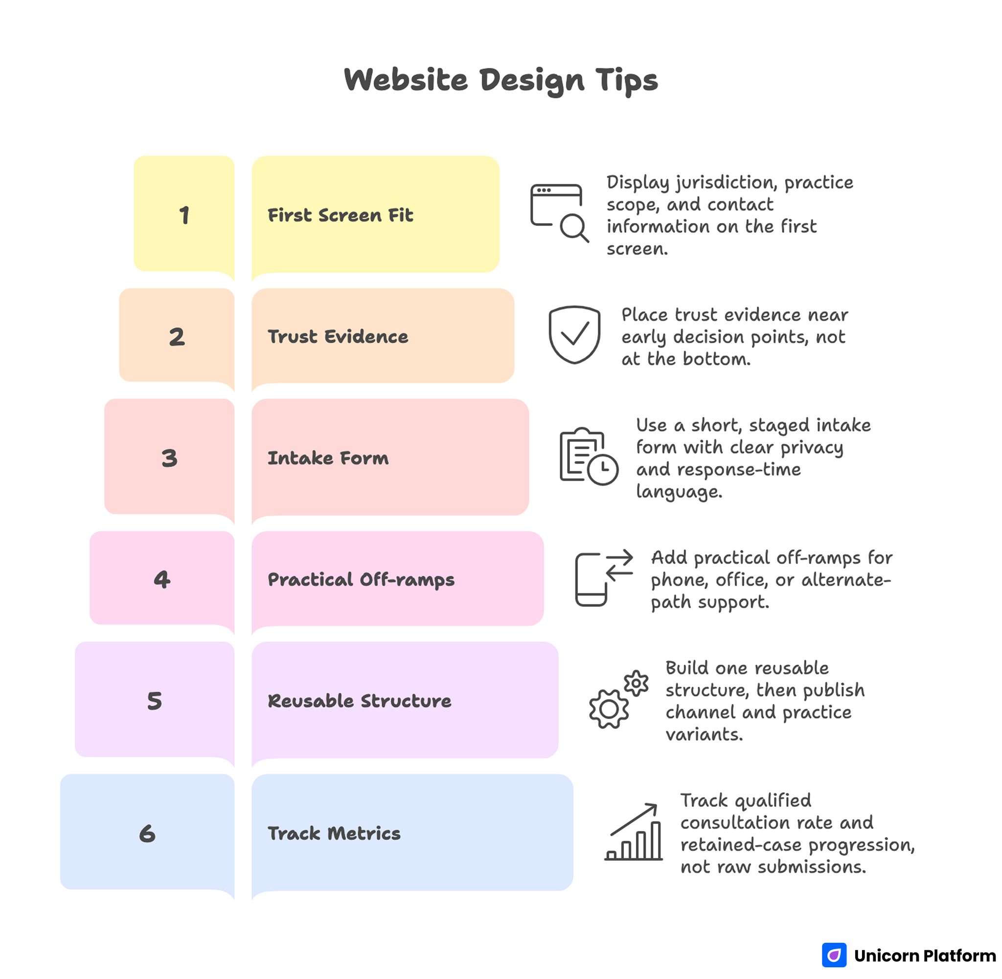
Website Design Tips
- Show fit in the first screen: jurisdiction, practice scope, and who should contact you now.
- Put trust evidence near early decision points, not buried at the bottom.
- Use a short, staged intake form with clear privacy and response-time language.
- Add practical off-ramps for people who need phone, office, or alternate-path support.
- Build one reusable structure, then publish channel and practice variants from that base.
- Track qualified consultation rate and retained-case progression, not raw submissions alone.
Why Legal Conversion Behavior Is Different
Most industries can recover from a little confusion on page. Legal cannot. Visitors are often comparing firms during stressful moments and evaluating risk in seconds. If they cannot confirm relevance quickly, they continue searching even if your firm is a good fit.
Legal buyers also have a dual decision process: "Can this firm help me?" and "Can I trust this process?" Many pages answer only the first question. Consumer search data from Google shows that users researching legal services often exhibit high urgency and specific intent, with many searches containing precise problem statements and immediate service needs. This reinforces why landing pages must reduce uncertainty before the form — legal search behavior signals that clarity and relevance matter in the first seconds. High-performing legal pages answer both with concrete detail about scope, confidentiality, and response expectations.
That is why legal conversion work should center on uncertainty removal. Every section needs a job: confirming fit, reducing perceived risk, or guiding the next action. When sections are decorative rather than functional, drop-off increases.
The First-Screen Fit Test: 8 Seconds To Clarity
Your opening screen has one responsibility: make the right visitor feel seen without overpromising outcomes. Lead with audience fit and practical next steps, not abstract brand claims. A clear value statement outperforms broad slogans in legal contexts.
Include four signals above the first fold. First, location and jurisdiction so visitors know where your firm can operate. Second, matter-type scope, including clear exclusions when needed. Third, consultation pathway, such as "request a confidential case review." Fourth, response expectation so users understand what happens after submission.
This is also the right place to prevent mismatch. A short "not the right fit if..." line can reduce unqualified inquiries and improve intake efficiency. Legal pages that do this early usually improve consultation quality faster than teams that only optimize form design.
Trust Architecture: What Legal Prospects Actually Validate
Trust in legal funnels is built from specifics, not adjectives. "Experienced" and "trusted" mean little without context. Visitors are scanning for concrete indicators they can evaluate quickly.
Build a trust stack around the first CTA zone. Include attorney credentials, relevant practice history, response windows, confidentiality framing, and case-type specificity. If testimonials are used, keep them grounded in service experience rather than dramatic promises.
Sequence matters. Put your strongest trust evidence before the user is asked for personal details. When trust proof appears after a long scroll, the form feels risky and completion drops.
Scenario Mapping: Help Visitors Identify Their Situation
A major conversion blocker in legal funnels is category uncertainty. People often know their life problem but not the legal label attached to it. If your page only uses internal legal categories, qualified visitors may assume they are in the wrong place.
Use scenario-based framing under your service overview. Start with plain-language situations, then map each one to your practice pathway. This simple bridge improves self-selection and reduces inquiry ambiguity.
A practical structure is: common situation, likely legal path, what to prepare, and expected next step. You are not giving case-specific advice on the page. You are helping a prospective client decide whether starting a consultation is appropriate.
Conversion Structure That Works For Law Firms
Most legal pages improve when they follow a consistent section sequence. The exact design can change, but the functional order should remain stable so users can predict the flow.
Start with a focused hero and immediate fit check. Follow with a short service map, then move into trust proof and process transparency. Add FAQ for risk reduction before the primary intake action, and keep a secondary contact path for urgent users.
If your team needs a reusable framework for section ordering and hierarchy, this guide on high-converting landing page structure helps align content decisions with conversion behavior.
After the primary CTA, include confirmation language about what happens next. Legal visitors respond better when the handoff is explicit: who replies, typical timing, and what first contact includes.
Intake Form Design: Balance Completion And Qualification
Legal teams often swing between two extremes: ultra-short forms that attract noise, or long forms that suppress qualified demand. The better model is staged intake.
Stage one captures essentials: name, contact method, broad matter type, and urgency window. Stage two can gather richer details during follow-up or scheduling. This preserves completion while giving intake staff enough context to prioritize.
Set expectations inside the form itself. Add one short privacy statement, one sentence on response timing, and a plain explanation of how information is used. Clarity in these micro-messages can materially improve completion quality.
For teams building consultation-first funnels, this lead generation landing page guide is useful for tightening qualification logic without adding friction.
Copy Standards For Legal Pages That Convert
Legal conversion copy should sound calm, specific, and operational. Avoid hype language and avoid implied guarantees. Readers need confidence that your process is professional, not promotional.
Use short, direct sentences around decision moments. Replace vague claims with concrete process statements, for example: what the initial consult covers, what documents are useful, and how quickly the team responds. This style lowers anxiety and keeps expectations realistic.
Maintain one consistent tone across hero, form, FAQ, and confirmation states. Mixed tone is a hidden trust leak in legal funnels. If the hero is formal but the form copy becomes casual or salesy, users perceive inconsistency and hesitate.
SEO And AI Visibility: Build Useful Depth, Not Thin Variants
Legal pages perform better when they combine evergreen intent coverage with timely updates tied to legal changes. Evergreen sections answer durable questions about process, scope, and consultation expectations. Update sections can reflect new regulations, policy shifts, or procedural deadlines relevant to your audience.
For organic visibility, depth and clarity matter more than repetitive phrasing. Build substantive sections that answer adjacent decision questions, not only headline intent. This improves search performance and also helps AI systems retrieve higher-quality snippets from your page.
Citations should be selective and authoritative where needed. Link to primary legal or institutional sources when you make procedural claims. The goal is reader trust and factual grounding, not citation volume.
Mobile UX Is A Legal Revenue Issue, Not A Nice-To-Have
Many legal journeys start on mobile during commutes, work breaks, or urgent personal moments. If your first screen is crowded or your form controls are hard to use, qualified visitors drop before they evaluate your firm.
Prioritize tap-friendly controls, high-contrast CTA visibility, and short paragraph blocks around key decisions. Keep phone and email actions persistent so users can switch channels without restarting the journey.
Test on real devices, not only browser emulators. A page that looks fine on desktop preview can still fail on keyboard overlap, form focus behavior, or sticky CTA conflicts.
When optimizing small-screen conversion flow, these user behavior tips to optimize landing pages provide practical checks that map well to legal funnel friction points.
Off-Ramps: Essential For Legal Trust And Access
Not every visitor is ready for digital intake. Some need immediate voice contact, office direction, or alternate support routes based on location and urgency. Pages that force one form path lose both trust and conversions.
Include clear off-ramps near decision points: phone line, callback option, office visit path, and alternate resource direction when out of scope. This is especially important in legal contexts where time sensitivity and jurisdiction boundaries can change the correct next step.
An off-ramp is not a distraction. It is a confidence mechanism that tells visitors your firm cares about useful outcomes, even when a standard form is not the best route.
Channel Variants Without Content Chaos
Paid search, referrals, and organic discovery produce different expectations. A single generic page can underperform across all three even when total traffic looks healthy.
Use one core page architecture, then adjust emphasis by channel. Paid visitors need immediate fit validation and urgency handling. Referral visitors need process clarity and trust continuity. Organic visitors usually need additional educational framing before they commit.
Controlled variation keeps operations manageable. Change one major block per test cycle, then evaluate qualified consultation outcomes before adding more edits.
For appointment-heavy practices, this reservation landing page blueprint can support cleaner scheduling handoffs and clearer expectation setting.
30-60-90 Day Execution Plan
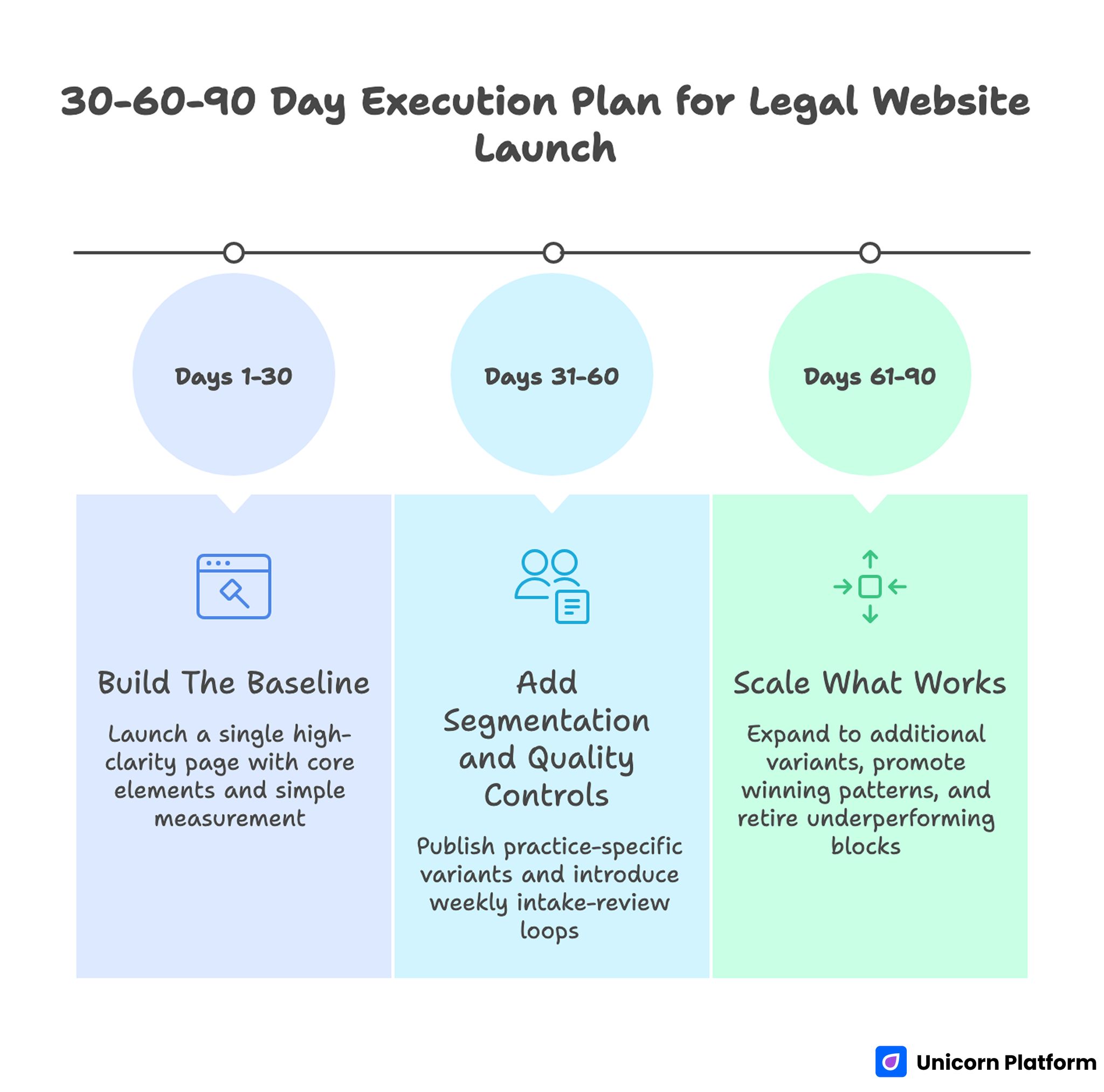
30-60-90 Day Execution Plan for Legal Website Launch
Days 1-30: Build The Baseline
Launch a single high-clarity page with jurisdiction callout, service map, trust stack, process explainer, and staged intake. Keep measurement simple: consultation request rate and qualified consultation rate. Define qualification criteria with intake staff before launch so reporting is consistent.
Run a pre-publish audit on mobile readability, response-time language, and contact routing. Most early legal conversion failures are operational mismatches, not design mistakes.
Days 31-60: Add Segmentation And Quality Controls
Publish one practice-specific variant using the same structure. Adjust only fit statements, scenario mapping, FAQ, and proof context. Keep navigation and core process blocks consistent so teams can compare outcomes fairly.
Introduce weekly intake-review loops. If recurring confusion appears in calls or emails, convert that issue into on-page clarifying copy. This creates a direct feedback loop between client questions and page quality.
Days 61-90: Scale What Works
Expand to additional variants by demand priority and channel economics. Preserve a shared component library so trust blocks, legal disclaimers, and process language remain consistent across pages.
Promote winning patterns into the default template. Then retire underperforming blocks decisively instead of layering endless tweaks. Scale in legal marketing comes from repeatable clarity, not constant redesign.
Common Failure Modes And Fixes
1) Generic Hero Messaging
If the headline could fit any firm, the visitor cannot self-qualify quickly. Replace broad positioning lines with concrete fit signals: location, matter scope, and first-step action.
2) Trust Proof Buried Below The Fold
When credibility appears too late, users treat form submission as risky. Move credentials, process reliability, and response expectations close to the first CTA.
3) Intake Form As A Legal Questionnaire
Overly long first forms reduce completion and increase abandonment on mobile. Split intake into two stages and capture deeper detail after initial intent confirmation.
4) No Alternate Path For Urgent Users
Form-only flows fail users who need immediate human contact. Add visible phone or callback paths at multiple decision points.
5) Publishing Without Governance
Frequent edits across campaigns can break consistency in tone, disclaimers, and process promises. Use an editorial checklist and component standards before every release.
Weekly QA Loop For Legal Conversion Pages
A legal page should be reviewed like an intake process, not like a static blog post. Assign one owner from marketing and one owner from intake operations, then run a short weekly review against real submissions and call transcripts. This keeps page promises aligned with what the team can deliver in practice.
Use a fixed checklist every week. Confirm that jurisdiction and scope statements still match the current service model. Verify response-time language against actual team capacity. Check that contact routes, office details, and callback expectations are current in every live variant.
Then audit friction signals. Review form abandonment points, mobile scroll behavior, and repeat questions from incoming inquiries. If a question appears repeatedly in consultations, it should be answered earlier on the page. This discipline turns user confusion into structured page improvements instead of ad hoc rewrites.
Finally, keep legal and brand controls explicit. Validate disclaimers, maintain tone consistency across sections, and confirm that no variant introduces unsupported claims. Teams that run this lightweight QA loop usually ship faster with fewer reversals because each release is grounded in operational reality.
FAQ: Legal Landing Page Execution
1) How long should a law firm landing page be?
Length should be determined by decision complexity, not arbitrary targets. For legal consultation pages, depth often performs better than short copy because users need fit, trust, and process detail before taking action. The page should be long enough to remove uncertainty without repeating the same point.
2) Should we build one page for all practice areas?
Usually no. A single broad page often attracts lower-fit inquiries because it cannot confirm intent precisely. A better model is one shared structure with practice-specific variants that tailor scenario examples, FAQ, and qualification language.
3) What should appear above the first form?
Place fit confirmation, trust evidence, and process expectations before asking for personal details. Visitors should understand who the page is for, what happens after submission, and why they can trust your intake flow.
4) Is it better to ask many form questions up front?
Not in most cases. Start with minimal qualification fields and collect deeper context in follow-up. This protects completion rates while still allowing intake teams to prioritize effectively.
5) How do we reduce unqualified consultations?
Improve self-selection early. Clarify scope, exclusions, jurisdiction, and case-stage expectations near the top of the page. Add scenario-based guidance so users can quickly assess fit before submitting.
6) How frequently should legal pages be updated?
Use a fixed review cadence, often monthly or quarterly, plus event-driven updates when legal rules or internal processes change. Consistent updates prevent mismatch between page promises and real intake operations.
7) What metrics matter most?
Track qualified consultation rate, consultation attendance, and retained-client progression. Raw form volume is useful context but can be misleading without quality outcomes.
8) Are testimonials enough to establish trust?
Testimonials help, but they are not sufficient on their own. Combine social proof with concrete credibility signals such as attorney context, process transparency, and clear response standards.
9) How important is page speed for legal conversion?
Very important, especially on mobile. Slow load and unstable layouts erode trust quickly during high-stress legal searches. Performance should be treated as a conversion and credibility requirement.
10) What is the most common strategic mistake?
Treating the page as a brochure instead of an intake system. High-performing legal pages are designed around decision flow, risk reduction, and operational handoff clarity.
Final Takeaway
Law firm landing pages win when they remove uncertainty faster than competitors. That requires clear fit signals, visible trust architecture, practical process explanations, and intake pathways that respect how legal buyers decide.
When your page is built as an operational intake asset, conversion quality improves naturally. Better-fit consultations, cleaner handoffs, and stronger retained-case outcomes usually follow.