Table of Contents
- What High-Performing Startup Template Pages Have in Common
- The 8-Block Startup Template Architecture
- 30-Day Startup Template Optimization Plan
- Common Mistakes and How to Fix Them
- FAQ
Early-stage teams usually have the same constraint: they need pages now, not in six weeks. Product updates, waitlist campaigns, feature launches, and partner offers all require fast publishing, yet many startups lose momentum because every landing page becomes a new design project.
Templates solve this speed problem, but only if teams treat templates as conversion systems instead of visual shortcuts. A template can help you publish quickly, but clarity, trust, and action flow still determine whether visitors convert.
This guide explains how startups can choose and customize simple landing page templates without falling into generic copy, weak CTA hierarchy, or random post-launch edits. The goal is practical: ship faster and convert better with a process your team can repeat every week.
If your team needs a baseline launch process before optimization, this startup landing page creation playbook is a strong companion and pairs well with the framework below.
sbb-itb-bf47c9b
Quick Strategic Takeaways
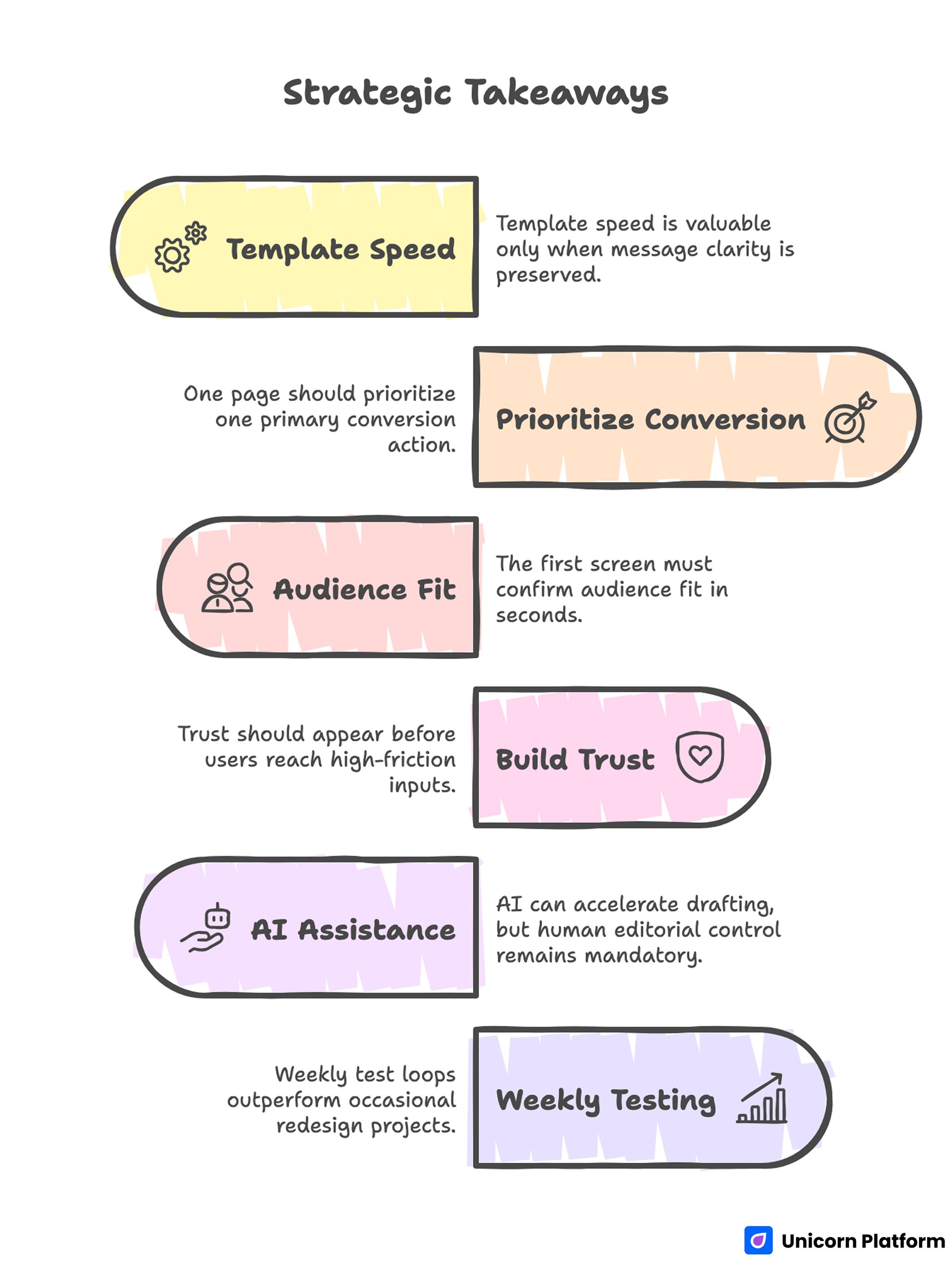
Quick Strategic Takeaways
- Template speed is valuable only when message clarity is preserved.
- One page should prioritize one primary conversion action.
- The first screen must confirm audience fit in seconds.
- Trust should appear before users reach high-friction inputs.
- AI can accelerate drafting, but human editorial control remains mandatory.
- Weekly test loops outperform occasional redesign projects.
Why Startup Template Pages Underperform
Template-based pages fail when teams confuse page completion with conversion readiness. A page can look polished and still underperform if the message is vague, the offer is unclear, or the CTA path is diluted.
Additionally, analysis from HubSpot confirms that landing pages with focused messaging, visual priority on primary actions, and clear trust cues outperform generic templates in both engagement and lead quality because they align content with user intent
Another common issue is template over-customization without conversion intent. Teams add sections to match internal preferences, not visitor decision needs, and the page loses scannable flow.
Many startups also launch with no clear optimization rhythm. Without structured review cycles, pages remain unchanged while user expectations, traffic mix, and competitor framing continue to shift.
What High-Performing Startup Template Pages Have in Common
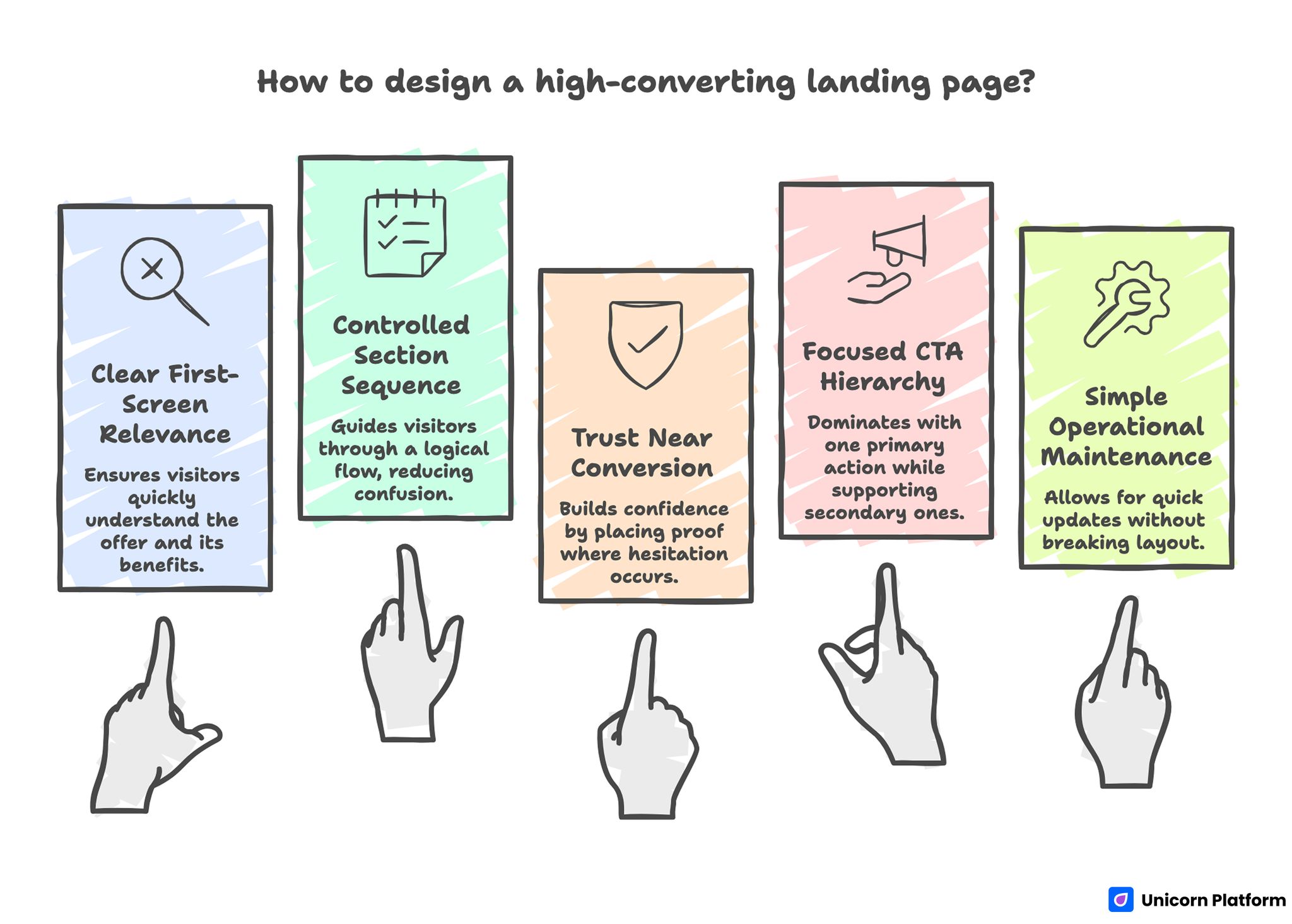
Key Principles for Designing a High-Converting Landing Page
Across SaaS, services, and digital product offers, high-converting template pages repeat a similar logic. The visual style can differ, but the decision architecture stays consistent.
1. Clear first-screen relevance
Visitors quickly understand who the offer is for and what practical result it delivers. The headline is specific enough to feel real without relying on inflated claims.
2. Controlled section sequence
The page follows a predictable decision flow: value, proof, friction reduction, then action. Strong sequence reduces cognitive load and helps visitors continue without confusion.
3. Trust placed near conversion moments
Proof is positioned where hesitation appears, not as a disconnected block near the bottom. This timing improves conversion confidence without increasing page complexity.
4. Focused CTA hierarchy
One primary action is dominant, while secondary actions support qualification without competing for equal attention.
5. Simple operational maintenance
Teams can update copy, proof, and offer details quickly without breaking layout consistency. This makes weekly iteration realistic for small teams.
How to Choose the Right Startup Template Before Customization
Template selection should be treated as a conversion decision, not a design preference. Choosing the wrong baseline template creates avoidable rework later.
Research from Smashing Magazine highlights that the most effective landing pages prioritize user intent and clear action pathways in their structure, and that template choice should support conversion logic (such as visible calls‑to‑action and purposeful content sequencing) rather than aesthetic variation alone.
Use this five-point filter before committing.
Fit to campaign intent
Pick a template whose default structure matches your campaign goal. A waitlist page, a consultation page, and a product trial page should not start from the same baseline architecture.
CTA compatibility
Confirm that the template supports one clear primary action in multiple sections. If CTA placement feels forced from the start, conversion friction usually appears after launch.
Proof flexibility
Your template should allow fast insertion of social proof, outcome statements, and trust elements without layout breakage. Trust content needs structural priority, not decorative placement.
Mobile behavior quality
Check mobile readability and control spacing before heavy customization. If mobile hierarchy is weak at baseline, fixes often consume more time than expected.
Editing speed for non-technical contributors
A startup template should support fast edits by marketing, founder, or content owners. Slow edit workflows reduce iteration frequency and hurt optimization quality.
The 8-Block Startup Template Architecture
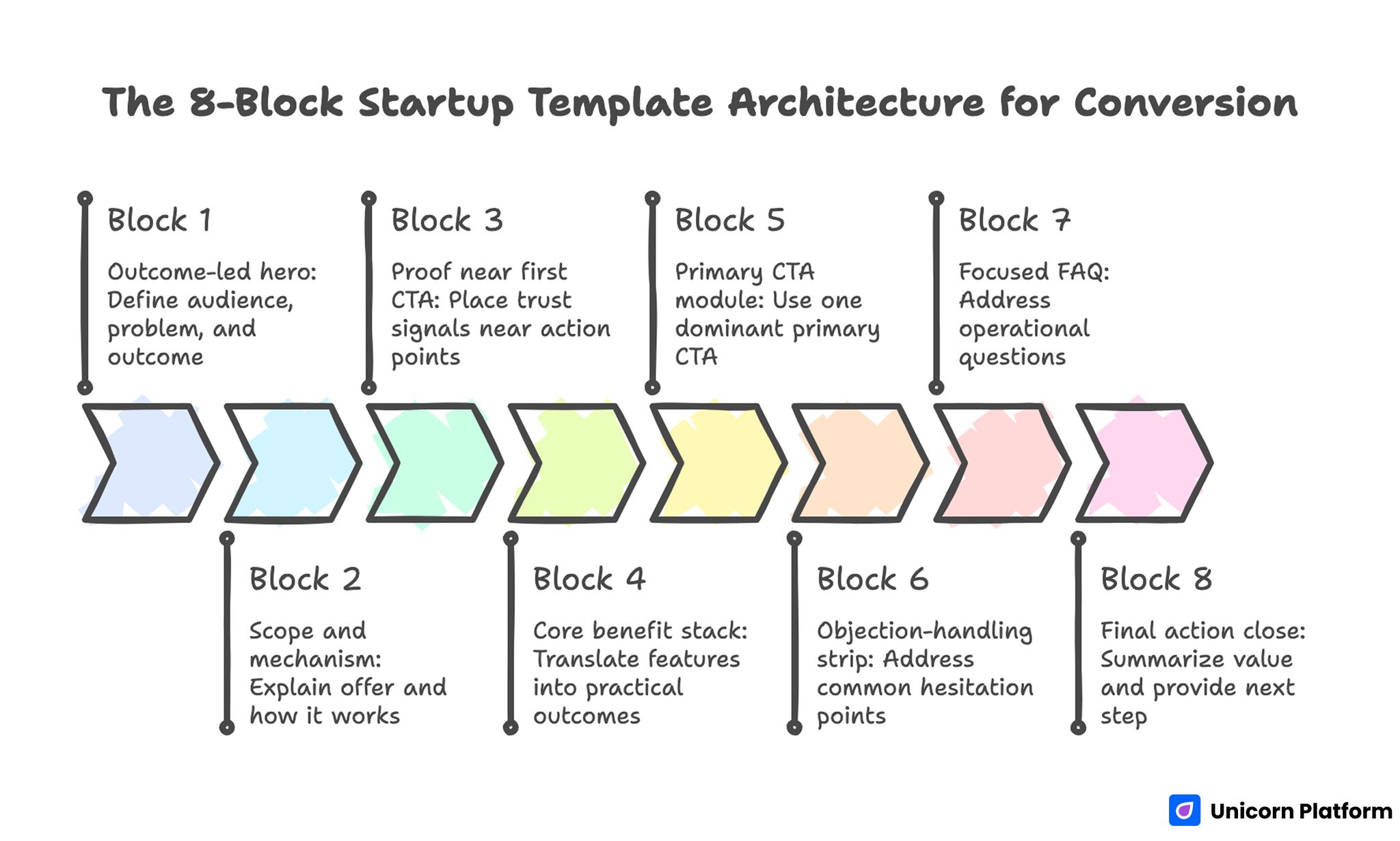
The 8-Block Startup Template Architecture for Conversion
This architecture works across most early-stage use cases and keeps template customization tied to conversion logic.
Block 1: Outcome-led hero
The hero should define audience, problem context, and concrete outcome in direct language. A strong hero reduces bounce by confirming relevance immediately.
Avoid broad phrases that could apply to any startup. Users decide quickly whether your offer is for them, and generic copy delays that decision.
Block 2: Scope and mechanism
After headline clarity, explain what the offer includes and how it works. This section should remove ambiguity around format, timeline, and expected effort.
Short mechanism clarity improves trust because users can see how the promised outcome is realistically achieved.
Block 3: Proof near first CTA
Place trust signals near early action points. Use proof types that match user concerns, such as role-specific testimonials, pilot outcomes, or concise credibility indicators.
Proof should answer likely objections, not just display praise. Relevance is stronger than volume.
Block 4: Core benefit stack
Translate features into practical outcomes users can evaluate quickly. Benefit stacks perform best when each point maps to one clear user pain or desired result.
Keep phrasing concrete and scannable. Overly abstract benefit copy slows comprehension and weakens action confidence.
Block 5: Primary CTA module
Use one dominant primary CTA with explicit action language. Users should know exactly what happens after click.
If your growth model depends on lead capture quality, a dedicated lead generation landing page framework can help align CTA logic with downstream qualification without overloading the first step.
Block 6: Objection-handling strip
Add short, direct answers for common hesitation points. Typical startup page objections include time-to-value, setup complexity, and commitment risk.
This strip should live close to action controls so users can resolve doubt without leaving conversion flow.
Block 7: Focused FAQ
FAQ should address operational questions that repeatedly block decisions. Keep answers concise, specific, and free of legal-style wording unless required.
A strong FAQ improves conversion and reduces support overhead because users find clarity before submitting.
Block 8: Final action close
End with a summary of value plus a clear next step. The final block should reinforce decision confidence rather than introduce new complexity.
Teams often underuse this section, but it can recover users who need one more confidence signal before acting.
Customizing Templates Without Losing Conversion Structure
Customization is where many startup pages break. Teams add visual or content elements that look useful internally but dilute external clarity.
Use the following workflow to keep customization controlled.
1. Lock section jobs before writing
Assign one job to each section: explain, prove, reduce friction, or convert. Section jobs prevent overlap and reduce copy redundancy.
2. Rewrite for audience language
Replace template-default wording with language your users actually use. Internal terminology often creates friction when visitors are unfamiliar with your phrasing.
3. Trim non-essential elements
Remove sections that do not improve decision quality. More content is not always better, especially when users are scanning on mobile.
4. Place proof by objection timing
Map major objections to the sections where they appear. Position proof where doubt is most likely to rise.
5. Validate first-screen scan clarity
If users cannot identify value and next step quickly, rewrite before launch. First-screen clarity often determines whether the rest of the page is even read.
AI-Assisted Startup Template Workflow
AI can accelerate startup page production when used as an editorial assistant, not an autopilot. The highest-performing teams use AI for option generation and then apply strict human review.
Use AI for headline variations, subheadline alternatives, FAQ drafts, and CTA options. Avoid publishing raw outputs without context validation.
When teams need faster iteration for early drafts, this AI landing page generator workflow can help speed ideation while preserving structural control.
Human review should focus on audience fit, specificity, and proof integrity. AI-generated language can sound fluent while still being strategically weak.
A practical AI quality gate is simple: every generated section must answer one user decision question, and no section should remain if that answer is unclear.
CTA Design and Placement for Startup Pages
CTA performance depends on clarity, hierarchy, and timing more than button color alone. Startup pages convert better when action cues are explicit and repeated at logical points.
Use action-oriented CTA labels tied to immediate value. Generic labels can reduce confidence because users are unsure what they are committing to.
Place CTAs after value explanation and after trust reinforcement, not only at the end. This allows ready users to act without extra scroll while still supporting users who need more context.
Avoid equal-priority CTA overload. If every action looks primary, users delay decisions or choose low-commitment options that do not match campaign goals.
Mobile and Performance Standards for Template-Based Pages
Startup traffic often comes from social, community channels, and mobile-first browsing. Mobile quality therefore has direct impact on conversion and cost efficiency.
Mobile baseline checks
- Headline and subheadline readable without zoom
- Primary CTA visible early in scroll
- Form controls easy to tap on small screens
- Proof sections scannable without dense text walls
- Final action block clear before page exit
Performance baseline checks
- Compressed media assets for fast initial load
- Clean script usage with no non-essential weight
- Stable layout behavior during load
- Fast interaction response for forms and buttons
Pages that pass these checks usually generate cleaner optimization data because technical friction is reduced.
SEO Layer for Startup Templates
Template pages can rank when they combine intent clarity with strong structure. SEO should support discoverability without compromising conversion logic.
Use your primary topic naturally in title, H1, introduction, and one supporting heading. Cover semantic variants through useful section content rather than repetitive phrasing.
Keep heading hierarchy clean and descriptive so users and search systems can interpret page structure quickly. Structural clarity helps both readability and discoverability.
When refining structure for both scanning and conversion flow, this high-converting landing page structure guide gives additional section-order logic you can apply to template customization.
30-Day Startup Template Optimization Plan
Week 1: Launch baseline and validate tracking
Publish one focused version with clear first-screen message, proof near early CTA, and concise form flow. Confirm that key events are tracked correctly.
Week 2: Improve message fit
Test one headline variation and one supporting-line variation tied to audience intent. Keep layout stable so copy impact is measurable.
Week 3: Strengthen trust timing
Adjust proof placement and objection handling based on scroll and interaction behavior. Prioritize relevance over adding more testimonials.
Week 4: Build one segment-specific variant
Duplicate the winning structure for one high-value segment. Adapt message and proof context while keeping core architecture consistent.
60-Day Growth System for Template-Based Pages
Days 1-20: Stabilize core winner
Validate performance consistency across sources, devices, and weekdays. Avoid scaling decisions based on short-term spikes.
Days 21-40: Expand with controlled variants
Create one additional version for a different segment or channel intent. Change only high-impact areas first, such as hero framing and proof context.
Days 41-60: Standardize reusable modules
Turn winning sections into reusable internal components. This improves launch speed, reduces quality drift, and helps new contributors ship faster.
Measurement Framework: What to Track Beyond Submission Rate
Submission rate matters, but it is not enough for startup decision quality. You also need indicators that show whether conversions are useful and sustainable.
Track at least these metrics:
- CTA click-through by source
- Form start-to-submit rate
- Conversion quality by segment
- Immediate post-conversion engagement rate
- Downstream action rate after first conversion
Interpret metrics in sequence rather than isolation. A high submission rate with weak downstream behavior often indicates message mismatch or poor audience alignment.
To improve interpretation quality, review metrics by acquisition source and by page variant at the same time. This helps teams identify whether performance changes are caused by copy updates, audience mix shifts, or channel-specific intent differences. Source-level review prevents overreacting to blended averages and makes weekly optimization decisions significantly more reliable.
Common Mistakes and How to Fix Them
Mistake 1: Publishing template-default copy
Default copy rarely reflects real audience intent. Rewrite key sections in user language before launch and validate first-screen clarity.
Mistake 2: Adding multiple equal CTA paths
When every action appears equally important, users delay commitment. Keep one dominant CTA and place secondary actions as support.
Mistake 3: Using AI output without editorial control
Unedited AI copy can be fluent but generic. Apply human review for specificity, proof quality, and message consistency.
Mistake 4: Delayed trust content
If proof appears too late, visitors hit friction before confidence is built. Move trust closer to early decision points.
Mistake 5: Ignoring mobile interaction details
Desktop clarity does not guarantee mobile conversion. Validate tap behavior, spacing, and readability before traffic scale.
Mistake 6: Optimizing without a fixed cadence
Random edits make results difficult to interpret. Use weekly hypothesis-based cycles and document outcomes each round.
Mistake 7: Scaling before reliability checks
Early wins can collapse at higher volume when technical or message issues remain. Confirm operational stability before significant budget increases.
FAQ: Startup Landing Page Templates and Conversion
Are templates good enough for serious startup conversion goals?
Yes, when templates are customized with clear conversion architecture and disciplined optimization. The structure and workflow around the template matter more than template novelty.
How many sections should a startup landing page include?
Use enough sections to resolve key decision questions without adding clutter. In many cases, six to eight focused blocks are sufficient.
What is the most important element above the fold?
A clear outcome-oriented message paired with one obvious action path. Users should understand relevance and next step within seconds.
Should startup pages include multiple CTA types?
A primary CTA should dominate. Secondary actions can exist for not-yet-ready users, but they should not compete with the main conversion goal.
How much should I customize a template before launch?
Customize message, proof, and CTA hierarchy first. Visual refinements can follow after baseline conversion data is collected.
Can AI replace manual landing page copywriting for startups?
AI can speed drafting and variation generation, but human editorial control is still required for strategic fit and trust quality.
How often should template-based pages be updated?
Weekly optimization cycles are a strong baseline for active campaigns. Monthly structural reviews can consolidate wins and remove low-impact experiments.
What metrics show whether template pages are actually working?
Track both conversion efficiency and downstream quality indicators. Submission volume alone does not confirm business value.
When should I create a separate page variant?
Create a variant when audience intent or traffic source differs enough to require different messaging or proof emphasis.
What is the fastest way to improve an underperforming startup page?
Start with first-screen clarity, trust timing, and CTA hierarchy. These three changes usually produce the highest-impact gains first.
Final Takeaway
Simple landing page templates become powerful startup assets when speed is paired with structure. The winning formula is consistent: clear relevance, practical proof, focused action flow, and steady weekly iteration.
With Unicorn Platform, teams can launch faster without sacrificing editorial quality. When your workflow combines template discipline, AI-assisted drafting, and measurable optimization, your landing pages become a repeatable growth engine instead of one-off campaign files.

