Table of Contents
- Build Page Architecture Around Decisions
- Use a 30-60-90 Day Execution Plan
- Common Failure Patterns and Practical Fixes
- FAQ
A personal website should do more than look professional. It should help the right visitors understand your value quickly, trust your capability, and take a clear next step. Many sites fail this test because they are built as visual portfolios, not decision systems.
When a visitor lands on your site, they are making a risk decision. They want to know whether you are relevant, whether your work is credible, and whether engaging with you is worth their time. If these answers are hard to find, even strong work can be ignored.
This guide gives you a practical framework for building a high-performing personal site with Unicorn Platform. You will find concrete methods for positioning, page structure, proof design, CTA flow, and continuous optimization so your website consistently supports real opportunities.
sbb-itb-bf47c9b
What Actually Matters
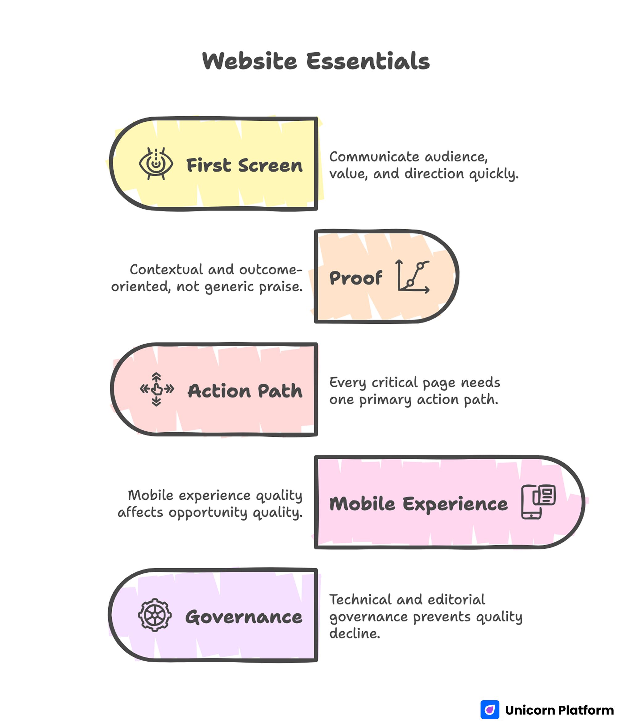
Website Essentials
- Your first screen must communicate audience, value, and direction in seconds.
- Proof should be contextual and outcome-oriented, not generic praise.
- Every critical page needs one primary action path.
- Mobile experience quality affects opportunity quality more than most teams expect.
- Technical and editorial governance prevents slow quality decline over time.
Begin With an Opportunity Objective
The first decision is not template selection. The first decision is business intent. Define what your site should produce in the next quarter: qualified client inquiries, recruiter interest, speaking invitations, collaborations, or audience subscriptions.
A specific objective simplifies everything else. Navigation becomes easier to prioritize, copy becomes more precise, and CTA design becomes more coherent. Without this anchor, pages tend to accumulate content for every possible visitor, which weakens relevance for high-fit users.
Write a simple objective statement with a measurable signal. Example: increase qualified discovery calls from early-stage B2B founders. This gives you a practical filter for every section and update.
Identify Primary and Secondary Audiences
Personal websites often try to serve too many audiences at once. That usually leads to broad language and low conversion quality. A better model is one primary audience and one secondary audience for each planning cycle.
Primary audience assumptions should include role, pressure, and desired outcome. This helps you write pages that feel specific instead of generic. Secondary audience paths can still be supported, but they should not control homepage positioning.
A concise audience definition template:
- Who they are.
- What situation they are in.
- What they need resolved.
- What uncertainty blocks action.
- What outcome they want.
Once audience assumptions are explicit, you can test message quality against real decision criteria instead of taste preferences.
Sharpen Positioning Until It Is Instantly Clear
Positioning is the strongest lever for personal-site performance. Visitors should understand your fit within the first screen, not after reading several sections.
A reliable positioning format combines audience, outcome, and approach. For example, a line such as "I help product-led teams improve activation through clearer onboarding journeys and conversion-focused UX decisions" gives immediate context and decision value.
Broad labels like "creative professional" or "growth expert" are usually too abstract to be persuasive. Specificity builds trust because it signals operational clarity.
If you are refining how your positioning and identity narrative appear across pages, the framework in personalize your online presence with a web profile is useful for validating message consistency.
Test positioning quality with real users from your audience segment. Ask what they think you do, who you help, and what makes your approach distinct. If answers vary widely, your message needs tightening.
Build Page Architecture Around Decisions
Page structure should reflect visitor decision flow, not internal organization. Most personal sites need a compact architecture that routes visitors to proof and action efficiently.
A practical baseline structure includes homepage, about page, work or portfolio page, offer page, and contact page. Each page should have one core job and one primary CTA. Supporting actions can exist, but they should remain secondary.
Structure clarity reduces cognitive load. Visitors do not want to decode where key information might be hidden. They want a predictable path from first impression to confidence.
A decision-focused architecture map typically follows this sequence:
- Relevance and positioning.
- Credibility and evidence.
- Process and fit boundaries.
- Clear next action.
When this sequence is consistent across page types, conversion behavior becomes easier to analyze and improve.
Design a Homepage That Routes, Not Distracts
The homepage should work as a routing layer. It needs to establish who you serve, what outcome you drive, and where a visitor should go next.
Use a clean first-screen structure: one positioning headline, one supporting line, one credibility cue, and one primary CTA. Keep visual noise low. Too many competing elements in this section can reduce both engagement and trust. Research from Baymard Institute shows that users rely heavily on first impressions and clarity when evaluating a website. Clear structure and visible value propositions help visitors quickly decide whether to continue exploring or leave.
For teams revising hero logic and first-impression behavior, personal landing pages that make meaningful first impressions can help validate sequencing and CTA clarity.
After the hero section, use short blocks with clear jobs: fit explanation, proof highlights, approach summary, and action invitation. This keeps the homepage readable while giving different visitors enough context to self-qualify.
Build an About Page That Supports Decision Confidence
An about page should strengthen trust, not repeat résumé content. Visitors are looking for operating clarity: what you focus on, how you work, and why your approach is credible.
A useful about-page structure starts with current positioning, then explains practical approach, then adds selective credibility signals. Personal story can be included, but it should connect to your professional method and standards.
Avoid long autobiographical sections that do not help visitors evaluate fit. Keep narrative concise and outcome-relevant.
Strong about pages usually include:
- Current focus and domain scope.
- Working principles and collaboration style.
- Evidence of reliability and expertise.
- Clear path to continue the conversation.
When this page is built well, it reduces hesitation around outreach.
Turn Portfolio Content Into Evidence
A project gallery is not enough. Visitors need context, role clarity, and outcome logic to trust your work.
Each project entry should explain initial problem, your contribution, constraints, key decisions, and resulting change. Quantitative data is useful when available, but qualitative impact can still persuade if written with precision.
Keep entries decision-oriented rather than purely visual. Ask whether a visitor could answer "Can this person solve my problem?" after reading one project.
If you need examples of structuring portfolio sections for credibility and action flow, build your best personal website with these easy tips offers patterns you can adapt to your own voice and niche.
Portfolio curation matters as much as formatting. Highlight the most relevant work first and archive low-signal examples that dilute perception.
Clarify Offer Scope and Boundaries
If your site supports service inquiries, scope clarity is essential. Ambiguous offers can increase inquiry volume while lowering fit quality, which wastes time on both sides.
Your offer page should clearly describe who the engagement is for, what outcomes are realistic, what process is used, and what early timeline to expect. Include boundaries so low-fit visitors can self-select out.
Scope clarity does not reduce opportunity. It usually improves it by filtering for aligned expectations.
A robust offer-page layout can include:
- Ideal-fit profile.
- Core problem areas addressed.
- Delivery model and collaboration cadence.
- Expected outcomes and constraints.
- Next step with response expectations.
This level of specificity increases confidence before the first conversation. It also reduces back-and-forth caused by mismatched expectations.
Use CTA Design That Matches Readiness
Not every visitor is ready for the same action. Some want a call now, others need more evidence first. CTA strategy should reflect this without cluttering the page.
Set one primary CTA per page and one secondary option for lower-commitment visitors. Keep wording explicit so users know exactly what happens after clicking.
Good CTA examples emphasize action and context. Weak CTA labels are vague and create uncertainty.
Form design is part of conversion quality. Ask only for information needed for the next step, then collect deeper details later if fit is confirmed.
Post-submit messaging should confirm timeline and next action clearly. This simple step improves perceived professionalism and reduces drop-off in follow-through.
Make Mobile Quality a Core Requirement
A significant share of personal-site traffic comes from mobile profile links and referrals. Mobile friction often explains why sites with good desktop design still underperform.
Mobile checks should include first-screen readability, CTA visibility, scrolling rhythm, touch-target quality, and form completion ease. These checks should be done on real devices whenever possible.
Performance on slower connections also matters. Heavy media and unstable layout shifts can reduce trust before visitors read your strongest proof.
When setting up or improving domain and launch foundations, host your personal website easily with Unicorn is useful for keeping technical setup simple and reliable.
Plan for mobile from the start, not as a final QA step. This shift alone can produce meaningful gains in opportunity quality.
Strengthen Technical Reliability and Discoverability
Technical health protects every content and design improvement you make. A credible-looking site with broken links, inconsistent metadata, or unstable forms loses trust quickly.
Core technical baseline:
- Secure domain and HTTPS.
- Clean URL structure and navigation logic.
- Correct titles and descriptions by page intent.
- Stable form handling and confirmation states.
- Optimized media for fast rendering.
- Structured headings and accessibility-aware markup.
Discoverability improves when topic signals are coherent. Publish around your core domain rather than broad unrelated themes. Clear topical depth usually performs better than mixed content volume.
Keep metadata aligned with on-page claims. Consistency between titles, descriptions, and body content supports trust and reduces ambiguity for both users and discovery systems.
Guidelines from Google Search Central emphasize that clear structure, accurate metadata, and consistent content signals improve both search visibility and user trust. Aligning technical setup with content intent ensures your site performs reliably across both discovery and conversion stages.
Build a Repeatable Content Engine
Personal websites compound when updates are consistent and focused. A monthly content cadence helps maintain authority and keeps proof current.
A practical cycle can include one deep guide, one case reflection, one portfolio refresh, and one optimization review. This balance supports both discovery and conversion.
Every new piece should connect to your positioning and primary objective. Content that does not reinforce those priorities usually adds noise.
Capture lessons from real work. Client questions, project decisions, and implementation tradeoffs are strong raw material for useful content.
Keep publication quality high by editing for clarity, relevance, and practical value. Depth beats frequency when building trust.
Use a 30-60-90 Day Execution Plan
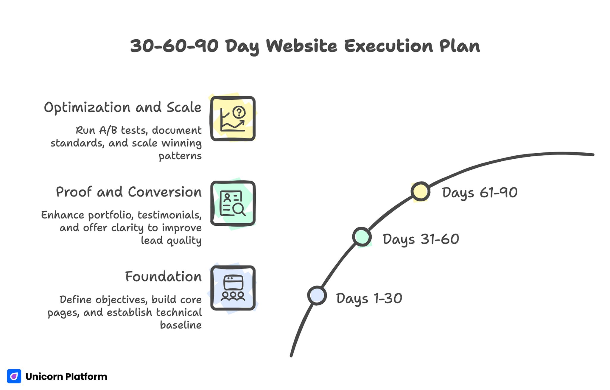
Website Execution Plan
Days 1-30: Foundation
Define objective, audience, and positioning. Build core pages with clear jobs and one primary action each. Complete technical baseline and mobile-first QA.
By day 30, visitors should understand your value proposition and next step without friction.
Days 31-60: Proof and Conversion
Strengthen portfolio context, testimonial quality, and offer-page clarity. Improve CTA wording and form flow. Validate source-level conversion behavior.
By day 60, the site should attract fewer low-fit contacts and more relevant opportunities.
Days 61-90: Optimization and Scale
Run controlled tests on first-screen messaging, proof placement, and CTA hierarchy. Scale winning patterns across pages and remove weak sections.
By day 90, you should have documented standards and a repeatable optimization routine.
Common Failure Patterns and Practical Fixes
Generic Message, Weak Fit
The site sounds professional but does not indicate clear audience alignment.
Fix by rewriting first-screen and page intros with specific role, problem, and outcome language.
Good Visuals, Low Trust
Pages look polished but lack contextual proof.
Fix by adding concise case evidence, role-aware testimonials, and process transparency near decision points.
High Traffic, Low Action
Visitors browse but rarely convert.
Fix by reducing CTA competition and clarifying what happens after each action.
Frequent Edits, No Progress
Changes are made without measurement discipline.
Fix by running one-variable tests with predefined success criteria and decision dates.
Strong Desktop, Weak Mobile
Performance drops on mobile sources.
Fix by prioritizing first-screen readability, touch interactions, and lightweight media on mobile-critical pages.
Content Sprawl
Too many unrelated topics dilute authority.
Fix by enforcing a focused topic map tied to your positioning and audience demand.
Stale Evidence
Proof sections no longer match current work.
Fix by assigning freshness cycles and archiving low-signal material quarterly.
Governance and Scorecard for Long-Term Quality
Even solo professionals benefit from explicit governance. Assign responsibilities for messaging, proof freshness, analytics, and release QA. In a solo setup, these can be checklist roles with fixed review times.
A quarterly scorecard keeps improvements aligned with outcomes. Track one primary opportunity metric, supporting behavioral signals, and technical reliability indicators.
Recommended scorecard dimensions:
- Opportunity quality outcomes.
- Engagement and progression behavior.
- Conversion and follow-through quality.
- Technical and mobile stability.
Use monthly reviews for execution and quarterly reviews for strategic decisions. This rhythm balances speed with coherence.
Documentation should be concise and operational. Record what changed, why it changed, and what impact followed. Over time, this creates a reusable decision system rather than ad-hoc edits.
FAQ: How to Create a Personal Website
Do I need a personal website if I already have strong social profiles?
Yes. Social platforms are useful discovery channels, but your own site gives full control over positioning, proof, and conversion flow. It also protects your narrative from platform changes.
How many pages are enough for launch?
A focused set of core pages is enough in most cases. Start with homepage, about, work, and contact, then add pages only when each has a clear job.
Should I include pricing on a personal site?
It depends on your model and audience expectations. Clear scope and qualification guidance are more important than public pricing when engagements are highly custom.
What makes testimonials actually persuasive?
Context and specificity. Short quotes with role background and concrete outcomes usually perform better than long generic praise.
How often should I update my portfolio?
Light updates monthly and deeper reviews quarterly work well for most professionals. Keep high-relevance projects current and archive outdated entries.
How do I reduce low-fit inquiries?
Improve self-qualification by clarifying audience fit, scope boundaries, and response expectations before form submission.
Can one site support both client work and hiring goals?
Yes, but intent paths must be clearly separated. Keep one primary objective per quarter and route secondary audiences through focused sections.
What is the fastest improvement I can make this week?
Rewrite your first screen for specificity and place one strong proof cue nearby. That combination often improves both engagement and action rate.
How do I know if my site is too broad?
If a target visitor cannot describe who you help and what you deliver within ten seconds, your messaging is likely too broad.
What should I test first in optimization?
Test first-screen positioning variants and proof placement order on high-intent pages. These changes often produce clearer signal than cosmetic updates.
Final Takeaway
A strong personal website is not defined by visual polish alone. It is defined by how effectively it helps the right visitors make confident decisions.
Focus on objective clarity, audience-specific positioning, contextual proof, and disciplined iteration. With that system in place, your site becomes durable opportunity infrastructure instead of a static profile.