Table of Contents
- What Great Personal Websites Actually Do Better
- Building in Unicorn Platform: Practical Workflow
- 30-Day Optimization Plan for Personal Websites
- Common Mistakes and How to Fix Them
- FAQ
A personal website is where your identity becomes legible. Social profiles can attract attention, but your website is where people decide whether to trust your work, follow your ideas, or start a conversation.
Most personal sites underperform for one reason: they prioritize appearance over clarity. Visitors arrive, see attractive sections, and still cannot answer simple questions about who you help, what outcomes you create, and what to do next.
Great personal websites solve that gap with deliberate structure. They combine focused positioning, relevant proof, clean reading flow, and one clear action path tied to your current goal. According to Smashing Magazine, well-organized site structure and readable content flow significantly enhance user trust and engagement, making visitors more likely to act on your primary calls-to-action.
This guide explains how to build that kind of site in Unicorn Platform without overengineering. You will get a practical framework for homepage design, credibility architecture, portfolio curation, and ongoing optimization so your site keeps improving as your career evolves.
If you are still deciding where to start technically, this personal website builders for beginners guide can help you compare setup options before you finalize your workflow.
sbb-itb-bf47c9b
Quick Strategic Takeaways
Strategic Takeaways for Building Great Personal Websites
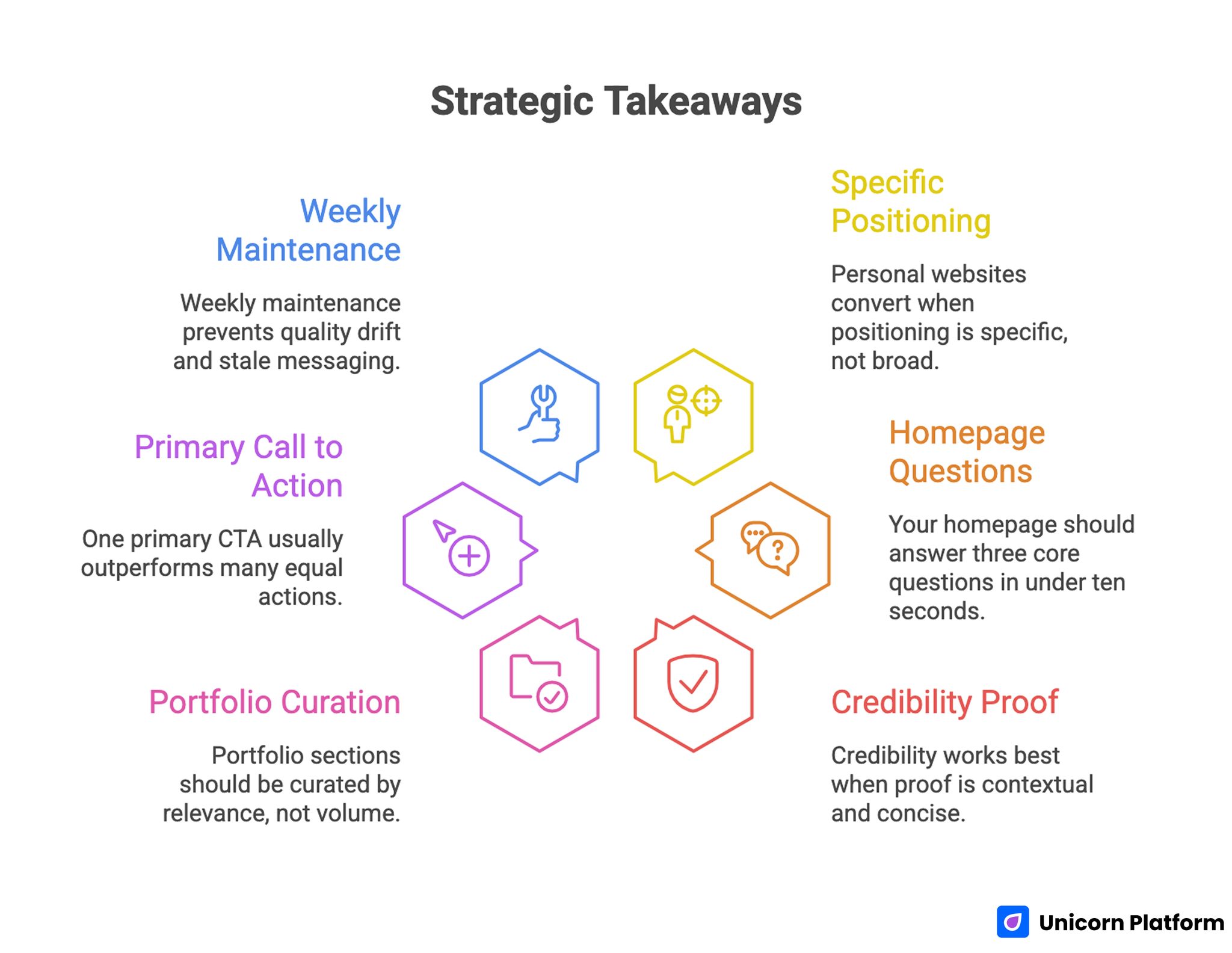
- Personal websites convert when positioning is specific, not broad.
- Your homepage should answer three core questions in under ten seconds.
- Credibility works best when proof is contextual and concise.
- Portfolio sections should be curated by relevance, not volume.
- One primary CTA usually outperforms many equal actions.
- Weekly maintenance prevents quality drift and stale messaging.
Why Personal Websites Still Matter in 2026
Platform algorithms change, but your website remains an owned asset. That ownership matters because it gives you control over narrative depth, trust sequence, and conversion pathways.
A well-structured personal site also shortens decision time for visitors. Instead of piecing your story together across social bios, old posts, and scattered links, they get one coherent view of your focus and value.
This is especially important for consultants, creators, operators, and job seekers whose opportunities depend on credibility. A clear site can improve inquiry quality, collaboration fit, and referral confidence.
The long-term benefit is compounding. Strong personal pages continue creating value through direct visits, internal links, search discovery, and shared references in conversations where trust matters.
What Great Personal Websites Actually Do Better
High-performing personal websites may look different visually, but they share consistent behavioral patterns.
1. They clarify identity quickly
Visitors understand role, audience, and value proposition in the first screen. There is no guesswork about what kind of work you do or why it matters.
2. They show proof near key decision points
Credibility appears before users are asked to contact, subscribe, or book. This reduces hesitation and improves conversion quality.
3. They prioritize reading and scanning flow
Section order is predictable, typography is legible, and page rhythm supports quick comprehension on desktop and mobile.
4. They guide users to one clear next step
Strong sites avoid equal-priority CTA overload. They keep one primary action visible and place secondary paths where they support, not distract.
5. They evolve through structured iteration
Top creators update positioning, proof, and CTA logic regularly instead of waiting for full redesign cycles.
Defining Your Personal Website Goal Before Design
Before choosing templates or visual styles, define the primary job of your website. Different goals require different section emphasis.
Common primary goals include:
- consulting and client inquiries
- speaking and partnership opportunities
- portfolio and hiring outcomes
- newsletter and audience growth
- founder or operator credibility building
When the goal is explicit, design decisions become easier. You can evaluate every section by one question: does this section improve the primary decision path.
A practical secondary step is defining one priority audience. If your site tries to speak to everyone equally, your message usually becomes vague and lower-converting.
The Core Homepage Framework
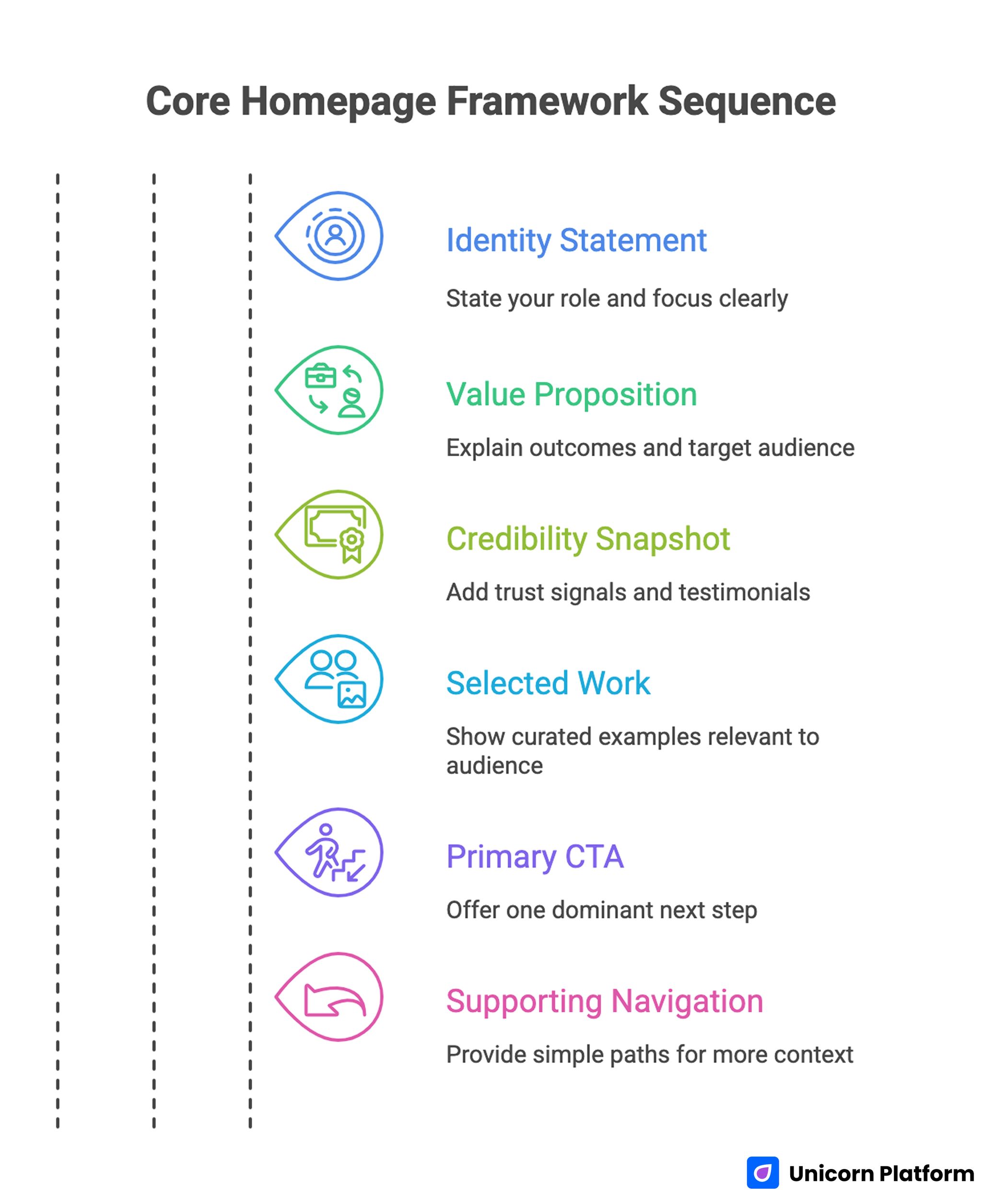
Core Homepage Framework Sequence
Your homepage should orient first-time visitors quickly and move them toward a useful action.
Use this sequence.
Block 1: Identity statement
State your role and focus in plain language. This line should be specific enough that the right visitors recognize fit immediately.
Block 2: Value proposition
Explain what outcomes you create and for whom. Generic claims reduce trust because they sound interchangeable.
Block 3: Credibility snapshot
Add concise trust signals near the first action opportunity. This can include outcomes, notable collaborations, or role-specific testimonials.
Block 4: Selected work or proof paths
Show curated examples that match your audience intent. Visitors should see evidence relevant to their context, not an exhaustive archive.
Block 5: Primary CTA
Offer one dominant next step tied to your main goal. If your current goal is high-quality inquiries, the CTA should reflect that focus clearly.
Block 6: Supporting navigation
Provide simple paths for readers who need more context before acting. Keep these pathways intentional and close to your core positioning.
For creators refining first-screen impact and decision flow, this personal landing pages guide offers practical patterns that adapt well to personal homepage architecture.
Writing Better Positioning for Personal Websites
Strong positioning is outcome-centered and audience-aware. Weak positioning usually relies on abstract language that sounds professional but says little.
Replace broad lines like "I help brands grow" with specific, testable framing such as audience type, problem context, and expected result. Research from Nielsen Norman Group shows that clearly structured, outcome-focused messaging helps users quickly understand your value and reduces cognitive load, increasing the likelihood of meaningful engagement.
A practical positioning formula:
- who you help
- what problem you solve
- what result you aim to create
- what makes your approach distinctive
This structure improves clarity across homepage headlines, About sections, and CTA microcopy.
Building Credibility Without Overloading the Page
Personal websites need proof, but too much proof can dilute attention. The goal is relevance, not volume.
High-impact proof formats include short case outcomes, concise testimonials, selected project highlights, and evidence of expertise such as talks or publications.
Place proof close to conversion moments. If proof is buried far below your main CTA, visitors may never see it before deciding whether to continue.
For professionals converting reputation into opportunities, this personal professional website framework is useful for structuring trust elements without making pages heavy or self-promotional.
Portfolio and Work Showcase Strategy
A portfolio section should help visitors evaluate fit quickly. Most people do not need to see every project you have ever done.
Curate a smaller set of examples that represent your strongest and most relevant work. For each item, explain context, your role, and measurable outcome where possible.
This turns portfolio entries from visual artifacts into decision-support assets. Visitors can understand your thinking process, not only the final output.
Keep portfolio layout scannable. Long unstructured galleries often reduce engagement because users cannot identify what matters.
Designing CTA Paths That Convert Better
Your CTA strategy should match your current business or career objective. Clarity here has direct impact on inquiry quality and conversion intent.
Choose one primary CTA such as "Work With Me," "Book a Call," or "View Portfolio." Then add one optional secondary path for visitors who are interested but not ready.
Place CTA blocks after value explanation and after proof sections, not only at the end of the page. This allows confident visitors to act quickly while preserving depth for those who need more context.
Avoid presenting many equal-priority options in the first screen. When everything appears urgent, users delay rather than choose.
If your current flow from page visit to action feels weak, these personal website optimization tips can help tighten conversion pathways without a full rebuild.
Mobile and Readability Standards for Personal Sites
A large share of personal-site traffic comes from mobile social and referral clicks. Mobile quality is therefore a trust signal, not only a usability detail.
Use these baseline standards:
- concise first-screen copy with clear hierarchy
- tap-friendly CTA and navigation controls
- readable text size and spacing on small screens
- compressed media for faster load behavior
- clear visual separation between major sections
Readability is equally important. Moderate line length, consistent heading scale, and paragraph rhythm improve comprehension and keep visitors engaged longer.
Pages that are easy to read tend to produce stronger inquiry quality because users can evaluate fit before taking action.
Building in Unicorn Platform: Practical Workflow
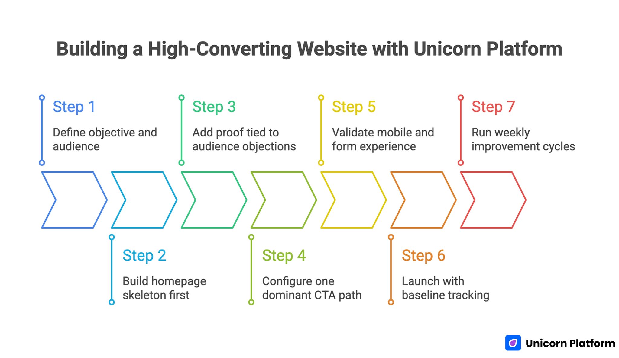
Building a High-Converting Website With Unicorn Platform
Unicorn Platform works best when you treat your site as a modular system rather than a one-time build.
1. Define objective and audience
Set one primary conversion goal and one priority audience for this iteration. This provides focus for every section decision.
2. Build homepage skeleton first
Create identity, value, proof, and action blocks before adding decorative elements. Conversion architecture should come before visual refinement.
3. Add proof tied to audience objections
Use trust blocks that address likely concerns directly. Relevance is more persuasive than quantity.
4. Configure one dominant CTA path
Ensure contact or booking flow is visible and operational. Remove competing action paths that dilute intent.
5. Validate mobile and form experience
Test on real devices to confirm readability, interaction quality, and response flow.
6. Launch with baseline tracking
Track top entry pages, CTA clicks, and conversion outcomes. Reliable measurement supports better iteration decisions.
7. Run weekly improvement cycles
Update one meaningful element each week based on behavior data and inquiry quality notes.
30-Day Optimization Plan for Personal Websites
Week 1: Baseline clarity
Review homepage headline, value statement, and CTA hierarchy. Ensure first-time visitors can understand your positioning in seconds.
Week 2: Proof refinement
Upgrade credibility blocks with stronger specificity. Replace broad statements with clearer outcomes and contextual evidence.
Week 3: Action-path testing
Test CTA wording and placement while keeping core layout stable. Compare inquiry quality, not only click volume.
Week 4: Content and navigation polish
Improve internal pathways between homepage, work samples, and contact flow. Remove navigation friction that distracts from primary outcomes.
60-Day Growth System for Personal Brands
Days 1-20: Stabilize message and conversion flow
Confirm consistency across homepage, About, and contact pages. Fix mismatches that create trust friction.
Days 21-40: Expand authority support
Add one or two content pages that reinforce your positioning and link them to your primary action path.
Days 41-60: Segment-specific refinement
Create a variant or dedicated section for a high-priority audience segment. Tailor proof and CTA language to that segment's needs.
This phased model keeps progress measurable and realistic for solo creators and small teams.
Audience-Specific Personal Website Variants
Most personal websites try to serve every visitor with one static message. That approach can work early, but it often underperforms once your audience mix becomes more diverse and your opportunities become more specialized.
A practical improvement is creating audience-specific variants or sections while keeping one stable core identity. Your tone and values remain consistent, but your examples, proof emphasis, and CTA wording adapt to the visitor type you care about most.
For example, a consultant may need one pathway for founders and another for marketing teams. The founder path can emphasize strategic decision clarity, while the marketing path can emphasize execution speed and measurable campaign outcomes.
Job-focused creators can use the same approach by separating hiring-oriented credibility from client-facing service proof. This makes each visitor path easier to understand because the page does not force everyone through a single generalized narrative.
When building variants, keep structure stable and change only high-impact elements first. Start with first-screen positioning, proof selection, and CTA phrasing before redesigning layout components.
Variant testing is most useful when your analytics already show intent differences by source. If one traffic source produces high-quality inquiries and another source does not, differentiated messaging often improves alignment faster than broad copy refreshes.
You can also implement lightweight segmentation without building fully separate pages. A modular section sequence with clear in-page pathways can direct visitors to the content most relevant to their goals while keeping maintenance manageable.
Trust Architecture for High-Quality Opportunities
Strong trust architecture is more than testimonials. It is the deliberate placement of evidence that helps visitors evaluate risk before they take a meaningful step.
Use three layers of trust across your core pages. First, include fast credibility cues in the first visible section, then add deeper proof in work or case blocks, and finally reinforce confidence near the primary CTA with concise expectation-setting language.
Fast credibility cues can include role clarity, years of focused experience, or selected collaborator context. These details work because they help visitors decide whether to continue reading before they commit to the full page.
Deeper proof should demonstrate thinking quality and practical results. A short project narrative that explains challenge, approach, and outcome usually builds stronger trust than long lists of tools or abstract claims.
CTA-adjacent trust is critical because hesitation often appears at the point of commitment. Add concise clarity around response expectations, process steps, or qualification criteria so users know what happens after they submit.
Trust architecture also improves internal confidence when collaborators review your site. Designers, editors, and assistants can make better updates when trust elements are clearly mapped to specific visitor decisions.
Content Maintenance Model for Long-Term Consistency
Personal websites often weaken over time because old proof and outdated positioning remain visible. A maintenance model prevents that drift and keeps your site aligned with current goals.
Use a monthly refresh cycle with three inputs: top landing pages, top conversion pages, and pages with declining engagement. This gives you a focused update queue without requiring full-site audits each month.
In each refresh, prioritize one message update and one proof update. The message update keeps positioning sharp, while the proof update protects credibility with current examples and outcomes.
Document every meaningful change with a short note on intent and expected impact. That history makes future decisions faster because you can see which edits improved inquiry quality and which edits created noise.
A maintenance model is also useful during rebranding or offer shifts. Instead of rewriting everything at once, you can update high-impact pages first and preserve site stability while the broader transition unfolds.
Monthly Metrics That Actually Matter
Personal website performance is more than traffic volume. You need metrics that reflect trust and conversion quality.
Track these each month:
- top landing pages by qualified visits
- click paths to primary CTA
- inquiry quality by page entry source
- returning visitor trend
- response rate and conversion-to-conversation ratio
Use these signals to choose one high-impact update at a time. Small targeted improvements usually outperform broad redesign experiments.
Common Mistakes and How to Fix Them
Mistake 1: Vague positioning
Generic messaging reduces relevance and attracts low-fit inquiries. Rewrite headline and value proposition with clearer audience and outcome focus.
Mistake 2: Homepage overload
Too many sections can hide your core message. Trim non-essential blocks and reinforce primary decision flow.
Mistake 3: Weak proof specificity
Broad credibility claims are hard to trust. Replace them with concise evidence tied to real outcomes.
Mistake 4: No clear next step
Visitors leave when action paths are ambiguous. Use one dominant CTA and confirm what happens after click.
Mistake 5: Inconsistent visual identity
Style inconsistency reduces perceived professionalism. Standardize typography, spacing, and button logic across core pages.
Mistake 6: No maintenance cadence
Without regular updates, pages become outdated and conversion quality declines. Run weekly maintenance and monthly strategic reviews.
Mistake 7: No documentation of changes
Teams repeat weak edits when history is not tracked. Keep a simple log of updates, intent, and observed outcomes.
FAQ: Building Great Personal Websites
What makes a personal website "great" in practice?
A great personal website communicates clear positioning, shows relevant proof, and guides visitors to one meaningful action without confusion.
How many sections should a personal homepage include?
Use only sections needed to answer core visitor questions. In many cases, five to seven focused blocks are enough.
Should I prioritize design or messaging first?
Messaging first. Clear positioning and action flow matter more than visual polish in early iterations.
What is the most important first-screen element?
A specific identity and value statement tied to audience outcomes. Visitors should understand fit immediately.
How often should I update my personal website?
Weekly light maintenance and monthly deeper reviews are a practical baseline for most personal brands.
Do I need a portfolio if I already have social proof?
Usually yes. A curated portfolio with context helps visitors evaluate fit faster than social snippets alone.
How can I improve inquiry quality, not just quantity?
Use specific positioning, stronger proof relevance, and clearer qualification language in CTA and contact sections.
What metrics should I watch beyond page views?
Track CTA path behavior, inquiry quality, returning visitors, and conversion-to-conversation outcomes.
Can no-code tools support professional personal websites?
Yes, if you combine no-code speed with structured content, clear trust design, and regular optimization.
What is the fastest high-impact fix for underperforming sites?
Improve first-screen clarity and CTA hierarchy first. Those two changes often unlock the largest immediate gains.
Final Takeaway
Great personal websites showcase your best self through clarity, credibility, and intentional action design. The strongest sites are not the most complex; they are the easiest to understand and the easiest to trust.
With Unicorn Platform, you can build and improve that system quickly. When you pair clear positioning with disciplined iteration, your personal site becomes a durable opportunity engine rather than a static profile page.
