Table of Contents
- Examples of Ecommerce Landing Pages by Growth Objective
- Page Blueprint: How to Build Before You Design
- 30-Day Implementation Plan for Growth Teams
- Common Mistakes and How to Fix Them Fast
- FAQ
Most ecommerce teams can launch a campaign page quickly. Far fewer teams can launch one that holds conversion quality steady across channels, seasons, and buyer intent levels. That gap is where margin is usually won or lost.
A high-performing page is not just a design outcome. It is a decision system that aligns message continuity, value clarity, trust timing, and purchase friction. When one of those parts breaks, paid traffic might still click, but revenue efficiency usually drops.
Growth teams often study what works in market leaders, then replicate surface design patterns without replicating decision logic. They copy hero styles, image blocks, or offer badges, but they do not define section jobs or objection order. The page looks current, yet conversion remains unstable.
This guide gives you a complete execution framework you can run in Unicorn Platform. It is built for teams that want practical structure, cleaner testing, and stronger outcomes than cosmetic redesign cycles.
sbb-itb-bf47c9b
Key Takeaways
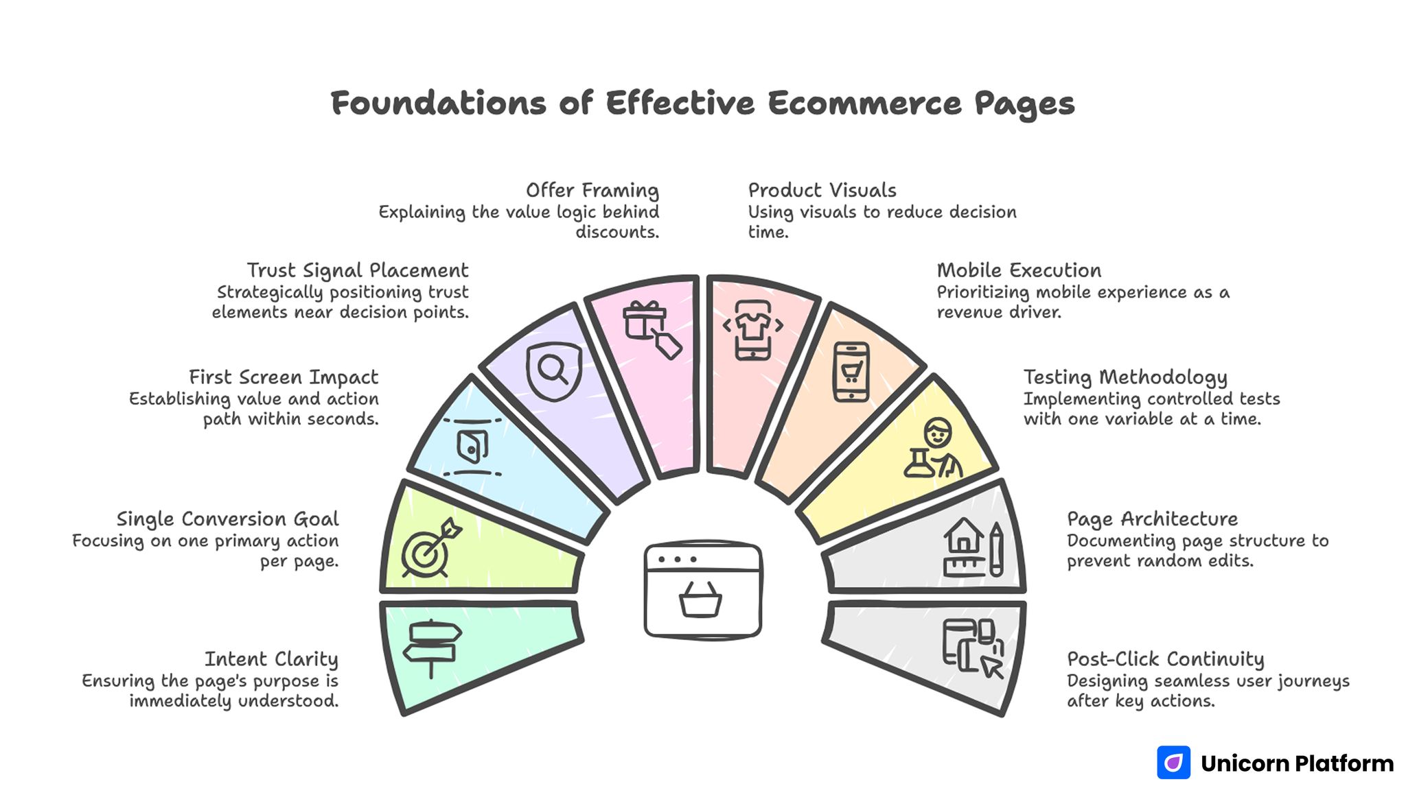
Foundations of Effective Ecommerce Pages
- Strong ecommerce pages begin with intent clarity, not with visual polish.
- One page should serve one primary conversion goal for one traffic segment.
- The first screen should establish fit, value, and action path in seconds.
- Trust signals perform best when placed near decision risk, not in isolated testimonial zones.
- Offer framing should explain value logic, not only discount size.
- Product visuals should reduce decision time, not increase decorative noise.
- Mobile execution quality is a revenue lever, not a QA afterthought.
- Testing works best when one major variable changes per cycle.
- A documented page architecture prevents random edits and analytics drift.
- Post-click continuity after submit or add-to-cart should be designed before launch.
Why Many Ecommerce Pages Underperform Even With Good Traffic
The first failure is intent mismatch. Traffic from paid search, social ads, email, creators, and affiliate channels reaches the same page with different expectations. If the opening message does not match click context, visitors hesitate before they evaluate your offer.
The second failure is value blur. Pages list product features, but they do not connect those features to near-term buyer outcomes. Visitors understand what the product includes but cannot quickly judge why buying now is rational.
The third failure is trust delay. Shipping policy, return terms, guarantee framing, and social proof appear too late. Users are asked to commit before the page addresses practical risk.
The fourth failure is CTA conflict. Several actions are presented with equal visual weight, so users browse without momentum. A page with multiple paths can still convert well, but only when route hierarchy is explicit.
The fifth failure appears in analytics. Teams celebrate gross conversion rate while refund sensitivity, post-purchase retention, and segment-level profit stability decline. Without quality metrics, page changes can look successful while business performance weakens.
What High-Converting Ecommerce Pages Consistently Do
High-performing pages are built like operational workflows. Each section has a job, each job supports one decision stage, and each stage reduces uncertainty before commitment.
Top-performing pages usually handle this sequence well:
- Confirm visitor fit from the first screen.
- Clarify specific value with concrete outcomes.
- Show credible proof for likely objections.
- Reduce friction around action and checkout intent.
- Preserve confidence after click with clear next steps.
This sequence can support different visual styles, brand voices, and category contexts. The common thread is not a shared template. The common thread is decision order.
Before you edit copy or design blocks, document section responsibilities. The workflow in this high-converting landing page structure guide is useful for mapping each block to one conversion job and one measurement signal.
A documented architecture also improves team execution speed. Content, design, and growth can iterate in parallel without breaking narrative coherence.
Examples of Ecommerce Landing Pages by Growth Objective
Ecommerce Landing Page Strategies for Growth
The strongest way to use reference patterns is by objective matching. Instead of asking "Which page looks best?" ask "Which structure best supports this traffic intent and offer type?"
Below are twelve practical page archetypes. For each one, focus on when to use it, where teams fail, and what to improve first.
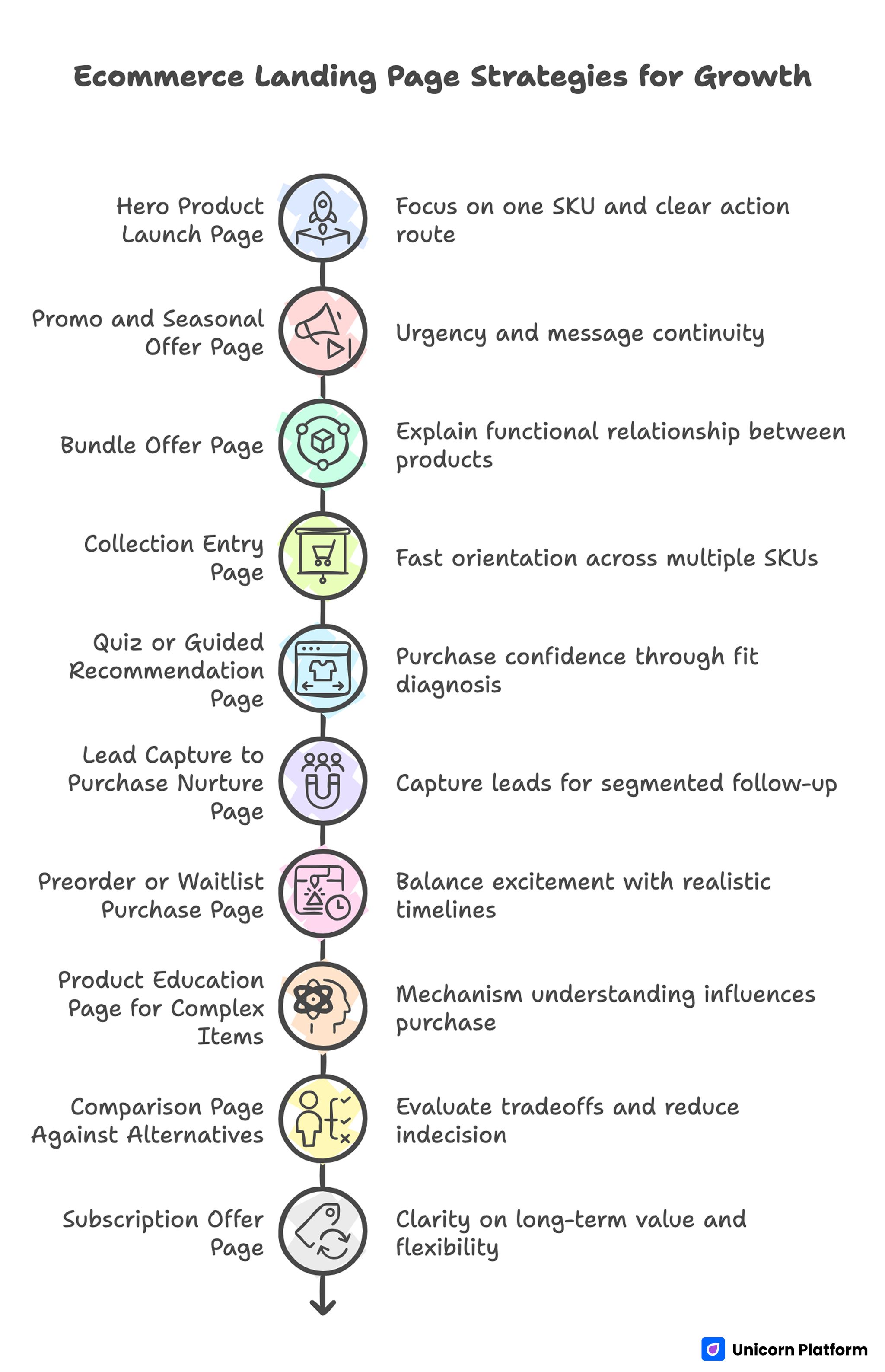
1) Hero Product Launch Page
Use this pattern when one SKU drives most campaign spend. Visitors should understand product category, differentiation, and purchase confidence without scrolling through unrelated catalog details.
Launch pages often fail because the first screen tries to communicate every feature at once. A stronger version leads with one outcome, one supporting mechanism, and one clear action route.
Prioritize fast trust insertion near primary CTA. Even minimal risk cues such as return window clarity or verified review snapshot can reduce hesitation at launch scale.
2) Promo and Seasonal Offer Page
Use this structure for short-window campaigns where urgency and message continuity matter. It works best when ad promise, on-page terms, and checkout expectation match exactly.
Typical failure: urgency is loud, but value logic is unclear. Visitors notice the timer but still do not understand who should buy, why this offer is meaningful, or what constraints apply.
Improve by writing transparent terms near the offer block. Clarify eligibility, timeline, and any exceptions before users hit the main CTA.
3) Bundle Offer Page
Choose bundle pages when average order value is the primary target. Strong bundle pages explain the functional relationship between products, not just total discount.
Teams often list bundle components without a usage narrative. Buyers then perceive the bundle as inventory packaging, not as a decision simplifier.
A better approach frames bundle logic around one buyer outcome. Show why the combined set shortens time to value or reduces decision fatigue compared with separate purchases.
4) Collection Entry Page
Use collection pages when users need fast orientation across multiple SKUs. This pattern is effective for categories where selection friction is high and comparison workload is heavy.
Weak collection pages overwhelm visitors with equal-priority options. Nothing stands out as the most sensible next step, so users bounce or start random exploration.
Improve by defining one primary route first, then exposing secondary paths. This keeps navigation useful without fragmenting attention.
5) Quiz or Guided Recommendation Page
This model works when purchase confidence depends on fit diagnosis. Skincare, nutrition, apparel sizing, and technical accessories often benefit from guided selection flows.
The failure mode is entertainment without qualification value. If questions feel generic or disconnected from recommendation output, completion rates may look fine while conversion quality remains low.
Keep every question tied to a decision rule. Users should understand why each input improves product relevance.
6) Lead Capture to Purchase Nurture Page
Use this page when direct purchase intent is low but category interest is high. The primary objective is to capture high-quality leads for segmented follow-up rather than force immediate checkout.
Common problem: lead magnets are broad and unqualified, so lists grow while revenue contribution remains weak. Strong pages align lead capture with clear buyer stage and clear next-step expectation.
Set expectations explicitly. Tell users what content or offer sequence they will receive and when the first follow-up arrives.
7) Preorder or Waitlist Purchase Page
This pattern is valuable when inventory constraints or launch timing prevent immediate fulfillment. Strong pages balance excitement with realistic timelines and risk transparency.
Teams lose trust when they rely on hype while hiding uncertainty. Visitors can tolerate delayed fulfillment when milestone communication is clear.
Use timeline checkpoints and policy clarity near the commitment action. If uncertainty exists, frame it honestly and maintain communication cadence.
8) Product Education Page for Complex Items
Use education-first pages for high-consideration products where mechanism understanding influences purchase confidence. Categories with technical differences or usage learning curves benefit most.
The usual mistake is long feature text without decision guidance. Visitors read but still cannot decide whether the product fits their context.
Organize education blocks around buyer questions, not around internal product taxonomy. Each section should end with a decision signal that moves users closer to action.
9) Comparison Page Against Alternatives
Comparison pages work when buyers actively evaluate tradeoffs. They can reduce churn from indecision if criteria are concrete and fair.
A weak comparison page over-claims and avoids nuance. This lowers trust, especially among informed shoppers who expect balanced framing.
Define who your product serves best and where alternatives may fit better. Balanced framing improves credibility and conversion consistency.
10) Subscription Offer Page
Use this pattern when recurring revenue is core to the business model. Visitors need clarity on long-term value, delivery cadence, and cancellation flexibility.
The major failure is positioning subscription as pressure. If users feel trapped, short-term conversions may rise while retention and refund behavior deteriorate.
Lead with convenience and control. Explain pause, skip, or cancel mechanics in plain language near the commitment point.
11) Retargeting Recovery Page
Recovery pages are designed for visitors who engaged but did not complete purchase. They should remove known friction rather than repeat generic awareness messaging.
Teams often re-use top-of-funnel pages for retargeting traffic. That wastes intent because returning users typically need objection resolution, not category introduction.
Use concise reminder framing, targeted proof, and shorter action path. Recovery pages should reduce decision workload for already-aware users.
12) Influencer or Partner Traffic Alignment Page
This structure is effective when acquisition depends on creator, affiliate, or partner narratives. Message continuity from source content to landing page is the main performance lever.
Performance drops when the page resets narrative after click. Visitors lose context and must re-interpret offer relevance.
Mirror source intent in first-screen framing and make the transition obvious. Continuity usually improves both conversion rate and checkout quality.
Choosing the Right Archetype for Each Campaign
Most underperforming programs fail before design begins because objective selection is vague. They attempt awareness, lead capture, and direct sales on one page with no action hierarchy.
A better approach starts with one primary KPI per page variant:
- First-order conversion rate for direct response campaigns.
- Qualified lead capture rate for early-stage education traffic.
- Average order value for bundle-focused initiatives.
- Return visitor conversion lift for retargeting programs.
After objective definition, align page type with traffic readiness. Cold traffic typically requires stronger value framing and trust depth, while warm traffic often needs faster path-to-action and objection cleanup.
Objective discipline improves testing clarity. When one page has one primary job, results become easier to interpret and scale.
Page Blueprint: How to Build Before You Design
Teams move faster when blueprinting happens before visual execution. A blueprint defines what each section must accomplish and what evidence confirms the section is working.
Use this practical blueprint model:
- Decision stage mapped to section order.
- Section objective stated in one sentence.
- Primary objection for each stage documented.
- Required proof element assigned to each objection.
- Measurement signal defined for each section.
This model turns creative iteration into structured experimentation. It also prevents random section additions that dilute page clarity.
When you build in Unicorn Platform, section-level modularity makes this workflow easier. You can keep architecture stable while iterating copy, media, and proof blocks based on measured behavior.
Messaging System That Improves Conversion Quality
Strong ecommerce copy reduces uncertainty. It does not rely on slogan density or aggressive persuasion tricks. Buyers need fast answers about relevance, expected benefit, and risk profile.
A reliable copy sequence looks like this:
- Audience context: who this is for.
- Practical outcome: what changes after purchase.
- Mechanism: how the product creates that change.
- Confidence cue: why the claim is believable.
- Action prompt: what to do next and what to expect.
Use specific language for outcomes. Replace broad statements with concrete impacts that users can evaluate against their workflow.
Keep claims bounded. Overstated certainty can increase click-through while reducing conversion quality when expectations are unrealistic.
Visual and Media Strategy for Faster Decisions
Visual quality should improve comprehension speed. Every screenshot, lifestyle photo, or motion clip should answer a buyer question.
A common performance issue is media overload. Pages include many assets but do not explain why each asset matters. Users scroll through visuals and still remain uncertain about fit.
Assign one message job to each major visual block. For example, first asset clarifies use case, second asset confirms result, third asset addresses common concern.
Sequence also matters. If users see advanced features before foundational value, perceived complexity rises and action confidence drops.
Use captions as decision aids, not decoration. Clear captions can increase utility of existing assets without expensive creative reshoots.
Trust Architecture: Where Confidence Cues Should Live
Trust should appear where risk is highest. A testimonial wall at the bottom cannot resolve objections that happen near first CTA or pricing blocks.
Map trust cues to objection points:
- Fit risk: targeted customer outcomes.
- Quality risk: validated review snippets with context.
- Delivery risk: shipping and fulfillment clarity.
- Financial risk: return, exchange, or guarantee language.
- Support risk: response expectations and access channels.
This mapping prevents generic proof placement. It also improves the signal-to-noise ratio for buyers making fast decisions.
Do not over-stack proof in one section. Distributed trust generally performs better than one dense credibility cluster.
Offer Framing and Incentive Design
Offer framing should explain value logic, not only urgency or discount percentages. Buyers convert more confidently when they understand what they gain and why timing matters.
Effective offer design usually combines one primary value lever with one confidence lever. Examples include bundled utility plus return assurance, or seasonal pricing plus delivery transparency.
Avoid combining too many urgency devices at once. Timer, low-stock badge, and countdown copy in one block can feel manipulative and reduce trust among comparison shoppers.
Use clean hierarchy in offer modules:
- Core value statement.
- Offer terms in plain language.
- Constraint clarity where relevant.
- One primary action.
When offer modules are clear, teams can test pricing and messaging without destabilizing the full page.
CTA Strategy and Action Path Design
A call-to-action should represent a decision stage, not just a button label. Clarity around what happens after click is often more important than creative phrasing.
For direct purchase pages, CTA language should reinforce immediacy and confidence. For lead capture or quiz flows, CTA copy should set expectation about effort and output.
Route hierarchy must stay obvious. Secondary actions can help different readiness states, but they should not compete visually with the primary route.
Practical CTA rules:
- Keep one dominant action above the fold.
- Use supporting microcopy to reduce commitment anxiety.
- Repeat CTA at natural decision points, not every section.
- Align CTA label with the real next step.
Teams often over-focus on button color while ignoring route clarity. Action hierarchy usually drives bigger gains than cosmetic button changes.
Mobile Execution and Technical Reliability
Mobile performance is a direct conversion variable in ecommerce programs. If layout shifts, tap targets, or form interactions fail under real conditions, paid efficiency declines quickly.
Prioritize these mobile gates before scale:
- Stable first-screen layout during load.
- Readable type and spacing without zoom friction.
- Persistent or well-placed primary action access.
- Reliable input behavior with mobile keyboards.
- Predictable media rendering on mid-tier devices.
A consistent responsive workflow reduces regressions when campaigns launch fast. This responsive landing page guide helps teams standardize block behavior across device classes.
After launch, test on real devices, not only browser emulators. Real-world latency and interaction behavior often reveal issues synthetic tests miss.
Measurement Model for Better Optimization Decisions
Optimization quality depends on metric quality. If teams only track top-line conversion, they can accidentally scale low-value behavior.
Use a two-layer measurement model:
- Front-end indicators: click-through to CTA, form completion, add-to-cart rate.
- Quality indicators: average order value, return sensitivity, repeat purchase tendency, segment-level profitability.
This model prevents misleading wins. A page change that lifts add-to-cart but harms downstream quality should trigger caution, not celebration.
Instrumentation discipline matters as much as creative quality. Keep event naming consistent and avoid changing tracking logic mid-test.
Testing Workflow: How to Iterate Without Noise
High-output teams often run too many simultaneous page changes. Result attribution becomes unclear, and strong patterns are harder to identify.
Use one-major-variable testing cycles. Change headline system, offer framing, trust block placement, or route hierarchy one at a time while keeping page architecture stable.
A practical weekly cadence looks like this:
- Week 1: establish baseline and QA instrumentation.
- Week 2: test first-screen relevance hypothesis.
- Week 3: test proof placement hypothesis.
- Week 4: test offer and CTA clarity hypothesis.
Document hypothesis, expected behavior signal, and success threshold before launch. This keeps post-test decisions objective.
When optimization stalls, behavioral diagnostics can uncover hidden friction points. The methods in this user behavior optimization guide are useful for prioritizing changes by real hesitation patterns instead of preference debates.
Content Governance for Teams Managing Many Campaign Pages
As stores scale, the number of campaign pages often grows faster than editorial control. Teams launch fast for seasonal pushes, influencer drops, paid tests, and retention programs, then struggle to keep messaging and policy details consistent.
A governance layer prevents this drift. Instead of treating each page as a one-off asset, define a controlled system of reusable blocks, approved claim language, trust-policy components, and offer term formats.
A practical governance framework includes:
- A canonical first-screen messaging pattern for each major intent stage.
- A proof library tagged by objection type, not only by campaign.
- Standard policy language blocks for shipping, returns, and guarantees.
- CTA naming conventions aligned with real next-step actions.
- A release checklist that combines editorial, technical, and analytics QA.
Ownership should also be explicit. One person owns conversion logic, one owns technical quality gates, and one owns brand-consistency review. Shared ownership without clear accountability usually creates contradictory edits and delayed launches.
Version tracking matters too. Keep a lightweight change log for each live page that records date, hypothesis, edited section, and result. This makes it easier to scale winning patterns and retire ideas that repeatedly underperform.
The main goal is not bureaucracy. The goal is compounding learning across campaigns so each new page starts with stronger defaults and fewer avoidable mistakes.
30-Day Implementation Plan for Growth Teams
Execution speed improves when responsibilities and milestones are explicit. Use the plan below as a practical operating rhythm.
Days 1-5: Audit and Blueprint
Review current page variants by channel and intent stage. Identify message continuity gaps, trust timing issues, and route conflicts.
Define one primary objective for the next iteration cycle. Write section jobs and objection mapping before design work starts.
Audit analytics for both front-end and quality metrics. Confirm that instrumentation is consistent across variants.
Days 6-12: Rebuild Core Structure
Create the updated section architecture with clear hierarchy. Keep scope focused on first-screen clarity, trust distribution, and CTA route logic.
Rewrite core copy using outcome language and bounded claims. Align visuals so each media block serves one decision function.
Run technical QA on mobile responsiveness, load behavior, and input reliability before opening traffic.
Days 13-20: Launch Controlled Tests
Launch one primary variant with one major hypothesis. Route traffic by segment so intent patterns remain interpretable.
Monitor early indicators daily, but avoid premature structural edits. Let tests run long enough to produce stable decision signals.
Capture qualitative insights from session recordings or support touchpoints. These signals help explain metric movement.
Days 21-30: Consolidate and Scale
Select winning patterns based on conversion quality, not only front-end lift. Merge validated changes into your default page blueprint.
Archive losing hypotheses with reasons. Documenting non-wins prevents future teams from repeating low-value experiments.
Prepare the next cycle with one prioritized hypothesis list. Maintain execution momentum without turning iteration into redesign chaos.
Common Mistakes and How to Fix Them Fast
Mistake 1: Treating all traffic as one audience
Fix: Build variants by intent stage and channel promise. Keep shared architecture while adjusting first-screen framing and proof order.
Mistake 2: Prioritizing style before decision logic
Fix: Define section jobs first, then design visuals to serve those jobs. A cleaner decision path usually outperforms visual novelty alone.
Mistake 3: Hiding policy clarity
Fix: Surface return, shipping, and guarantee details near commitment points. Risk transparency often lifts qualified conversion.
Mistake 4: Running multi-variable tests without control
Fix: Use one-major-variable cycles and stable instrumentation. Clean tests compound learning faster than broad redesign experiments.
Mistake 5: Measuring only gross conversion
Fix: Add downstream quality signals to reporting. Conversion gains are only meaningful when they improve business outcomes.
Mistake 6: Over-linking or over-explaining inside one section
Fix: Keep each section focused on one decision stage and one next action. Clarity beats density in high-intent environments.
FAQ: Examples of Ecommerce Landing Pages
What makes examples of ecommerce landing pages useful for strategy?
They are useful when you extract decision logic rather than copy layout details. Focus on intent matching, trust timing, and action hierarchy, then rebuild those mechanics in your own brand voice and offer context.
How many landing page variants should an online store run at once?
Run as many as your team can measure and maintain with discipline. Most teams perform better with a small set of objective-specific variants than with many lightly managed pages.
Should one page target both cold and warm traffic?
It can, but performance usually improves when first-screen framing and proof order are adjusted by readiness stage. Cold traffic needs stronger context while warm traffic often needs faster objection resolution.
Which section should be tested first?
Start with first-screen relevance because it shapes how users interpret every section below. After that, test trust placement and offer clarity before cosmetic elements.
Are long ecommerce pages always better than short pages?
Length is not the deciding factor. Depth should match consideration complexity. High-intent, simple offers may convert with shorter flows, while complex or higher-risk offers need stronger educational and trust depth.
How should discount messaging be handled without hurting brand trust?
Use transparent terms and clear value logic. Explain why the offer exists, who it is for, and what constraints apply. Avoid stacking multiple urgency cues in one area.
What is the best way to place testimonials?
Place proof where objections emerge, not only in one social-proof block. Use specific, context-rich evidence tied to product fit, quality, or delivery confidence.
How can a team improve mobile conversion quickly?
Fix stability and clarity first: layout shifts, tap target issues, slow media, and ambiguous CTA placement. These changes often outperform late-stage visual refinements.
Do templates limit performance?
Templates are not the problem when architecture and messaging are strong. Performance drops when teams keep template defaults without aligning them to objective, intent stage, and offer logic.
How often should ecommerce pages be refreshed?
Refresh cadence should follow signal quality, not calendar pressure. Update quickly when clear friction patterns appear, and preserve stable structures when performance is healthy.
Final Takeaway
Winning ecommerce page execution is not about finding a single perfect design. It is about operating a repeatable system where intent matching, value clarity, trust timing, and technical reliability work together.
When your team defines section jobs, tests one major variable at a time, and measures quality outcomes alongside conversion rate, page performance becomes more predictable. That is how you move from occasional campaign wins to consistent growth.