Table of Contents
- Why Digital Guide Pages Underperform
- Form and Checkout Design: Remove Unnecessary Friction
- 30-Day Implementation Plan
- Common Failure Modes and Practical Fixes
- FAQ
Digital products can be excellent business assets, but many ebook launches still underperform for a simple reason: the page asks for commitment before confidence is established. Visitors arrive with curiosity, scan quickly, and leave when value, relevance, or trust is unclear.
This is not usually a traffic problem. Teams often have enough reach through newsletters, social channels, partnerships, or search campaigns. The bottleneck appears at decision time, where the page must help readers understand what they get, why it matters now, and why the offer is credible.
Strong ebook conversion pages solve this with structure, not hype. They guide readers through a practical sequence: fit, value, confidence, and action. When that sequence is clear, both conversion rate and conversion quality improve.
Unicorn Platform helps teams execute this approach because page updates can be shipped quickly without rebuilding from scratch. Speed matters only when it is paired with discipline. A fast publishing workflow plus stable architecture is what creates compounding gains over repeated campaigns.
sbb-itb-bf47c9b
Quick Takeaways
Conversion Optimization Tips
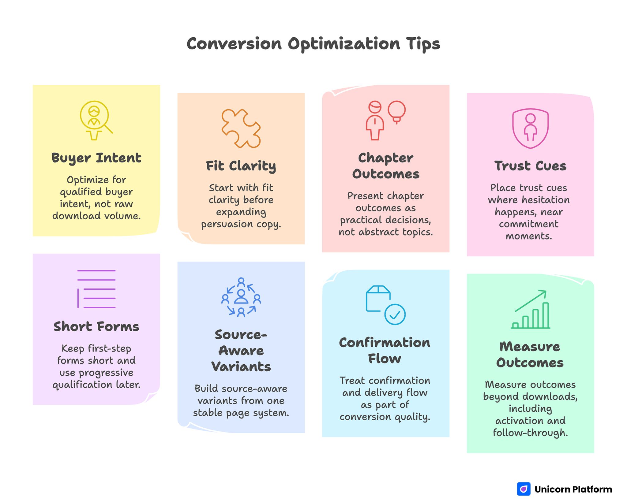
- Optimize for qualified buyer intent, not raw download volume.
- Start with fit clarity before expanding persuasion copy.
- Present chapter outcomes as practical decisions, not abstract topics.
- Place trust cues where hesitation happens, near commitment moments.
- Keep first-step forms short and use progressive qualification later.
- Build source-aware variants from one stable page system.
- Treat confirmation and delivery flow as part of conversion quality.
- Measure outcomes beyond downloads, including activation and follow-through.
Why Digital Guide Pages Underperform
Underperformance usually starts with weak relevance framing. Visitors see broad claims such as "ultimate" or "complete" without clear audience context. When people cannot quickly determine whether the guide is meant for them, they delay action.
The next issue is vague value language. Many pages list topics but do not explain what readers will be able to do after reading. Topic lists create awareness. Outcome framing creates motivation.
Trust timing is another common failure. Proof is often buried below long copy blocks or placed too late in the page. Readers are asked to submit or pay before uncertainty is reduced.
Finally, post-conversion flow is frequently neglected. Even when a page converts, a weak confirmation or delivery experience can reduce engagement and increase refunds. Conversion quality includes what happens after the click, not only at the form.
The Decision Sequence That Improves Conversion Quality
High-performing pages usually follow one decision sequence: fit, outcome, proof, and action.
Fit identifies who the resource is for and when it is useful. Outcome explains what practical progress readers can make. Proof reduces perceived risk through contextual evidence. Action presents a clear next step with minimal friction.
If this order is broken, performance suffers. Asking for commitment before fit attracts low-intent submissions. Showing proof before outcomes can feel disconnected. Presenting multiple equal actions can create hesitation.
Teams standardizing structure can apply principles from this high-converting page architecture guide to keep section flow consistent across launches.
First-Screen Clarity: The Highest-Leverage Section
The first screen should answer three questions in seconds. Who is this for? What practical value does it provide? What should the visitor do next?
Strong opening copy is specific and outcome-led. Weak opening copy relies on category language and enthusiasm without operational detail.
A practical first-screen formula includes audience signal, one measurable value statement, one short credibility cue, and one clear primary action. This gives enough certainty for qualified visitors to continue.
Drafting Framework for Better Openers
Use this framework before publishing:
- Audience: define who benefits most right now.
- Outcome: define one tangible result the reader can achieve.
- Timeline: define when or how fast that result can begin.
- Action: define the exact next step.
If the opener cannot support these four elements, the page is usually not ready.
Offer Positioning: What the Ebook Actually Delivers
Visitors do not convert because a guide exists. They convert because they expect useful progress after engaging with it. The offer should be framed around decisions, workflows, and avoidable mistakes.
Instead of listing chapter titles alone, describe chapter outcomes. Readers should understand what each section enables them to do differently in real work.
Outcome depth should match buyer intent. For early-stage audiences, provide clarity and planning value. For advanced audiences, provide implementation frameworks and tradeoff guidance.
This shift from topic list to decision utility is one of the fastest conversion upgrades for most ebook pages.
Content Preview Strategy: Show Substance Without Giving Everything Away
Preview sections should reduce uncertainty while preserving curiosity. Give enough depth to demonstrate quality, but keep room for the full resource to remain valuable.
A practical preview model includes one framework excerpt, one case snippet, and one checklist fragment. This combination shows both strategic and tactical value.
Previews should be concise and scannable. Dense preview blocks can overwhelm readers and dilute the primary action.
Trust Design: Evidence That Lowers Risk
Trust works when it is contextual. Generic praise like "great resource" rarely changes behavior. Specific feedback tied to outcomes and use cases is far more persuasive.
Useful trust signals include reader outcomes, role-based testimonials, proof of author expertise, and examples of real implementation results. Even simple evidence is effective when it is relevant.
Placement is critical. Trust elements should appear near decision points, not isolated at the bottom. Readers need confidence where hesitation begins.
For teams selling higher-consideration resources, this product conversion page guide can help structure risk reduction and commitment logic.
Pricing and Value Framing for Paid Guides
Pricing should reflect transformation depth, not just file format. Low pricing can increase impulse purchases but may reduce perceived value. Higher pricing can work when implementation benefit is clear.
The best pricing choice depends on audience maturity, offer depth, and follow-up model. There is no universal correct number.
What matters most is value context. If buyers understand what decisions become easier and what outcomes become more likely, pricing resistance declines.
Packaging Patterns to Test
- Standalone guide with immediate download.
- Guide plus templates bundle for implementation speed.
- Guide plus mini workshop or Q&A session.
- Guide as entry offer into a broader product stack.
Testing these formats in a controlled way often improves both conversion and customer fit.
Form and Checkout Design: Remove Unnecessary Friction
Form friction is a frequent hidden leak. Teams often request too much information too early, especially for free resources used as demand capture.
A strong first-step form usually collects only essentials. Extra details can be captured after initial intent is confirmed.
Checkout pages for paid guides should also minimize complexity. Buyers need clear pricing, clear delivery expectations, and clear support context.
Form Field Audit Questions
- Does this field affect routing or personalization?
- Can this information be captured after conversion?
- Does the field create mobile friction?
- Is the value exchange obvious enough to justify the request?
If the answer is weak, defer the field.
Progressive Qualification and Buyer Segmentation
Progressive qualification balances conversion volume with quality. First capture basic intent, then gather deeper context in follow-up interactions.
For free downloads, a useful pattern is initial email capture followed by one short intent question in the delivery step. For paid offers, confirmation flows can include one optional implementation readiness prompt.
This approach preserves first-step momentum while improving segmentation quality for downstream communication.
Teams combining content offers with pipeline goals can align this with broader demand systems using this lead capture framework.
Mobile Conversion Standards
A large share of ebook traffic comes from mobile channels. Weak mobile readability or form interaction can reduce conversion quality before teams notice it in blended reports.
Mobile readiness should include first-screen readability, visible CTA hierarchy, field interaction comfort, and fast confirmation flow.
Real-device testing is mandatory. Emulator checks are useful, but they rarely surface every friction point that affects real user behavior.
Traffic-Source Alignment Without Template Chaos
Search, newsletter, social, and referral visitors do not arrive with the same intent context. One static message often underperforms across all channels.
The strongest model is one canonical page template with controlled message variants by source. Adjust framing, proof order, and CTA emphasis while preserving overall section architecture.
This allows teams to improve relevance without sacrificing governance. It also produces cleaner test insights because structural noise is reduced.
Conversion Does Not End at Download or Purchase
Submission or payment is only a midpoint. If delivery, onboarding, or follow-up feels generic, trust declines quickly and engagement drops.
A strong post-conversion flow includes immediate confirmation, clear access instructions, and one practical next action. For paid resources, include usage guidance and support clarity.
When this handoff is consistent, downstream outcomes improve: higher reading completion, stronger replies, better upsell readiness, and fewer refund issues.
Analytics Model for Ebook Business Outcomes
Page views and downloads are useful, but they are incomplete. Better optimization requires layered metrics tied to business value.
Layer one includes page behavior: CTA clicks, form starts, completions. Layer two includes early engagement: delivery opens, first-session interaction, intent signals. Layer three includes commercial outcomes: paid conversion, refund trend, next-offer progression.
Each campaign should define one primary metric and one guardrail metric. Guardrails prevent local improvements that damage long-term performance.
Practical Metric Pair Examples
- Free resource campaign: primary is qualified completions, guardrail is low-intent rate.
- Paid resource campaign: primary is completed purchases, guardrail is early refund rate.
- Bundle campaign: primary is bundle conversion, guardrail is follow-up engagement quality.
Using this structure makes optimization decisions more reliable.
Weekly Optimization Operating System
Random edits create noisy outcomes. A weekly operating system improves clarity and execution speed.
A practical cadence: Monday performance review, Tuesday hypothesis selection, Wednesday controlled update, Thursday QA validation, Friday decision log update.
One major variable per cycle is usually enough. Faster learning comes from consistent iteration, not from changing many elements at once.
Monthly Freshness Operations
Even strong pages degrade when proof, examples, or positioning become outdated. Freshness operations keep trust and relevance aligned with current audience reality.
Use a monthly refresh cycle for active pages. Review proof recency, offer clarity, pricing context, and CTA messaging.
Quarterly, run a template-level review to promote winning patterns and retire low-value sections. This maintains consistency while allowing structured evolution.
For teams accelerating drafting cycles, controlled use of AI page drafting workflows can improve speed if QA discipline remains strict.
Scenario: Paid Guide Relaunch With Better Conversion Quality
A creator selling a specialized business guide had healthy traffic but low purchase consistency. The page emphasized broad benefits and long personal narrative, with weak outcome specificity.
Audit identified three issues. First, fit language was too broad. Second, trust proof lacked context. Third, checkout confidence was weak due to unclear delivery expectations.
The team rebuilt in Unicorn Platform using a clear fit-outcome-proof-action sequence. They added chapter outcome previews, moved trust cues near CTA, and simplified checkout messaging.
In the next launch cycle, purchase conversion improved and refund requests decreased. The biggest gain came from clearer expectation setting, not from visual redesign.
Scenario: Free Guide for Qualified Demand Generation
A SaaS team used a free guide to collect leads. Submissions were high, but sales acceptance was low.
The page used generic growth language and asked for too little context, attracting broad curiosity without buying intent.
After restructuring in Unicorn Platform, the team added precise role-fit language, practical outcome framing, and one lightweight intent signal in follow-up flow.
Total submissions decreased slightly, but qualified meetings increased because conversion quality improved. This made the funnel more valuable despite lower raw volume.
30-Day Implementation Plan
30-day Ebook Landing Page Conversion Optimization
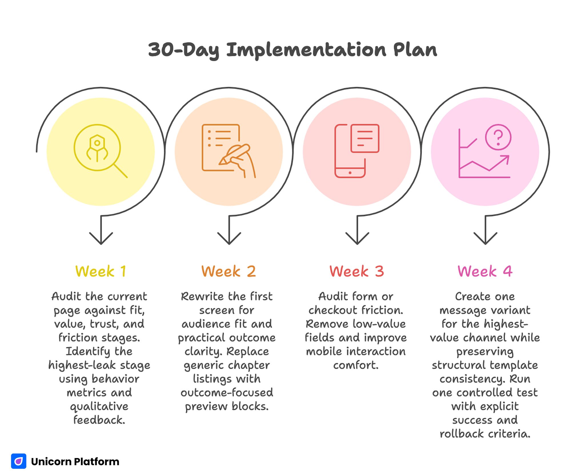
Week 1: Diagnose and Baseline
Audit the current page against fit, value, trust, and friction stages. Identify the highest-leak stage using behavior metrics and qualitative feedback.
Define one primary metric and one guardrail metric. Document baseline performance before publishing changes.
Week 2: Rebuild Core Conversion Sections
Rewrite the first screen for audience fit and practical outcome clarity. Replace generic chapter listings with outcome-focused preview blocks.
Reposition trust evidence near commitment points and simplify CTA hierarchy.
Week 3: Improve Action Flow and Mobile Quality
Audit form or checkout friction. Remove low-value fields and improve mobile interaction comfort.
Strengthen confirmation and delivery continuity so expectations remain clear after conversion.
Week 4: Launch One Source-Aware Variant
Create one message variant for the highest-value channel while preserving structural template consistency.
Run one controlled test with explicit success and rollback criteria, then document outcomes in a decision log.
90-Day Scale Plan
Month 2: Expand by Intent Segment
Extend the core template into segment-oriented variants for discovery, evaluation, and high-intent audiences. Keep structure fixed and adjust message emphasis.
Develop reusable modules for preview blocks, trust sections, and confirmation cues to improve launch speed without quality drift.
Month 3: Operationalize Reliability
Formalize release gates for route integrity, measurement validation, and mobile QA.
Add rollback rules tied to guardrail decline and require ownership sign-off before scaling traffic.
At this stage, growth should come from reliable operating rhythm rather than frequent full redesigns.
Common Failure Modes and Practical Fixes
1) Broad Audience Positioning
The page sounds appealing but does not define who should convert. Add explicit role and use-case fit signals in the opener.
2) Topic Lists Without Outcome Context
Readers see chapter names but not practical value. Add outcome statements tied to decisions or workflows.
3) Late Trust Placement
Proof appears after commitment requests. Move trust cues closer to primary action points.
4) Overloaded First-Step Forms
Too many required fields reduce completion quality. Use staged qualification and defer low-value inputs.
5) Checkout Uncertainty
Paid buyers cannot quickly confirm delivery or support context. Clarify what happens immediately after purchase.
6) Mobile Interaction Friction
Small-screen readability and field behavior are weak. Validate on real devices before campaign scale.
7) Source Message Mismatch
One message serves all channels and underperforms. Keep one template, adapt message emphasis by source.
8) Weak Confirmation Flow
Post-conversion communication is generic or delayed. Reinforce value and next step immediately after conversion.
9) Volume-Only Optimization
Downloads rise while business outcomes stall. Use layered metrics with primary and guardrail pairs.
10) No Freshness Routine
Proof and claims become stale over time. Run monthly updates and quarterly template reviews.
Pre-Launch QA Checklist
Confirm first-screen fit clarity, value specificity, and one dominant action path. Verify each section supports one job in the decision sequence.
Check proof relevance, form or checkout friction, and confirmation continuity. Validate mobile behavior on real devices.
Confirm analytics events for primary and guardrail metrics before scaling spend. Require final sign-off from content and QA owners.
FAQ: Ebook Page Conversion Strategy
What should be optimized first on an ebook page?
Start with audience-fit clarity and outcome framing in the opening section. These two elements usually drive the biggest early gains.
Should free guides always ask for minimal data?
Yes for first-step conversion in most cases. Collect only what is needed for routing and gather deeper context after intent is confirmed.
How many CTAs should the page use?
Use one dominant CTA and one secondary option when needed. Too many equal actions typically reduce conversion confidence.
Is long copy better for digital guide sales?
Length alone does not improve conversion. Clarity, structure, and relevance are more important than total word count.
What type of proof performs best?
Contextual proof tied to specific outcomes and audience similarity usually outperforms generic praise.
How can teams reduce refund risk on paid guides?
Set clear expectations before purchase, provide immediate delivery clarity, and include practical usage guidance after conversion.
Should different traffic sources get different page layouts?
Usually no. Keep one core layout and vary message emphasis to preserve test integrity.
How often should pages be refreshed?
Run monthly freshness checks on active pages and quarterly reviews at the template level.
What metric matters most for lead-magnet style guides?
Qualified completion quality is usually the best primary metric, paired with a guardrail such as low-intent rate.
What creates compounding performance over time?
Stable structure, disciplined iteration, strong post-conversion continuity, and metrics tied to business outcomes.
Final Takeaway
High-performing ebook conversion pages are built on specificity, trust, and disciplined execution. Teams that optimize only for surface-level volume often miss the larger business opportunity.
Unicorn Platform enables a stronger approach: rapid updates on stable architecture, clean testing loops, and better continuity from first click to post-conversion engagement. Keep the decision sequence clear and conversion quality will improve with every cycle.