Table of Contents
- What to Look for in a No-Code Ecommerce Landing Setup
- How to Build the Page in Unicorn Platform
- 30-Day Launch and Optimization Plan
- Common Mistakes and Fixes
- FAQ
Most ecommerce teams do not lose revenue because they lack traffic. They lose revenue because campaign visitors land on pages that are unclear, overloaded, or mismatched to intent. A paid ad can promise one thing, but the page can present a different message, weak proof, and too many next-step options. That gap is where conversion quality breaks.
A custom ecommerce landing page solves this by narrowing attention around one offer for one audience at one moment. Instead of pushing visitors into a broad store experience, it guides them through a focused decision path: value, proof, risk reduction, and action. The structure is simple, but the discipline behind it is what creates consistent results.
In 2026, building this type of page no longer requires long development queues. No-code execution with Unicorn Platform can give teams launch speed and editorial control, but speed alone is not enough. You still need message clarity, section logic, and a repeatable optimization process.
This guide gives you that process. You will get a practical framework for selecting the right no-code setup, building a high-converting ecommerce landing page from scratch, and improving performance through weekly test cycles that compound over time.
If you want to align your process with known conversion pitfalls before building, start by reviewing these ecommerce landing page mistakes to avoid, then return to this playbook with that failure lens in mind.
sbb-itb-bf47c9b
Quick Strategic Takeaways
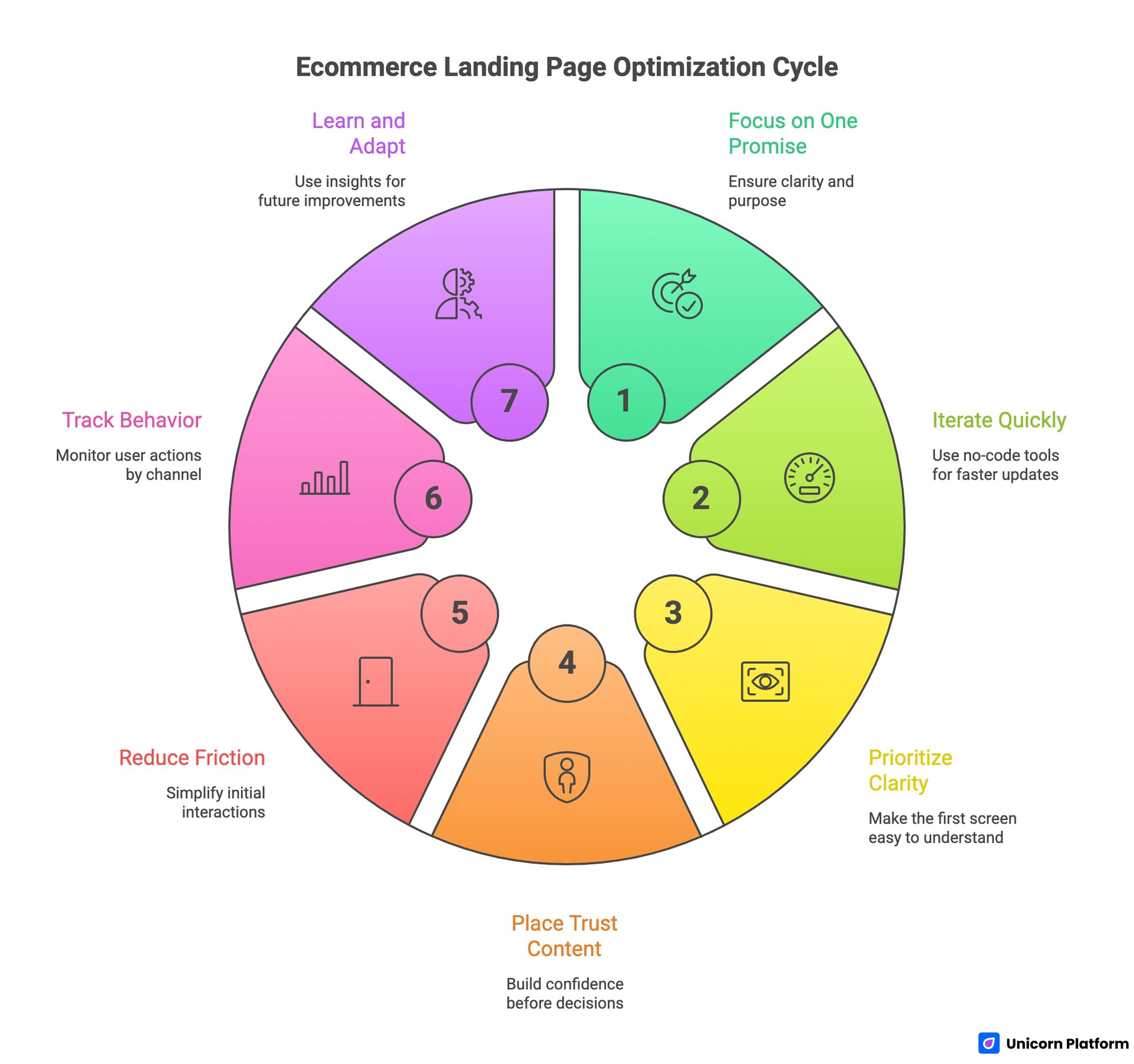
Ecommerce Landing Page Optimization Cycle
- Focus each landing page on one campaign promise and one primary action.
- Use no-code speed to iterate faster, not to publish unfinished structure.
- Prioritize first-screen clarity before visual experimentation.
- Place trust content before high-friction decision moments.
- Keep initial form or checkout friction low, then qualify later.
- Track behavior by channel to avoid false optimization conclusions.
- Use weekly learning loops so gains compound across campaigns.
Recent conversion research from Loopex Digital shows that typical ecommerce sites convert only around 2–3%, while top performers reach 10–11% or more, and nearly 70% of carts are abandoned, emphasizing the importance of focused optimization, clean UX, and friction reduction throughout the landing page funnel.
Why Ecommerce Campaign Pages Underperform
Underperforming pages usually fail in the same four areas. First, they lead with product category language instead of audience-specific outcomes. Visitors care about how the product improves a real situation, not how the business internally labels the offer.
Second, they delay confidence signals. When social proof, guarantees, delivery clarity, or return terms appear too late, users reach pricing or form sections without enough trust to continue. The result is hesitation, comparison behavior, and abandonment.
Third, they mix too many goals into one experience. A landing page designed for conversion should not behave like a full site navigation hub. When campaign traffic sees equal-priority links to unrelated paths, conversion intent diffuses.
Fourth, teams launch pages and then optimize inconsistently. Without a fixed review cadence, the page stays static while channel conditions, user expectations, and competitor framing keep changing.
The No-Code Advantage, Used Correctly
No-code tooling changes what ecommerce teams can execute in a week, but it does not replace conversion strategy. The real advantage is operational: marketers, founders, and content teams can adjust high-impact sections directly without waiting for engineering bandwidth.
That speed creates leverage only when decisions are structured. Without standards, teams publish frequent edits that look productive but do not improve outcomes. With standards, each update maps to a known bottleneck and measurable hypothesis.
Best practices from conversion experts at Convert.com reinforce this approach: improving site speed as a trust signal, adding obvious trust cues, and optimizing the checkout and form flows based on UX patterns are proven ways to boost ecommerce landing page conversions across high‑traffic campaigns.
A practical no-code model for ecommerce pages includes three layers. The first layer is page architecture, which defines section order and decision flow. The second layer is message quality, which determines whether the right audience feels immediate relevance. The third layer is optimization rhythm, which protects performance from stagnation.
When these layers are aligned, no-code execution becomes a growth system rather than a publishing shortcut. Teams gain both speed and reliability because each update has a defined conversion purpose.
When to Use a Builder vs. When to Use a Developer
Many teams ask whether a no-code landing page builder is always the right choice. In most campaign scenarios, the answer is yes. In some scenarios, custom development still wins.
Choose a no-code builder when rapid iteration is a competitive advantage. These conditions usually indicate that business velocity matters more than custom engineering depth.
- you need fast launch cycles for ad or email campaigns
- offers change frequently by audience segment
- the page logic is conversion-focused and modular
- your team needs direct control over copy and structure
- experimentation speed is more valuable than bespoke engineering
Choose custom development when technical requirements exceed practical no-code boundaries. In these cases, engineering effort protects compliance, performance, or integration integrity.
- you need deep backend logic directly in the page experience
- compliance requirements demand highly custom technical controls
- design interactions require custom code beyond practical no-code limits
- your team has stable specs that will not change often
- long-term maintenance is already owned by an engineering team
The best teams do not frame this as either-or forever. They use no-code for speed where it creates business value, and they reserve developer time for genuinely technical constraints.
What to Look for in a No-Code Ecommerce Landing Setup
High-performing pages are built on the right operational foundation. Before designing sections, evaluate your setup against five criteria.
1. Usability for non-technical operators
Your team should be able to change headlines, trust blocks, and CTA logic without fragile workflows. If routine edits require multiple handoffs, your iteration speed will collapse.
Usability includes publishing confidence. Teams need clear preview states, rollback safety, and clean collaboration so rapid edits do not introduce avoidable quality errors.
2. Integration with existing stack
Landing pages should connect cleanly with analytics, CRM, email, and payment flows. Conversion optimization breaks down when data is incomplete or delayed.
Integration quality also affects attribution. If source-level performance does not pass through reliably, teams may scale channels that look efficient on top-line metrics but produce low-quality outcomes downstream.
3. Customization depth without technical debt
You need enough flexibility to express brand voice and offer differences by campaign. At the same time, too much unconstrained flexibility can create design drift and inconsistent decision flow.
Strong teams use reusable modules with controlled variation. That balance preserves speed and coherence while still allowing campaign-specific adaptation.
4. Analytics and testing readiness
A landing page environment should support event instrumentation and fast variant publishing. If testing requires major setup each cycle, the team will avoid experiments and rely on opinion-based edits.
Your baseline should include CTA click tracking, form or checkout starts, submission completion, and thank-you page arrival. These events make bottlenecks visible and keep optimization grounded in behavior.
5. Pricing and operational fit
No-code cost should be evaluated against output speed and conversion impact, not subscription price in isolation. A slightly higher tooling cost can still be cheaper than slow release cycles that delay campaign learning.
Operational fit also matters. A platform can have strong features and still fail if your team cannot maintain a disciplined process around it.
Section-by-Section Blueprint for Ecommerce Landing Pages
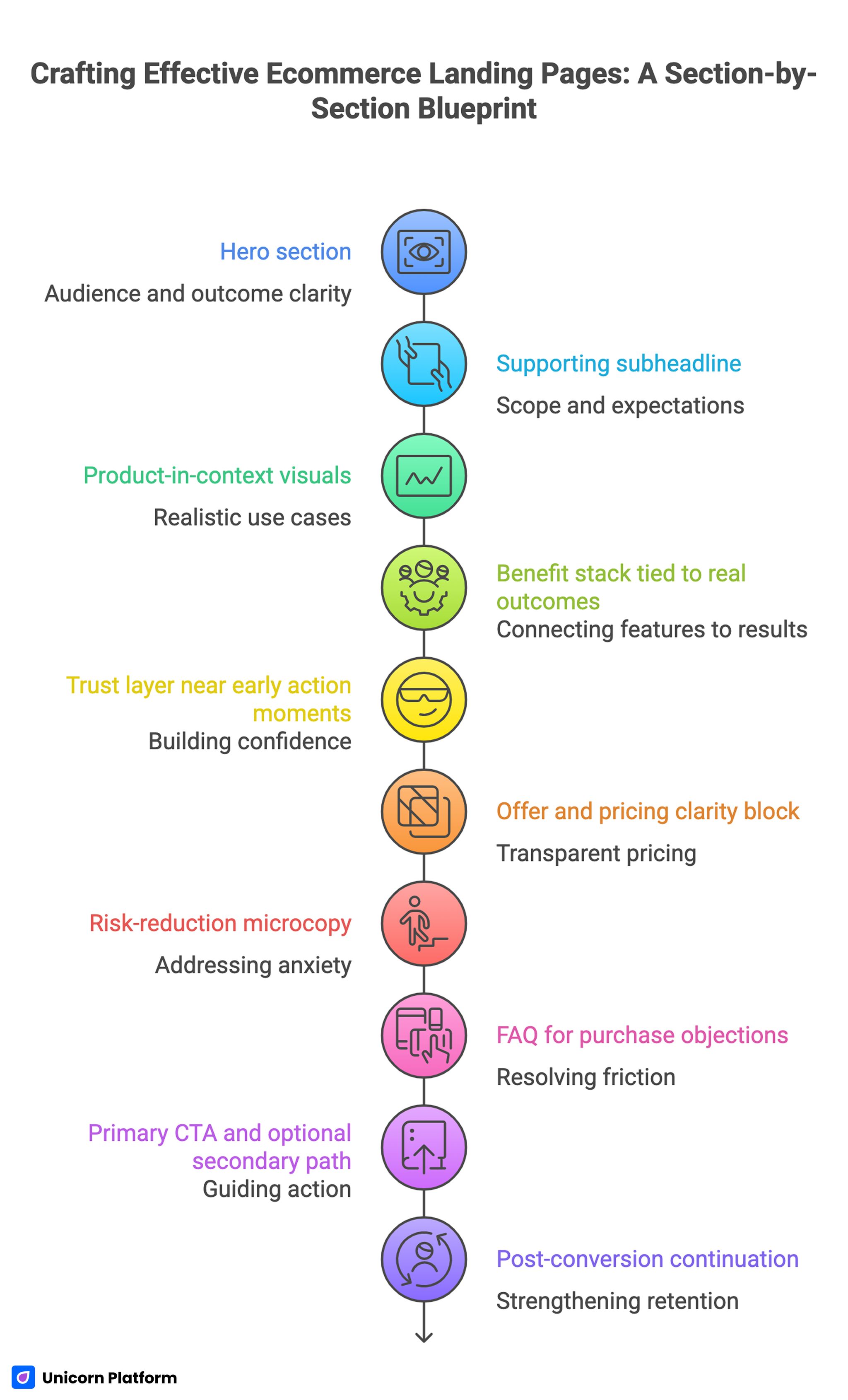
Section By Section Blueprint For Ecommerce Landing Pages
The strongest custom ecommerce landing pages follow a consistent decision architecture. Users should feel guided, not rushed, and informed, not overloaded.
1. Hero section: audience and outcome clarity
Your hero should confirm two things quickly: who the offer is for and what outcome it delivers. Product adjectives and generic brand claims are not enough for first-screen conversion.
Use specific language tied to context. If a visitor arrives from a campaign about faster morning routines, your hero should not open with broad category positioning. It should connect directly to the promised result and relevant use case.
2. Supporting subheadline: scope and expectations
The subheadline should remove uncertainty. Clarify what is included, who the offer best serves, and how quickly users can experience value.
This short block reduces bounce caused by ambiguity. Visitors are more likely to continue when they know whether the offer matches their situation and constraints.
3. Product-in-context visuals
Show the product in realistic use, not just isolated studio images. Context visuals answer practical questions that buyers often ask implicitly: fit, scale, quality, and real-world application.
When visuals support decision-making, they increase confidence. When visuals are purely decorative, they can consume attention without helping conversion.
4. Benefit stack tied to real outcomes
Feature lists are useful, but outcomes convert. Present a concise sequence that connects each core feature to a practical result for the buyer.
Keep the language plain and concrete. Overly stylized phrasing can reduce trust when users are trying to evaluate utility quickly.
5. Trust layer near early action moments
Insert trust elements before high-commitment points. This can include customer feedback, usage volume context, concise guarantees, or policy clarity.
Trust timing matters more than trust volume. Five proof points placed too late are less effective than two proof points placed exactly where hesitation rises.
6. Offer and pricing clarity block
Present the offer structure clearly. Users should understand what they get, what it costs, what is optional, and what terms apply.
If your page includes bundles, compare them by outcome relevance rather than by feature overload. Decision clarity improves when buyers can quickly see which option fits their priority.
7. Risk-reduction microcopy
Before checkout or form submission, answer common anxiety triggers in concise language. Delivery timing, returns, support response, and secure checkout cues can reduce final-step drop-off.
This copy should be specific and easy to scan. Vague reassurance language usually fails under real buyer scrutiny.
8. FAQ for purchase objections
A focused FAQ can resolve friction that is too specific for headline sections. Address compatibility, sizing, shipping windows, and change or cancellation terms with direct answers.
Well-structured FAQ content also reduces support load by addressing repeat questions before users leave the page to search elsewhere. It also keeps users inside the conversion flow instead of forcing them into off-page research.
9. Primary CTA and optional secondary path
Keep one dominant primary CTA aligned to campaign intent. Secondary actions can exist, but they should support the main path rather than compete with it.
For cold traffic, a lower-friction secondary path can help users who are not ready for immediate checkout. The key is preserving action hierarchy so the page stays conversion-focused.
10. Post-conversion continuation
A landing page should define what happens after action, not end at submission. Thank-you states should guide users to the next step that strengthens retention and downstream value.
This might include onboarding content, usage guidance, or category-specific resources that keep momentum after the first conversion event. A clear post-conversion path increases perceived professionalism and improves follow-through behavior.
How to Build the Page in Unicorn Platform
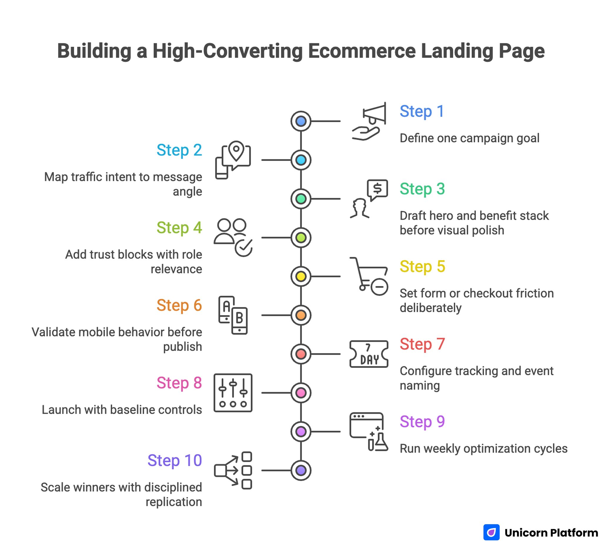
Building a High-Converting Ecommerce Landing Page
The workflow below keeps no-code execution structured and repeatable. It is designed for teams that need both speed and consistent quality controls.
Step 1: Define one campaign goal
Start with one measurable page objective. Examples include product purchase, waitlist enrollment, or lead capture for high-ticket product flows.
If you try to maximize multiple conflicting outcomes in one cycle, your copy and section order will lose focus and your data will become harder to interpret. A single-page objective creates cleaner decisions and clearer reporting.
Step 2: Map traffic intent to message angle
Document where traffic comes from and what promise users saw before clicking. Your landing page message should continue that promise with tighter specificity.
Intent continuity is one of the fastest ways to improve conversion quality without major redesign effort. Small message-alignment fixes often outperform large visual changes in early test cycles.
Step 3: Draft hero and benefit stack before visual polish
Write the most important conversion copy first. This ensures that layout decisions support message quality rather than hiding weak copy behind visual effects.
Early copy drafts should be reviewed for clarity, not creativity alone. Campaign pages need persuasive precision more than brand theater.
Step 4: Add trust blocks with role relevance
Choose proof elements that match the audience. Founders, operators, and lifestyle buyers evaluate credibility differently, so proof context should align with their decision lens.
Role-relevant proof usually outperforms generic praise because it helps users see themselves in the outcome. Relevance increases trust faster than volume.
Step 5: Set form or checkout friction deliberately
Ask only for information required at that stage. Additional qualification can happen after conversion when commitment is already established.
This is especially important for paid traffic landing pages, where unnecessary form friction can erase channel economics quickly. Lower friction protects cost efficiency while preserving buyer intent.
Step 6: Validate mobile behavior before publish
Mobile issues are often discovered too late, after spend is already active. Test headline readability, CTA visibility, and form interaction on real devices before launch.
When mobile behavior is central to your acquisition mix, this step is not optional. It should be part of standard pre-launch QA for every campaign.
If your team needs a deeper reference on first-screen clarity and action flow for smaller screens, this mobile app landing page conversion guide offers practical implementation patterns that transfer well to ecommerce.
Step 7: Configure tracking and event naming
Set a consistent event schema for CTA clicks, form starts, checkouts, purchases, and post-conversion actions. Consistent naming across campaigns makes comparison easier and reduces reporting confusion.
Event quality determines optimization quality. Weak instrumentation turns test cycles into guesswork.
Step 8: Launch with baseline controls
At launch, keep variables controlled so early data is interpretable. Avoid stacking multiple major changes in the first few days unless a severe bug requires immediate correction.
Baseline stability helps you diagnose real performance issues faster. It prevents false conclusions caused by simultaneous changes.
Step 9: Run weekly optimization cycles
Use one hypothesis per cycle. Example: "moving trust block above pricing will increase checkout starts from paid social traffic." Keep changes narrow so results are attributable.
Document what changed, what happened, and what to test next. This turns isolated edits into a reusable performance system.
Step 10: Scale winners with disciplined replication
When a variant wins, replicate the underlying logic across related campaigns. Do not clone every section blindly. Preserve conversion principles while adapting message details to each audience segment.
This is how no-code teams scale output without flattening relevance. Replication works best when teams copy principles and rewrite specifics.
Conversion Copy System for Ecommerce Pages
Copy quality often determines whether a visitor keeps reading long enough to evaluate your offer. Strong copy does not need to be dramatic. It needs to be clear, specific, and relevant to context.
Outcome framing over feature dumping
Lead with what changes for the buyer. Then support that promise with feature details that explain how the result is achieved.
This order aligns with decision psychology. Buyers first ask "is this for me," then ask "is this credible," then ask "is this worth it."
Specificity beats intensity
Replace generic intensity words with concrete detail. Phrases like "premium," "advanced," and "next-level" add little value unless anchored to tangible outcomes.
Specificity can be practical: time saved, setup simplicity, clearer process, reduced risk, or better consistency. These concrete details increase credibility and reduce interpretation errors.
Objection-aware phrasing
High-converting copy anticipates hesitation and resolves it without sounding defensive. Common ecommerce objections include shipping uncertainty, compatibility doubts, and return complexity.
Address these concerns close to conversion points using plain language and precise terms. Direct phrasing reduces hesitation more effectively than broad reassurance.
CTA microcopy that reduces hesitation
Button text and adjacent support text should confirm what happens next. If users are unsure whether they are starting checkout, requesting contact, or downloading a resource, conversion drops.
Clear next-step framing reduces uncertainty, especially for first-time visitors. Confidence in the next action improves completion behavior.
Message consistency across sections
Every section should reinforce the same core promise. If the hero emphasizes speed, but the body emphasizes luxury storytelling without practical details, users experience message drift.
Consistency creates confidence. Confidence supports action.
Visual and UX Patterns That Support Conversion
Design quality matters, but conversion design is about decision support, not visual novelty. Every visual decision should strengthen clarity, trust, or action progression.
Clear hierarchy
Use one dominant headline, structured subheads, and concise text blocks. The user should always know where to look next.
Hierarchy is especially important on mobile, where visual clutter and long dense blocks can quickly reduce attention quality. Mobile users need fast orientation to stay in flow.
Scannable rhythm
Alternate explanation, proof, and action cues in a predictable flow. Long uninterrupted text sections can reduce comprehension and increase abandonment.
Spacing, grouping, and heading clarity are practical conversion tools, not cosmetic choices. Better structure improves comprehension speed and reduces cognitive fatigue.
Visual consistency with campaign promise
If your ad creative promises a minimalist premium offer, your landing page should reflect that tone and structure. Visual mismatch can signal low reliability, even when the product is strong.
For lifestyle and visual-first categories, this alignment often benefits from proven fashion website landing page frameworks that combine storytelling and conversion hierarchy without sacrificing usability.
Accessibility and readability fundamentals
Readable contrast, legible type sizes, and predictable focus behavior are not optional quality extras. They directly affect usable conversion reach.
Accessibility improvements often increase performance for all users, not only users with formal accessibility needs. Cleaner interaction patterns tend to raise usability across device and age segments.
Segment-Specific Variant Strategy
A single landing page can perform well, but segmented variants often outperform generalized pages when traffic intent differs significantly. Segmentation helps each audience see relevant value faster.
Cold prospect variant
Cold traffic usually needs stronger context and trust. Emphasize clarity, social proof, and low-friction entry.
Avoid aggressive urgency language before credibility is established. Pressure without trust usually lowers conversion quality.
Warm retargeting variant
Retargeting visitors already know your brand at some level. Focus on concrete differentiation, objection handling, and confident CTA progression.
Use tighter copy and faster access to pricing or bundle logic. Warm audiences generally prefer efficiency over long educational framing.
Repeat customer variant
Returning buyers respond well to speed and relevance. Prioritize quick offer comprehension, loyalty-based framing, and reduced steps.
Repeat buyers should not re-read educational basics they already understand. Prioritize quick value confirmation and frictionless progression.
Channel-aligned variant logic
Map variant focus to source behavior. Search traffic may require direct intent matching, while social traffic may require stronger narrative context.
This source-aware approach improves both conversion volume and downstream quality. It also reduces wasted spend on misaligned traffic experiences.
For teams balancing educational and transactional paths, a strong lead generation landing page reference can help structure top-of-funnel pages without undermining ecommerce conversion logic.
Measurement Framework: Track What Predicts Revenue Quality
Conversion rate alone can hide weak outcomes. You need a measurement set that reveals both efficiency and buyer quality.
Track these as a minimum to understand both efficiency and buyer quality. The list below provides a reliable baseline for weekly decisions:
- click-through rate from campaign source to landing page
- first-screen CTA engagement by source
- form or checkout start rate
- completion rate from start to submit
- average order value by landing page variant
- refund or cancellation rate by variant
- repeat purchase or follow-up action rate
Review metrics in sequence, not isolation. A high click rate with low completion usually indicates message over-promise or form friction mismatch. A high completion rate with weak post-purchase quality may indicate poor audience fit.
Reliable interpretation comes from trend observation over multiple cycles, not one-day snapshots. Short-term movement can be noise, especially during channel volatility.
30-Day Launch and Optimization Plan
Week 1: Build baseline clarity
Publish the initial page with strong first-screen relevance, outcome-based benefit framing, and one primary CTA path. Confirm tracking integrity before scaling budget.
Use this week to catch structural issues early, including broken event flows, mobile readability problems, and unclear offer transitions. Fixing these issues first prevents wasted spend in later tests.
Week 2: Improve message precision
Test one headline and one support line variation that sharpen audience fit. Keep layout stable unless behavior data points to a severe structural bottleneck.
Analyze by source so you can separate paid behavior from owned-channel behavior. This prevents cross-channel averages from masking real bottlenecks.
Week 3: Optimize trust and risk reduction
Adjust proof placement and risk-reduction content based on where users pause or abandon. Focus on trust timing, not proof volume.
A small proof timing change often produces larger gains than adding more testimonial content lower on the page. Timing usually matters more than quantity.
Week 4: Refine friction and scale
Reduce unnecessary form steps, simplify offer explanation, and tighten CTA language where needed. Promote the winning variant gradually while validating that quality metrics hold.
Before major scale decisions, verify that operations and support workflows can handle increased conversion volume without degrading customer experience. Operational readiness protects conversion gains after growth.
60-Day Scale Plan for Repeatable Growth
Days 1-20: Stabilize winners
Keep the best-performing variant active while validating consistency across weekdays, devices, and traffic sources. This protects against premature conclusions from short-term spikes.
Use this phase to document the conversion logic that appears most resilient. Durable patterns should guide future campaign builds.
Days 21-40: Expand variant coverage
Create one additional variant for a distinct audience or channel. Keep section architecture similar while changing message and proof context to fit that segment.
Compare not only conversion rate but also post-purchase behavior and support impact. Quality signals keep scale decisions honest.
Days 41-60: Systematize and scale
Turn winning sections into reusable modules across campaigns. Define quality standards for message clarity, trust timing, and friction controls so new pages launch with higher baseline quality.
This modular approach lets teams increase output without recreating strategy from zero each cycle. It also improves onboarding for new contributors.
Common Mistakes and Fixes
Mistake 1: Generic hero copy with no audience focus
Visitors cannot see immediate relevance, so they bounce before evaluating the offer. The page fails before trust can develop.
Fix: Rewrite first-screen copy around one audience situation and one practical result. Keep the promise concrete enough to scan in seconds.
Mistake 2: Overdesigned page with weak conversion logic
Visual polish can hide unclear decision flow, especially when section order is inconsistent. The page may look premium while still converting poorly.
Fix: Rebuild the page around value, proof, risk reduction, and action progression. Use section roles that map to buyer questions in order.
Mistake 3: Trust signals placed too late
Users encounter checkout or form friction before confidence is established. That sequence increases abandonment at the worst point in the funnel.
Fix: Move concise trust elements earlier and align them to likely objections. This reduces hesitation before commitment.
Mistake 4: Long form requirements for low-commitment offers
Early friction reduces completion and makes paid traffic less efficient. It can also distort channel-level performance comparisons.
Fix: Capture minimal required details first, then collect additional context later. Keep initial commitment small and clear.
Mistake 5: Inconsistent message between ad and landing page
Expectation mismatch creates confusion and weakens conversion quality. Users lose confidence when page language diverges from campaign promises.
Fix: Mirror campaign promise language in the first-screen narrative and support blocks. Maintain wording continuity across ad and landing copy.
Mistake 6: Optimization without documentation
Teams repeat unsuccessful edits because lessons are not captured. Over time this wastes budget and slows team learning.
Fix: Keep a weekly changelog with hypothesis, update, and measured result. Documentation turns experiments into reusable guidance.
Mistake 7: Scaling too early
Short-term wins can disappear under larger traffic volume if the page has unresolved friction. Scale exposes weaknesses that small traffic volumes can hide.
Fix: Validate mobile, operations, and post-purchase stability before major budget increases. Scale only after baseline reliability is proven.
FAQ: Creating Custom Ecommerce Landing Pages Without Coding
Do ecommerce brands still need dedicated landing pages if they already have a full store?
Yes, for campaign traffic they usually do. Store pages support browsing, while landing pages are designed for focused conversion decisions with fewer distractions.
Can no-code pages convert as well as custom-coded pages?
They can, especially when message quality and optimization discipline are strong. In many campaigns, execution speed and iteration quality matter more than custom code depth.
How many fields should I include in my form or checkout flow?
Start with only what is necessary for that conversion stage. Additional qualification can be handled after initial commitment to protect completion rate.
What is the biggest first-screen mistake on ecommerce landing pages?
Using broad brand language instead of clear audience outcome framing. Users should understand relevance within seconds, not after scrolling multiple sections.
Which trust elements should appear first?
Begin with concise, high-credibility signals tied to likely objections for your audience. Detailed proof can appear later, but early confidence cues are critical.
How often should I update my landing page?
Weekly review cycles are a strong default for active campaigns. Monthly structural reviews can consolidate wins and retire low-value experiments.
When should I involve a developer?
Bring a developer in when your page requires deep custom logic, strict technical controls, or interaction patterns that exceed practical no-code limits. Clear escalation criteria prevent unnecessary delays and reduce tool misuse.
What should I prioritize if conversions stall?
Diagnose in order: message match, trust timing, offer clarity, then friction in form or checkout flow. Isolating one bottleneck at a time improves diagnosis quality.
How do I measure whether a page is attracting the right buyers?
Track post-conversion quality indicators such as average order value, refund rate, and repeat purchase behavior by variant and source. These metrics reveal whether conversion growth is sustainable.
What makes no-code execution sustainable for teams?
Reusable modules, clear QA standards, consistent event tracking, and documented testing decisions. Without these, fast editing becomes random editing.
Final Takeaway
A custom ecommerce landing page without coding can outperform generic store paths when it is built with strong decision architecture and operated with disciplined iteration. The winning formula is clear: precise first-screen relevance, trust where hesitation appears, low-friction action flow, and weekly improvements grounded in real behavior data.
Unicorn Platform gives teams the execution speed to run this model consistently. If you combine that speed with clear standards and measurable test cycles, your landing pages stop being one-off campaign assets and become a repeatable conversion engine.