Table of Contents
- What High-Performing Mobile App Pages Have in Common
- Conversion Architecture for a No-Code iOS Landing Page
- 30-Day Execution Plan for No-Code Teams
- Common Failure Modes and How to Correct Them
- FAQ
Most app teams do not lose because their product is weak. They lose because the first marketing page fails to turn curiosity into confidence quickly enough. Visitors arrive, scan a few lines, and leave before they understand why the app matters.
That gap is expensive. It raises paid acquisition costs, lowers install quality, and slows organic growth because weak engagement sends poor quality signals across channels. A dedicated iOS landing page closes that gap when it is built with clear conversion logic instead of generic template filler.
No-code tools make this practical for lean teams. You can launch faster, test more often, and ship copy and structure improvements without waiting for engineering bandwidth. Speed helps only when it is paired with a disciplined framework, so this guide focuses on exactly that framework from strategy to execution.
sbb-itb-bf47c9b
Key Takeaways
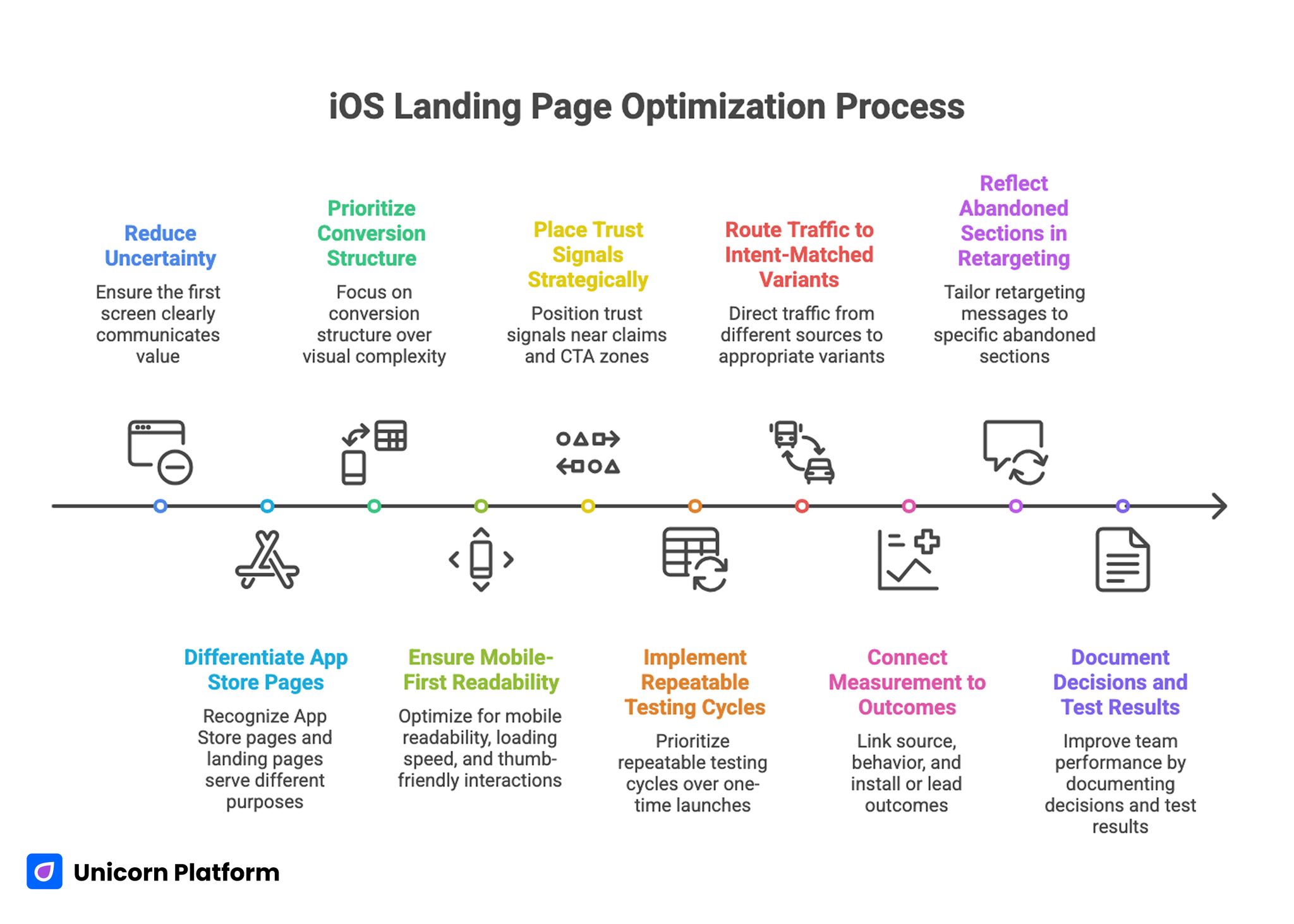
Key Takeaways for Building a High-Converting iOS Landing Page
- A high-performing iOS landing page must reduce uncertainty in the first screen.
- App Store pages and landing pages serve different jobs and should not be treated as substitutes.
- Conversion structure matters more than visual complexity. Independent benchmarking from HubSpot Research finds that consistent page structure, clear value sequencing, and strategic placement of proof elements correlate with higher click‑through and conversion rates across mobile and product landing pages.
- Mobile-first readability, loading speed, and thumb-friendly interactions are baseline requirements.
- Trust signals should appear near claims and CTA zones, not only in footer areas.
- A no-code workflow should prioritize repeatable testing cycles, not one-time page launches.
- Directory, social, and paid traffic should route to intent-matched variants.
- Measurement must connect source, behavior, and install or lead outcomes.
- Retargeting performs best when messages reflect the exact section users abandoned.
- Teams that document decisions and test results improve faster with less redesign churn.
Why an iOS Landing Page Still Matters in 2026
An App Store listing is necessary, but it is not enough for most acquisition strategies. Store pages are constrained by platform formats, limited storytelling range, and minimal control over narrative sequence. A landing page gives you control over message order, proof placement, and conversion paths before the install click.
That control is critical when traffic intent varies by channel. Paid social visitors often need fast value framing and emotional clarity. Search visitors may need comparison depth and practical detail. Partnership traffic usually needs trust and category fit before commitment.
A dedicated landing page also lets you run offer experiments without platform submission delays. You can test headlines, screen hierarchy, objection handling, and CTA language in days rather than waiting for slow release loops.
What High-Performing Mobile App Pages Have in Common
Top-performing app pages usually look different on the surface, but the strongest ones follow the same behavioral principles. They answer essential questions fast, prove claims with specific evidence, and make the next step obvious.
1. Immediate above-the-fold clarity
Visitors should understand four things in seconds: who the app is for, what outcome it creates, what makes it different, and what action to take now. If any of these are delayed, the scroll depth curve usually drops hard in the first moments.
Clear does not mean simplistic. A sharp headline, one focused supporting sentence, and one primary CTA often outperform dense hero sections filled with multiple equal-priority claims.
2. Product evidence before feature volume
High-performing pages show the product in action, not just abstract promises. Screenshots, short motion clips, and annotated UI moments help users evaluate fit quickly. Evidence should explain workflow impact, not only interface beauty.
Strong teams map one visual to one practical outcome. That keeps the page easy to scan and improves message retention during comparison.
3. Trust integrated into decision zones
Trust sections work best when they are woven into the decision path. Social proof near pricing, security notes near sign-up forms, and review context near CTA blocks reduce last-second hesitation.
When trust appears only at the bottom, many users never see it. Placement is part of persuasion.
4. Scannable long-form depth
Short pages can work for simple offers, but many app categories need more depth to convert informed buyers. Strong long-form pages remain scannable through crisp headings, concise paragraphs, and clear section purpose.
Depth should answer real objections and use cases. Filler length usually increases bounce rates instead of improving conversion.
5. Mobile experience treated as primary
For iOS campaigns, mobile is often the first interaction. Layouts must hold hierarchy on small screens, maintain readable typography, and keep CTAs easy to tap. Fast perceived load speed is a trust signal on its own.
Pages that feel heavy or cramped on iPhone screens lose users before message quality has a chance to work.
Mobile engagement patterns matter beyond aesthetics. According to Google UX Playbooks, thumb-friendly interactions, tap target sizing, and predictable scrolling architectures substantially improve mobile user satisfaction and engagement — especially for users comparing apps and looking to commit quickly.
Strategy Before Build: Decisions That Prevent Rework
Most underperforming app pages share one root problem: the team started with sections and visuals before defining audience, promise, and conversion objective. A better build process starts with strategy constraints.
Define the primary audience by job, not by demographic
Demographics can support targeting, but conversion copy should be grounded in the user job. Ask what the user is trying to accomplish, what blocks that progress today, and what outcome they need soon.
An audience defined by job creates sharper copy and more useful proof. Instead of generic “busy professionals,” you can write for “small team leads who need daily priority alignment across iPhone and desktop workflows.”
Pick one primary conversion action
A page with too many primary outcomes causes decision friction. Decide whether the main action is install, waitlist join, demo request, or trial start. Secondary actions can exist, but one path should dominate the visual hierarchy.
This single decision improves CTA clarity, analytics setup, and test interpretation.
Build an offer hierarchy
Users evaluate risk before commitment, so your page should present a clear progression from low-risk engagement to higher commitment. An offer hierarchy could be install first, then onboarding guide, then premium upgrade.
Without this progression, teams often overpush high-friction actions too early and mistake the resulting drop-offs for traffic quality issues.
Prepare proof assets before writing full copy
Collect testimonial snippets, quantified outcomes, product screenshots, founder credibility signals, and support policy notes before final writing. Copy quality improves when evidence is available during drafting instead of being inserted later as decoration.
Evidence-led writing also reduces exaggerated language because claims are anchored to real inputs.
Conversion Architecture for a No-Code iOS Landing Page
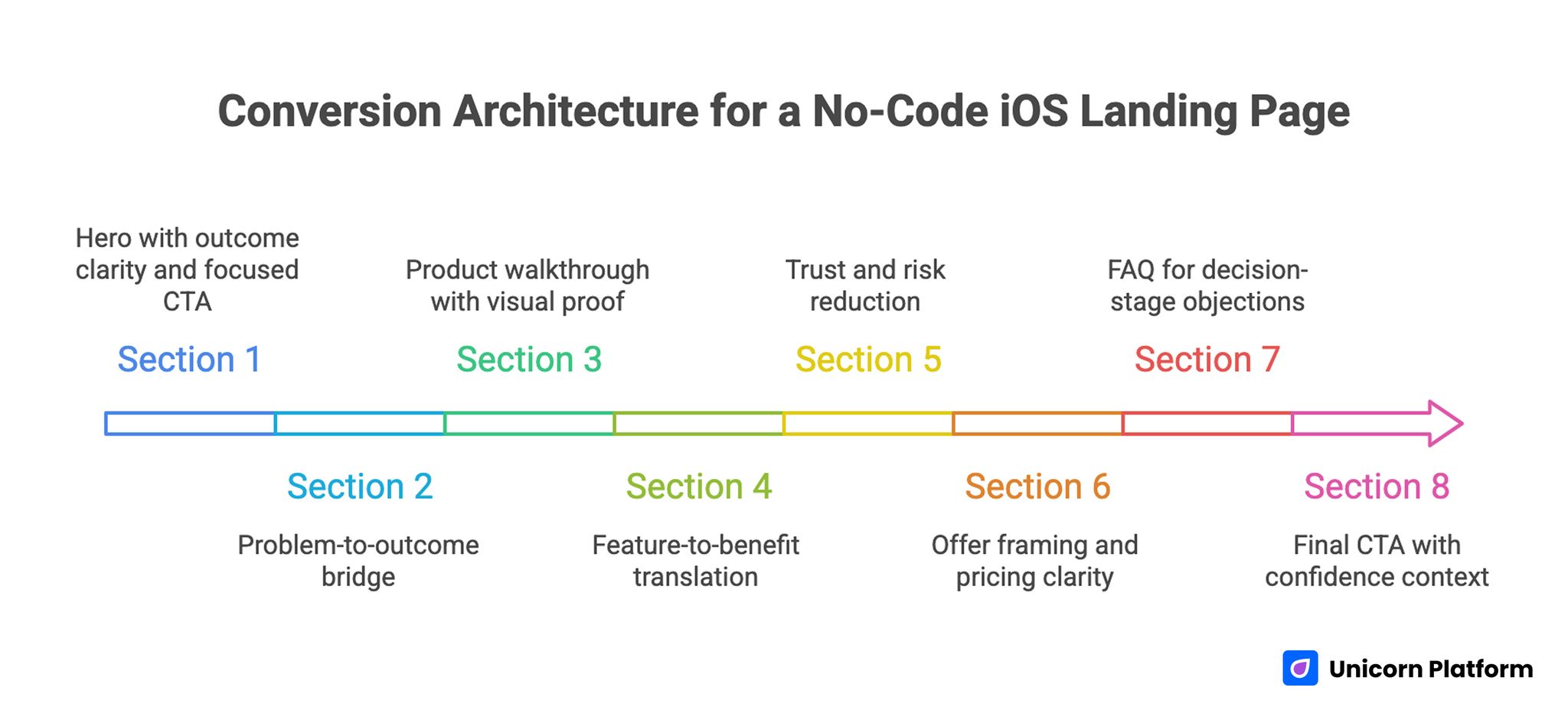
Conversion Architecture for a No-Code iOS Landing Page
A reusable architecture keeps teams fast and consistent across launches, seasonal campaigns, and segment-specific variants. If you want a full structural blueprint, align this framework with the sequence in a step-by-step guide to a high-converting landing page structure.
Section 1: Hero with outcome clarity and focused CTA
Use an outcome-led headline tied to one audience. Avoid broad claims that could describe any app category. The supporting line should explain practical value with one concrete differentiator, not a list of features.
CTA language should match user readiness. “Download on the App Store” works for high-intent traffic. “See how it works” can improve early engagement when audience awareness is lower.
Section 2: Problem-to-outcome bridge
After the hero, validate the user’s current frustration in plain terms. Then show the improved state your app enables. This transition helps users self-qualify and stay in the journey.
A concise before-and-after block often works better than long narrative explanation because it frames value in decision terms.
Section 3: Product walkthrough with visual proof
Show the workflow in a logical sequence. Each screenshot or short clip should answer a specific question such as setup effort, daily usage speed, or collaboration visibility.
Captions are critical. Users skim visuals quickly, and captions provide the meaning layer that turns images into persuasive proof.
Section 4: Feature-to-benefit translation
Features by themselves rarely convert. Translate each capability into operational impact, saved time, reduced risk, or better outcomes. Keep wording concrete and measurable where possible.
Benefit language should remain credible. Specific, modest promises usually outperform exaggerated claims in sustained conversion tests.
Section 5: Trust and risk reduction
This section should remove the final objections that block action. Include relevant testimonials, privacy reassurance, security clarity, and support expectations. Position trust elements near the points where users are asked to commit.
For products in sensitive categories, explain data handling and account controls in plain language rather than legal abstraction.
Section 6: Offer framing and pricing clarity
If pricing is visible, keep it simple and connected to value outcomes. If pricing is deferred, explain how users can evaluate fit before commitment. Hidden friction tends to depress install quality even when top-of-page CTR looks strong.
Transparent expectations reduce low-intent signups and improve downstream retention.
Section 7: FAQ for decision-stage objections
FAQ sections perform best when they answer practical friction: setup time, cancellation, data portability, integrations, and onboarding support. Keep answers short and direct.
Decision-stage visitors use FAQs as a confidence check, so this section should feel operational, not promotional.
Section 8: Final CTA with confidence context
The final CTA should restate the promise, reduce perceived risk, and clarify the next step. Repetition is useful here when it is concise and contextually aligned with what users just read.
A strong final block acts as a conversion bridge, not a generic closing paragraph.
Copy Framework That Improves Install Intent
Copy quality is where many no-code pages either gain leverage or lose it. A clean model is the 4P flow: Problem, Promise, Proof, and Path. It keeps narrative focused and prevents feature dumping.
Problem language should mirror user reality without dramatizing it. Promise language should express one core result in practical terms. Proof should validate the promise through evidence. Path should tell users what to do next without ambiguity.
Headline writing deserves dedicated iteration because it influences nearly every downstream metric. Strong headlines combine audience fit, outcome clarity, and timeframe or mechanism where appropriate.
Subheadlines should complement, not repeat, the headline. Use them to add specificity and lower skepticism.
Microcopy also matters more than teams expect. Button labels, form hints, and error-state language shape trust during critical moments. Clear microcopy removes friction and can raise conversion without any major design changes.
Design Decisions That Make No-Code Pages Feel Premium
Premium perception comes from coherence, not complexity. Teams often overuse visual effects when the real win is tighter hierarchy, better spacing, and controlled contrast.
Use one strong visual rhythm across sections. This means consistent spacing rules, predictable text widths, and clear transitions between section jobs. A stable rhythm lowers cognitive load and helps users process long-form content faster.
Typography choices should support scan speed on both desktop and mobile. Large but not oversized headlines, readable body text, and disciplined line length reduce fatigue in deeper pages.
Color and emphasis should direct attention to decisions. If every block is visually loud, nothing feels important. Reserve high-contrast treatment for key proof and CTA zones.
Custom visuals should demonstrate product behavior, not only brand style. Decorative media can support atmosphere, but conversion sections need functional visuals that help users evaluate fit.
Mobile-First UX and Performance Checklist
Mobile optimization is a growth requirement for iOS campaigns, not a polish step. If the mobile experience is weak, paid and organic traffic efficiency drops across the funnel.
Start with first-screen readability. Headline length should fit naturally, supporting text should not collapse into dense walls, and the primary CTA should remain obvious without awkward scrolling.
Interaction design should account for thumb behavior. Buttons need comfortable tap targets, form fields should minimize typing burden, and important actions should remain reachable in natural hand positions.
Image handling requires strict discipline. Use compressed assets, modern formats, and scaled dimensions matched to layout needs. Oversized screenshots are a common cause of poor mobile performance.
Track real-world performance, not only lab scores. Monitor load behavior on actual iPhone devices and mixed network conditions to catch friction that synthetic tests miss.
When teams need a deeper implementation guide, the mobile execution checklist in creating a high-converting mobile app landing page is a useful companion for launch QA.
SEO Layer for Sustainable App Acquisition
An iOS landing page should convert now and compound over time. That requires SEO fundamentals built into page architecture instead of added as an afterthought.
Use intent-aligned title and heading structure. The H1 should match core page intent, while H2 blocks should cover adjacent questions users ask before installing. Semantic breadth matters when users compare alternatives and workflows.
Keep copy natural while covering related terms users actually search. Over-optimization usually hurts readability and trust.
Internal linking should support genuine next steps in the decision journey. When mapping cluster opportunities and content expansion paths, use the planning method in data-driven SEO strategy planning.
Technical basics still influence outcomes: clean metadata, fast media delivery, stable layout behavior, and indexable content structure. These are not advanced tactics, but they are often the difference between steady growth and stalled visibility.
Retargeting Strategy That Matches User Behavior
Retargeting works best when it reflects what users actually did on the page, not just the fact that they visited. Behavioral segmentation raises relevance and reduces wasted impressions.
Segment one can include users who bounced early from the hero. They usually need clearer value framing and shorter creative hooks. Segment two can include users who engaged with visuals but skipped the CTA; they often need stronger proof or objection handling.
Segment three can include users who reached pricing or final CTA but did not convert. They may respond to risk-reduction messaging, onboarding clarity, or limited-time implementation support.
Ad message and landing message should stay aligned. If retargeting promises one outcome but returns users to a mismatched section flow, performance decays quickly.
Use sequential retargeting when possible. First touch can reframe value, second touch can present proof, and third touch can reduce commitment friction. Sequencing generally outperforms repetitive single-message campaigns.
Measurement Framework for Faster Learning Cycles
No-code speed becomes a real advantage only when measurement quality is high. You need clean event definitions, consistent reporting windows, and a decision model for acting on results.
Track metrics in three layers. First, interaction metrics such as hero CTA clicks, scroll milestones, and section engagement. Second, conversion metrics such as installs, trial starts, or qualified leads. Third, quality metrics such as onboarding completion or early retention.
Source-level analysis is essential. A page can look healthy in aggregate while underperforming for specific traffic types. Segment by channel and intent before concluding that copy or design is the root issue.
Create a weekly optimization ritual. Review one major friction point, propose one focused change, ship it quickly, and measure impact before stacking new edits.
For practical experimentation ideas, apply these behavioral diagnostics alongside the frameworks in user behavior tips to optimize landing pages.
30-Day Execution Plan for No-Code Teams
Week 1: Positioning and architecture
Define audience jobs, primary conversion action, and message ladder. Build section architecture and collect proof assets before detailed styling begins.
By the end of week one, the team should have a complete draft flow from hero to final CTA with clear section purpose and required evidence inputs.
Week 2: Build and instrument
Implement the page in Unicorn Platform with mobile-first constraints. Connect analytics events, source parameters, and conversion tracking before launch.
QA should include live-device checks, CTA path verification, and content consistency across sections.
Week 3: Launch and diagnose
Publish the first controlled version and route initial traffic. Monitor behavior by source and identify where intent and message diverge.
Prioritize fixes that address first-screen clarity, trust placement, and CTA relevance before testing cosmetic changes.
Week 4: Optimize and scale
Run two to three focused tests on headline framing, proof order, and CTA language. Keep changes isolated enough to preserve interpretation quality.
At the end of week four, document wins, losses, and open questions so the next iteration starts with evidence instead of assumptions.
Common Failure Modes and How to Correct Them
1. Feature overload in early sections
Teams often stack too many capabilities before establishing user outcome. Readers cannot prioritize what matters and exit early.
Correction: lead with one clear outcome and sequence features as evidence for that outcome.
2. Generic trust content
Badges and testimonials appear, but they lack context. Users see proof elements without understanding why they should care.
Correction: attach role, use case, or measurable context to each trust element and place it near relevant claims.
3. Weak mobile scan experience
Desktop layouts are adapted to mobile without rethinking hierarchy. The result is long first screens and buried actions.
Correction: redesign first-screen hierarchy for phone behavior and validate on real devices before traffic scale.
4. Misaligned CTA language
Button text does not match visitor readiness or traffic intent. Low-intent users see high-friction asks too soon.
Correction: match CTA phrasing to stage awareness and preserve one clear primary action.
5. No decision framework after launch
Teams collect data but do not convert it into action. Iterations become random and hard to evaluate.
Correction: adopt a weekly decision cadence with one prioritized hypothesis and one measurable change per cycle.
FAQ: Building an iOS Landing Page Without Code
Do I still need a landing page if I already have an App Store listing?
Yes. The landing page lets you control narrative flow, segment messaging by channel, and test conversion strategy faster than store-page-only workflows.
How long should an iOS landing page be?
Length should match decision complexity. Many app categories perform best with scannable long-form content that answers objections and validates trust, rather than ultra-short pages.
What should appear in the hero section?
Include one audience-specific outcome, one supporting value statement, and one primary CTA. Keep it concise and immediately understandable.
How many screenshots are ideal?
Use enough visuals to explain the core workflow, usually four to eight, with captions that connect each screen to a user outcome.
Should I show pricing on the landing page?
If pricing transparency affects trust and qualification, show it clearly. If your model requires guided onboarding, explain the evaluation path and commitment expectations instead.
What conversion action should be primary?
Choose one based on business model and traffic intent: install, trial start, waitlist join, or demo request. Secondary actions can exist, but one should dominate hierarchy.
How often should I update the page after launch?
Review performance weekly and ship focused improvements in short cycles. Frequent, evidence-based updates outperform occasional full redesigns.
Which metrics matter first?
Start with section engagement, CTA click behavior, and conversion completion by source. Then add downstream quality metrics like activation and early retention.
Can no-code pages really compete with custom-coded pages?
Yes, when strategy, copy quality, trust architecture, and performance discipline are strong. Tool choice matters less than execution quality.
What is the fastest win if performance is weak?
Improve first-screen clarity and proof placement before making major design changes. Those two factors usually drive the biggest early gains.
Pre-Publish QA Checklist for iOS Landing Pages
Before routing meaningful traffic, run a final quality gate that covers message, UX, and measurement in one pass. This prevents teams from launching pages that look polished but fail on conversion fundamentals.
Use this practical checklist:
- Confirm the first screen explains audience, outcome, and primary action without ambiguity.
- Check that each major section has one job and does not repeat the previous block.
- Validate that every product visual has a caption tied to user value.
- Ensure trust signals are present near major CTA zones.
- Test all CTA destinations and event tracking on real iPhone devices.
- Verify that load speed, text readability, and tap targets hold up on slower networks.
- Confirm FAQ answers cover setup effort, pricing expectations, and data concerns.
- Review source tags so channel-level performance can be read cleanly after launch.
A short pre-publish gate usually saves weeks of low-quality traffic analysis. It turns launch day into a controlled experiment instead of a guess, and it keeps your first optimization cycle focused on meaningful behavioral insights rather than preventable technical mistakes.
Final Takeaway
Building an iOS landing page with no code is no longer a compromise. It is a practical operating model for teams that need speed, control, and measurable learning.
The winning pattern is consistent: clear promise, evidence-led structure, mobile-first execution, and disciplined optimization after launch. When those pieces work together, your page becomes a reliable acquisition asset rather than a one-time launch task.
Use Unicorn Platform to move fast, but keep the standards high. Publish with intent, measure by source and behavior, and improve in focused cycles until conversion quality compounds.
